






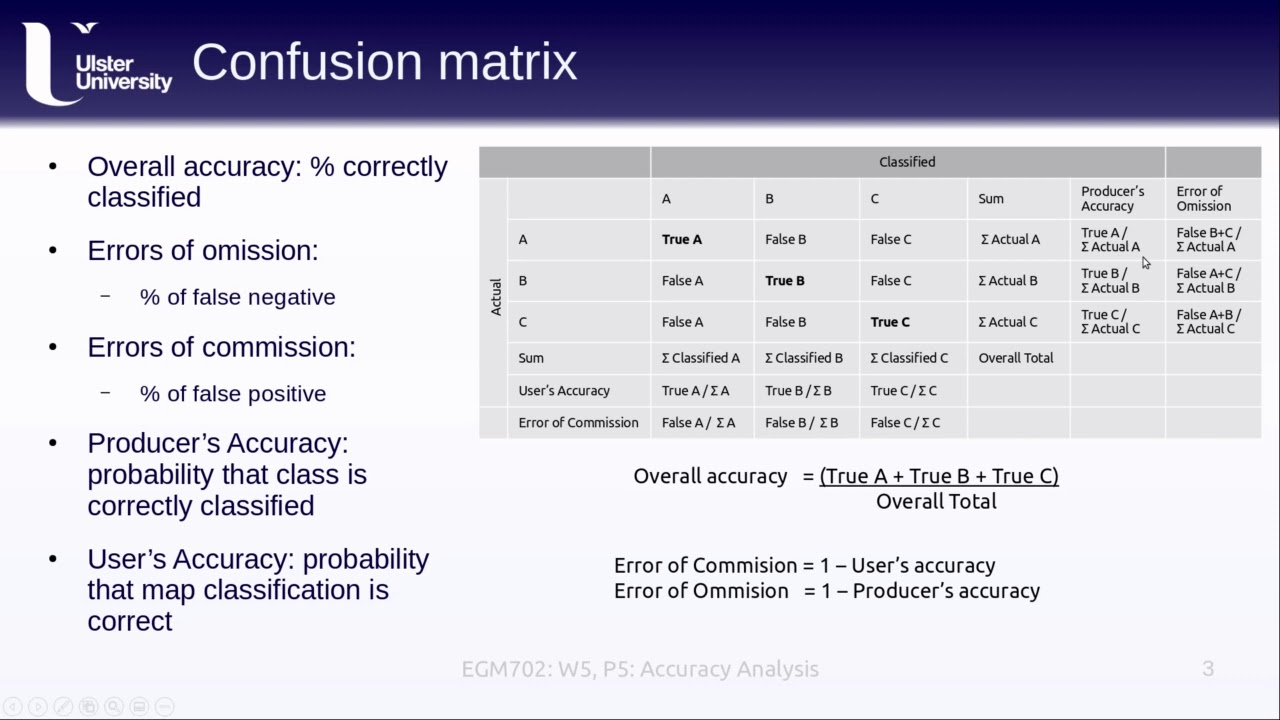












This tutorial demonstrates how to map mangrove extent and perform time series analysis using Google Earth Engine and QGIS. The methodology involves importing Landsat imagery, creating cloud-free composites through spectral indices (NDVI, MNDWI, SR, etc.), training a random forest classifier using stratified sampling of mangrove and non-mangrove areas, and validating model accuracy using the QGIS Class Accuracy plugin. The process includes setting up study areas, filtering by elevation and vegetation indices, and calculating mangrove area changes between time periods (e.g., 2009 vs 2019) to monitor mangrove dynamics over time.
NASA ARSET: Mapping Mangrove Extent with Google Earth Engine | Part 2/3 | Remote Sensing Training
Added:Basic remote sensing principles, including spectral signatures of vegetation and water, and the characteristics of Landsat satellite bands.
Fundamentals of Google Earth Engine (GEE), including navigating the code editor, using the JavaScript API, and handling ImageCollections.
Core concepts of supervised machine learning, specifically how decision trees and the Random Forest algorithm function for classification tasks.
The basics of classification accuracy assessment, including training/validation data splits, confusion matrices, and overall accuracy metrics.
Time-series analysis and change detection techniques (such as LandTrendr) to monitor mangrove deforestation, degradation, and recovery over multiple decades.
Multi-sensor data fusion, integrating optical imagery with Synthetic Aperture Radar (SAR) data (e.g., Sentinel-1, ALOS PALSAR) to improve mapping accuracy in cloud-prone tropical regions.
Blue carbon stock estimation and biomass modeling by combining mangrove extent maps with canopy height data (LiDAR) and field measurements.
Applying advanced deep learning frameworks, such as Convolutional Neural Networks (CNNs), for high-resolution wetland and coastal ecosystem classification.
14.7K views291likes1:50:10Original Release: 2020-11-13
hello everyone and welcome to the second part of our mangrove workshop the this part of the workshop will be covering mangrove extent mapping and time series analysis and we will also be covering how to perform an accuracy assessment of our resulting map so for this part of the workshop we will be exploring some of the themes that we discussed last week and going through the methodology of how we can actually create those maps using google earth engine this workshop is structured as a series of three one and a half hour sessions the first occurring on november 5th which can be found on our set website uh today's session on the 12th and then there will be a third session on the 19th the same content will be presented at two different times each day first session happening between 10 and 11 30 eastern standard time and the second session happening between 3 and 4 30 eastern standard time all webinar recordings powerpoint presentations and the homework assignment can be found through the applied sciences.nasa.gov website by following this link and they can be found after each session and if you have any questions that were not answered during the lecture you can follow up by emailing us at our nasa emails again there are three homework assignments assigned after each weekly part so there will be another assignment after today's workshop and answers must be submitted via google forms in order to achieve the certificate of completion you must attend all three live webinars complete the homework assignments by the deadline which you can access through the rsat website and you will receive certificates approximately two months after the completion of this of the course from marness there are several prerequisites that were posted on our set website for this course if you don't already have it you will need to download version 3.10 of qgis you'll also need to download install class accuracy plugin for qjs through the following link there we also have instructions for download available on the rset website for this workshop for additional prerequisites we recommend the fundamentals of remote sensing and enter to javascript for google earth engine since we will be diving in pretty quickly to coding in google earth engine i will be covering a bit of a review of intro to earth engine but we will not be going into it extensively you will also need to create a google earth engine account if you do not already have one we've also provided some optional links that can help you as you're trying to learn google earth engine including a beginner's cookbook a guide to managing assets and introduction to google earth engine tutorial for today's workshop we will be going over the basics of google earth engine and by the end of this presentation you will also understand how to create a mangrove extent map using a random vars classification and create a time series for mangrove extent change over the course of the workshop today we will first be doing a quick review of google earth engine followed by a review of time series analysis and what we mean by that analysis and then i will be going through a demo of performing a time series analysis for guyana as an example study site we will go over how to set up our map and filter a landsat composite then we will be constructing a random forest model we will then do a time series comparison a new random forest classification for that comparison we will go through calculated mangrove area from our resulting maps we will cover exporting layers of interest and finally we will go through a demo of the qgis class accuracy plugin to determine how accurate our resulting model is so as a quick review of google earth engine this is a free open source cloud-based geospatial processing platform it comprises of a catalog of publicly available data sets such as landsat imagery or land cover imagery google's computation power an application programming interface or an api as well as a code editor we will not be covering the api today it's more for exploratory purposes to see what data is available through google earth engine whereas the code editor is more useful to us for actually performing robust calculations and analyses what's great about google earth engine is that it is freely available to the public and it grants us fairly easy access to satellite imagery from a number of nasa and esa satellites including landsat and sentinel the way earth engine works is that it is a cloud-based platform with client and server functions essentially the user which will be us manipulates proxy objects through the server so we work with the earth engine interface to manipulate these objects and send instructions to google for processing so instead of performing these analyses on our computers engine we are sending requests to google and results are being sent back to the web browser for display everything in earth engine defaults to wgs 84 projections which is important as we learn how to export our data and if we decide to work with it in arcmap qjs or another platform earth engine grants us a lot of capabilities it has access to data at a planetary scale and again it grants us fairly easy access to satellites like landsat however there are quota restrictions due to its open source nature and you can be limited in terms of the user memory as you get more familiar with earth engine we you can learn how to work around some of this and how to process different requests to minimize how much data processing you're actually requesting from earth engine and again this is just a visualization of what earth engine is doing the user or the coder is sending a request to google's computer processing power using these geospatial data sets of interest the requests are being sent to google where computations and analyses are done then the results are sent back and displayed on our web browser so today we will be using the code editor side of google earth engine again we will not be focusing on the api this is for me more detailed analyses such as the one that we'll be running today it involves using a javascript code editor there is python availability but we will not be covering that there's also a map display an api reference documentation or the docs tab the console output or the console tab a task manager which is the tasks tab and then the interactive map query the inspector tab again there's a quick review of glossary of terms of google earth engine asset is an external data set loaded into google earth engine 4 analysis tables are vector data's in shapefile format so for example this could include ground truth location data or shapefile of your study area an image refers to raster data composed of one or more bands so for example distance to stream and then an image collection is a stack or time series of images like landsat 8 imagery so we'll be working with an image collection today and mosaicing that to an image for easier working purposes if you're unfamiliar with what google earth engine looks like this is an example of what the code editor looks like and what we will be working in today and after we go through some more introduction i will be moving over to displaying my screen in google earth engine if at any point you are looking for extra help with understanding some of the code we'll be using i highly recommend exploring the docs tab in google earth engine there's also a developer's guide through the google earth engine website and then there is a google earth engine developers group available as a google group that it works like stack overflow where you can ask questions or you can explore questions that other users have asked that may reflect something that you're trying to do in your own work now we'll be moving into actually performing the time series of mangrove extent for today's workshop we want to perform a time series because we want to understand change over time so as lolita talked about in the last part of the workshop mangroves change over time due to different natural and anthropogenic effects so we can use the time series analysis to understand how mangroves have changed over time we can identify areas of loss and gain and then understand patterns of change to see if those changes are linked to any sort of source in particular or source that we are interested in studying so this image is an example of what we are hoping to end up with at the end of this series this is showing a zoomed in image of mangrove extent in guyana for 2000 2010 and 2020.
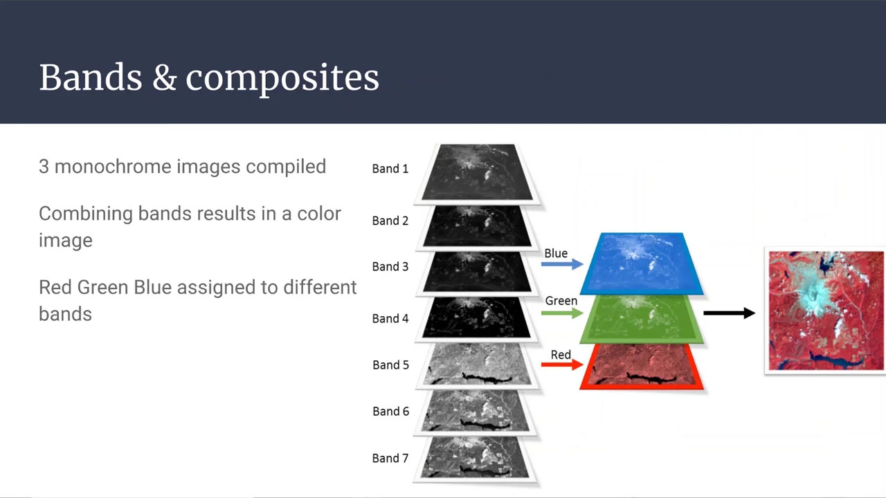
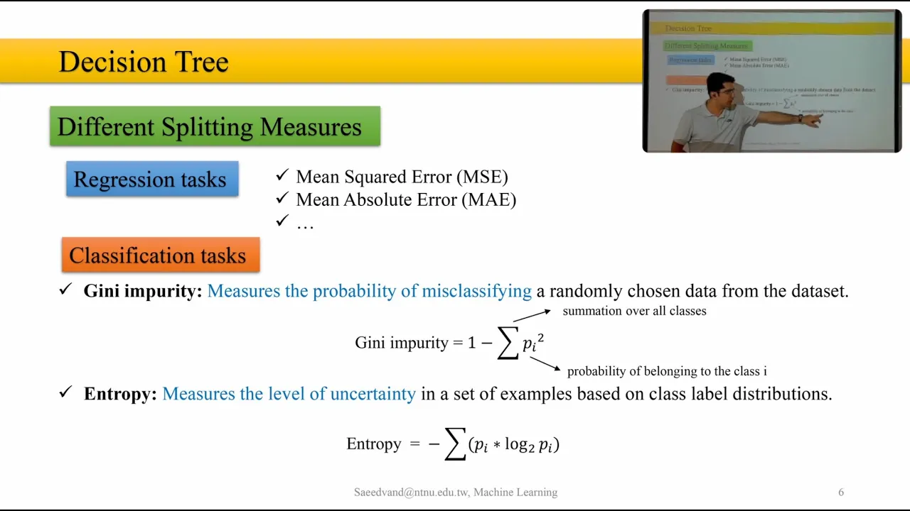
for time series analysis we are going to be examining the same study area over several years so we are going to focus on specific years of interest depending on the type of study you are conducting you may be interested in decadal information you may be interested in annual information and we can apply the techniques that we are going to review today to a number of these different studies so for example this is a comparison of mangrove extent in colombia in 2000 which is the map on the left and 2019 which is the map on the right to do this analysis we are going to be using landsat data so this is a representation of a false color composite of landsat data in 2000 and 2019 and we are going to figure out how to train a model to interpret this data to help us map mangroves and determine the amount of change over this time period so we can compare values of different indices like normalized difference vegetation index across different years to understand how mangroves are changing over time and i will be defining some of these indices later on as we go through the demo but this example index the normalized difference vegetation index is essentially a display of greenness and how green a certain pixel is that we're studying so higher values of ndvi indicate higher levels of vegetation i.e mangroves we're able to plug this information into a model then to determine where mangoes are found without having to do the heavy lifting of doing ground-based studies of delineating where mangoes are on the ground so through earth engine and using landsat data we can create samples of areas with and without mangroves using this imagery and machine learning allows us to use these samples to detect mangroves across a region for this workshop we will be using a random farce classification this is a type of machine learning and machine learning essentially uses statistics to identify patterns in large data sets it is a type of artificial intelligence that learns from data this is a tool that allows us to process large quantities of data to answer particular research questions a random farce classification is an ensemble tree based learning algorithm essentially what that means is we are creating trees that are looking at a single pixel of our data and each tree is looking at different variables such as the ndvi such as different bands of landsat imagery that may help us figure out where mangroves are and each tree is using that information to make a vote so one tree may vote that that pixel is mangrove another may vote that it's not and these decision trees select the best option based on how many trees vote in one direction versus another and this is a type of supervised machine learning because we are giving this training data so you do not have to be an expert on machine learning to use it in your research this is kind of a black box where we are giving input and training data to a machine learning algorithm and then achieving some sort of output so we can only observe what goes into the algorithm and what comes out of it and then we can manipulate those inputs until we get a result that we feel reflects um the area of interest more accurately so again this random forest classification constructs these decision trees for each sample based on the predictors these bands from landsat the trees will vote for each pixel to detect mangrove versus not mangrove and the most supportive value is assigned to each pixel so you are welcome to delve further into machine learning but again you don't need to be an expert on it for us to move forward and actually apply it to this particular study essentially the process that we'll be using to run this random forest classification is we will create samples based on the available landsat imagery within google earth engine we will then feed these samples into our random forest classification so into our machine learning model and then we will take these results and we will continually refine our model until we feel that we are happy with the results after we have created a map that we feel is accurate we then need to validate it to see if it's actually accurate understanding the accuracy of our model allows us to understand how reliable our results are and we can use stratified random samples to run an independent accuracy assessment so if you have available ground truth data this is also something you can use to run an accuracy assessment but in this case we do not have that so we're going to create our own sample data we are going to then visit each point using satellite imagery and then we're going to mark if they are correct so rather than using ground truth data we are going to zoom in on very specific points that we've created across the landscape determine is this point mangrove or not mangrove and then see if the model that we created reflects those points correctly for this exercise we will use the class accuracy plugin in qgis 3.10 again this is another link to that plugin if you don't already have it and today we're going to go through this iteration once really but this is a continual process until you get a model that you're happy with so we run our model we see how accurate it is and if it's not accurate or we're not happy with it we can refine our model we can input more training data and we'll go over some other ways that we can refine that model for today's workshop we will be using guyana as our study area nasa and sevier work with in-country partners in countries like guyana to help them monitor mangroves and guyana foresees future flooding and saltwater intrusions as sea levels rise so in this case this is an area where mangroves may be threatened by sea level rise and so we want to understand where mangroves are currently found and how they have changed in the past decade or so so this study is going to show how many how mapping mangroves can help us focus conservation practices now i'm going to be switching over to the code editor for the rest of the demo you can follow along with the script by clicking this link you can also follow along with a powerpoint presentation that we made available on our set website which contains all of the code for the analysis that we'll be running today so if you're following along with the link that i provided all of the code is already included in the code editor and you can run it as is and you will get the final results of our model but otherwise you can type along with me or copy paste some of the code over whichever way suits your learning services for the first part of this analysis we first need to include our imagery that we're going to be using so in this case we're going to be using landsat 8 surface reflectance tier 1.
you can see that it's already been imported for me but we are going to look for it anyway just so that we know where to find it so if you type in in this search bar at the top of the screen landsat 8 surface reflectance we'll see this option pop up before we import it we can click on the title and double check that this is in fact the image collection that we want to use we can see what the id is for it we can see which bands of interest are available and look at the image properties and what's actually contained in this data set and this looks good so i'm happy with what i've imported the other data set that we need to import is srtm digital elevation information again we can search for it up top we'll see our srtm digital elevation data version 4 and then digital elevation 30 meter the 30 meter option is what we want to be using again this is from the shuttle radar topography mission this is going to provide us with elevation and slope which we will be using later on to narrow down our study area to areas where mangroves are more likely to be found and before i jump into actually running the code i will be going through this demo fairly quickly and we are not expecting you to necessarily keep up at my pace however this workshop is going to be recorded and will be available within 24 hours so you can refer back to this video as well as the link to the code that i've provided our first step of this analysis is going to be setting up our map i like to start off by centering the map to my area of interest so that when i return to the code it's a lot easier to get started because i'm already centering in on my study area so in this case i have drawn a geometry for my area of interest and this is reflecting the coastline of guyana and if i wanted to create a new geometry all i would have to do is move over to this tool for drawing a shape and i'll select draw polygon i will create a new layer and i will start drawing my area of interest then i'll exit out of that so now i have this new polygon i'm going to get rid of it because i've already drawn one that fits the coastline a bit better because we are only interested in mangroves and mangroves are found on the coastline this seems like it will provide a pretty good study area as you refine your model more this is one of the things that we can manipulate so say i wanted to make my study area a bit more exacting i could then click on that geometry and move some of these vertices around to hug that cosine a bit better but for now i'm pretty happy with that and so i'm going to center my map around that geometry using dot center object and then into this i put the geometry that i want to center on and then my zoom so right now i'm zoomed at 7 if i wanted to zoom in or out i could play with that number so now we're zoomed in a little bit too far if i zoom out a bit more to me that's too far away so i like seven but you can manipulate that number based on what visually to use easier to work with the other thing that i like to do which is optional is to set up my map with this satellite base map so you can either do that through the code so that every time you run this code it automatically sets up with the satellite baseline otherwise it's going to default to the google maps background you can work with whichever one you think is easier to visualize i personally think the satellite data is makes it easier for me to visualize where mangroves are found all right so we have our map set up the way we want it and we have our landsat and srtm data pulled in so the next thing we need to do is we actually need to filter that landsat composite to a cloud-free mosaic so landsat data includes a pixel qa band which contains information about the quality of each pixel and if those pixels contain clouds or other features that may obscure the data and we are going to create a function to mask out any of these cloudy pixels so this function mass clouds is something that you will tend to use over and over again essentially what it's doing is it is creating these masks in the landsat imagery and pulling out any sort of data that may have clouds and that we want to remove from the images that we're looking at so we create this function and it's going to return an image that is updated with a mask that will mask out areas of cloud now you'll notice that if we run this nothing happens yet this is because we haven't actually asked anything to display on the map so just keep note of that that as i'm going through some of this code until we actually write in code to print something or to add a layer to the map we won't actually see anything display however we can definitely check ourselves by running the code and the way i'm running the code i'm on a mac so i'm hitting ctrl enter i believe on windows it's command enter or we can hit run at the top of our code editor and it's great to check as you're going if the code is running because for example if i forgot to include a curly bracket at the end i will run this code and i will get a syntax error and i can see that there is an error here i have an unmatched curly brackets and that would be this guy so you'll also notice that you can code things in or out by adding these two dashes and on a mac you can use command then slash to code out a whole line and i believe on windows it's control slash our next step is going to be adding spectral indices to our landsat data using data that's already provided through this landsat 8 imagery so we'll be adding seven indices to the landsat imagery so we're going to be using ndvi normalized difference vegetation index this relies on red and near infrared bands to quantify vegetation ndmi normalized difference moisture index which uses near infrared and shortwave infrared and this helps us get a vegetation water content mmdwi is modified normalized difference water index which uses green and shortwave infrared and this will provide some water information and then we have a few ratio bands so we have sr simple ratio which uses red and near infrared to provide a simple vegetation index there's ratio 54 which is short wave infrared and near infrared this maps water features ratio 35 uses red and short wave infrared to map water features as well and then we'll also be using gcbi 3 and chlorophyll vegetation index which uses near infrared and green to map green leaf biomass so essentially we are adding a bunch of different indices that provide some sort of information on not only the vegetation in a pixel but also water content and this is because we are looking at mangroves which are found close to water so to add these indices we are going to create a function called add indices l8 and for each of these indices we are going to actually calculate them out using the bands available so for ndvi we are going to take the normalized difference between red and near infrared bands you're also going to rename this as ndvi so you'll notice this pattern for each of these lines of code so from lines 55 to 69 we are performing calculations of the bands that we are interested in and you're renaming them so that we have bands that are easier for us to work with and then as the final part of this function we are going to return our image which will be our landsat image with all these bands added so we're going to use dot add bands to add our ndvi ndmi and all of the rest of our indices of interest again i will just run that real quick and i'll notice that i don't have any errors so so far so good now we need to actually filter down our landsat data by date and region so right now we have landsat data available globally but we are only interested in guyana so and we are also only interested in the year 2019 for the moment so first we're going to set up our temporal parameters we are going to create a variable called year and we're going to say year equals 2019 and what's nice about setting it up like this is that we can change this line at any point to reflect any year where landsat 8 data is available so you'll notice that these next couple lines where we create a variable for our start date and our end date we also include this variable year so rather than typing out our variable start date equals 2019 01.01 and then having to find these lines of code i only have to find line 87 and change this around if i decide that i have a different year that i would like to look at so we are going to look at 2019 minus one so we're actually going to be looking at 2018 through as much data as we can acquire from 2020 and this is because we are trying to accumulate as much landsat data as makes sense to create a cloud-free composite the thing about studying mangroves especially in areas like guyana is you often are studying them in areas that are cloudy and have a lot of rainfall and so we can't just collect imagery from one month in a year because we are likely to only get cloudy images that are not useful for analysis so instead we look at imagery from a year before and a year after and we look for the best pixel available within that time period and we mosaic those pixels together to create a cloud-free image so now we're going to start applying some of these filters and masks to our landsat 8 imagery so for that we are going to create this new variable l8 and we are going to take our capital l8 our landsat data first we're going to filter it by our start date and end date so now we've only filtered it down to 2018 to 2020 we are going to use dot map to apply that mass clouds function and then again we are applying another function so we're going to use dot map again and we are going to add our indices so nddi and all the other indices that we are interested in for the purposes of this study so right now our landsat imagery is still in an image collection and we we could see that if we wanted to just double check ourselves by using print and if we printed l8 we'll see that it's printing as an image collection so right now it's not in a format that we can use to run our random vars classification and we need it to be an image it's also as you can see a fairly large image collection because we're still looking at global data so we need to mosaic our image collection to an image and also filter it down to just our study area the way we do that is we composite on a per pixel per band basis we are going to use a median reducer you can use other reducers such as quality mosaic using a band of interest or an index of interest like ndvi median works pretty well for filtering out clouds you don't want to use something like maximum because it is more likely to result in cloudier images so our dot median reducer works really well and this essentially is mosaicing our data down and then we're going to clip our composite to our area of interest and just to check ourselves i'm going to use print and i'm going to print this new variable and we can see that now it's an image with 19 bands and if i expand this and expand the bands i can see the different bands that landsat 8 already comes with and then further below i can see the indices that we actually added through that function i'm gonna get rid of this next we need to filter down a little bit more using other information that we have available and our prior knowledge about mangroves so right now our landsat data has been filtered to this whole study area but we know that mangroves are found generally in low elevation that they are going to have high ndvi values and high mnd wi values because they are highly vegetated and they are associated with water so the first thing we are going to do is we are going to clip our srtm data to our study area so srtm.clip and then we are going to use our geometry to clip this data and the next thing we are going to do is we are going to mask to elevations less than 65 meters so we are going to create a mask called elevation mask we are going to use this clipped srtm data and we are going to say we want areas that are less than 65 meters now this is a value that i played around with that worked pretty well you can refer to other data sets of mangrove studies to explore other values or this is a value that you can manipulate as we work with our model a bit more so for example if i felt that this was not constrictive enough i would say okay give me areas that elevation is less than 45 meters and if i felt that this was too constrictive and i wasn't getting enough of my study area included then i could raise that number again but we'll stick with 65 meters for this and then we will create our ndvi and mndwi masks so we are going to call in our composite so our landsat image we're going to select our bands of interest so here our ndvi band and we are going to mask to areas that are greater than 0.25 so all these indices are going to run from negative 1 to 1.
areas that are greater than 0.25 are going to be highly vegetated and for mndwi we want areas that are greater than negative 0.5 and then finally we want to apply these masks so we are going to take our landsat composite and we are going to use dot update mask to mask out areas that are not high vegetation areas that are not associated with water and in areas that are too high elevation to support mangroves so we are making it easier for our model before we actually even run the model if we run the model across the entire landscape it is going to be looking at areas of vegetation too far inland to actually be mangroved so we are going to exclude those areas and just narrow down to where it is already more likely for mangroves to be found and now we get into actually visualizing those results and seeing what that looks like so the first thing that we need to do is we need to set up our visualization parameters we are going to do a false color composite in this case so i'm going to use sans 5 6 and four i find this easier to use for random parts classifications for mangroves than a true color composite which would just be the red green and blue bands that is up to personal preference but you'll see when we display this that it's fairly easy to pick out vegetated areas from non-vegetated areas using the false color composite rather than using the true color composite where you can see everything just kind of in the background imagery looks pretty green and then we are going to use map dot add layer to add this landsat composite that has been masked to our map so if we run this map dot add layer we'll use composite new which is again our filtered composite that has been masked to our area of interest and clip to our geometry we're going to use our visualization parameters and we're going to give it a name so it's easier for us to take out from other layers as we add more and real quick these numbers for a minimum and maximum are going to be the minimum and maximum values that we are stretching those bands these are again numbers that you can play with for display purposes they don't actually affect what values are contained in the data they just affect how the data is displayed so if i run this you'll see i now have a layer being added to the map for now i'm going to turn off my geometry for the study area so that i can better visualize what landsat imagery i am left with given these masks that i put in place so you'll see we have our landsat data available through false color composite areas that are darker red on an orange are going to be areas that are higher vegetation so for example this area where it's dark rusty orange is pretty likely to be mangroves whereas if we move further along we'll see other areas display that are green or are this dark orange almost black and those areas are pretty clearly not so the false collar composite if you haven't worked with it before is something to adjust to but the changes in amount of vegetation appear to be a starker contrast than using a true color composite next we'll be moving on to constructing our random forest model so the first thing we need to do for this is actually prepare trading data and predictors that we will be feeding into our model now as you can see by the geometries that i've drawn on here i've already created training data and i've created data for 2019 and also for 2009 because we will be doing that for our time series to do a decadal analysis now if i turn on these geometries i can see where i've already drawn training data so for these geometries my non-mangrove geometry is dark blue so you can see these points pointing to areas where mangroves are not found and then mangroves are this green geometry and if i want to add to these geometries at any point i can certainly do that to create a new one you would go to new layer you would have a new geometry display and then before you do anything else you need to move to settings and you need to actually change this title so for here i'll just do mangrove test and you need to change it from a geometry to a feature collection because by doing that we can then add a property now the property that we want to add is land cover and we're going to give mangroves a value of one so we will be doing this for all of our geometries that we use to train the data set and this is because we will later be looking at these future collections and we will be looking at the values of land cover to help train the model and show it these are areas where we as a user define mangroves as being and these are areas where we as a user are defining mangroves being excluded so i'm going to cancel out of that i'm going to delete that for cleaning purposes and then if i wanted to take any of those feature collections that i've created and add to them i would then select it i would see make sure that it's bold and then i would zoom in to any other areas where i feel like it is very clear that something is mangrove or not mangrove so once this displays you'll see that this area is again this deep rusty orange so i would classify this as mangroves and further north on my map again i see other areas of rusty orange you can use the background satellite imagery that google provides to help kind of verify that but you don't want to rely completely on it because it may not be from the same year that you're performing your analysis on but i will add this area as a mangrove sample i can add polygons like what i'm doing now or i can add points if i think that that is easier and there isn't necessarily a set number of training points that you need to provide you will notice that if you provide too many turning points the model can be a bit slower and it is sometimes more helpful to start with fewer training points and then work your way up so run the model see how accurate it is and if you feel that it needs improvement add more training data so we're going to do the same with our non-mangrove future collection all this area looks like it's either agriculture or urbanized so i'm going to add some points here and then i'm going to add polygons so i now have these two feature collections mangrove and non-mangrove and they both contain some sort of training information about where mangroves are found the next thing i need to do is i actually need to set up my model so after we draw these training polygons we can merge them together and create a new variable called classes and we're going to take mangrove which is the mangrove training dataset for 2019 and we're going to use dot merge to merge it with non-membranes so if i wanted to print this and see what that looks like we see that we have a feature collection and we can see that has 33 features in it and that each of them has a property for land cover and if we click around we can see that some of them have land cover equals one and land cover equals zero so we can see that that worked and next we are going to define the bands that we want to include in the model in this case i'm going to be using bands five six and four so you'll notice those are the same bands we use to display our false color composite we're going to use nddi mnd wi sr and gcbi so i haven't included all of the indices that we have attached to our landsat imagery but that does mean because they're there if i run my model and i feel like it needs additional information i could later add that in here and just attach it to the list of bands that we're including so next we're going to create a variable called image and we are going to take composite new which is again our landsat 8 composite we are going to select these bands and then we are going to clip it to our study area next we need to actually assemble samples for the model the way we do that is we use sample regions and this is going to work over our image collection and it is going to take our collection that we've created our classes which is again our mangrove versus not mangrove training data it's going to look through this data set for the land cover property and it's going to use that and attach that to the image so for these areas at these pixels it is going to get information on what the values are for each of these bands and then finally we are going to attach a column to this with random numbers and this is going to be used for a first test of the model's accuracy this will not be an independent accuracy assessment so just take note that the numbers that we're going to be seeing here do not reflect the actual accuracy of the model instead it's going to help you determine how well the model fits itself so it's more of a sanity check than actually looking at quantifying the accuracy of the model now we are going to end up splitting our data and we are going to take 80 of the data within our sample variable and use it to train the model and we are going to set 20 aside for testing so again testing that models fit to itself so we take this random column and we set up a filter so we use dot filter we create an earth engine filter and we are going to take a split of that data based on this random column and we're going to take 80 and we're going to use it for training so we use lt to determine like to determine less than or split and we are going to use gte greater than or equal to to subset 20 percent of the data for testing now we can print these different variables to see how much training and testing data we are actually using so how many pixels are we using to train our model and if we run this it's going to compute that number for us so we can see this is our total for pixels available for our samples and then since we subset 80 of our data for training this is how many pixels are actually used to train the model and as you add training data if you decide to do that you'll see these numbers change finally we are going to actually set up our random forest so here we're using dot smile random parts which is an update from dot random forest in google earth engine we are going to run the model using 100 trees and five randomly selected predictors per split and if we want more information we can always go back over to the docs tab and we can type in dot smile random parts you'll see there are a number of different classifications available so cart is another one you could use but today we're using random fire since it's a fairly robust machine learning algorithm we can see that by using dot smile random forest we create an empty random vars classifier and we can provide different arguments so the number of decision trees to create the number of variables per split and so on so if at any point you need more information about some of the code we're using i highly recommend just typing things in to the docs tab to get more information so for a smile random virus create a variable called classifier we're going to use e dot classifier dot smile random bars this is going to create again an empty random virus classification that we then provide information for so using 100 trees with five predictors per slit so each slit is going to look at five of these bands so it won't look at all of them and i'll just look at five randomly selected bands from that list and then it's going to train that model using our training data and selecting not only our bands of interest but also the land cover defined by that training so it's going to pull that land cover property from our classes variable and it's going to use our bands as our input properties so just by running that we see again we only still have numbers for our training data and we need to actually do a little bit more to see what that did so first let's test the validation of our model and see how well the model fits itself we are going to use testing.classify so this is actually applying our classification to our testing data to see how well the model classifies that testing we are going to use an error matrix using land cover which is our input and classification which will be the output value that the model gives and if we print these you'll see that earth engine calculates a confusion matrix for us and then provides us with the overall accuracy so this number should be very close to one because again the model is kind of testing itself against itself we will do an independent accuracy assessment in pjs to see how ethnic model actually is so this model should be fairly close to what in terms of the current activity now we have to actually apply the classification to our landsat imagery so we're going to create this variable classified rf using our landsat imagery selecting the bands of interest and then classifying it with our classifier so applying the random forest now something that i've added here that is optional is that we can clean up the model before we manually clean it and we can use that by reducing noise so essentially what these two lines of code are doing by creating this pixel count and count mask is we are looking at all the pixels within the results model looking at if any of them are unconnected to other pixels so we are going to create an image that shows the number of pixels each pixel is counted to which is done with this counted pixel count and then we are going to filter filter out all pixels that are connected to four other pixels or less so rather than having random pixels appearing in areas across the landscape that may be defined as mangrove we are going to eliminate those because it will clear up the model a bit and make it less noisy and then these are created as masks so we need to then apply them and we are going to also create a mask to show us just values of mangroves so the final classification is going to give us a map of mangrove and non-mangrove areas but since we're only interested in mangroves we can use dot select classification which is going to be a band that contains land cover values so mangrove or not and then we're going to select values that are greater than zero so any value that is one is going to be and then we create this new variable called clast and it is going to use this classified rf and update a mask using this count mask and class mask and finally we are going to add these classifications to our so we'll see here where i've used map dot add layer i've pulled in our class image so our final model i've given it min and max values of one because again we're only displaying mangroves and then i've just used palette to give it the color blue you'll see that it's displaying across our study area i can already see that there may be some problems in it so we'll see later on how we may want to adjust that but first something that we can do fairly quickly to see how accurate we think the model is from a visual standpoint we can compare our results to another available data set so in this case we are going to use global mangrove watch so i'm going to create this gmw layer and i'm going to call in an image from a image collection that i already have or an image i already have available in my projects and then i'm going to add this layer to my map as well and i'm going to color it green so i can distinguish between the two of them and to make a little bit easier i'm going to zoom in you'll see the blue of our map displaying and then you'll see the green of gmw and i can either toggle these on or off or i can just play with the opacity of my layer so you can see that i am still picking up a lot of mangrove and areas where gmw is not picking them up i can refer back to my landsat composite to see if i feel like that is accurate i think these areas are a bit too bright which means that they are less vegetated so there's probably not mangrove there so there are a number of things that we can do to adjust our model we won't go and do them in detail right now but again one thing we could do is we can adjust our study area so for example in places like guyana mangroves are really found really close to the coast so i could pull in my study area to hug the coast much more tightly and get rid of these inland patches that i think are unlikely to be mangroves and some of this really just depends on some prior knowledge that you already have about your study area other things that we can do is we can add to our training data the way i showed before and we can also play with the numbers of our trees and our splits so these are all places where you can adjust your model in earth engine after your first run so just know that that is available to you as you continue to make better better models but for now we're going to move into our time series comparison and for that we are going to pull in landsat 7 imagery so up at the top you'll see that i have already imported landsat 7 surface reflectance tier 1 imagery again you could search for it up here but i've already imported it and i've already verified that this is the image collection i want to use and so back down with our time series comparison again we're going to create a function to add spectral indices for mapping to our landsat 7 imagery and this time we have to create a different function this is because landsat 5 and 7 have different band numbers from landsat 8.
landsat 8 also collects images in wider swaths so we need to assign spectral indices using a different function as you get more advanced with google earth engine there are examples for how to harmonize landsat 5 7 and 8 but for the purposes of this training we are just going to create another function so you'll see i'm still calculating my ndvi mdm mdmi using normalized difference but instead of the other bands i was calling in i'm using bands four and three and so on and so forth so you'll see that these numbers are a little bit different from the initial function we use to add indices to our landsat 8 imagery we are going to apply some of the same filters that we used before so this time our year of interest is going to be 2009 so we are going to perform a decadal comparison again you'll see we have created variable start date and end date i'm not going to go into all this again in too much stuff because a lot of this reflects the code that we used previously we will then apply the same filters to our imagery we can reuse our mass clouds function to mask out clouds because this refers back to the same band name that we use for landsat 8 so we're going to use stop map to add our mass clouds to mask out those areas that we're not interested in because they don't have enough reliable data and then we're going to use it to add indices to your landsat 7.
again we will composite this data using median and then clip it to our study area and we are going to mask two areas of low elevation and high ndvi at mndwi again in this case we can use the same number values so 0.25 and negative 0.5 but we have to use the band associated with landsat 7 so that we get an accurate depiction we'll apply these masks and we can use the same elevation mask because we're relying on srtm for that so we'll display these results and see how that differs from our landsat 8 imagery i'm going to turn off our model results for now just to make it easier to load and visualize so now that we have our landsat composite for 2009 and our composite for 2019 displayed we can toggle between the two to see if there's any obvious changes so right now we're seeing 2019 this is 2009 and so already we can get a picture for example if you look at this area here we see some changes happening in the vegetation between 2009 and 2019.
so we can see that this area looks like it actually may have expanded or this area actually may have been lost within those years so already we're getting some sort of sense that there have been changes in vegetation during this time period so next we need to figure out how to quantify that again we're going to create a series of training data so here i created new geometries for mangrove versus that mangrove so mangrove 2009 let's make sure that i'm looking at the right layer and i would say that this area is probably meaningless so you would go through the same process of creating polygons for mangroves and non-mangroves so that you have an entirely new set of training data that is specific to that year we are going to define the bands that we want to include you'll see it's same list of bands even though the numbers are different we're still using the same same color advance and then we are going to create a new variable for l7 image using our landsat 7 composite with our bands of interest and you'll notice we're just going through the same process of creating samples specific to our image with their training data for 2009 looking at our land cover property within that data we are subsetting our training data based on this random column so that we have some set aside to test the model i'm going to skip printing these but you can print that data if you would like just to verify how much training data you have for each year and then we assemble our random fars classification so we create this variable l7 classifier we again use ee.classifier.smile random forest we use the same number of trees and predictor variables the same bands and then we run it with our landsat 7 trading data we then classify this model using our l7 classifier and again we can clean this up using our pixel count and count math so we again create a new mask so that we are only looking at results for areas of mangroves and then we apply these masks so our count mask to filter out noise and then our class mask to help us display only mangroves and we can now add this layer to our map and to make it easier and faster to display i'll turn off some other layers and i'll zoom in to that same area that we looked at earlier and we'll see how that map has changed from just our first iteration so let's zoom into a nice big block like this again our blue layer is going to be our extent map for 2019 and then our 2009 extent map is going to be this green light so i can see because there is some modeling in this area and it looks like this area is now agriculture these are areas that i may want to clean up in future iterations of the model but for now let's just compare this this big chunk where it looks like both models picked up as being neighborhoods again we can just play with the opacity of that and see how those areas have changed over time now if this model is accurate it looks like that this is displaying that there was actually mangrove growth i would want to verify the accuracy of the model and work through a different a few different iterations of cleaning up the model before i say that's a trend that i can actually follow but just to go ahead and see what some of the results of this sort of classification give you we're going to go ahead and calculate mangrove area for our different years and we do that using a reduced region to calculate the sum of pixels within our model that are going to be mangrove so we're going to use l7 clast and that is referring to our masked landsat image so only areas of our model that are mangroves we're going to multiply this by our ee.image.pixel area to get the actual scale of each pixel rather than getting the count of pixels we're going to convert that to hectares by dividing it by 10 000 and this is where we apply reduced regions to get the sum of all pixels within the model i'm going to use a scale of 100 you want to try to get the scale to be close to what the landsat scale is which would be 30 but sometimes that runs pretty slowly so i upped it just to show you an example of how this calculates and then we are going to print those results so now we have our value for mangrove extent in hectares for 2009 and we're going to do the same for 2019 so that we can compare values so we can see that these numbers do change between 2009 and 2019 it looks like from the initial run there's actually a significant mangrove growth but i don't think that's an actual trend i think that that is an indicator that i need to refine my model a bit more test the actual accuracy before i can see if that trend is displaying truth so for the last part of the code we will be actually setting up to run this independent accuracy assessment so we are going to create stratified random sampling points in earth engine to use in the class accuracy plugin in qgis so the way we do this is we create a variable for our stratified random samples we can take our final classification so classified rf and then we're going to use dot stratified sample to create a number of random samples so we are going to use 150 points per class means that there will be 150 points for mangrove and 150 for non-mangrove we're going to use the classification band to determine that information and we're going to look at a scale of 30 and you can adjust this number higher or lower depending on if you feel like this is a robust accuracy assessment or if you um want to run it more quickly just to get a first test of it you can always lower this number so you can get a feel for how the accuracy assessment runs next we actually want to add a buffer to these points so that we can look at points with a 30 meter diameter radius and this will reflect the scale of the landsat imagery that we are also looking at so to do this we are going to create a function using our classification values and we are going to set a buffer of 15 meters so a 15 meter radius or a 30 meter diameter buffer around each point from our stratified samples and after creating that function we then map it across those samples the last thing that we need to do is we need to export layers of interest so a couple things we might want to do here is we might want to export the results of our model so export our final maps we do that with these lines of codes export.image to drawing and we just make sure that we call in the correct image we give it a description that's meaningful to us we set a scale and then we include max pixels because sometimes earth engine runs out of space if we define max pixels sometimes we can get it to give us a bit more memory to actually run that export and then for our stratified random samples we are going to use export.table to drive and we are going to take those stratified points and export them as a shape file and now if i run my data you'll see that if you if i run my code you'll see that my tasks tab lights up and you'll see i now have three different objects i can export so if i click run you'll see it's auto wrap it's um already going to my drive i could also export it as an asset to go straight back into my earth engine assets but since i'm exporting this to qjs i'm going to export this to my drive and i'll run that and then you could also run these other images to export to drive now i'll run those but we will not be working with those for the rest of the day today um i recommend playing around with exporting images and tables so that you're familiar with the process images take a lot longer to export than tables so i'm just going to let this run but we will not be using these for the rest of the tutorial and for next week's tutorial i will actually be providing you with images that i've already created so if for some reason you struggle with the export or it's taking too long just know that we will be having images available for you to use for the last part of this workshop so now i'll be moving over to qgis to use the class accuracy plug-in if you have not already installed it or have had any trouble installing it just remember to refer back to the instructions on the rset website you will be downloading a file that contains a readme file and the readme file needs to be taken out and you can zip together the main class accuracy folder and install this into qgis so this plug-in was created by dr peter bunting and this tool takes the user through each randomly stratified point that you provide and essentially you are visiting each point and then defining whether the point was accurately classed by the model or not the result is an assessment of the overall accuracy of the model so moving into djs the first thing that we want to do is we want to add our stratified random points so you can see that i've done that here and these points will display here and you'll see that they're they're pretty well stratified across our lane cover and then we are going to choose some satellite imagery to have in the background so in this case i've used being aerial imagery you can also use esri world imagery if you have access to other data sets such as worldview imagery or imagery that is more specific to the time period of interest those can also be really great to use and really effective in qgis but for now we'll use the bay area so i've already gone ahead and i've installed the class accuracy plugin and it will now appear under your plugins and we can see it here before we go into that we need to check a couple of things within our attribute table so right now we just have our classification output from the model but we need to make sure that we add a couple of columns for the processing so we need to ensure first of all that all of our columns are in string so for example if you had a data set where classification instead of being one was mangrove spelled out in string you could also use that so we are going to edit this and we are going to add three columns the first one is going to be class we're going to make sure that is text we will add another one for output again make sure it's string and then finally we are going to add one for process if you don't have these in string you will get an error as you try to run the class accuracy so we are going to fill in this class column using our field calculator and we are going to update an existing field and we are going to update our class field and we are going to say that it equals our classification output from right so we can take out that equal sign we hit ok and we see that it's filled in now these other columns remain blank because we are going to have those filled in as we move through our class accuracy problem so we can close we can save our edits we can stop editing and we can close out of this now we can move into our class accuracy plugin you'll see here that we have this new popup and we can select a vector layer in this case we've only got one loaded so it makes it easy and then we have to select our column so our classified column which is the column that has the points classified by the model we're going to select flats because that is our new string column an output column and our output column is going to contain the values that we as a user assign to each point so for example if a point is classified by the model as mangrove but we as a user see visually that it should not be mangrove it will be marked as not mangrove in this column and then this process column is just to help track which points have been processed and i like to click visit process points in case i want to return any points that i have second thoughts about then we just hit start and you'll notice that we start visiting each of our points again looks like it's too far inland and it's not this dense vegetation that we're seeing like in this patch over here and i'll just click through a few points so that you can get a feel for how this actually works and you may get some that you're not sure this one i think maybe mangrove i'm going to classify that as negro but i could always make a note and i can see that this is 0.4 so i can always revisit it if i decide that i would like to and i can also go to a specific feature so let's say i want to revisit feature 136 i can type it in here i click go to and i can see this feature specifically so once you have done all of this you will click calculate error matrix and this will produce an excel file for you outside of tgis so i've already gone ahead and run through all of the points and i can see what the overall accuracy of my model is and right now it's about 78 percent which is okay i would like it to be better so in that case i would go back to my model in um earth engine i would try to make some changes i would want a new accuracy assessment and there are ways to take the points that we've created through qgis to plug them back into earth engine to make it easier to run the accuracy assessment and mail but class accuracy actually provides this excel spreadsheet with the overall accuracy and then it shows us the error matrix so we can see that 85 of 115 points i ended up using were considered to be not mangoes so 85 of those 115 not mangrove points were correctly assessed and then 122 of 130 points for mangroves ended up being actively assessed and you can see that in this case i have added in a couple of other categories so if you're noticing that you're seeing areas that may be in between or aren't really classified as either so in an example where you have multiple land cover classes class accuracy allows you to add these as land cover types as you saw me add that zero as an option and then down below we can see what the actual accuracy is for each land public category so we'll see that here non-mangrove was assessed a bit better than mango so this is how we start seeing how well that model is actually performing and then move forward in improving the model so to recap over the course of this lesson we covered how to map mangrove extent during two different time periods so that we could run a time series analysis and then we went through one example of performing an independent accuracy assessment of that model there are tools outside of qgis and outside of this class accuracy plugin but this is providing one such tool that does a really good job of helping you assess the accuracy of model of a model that you produce for the final part of this workshop we will go over creating country specific apps and we will also have example applications of results from mangrove mapping and other analyses so next we'll be moving into the questions and answers section of this workshop please feel free to post any questions into the q a box any questions will be posted on the training website so if you're unable to answer your questions during the workshop feel free to follow up with the conclusion of the course and homework will also be available now on the arsenal website for this training again here is our contact information if we are unable to address your questions over the course of the q a session and if you have general rsi inquiries and need access to the website here are links for that thank you so much for joining the second part of this training and we look forward to having you join us for the final session next week okay great so we're going to move into the questions and answers portion um i know that we're close to the scheduled end for this webinar i can go until um quarter to noon 11 45 eastern standard time um and then anything that we don't address today will still be available through the uh arza website for this workshop we'll still be answering any questions that you have that we weren't able to address um one thing that you may have noticed towards the end is that we had um an issue with the class accuracy plug-in where we weren't actually didn't realize that we didn't record the pop-up where i was moving through the different points there is a picture of what that pop-up looks like in the pdf version of the presentation and there will be more details available you can also have access to what it looks like through the links we provided for installing the plugin there's more information there so hopefully um that helps so apologies for that issue okay so the first question how do you deal with the slc error of landsat 7 between 2003 and 2014 so earth engine already masks this era for landsat 7 so if you were to pull a single image essentially you would just see stripes because it's already masking out places where that imagery is missing to compensate for this we end up taking a mosaic of several landsat images so if you'll remember from going through the code we're pulling imagery from either side of the year that we're interested in so that hopefully we're getting enough pixels that we can have a clear picture of that error area question number two how can we unfold the black box and prepare our own algorithm according to our own needs so understanding the black box and preparing new machine learning algorithms uh requires a deeper understanding of machine learning than what i have and what um a lot of uh folks in my lab have because we are using it as a tool that we know works generally we are interested in using models that someone else has already proved to be robust so i would say if this is where your interests lie then you would have to delve further into a study of machine learning um so unfortunately i don't have a really uh clear answer to that just because that's the limits of my own knowledge question number three uh is there a reason you choose qjs 3.10 versus 3.14 you can really use either we chose 3.10 because that's what i had on my computer um and i tend to have more difficulty installing new software onto this machine so i went with what i already had however someone actually emailed me between sessions to say that they were able to install the plug-in on 3.14 so you can definitely use the plug-in on other versions of qgis question four i some doubts in exporting the mangroves data from ge i'm trying to export the data with a resolution of 10 meters the ge shows an error that it cannot be exported because of greater pixel size so what should i do to reduce the pixel size so if you're trying to export what we worked on today or something based on landsat imagery the spatial resolution is going to be 30 meters so i would export at a 30 meter resolution to match that um in that case trying to extrapolate to a 10 meter resolution is not really going to yield accurate results anyway um if however you're working with a different data set and the resolution is that fine what you may have to do is export the data in smaller in in batches so essentially you could create several geometries that cover your study area and export for each individual geometry rather than across the entire study area question five can we use this method to predict future extent and distribution so not i wouldn't say you can make robust predictions based on the methods that we use today you can potentially extrapolate trends of loss so you could make statements like if loss continues at the rate that we've seen to date this is how much manger would be lost into the future but in terms of mapping where that loss would occur um the losses that we're seeing are attributed to several different factors they could be attributed to erosion to conversion to commodities to urbanization and so some of those things we don't necessarily have models that we can use to project mangrove area so it's a bit different from model projections like climate models because these drivers vary so it's it's definitely more robust if you're looking at changes from past to present okay question six um as you write that code in earth engine's website as javascript but in qgis with a ge plugin it will be python so in this case you could do i think it's could you provide the ge code in python as well um i do not have this code in python since i primarily export what i've done in earth engine to qgis and i work with the user interface portion of qgis there are capabilities of using retention directly through qjs as you mentioned but it's it's not something i've been able to explore yet so this code that i provided i only have in in javascript uh question seven what is the median reducer is it a filter can any other filters be used to remove cloud contamination um that's a great question so the median reducer is essentially filtering through all of those landsat images that we collected and for each pixel it's grabbing the median value and that kind of helps create a cleaner mosaic that's cloud free however you can also use other operators so you could use um maximum but it tends to yield a cloudier image and you can also use dot quality mosaic and this essentially uses a default to grab the the quote unquote best pixel value for that stack of images that you've assembled question eight i would i would need to be rephrased can you please explain why fcc is more useful than tcc for identifying mangroves um i'm not familiar with those acronyms so if you could please clarify that question okay question nine the instructor is adding and removing comments double slashes from lines of code to wrong portions of the code how is this done if you are on a mac you can hit command and slash on after you've highlighted a line on a pc it's control slash question 10 ins and darvin's mangroves of ganges from a brahmaputra delta region elevation showing in srtm is zero or negative z values so how to correct it um while the video is playing i checked in earth engine and i wasn't having this issue so i can't really say more about what's going on until um you know i could look at your code for you but i'm not really sure what's going on um question 11 is it better to use points or polygons for the classifications polygons are really great if there are areas that are uniform it makes it easier to collect a bunch of training data at once um and if the landsat image imagery looks very clear like this area's mangrove this area is not it helps us build our training data much more quickly and points can be really helpful for refining the model but honestly you can really use either it just depends on if you want to save yourself a bunch of clicking then polygons if the area is is pretty clear to pick out um the different land cover types i would go with those just in terms of efficiency okay question 12. in general how many pixels should a trading area cover it this one is is not really something i have an answer for or could give you an answer for it depends on how clear that area is so for example if you're working in a stark contrast area where it's desert versus vegetation you may not need as much training data to train the model in areas like this where we're picking out different types of vegetation you probably need more training data so it's one of these things where you generally start with fewer pixels or fewer polygons and you test the model and then you add more as you refine the model you don't want to start with a bunch of training data at once because it can slow earth engine down without necessarily providing um help to the model so you kind of just want to start small and then work your way up question 13 can you explain the random forest model again is it a sort of hierarchical clustering uh so yes the the model works through a series of decision trees so essentially a hierarchy and there are several trees for each pixel and what's happening is that each tree is going through a series of decisions and then coming to a vote on the classification of a pixel and so the majority of votes from each of the trees for a single pixel will decide what the pixel is classified as so if the majority of trees are coming to the conclusion that a pixel is a mangrove then that's what the pixel will be classified as by the model question 14 how do you know if you have too much training data so the quickest way to figure this out is that earth engine will just time out on you or give you an error for memory limit exceeded um and sometimes you can tell if you've provided too much training data it may you can look at your map and um it just may not be as accurate because you've given it too many um contradictory pixels but generally the quickest way to find this out is that earth engine will just time out on you question 15 how do we know the dates of the satellite imagery we're using that is to say day and month of 2009 or 2019 or is it an annual average so the pixel we use so the method we use pulls each available image from the study period that we specify so rather than it being a pre-made annual average we are we are going pixel by pixel selecting the median value for each pixel across that study period and we are essentially filtering through all those available images and picking out the best pixel so each so one pixel may come from october in 2019 another pixel may come from september um but that was the best pixel from that image stack so you could use the inspector tool i believe to get information um but it would i think to get for each image of each year you would have to run a different analysis but i hope that helps a little bit just to clarify that's not an annual average okay question 16.
i guess all the signatures were made once for both pre post years and then same training data was used for classification 2009 and 2019 does the google earth engine basemap satellite um sorry could you scroll up thanks um does this google earth engine base map satellite switches back to 2009 when i call my image of 2009 is it okay to redraw signatures for 2009 separately for the purpose of classification too um so i wasn't sure i completely understood this i think you're referring to the training data we created and we do create training data specific to each year of interest so we create training data for 2019 and then we create additional training data for 2009.
um now in terms of the i think there were two questions here the other question about the base map so the satellite imagery that earth engine just provides as an option for the background it we don't know what year this is from so we don't want to rely on it for the classification it will it will not switch back between 2009 and 2019 only our landsat data is doing that because we specifically called it in that way okay question 17 could we select a location using polygons and points and then the computer earth engine tells us the possible bands we can use we can select instead of telling the model the bands a priority um i don't personally know how to do this ahead of time um however what you can do is you can run the model and you can use dot explain this will print out how much each band is contributing to the model and from there you could change the inputs and you can provide additional bands or remove a band that isn't really helping the model okay question 18 how is python used instead of javascript and earth engine there is a python plug-in for earth engine but it's still a bit clunky from the last time i heard you can use the qjsg plug-in as well but i find that javascript is the best option for now so um of course it's easier to use a coding language you already know but sometimes coding languages you switch between them depending on which tool you're using and so i just work in javascript for earth engine uh question 19 why did you create a landsat 7 mask instead of a landsat 8 mask so if i'm understanding this right for the second part of the tutorial we were looking at 2009 imagery which is not available through landsat 8 so for that reason we switched to using a different satellite landsat 7.
okay um question 20 when we cloud mask the collection how likely is it the median composite would have the masked pixel if still there exists if there's still a mass pixel how do we resolve it so you can still have masked pixels so um after you mosaic your image collection you may notice that there are pieces of the landsat data missing one way to work around this is by expanding the study period that you are pulling landsat data from so for example if you're looking at a year on either side of 2009 but there's still a lot of data missing you would then maybe look at an additional year so 2007 through 2011 and then hopefully across that whole study period you would have enough pixels to have a cloud-free image mosaic um the other thing that you can play around with is other reducers so you could use that quality mosaic um command instead of median and see if that provides a better image um okay as the median composite may have different bands with different time steps time time stamps would that impact classification if yes how to address right so because we're pulling the median composite we do have pixels that are coming from different times through that study period that we suggested typically we just um are working under the assumption that it's going to be close enough to our time period that we're still getting a clear picture across the landscape as a whole um this is why like i previously i for the last question i just said that you could expand your study period you don't want to expand it too far because then you are increasingly you're increasing your likelihood that you're going to be pulling pixels that are too far from your study period to um really be accurately saying this is the classification of the year that you're specifying so yeah i would say that the the best way is to try to work within a smaller study period so work within a year and then only expand out if you need to can we use uh question 22 can we use google earth engine to determine the future pathways of a certain scenario example bau versus green economy scenario um i would say i personally do not work as much with projections and with future modeling um however my instinct is to say that yes you could you could do this in revenge because in earth engine if you already have access to raster layers and to model outputs these are all things that similar to any other gis platform you can import these data sets and perform these models so i know that that climate modeling is available in earth engine so i would imagine that these other scenarios you could you could run these analyses in earth engine um i think i'll i think i'll be able to finish this off since there's only two more questions so question 23 is it possible to use pan sharpen imagery to generate a classification map what would be the advantages and disadvantages um absolutely so i work with hand sharpen imagery or high resolution worldview imagery to generate training data um what i generally do is i generate the training data from this imagery but still use the landsat imagery to run the classification the disadvantage of working with high resolution imagery is that it is quite large so it can slow down your analysis and it can it's not as consistent as landsat imagery so for example you may have one really clear image for a study area but if you're trying to do some sort of annual analysis you may not get the same coverage each year um i would i would say that the main those are the main disadvantages of using the high resolution imagery um and i do my you could run the random forest classification using the this pan sharpen imagery as well and that may give you an even more accurate um model but it really depends on how much imagery you're using how much it's going to slow down earth engine or whatever platform you're using and um if you are trying to do a time a one time um picture of what mangroves or your landcover class looks like in a given year or if you're looking at annual trends and just from there how much data is actually available and then the last question question 24 is it possible to perform trend analysis of mangrove loss gain in earth engine yes so we um in the next portion of the workshop we'll be going through creating a gui or an interactive app through earth engine and one of the things that we pull in is calculating the values of a mangrove extent for the years that we mapped so what you could do if you're not interested in the gui side of things is in the code that we use today you can generate a mangrove extent map for each of your years of interest and from there you can calculate the total extent in an area and you can also create rasters of pixels where mangrove was lost or mangrove was gained so you can definitely do this analysis in earth engine okay um i think looks like that's it and we're over the time so thank you so much for joining today these the the questions and answers session will be made available to all of you so if there's anything that you wanted to refer back to this will be provided on the rsat website so we are excited to see you next week for the last section of the workshop where we will be going over creating an app in earth engine so thank you again so much and hope everyone has a great day
Up Next
152:24
NASA ARSET: Mangrove Mapping with SAR Data | Tutorial
@NASAgovVideo
7.7K views•2020-06-01

12:54
Triumph of Orthodoxy Icon: Byzantine Art & History Explained
@BenCallan
2.1K views•2024-08-06

122:23
NASA ARSET: Google Earth Engine Basics and Applications, Part 1/3
@NASAgovVideo
20.6K views•2021-06-17

1:42
Game of Thrones Opening Credits: A Cinematic Analysis
@gameofthrones
46.3M views•2011-04-18
Related Study Plans & Knowledge Roadmaps
Structured learning paths in General & Interdisciplinary Studies
general-studies
Elevator Engineering: History, Physics & Cities
01From Hoists to Safety Brakes: The Dawn of Vertical Lift
02Hydraulic vs. Traction: The Engineering Physics of Elevators
03Modern Speed, Safety, and Algorithms
+ 2 more learning modules
12h5 modules
Explore Roadmap
general-studies
Rubber: Material Science, History & Geopolitics
01Origins of Natural Rubber & Mesoamerican History
02The Chemistry of Natural Rubber & Vulcanization
03The Geopolitics of the Rubber Boom & Colonization
+ 2 more learning modules
12h5 modules
Explore Roadmap
general-studies
Containerization: Evolution, Logistics & Trade
01Ancient Trade & Bulk Cargo: Amphorae to Barrels
02The Industrial Revolution & Cardboard Packaging
03The Containerization Revolution: Malcom McLean
+ 2 more learning modules
12h5 modules
Explore Roadmap
general-studies
Textile Tech: Evolution, Labor & Global Impact
01Pre-Industrial Textiles: Handloom & Cottage Industry
02Mechanization: The Spinning Jenny to the Power Loom
03The Factory System & Global Labor Transformation
+ 2 more learning modules
10h5 modules
Explore Roadmap