







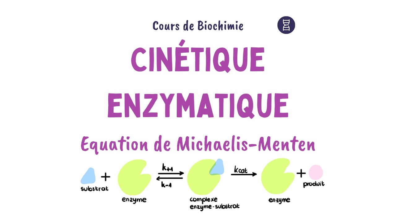






















The Lineweaver-Burk plot, a double reciprocal transformation of the Michaelis-Menten equation (1/v = (Km/Vmax)(1/S) + 1/Vmax), allows calculation of enzyme kinetic parameters by plotting 1/velocity against 1/substrate concentration; Vmax is determined from the y-axis intercept (1/Vmax), while Km can be calculated using the gradient (Km/Vmax) or the x-axis intercept (-1/Km), enabling accurate determination of maximum reaction velocity and Michaelis constant from experimental enzyme data.
How to Calculate Vmax and Km from a Lineweaver-Burk Plot
Added:Understanding of the Michaelis-Menten equation and the definitions of maximum velocity (Vmax) and the Michaelis constant (Km).
Basic algebraic skills, specifically how to take reciprocals and work with the linear equation formula (y = mx + b).
Familiarity with basic Excel functions, including data entry, formula application, and creating scatter plots with trendlines.
The concept of how substrate concentration ([S]) affects the initial rate of an enzyme-catalyzed reaction (v0).
Analyzing different types of enzyme inhibition (competitive, non-competitive, and uncompetitive) by observing changes in the Lineweaver-Burk slope and intercepts.
Understanding the statistical limitations of the Lineweaver-Burk plot, such as its propensity to distort experimental error at low substrate concentrations.
Exploring alternative linear graphical representations of enzyme kinetics, such as the Hanes-Woolf and Eadie-Hofstee plots.
Using non-linear regression software (or Excel's Solver tool) to fit data directly to the Michaelis-Menten equation for more accurate parameter estimation.
Calculating the turnover number (kcat) and catalytic efficiency (kcat/Km) to evaluate and compare enzyme performance.
106.4K views1.1Klikes8:34Original Release: 2020-02-05
In this video, we'll be looking at how we can use the Lineweaver-Burk plot to calculate the maximum velocity and Km from an enzyme experiment.
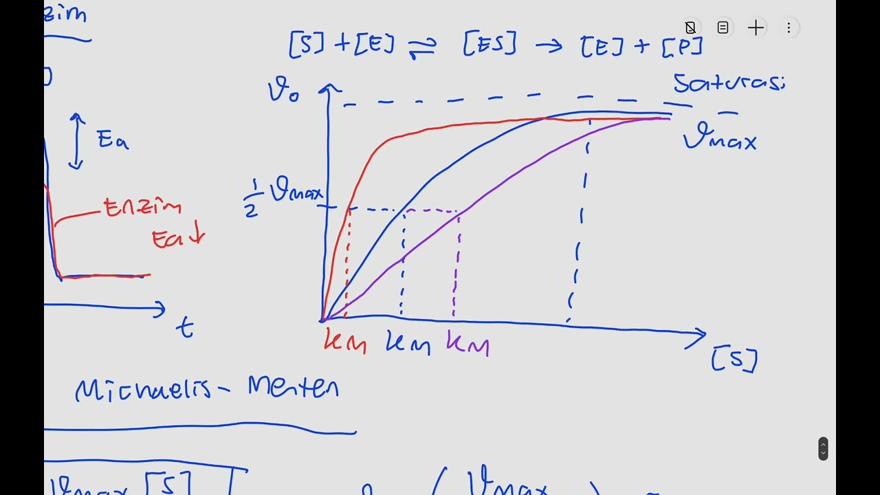
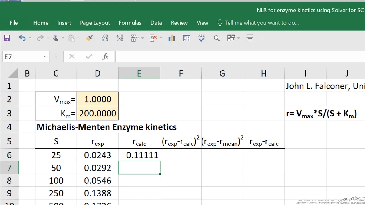
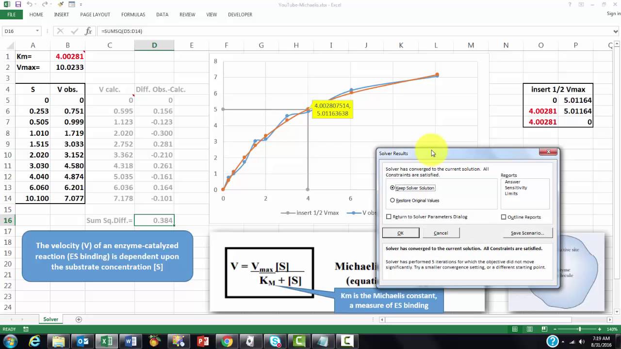
So the Lineweaver-Burk is basically a double reciprocal plot of the Michaelis Menten plot. If you look at the Michaelis Menten plot here in the top left we can see that we're plotting the substrate concentration on the x-axis against the reaction rate or the velocity on the y-axis. Now one of the problems with this representation of the data is that we can't actually determine accurately what Vmax is because this graph, in theory, never actually plateaus. Because we use an estimate of that plateau value for Vmax and therefore when we come to a calculate Km as 1/2 Vmax both of these values are estimates, but the equation we derive from this Michaelis Menten is v equals Vmax multiplied by the substrate concentration divided by Km plus the substrate concentration. If we take the reciprocal of that we end up with this equation here which is 1 over v is equal to Km plus the substrate concentration divided by Vmax multiplied by the substrate concentration and we can rearrange that into this format here so Km over Vmax multiplied by 1 over the substrate concentration plus 1 over Vmax is equal to 1 over V so that's the equation that we're going to be using when we go into Excel to actually calculate Vmax and Km.
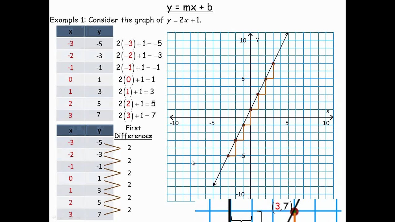
Now graphically we can see here that 1 over Vmax is represented by the y-axis intercept point and negative 1 divided by Km is the x-axis intercept point. We can also use the gradient of the trend line here to calculate Km and Vmax because the gradient is equal to Km divided by the Vmax. So what we're going to do is we're going to jump over into Excel and we'll actually look at some raw experimental data and how we would manipulate that in order to create a Lineweaver-Burk plot and calculate Km and Vmax.
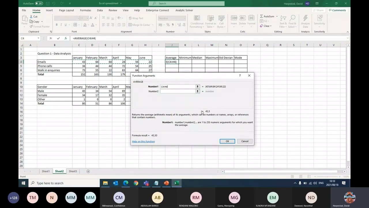
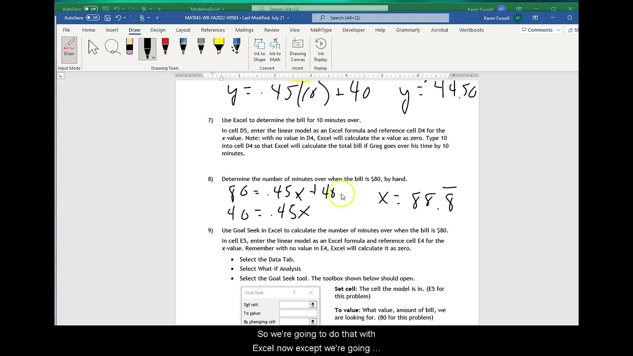
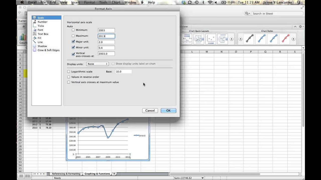
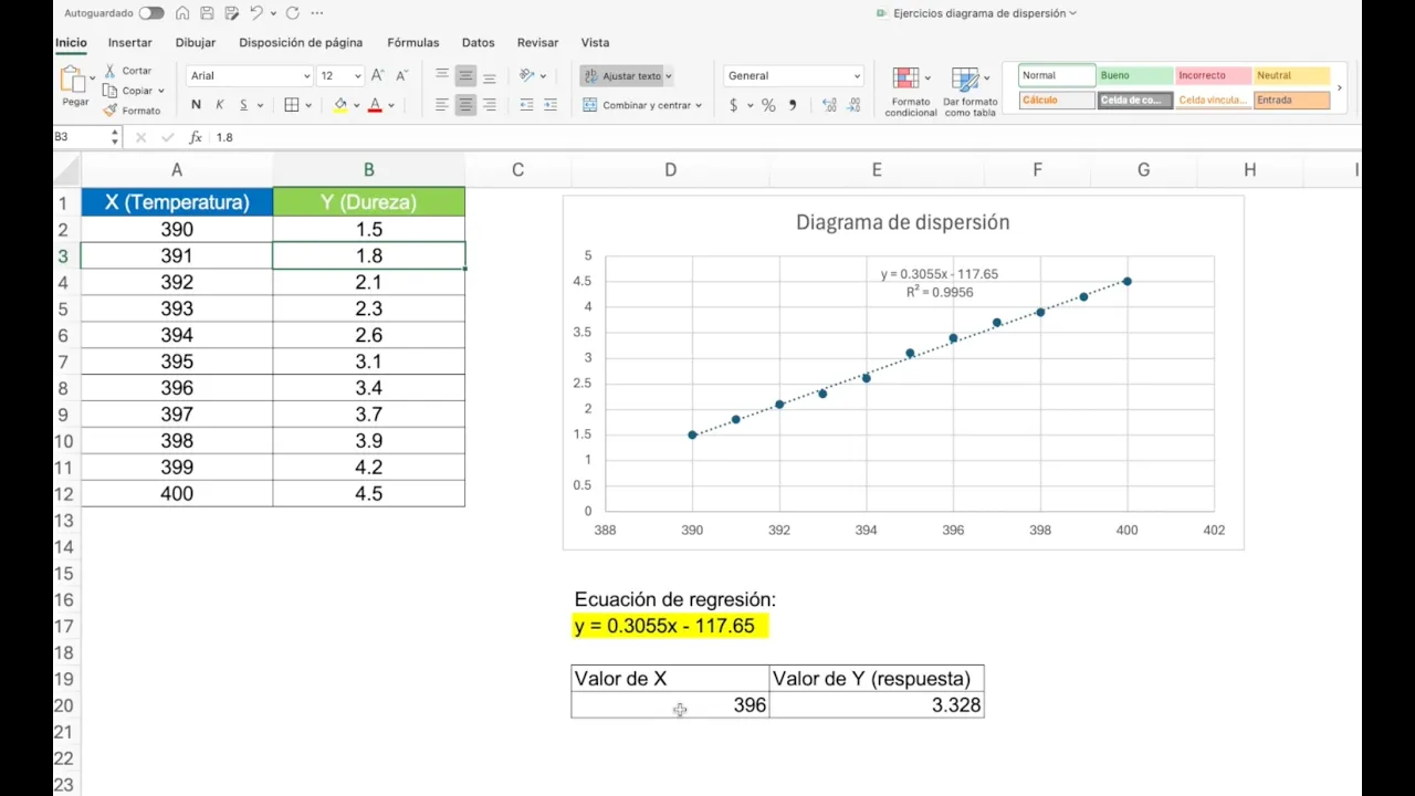
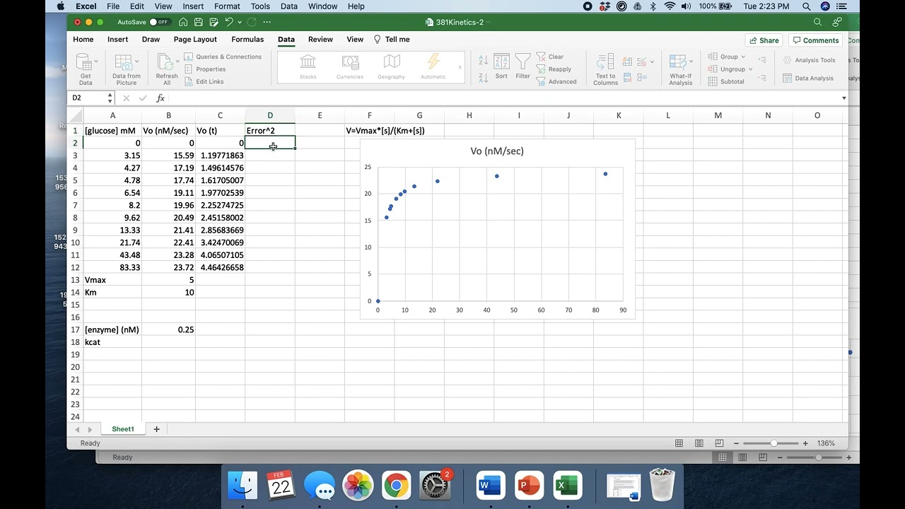
So now we are in Excel and I should say that I'm using the Mac version of Excel so there might be some small differences between what you see here in the Mac version and where things are found in the Windows version but essentially the process is going to be the same. I've already entered some raw data from the enzyme assay. In column A here I have my substrate concentration and in column B I have the velocities or the rates that were recorded. Now from what we've just talked about you will know that we now need to calculate the reciprocal values for the substrate concentration and reciprocal values for the velocity or rate. To do that I can use a formula in Excel so I just say equals one divided by and I click in cell A2 and it will automatically insert the value that is in A2 into this cell for me. If I press return you can see that has indeed divided one by ten. In order to copy this formula across I can hover over this little square in the bottom right-hand corner until the cursor turns to a black cross, if I click and drag across it will copy that formula across into column E and if I then drag down it will replicate that formula into all of these cells. So this cell here, for example, is 1 divided by 120. What we then need to do is to plot this graphically, so if I go to insert and I select the XY scatter graph and pick this one here, just make that a bit bigger so we can see a little bit more easily, you can see that I now have a linear representation of my data. So we have 1 over V on the y-axis we have 1 over substrate concentration on the x-axis. In order to get a trendline what you need to do is to click on one of the data points and then right click and click on add trendline. In the Mac version it will bring up this dialogue box so on the right-hand side here. The linear trendline is automatically selected so you don't need to change that. What I can also click is this display equation on chart and what that now has done is inserted the trendline equation in the format y equals mx plus c. When you look at Lineweaver-Burk plots in the literature, you will see that they are normally extended back to the x-axis intercept. What you can do here is go to the forecast feature and in the backwards dialogue box I already know that I need to enter a value of about 0.02 if I press return and what you can see is that the trendline has been extended back to the x-intercept. Now when you do this with your raw data you will need to play around with that backwords value until you get a graph that you are happy with the appearance of. So this is what we're going to use now in order to calculate Vmax and Km from this experimental data we can calculate Vmax because we know that the y-axis intercept here is equal to 1 divided by Vmax. The intercept is given by our c value in the equation y equals mx plus C, which is 0.0243, so we can type equals one divided by 0.0243 and that will tell us that the maximum velocity is 41.15. Now Km can either be calculated from the x-intercept which is negative one over Km or we can use the fact that we know that the gradient is equal to Km divided by Vmax, so I'm going to use that way. So Km is equal to the gradient which is given as 2.0531, so two equal to 2.0531 multiplied by Vmax, which is here. If I press return then we find that Km is 84.489. So that's how you will calculate Vmax and Km from a Lineweaver-Burk plot. When you come to putting this into your final report you want to make this graph look a little bit better so you probably don't need these vertical and horizontal trend lines you're not going to need the chart title but it probably would be a good idea to try and make this equation a bit bigger so it's easier to read and so you can make that graph just look a little bit more pretty. In order to export that into a final report what you need to do is click on it anywhere in the graph area right click and say copy you then jump over into Word, this is a blank Word document here you can then right-click again and click paste. Now this graph is actually linked to the Excel spreadsheet, the other way that you can do this is to actually paste as an image. So if you go up to the paste option here you see this down arrow and you can paste as a picture and that will give you the same graph but it's no longer editable within Excel underneath that you're going to need to put in a figure legend. So Figure 1 Lineweaver-Burk plot 1 over V versus 1 over the S concentration for the determination of kinetic parameters of and only you can expand that for whatever the relevant enzymes and conditions of your experiments are. So that's how you would calculate Km and Vmax in Lineweaver-Burk and that's how you would represent this in your final report
Up Next

39:12
Taste Matters: Why We Like the Food We Do | Professor John Prescott
@smagforlivet-video
409 views•2015-12-07

16:07
Enzyme Catalytic Efficiency (kcat/Km) Explained
@AKLECTURES
248K views•2015-03-13

5:35
Enteric Nervous System Explained: The Gut's Brain | Neurobiology Lecture
@alumniu6029
438 views•2018-09-12

7:08
Bacteriophages: Earth's Deadliest Killers and Future Antibiotics
@kurzgesagt
34.6M views•2018-05-13
Related Study Plans & Knowledge Roadmaps
Structured learning paths in Biology
biology
Analyzing Animal Venoms: Genetics & Pharma
01Molecular Biology & Physiology Foundations
02Venom Evolution & Toxin Gene Recruitment
03Neurotoxins & Ion Channel Pharmacology
+ 2 more learning modules
18h5 modules
Explore Roadmap
biology
RNAi: Biogenesis, RISC & Gene Silencing
01Molecular Biology Foundations: DNA to Protein
02Introduction to RNA Interference (RNAi)
03Molecular Biogenesis of miRNA and siRNA
+ 2 more learning modules
10h5 modules
Explore Roadmap
biology
Mycorrhizae: Signaling, Biophysics & Ecology
01Foundations of Mycorrhizal Symbiosis
02Molecular Signaling and Root Colonization
03Biophysics and Bioenergetics of Nutrient Exchange
+ 1 more learning modules
11h4 modules
Explore Roadmap
biology
Circadian Clocks: TTFL, SCN & Periphery
01Foundations of Molecular Biology & Gene Expression
02Introduction to Chronobiology and Actograms
03The Core TTFL: Molecular Architecture of the Clock
+ 3 more learning modules
14h6 modules
Explore Roadmap