Mark Rothko created his iconic floating color field paintings through specific techniques including layering multiple zones of paint over one another, using a 'turpentine burn' to soften corners and erase hard edges, and applying paint so thinly that viewers could literally see through veils of color; these methods allowed the forms to appear to advance toward or recede away from the viewer, creating an emotional experience that Rothko intended to evoke powerful feelings, including tears, similar to how music affects listeners.
Mark Rothko Painting Techniques | Color Field Art Explained
Added:Deep Dive
Introduction to Abstract Expressionism and the historical context of the mid-20th century New York School.
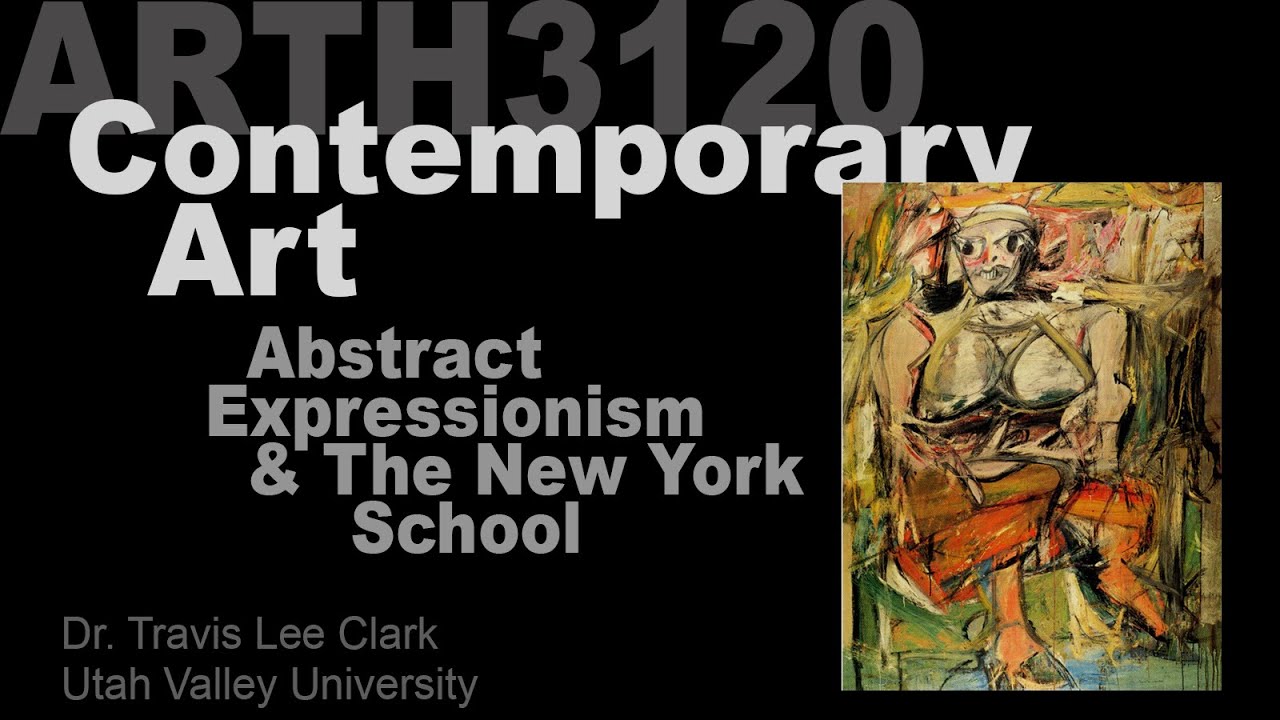
Lecture 04 Abstract Expressionism & The New York School
64.7K
Abstract Expressionism emerged in mid-20th century New York as a revolutionary art movement that fused European artistic refugees' experimental techniques with American innovation, characterized by process-oriented creation, spontaneous gesture, and the elevation of artistic concept over finished product, with key figures including Arshile Gorky, Willem de Kooning, Jackson Pollock, Franz Kline, Robert Motherwell, and Barnett Newman, who gathered at the Cedar Tavern to develop this movement that would dominate post-WWII art and pave the way for contemporary art practices.
Click to watch →

Lecture 19 Abstract Expressionism & The New York School
20.5K
Abstract Expressionism emerged in post-WWII New York as a revolutionary art movement formed by European refugee artists who fled Nazi persecution, including figures like Jackson Pollock, Willem de Kooning, Mark Rothko, and Barnett Newman; this movement uniquely combined formal abstraction with spontaneous, expressive techniques derived from Surrealist automatism, creating a new paradigm where theory and practice developed in parallel through theorists like Clement Greenberg and Harold Rosenberg, ultimately influencing subsequent movements like Color Field painting and setting the stage for modern art's dominance in the mid-20th century.
Click to watch →
История современного искусства: откуда оно взялось и почему оно такое?
211.1K
Post-WWII America became the center of abstract art, with New York replacing Paris as global capital. Artists like Willem de Kooning and Jackson Pollock developed powerful new abstract approaches. De Kooning's Women series confronted human vulnerability through distorted female forms, declaring these representations 'the quintessence of female beauty.' Pollock pioneered action painting, where physical process became integral to artwork. Mark Rothko developed color field painting exploring spiritual experience through pure color. Alberto Giacometti created elongated figures embodying human fragility and existential anxiety. Jean-Paul Sartre noted emptiness permeates such work. These artists transformed painting into meditative spiritual practice, reflecting how WWII fundamentally altered artistic purpose and human self-perception.
Click to watch →
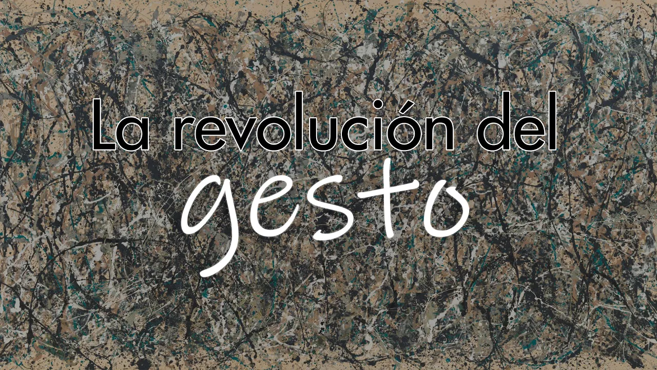
EXPRESIONISMO ABSTRACTO
347
Abstract Expressionism was a revolutionary art movement that emerged in New York City in the late 1940s and 1950s, characterized by three core principles: the physical gesture of painting, radical abstraction, and deep emotional expression. The movement divided into two main approaches: Action Painting (exemplified by Jackson Pollock's dripping technique and Willem de Kooning's aggressive brushstrokes) and Color Field Painting (represented by Mark Rothko's emotional color rectangles and Barnett Newman's metaphysical color fields). This movement transformed art from representation to experience, democratizing the artist's role as an explorer rather than a mere reproducer, and ultimately became a symbol of American freedom during the Cold War, establishing New York as the new global art center.
Click to watch →
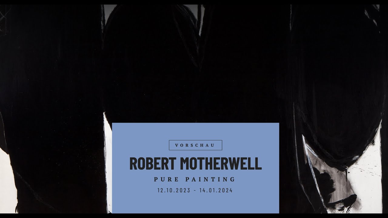
Ausstellungseröffnung: Robert Motherwell - Pure Painting
326
Abstract expressionism emerged in New York in the late and mid-1940s as a response to the historical moment of World War II. Many artists felt that working unconventionally, abstractly, and reducedly was the only way to continue creating in the aftermath of such devastation. This movement represented a distinctly American approach to modern art that was seen as important and independent. Motherwell, who came from the western United States, was part of this group that established a new American art tradition. He was exposed to European surrealists who had been forced into exile in New York during the Nazi occupation, who introduced young Americans to the practice of working from the unconscious mind, creating art strongly connected to personal feelings and emotions.
Click to watch →
Deep Dive
Basic principles of color theory, including hue, value, saturation, and optical color mixing.
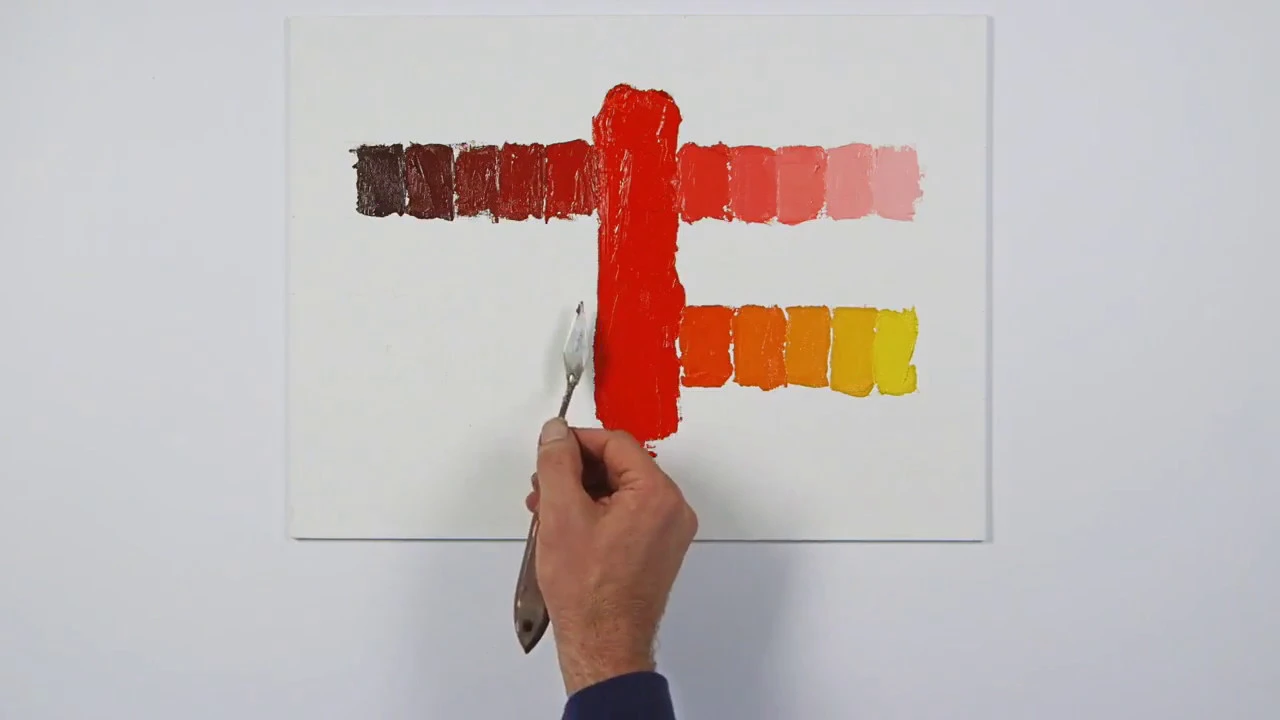
Tutorial : Hue, Value & Saturation
100.9K
In color theory, hue refers to the actual color (like red, yellow, or blue), value refers to lightness or darkness, and saturation refers to intensity or purity; these three properties can be adjusted independently through specific mixing techniques: adding white creates tints (raising value while maintaining hue), adding black creates shades (deepening value while reducing saturation), adding gray desaturates color while preserving value, and adding complementary colors shifts hue (such as adding yellow to red shifts it toward orange).
Click to watch →

Color Theory| Lesson 2
132
Hue is the main property of a color, essentially the scientific term for a color. When using the Hue and Saturation effect in Photoshop and moving the Hue slider, all hues in an image change. Saturation is the intensity of a color—high saturation makes colors vibrant and pure, while low saturation makes them pale or gray. Value (lightness or brightness) is how illuminated a color appears, with higher values meaning brighter colors up to white. A tint is created when a color is mixed with white, a shade when mixed with black, and a tone when mixed with gray. The color wheel is a circular arrangement of all color hues representing primary, secondary, and tertiary colors. Primary colors are red, yellow, and blue—they can be mixed to create secondary colors but cannot be recreated. Secondary colors are orange, green, and purple, created by mixing primary colors and positioned between them on the color wheel.
Click to watch →

¿Cómo funciona el color?
4.9K
This section covers color theory fundamentals: (1) The color sphere model with black at bottom and white at top representing value scale; (2) Three color components: Value (lightness/darkness), Saturation (intensity), and Hue (actual color name); (3) Printing system limitations that tend to saturate magentas; (4) Creating value with grays from black and white; (5) Covering the entire color spectrum with limited pigments (yellow ochre, cadmium red, black); (6) Color mixing works by comparison, requiring artists to compare mixtures with references by closing one eye; (7) Proper lighting for comparison requires both painting and reference positioned vertically (90 degrees) and perpendicular to the light source.
Click to watch →

Intro to Color Theory
252.2K
Hue refers to what the color is (its name). Saturation refers to how intense or pure the color is. Lightness, also called value, refers to how light or dark the color appears. By manipulating these three variables, any color can be created.
Click to watch →
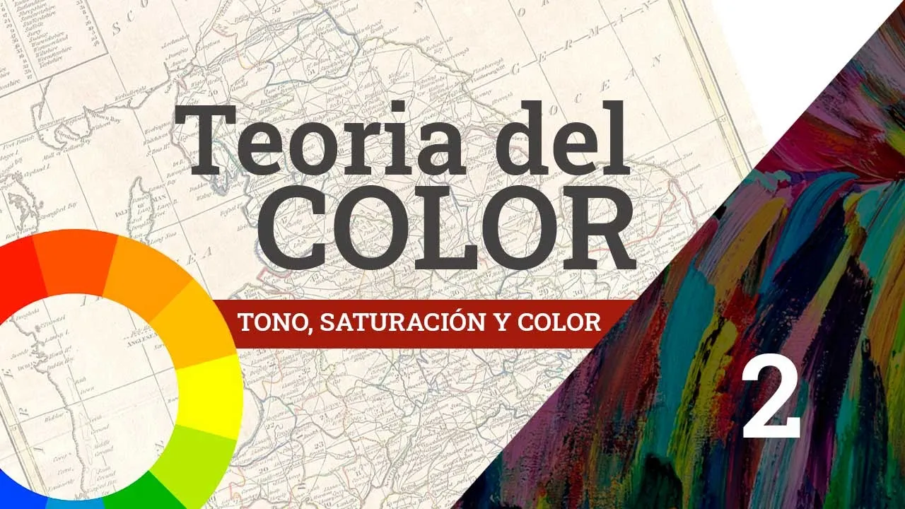
Aprendamos Teoria de color 2 de 3 - Tono, saturación y valor // Diseño Gráfico
8.2K
In color theory, hue (tono) is the attribute that gives colors their names (red, blue, yellow) and is measured in degrees on the color wheel (0°=red, 30°=orange, 60°=yellow, 180°=cyan, 330°=near violet); saturation (saturación) represents the intensity or purity of a color, ranging from pure color to gray, and is adjusted by mixing with complementary colors; value (valor) corresponds to the lightness or darkness of a color, with tints created by adding white and shades by adding black. These three qualities work together to define any color, and in tools like Photoshop, adjusting saturation moves colors toward white or gray depending on their current value.
Click to watch →
Deep Dive
Fundamental painting terminology, specifically concepts related to paint transparency, glazes, washes, and mediums.

Paint Beginner Workshop | Craft O’Clock Academy
153
Different terms describe the same paint consistencies: (1) Wash - applying water first, then a tiny bit of paint, creating the lightest finish, (2) Glaze - layering paint over dried layers, allowing underlying colors to show through, (3) Medium - typically refers to milk consistency (50/50), (4) Thick - applying paint neat (undiluted). These terms are interchangeable. Different consistencies serve different purposes: wash is ideal for skies and base coats, glaze is used for layering to build depth and create realistic shadows, medium is good for general painting, and thick is used for opaque coverage. The instructor demonstrates this with lemon painting, showing how layering with glaze creates more realistic shadows than just applying brown.
Click to watch →

How to Paint with a Palette Knife | Acrylic Bird Painting Tutorial | Paint Along with De Gillett Cox
709
Glazing medium extends acrylic paint and creates transparent layers that behave like colored glass over existing paint. It enhances underlying colors rather than obscuring them. Paint transparency is indicated by symbols: empty circles mean transparent (see-through), filled circles mean opaque (completely covering), and half-filled circles mean semi-transparent. Opaque colors don't work well in glazes because they cover rather than enhance. Transparent colors are essential for effective glazing. The medium allows corrections while wet—unhappy glaze applications can be wiped off easily. The instructor emphasizes that glazing doesn't have to be your final layer but should be towards the end of the painting process.
Click to watch →

HOW to GLAZE Miniatures | Differences of INKS, Washes and Glazes
19.8K
Transparent paints differ from inks and washes, maintaining normal paint consistency while offering saturation. Glazing involves layering transparent paints to blend edges and create volume. Adding glaze medium increases transparency while maintaining brush consistency, unlike water which makes paints watery and causes pooling. A typical glaze ratio is 3:1 paint to medium. Stippling application creates natural organic textures for skin and cloth. Artists should learn their specific paint behaviors rather than rigidly following ratios.
Click to watch →
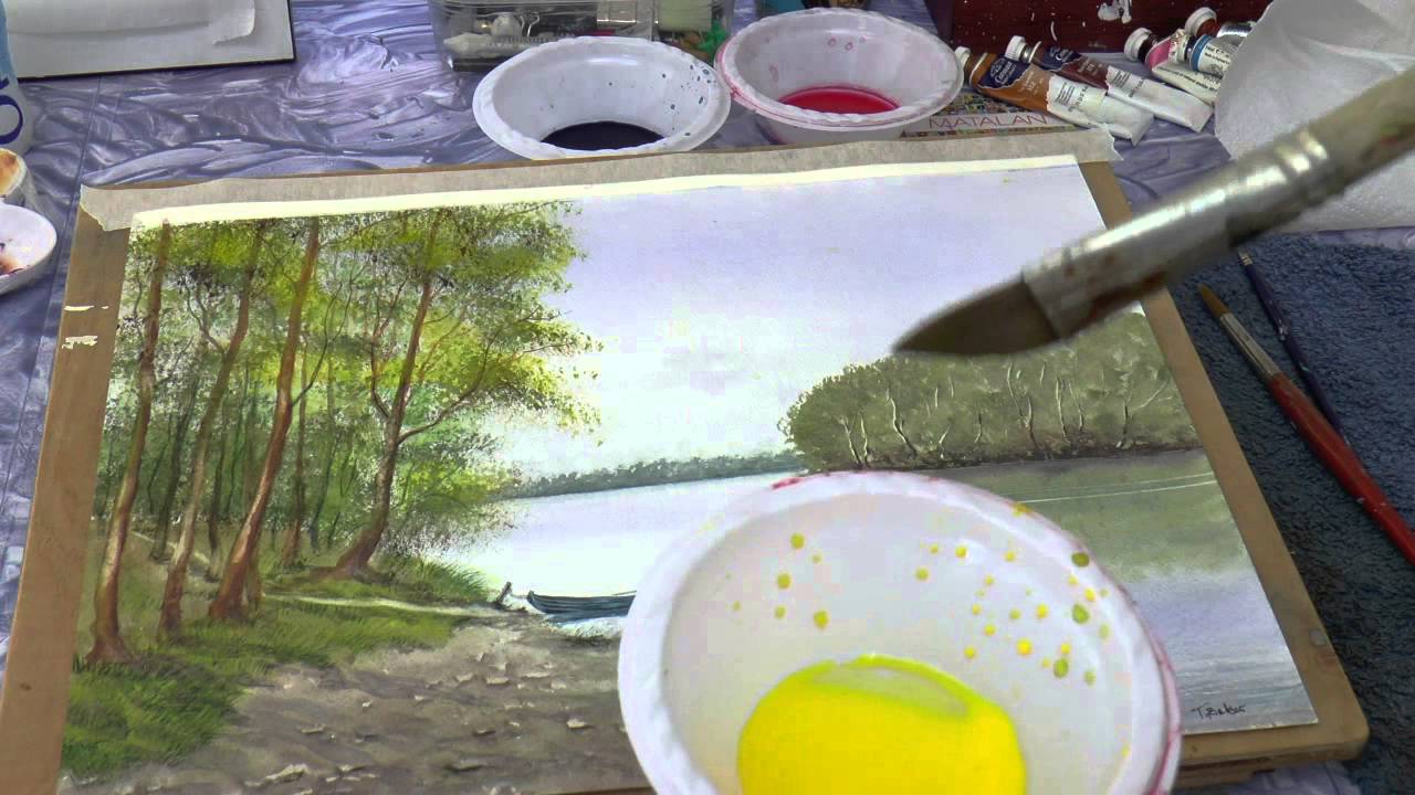
Важно энать про Лессировку в акварели. Glazing
44.1K
Glazing is a painting technique involving thin transparent or semi-transparent layers applied over dried paint. The surface must be completely dry to prevent muddy colors. Different mediums require different approaches: watercolor uses water, acrylic needs special glazing medium, and oil uses linseed oil or varnish. Paint must be fluid and transparent (labeled 'transparent' on tubes). Soft brushes like squirrel hair are essential, as pointed brushes can lift underlying paint. Glazing creates contrast between light and dark areas, transforming lifeless paintings into vibrant works.
Click to watch →
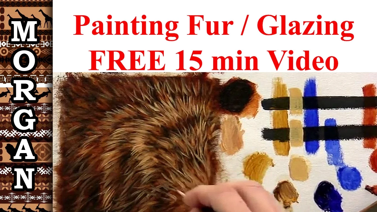
Glazing Techniques : Oil Painting - How to Paint Fur / Hair Tutorial - Jason Morgan wildlife art
216.4K
A glaze is a transparent paint layer that reveals underlying marks, unlike opaque paint which covers everything. Key glazing paints include raw sienna (excellent for toning while maintaining transparency), ultramarine blue (naturally transparent), and burnt sienna (becomes transparent when thinned). Cadmium yellow is opaque when straight but becomes transparent when thinned. The critical rule: never add white to glaze mixtures, as this destroys transparency. Different paints require different amounts of medium to achieve glazing transparency.
Click to watch →
Deep Dive
The distinction between action-oriented gestural abstraction (like Jackson Pollock) and contemplative Color Field painting.

Color Field
896
Color field painting is related to post-painterly abstraction, hard-edged painting, and lyrical abstraction. It initially referred to Abstract Expressionism, especially Rothko, Still, Newman, Motherwell, and Gottlieb. An important distinction from action painting was paint handling. Color field painters revolutionized paint application, seeking to rid art of superfluous rhetoric. Artists like Newman, Rothko, Still, Gottlieb, Louis, and Stella used greatly reduced forms with drawing simplified to repetitive systems. Basic references to nature and psychological use of color were employed. These artists eliminated overt recognizable imagery in favor of abstraction, presenting each painting as one unified, cohesive, monolithic image. Rothko stated his interest was in expressing basic human emotions—tragedy, ecstasy, doom—rather than color relationships.
Click to watch →

32 Arte 1950 1970
319
Color Field Painting features horizontal color fields with completely soft edges. The chromatic richness comes from successive layers of color applied by the artist. Barnett Newman, like Rothko, worked in Color Field Painting but focused on vertical compositions with his signature 'zip'—a vertical band of color that creates space within the painting. This line is contiguous with the canvas edge, marking the finitude of the pictorial plane. The gesture is different from Action Painting's gestural approach, representing a contemplative rather than performative mode of artistic creation.
Click to watch →
Abstract Expressionism in 8 Minutes: From 'Jack The Dripper' to Color Fields 🔵🟡
276.6K
Abstract Expressionism encompassed two distinct approaches. Action painters prioritized the physical act of painting with vigorous, expressive techniques—Pollock's pouring and dripping, Newman's existential zips, Frankenthaler's soak-staining. Color field painters took a cerebral approach using large areas of flat color to provoke contemplation. Rothko layered thin paint to create glowing hues achieving atmospheric depth, aiming for spiritual experiences akin to Mozart's music. While both shared emotional goals, their methods differed fundamentally—one dynamic and performative, the other meditative and immersive.
Click to watch →

Acrílico y Morris Louis: la ciencia del Color field
5.4K
Action painting, exemplified by Jackson Pollock's dripping technique, emphasizes the artist's physical act of painting. Color field painting, pioneered by Morris Lewis, creates large areas of flat color through controlled pouring. Lewis suspended canvas like a sheet and let paint flow by gravity, creating trails and color fields. Acrylic paint's unique properties—fluidity, rapid drying, and layer compatibility—enabled both approaches. The drying mechanism allows repainting and maintains porosity for underlying layers, making these techniques possible.
Click to watch →
The Shape of Freedom. International Abstraction after 1945 — Expert Talks (short)
1.4K
Action painting (Rosenberg, 1952) treated canvases as arenas where painting became events, rejecting preliminary studies for impulsive color/form interplay. Color Field painting combined monochrome fields for contemplative spaces. German Informel artists like Fred Dahmen created rough, cracked surfaces resembling old walls, while Karl Otto Götz absolutized movement through tangled black lines. Both approaches eliminated composition, foreground/background distinctions, and hierarchical image structures.
Click to watch →
Prerequisite Knowledge
- Concept 01Introduction to Abstract Expressionism and the historical context of the mid-20th century New York School.
- Concept 02Basic principles of color theory, including hue, value, saturation, and optical color mixing.
- Concept 03Fundamental painting terminology, specifically concepts related to paint transparency, glazes, washes, and mediums.
- Concept 04The distinction between action-oriented gestural abstraction (like Jackson Pollock) and contemplative Color Field painting.
Subsequent Learning
- Step 01The chemistry of Rothko's materials and the unique conservation challenges involved in preserving his highly sensitive, unvarnished surfaces.
- Step 02The spatial and architectural dimensions of Rothko's work, specifically analyzing the design and phenomenology of the Rothko Chapel in Houston.
- Step 03Exploration of related Color Field artists, such as Helen Frankenthaler's 'soak-stain' technique and Morris Louis's veil paintings.
- Step 04Advanced studies in the psychology of art perception, focusing on how scale and color immersion elicit profound emotional and spiritual responses.
Layer & Edge
Color Depth
Layer & Edge
0:08Playing Section
- 1
Rothko layered thin veils of paint to create floating, vibrating forms.
- 2
Softened corners and turpentine burns dissolve hard edges for spatial ambiguity.
Formalist Skepticism and the Critique of Emotional Projection
While Rothko and his supporters asserted that his color field paintings were vessels for profound spiritual and emotional experiences, alternative perspectives challenge this narrative. Formalist critics, such as Clement Greenberg in his later analyses, argued that the significance of Color Field art lies strictly in its flat, material, and visual properties rather than any mystical or transcendental content. From this perspective, the emotional resonance attributed to Rothko’s work is not inherent in the canvas, but is instead a product of cultural priming, viewer projection, and the highly controlled, theatrical staging of museum environments (such as dim lighting and secluded chapels). Furthermore, skeptics of Abstract Expressionism argue that the extreme simplification of technique—relying on staining and basic geometric blocks—lacks the rigorous draftsmanship and technical skill of traditional art, viewing the academic elevation of these methods as an exercise in high-art pretension rather than objective artistic mastery.
Deep Dive
The chemistry of Rothko's materials and the unique conservation challenges involved in preserving his highly sensitive, unvarnished surfaces.
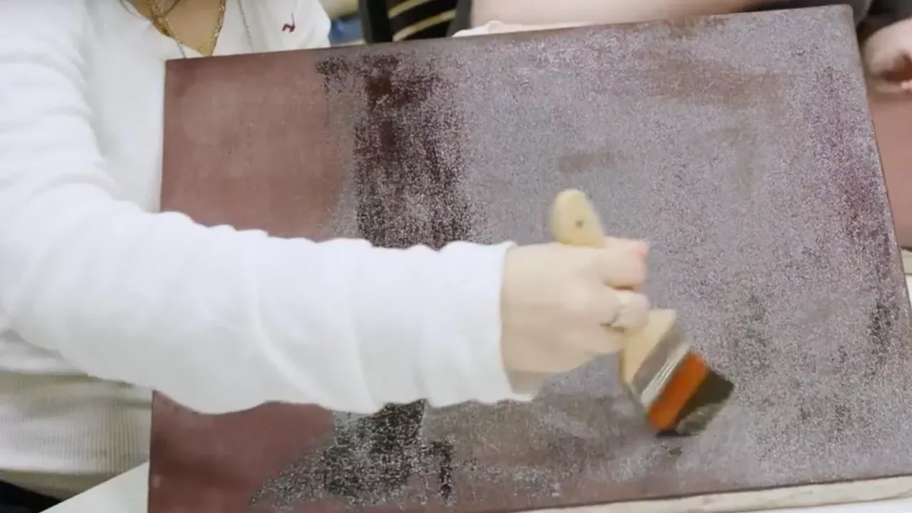
Rothko materials and techniques lesson at MoMA teen conservation course | AT THE MUSEUM
184.5K
Mark Rothko achieved his signature soft, brushy edges by using alkyd resin paint (originally sold as household paint since the 1970s) and building up layers slowly, combined with a damar resin ground layer; he worked with the natural qualities of his materials rather than attempting to control them, creating the feathered, transparent edges visible in his paintings.
Click to watch →

A History of Art in Color
80.8K
The Harvard murals, donated by Rothko to the university, shared the form of the open rectangles of the earlier Seagram murals and a similar palette. However, what was once deep red crimson is now a faded gray-green-blue, their appearance completely washed out. Technical analysis revealed that Rothko used highly unstable Quinacridone red, one of the key red pigments in printing but highly volatile and not light-fast at all. When installed in a dining room with floor-to-ceiling glass windows on the top floor, the deterioration was incredibly rapid within just a few years.
Click to watch →

The Rothko Room: An Unprecedented Reinstallation
576
Mark Rothko's signature technique involves applying thin, multiple layers of oil paint to create subtle color fields with soft-edged rectangular forms, which gives his paintings a matte appearance and creates conservation challenges since scratches are difficult to retouch without compromising the ethereal quality of the work.
Click to watch →

Rothko’s Harvard Murals: An Image for a Public Place
551
Mark Rothko created immersive environments where viewers are surrounded by paintings hung close together and low to the ground, with optimal viewing distances from a couple of inches to 18 inches. He conceived his murals as unified single pictures rather than separate paintings. The Harvard murals were commissioned by Vasile Lean for Nobel Lat for their meeting room in the Holy Oak Center, designed by Jose Luis Sert during Harvard's modernism period. Rothko was preoccupied with translating pictorial concepts into murals serving as images for public places. The murals were installed in the mid-1960s with significant architectural challenges, including Florida ceiling windows and tight corner installations. Rothko wanted curtains drawn at all times, but the 10th-floor location with views across the Charles River made this impractical. In 1979, after insistence from people like Sally Zacker, the murals were taken down and put into storage. The conservation project focused on three essential elements: the painting, the viewer, and the light. The paintings are unvarnished with a background of thin red, ultramarine, and rabbit skin glue applied to the canvas, where canvas nubs form part of the visual experience. Varnishing would cause canvas darkening, color saturation, and affect the glossy egg tempera figures. Light can alter how we experience paintings, as demonstrated by Raymond Lafontaine's experiment with yellow varnish and blue-filtered light revealing bits of the painting as if there was no varnish. To restore the murals, the team created target images representing the 1964 appearance using Ektachrome slides, custom scanners, chemical fading models, and color charts. Panel 6, a spare panel with an unfaded strip, provided reference data. The restoration process involved photographing the faded state, feeding it into a PC, and creating an algorithm that compensates for RGB channels and grayscale values to produce a compensation image—a map of lost color containing approximately 2 million pixels. MIT provided crucial support. Alignment software ensured the compensation image projected onto the painting matched the target image exactly. The room lighting was designed to prevent a glowing rectangle on the wall, allowing the eye to move across the painting surface and around the room without interruption. Color is relative, not absolute—two squares of the same color appear different depending on surrounding colors. Rothko's center color appears different in each painting depending on what color it's next to. The team recreated the niche and wilder green fabric wall covering based on accounts from people who helped Rothko install the paintings. The Cambridge Fire Marshal prevented a door in the center, altering the original plan. The exhibition allowed viewers to experience both faded and restored versions simultaneously, with people gathering to watch projectors turn off at 4:00 PM, experiencing a transformation that took many years in just a few seconds. Philosophical debates arose about whether projected light blocks the metaphorical light of the painting and violates the work's terms. Jeffrey Weiss argued that restoration substitutes for the original, risking loss of authenticity. Brad Epley noted the restored version is like a digital remaster while the unrestored is like a vinyl LP, questioning which is more authentic. This reflects how we impose our own values onto paintings—we want youth in 50-year-old paintings but accept wrinkles in 100-year-old paintings. Kate Rothko Pritzker noted the setting felt right and experienced Rothko's luminosity. The restoration is now part of the murals' history, integrating into their legacy. The compensation system works with any lighting source—daylight, tungsten bulbs, or LEDs—the actual source is irrelevant as it can be adjusted in software. Projected light levels were about 35-40 lux, very low and lower than watercolor standards, with testing confirming no visible difference during the exhibition. Rothko built up layers of color with underlayers visible through upper layers, but the Harvard murals are relatively simple—just two layers except for mural 2 with reworking. The Rothko Chapel murals appear darker due to unique skylight effects that have changed over time with multiple iterations. A similar fading system could compensate for these environmental light effects. Museums now work with artist studios to understand how artworks age and anticipate what will happen, determining preservation strategies from the minute artworks enter collections. The conservation community shares knowledge constantly, with colleagues seeking advice on how to look after things.
Click to watch →
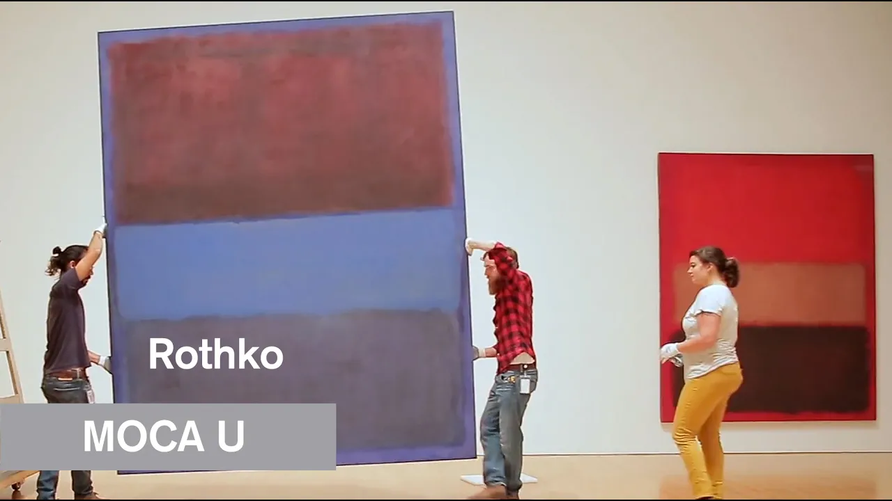
Mark Rothko - The Art of Conservation - MOCA U - MOCAtv
57.7K
Mark Rothko's paintings require specialized conservation due to their fragility and sensitivity to light exposure, which can cause fading; conservators at MOCA take these paintings off exhibition for 9-12 months to perform thorough condition analysis, replace non-archival backing boards, and implement basic preservation treatments, ensuring they receive proper rest from light exposure while establishing baseline evaluations for future monitoring.
Click to watch →
Deep Dive
The spatial and architectural dimensions of Rothko's work, specifically analyzing the design and phenomenology of the Rothko Chapel in Houston.
Dominique de Menil: The Silent Swan in Capote’s Kingdom of Noise
712
The Rothko Chapel commission was not a business contract but a spiritual pact—an act of profound trust where Rothko would create the chapel itself, determining its shape, light, and atmosphere. Rothko specified an octagonal (eight-sided) shape—a deliberate symbolic choice distinct from traditional cross-shaped basilicas or perfect circles. The octagon represented contained, faceted, equal-ruled contemplation—a space with no single focal point or altar dictating where viewers must look. It was both a womb and a tomb. Rothko demanded a single central oculus as the sole source of light, rejecting distracting windows looking outward. This design ensured light would fall directly onto the canvases, which he called his children, creating a total immersive experience where paintings would be the architecture rather than mere decoration.
Click to watch →
Марк Ротко / Mark Rothko, 1903-1970, an abstract humanist
6.9K
During this period, Rothko continued to write his classic paintings from blocks. In some, he used luminous shades; in others, large rectangles disappeared into darkness, using dark red, dark blue, and dark brown colors. In both cases, we see simplified expressions. Rothko's son Christopher was born around this time. Rothko began to doubt the changes he had made in his work. It is believed that in 1957, his father began painting dark paintings, though this is not entirely accurate—he had many dark paintings before this period and many light and bright ones after. Rothko believed that even his brightest and most joyful paintings were tragic—they were about the human condition. He would have been surprised if he thought people could miss the meaning of his paintings when he used such bright, beautiful colors. He also believed that Rothko invited viewers to meditate, and that dark colors made the process more natural, as in his drip paintings where there is so little color and almost nothing to grab onto. In 1963, Rothko accepted an offer to paint a series of paintings for a future chapel at the University of St. Thomas in Houston, Texas. He intervened in the building process, changing its shape to an octagon. An arrow pointing downward should have been placed on the roof. He chose tones for the interior and designed the lighting. The Catholic chapel in Houston became the highest architectural and painting achievement in his career.
Click to watch →

Mark Rothko | Storia del'Arte mentre #iorestoacasa | Carlo Vanoni
30.3K
The Rothko Chapel in Houston (1965-1967), commissioned by oil tycoons Dominique and John de Menil, represents Rothko's masterpiece—a space where 14 large violet paintings interact dynamically with natural light through a central skylight, creating a visual symphony. Rothko died in 1971, never seeing the chapel's inauguration. His philosophical writings reveal a deep meditation on human existence: individuals cannot convey mortality's anguish through physical movement alone, and multiple solitudes converge in public spaces only to form a tableau vivant of human incomunicability. Rothko concluded that distinctions between figurative and abstract art are irrelevant; what matters is ending silence and solitude, expanding one's chest, and returning to breathe—to reconnect with others despite inherent barriers of human isolation.
Click to watch →
Christopher Rothko - Mark Rothko and the inner World
89.4K
In the late 1950s and 1960s, Rothko darkened his palette and stripped away layers in search of greater clarity. Paintings became formally tighter with more regular rectangular shapes, layers reduced, and brushwork less visible until reappearing dramatically in his final years. This represents increased emotional demand—viewers need to bring more of themselves to the painting. A crucial change involved reflectivity: whereas 1950s paintings had luminous glow from within, 1960s rectangles shine with reflecting seen, keeping viewers more at arm's length. The Rothko Chapel in Houston represents culmination—viewers stand in rooms full of dark mirrors reflecting back on themselves. Rothko Chapel makes clear that paintings yield only what you put in—they only speak to our inner worlds when we are open to their invitation. Rothko's paintings are hardly paintings at all but suggestions and ideas expressed through color and form—ideas that only come into being at the moment of interaction with each individual. A chemistry between artist and viewer creates primal pre-verbal communication. The paintings speak a universal deeply human language, but viewers bring different ears and receive different messages stemming from their own inner worlds.
Click to watch →

Марк Ротко: погружение в цвет
16.7K
Mark Rothko (1903-1970) was born in Dvinsk, Russian Empire (now Daugavpils, Latvia), from a Lithuanian Jewish family that emigrated to America. His original name was Marcus Ratkovic, which he changed to Rothko in the 1930s. In the 1930s, Rothko created figurative works depicting scenes from New York City's subway, but already showed his characteristic love for flat color planes and enclosed spaces. In 1943, Rothko and Adolph Gottlieb published a famous letter to the New York Times that became a manifesto for abstract art, declaring that art is a journey into an unknown world and that flat forms destroy illusion to reveal truth. Rothko developed a distinctive technique using vertical canvases divided into unequal horizontal rectangles, stretching color rectangles almost to the edges but never quite to the very edge. He believed forms possess their own will and internal freedom without needing to correspond to anything in the familiar world. He was deeply inspired by Henri Matisse's 'The Red Room' and wrote that color's main task is expressiveness. In the mid-1950s, Rothko transitioned from bright colors to darker, more restrained tones, particularly dark reds, influenced by his travels through Europe where he studied classical art. He was deeply influenced by Nietzsche's 'The Birth of Tragedy' and its concepts of the Dionysian element opposing the Apollonian. In 1958-1959, Rothko created the famous 'Seagram Seven' series for the restaurant 'The Seasons' in the Seagram Building in New York, creating approximately 40 paintings instead of seven, all in dark red and almost black tones. This led to conflict with the restaurant's owners who wanted his paintings to enhance their dining experience. Rothko refused to continue, returning the advance payment and keeping the paintings in his studio until his death, eventually donating them to major museums. Rothko's final three years saw him create his opus magnum: 14 paintings for the Rothko Chapel in Houston, Texas, despite health problems with his heart. The chapel features a central pure space with a dome, characteristic of classical church architecture, and a triptych format traditionally used in church altars. Rothko considered his paintings a humanist response to the modern world that had experienced the Holocaust, global war, and nuclear bombs. He stated he was not interested in relationships between colors or forms but only in expressing elementary human emotions - tragedy, ecstasy, and fate. In a lecture at the Pratt Institute, Rothko presented seven ingredients of art: mortality, sensuality, tension, irony, humor, the ephemeral element of chance, and hope (exactly 10%). He wrote that the most important instrument an artist masters is faith in their own ability to create miracles, and that completed paintings should become revelations - unexpected resolutions of eternal desires. Rothko ended his life tragically by suicide in 1970, though his family initially did not believe this. One friend noted that one reason was accumulated anger - the justified anger of a man who knew he was destined to paint temples but saw his paintings perceived only as banal merchandise.
Click to watch →
Deep Dive
Exploration of related Color Field artists, such as Helen Frankenthaler's 'soak-stain' technique and Morris Louis's veil paintings.

Color Field Sketchbook - Lesson Plan
21K
This lesson teaches students how to create a personalized sketchbook cover using the Color Field stain painting technique pioneered by artists Helen Frankenthaler and Morris Louis in the 1950s. Students learn to construct a sketchbook by binding paper with padding compound, then apply diluted acrylic colors poured onto canvas and activated with water spray to create flowing color veils. The technique involves experimenting with color alternation, varying paint consistency, utilizing gravity, and leaving intentional white spaces. Students also learn to design functional closures such as button loops and pencil pockets while adding decorative elements like painted wave edges.
Click to watch →

She Invented the Painting Technique. Two Men Copied It and Got Famous.
45.3K
In 1952, 23-year-old Helen Frankenthaler invented the soak-stain painting technique by pouring thin paint onto raw, unprimed canvas laid on the floor, eliminating the barrier between paint and surface. When art critic Clement Greenberg brought Morris Louis and Kenneth Noland to her studio in 1953, they copied her technique and built their careers on it, while Greenberg championed them over her despite being her boyfriend for five years. Despite decades of art world dismissal, Frankenthaler continued creating for six decades, and the art market has since validated her work, with eight of her top 10 auction records coming from the 1970s—the exact decade the art world dismissed her.
Click to watch →
Morris Louis - Being There: Slow Art
2.2K
Morris Louis pioneered color field painting by developing a systematic yet emotionally restrained approach that eliminated the artist's physical gesture from the creative process; he poured diluted acrylic paint onto unprimed cotton duck canvas, using the canvas's natural texture and gravitational pull to create rhythmic vertical stripes, achieving vibrant, translucent color layers that allowed pure color to exist independently of representation or emotional expression.
Click to watch →

Helen Frankenthaler: The Lyrical Artist Behind the Viral Pinterest Photo
6.4K
Helen Frankenthaler (1928-2011) was a pioneering American abstract expressionist artist who developed the innovative soak-stain technique, where she thinned oil paints with turpentine and soaked them into unprimed canvas, creating luminous color field paintings that influenced the transition from abstract expressionism to color field painting; her lyrical approach, which incorporated whimsical elements and personal landscapes, challenged gender stereotypes in art criticism and paved the way for other women artists to be taken seriously in the art establishment.
Click to watch →
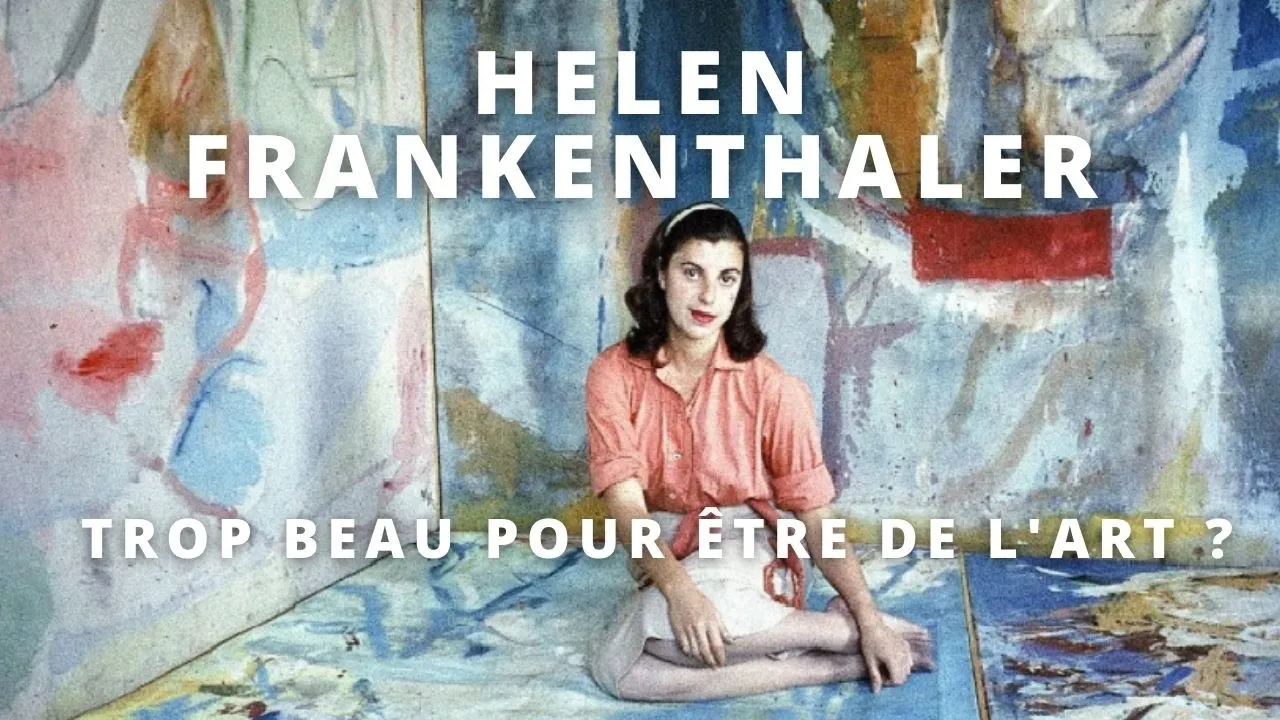
Portrait I Helen Frankenthaler et l'expressionnisme abstrait
4.7K
Helen Frankenthaler, one of the few women artists to emerge in the male-dominated New York School of Abstract Expressionism, developed her revolutionary 'soak-stain' technique in 1952 by mixing oil paint with turpentine to create fluid, two-dimensional color fields that seeped into the canvas, which was championed by critic Clement Greenberg despite initial criticism that her work was too beautiful and feminine; she remained faithful to abstraction throughout her career and is now recognized as a pioneering figure who helped establish color field painting.
Click to watch →
Deep Dive
Advanced studies in the psychology of art perception, focusing on how scale and color immersion elicit profound emotional and spiritual responses.

Isaac Aden and David Eichholtz "The Numinous Sublime" Gallery Discussion - part 1
117
In art, the numinous sublime refers to a spiritual or transcendent experience evoked by art that is larger than human comprehension, combining vast scale with atmospheric color to create immersive, contemplative works that reward prolonged viewing and engage viewers' perception through subtle color layering and optical mixing effects.
Click to watch →

MassoniArt presents WATER / WAYS 2022 - Marcy Dunn Ramsey - Surfacing
608
Large-scale painting creates immersive experiences that fundamentally change the viewer's relationship with the artwork. The artist explains that painting on a great scale allows her to enter what she calls an 'alpha state' - a magical, transformative state that artists pursue. This demonstrates how physical scale in art can create envelopment and immersion, where viewers feel 'inside the painting.' The artist hopes viewers can experience the same absorption, showing how artistic vision can be designed to invite contemplation and emotional engagement through physical presence.
Click to watch →

(ART THEORY) The Drama of Perception: Looking at Art by Siri Hustvedt
1K
When looking at an object for extended periods, the word for it vanishes first—other qualities come to the fore. Edmund Husserl's concept states that the same unchanged form has changing appearance according to its relation to the body. Morandi's late works 'seem to depict the experience of perceptual duration inside a single canvas,' including shifts of attention that reveal various qualities of things. Gottfried Bammes describes 'the pulsation of pictorial elements'—despite illusion of movement, a calm overall impression re-establishes itself. Bammes discovered a paradoxical reality: 'In his pictures Morandi allows us to participate in a temporal order that is optimistic and immaterial at the core of its experience. The objects are as disembodied as they embody themselves.' All perception is accompanied by feeling, even neutrality. What neurologist Antonio Damasio calls 'background feelings' are always present. Color falls into the pre-attentive visual scheme—before we can name a hue, we have felt it as a sensory reality in our bodies.
Click to watch →

PURE ABSTRACTION: The Origins & Triumph of Abstract Art
479
Abstract artists compared their work to words and music - just as certain words or musical notes make us feel specific ways, colors and symbols in abstract art can make us feel certain emotions. This represents a new language of art severed from the real world and focused on imagination and spirituality. When viewing abstract paintings, what you feel will be different from what the artist intended because viewers bring their own experiences and emotions to the work. This is a new idea in art - that viewers' personal experiences are valid and important. Scale is important - when artists create large paintings, they are trying to show something important. Large-scale paintings envelop viewers and create more powerful emotional impact.
Click to watch →

VIERNES SOCIAL: Neuroplasticidad de la memoria - Plinio Avila
1.6K
Physical scale of artwork significantly impacts viewer experience and emotional response. Large-scale artworks create sense of presence and immersion that smaller works cannot achieve. Architectural spaces, particularly religious buildings, generate powerful feelings of presence and transcendence. The scale, light, and spatial qualities create experiences connecting with something beyond the physical world, raising questions about how physical spaces facilitate spiritual or transcendent experiences.
Click to watch →
Layer & Edge
Color Depth
Layer & Edge
0:08- 1
Rothko layered thin veils of paint to create floating, vibrating forms.
- 2
Softened corners and turpentine burns dissolve hard edges for spatial ambiguity.
Formalist Skepticism and the Critique of Emotional Projection
While Rothko and his supporters asserted that his color field paintings were vessels for profound spiritual and emotional experiences, alternative perspectives challenge this narrative. Formalist critics, such as Clement Greenberg in his later analyses, argued that the significance of Color Field art lies strictly in its flat, material, and visual properties rather than any mystical or transcendental content. From this perspective, the emotional resonance attributed to Rothko’s work is not inherent in the canvas, but is instead a product of cultural priming, viewer projection, and the highly controlled, theatrical staging of museum environments (such as dim lighting and secluded chapels). Furthermore, skeptics of Abstract Expressionism argue that the extreme simplification of technique—relying on staining and basic geometric blocks—lacks the rigorous draftsmanship and technical skill of traditional art, viewing the academic elevation of these methods as an exercise in high-art pretension rather than objective artistic mastery.
Introduction to Abstract Expressionism and the historical context of the mid-20th century New York School.
Basic principles of color theory, including hue, value, saturation, and optical color mixing.
Fundamental painting terminology, specifically concepts related to paint transparency, glazes, washes, and mediums.
The distinction between action-oriented gestural abstraction (like Jackson Pollock) and contemplative Color Field painting.
The chemistry of Rothko's materials and the unique conservation challenges involved in preserving his highly sensitive, unvarnished surfaces.
The spatial and architectural dimensions of Rothko's work, specifically analyzing the design and phenomenology of the Rothko Chapel in Houston.
Exploration of related Color Field artists, such as Helen Frankenthaler's 'soak-stain' technique and Morris Louis's veil paintings.
Advanced studies in the psychology of art perception, focusing on how scale and color immersion elicit profound emotional and spiritual responses.
1M views8.9Klikes3:32@themuseumofmodernartOriginal Release: 2010-10-24
(somber piano music) Voiceover: In the 1950s, Mark Rothko explored how forms could float in space, sometimes advancing toward you, other times quietly receding away from you.
Now by looking at his paintings, there's a number of ways that we could discern how these effects are achieved.
However, Rothko was notoriously hermetic about his studio practices.
We don't know all that much about what materials he used and how exactly he did it, but by looking closely, we can learn a lot.
Now how these forms are liberated in space, how they even have this ability to move via color is also about the way Rothko handles the edges of these floating cloud-like forms.
Rothko layered zone over zone over zone of paint.
Here we can a very bright blue, almost totally overpainted by a dark burgundy.
It appears that Rothko often flared out paint, one layer over another and as we look at the edges, we realize that there's kind of a buzzing sensation as these two colors compete for our attention and almost vibrate against one another.
To further allow these forms to float off and away from the surface of the canvas, Rothko often softened the corners of these forms and here we see something called a "turpentine burn", where the artist likely took some solvent on the rag and scrubbed back into the surface of the canvas, blending all of those colors together meanwhile erasing a hard corner, which would visually locate that form in space.
In addition to leaving hints of these colors around the edges of forms, crucially, Rothko allows you to see through veils of paint because he painted so thinly.
Now let me show you exactly how Rothko painted so thinly.
Rothko would add so much turpentine to his paint, that he would stain the canvas, less painting on the canvas, but really pushing his paint into it as a stain.
Because these stains are so thin, you're able to read one color quite literally through another.
In thicker areas of paint, you see the over layer.
In thinner areas of that over layer, you begin to see the under layer.
And because Rothko layered color over color over color, any given zone is infinitely complex.
Rothko thought that if the viewer properly experienced his paintings, that he or she would very often cry.
We're quite literally talking about a painter who wanted his viewers to experience the kind of emotions that he very likely did himself.
It's not uncommon for people to be emotionally moved, perhaps even to cry when listening to music.
However, it's very rare that visual art can evoke those same emotions.
Rothko, if you will, is competing on the territory of music, trying to evoke very, very strong emotions through paint.
The experience of viewing his painting is a very somber one.
It lacks resolution.
Although it's very quiet, although it's a quite beautiful painting, it's a painting that never has a finality to it.
It's one that almost unravels in time.
Up Next

3:49
Barnett Newman's Painting Technique: Vir Heroicus Sublimis Analysis
@themuseumofmodernart
258.4K views•2010-10-24
12:54
Triumph of Orthodoxy Icon: Byzantine Art & History Explained
@BenCallan
2.1K views•2024-08-06
19:49
Learn Willem de Kooning's Action Painting Techniques | MoMA Studio
@themuseumofmodernart
1.9M views•2017-04-05

1:42
Game of Thrones Opening Credits: A Cinematic Analysis
@gameofthrones
46.3M views•2011-04-18
Related Study Plans & Knowledge Roadmaps
Structured learning paths in General & Interdisciplinary Studies
general-studies
Elevator Engineering: History, Physics & Cities
01From Hoists to Safety Brakes: The Dawn of Vertical Lift
02Hydraulic vs. Traction: The Engineering Physics of Elevators
03Modern Speed, Safety, and Algorithms
+ 2 more learning modules
12h5 modules
Explore Roadmap
general-studies
Rubber: Material Science, History & Geopolitics
01Origins of Natural Rubber & Mesoamerican History
02The Chemistry of Natural Rubber & Vulcanization
03The Geopolitics of the Rubber Boom & Colonization
+ 2 more learning modules
12h5 modules
Explore Roadmap
general-studies
Containerization: Evolution, Logistics & Trade
01Ancient Trade & Bulk Cargo: Amphorae to Barrels
02The Industrial Revolution & Cardboard Packaging
03The Containerization Revolution: Malcom McLean
+ 2 more learning modules
12h5 modules
Explore Roadmap
general-studies
Textile Tech: Evolution, Labor & Global Impact
01Pre-Industrial Textiles: Handloom & Cottage Industry
02Mechanization: The Spinning Jenny to the Power Loom
03The Factory System & Global Labor Transformation
+ 2 more learning modules
10h5 modules
Explore Roadmap