

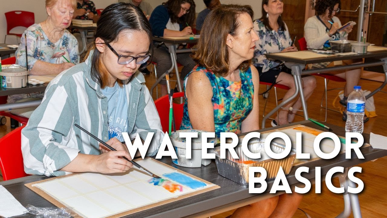












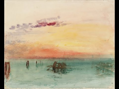




This video demonstrates how studying master paintings like Thomas Girtin's 'The White House at Chelsea' (1800) helps artists learn compositional techniques, brushwork methods, and tonal value relationships; key insights include using horizontal brush strokes for water surfaces, applying Carlson's theory of tonal hierarchy where the sky is the lightest value followed by ground and then darker vertical elements like trees, and experimenting with white gouache for sky reflections while understanding that watercolors tend to dry lighter than wet, requiring careful planning of tonal values.
Master Study Sketch: Watercolor Techniques in Thomas Girtin's 'The White House at Chelsea'
Added:Basic watercolor mechanics, including pigment-to-water ratio control and fundamental wash techniques (wet-on-wet, wet-on-dry, and graded washes).
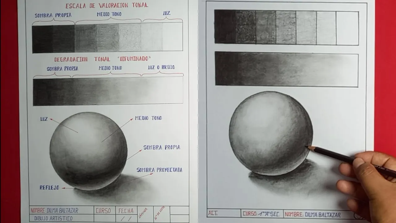
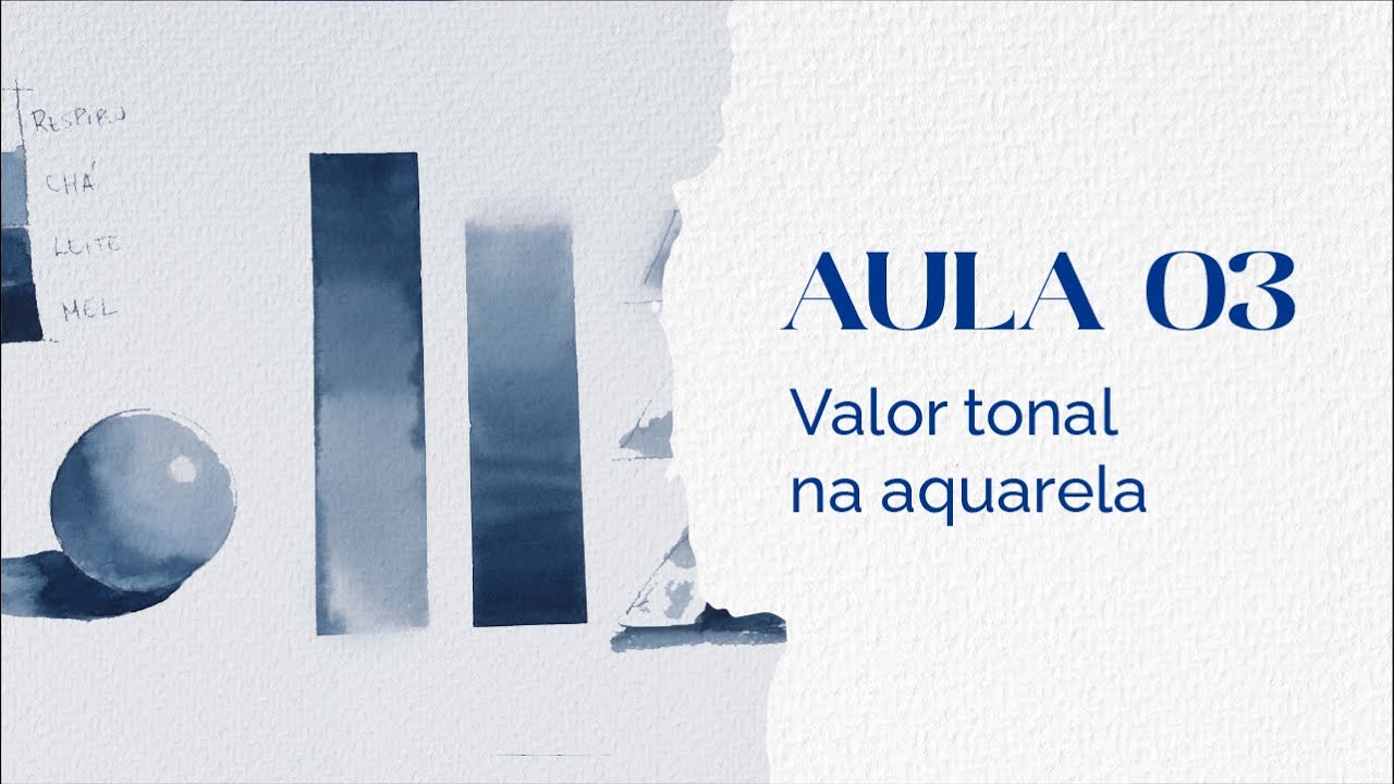
The concept of tonal value (chiaroscuro) and how to construct a value scale to represent light and shadow in a two-dimensional medium.
An understanding of basic color theory, particularly how complementary colors and neutral tints are used to build depth in landscape painting.
Familiarity with historical landscape art conventions, specifically the English Watercolor School of the late 18th and early 19th centuries.
Advanced atmospheric perspective techniques, focusing on how to manipulate color temperature and edge control to depict vast distances.
Comparative master studies of J.M.W. Turner's early watercolors to understand the stylistic dialogue and technical innovations shared with Thomas Girtin.
The application of limited and historical color palettes (such as earth pigments, indigo, and madder lake) to evoke specific moods and historical accuracy in landscape art.
Developing a personal landscape sketching practice that integrates Girtin's wet-in-wet sky techniques with precise dry-brush foreground textures.
603 views19likes27:56Original Release: 2022-05-08
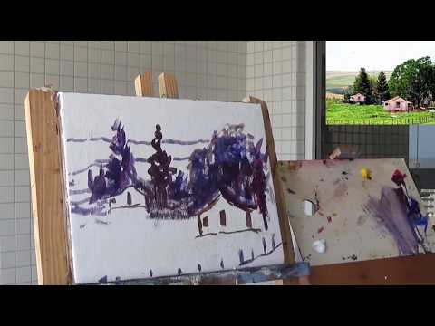
hello and welcome to andrew broussard watercolors i am jumping right into part two of painting the white house at chelsea by thomas burton well essentially just doing a sketch and a study of it and trying to learn ideas and techniques as i go along i'm using the quill brush now this is a smaller one i think i got it off of blick.com mixing up a green with prussian blue and raw sienna and now kind of nailing it out with some um burnt sienna the purpose of these studies and experiments are to learn from the masters compositionally painting brush techniques and at least carrying some of these ideas over into my own personal style of painting uh one of the big takeaways so far for this one was something that i had talked about in the past but studying this one it seemed even more important looking at this painting the horizontal brush strokes that are present in the water to create the horizontal plane uh that's been a reoccurring theme eric coppol oil painter modern oil painter who paints in the hudson river valley style in a video had talked about the horizontal plane for water and in the previous study looking at a copley painting we saw i think there was horizontal strokes there in the water or at least you get the horizontal marks from reflections of light and we just see the importance of it showing through again here then and i always kind of think of sergeant when i talk about skies like being all over the place this one i was playing with the gradation and i had carlson's guide to landscape painting in my mind i've been starting to reread that today and there's going to be the gradation vertically and horizontally if i'm going to kind of quote not quote them but summarize that's the word i've been looking for that even with the sun almost at its zenith it's highest point in the northern hemisphere looking to the north the sky is going to be darker so you're going to have a change in that aspect there bring a little bit into the wash down here okay so vertical gradation and horizontal gradation in the sky but then to move things a little bit further you don't have to have the horizontal and vertical brush strokes in the sky you can play around with different lines and different shapes which i did not take advantage of i started to hear but now i'm realizing all those movements in the sky can be summarized by the simple brush strokes hopefully that's not me hopefully that's making sense and i'm not rambling too much this painting is post workday post afternoon nap host moe in the yard i really need to bite the bullet and um purchase a lawnmower that is self-propelling it just gets exhausting and i think every video this summer i'm going to mention mowing i really need to not do that i'm sorry so with carlson's guide to landscape painting and i mentioned this in the previous one previous video the sky is going to be your lightest tone this is his theory of angles and i'm going to do a video on that i did one in the past and i'll re only do it with his guide to angles or theory of angles the sky is going to be the lightest accepting white buildings because you know just not natural for the scene snow is an exception there's just a few exceptions for his theory that he has but your lightest tonal value sky your second lightest or as you go up the scale and get darker your next thing is going to be the ground the ground is going to catch most of the light from the sky but it's going to filter through clouds etc it's going to have bumps and valleys on it and it's going to have lights and darks then your darker element from that is going to be your vertical these are going to be your trees so we're just trying to keep those concepts in mind i really like the difference in edges that kind of take place in master paintings in some areas you'll have a nice crisp edge and in other areas you'll have kind of like a slightly bleeding edge yeah hammy let's just bring this wash down those horizontal brushstrokes okay super dark far background trees let's try light red oxide with some of that prussian blue some of this is palette exploration exploration blah blah blah now i cannot wait to go back to sleep okay so what i'm trying to do here is have a slight separation tonality wise between my vertical elements my trees and the water shadow all right now in this painting there's a list that i'd seen earlier that actually say the names of each one of these windmills and the church that are on either side of the white house but i don't know them off the top of my head so let's put in the windmill here i don't think i've ever painted a windmill okay so since it's a vertical element carlson's theory is that this should have the darker aspects of it darker tone values now the the blades are fans of the windmill um actually something interesting that gets addressed in carlson's guide in regard to that he talks about a net just imagine that you have a net up against um just hanging up a soccer goal black net whatever you want and at a distance it's going to appear gray appears gray because or just tonally kind of a mid-tone not as dark as it might be you have the light shining through it so the light wants to push the net to a lighter tone of value while you have the light itself with the black net around it where the black wants to push it to a darker tonal value i'm gonna have to reread that section just find a better way to phrase that these are the reflections for right there this building rising up originally when i started this i was just going to um use white gouache for the um the white house even though the tape description said that the white house was essentially just painted by leaving the white of the paper and i really didn't expect it to be able to lift like that so very happy there i might use white gouache for that reflection coming down we're going to put these little dots for the under portion of this bridge and i want the tree line above it to be a little bit darker tonally then around a little bit darker on that vertical trees there we go are we wet here not too bad i got a boat ship i gotta find out what the difference is between a boat and a ship i have some friends that are boat captains this guy should be darker tonally just using the idea that it's a vertical element i'm just using the number one rigger which that's where the name of that brush comes from uh for painting the the rigging on sales might be a little too big but it's like that there i think uh every so often lois davidson posts like a really great ship boat sailboat painting i forget what movement the maritime painting was a big part of there we go you have you like here it kind of goes against my love of just using like a payne's gray or dark for some reflections using the carlson's ideas i wanted to play around with white gouache to see what would happen now i would love for you to let me know in the comments below what you think if you would have used the white gouache or not it was commonplace back then i want to see if it it just has to be so pure to get a good effect from it because the water being a little bit dirty the brush is being a little muddy you can see or hopefully it shows up that that is not working another bucket of wash water might be in store to try that let's just try a clean brush even that has difficulty okay but what we can do is use that for a little bit of just mark variation in the sky and the really lighter end of things he really doesn't have that much movement in the sky in this one but i'm gonna go for it and just see how that dries see how that changes i use the white of the paper right here let's throw a little bit of white gouache in the sky right there around those edges i'm using a larger quantity now rather than a wash to kind of just get that thick aspect is davinci brand gouache um mind of watercolor has a video up comparing different brands i think that da vinci brand did not have the best opacity compared to others from this experiment if i recall correctly but i like davinci brand and i like the price point so it works for me a little bit as the reflection here we'll leave the white of the paper there separate them a little bit right there there's really no let's try a wash in the water let's see how that affects and build that up to kind of talk a little bit about white gouache we're near the end of this video handprint.com had mentioned that in the 1800s some would cover their painting with chinese white the paper and then paint over it um then from there joe menza was talking about experimenting with that then in one of the british art books i was going through it said kind of mentioned um a wet and wet white watercolor technique but they didn't go into much detail they just said oh like the pre-raphaelites um he did this uh and i was like i really want this book to expound more upon that but that didn't happen it was just such a thing where i just kind of coming across that concept a little bit at a time and that's essentially the technique that bob ross used and his predecessor had used in oils and it also refers the book referred to it being done in the 1800s or 1700s in oils and watercolors so i just really want to learn more about that so it's just slowly picking through stuff and seeing what comes and happens i'm just trying to push some more white on here okay so let me know what you think about that white i don't like that i feel like that's too much i lost the tonality of that one cloud right in there all right let's dry this off and we'll see all right so the movement in the sky from the white gouache shows up a lot more in person than it does on camera right away i saw that the tonal variety this the tonal values of this boat had to be darker that's probably one of the issues of watercolors as you focus on just tonal values if you're not prepared for it and things dry lighter you're going to start having issues with how things stay i think the major takeaways from this painting was the directional brush marks um the gouache washes were quite fun this is some prussian blue which i am just trying to increase the intensity of i feel like i'm going to be using a lot of prussian blue in these experiments and i think that kind of attests to the quality of the paper is that there's going to be multiple layers and kind of that wiping back and forth as i experiment and learn the how much abuse the water the paper can take this is a mixture of that prussian blue and burnt sienna just trying to build up that tonal value and i think that's why watercolor studies like some washes and things like that kind of turn me off it's that they're just um two tonally light i think it's very common for that to happen and if you follow my painting channel i mean obviously you know that i love watercolors but i love the darker moodier aspects of it there we go let's see if that helps let me know if those marks if you liked bringing that there helped out a bit of texture on that beach front let's do one last try off there's going to be a lot of back and forth in these videos oh my god this this cloud i wanna i mentioned earlier how i lost the tonality of it and i wanted i don't wanna bring it back um [Music] i think it's fun i'm loving these experiments i'm laughing at myself um for what i say and then what kind of pics at my brain a little bit but i think that's a good thing and i think it shows what's important for me um that's actually that's a carlson quote as well like what you choose to put in what you choose to omit um is the artist's signature essentially that's way too dark so um obviously you can see what my mind is gearing towards so look at the original painting try it for yourself and let me know what you think is important in the original painting and that'll be y'all letting your artist signature come out i just i'm not a fan of the cauliflower edges and things like that all right this is too much fun let's do our last drive all right so i'll show you all how i'm signing these uh whenever i'm doing these master studies and attributing the master um so put my name i'll see who it's after this is a noodler's boston safety pen um it has platinum carbon ink in it the white house you go all right well i hope you enjoyed um if you have any questions comments suggestions anything like that let me know if you want to support this channel a whole bunch of links below and we got a hammy hey hear me all right y'all take care bye
Up Next
35:21
William Morris and Victorian Medievalism | Lecture by Julia Rossi
@AntrimLiteratureProject
646 views•2023-11-27
12:54
Triumph of Orthodoxy Icon: Byzantine Art & History Explained
@BenCallan
2.1K views•2024-08-06

9:49
FastAPI vs Flask vs Django: Choosing the Right Python Web Framework
@TechWithTim
302.5K views•2024-05-26

1:42
Game of Thrones Opening Credits: A Cinematic Analysis
@gameofthrones
46.3M views•2011-04-18
Related Study Plans & Knowledge Roadmaps
Structured learning paths in General & Interdisciplinary Studies
general-studies
Elevator Engineering: History, Physics & Cities
01From Hoists to Safety Brakes: The Dawn of Vertical Lift
02Hydraulic vs. Traction: The Engineering Physics of Elevators
03Modern Speed, Safety, and Algorithms
+ 2 more learning modules
12h5 modules
Explore Roadmap
general-studies
Rubber: Material Science, History & Geopolitics
01Origins of Natural Rubber & Mesoamerican History
02The Chemistry of Natural Rubber & Vulcanization
03The Geopolitics of the Rubber Boom & Colonization
+ 2 more learning modules
12h5 modules
Explore Roadmap
general-studies
Containerization: Evolution, Logistics & Trade
01Ancient Trade & Bulk Cargo: Amphorae to Barrels
02The Industrial Revolution & Cardboard Packaging
03The Containerization Revolution: Malcom McLean
+ 2 more learning modules
12h5 modules
Explore Roadmap
general-studies
Textile Tech: Evolution, Labor & Global Impact
01Pre-Industrial Textiles: Handloom & Cottage Industry
02Mechanization: The Spinning Jenny to the Power Loom
03The Factory System & Global Labor Transformation
+ 2 more learning modules
10h5 modules
Explore Roadmap