![Как анализировать данные с Python библиотеками Pandas и Numpy [GeekBrains]](https://i.ytimg.com/vi_webp/lLf6Qt6wSJ8/maxresdefault.webp)
![[TUTORIAL] PYTHON para Análise de Dados - Aprenda do ZERO](https://i.ytimg.com/vi/FZODEbfcDwU/maxresdefault.jpg)






![สถิติและการแจกแจงความน่าจะเป็น ม.6 - ปูพื้นฐาน [Part 1/2] | คณิตศาสตร์ By พี่ปั้น SmartMathPro](https://i.ytimg.com/vi/VKblxmZfJ58/maxresdefault.jpg)


















![[MLOps Marathon] Seminar #6 - Data Drift and Solutions](https://i.ytimg.com/vi/EBYnWvA2z8M/maxresdefault.jpg)
Evidently AI is a free and open-source Python library that enables data scientists to monitor machine learning models by generating interactive reports that visualize model performance metrics and detect data drift across reference and current datasets, helping identify when features or target variables have changed significantly over time.
ML Model Monitoring with Evidently AI: A Practical Guide
Added:Fundamental Python programming skills, including familiarity with data manipulation libraries like Pandas and NumPy.
Core Machine Learning concepts, specifically model evaluation metrics (e.g., Accuracy, Precision, Recall, RMSE) and the distinction between training and inference data.
Basic understanding of statistical concepts, particularly data distributions, probability, and how features change over time.
A general awareness of the Machine Learning Lifecycle (MLOps), specifically the transition from model development to production deployment.
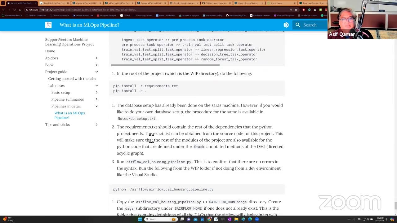
Integrating Evidently AI into automated MLOps pipelines using orchestration tools like Apache Airflow, Prefect, or Kubeflow.
Setting up real-time monitoring and alerting dashboards by integrating Evidently metrics with Prometheus, Grafana, or BI tools.
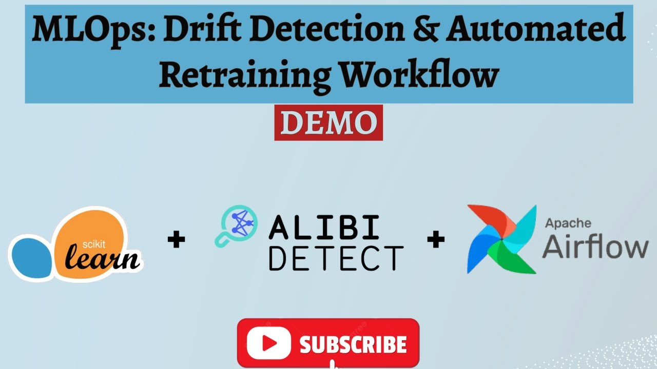
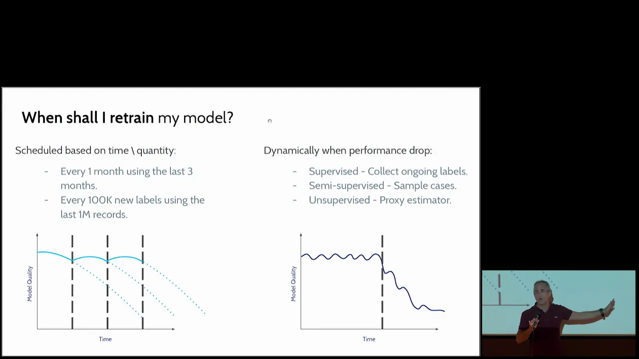
Designing automated model retraining strategies and fallback mechanisms triggered by detected data drift or performance degradation.
Exploring advanced statistical drift detection methods (e.g., Wasserstein Distance, Population Stability Index) and building custom monitoring suites.
26.7K views419likes21:47Original Release: 2021-08-21
in this video i'm going to review in this video i'm going to provide a quick overview of how to use evidently ai for your data science projects and so without further ado we're starting right now so prior to filming this video i've heard about evidently ai on twitter and also on linkedin and so in this video i'm going to provide you a very quick overview and i'm going to show you how i would approach using a new library and so let's have a look together and i'll talk about my thought process of how i adapt a new library into my existing data sets and so let's have a look at the website so this is the website of evidently ai and you could head over to evidentlyai.com and so let's have a look here so here the first feature that you see is that it will provide you some metrics that will allow you to look at the model performance and a unique part of this is that it allows you to have a look at the drift of the data and it will signify which features are drifting and here it will allow you to visually have a look at the target drift and if you have a look further there's also a visualization that will allow you to also perform like a quick eda so for one thing any data set that you're working with there's a high probability that you're going to have some missing data and so evidently ai provides a very quick approach for you to have a look at the missing data and so here the red boxes will represent the missing data however it should be noted that this feature for data integrity will be available soon same for feature analysis so you could also have a look at the change in the correlation of some features over time and another feature that will be available in the future would be the performance by segment so for this one you could stratify the data set and then you could look at the various statistical metrics as a function of the stratified data like for example here they mentioned about the data region so for example if you have a classification data set where you're classifying the iris flowers so it will allow you to segment or stratify amongst the different types of flower so for each of the three different types of flower you will be able to look at the various statistical metrics let's go further here so this provides a very quick overview of evidently ai so here it mentions that you would only have to import evidently.dashboard and also import evidently.tabs into your jupyter notebook and then the thing is you'll prepare your data as a dataframe using pandas and then the rest from there you're going to use evidently ai and here it mentions that at the end of your analysis you'll be able to generate a report which you could share with your team and for this one it will be available soon so you could run it as a service so probably they're going to make it into like a dashboard a portable version like a web application probably similar to that of radio or streamlits and to get started you only need to pip install evidently and so why don't i have a look at the documentation let's click here so let's figure out together how i'll use evidently ai on an existing data set that i normally use so let's have a look here what is it it allows you to evaluate and monitor machine learning models in production and it will generate interactive reports or json profile from your pandas data frame or csv files and so here it mentions that it will generate six types of reports and currently it supports tabular data and so the first type of report is the datadrift report and you notice here that there's a link so if you click on the link you're going to have more details about it and so the documentation of evidently ai is very nice and it's very complete as well so here they provide the tlbr they provide the summary it provides the requirements here and how does it work and it provides you a glimpse of how does it look like for the data drift table so here you could have a look at the distribution of the data for your reference data and also for the current data and whether there is data drift detected or not and the p-value and another way of visualizing such data drift by the features here is to have a look here and they'll also provide you data distribution by feature and so you have the reference data in gray and the current data in red okay so it's very detailed right so this is for the first report data drift and the second report is the numerical target drift so let's have a look here it detects changes in numerical target and the feature behavior so these are some nice visualization generated by the reports let's have a look at the third type of the report and it is the categorical target drift so here it provides a detection of changes in the categorical target and the feature behavior let's have a look at this so this is the example image generated by the reports so here you see the reference in the left panel here and for the right panel you see the visualization for the current data set so the target drift doesn't occur when it is comparing the reference data versus the current data okay so they segment the data and then they show you two separate visualization in order to allow you to see whether there is a data drift occurring or not all right and so the fourth report is the regression model performance and the fifth report is for the classification model performance so here they take the error and they show you the distribution in histogram for the reference data and also for the current data and so you'll be able to see the spread of the data for both and then they're gonna see that it exhibits different behavior okay so this provides a very useful diagnostic of the model and the classification model as well so you compare the reference with the current data in order to see whether there is a correlational difference that arises from the data drift and how about number six the report is for probabilistic classification model performance so here you're taking a classification model so typically the values here are generated by second learn and it's coming from the function predict proba and so it's the prediction probability and so you could use those probability to visualize here so they compare again the reference data and the current data and so you can see that the reference data there is a clear separation between the malignant and the other whereas for the current data here the distribution is not so distinct okay so they're starting to have some overlapping regions at the middle here all right so these are the six type of reports and they even provide some example jupiter notebook and tutorials let's have a look at the notebook here all right very nice it provides a very detailed explanation on how you could prepare your data as a pandas data frame and so here they essentially stratified the data into two portion so the first is the reference right and then the second will serve as the current data set so essentially they're comparing here is two data frame okay so the current data frame and the reference data frame so reference data frame could be a data frame for the model that you have already built and let's say that over time a year afterward that would then become the current data okay so you would want to see whether your model which you have built last year is it still applicable or is it still valid for the future data the current data okay so they use the reference data set and the current data set and then they use both for comparison and so apparently evidently ai will perform all of this automatically here using functions provided in the notebook and so whichever you would like to implement you could click on the link and you go to the reports description here and they also provide you some jupiter notebook as well let's go and have a look at some of the functions here generating the reports okay so actually we could follow this step by step so the first step here would be to prepare the data as a pan this data frame and let's see all column names are string all feature names that are analyzed for drift have numerical type okay pass the column mapping into dashboard okay so it is for mapping the properties of the columns okay so essentially they're creating a dictionary an empty dictionary and then here line by line you're going to populate the dictionary so the first key would be target and then the following value would be y so this is the name of the column which will serve as the target and so the prediction here is the name of the column with the model prediction so your predictions will go here into the prediction and then id is the id of the data set date time is the name of the column with date time okay so if your data set has date time your data set is a time series data set then you would have this column numerical features and categorical features okay so here you specify which of your columns are numerical and which of your columns are categorical okay so if you have categorical features and you're encoding them you would also specify it here okay so and then it provides you some detail of generating the reports all right so why don't we fire up a jupiter notebook so here it apparently saves the import dashboard and tabs so let me see let me see oh open up the examples here as well so why don't i choose the regression performance here i'll put the byte sharing link and so here is the trooper notebook of it all right so let me have a look briefly at the notebook here so here they're importing all of the libraries so they have pandas numpy they have the random forest from scikit-learn and then they import specific functions from evidently all right so here they'll read in the data sets and then they'll segment the data into the reference data and the production data so the current data right all right so they just have like the first 120 rows to be reference data and then the last few rows to be the production data and then they specify the target to be cnt and then they specify the numerical features and the categorical features and then for the features they had the numerical and the categorical combined and then they built the model made the prediction all right and then they generated the reports okay cool so why don't i simply just instead of creating a new one here i'll copy this link and let's see i'll open up a new one open notebook i'll go to github and i'll paste the link okay and i'll click on the bike sharing one right which is the link that i copied okay so i'll modify this okay so here is gonna be the solubility data [Music] so i just say look load data okay and so raw data here i'll put in the link of the data sets i'll also rename the okay so let me save it into my google drive so it's creating a copy all right so let me close that one then so here the link i'll put in delete the other ones okay so i'll read it in ask raw data let's see how many okay so i'll import pandas as pd first oh okay so i'll have to install evidently first so pip install evidently so i don't think i'm using numpy so i'll delete it and then i'll run it okay and then let's load the data and then let's have a look at the shape of the data shape so i have 1444 so let's say if i do a 80 20 splits how many would that be so i'll do one one four four multiply 0.8 so it's going to be 915 okay so why don't i do this 915 here 915 until the last one okay so let's have a look at the ref data shape and the broad data shape okay so now i have 915 rolls for the ref data and i'll have 228 rolls for the production data it's roughly 80 20.
so let's have a look at the ref data here so apparently all of them are numerical so let's see for the target it's going to be the lock s so i'll change that to log f date time i don't have it i'll just comment it okay so categorical features i don't have so i'll delete that from here and numerical features so we have so why don't i let me see so this is graph data so if i do columns what do i get and if i do list okay cool and but i will not okay so why don't i do this let me drop [Music] i'll draw block s let's see what do i get okay so i have to add axis with one okay there you go so what i did just now is i take the ref data data frame and that i dropped log s which is the last column so that i have only the x variables and then i use axis equals to 1 to specify that i'm dropping the column so if x is equal to zero then it means that i'm working with the rows but then because it's column i use x is equal to one and then dot columns here will display the names of the columns right here and then i'll make it into a list so that it will resemble a list here so i'll put that in here and i have my numerical features all right and so we'll build a random forest model okay and here we use a random state of zero and we'll assign it to the model variable let's do that and then we'll build the model using the model.fit function so we specify the x and the y so x are the features and y are the target so the model is built and then we'll perform the prediction using model.predict and then the input data is the x for a reference which is like the training set and production which is like the test set and then we assign it to the ref data in a new column called prediction and we'll do the same for the production data so we'll assign it to a new column called prediction as well we'll run it okay so let's have a look at the data set again i mean a data frame with a new column prediction so it's right here prediction side by side okay and the production data let's have a look data and the prediction is right here to the right okay and let's see regression performance reports column mapping target is target prediction prediction date time we don't have it so i'll comment that out the miracle features yeah we have that um categorical features we don't have that i'll comment that out okay let's run it the column mapping and then let's create the dashboard all right let's see i think they left space here so let's run it so it's creating the dashboard and let's see in a moment we probably will see it here dashboard.show loading okay so if it's not showing then i'll generate the report then so probably we'll have to activate some options in the jupyter notebook to make it work but to save time we'll just proceed here so let's save it out as the reports so i'll call it solubility dot html and so it should be in the file pane here here installability let me double click let's see it's taking a long time okay so it shows me the html so why don't i download it and then i'll open it up for you okay and it's loaded right here or click on it solubility all right so this is the reports so for the reference data and the current data so let's see mean error this is zero this is minus 0.02 mean absolute error 0.21 and the current is 0.59 okay and so the reference data is shown here and the current data is shown here so i will look at the predicted versus actual okay so roughly it looks quite similar reference error okay and it's performing some diagnostic measures here and so roughly the error distribution are the same pretty much this is more smooth because of more data here and the normality is roughly normal okay so you will see that both are not really drifting and you might see that the variance is a bit loose here because there is fewer data all right because we have 80 here and 20 here all right let's have a look at the error bias okay so they're showing for each features and then you're going to see the reference and the current data okay so they're showing for each of the features so you could compare 2.42 with the majority and it's 2.17 for the majority of the currents so here have the majority and they have the overestimation shown in red and the underestimation shown in blue and the majority is shown in green okay so they are the predictions under or over the general trend line okay so pretty nice here allows you to quickly compare the two data sets and because we're drawing them from the same data set it really looks the same and so they don't really have a data drift but it would be interesting to actually use that on an actual data where over time something might have changed maybe the buffer i mean the reagent that are used for the experiment might change maybe they changed the brand and so that might also influence the measured property and so that would be an interesting way to observe such changes over time and so let me know in the comments down below how you found this evidently ai library and if you're finding value in this video please smash the like button subscribe if you haven't already and also hit on the notification bell to be notified of the next video and as always the best way to learn data science is to do data science please enjoy the journey
Up Next

399:57
Go Programming Tutorial: Variables, Functions, and Concurrency
@freecodecamp
2.6M views•2019-06-20

87:26
Introduction to Secure Multiparty Computation with Yehuda Lindell
@fhe_org
7.7K views•2021-02-04

4:55
HTTP Requests Explained: GET, POST, PUT, DELETE
@codecademy
103.1K views•2021-10-07

19:25
Enigma Machine Mechanics: WWII Encryption Explained
@JaredOwen
13.2M views•2021-12-11
Related Study Plans & Knowledge Roadmaps
Structured learning paths in Computer Science
computer-science
Container Runtimes: Namespaces, Cgroups & Go
01Linux Systems & Go Programming Foundations
02The Core of Isolation: Chroot and Filesystems
03Linux Namespaces: Process Isolation
+ 3 more learning modules
32h6 modules
Explore Roadmap
computer-science
Building a CHIP-8 Emulator: Rust & CPU Basics
01Computer Architecture Foundations (Bits & Bytes)
02Rust Programming for Systems Development
03CHIP-8 Virtual Hardware Specifications
+ 2 more learning modules
32h5 modules
Explore Roadmap
computer-science
Building BitTorrent: Go, P2P & Concurrency
01Go Fundamentals & Concurrency
02Networking Foundations & P2P Architecture
03Bencode Parsing & Torrent Metadata
+ 3 more learning modules
26h6 modules
Explore Roadmap
computer-science
Actor Models (C++ Concurrency & Lock-Free)
01C++ Multi-Threading Foundations
02Thread Pools and Task Scheduling
03Atomics and Lock-Free Queue Design
+ 3 more learning modules
45h6 modules
Explore Roadmap