


![[컴퓨터활용능력2급 필기] 제58강 차트 설명 및 종류(p241~p251)](https://i.ytimg.com/vi/hdDge7CJlPI/sddefault.jpg)







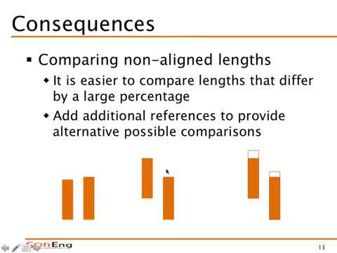




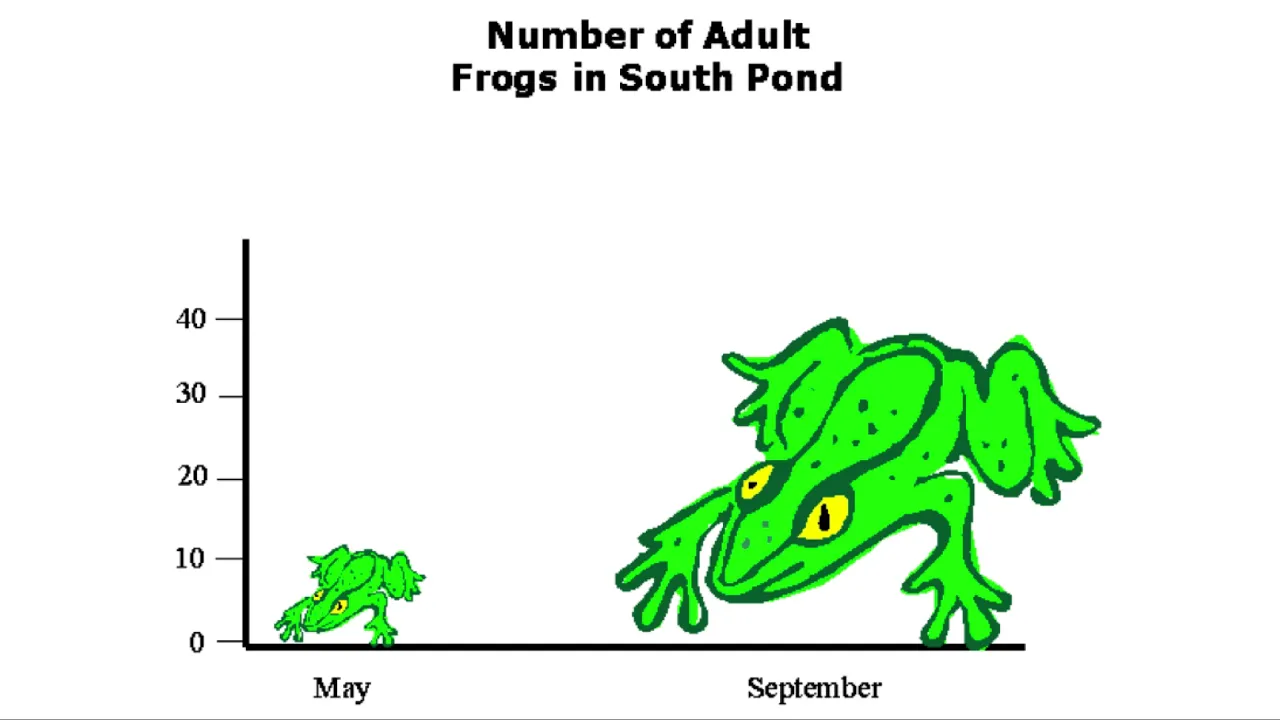











This presentation reveals five common methods of misrepresenting data through visual communication: (1) manipulating axis scales to exaggerate or minimize changes, (2) cherry-picking data to support a predetermined narrative while omitting contradictory evidence, (3) using misleading comparisons without proper baselines or normalization, (4) correlating unrelated variables to imply causation, and (5) exploiting visual perception through maps and charts that play on cognitive biases. The core principle is that humans predominantly process information visually and tend to see what they want to see, making data visualization both a powerful tool for truthful communication and a dangerous instrument for deception when wielded irresponsibly.
Misleading Data Visualization: Five Deceptive Tactics in Charts
Added:Basic anatomy of common chart types, including bar charts, line graphs, pie charts, and scatter plots.
Understanding of scale, intervals, and axis baselines, particularly the mathematical significance of a zero-baseline.
Fundamental descriptive statistics, including concepts like percentages, proportions, and sample distribution.
An introduction to visual perception and how the human brain naturally processes and compares lengths, areas, and color contrasts.
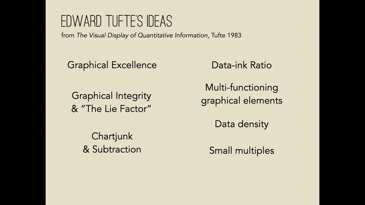
Edward Tufte's principles of data integrity, specifically calculating the 'Lie Factor' and maximizing the data-ink ratio.
Best practices for configuring professional data visualization tools (such as Tableau, PowerBI, or ggplot2) to ensure unbiased data representation.
Methodologies for auditing public media, marketing reports, and scientific papers to detect visual disinformation.
Advanced cognitive biases in data interpretation, such as visual framing effects and confirmation bias in data storytelling.
2.8K views103likes55:42Original Release: 2022-03-01
one of the things that i really love with coming to this venue and especially this stage there are two things one is the size of these speakers are amazing so i can i can play music much better than i can do back at home another part is that this stage is technically floating means that every time i go up on it i need to consider my own mortality i am not entirely sure that i will survive the event but i'll take it this is the untruthful art this has also been called the angry swede for an hour i'll come back to why this session for starters it's not designed to make people uncomfortable it's not designed to make people angry it has been known to do just that and again that is not my intention but as we walk through these five scenarios and five things you're gonna see exactly why my blood pressure tends to rise as i do this session in the name the untruthful art it's a nod to one of the the seminal works within data visualization it's called the truthful art it was written by alberto cairo he's one of the the absolute giants when it comes to database he reached out on twitter about a year back and said oh that's a nice nice name of your session i needed a pair of new underpants but he was very kind he wasn't angry at all he just thought it was kind of a cool thing let's kick off we live in the world of information in 2021 it's been estimated to be about 74 trillion gigabytes of data that's 74 zettabytes i suspect that more than half of that is probably porn and spam and the rest is evenly divided between cat pictures um music and selfies and maybe at the corner some useful data but how much of it is true well i wish there was a way of explaining what true is but we can't it's just too complex and in this world of complexity there are ways to leverage this not only the information itself but also the information overload to push an agenda to change outcomes and the only thing that's worth worse than being played that's being played without you knowing it we're going to spend the next hour talking about these things we're going to look at what deception look like some of it is going to be plain obvious some of it isn't some of it that's going to make you pissed how to spot foul play most of the time unless someone is lying to your face there are going to be some red flags not always but often and we're also going to see what makes the data visualization craft so extremely dangerous most of us are predominantly visual that means that we take in visual information and do a lot with it thus we're kind of susceptible to everything that i'm going to show you my name is alexander uh i'm going to tell you that in a bit my goal today i should say um is to show you the central tenet of visual trickery ourselves we see what we want to see literally so by creating a possible narrative i can mislead just about anyone and that's all it takes my name is alexander i am not an american i am a swede i.e from slightly to the right of norway i have spent 24 years in data anything from databases to analytics the whole nine yards if there's data i'm doing it it's kind of neat to be able to say yes i work with data or in sweden then again it turns out for the ones in here that actually speak swedish that picture walking into a bar and going you're going to go home alone ask me how i know so yeah i work as a principal solutions architect for atollo in sweden a stockholm based bi company that is probably the best title i've ever had because nobody knows what i do the thing is it's kind of easy to explain what i do because i make data matter only data that matters can have any impact on anything and that's at the end of the day it's all about business it's not about tech i um i used to go all over the world to speak at conferences to teach courses and all that stuff and then the world ended and i've kind of been stuck in my home office it's a great home office but i'm pretty sure that the walls are actually moving slowly engineer so it's so good to be able to go out until the world ended again yesterday but this still it's much better than my home office just just saying if you were in my home office i'd be kind of concerned i'm one of seven data platform mvps in sweden i co-host a podcast called native in tech i have some stickers everybody loves those i have it on good authority that a computer with stickers is a faster and happier computer but you didn't know that so just grab any stickers you want and for the people in here that are my age or older yes that is the doom game logo probably the best game ever done so let's go to the first part this is greta great is angry she's very very angry because she's gotten into her little head that the world is going to and she's kind of concerned about this and would very much prefer that the world leaders would do something about it is the world going to well maybe maybe not let's look at a few things this was put on by the national review a um an american outfit that's um what do you call it a conservative news outlet and this is in fahrenheit so i apologize for that but they basically say that this is the only climate change chart you'll ever need to see might drop really do we have any issues with this oh boy yes we do so let's look at what this actually means for starters we can't work with that scale for starters let's look at the data around 57 degrees fahrenheit or 13.7 degrees centigrade this is where the the interesting things happen we can start to see a bit of a trend and it's slowly inching upwards right what's even more interesting is that this is the absolute numbers it's not the change and then there's the small detail that this is the average ocean temperature for the entire globe do you think that there might be some local changes and local differences between the different corners of the globe oh maybe let's look at the actual change i.e the anomaly it would seem that yes we are changing and yes there is a pretty decent reason for greta to be pissed this is it this is what the data actually shows us all right it's going to get worse let's shift into something else so everything around numbers in in a visual in a chart like this is called scaffolding we have the axes we have the labels all that stuff what if we were a company selling the absolute latest in cat fashion we can see that the conversion rate which is the number of people going to our website and going from just browsing to actually buying anything it's skyrocketed in april since my bonus is based off the conversion rate i'm going to be rich i'm going to be filter rich just look at april holy yeah yeah no small detail big blue arrow pointing to the y axis if i force the y axis to six percent i am forcing everything to be relative to that number meaning that holy cow it's an enormous change in april what it might actually be looking like this this is what we should do we should have a zero as a baseline suddenly yes it's a better conversion rate in april that's fine but it's not this enormous change it's not an artifact artificially large change so um how do we do this well in power bi which is my stomping ground i do just about only microsoft stuff you set the uh the the chart to to auto basically that that's how it will sort the zero on itself it's not if it's not set on auto well you can go in and set it as zero or auto okay if you want really good examples of how to completely screw people over when it comes to visuals i highly recommend fox news in fact i considered calling this session an hour with fox news i don't think i would ever be allowed back in the u.s and case in point i haven't done this session in the u.s i don't think i will there's a reason for that fox news does amazing things to data or i should say horrible things it's kind of the same thing in this case just look at this wonderful graph somebody stole the y-axis yeah we're going to come back to that so the y-axis is gone again there's a reason for that something's kind of funky with the x-axis as well what is funky well the the points are not equidistant they have just arbitrarily put these num points out meaning that they have an almost perfect line that's a bit of a warning sign roughly the size of texas um okay so what do we do well you've kind of started to see the pattern let's look at the actual base data that data can be found at the bureau of labor statistics and it looks like this okay let's plot out the everything that we see so we are starting with the arbitrarily pointed numbers right so the distance between december of 7 september 8th well it's not the same as september 8th to march 09 and so on and so forth so let's move these things a tad so it actually looks like the way it should look um yeah no my straight line kind of went to it kind of went out the window didn't it but it's worse because there is a crap ton of data that they didn't bother to put in there because if you actually overlay the data on all the data points it looks like this and bye-bye went my straight line funny that and finally for the first part i'm going to give you this it's kind of a serious uptick at the end right yeah the reason for this because someone had a bit of a meltdown and created a logarithmic scale all of a sudden seriously why would you do that we had a great thing going with 80 90 1999 99 no no you don't do this ever and if you do you should put it out in huge texts i did something here okay what can we conclude from this well first of all look at the scaffolding look at everything that is around the actual graph and if it's not there ah danger will there almost endanger there is a reason why the scaffolding is not there i'm going to show you something called fluff in a bit kind of the same thing also if you have a bar chart or generally if you have any charts at all the axis should go to zero because that is going to be your baseline something to compare everything to there might be specific reasons why you don't want to go for a zero and that's fine but again if you don't make sure you point it out and for the love of everything that is holy do not change axis scales midstream because i will find you right so let's go for cherry picking and cherry picking is kind of the art of choosing the data that fits your narrative and if it's done in science it's going to be called p hacking p for statistical probability um the rest of the world is just called shenanigans but people really consider it now it's kind of an inception thing that i'm going to do here let's see if you catch it let's start with this what am i just doing well i'm doing a couple of things first of all i am expecting each and every one of you to have seen star wars if you don't we have a bit of an issue i might be a bit of a star wars fan just saying now so most people have seen star wars most people know the premise of the evil empire and the overlord darth vader and that the stormtroopers have a pretty limited life expectancy if they don't follow his rules well some actually do follow the rules and still perish that's a whole different story so by choosing who i ask and frame the question in the way that i can control the answers well suddenly why why am i doing this i am creating a question and i'm forcing you down a very narrow path because there is just one correct answer that's cherry picking in a nutshell so how do we how do we do this in in data well first started let's let's go to sweden did you know did you know that sweden turns out to be the second most dangerous country in europe huh interesting i didn't know that and i was born there uh this is according to a site called namvio.com so by filtering on on crime index by country in 2020 sweden sticks out like a sore thumb we are in great company with the ukraine and france and ireland and moldova are some issues with this first one is this is self-reported meaning not only do you need to find this site you also need to go in and put in data i kind of see that this is going to happen on friday evening after a beer or two and nobody bothered to define danger so it's gonna be yes sweden is very very dangerous so what do we do well before we look at the data who do you think uses this well this has been quoted by the more shall we say racist parts of the swedish political establishment let's look at the data again let's look at the data this is available underneath apparently the number of reported crimes are going up yep that's a fact the number of um manslaughters and murder ones and all that stuff is staying at a fairly stable level now this does not take into account the latest shootings we've had an uptick in in shooting especially in my city uh kind of a bummer but it's not part of this this um uh this chart so what we can conclude here is that the number of crimes being reported is going up that's the only thing that we can conclude this does not mean that we're living in a more dangerous time huh another great example of cherry picking this was run by a site called economicshelp.org and it was designed to to show cherry-picking the uk is still on everybody's lips after the disastrous brexit yeah i'm not going to be able to do this session in the uk either for reasons that you're going to find in a bit and this does look a bit strange because again if we were to look at our old friend the x-axis we're going to see that they have kind of constrained this between 1995 and 2016.
i'm pretty sure that they had some inflation stuff going on before 1995 probably after 2016 as well so what if we go and dig out the base data again suddenly looks like this they managed to find the smallest part in the data that supports their narrative what can we conclude from this data does not have its own voice data is not going to tell you that you don't decide it says or the people trying to tell you so don't trust data ever and uh case in point this was put on on put up on twitter i think it was three or four months ago i'm i'm just stumbled upon it and i i decided then that yeah this is going to go into my session so bernborg is a danish i think science denier or client's client climate skeptic or climate change denier he put up this one and said well apparently this is not as big an issue that people think it is unfortunately for him andrew destler who is a professor of atmospheric sciences and a climate scientist at texas a m found this and went ah wait a second that's kind of weird because yes the 30s they were hot but they were not that hot and why on earth isn't the 2010s showing up at all something is strange now this is epa data so the environmental protection agency has put this out this is correct validated verified data why does it look the way it does a couple of reasons so for starters this is plotting what's known as the heat wave index and if i were to ask any of you what the heat wave index would be we'd have a lot of great answers none of them would be correct i'm reading verbatim a heat wave index counts the occurrence of four day heat waves of temperatures exceeding one in a 10-year recurrence okay that's a kind of a different view on things so by choosing this extremely strange metric you can show this what if we change the the way we look at heatwave to something more reasonable instead perhaps let's look at the the actual temperatures and compare that suddenly we're going to look at this huh so the 30s yes they were warm they were not that warm and then we've had a gradual increase back to the 2010s and 2020s the funny thing is that there's actually two cherry picks in this single thing the first one was choosing the very obscure metric the second one this is just the u.s the world looks a bit different funny that so no mr lomborg you can crawl back under your stone what can we learn from this well look at the agenda someone is always trying to sell you something if you don't know what they're selling you might be the product i think you've heard that before and consider the responders if i were to ask a very homogenous group something and ask another group that has nothing to do with the first group the same question we might have two completely different answers just saying and finally try to examine the base data if you can we have so much data available to us it might be kind of a difficult proposition to to find your way in and find the base data but most of the time it is there and you're going to find that a lot of times what's reported is not necessarily supported by the actual data so let's look at comparisons comparisons while comparing things they're kind of a classical way of driving a narrative there's a saying that one would compare apples to apples but i'll show you some creative ways of comparing both basically apples to trombones and in case anybody's wondering that's a six-valve military trombone from 1866.
comparing stuff is hard it's even harder if you lack basic literary skills literacy skills uh how many weeks do we have in august again um yeah no not these many at all where do you think i found this picture which tv station yes fox news anyways let's go back to the relative dangers of living it turns out that living is actually terminal you're not going to get away with your life but that's a different story in it of itself so this is a visual that plots the relative danger i.e the most dangerous cities in the us we have this small infographic that shows you the relative danger i don't know how you measure danger is that in kilos or in meters i don't know and this is what's known as fluff there is data here but there's also a crapton of cool visuals and graphics and stuff that does nothing except make your eyes go like this you don't know what you're looking at so if we were to clean this up remove all the fluff and just look at the actual data this is what we're going to find so chicago is kind of um at the top here and the top 10 most dangerous cities in the u.s are we missing something yeah where's my scale where's my x-axis somebody misplaced my x-axis so let's put that in so this is actually number of homicides per city from 2019.
do we have any issues with this yes we do i was never very good at geography but even i know that there's a bit of its size difference between chicago 8.9 million people and baltimore the 2.3 million people so if you were to compare the the absolute number of people killed you are probably going to see some differences in the numbers what do we do well yes we're going to come back and look at the data but we are going to control for the size of the city we can do that by simply saying the homicide rates per 100 000 residents per city where did um chicago go huh chicago is not that dangerous apparently well baltimore is still more difficult and st louis you don't want to go there but again the fluff didn't show you this and if you don't control precise this is what you end up with and then we have this this was sent to me by a former colleague of mine that i've said from the start of this pandemic i am not going to touch kobe 19 data with a 10 foot stick because the data is horrible you cannot compare kovid 19 data that's all i'm going to say on that he sent me this and said this is an interesting example of what well let's see what this actually shows this is from the uk and this is the the hospitalized patients and we can see that scotland had a pretty crappy day and what's going on in northern ireland i don't know look at the y-axis yeah so at the top of england we have 30 000 at the top of northern ireland we have 700.
you cannot compare these what are people going to do well we're predominantly visual so we're going to look at the shapes of the the the visuals and it apparently seems like the northern ireland part is a bit iffy you do not compare these like this you need to have a common baseline this is the bbc if anyone should these people should know better then we can look at revenue and as we can see from my company i am rich i'm becoming richer just just look at my revenue it's going up up and away kind of awesome uh but if we were to um oh i don't know look at the the y-axis again kind of a large sum of money 500 millions a thousand millions also known as a billion one and a half billion something is kind of funky here it's just it keeps going why is this well it's because we're looking at cumulative revenue and if you weren't told that this is cumulative revenue no we kind of again look at it and go yeah seems reasonable this is what it actually looks like but since it's cumulative you need to have a pretty serious deficit in order for this the the line to dip downwards so be careful when you compare cumulative or absolute revenues or numbers at all compare apples to apples do not put any trombones in your data taken out of context that is a very strange sentence compared to what always have a baseline i'm the best speaker ever compared to my cats my cats have never been on stage so yes you need to compare to something reasonable my cats are not reasonable and please consider absolute versus community cumulative increases it might look the same on a graph but look at the scaffolding look at the text look at the description what are we what are we trying to show you and it's time to take a turn for the worse correlating causation so what does this mean causation this is the action of causing something i'm sure you've heard correlation does not imply causality more than once and that is extremely true but it is also something that very few people realize what it means i'm going to show you for starters this did you know that the per capita consumption of cheese in the u.s and the total revenue generated by golf courses each year actually correlate ha but they do not what they're not not causal i can guarantee you that there is no causation between the consumption of cheese and the revenue generated by golf courses there is nothing driving the other they happen to correlate they don't drive each other hold that in your minds because i'm going to show you something terrible this is glyphosate or as it's more commonly known as roundup roundup is a weed killer brought to market by the monsanto corporation in 1974 and it's been called many things for instance in in 1996 the attorney general of new york ordered monsanto to pull ads that said that well roundup is safer than table salt um it was also practically non-toxic to mammals birds and fish the debate whether this is carcinogenic or not is still raging today and i mean it's hard to figure out what's true or not because there's been several lawsuits regarding this and people have been paid inordinate amounts of money for it for claiming that this caused the cancer i don't know but in 2015 the world health organization's international agency for research on cancer iarc they classified glyphosate as probably carcinogenic in humans in contrast the european food safety authority concluded in november of the same year 2015 that the substance is unlikely to pose a carcinogenic threat to humans i don't know and that's the thing i don't know nobody knows but the lack of firm evidence does not mean that people don't create these kind of visuals so um and while we're at it why don't we just toss genetically modified crops under the boss as well there are a few weird things going on here both stuff that we see and stuff that we do not see i mean there's a few things that i i want you to point out i want to point out to you how for instance can we have minus 10 of something how can we have minus on a scale like this well the reason for it to be minus is to have the intercept i.e the way that the lines intercept and intersect each other to kind of look good this is classic manipulation of a visual the whole point is to show that there is a connection between the incidence of thyroid cancer and the glyphosate amount applied to corn and soy these correlate there is no causal link that has been established has anybody ever seen this gentleman this is a british physician called andrew wakefield and in 1998 he published a study linking the mmr vaccine to autism that study has been thoroughly torn to shreds in fact he's been tossed out of the british medical association he's no longer allowed to practice medicine unfortunately that didn't stop people from thinking that vaccines cause autism and yada yada and let's think of this what kind of consequences does this information have well the global and the vaccine movement which is running rampant especially under covet conditions but even before kobe when it comes to the mmr stuff they got a serious amount of wind in their sales and we can use that data to push an agenda and combine probably very innocent things together like this so we can see that the sales of organic food is going up we can see that the autism prevalence is going up that's all we can see we don't know why we don't know why organic food sales is going up we don't know why the prevalence for autism is going up that's it remember that people see what they want to see consider a family having a child by being diagnosed with autism that is a terrible experience and it's not far-fetched to think that in their grief in their their fear in their anger they they go to the internet and they try to figure out why have their child been struck with this why has this calamity happen to them and they find this they find something to latch onto we're seeing data but this is not as much data as it is the human factor the human condition everything has consequences suddenly they have something to latch onto and something to lash out on and we just went from a fairly innocent visual to people in the streets this is extremely dangerous what can we learn from this well just because you can doesn't mean you should just because you can compare things and just because you can whip up funny correlations doesn't mean you should everything you do has consequences and scale will decide the curve if i want to i can make just about any curve intercept another curve as long as you fiddle with the scales again don't do that have zero as a baseline there's a reason for that and finally you forget everything from this session remember this correlation does not equal causation just because two things happen at the same time does not mean that they are happening because of each other it's time to dive into the fifth and the the final part i should say we're going to start with the indian bratia genada party or bjt they put up um kind of funny thing on on twitter they they have a pretty clear agenda right they're political and their agenda is to make sure that narendra modi stays the prime minister of india and like many other political organizations they kind of play fast and loose with numbers i mean apparently the constituents are roughly as smart as a brick so they they put up this on twitter i'm the first to to to be very clear i'm terrible at math but even i figure something is not entirely correct here a bit okay so what do we do well let's defluff it let's take away all the weird stuff that we're looking at again it's because of the fluff that we not immediately see that something is wrong so let's clear off the bars there we have numbers without the bars the mind don't have anything to latch on to so suddenly we can see the progression of numbers and go yeah that's that's reasonable and we can do it even more than this what if we were to put back the bars as it should have looked huh that's kind of a different message isn't it and this this was obvious this is what we should have seen this is a wonderful example of misleading or just lying to your face with a visual they didn't even try to hide it it's clear for everybody to see consider how many people actually did in many ways it doesn't matter if you're trying if you're convincing everyone as long as you're convincing someone well you kind of made your point oh we're gonna go to the u.s and this is a bit of a sensitive issue i'm not dumb enough to dive into the latest election that's walking on a minefield this is bad enough so with 2012 there was a the election that saw the um barack obama the incumbent uh democratic president he was challenged by the republican candidate mitt romney okay so this is a map of the the us the well it's both the continental u.s and hawaii and if we were to color the states that voted democrat blue and the states that voted republican red this is what we're going to see there is a lot of republicans here there's a lot of people voting republican right yeah but it turns out that the states themselves they're kind of divided into smaller chunks i.e counties and then it looks like this instead holy cow that is a lot of red i mean just looking at this map isn't it obvious that the republicans should have won it is isn't it obvious that mitt romney had probably won the election just look at the number of red stuff they had their election taken away from them have you heard that narrative before stop this deal so okay this is the question should they have won well that was kind of the narrative that people was trying to push i didn't say they won i'm saying they should have won and that's all people need to hear well obviously they should have won obviously there is something wrong with the election pitchforks out and to the streets we go and yes there is a lot of things wrong with the u.s election system but no i'm not going to touch on that the thing is land don't vote people do and if you were to look at the number of voters per county or actually per state we're going to see that there's a heck of a lot of people living in california like in california we have millions of people and in wyoming we have millions of cattle they do a lot of things but they do not vote well some of them might do actually but that's yeah and and here's the thing over here we have the people and if we take that data and do the math again we're going to find that ha the democrats actually did win because the number of people voting democrat was much higher than the number of counties doing so land don't vote we have this tendency whenever we see a map to think that everything is is equal if we have a map of the us for instance we tend to assign every area the same number so that's why we look at a map to see a crap ton of red and go huh i think the republicans won that is a dangerous thing with maps it's nothing wrong with the maps it's just the way we tend to interpret them meaning that if you were to show a map you need to consider this we're going to stay in the u.s we're going to go to florida florida is a wonderful state it's warm i enjoy warm it kind of windy sometimes that's part of the fun i suppose they also enacted a law back in 2005 this so-called stand your ground law stand your ground is a law that gives you the right to exercise deadly force if you are being attacked it gets worse than that it is completely fine for you to pull a gun and shoot someone in the head if you feel threatened and it's also perfectly fine for you to shoot the same person in the head again regardless if you could have de-escalated by just backing away so they put up this this is reuters kind of a big news outlet they put this up to show what happened at 2005.
there are a few things kind of sticking out here when i saw this i literally poured my coffee down my windpipe because 721 is kind of less than 873 how the heck did we manage to do this visual well that's why they turned the damn thing on its head they turned the visual on its head this is what it should have looked like what can we conclude from this well when they enacted stand your ground the number of deadly homicides or it's not technically a homicide it's just self-defense it skyrocketed who'da thought that this is not acceptable this is an outright lie by reuters i did some research and i found that somebody had asked the the artist that did this visual and asked them why how did you come up with this and the response was well i wanted to show how the blood flows down i'm gonna call on that one speaking of let's go to the uk again the uk um from the start of the pandemic they've been putting out the weekly kobe 19 report it's been identical since the start of the pandemic in 2019 and this is what uk has looked like so we have a map we have colored areas showing the um the prevalence of of kovid all right so this was the case up until week 40 of 2020.
from week 40 and onwards they slightly tweaked it to call it the weekly kobit 19 and seasonal flu report because they're adding the seasonal flu as well and as we can see back in week 40 the uk finally managed to break the covid infection everything was fine in the uk in the week 40.
or was it there is no difference between the report of week 39 and week 40 apart from this look at the scales they changed the scales and thus they changed the coloring there is no information about this nothing how do people look at this data well they're probably going to look at it and go yeah everything is much better i'm gonna go buy stuff or i'm gonna go without a mask god knows what you don't do this people see what they want to see we want this pandemic to be over trust me i do and when i see something like this well apparently it's kind of normal so um where do we go from here well people have limited attention span people are not stupid no god no that is not what i'm saying but people have a limited attention span and just like i can choose who i ask and what i ask i can pretty much guarantee that you're going to draw a specific set of conclusions that makes me with data infinitely more dangerous than someone just screaming and always be careful with maps because as i said we have a tendency to ascribe a map a specific number all the the different areas of the map has the same value if you will that is something that is intrinsic to our minds that's how we've learned to look at maps i.e be very very careful when you're dealing with colored maps so called choropleth maps visuals are powerful most of us are predominantly visual meaning that we assign more impact to visuals and again how many people actually look at the data we look at the visual we correlate with what we want to see there we go my goal was to show you how easy it is to trick people with visuals and when i started building this session out i i had it in my head for a long time and i started building it out roughly two years ago and i wasn't expecting to find just as much shenanigans as i did i mean it's rampant the stuff people do and even established news outlets occasionally make mistakes and if you're tired of the mistakes just go to look at fox that's not a mistake that's intentional and this was hilarious for a bit because i realized how much crap is out there and if these fairly basic things managed to fool so many people what is it out there that i didn't even see i am in no way immune from this information and crappy visuals i like to think that it is harder to fool me than most people who do not spend their entire day working with data but i'm sure that i will be easy to fall as well so the question is are we doomed well no i don't think so i don't think so unless we choose to be everybody has a choice we always have a choice to be better i can always be better tomorrow than i was today or yesterday that is a choice that's how i go through life i want to change i want to learn i think it is still possible to make people well basically help them think help them realize that things might not be as easy or simple as they seem we crave simplicity we sadly we can't have it and i think that solution is just as obvious as it is rare the solution is called data literacy training we know automatically to well how to interpret red lights right we know not to buy things from strange men in alleys we know not to eat yellow snow these things are obvious it's they're they're called common sense and they're common sense because we've been told this over and over and over again what if we were able to make charts and reading charts and reading data equally common sense what if we were able to teach this and and this kind of of them critical thinking in school what if we were able to give our kids the basic insights like this in school how difficult do you think it would be to fool them there are many many ways of doing this i highly recommend any of these books anything by by um alberto cair is fantastic uh we have a personal favorite of mine hans rusling uh he was taken from us way too early he had this fantastic way of making data approachable making data easy to relate to and no he never made anything too too difficult it's both interesting and exciting though so don't play me if you start to read this and kind of fall into the the very very deep hole that data visualization is it's a fantastic field so many many impressive people writing stuff so much interesting information so much insight into the human condition and psychology that you might not expect when you went in there we've seen examples of everything from fairly innocent mistakes to outright lies so what can we conclude from this hour well we can for starters with great power the sorry i had to again i do power bi comes great responsibility it is up on you that does the visual to think about how can this be interpreted i'm not going to give anyone who just whipped up a visual and well it's up to you to figure out what you're looking at no it's the person that crafts the visual that has the responsibility to make sure that it is as clear as concise as possible and we see what we want to see every day it's the same mechanism underneath racism for instance we see what we want to see as soon as something happens that fits a narrative that we know well we're just going with that's the fact it supports my facts something else comes along that does not conform to what i know what do i do i discard it it's apparently something strange so that's how the mind works and i still think that increasing data literacy is key we can sort this it's not going to be easy but it can be done and it must be done it must must must be done i want you well let me rephrase that i challenge you to go out and help others become more data literate you might not think it but this hour has given you more points in the daily literacy column help others not everyone can go to this or read a book or see this whenever you hear something strange related to data explain things don't just let it slide we're not doomed yet not quite yet be observant be curious be literate and you won't get burned my name is alexander and i thank you so much for this session [Applause]
Up Next

12:19
The End of the Mercator Projection: Google Maps and Its Global Impact
@ibx2cat
128.2K views•2018-08-06

12:54
Triumph of Orthodoxy Icon: Byzantine Art & History Explained
@BenCallan
2.1K views•2024-08-06

9:49
FastAPI vs Flask vs Django: Choosing the Right Python Web Framework
@TechWithTim
302.5K views•2024-05-26

1:42
Game of Thrones Opening Credits: A Cinematic Analysis
@gameofthrones
46.3M views•2011-04-18
Related Study Plans & Knowledge Roadmaps
Structured learning paths in General & Interdisciplinary Studies
general-studies
Elevator Engineering: History, Physics & Cities
01From Hoists to Safety Brakes: The Dawn of Vertical Lift
02Hydraulic vs. Traction: The Engineering Physics of Elevators
03Modern Speed, Safety, and Algorithms
+ 2 more learning modules
12h5 modules
Explore Roadmap
general-studies
Rubber: Material Science, History & Geopolitics
01Origins of Natural Rubber & Mesoamerican History
02The Chemistry of Natural Rubber & Vulcanization
03The Geopolitics of the Rubber Boom & Colonization
+ 2 more learning modules
12h5 modules
Explore Roadmap
general-studies
Containerization: Evolution, Logistics & Trade
01Ancient Trade & Bulk Cargo: Amphorae to Barrels
02The Industrial Revolution & Cardboard Packaging
03The Containerization Revolution: Malcom McLean
+ 2 more learning modules
12h5 modules
Explore Roadmap
general-studies
Textile Tech: Evolution, Labor & Global Impact
01Pre-Industrial Textiles: Handloom & Cottage Industry
02Mechanization: The Spinning Jenny to the Power Loom
03The Factory System & Global Labor Transformation
+ 2 more learning modules
10h5 modules
Explore Roadmap