
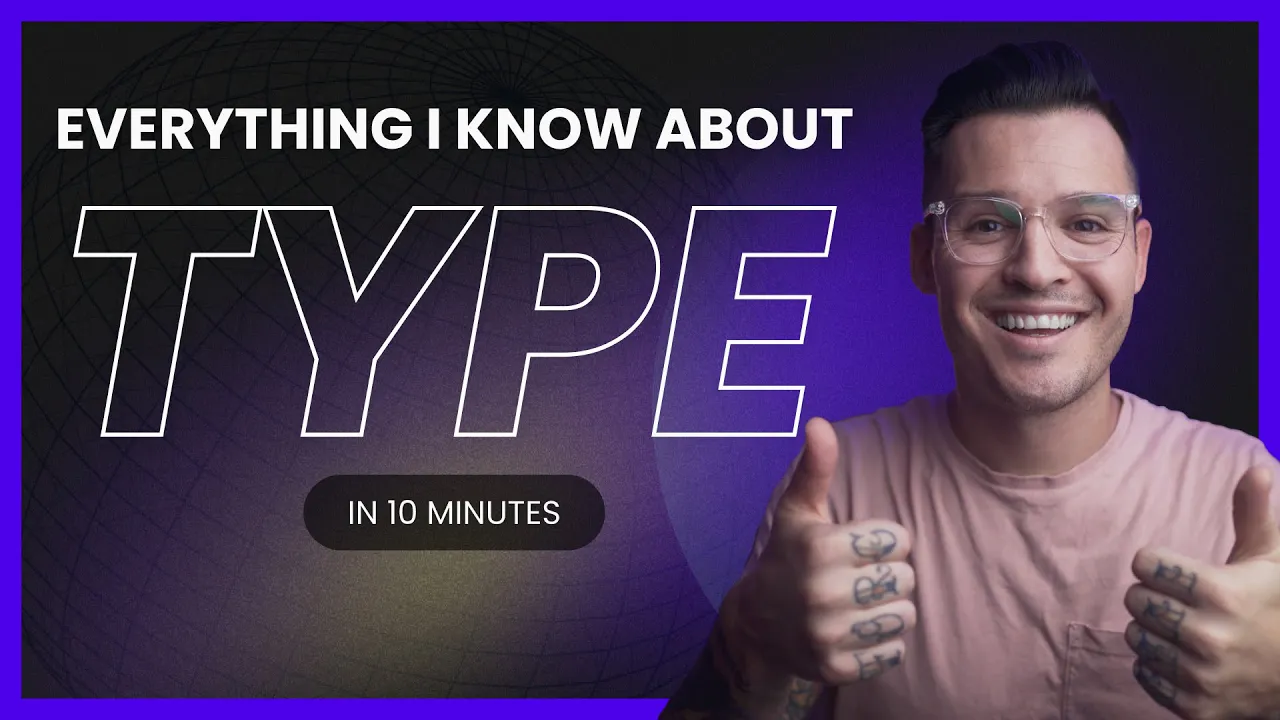














Typefaces serve as powerful narrative tools in film, acting as the first visual element audiences encounter and shaping their emotional expectations; designers function like casting directors who select or create fonts that embody specific moods, personalities, and cultural associations, with historical films using simpler, more expressive typography while modern blockbusters increasingly eliminate opening titles as characters become instantly recognizable.
How Film Title Typography Shapes Narrative and Viewer Experience
Added:Basic typographic terminology, including the distinction between typefaces and fonts, as well as core concepts like serif, sans-serif, kerning, and hierarchy.
The fundamentals of visual semiotics, specifically how visual elements and design choices communicate implicit cultural meaning and emotion to an audience.
An introductory understanding of cinematic storytelling, focusing on how tone, genre, and atmosphere are established in the opening minutes of a film.
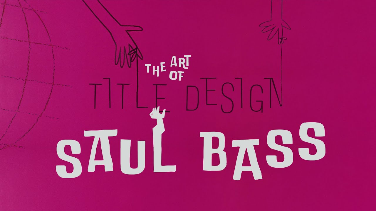
A general awareness of the history of title sequences, from simple silent era intertitles to the iconic, narrative-driven work of designers like Saul Bass.
The study of motion design and kinetic typography, exploring how to animate text to express narrative rhythm, tension, and action in film and television.
Advanced brand identity systems, examining how custom typography is engineered to scale across merchandise, promotional posters, and digital interfaces.
The psychology of font perception, investigating empirical research on how typographic choices subconsciously influence consumer trust, recall, and emotional response.
The legal and technical aspects of type design, including font licensing, intellectual property rights, and the creation of bespoke typefaces for entertainment franchises.
7.3K views419likes13:51Original Release: 2024-06-24
Do you like any of these fonts?
It's nice, but that's too pretty in a way. This one is too loud. I mean, it just like bursts right into the conversation. This one is like upper east side, right?
The New Yorker and all that, you know?
Wait, go back. No, no, make that boulder. Too much.
For me, hype is indiscible from culture.
It's very much part of the visual fabric of the world that we live in.
[Music] We must make immediate contact.
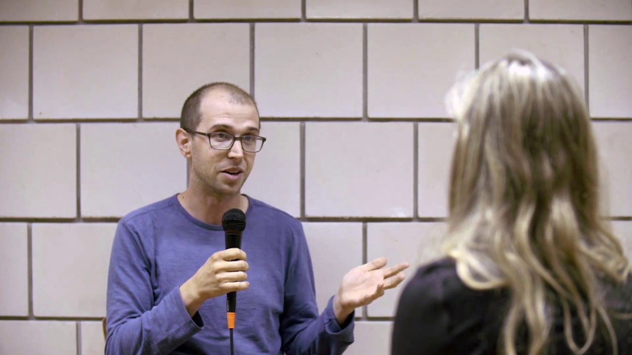
I think the best way to explain it is that for a lot of people, type is a tool. But for me, type's a material and it's something that you can mold, that you can shape, you can deform, you can play with to express things. And it's a very interesting material because it's rarely ever pure.
For color, you can have just red or just yellow. For type, you can never really have just type because there's always meaning attached to the words that it creates. And it's it's the juxtaposition of that meaning and a visual way to form it that makes it such an incredibly rich thing, incredibly full of meaning, too.
[Music] I think it's important to point out that with historical films, the framework is slightly different um because of technical limitations. when we didn't have the same tech that we now have to show type on screen.
It's really fascinating seeing them kind of using what they had and making meaning out of not much.
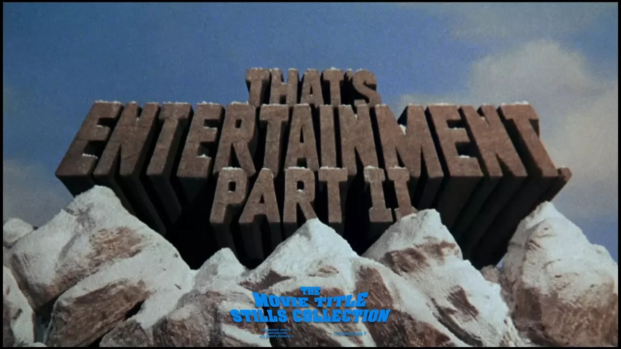
The type, you know, especially for the title of the films, whether it's on a poster or on a screen, it's a lot more expressive. It's a lot simpler. It's a lot more straight to the point.
gone with the wind. You know that beautiful effect of the letters kind of swooshing to the left.
They were just less scared about being intuitive and emotional in the way that they use type.
Psycho is another really good example of that, you know, with the fracture letters hinting at um things breaking, mental illness going crazy.
And actually, the fractured type that they used on the poster became even more iconic than the original title sequence, and I think they used it for the franchise as well.
[Music] The Star Wars title sequence is my favorite in the world specifically for that reason. Is so lowbudget. It's so simple and yet so effective. It's such a powerful way of using type in space. No pun intended. Really using layout to give that impression of huge massive space void.
Steven, not this again. I forgot about it for years, but then I remembered that Avatar, a giant international blockbuster, used the Papyrus font as its logo. He just highlighted Avatar, he clicked the drop- down menu, and then he just randomly selected Papyrus like a like a thoughtless child.
An actor that's miscast in a role will affect someone's experience of of a movie or play that they're watching. I think the typography is is similar to that. A a designer choosing type faces essentially a casting director.
I think we could push it even further.
If you're a casting director, you can't really fabricate your actors, but we can. We can literally mold them from scratch. It goes beyond that metaphor.
In most films, the title screen is is the first character you see. Those letters are literally the first characters you see. And you know, it's an interesting play on the word character because it means glyphs as well, but it's just a really powerful and quite narrow short window of time to get people's attention.
People have these emotional associations with tight faces. For most people, it's not a conscious process. So, it's really playing with that instant reaction.
You know what you did? I know what you did.
[Applause] Today there are all these layers of cultural awareness, cultural stereotyping.
[Music] There's an irreverence there, you know.
It It doesn't sit straight on the baseline. There's a lot of movement and the letters are kind of irregular. It just feels less serious. It feels more approachable. It almost feels handdrawn in some way. I think it goes back to what we were saying about those letters being the first characters we see. Like they're telling you, "Hang in there.
This is going to be fun." And until the real characters come on screen, it's almost like a proxy for what's going to happen, how they're going to interact, and the the tone of the film.
What's remarkable is how willing we are to treat letters as humans. like even the way that we talk about them, the way that letter parts are named and the vocabulary of type.
Letters have legs and spines and eyes.
So then surely it means that we're kind of making assumptions about the way letters behave because we're ascribing all of these human qualities to them.
And surely that must extend to gender stereotypes.
As a design professional, still to this day, I get briefs where it's like, "Oh, our audience is way too masculine for this or I want this to be more feminine."
Okay, but well, what do you mean by that? It was just something I heard a lot and then when I tried to research it, there was nothing at all. So that's when I thought, okay, I'm going to have to research this myself then. And it's really interesting when you try to go at a very basic level in, you know, exploring the letter structure, the shapes themselves almost back into symbiotics in a way where it's like if it's big, it's powerful.
If it's small, it's dainty or whatever.
Masculine, feminine, forget those words.
what are any other words that you could use to really describe this tight face or what you want from this tight face?
And then you find out that it's actually things like I want to be assertive or I want to be delicate or I want to be violent. That's the most helpful way of framing these conversations trying to really elicit a particular emotional reaction or connection because the point of this is to make things better so that we don't end up with cookie cutter designs that don't really serve anyone.
[Music] Today's title sequences are often built in a much more complex way where the type is just one creative element in a standalone sequence [Music] because there's much more emphasis put on the aesthetics, on effects.
Spider-Man's name is Peter Parker.
What the In fact, many recent blockbusters, um, particularly superhero movies, seem so self-aware that they emit their opening titles altogether.
All right, let's do this one last time.
and kind of flip that whole title as the first character you see idea because the characters and even the actors really need no introduction and it's not just confined to superhero movies either.
Oh no, we're starting here.
[Music] But that's not all, folks. Here's the real blockbuster. Brace yourselves. You might want to sit out.
The crux of it all is that type can encapsulate a feeling, an idea, a person. And there are so many ways of bringing that to life. You know, branding a film, a franchise, or even a director.
[Music] It's almost like a promise of what type of experience that director will bring you.
[Music] That's essentially how I feel about life. full of loneliness and misery and suffering and unhappiness and it's all over much too quickly.
And if you have a strong brand in a different context or film, it can really provoke big surprises.
Rather than using an existing type face, something the director might commission is custom lettering. So, somebody designing the logo as just a self-contained thing.
[Music] As marketing became more important in film history, seeing films more as a product, being like, okay, we're going to package this in such a way and using that logo. Like Star Wars is a great example of that. Godfather, great example of that as well. There's so many. I think, you know, you couldn't really make a film without that today.
[Music] And as a result, certain popular fonts seem to take on a life.
and unofficial usage of their own.
[Music] There's something that really makes type a unique material to work with just because of the way that it interacts with the spoken world, with thoughts, with culture.
And we have no type sets the stage for the film.
Idea what we're doing.
[Music] It's really historically something that has framed movies of the world with, you know, title and end credits.
[Music] Sometimes the poster is part of that conversation as well.
But when you have this perfect alignment of audience, context, and design choices, the combination can just really explode.
It's It's just amazing.
He just put it in bold.
[Music] He just put it in bold.
Up Next
3:52
The Trajan Typeface: How One Font Dominated Movie Posters for 25 Years
@Vox
736.4K views•2018-06-28
12:54
Triumph of Orthodoxy Icon: Byzantine Art & History Explained
@BenCallan
2.1K views•2024-08-06
9:49
FastAPI vs Flask vs Django: Choosing the Right Python Web Framework
@TechWithTim
302.5K views•2024-05-26

1:42
Game of Thrones Opening Credits: A Cinematic Analysis
@gameofthrones
46.3M views•2011-04-18
Related Study Plans & Knowledge Roadmaps
Structured learning paths in General & Interdisciplinary Studies
general-studies
Elevator Engineering: History, Physics & Cities
01From Hoists to Safety Brakes: The Dawn of Vertical Lift
02Hydraulic vs. Traction: The Engineering Physics of Elevators
03Modern Speed, Safety, and Algorithms
+ 2 more learning modules
12h5 modules
Explore Roadmap
general-studies
Rubber: Material Science, History & Geopolitics
01Origins of Natural Rubber & Mesoamerican History
02The Chemistry of Natural Rubber & Vulcanization
03The Geopolitics of the Rubber Boom & Colonization
+ 2 more learning modules
12h5 modules
Explore Roadmap
general-studies
Containerization: Evolution, Logistics & Trade
01Ancient Trade & Bulk Cargo: Amphorae to Barrels
02The Industrial Revolution & Cardboard Packaging
03The Containerization Revolution: Malcom McLean
+ 2 more learning modules
12h5 modules
Explore Roadmap
general-studies
Textile Tech: Evolution, Labor & Global Impact
01Pre-Industrial Textiles: Handloom & Cottage Industry
02Mechanization: The Spinning Jenny to the Power Loom
03The Factory System & Global Labor Transformation
+ 2 more learning modules
10h5 modules
Explore Roadmap