
![Tipografia - Escolhendo a tipografia perfeita [Aulão completo]](https://i.ytimg.com/vi_webp/DpSbHbtV3dw/maxresdefault.webp)







![[LIVE CLASS] Typesetting Class](https://i.ytimg.com/vi/8nmj9kAn6uA/maxresdefault.jpg)







![Font Technology and Type Design at Adobe – Miguel Sousa [ATypI São Paulo]](https://i.ytimg.com/vi/N7UTMo6ftxo/maxresdefault.jpg)




Trajan, a digital typeface based on Roman Emperor Trajan's column inscriptions created by Carol Twombly for Adobe in 1989, became Hollywood's dominant movie poster font because it was readily available in design software, allowing studios to quickly produce official-looking posters; however, its overuse transformed it from a symbol of prestige to a visual cliché associated with lower-budget films, illustrating how digital typography's convenience can undermine the artistic uniqueness that characterized hand-painted lettering in pre-digital movie poster design.
The Trajan Typeface: How One Font Dominated Movie Posters for 25 Years
Added:Basic terminology of typography, specifically the distinction between serif and sans-serif typefaces and the anatomy of letterforms.
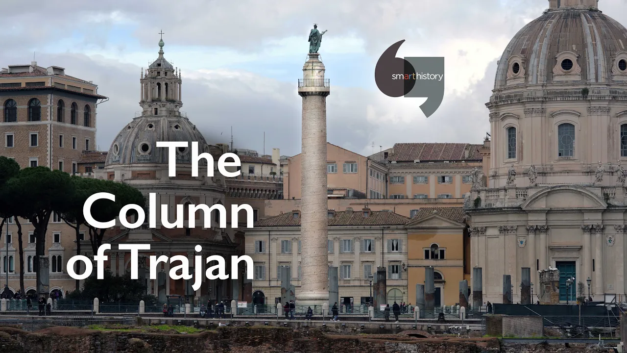
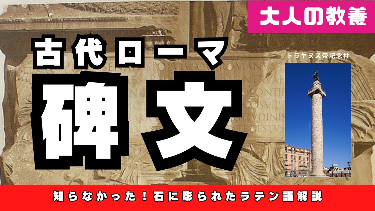
The historical origin of Roman square capitals, particularly the imperial inscriptions on the Column of Trajan (113 AD).
Fundamental principles of graphic design, visual hierarchy, and the role of layout in marketing.
The concept of typeface psychology—how font choices subconsciously evoke specific emotions, authority, or cinematic genres.
The phenomenon of typographic ubiquity and design fatigue, examining how overused typefaces (like Trajan, Papyrus, or Comic Sans) transition from prestige to cliché.
Advanced studies in visual semiotics, analyzing how movie poster compositions, color palettes, and typography work in tandem to construct narrative expectations.
The history of digital typeface revivalism, specifically focusing on Carol Twombly's 1989 digitization of the Trajan alphabet for Adobe.
A comparative analysis of modern film typography trends, exploring the shift from standardized serif fonts to bespoke, custom-designed branding in contemporary cinema.
736.4K views21.4Klikes3:52Original Release: 2018-06-28
If you’re in a theater during previews, and you see this ….
… you know to expect a comedy movie.
If you see this — you know it’s going to be action.
Make the letters a little skinny — and boom.
It’s sci-fi.
You know this one's going to have fast cars... This one’s going to have Michael Cera…. … and this one’s gonna be a rom-com.
You don’t even need the music to know it.
But what about this?
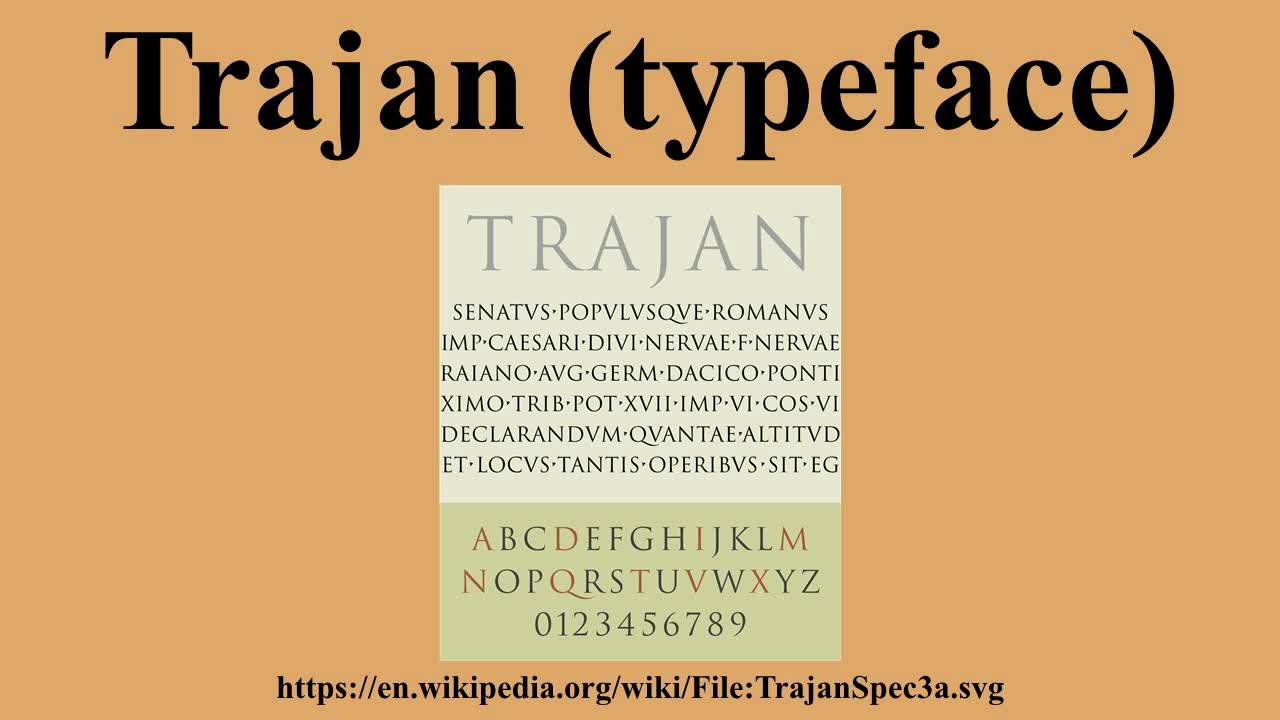
This typeface — Trajan – is probably one of the most popular movie poster fonts ever.
You can see it in Crouching Tiger, Hidden Dragon, Double Jeopardy, Letters from Iwo Jima, It’s everywhere.
So how did it get there?
I'm Yves Peters, I am a graphic designer who has been writing professionally about type and typography since about 10 years.
Yves has looked at a lot of posters.
And a few years ago, he started to notice a trend.
I started clicking, clicking, clicking, and didn't know where I started because I ended up looking at about 16,000 posters.
Yeah.
Well I look at about 100 posters per month and I've been doing this series since 2006… It’s a lot of posters every year.
He noticed that the use of Trajan rose significantly in the last couple of decades.
But why?
In 1989, designer Carol Twombly adapted inscriptions from Roman emperor Trajan’s column into a digital typeface.
It was made for Adobe, so it was a part of the software that a lot of people were starting to use to make posters.
A couple years later, it made its movie poster debut here — for Héctor Babenco’s At Play in the Fields of the Lord.
After that, it was on The Bodyguard, and Scent of a Woman.
Then it was on three 1993 box office hits.
By 1994, it was everywhere.
It's originally used for epic movies, movies about people that overcome difficulties, like the big war epics and so on.
But then you see gradually that it becomes the standard movie font.
It's like the Arial of movie posters.
So people need to churn out a poster really quickly, and they just pick Trajan.
Eventually, that overuse changed the kinds of movies that used the typeface.
You don’t see it as much on the big productions anymore.
It's become the typeface of horror movies, B-movies, and also the straight-to-video ones.
So you'll see that a lot of posters are for the lesser movies that want to pretend they are better than they actually are.
The rise and fall of Trajan illustrates the downside of digital typeface.
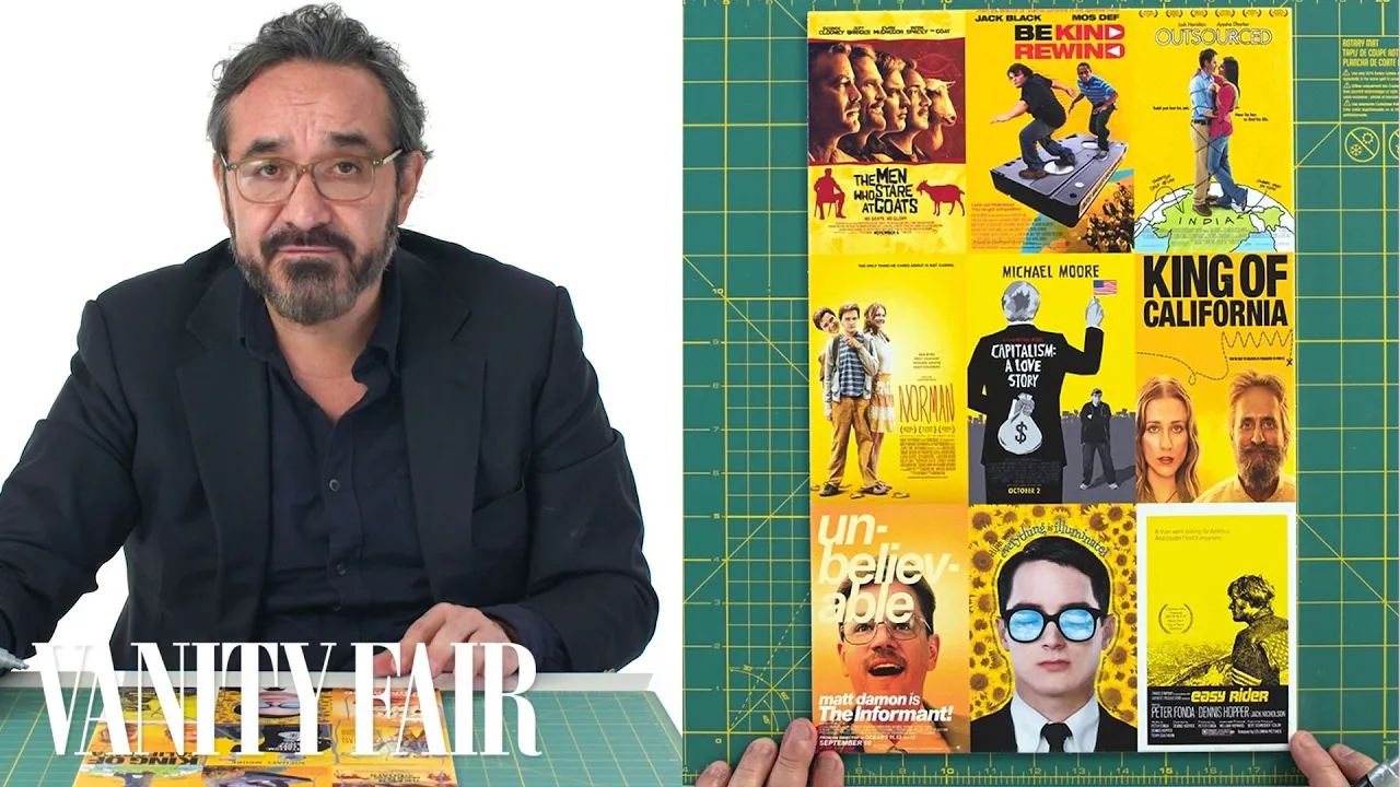
The convenience of swapping fonts is a huge shift from old movie poster days when hand-painted typefaces or "lettering" was an art that was specific to each movie.
So what you see behind me — this is more like the pre-blockbuster thing... pre-genres, pre-standard styles — and that's why you will be hard pressed to find two that are similar.
That doesn’t make today’s genre-specific typography bad design.
These visual clichés make it possible to communicate tone and plot details to an audience incredibly efficiently.
And there’s a certain art to that.
People get nostalgic about the old era of movie posters, when everything was still done by hand and still very unique.
But you could compare it to music, where some people say, “nothing good was produced since the Beatles.” But then there are people who say there’s nothing good since Mozart.
Fair enough, but there's many other interesting things that are being produced now.
There’s just much more.
But there's still a lot of very good poster design happening.
It’s just, you need to know where to look.”
Up Next
4:41
Title Design: Dan Perri on Crafting Movie Title Sequences
@TheAcademyChannel
411.3K views•2016-07-25
12:54
Triumph of Orthodoxy Icon: Byzantine Art & History Explained
@BenCallan
2.1K views•2024-08-06

8:50
What the SAT Really Measures: Bias, Wealth, and College Access
@Vox
3.1M views•2019-07-12

1:42
Game of Thrones Opening Credits: A Cinematic Analysis
@gameofthrones
46.3M views•2011-04-18
Related Study Plans & Knowledge Roadmaps
Structured learning paths in General & Interdisciplinary Studies
general-studies
Elevator Engineering: History, Physics & Cities
01From Hoists to Safety Brakes: The Dawn of Vertical Lift
02Hydraulic vs. Traction: The Engineering Physics of Elevators
03Modern Speed, Safety, and Algorithms
+ 2 more learning modules
12h5 modules
Explore Roadmap
general-studies
Rubber: Material Science, History & Geopolitics
01Origins of Natural Rubber & Mesoamerican History
02The Chemistry of Natural Rubber & Vulcanization
03The Geopolitics of the Rubber Boom & Colonization
+ 2 more learning modules
12h5 modules
Explore Roadmap
general-studies
Containerization: Evolution, Logistics & Trade
01Ancient Trade & Bulk Cargo: Amphorae to Barrels
02The Industrial Revolution & Cardboard Packaging
03The Containerization Revolution: Malcom McLean
+ 2 more learning modules
12h5 modules
Explore Roadmap
general-studies
Textile Tech: Evolution, Labor & Global Impact
01Pre-Industrial Textiles: Handloom & Cottage Industry
02Mechanization: The Spinning Jenny to the Power Loom
03The Factory System & Global Labor Transformation
+ 2 more learning modules
10h5 modules
Explore Roadmap