















Ecological forecasting uses remotely-sensed data products such as MODIS NDVI, VIIRS Land products, and AppEARS to predict ecosystem changes by analyzing land cover, vegetation indices, burn severity, and tree mortality as predictor variables in species distribution models.
Ecological Forecasting with NASA ARSET: Session 1
Added:Basic principles of remote sensing, including how sensors capture electromagnetic radiation and the concept of spectral signatures.
Fundamental concepts of ecology, such as land cover types, vegetation dynamics, and biodiversity indicators.
An introductory understanding of Geographic Information Systems (GIS), specifically dealing with raster data structures and coordinate reference systems (CRS).
Familiarity with common vegetation indices, such as the Normalized Difference Vegetation Index (NDVI).
Advanced ecological modeling methods, such as Species Distribution Modeling (SDM) and habitat suitability index mapping.
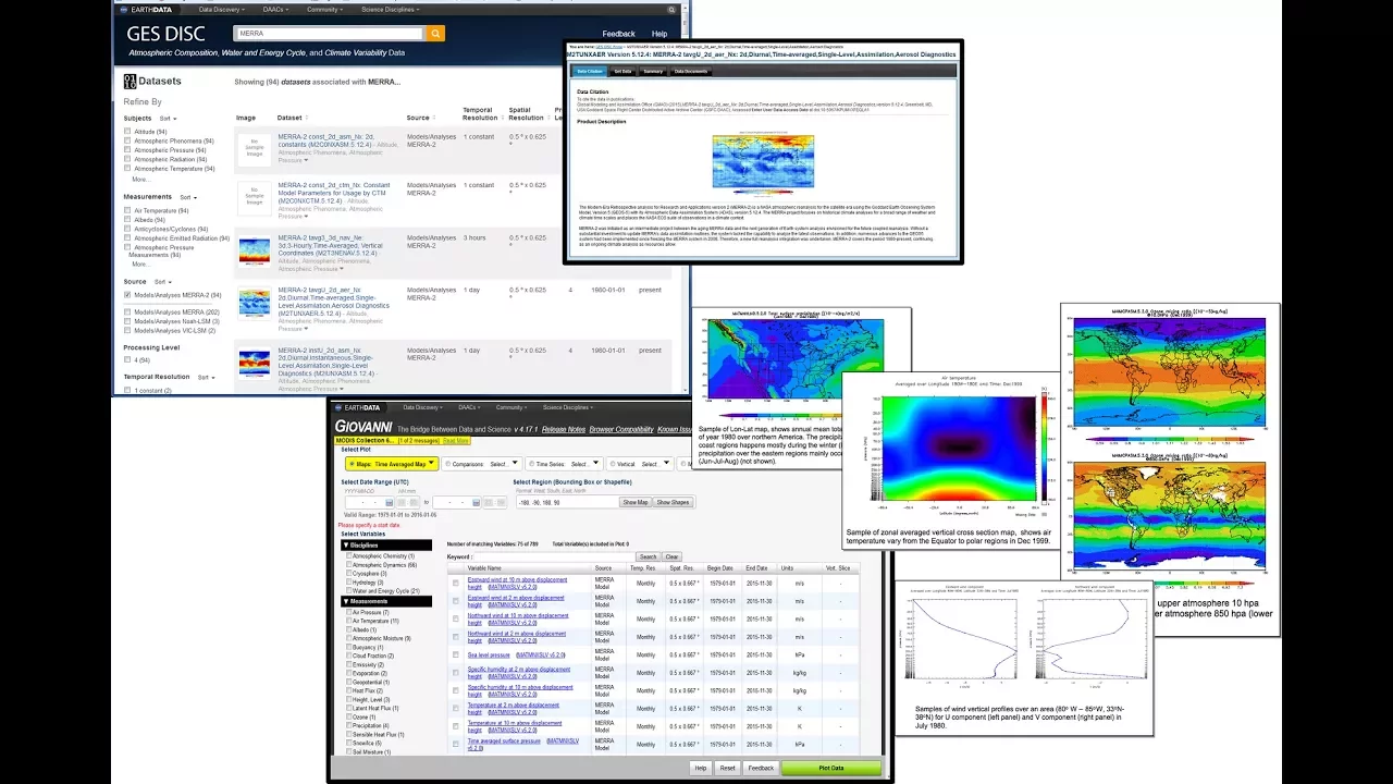
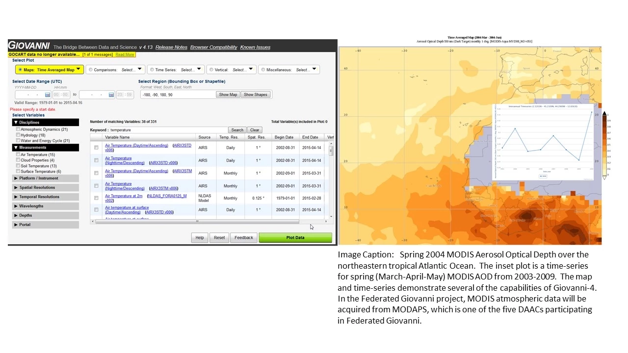
Hands-on utilization of NASA's data access and visualization tools like Giovanni, AppEEARS, and Earthdata Search.
Time-series analysis of remote sensing data to detect and forecast long-term environmental trends and disturbances (e.g., deforestation, wildfires).
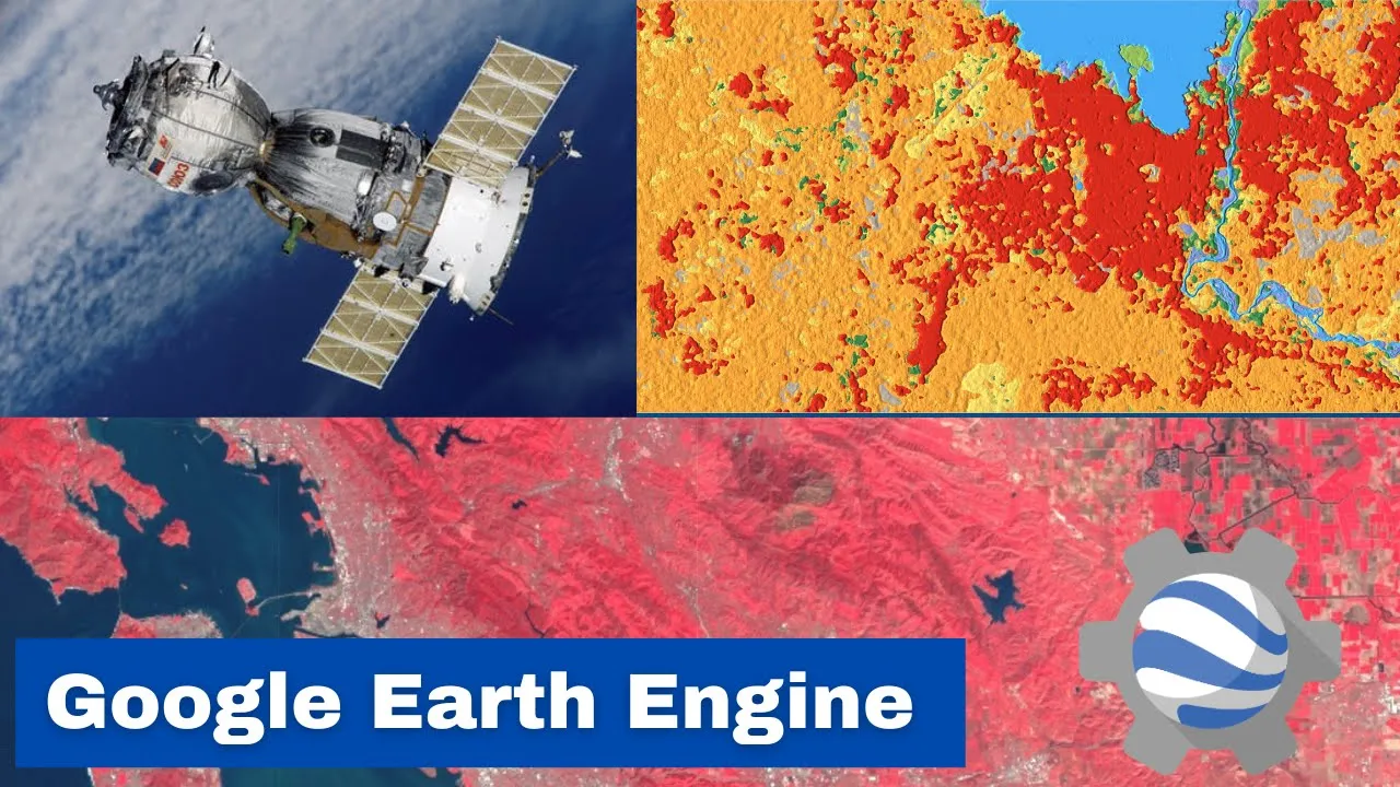
Implementation of planetary-scale cloud computing platforms like Google Earth Engine (GEE) to process large ecological datasets.
2.4K views49likes1:00:47Original Release: 2018-11-06
hello all thank you for joining us for the first session of the rset webinar series introduction to remote sensing for a scenario based eco forecasting my name is amber mccollum and i will be your instructor today for this course we will have four one hour sessions each thursday in september at 12 to 1 pm eastern time we'll have lectures followed by a short question and answer session we will also have multiple guest speakers from the usgs north central climate center in weeks two through four and we're really excited about having them with us this course will likely be a precursor to an in-person advanced training to be held in the winter or the springtime so check back on the rsat website for those details you can find all the course materials at the website listed here this includes the recordings presentation materials and links to homework we will also eventually have each of our presentation materials available in spanish if there are any additional questions after our q a session you can email myself or my colleague cindy schmidt at the email address listed here we will have two homework assignments and they will be available after sessions two and sessions four and they will be submitted via google forms the first link will be available during the session for next week to receive credit for your homework assignments you have to submit all your answers via google forms by september 28th for the first homework and by october 12th for the second homework to receive a certificate of completion you have to attend three out of four of the live webinars and complete the homework and it takes some time to process these certificates so you can expect to receive them about two months after the completion of this course there's one prerequisite for this course you should know and understand the fundamentals of remote sensing so you can watch our on-demand course listed here which includes two one-hour recorded webinars that you can watch on your own time as i mentioned previously you can access all the course materials at the website here a pdf of the powerpoint presentation is available in both english and spanish and you can also access those pdfs in the handouts icon on your web browser right now in order to view the recordings after each session you have to register and once you register for the to view the recording you'll be automatically taken to view them but this just helps us keep track of who is viewing our webinars each week so here's an overview of the general course agenda this week we'll be providing an overview of ecological forecasting and i'll be talking about some of the products that we will eventually be able to use within scenario planning so this week i first will give a brief introduction about the rset program and then talk a little bit about scenario planning then we'll discuss various land cover products available that can be used for scenario planning and these include things like phonology burn severity tree mortality and then i'll talk a little bit about some land cover data access and tools such as appears and earth data search so first as we often do i'll just provide a brief overview of our set the applied remote sensing training program or rsa is part of nasa's applied sciences program our goal is to increase the utility of earth science data for applied resource management professionals policy makers and regulatory agencies our set conducts these types of online webinars as well as in-person trainings in the focus areas of disasters land management health and air quality and water resources the the team for our set we're located at multiple nasa centers i'm at the aim center in the san francisco bay area in california and we all have backgrounds that are specific to the area in which we teach arsenal has completed over 80 training since it began in 2009 and has reached thousands of participants globally so the figure here shows the geographic distribution of our participants so we've had over 8 000 participants um actually over 11 000 now um in over 2500 organizations in 150 countries so our online trainings are really important for our international audience especially in regions where there's little in-situ data or in-person resources available so we try to engage a really large community with a highly varied audience that has a need for remote sensing but that might not know how to access it or incorporate it into current workflow there are multiple levels of training that we conduct from the fundamentals such as the prerequisite for this course to basic trainings like this one and then also we have advanced trainings where for the advanced trainings we often have exercises and we show you how to download the data and you're actually working with the data specifically and these can be online or in person at the bottom here you can see a couple of examples of training that we've conducted for each of these levels all of the previous rsi webinars are freely available to view on the website you can search by specific topic area or view all the webinars like what's shown here in order to view the past recordings you will need to enter your registration information as i mentioned and then you'll be taken directly to them okay so first uh let's start off with providing a just a brief introduction to scenario planning so i wanted to start off with a few definitions of some terms that will be important throughout this webinar series scenario planning is a structured way to think about the future the central idea of scenario planning is to consider a variety of possible futures that include uncertainties in a system so many different disciplines use this approach but what we'll be focusing on is how it's used in ecological forecasting and specifically ecological forecasting predicts how ecosystems will change in the future in response to environmental factors the scenario planning approach is often used in species ecological niche modeling which defines a set of current and future conditions necessary for species survival and reproduction those conditions can be external such as environmental conditions or internal such as density dependency so scenario planning in this webinar series will focus primarily on those external conditions necessary for species survival species distribution models follow the ecological niche approach by assessing the suitability of habitat for species the models use raster-based layers such as land cover elevation etc as predictors of suitable habitat the predictor data is combined with either presence or absence data of species abundance in empirical statistical models so what we will really focus on is describing some of these models in this webinar series in the later sessions but this week the primary focus will be the sources of these types of predictor variables that can be used within these models this is a list of some typical predictor variables for species distribution modeling and these include things like land cover vegetation indices burn severity tree mortality topography and climatology so i'll describe some of the sources of land cover and vegetation products that can be obtained through remote sensing so now we will jump into some of these land cover products that can be used there are several existing land cover products including the national land cover database or nlcd the gap analysis program or gaap and the lance landscape fire and resource management planning tools or land fire and these are for the united states for global coverage there are things like modis land cover products the fao global land cover and the esa or the european space agency climate change initiative land cover the nlcd products include land cover type percent impervious surface and percent tree canopy cover at a 30 meter spatial resolution and again these are for the u.s the database is available for 1992 2001 2006 and 2011 and is created using a 16 class classification scheme the database is primarily based on landsat data along with other data sources such as topography census data agricultural statistics soil characteristics wetlands and other land cover maps the data are freely available at the website listed here landfire is a shared program between the usda forest service and the department of the interior again this is united's states focused this program provides landscape scale geospatial products that are designed to support cross-boundary planning management and operations this site includes multiple data types for a variety of areas and it's not limited only to remote sensing remotely sensed data you can also find research and publications relevant to these types of application areas the gap analysis program it represents a detailed data on vegetation and land use patterns in the united states and this includes alaska hawaii and puerto rico this national dataset combines detailed land cover data generated by gaap with landfire data the sources for land cover data are all use similar base satellite imagery classification systems and mapping methodologies and this allows for the creation of a seamless national land cover map at 30 meter spatial resolution the vegetation classes are based on nature serves ecological systems classification which describes vegetation communities at a finer level of thematic detail than what has been previously mapped for the us data are available for viewing and downloading from gaps ecosystem viewer which includes vegetation range maps and descriptions for each of the seven tiered levels of vegetation so here's uh what the usgs gaap land cover data viewer looks like here you can visualize and download data by state and county or by landscape conservation cooperative so in this example i just selected the state of california and then i can click on the bot at the buttons at the bottom to get a printable map or to download the data directly so you can use this interface to obtain some of these land cover information the modis yearly land cover product incorporates five different class classification schemes that describes land cover properties derived from observation spanning a year and these products are available globally the primary class classification scheme identifies 17 classes defined by the international geosphere biosphere program or igbt and this includes 11 natural vegetation classes three developed land classes and three non-vegetated land classes the data have a spatial resolution of 500 meters and currently the modis version 5 processing has ended so the land cover products that are currently available are available only from 2011 to 2013.
however a new suite of version 6 products are expected to be completed by the end of this year so you can download these products from nasa's earth data website which i will talk a little bit about this earth data search website later on in the lecture so this image shows the modis global land cover products with the 17 different land cover classes note that it has five different classes for different types of forests can download the modis land cover product through nasa earth the earth data search web portal and so this is an example of what what this looks like and i'll be demonstrating a few of the features with earth data search later on in the lecture here the fao global land cover share database provides a set of major thematic land cover layers resulting from a combination of the best available high resolution national regional or sub-national land cover database these products are produced at a resolution of one kilometer the data includes 11 land cover classes and is distributed in separate layers in a geotiff format and they are all available through the fao um geo network portal which is listed here the fao also has national and regional land cover data sets for many countries in africa and the himalayas through its climate change initiative the european space agency or the esa produces annual global land cover time series data from 1992-2015 and these are available at a spatial resolution of 300 meters the effort was supported by processing data from different satellite missions um so the some of the sources are listed here and these include noaa's avhrr spot nvsat and proba v the data include 22 land cover classes based on the un land cover classification system so you can visualize and download these data using the cci land cover viewer so here's what that cci land cover viewer looks like on the left you can see that there are various land cover types including percent curve tree cover you can select the gear you want along the top of the screen and you can also get graphs that include greenness snow and then you can obtain something like a csv file or you can download a raster layer that you can then import into some kind of geospatial software directly for additional analysis okay now uh we'll talk a little about exception and be used in your modeling as well so phonology is the study of the timing of biological events in plants and animals such as flowering leaving and hibernation plant phenology is the annual dynamic of vegetation greenness so this is like the green up and the green down vegetation indices from satellite imagery such as the normalized difference vegetation index or ndvi and the enhanced vegetation index or edi can be used to monitor phenology in plants so as you recall and as you know from understanding the fundamentals of remote sensing when sunlight strikes plant leaves the chlorophyll in those leaves strongly absorbs visible light in blue and red and the cell structure of the leaf reflects green and strongly reflects near infrared light so that's portrayed on this graphic shown here on the left in the graphic on the right you can see the spectral signature of a general vegetation vegetative plant so the two key wavelengths that we use for ndvi are the red shown with this dip here in the reflectance and the near infrared where we see a strong spike in the reflectance in these common vegetation signatures so ndvi is this relationship between the near infrared and the red wavelengths and the formula specified here the values of ndvi for an individual pixel range from negative one to one any pixel between negative one and zero means that no vegetation exists and a pixel close to 1 indicates the highest possible density of green leaves the picture on the right shows that healthy green vegetation absorbs most of the visible of the visible light here only about eight percent is reflected and it reflects a large portion of the near infrared light so here um close to 50 is reflected unhealthy sparse or senescing vegetation reflects more visible light so you can see here that 30 is reflected but it reflects less near infrared light so only 40 is reflected so the you can see the resulting differences in the ndvi values in the values below each of these images so the green vegetation has a value closer to one here it's 0.72 and the branches is closer to zero here it's 0.41 as an example the enhanced vegetation index or the evi is just another vegetation index that's available from the the moda sensor so you can actually download this as a as a product the ndvi is more chlorophyll sensitive while the evi is more responsive to canopy structure variations including things like leaf area index and canopy type one issue with the ndvi is that it saturates in regions where there's really high biomass so the evi was developed to optimize the vegetation signal so it has improved sensitivity in these high biomass regions so these really dense forest regions um so you can actually download these as a standard product from modis at various spatial resolutions like 500 meters and one kilometer but the formula is also shown here for how the evi is calculated plant phenology is the annual dynamic of vegetation greenness and so it can be tracked using these vegetation indices in the graph on the right you can see the progression of vegetation dynamics in the season of change in the figure on the left you can show that you can see the differences in ndvi in winter and summer so early in the year which is the winter there are no leaves on the trees resulting in these low ndvi values but then when spring arrives the vegetation greens up and ndvi increases until it peaks in the summer then the vegetation senescence and loses those leaves and the ndvi declines so you can see those differences clearly identified in these winter versus summer images both modis and viirs both have phenology products available for download and you can download those through the earthdata search which i mentioned previously there are multiple spatial resolutions but the most commonly used is the 500 meter and these 500 meter resolution images are produced annually they both primarily use the evi the modis version 5 is currently available and version 6 along with the viirs phonology product those will be coming really soon so next we will discuss burn severity which is another type of factor you can look at when developing your your models burn severity is the effect of a fire on ecosystem properties and this is often defined by the degree of mortality in vegetation it's the degree to which a site has been altered or disrupted by fire and is loosely the product of the intensity and the residence time fire intensity is the amount of energy or heat released per unit time or area and it encompasses several specific types of fire intensity measures and the residence time is how long the fire burns for and fires can really drastically affect ecosystems and can be used as an input to scenario models so we can use remotely sensed imagery to assess the effects of fire on ecosystems so how do we really connect these pixels in a satellite image to burn severity as we saw when we talked a little bit about the phonology healthy vegetation has this characteristic spectral signature and this is shown in the figure here in green you can also see characteristic signatures for things like dry bear soil in brown and clear water in blue in a similar approach to the ndvi the differences in the spectral signatures can be used to map fires imagery collected over a forest in a pre-fire condition will have very high near infrared band values and very low mid infrared band values imagery collected over a forest after fire will have low near infrared and high mid-infrared so here you can see typical signatures of low high prosperity and these are shown with high and red moderate in yellow and low and blue and these are compared to a relatively healthy or unburned vegetation in green so you can see that as the severity of the fire increases this spectral signature deviates more from what you would observe in healthy vegetation and these differences are what's really important for us to be able to map burn severity so as you can see here the relationship between these two spectral signatures is exploited to identify severity the areas where the relationship between the two bands has changed the most are the most likely to be severely burned the areas where the relationship has changed little are likely to be unburned or just very lightly burned the best way to do this is to measure the relationship between these bands prior to the fire and then measure them again after the fire to determine this analysts perform a a band ratio between the mid and the near infrared bands and the result is a classification of burned areas so the goal here is really to take advantage of these differences in these spectral response curves or spectral signatures and then distinguish them from one another and map these locations so just like the ndvi we have something called the normalized burn ratio and it's often used to study disturbance it's the equation for it here is shown on on the right and this is the ratio of the near infrared band to the shortwave infrared band the nbr takes values ranging between one and negative one in vegetated areas it has a positive value while it's negative it's negative when it corresponds to things like bare soil in burned areas nbr values decline at the same time as the fire severity increases this ratio helps identify where wildfires occurred and this figure shows the extent of the rim fire which was a fire in 2013 that burned in yosemite national park at the forest service they use this ratio to create a burned area reflectance classification or bark this is a post-fire vegetation conditions map and this has four classes high moderate low and unburned however to assess severity what you really need to examine is a nbr of a pre-fire image so before the fire occurred in the same location and then after the fire occurred in the same location and as you can see here landsat is really the most commonly used satellite for this type of of analysis so as i mentioned to assess burn severity you need two images so you'll create a nbr for both images and then subtract the post-fire image from the pre-fire image and that equation is shown here on the right so here a higher difference to nvr or dnbr indicates more severe damage so generally classes of burn severity are low if they're about 0.1 to 0.27 moderate if they're 0.27 to 0.66 and high if they're greater than 0.66 typically nbr and differenced nbr images are generated really shortly after the fire burns to get an initial assessment of burn severity and to support field work then during the next growing season these data sets can be calculated again and then used to assess vegetation survival and maybe even delayed mortality they can be used in developing emergency rehabilitation and restoration and they can be used to estimate soil burn severity and then also look at things like flooding landsats and soil erosion so this could be included within your your model to assess the effects of fire on ecosystems the monitoring trends in burn severity is a project that consistently maps this these types of features that i was just talking about so it maps burn severity and fire perimeters across the us it's a partnership between the usgs and the usda forest service so they use multiple data sources including remotely sensed imagery like landsat but they also use in-situ data and they use the expertise of individuals who know the area to create classifications fire perimeter data and fire perimeter data so they have these analysis with data processing experience and who really know the region to generate these burn severity classifications so these are things that you can obtain directly without having to go through the the process yourself of doing those types of calculations so another variable that is often included in these types of models is tree mortality so we'll discuss this a little bit if an area of tree mortality is large enough it can be detected by satellites sources of existing vegetation mortality or disturbance include things like data from a matt hansen's group which created the global force watch which i'll talk a little bit about later and here data can be visualized and downloaded where forest disturbance is occurring in the united states the u.s firsters carries out aerial surveys each year and these data can be found on the forest service website in readily usable formats in a geospatial processing software lastly you can use image processing change detection methods to detect tree mortality for maybe your specific area of interest so the images here on the right show mortality of lodgepole pine in colorado as part of due to the bark beetle epidemic that occurred and um the top image was from 2005 and then the bottom image was from 2011 and you can see the areas in red in the center here are where the trees have died off in this region so the global forest watch is an interactive online forest monitoring and alert system and it's really designed to empower people with the information they need to better manage and conserve forest landscapes it provides information about the status of forest landscapes and this includes things like tree covered gain tree cover loss land cover information land use conservation population density and country specific data for the tree cover loss and gain the global forest watch uses landsat so it it has data available at a 30 meter spatial resolution and it provides data from 2001 to 2015.
so it shows the location and the amount of disturbance but not necessarily the cause so that would be something that you would need to think more about with a region of interest specifically and it's a really cool easy to use online tool and i really love to just play around with all of these layers and get an idea of of what's going on in specific regions so in this example here what i've just done is zoomed in to the democratic republic of congo or drc to look more closely at the area of tree cover loss in this country so if you click on the purple country data tab on the far right you can actually type in the democratic republic of congo you can then click on analyze to obtain specific country metrics and that will show up on this panel that's shown here on the right so here you can see that from 2001 to 2015 there was an area of over 9 million hectares of forest loss in that country and that's the value indicated there in pink and then you can also download the data directly from the map viewer in this you can see the download data button here at the bottom of this side panel so then you can analyze it on your own and have the data for yourself in the u.s the forest service collects and reports data on insect disease and other types of forest disturbance using experts in aircrafts these experts visually identify the location and the cause of mortality and then they also draw polygons on handheld devices that can be used within a gis those data are available at the website listed here at the bottom the image on the right shows the progression of tree mortality in the southern sierra nevada from 2014 to 2016 due to widespread drought and also to beetle infestation in this region this is an image of the insect and disease survey for 2015 in the u.s the pink to red areas show varying levels of tree mortality so you can see the extensive amount of mortality in the western portion of the u.s in particularly in the southern sierra nevada in california recent developments in lan in change detection methods take advantage of these really long term freely available landsat archives by using monthly or annual time series to look at changes and to also identify trends while the previously described mess methods you would only use maybe two image dates this method you could use 20 or 30 different image dates and it allows you to capture the duration of disturbance events along with long-term disturbance trends this approach is found in on the this approach is founded on the recognition that change is not simply a comparison between two different points but rather a continual process operating at both fast and slow rates so it could help you identify the difference potentially between a large wildfire and maybe slow mortality that occurs due to beetle infestation there are several different algorithms that are used and one of them is called land trender and this is a really useful tool developed by some folks at oregon state university results of this algorithm include the magnitude of change that identifies the percent of tree cover loss and the duration of the disturbance and the year of the onset of the disturbance so you can kind of pull apart some of these features that you might not be able to identify very clearly with just looking at two different time periods so this might be something that's really useful for you if you have change occurring over long periods of time within your region of interest okay so finally i wanted to provide an example of two data access tools that can be used for land cover the application for extracting and exploring analysis ready samples or appears is a really newly developed tool by the land processes distributed active archive center or lp deck um this is using this tool you can download data and analyze it within a specific user interface data sets that may be particularly relevant for scenario modeling are the modis land cover and things like damage data which has climate conditions appears also enables users to select data spatially temporally and spectrally and the volume of data downloaded for analysis is really greatly reduced so two types of sample requests are available you can identify specific points that you're interested in and you can do this by using geographic coordinates or you can identify area samples using different polygons or regions of interest that you draw yourself they have interactive visualizations with summary statistics on the sample results and these are provided within the application so you can really preview and interpret the data and interact with it before you actually have to download any of the data itself the primary operational function of appears is the extraction and analysis of point samples so in the extract tab if you have a file of point coordinates you can upload them as a csv file here you can then also select the date range and then you can choose the data type in the search function here so again as i mentioned they have a lot of the same layers that you can obtain from the standard lpdoc website such as fire locations modis land cover land surface temperature a variety of different things that you can select and include and compare you can then view the data visualization as time theory time series plots in this output visualizations so here we have an example of modis land surface temperature data with these plots you can stack data zoom into specific time periods and conduct simple correlation analysis between different types of layers you can also save your searches and then easily access those files and figures at a later date a new function that's still in in beta but it should be released soon is the use of area samples to conduct those same types of analysis so here you can select a larger area file such as a you can use a shape file or you can draw your own polygon you can then and so that's where you do that here you can then again select your date range of interest and then your data product of interest in the same way you can also select a specific projection and data type here so you can download the output from this analysis as a geotiff and then open it within some kind of geospatial software once the processing is complete you will have three options available you can view the data and interact with the results you can like you can see here on these figures here on the right and these are examples of a percent tree cover from modis in rwanda you can also see the distribution of tree cover over multiple years in these box plots along the bottom so there are various ways to visualize the data results and again this is something that's brand new and it's just coming out so there there are a lot of possibilities here i think with some of this initial analysis before you download it and start to use it within your your modeling so another as i mentioned before the earth data search is another useful resource and a useful imagery layer to obtain for scenario modeling is a yearly land covered data set and so as i mentioned you can obtain this from modis and as the mcd 12q1 and this is the modis yearly uncover product and the earth data search website is shown here and again this is a fairly new tool as well that i really encourage you all to to take a look at once you get to the website you'll be asked to take a short tour which which i really recommend it talks a little bit about all the features available and you can log in with your earthdata account via the button at the top or you can create account it's free for you to join you just need to register in order to download the data using the search function along the top along the top left here you can type in the short name the mcd12q1 as i've shown here and then you'll see a list of collections that populate along the bottom pane shown here you can then choose a spatial subset using this icon here you can draw a polygon rectangle or choose a point you can also upload a shapefile if you have the area of interest you can then specify a time period finally once you have all the gra all of the granules or the images that you want you can download them directly here for most of the download options you can customize the product where you can download it as geotiffs and you can also specify things like the projection and the layer of interest once you click submit you'll be taken to a page where the data process will begin immediately and will eventually give you links to download the data directly you also will receive email updates when the data has finished processing and if you're interested in learning a little bit more about this we have a recorded demonstration of this tool in our recent drought webinar so if you go to the net go to the rsat website you can actually view a video that takes you through this type of demo if you'd like more information on on this tool so now it looks like we have almost about 10 minutes for questions and i just wanted again to tell you that you're free to email us with any follow-up questions that you may have that we can't address here or that we may not know right off the top of our heads so here are the contact emails for myself amber mccollum and my colleague cindy schmidt and then if you have general questions about our set you can email our program manager anna paras and her emails listed here and then again the arset website is listed for reference so thank you all for joining me today and as a reminder next week we will focus on an overview of climate science and data and we'll have our guest speaker helen sofer from the usgs fort collins science center and again we're really excited to be partnering with the usgs as they are really going to be our experts in in all of the scenario modeling details here so thanks again and um we will now take a few minutes for questions so if you just type your questions into the question box we um are going to display them up on the screen here and then i'll i'll answer as many as i can also if you're interested in connecting with any of your colleagues that may be on this webinar you can type in your name and location organization email address and we will display those within the question box um so so thank you again and we will be pulling up those questions here momentarily all right everyone so um i'm just going to go through some of these questions here and answer them as i can and hopefully you can all see we're now displaying this google document with some of the questions here um and there may be some that i skip along the way and if i do i'll hopefully get back to them or you can email them to me later on and we will eventually hopefully compile these questions and answers and put them up on the website this is kind of a new thing that we're trying out so we're hoping this will this will work for us a little bit yeah the the first question here is why are there so many different data sets and thus different classifications and that's a really good question and i think that that really depends on the region of interest that's the focus for whichever agency is conducting these classifications also um depending on the data that they're using and so i'm not really super familiar with the reasoning behind why they create these different classifications but um it might be useful for you to think about your region of interest and maybe which classification scheme or which data type is focused on that area and take a look at those and there are some really commonly used ones which are the ones i've mentioned here and it really also might depend on your interest and what kinds of designations are made and if those designations are informative for you within within your research so um that's not a very specific answer um but hopefully that helps a little bit for you um the spatial resolution of the fao data is at one kilometer so they they have 11 different classifications on their their portal at a resolution of one kilometer the next question here is the will the esa create a land cover with sentinel in the future i cannot give you a yes or no answer to that i'm not sure what the esa will do but i would imagine that they would use sentinel data for for conducting those land cover classifications as it's very similar to landsat here that we use at nasa so if i had to give you i guess or no right now i would say yes but i'm not familiar with what the esa is doing in regards to their classification and again oh i wanted to mention too if anyone on the webinar listening might know the answer to some of these questions better than me feel free to to type those into the question box and we can share those answers with your colleagues as well because i know that we have a lot of experts here online as well and they might know some of these answers better than i do even oh this is a really good question talking about high-resolution worldview imagery and is anyone using that for land cover that's a really great question we have been for another job that i do here at nasa we've been looking at some of the worldview data and yes the spatial resolution is is much higher than landsat and if you have data available for your region it is something that is uh that could be very useful for you however you have to think about some of the limitations of commercial satellite data are that unless you are with a government or tribal organization you have to pay for these data and they are collected on the basis of requests from customers as far as i understand it and so there might not be data available in your region for the time period that you are interested in so it's really a matter of um yes there is the benefit of higher spatial resolution which might allow you to identify different classes of land cover more specifically or designate these classes with a higher accuracy however there are limitations in that the data are not globally freely available and that they might be uh provided at a different kind of temporal resolution uh in different regions depending on your study area so again there's always pros and cons to the use of nasa data versus commercial data but that's definitely if you if you can get the data and you have it over multiple time periods in a region it's it can be really useful um so the ndvi equation that's a really good question so ndvi is essentially a ratio of the red band and the near infrared band and so um if you just take a look back at the uh at the presentation the the formula is on slide 34 and so um what what it is is a ratio between the the red being subtracted or added from the near infrared and so this is really that difference between the absorption of the red and the high reflection of the near infrared for vegetation so we we obtain a ratio essentially so you get a value between negative one and one where anything below zero means that there's no vegetation and then as you increase from above zero to one we see the highest density of vegetation when we get a value close to one for the ndvi um i think this next question refers to uh oh okay i think there was just a little confusion about the version of the the modis data so there's no gap in the data availability between 2013 and 17. they're just um nasa is creating a new version so with each version of the data release there are updates to some of the algorithms things like cloud masking is sometimes improved and so with version 6 all of those data will be available they are they just haven't released the version 6 data for for use yet but those those data will be available for that time range so there's not necessarily a gap in modis data availability because modis is still acquiring imagery okay here's a question about aerial surveys in the us if satellites can be used and this this sort of goes back to the conversation about resolution uh uh spatial resolution versus temporal resolution the pros and cons of um things like aerial or high resolution imagery compared to maybe moderate satellite imagery so the aerial surveys when taken over specific locations in the us often have a much higher spatial resolution so they can identify areas smaller areas where tree mortality might be occurring that that might not be identifiable by a more moderate or coarser resolution satellite imagery that you can obtain so the aerial imagery might be for example on a might be a meter or submeter pixels whereas the landsat imagery as an example is 30 meter spatial resolution so if you have tree mortality occurring in a smaller area than 30 meters you might not be able to detect it with the satellite so the aerial surveys kind of provide an additional benefit in terms of um spatial resolution however because they're flying on aircraft they they can't get that global uh resolution on a temporal basis so you with modis for example you can get an image nearly every day of the same location but the resolution is much coarser whereas an aerial survey you have a very specific location but higher resolution so again pros and cons here when looking at at these things um so i know that we have quite a few more questions here however we are now at our time and so i think maybe what uh what we'll do here is we can log these questions and we can make notes on on some of these and we can come back to these questions if we don't address them later on um in our webinar series um so good questions uh i really like all this interaction and um maybe at certain points we'll have have longer periods for for some of the q a but um i i want to thank you all again for for being here and we look forward to seeing you next week and we'll focus more on climate data next week in our session with our usgs guest speakers so thanks again if we didn't get to a question you um can feel free to email me any questions that you have or we might actually address some of these later on in in the webinar series so um thanks again and we'll talk to you all next week you
Up Next

90:38
Prescribed Fire for Invasive Plant Management: Expert Insights and Outcomes
@BlueRidgePRISMVA
222 views•2025-10-16

15:54
Life in Biosphere 2: Sustainable Ecosystems & Human Survival
@TED
334.9K views•2009-06-16

62:44
NASA ARSET: Mapping Urban Heat Islands with Landsat & MODIS
@NASAgovVideo
18.1K views•2022-08-04
10:28
Ice Stupa Artificial Glaciers: Solving Ladakh's Water Crisis
@SonamWangchuk66
3.2M views•2015-05-03
Related Study Plans & Knowledge Roadmaps
Structured learning paths in Environmental Science
environmental-science
Ocean Noise: Cetacean Impacts & Mitigation
01Fundamentals of Underwater Acoustics
02Marine Mammal Bioacoustics
03Anthropogenic Noise: Shipping & Seismic Surveying
+ 2 more learning modules
16h5 modules
Explore Roadmap
environmental-science
Road Ecology: Corridors, Overpasses & Fencing
01Foundations of Habitat Fragmentation and Carnivore Ecology
02The Road Barrier: Ecological Impacts of Transport Infrastructure
03Principles of Ecological Corridors and Connectivity Mapping
+ 3 more learning modules
14h6 modules
Explore Roadmap
environmental-science
Ocean Acidification: Kelp Buffering & Shellfish
01Fundamentals of Ocean Chemistry & pH
02Chemical Pathways of Coastal Acidification
03Bivalve Physiology & Calcification Under Stress
+ 2 more learning modules
18h5 modules
Explore Roadmap
environmental-science
Ice Stupas: Glacial Retreat & Water Security
01Foundations of Glaciology & Mountain Hydrology
02Climate Change and Glacial Retreat Dynamics
03The Science of Ice Stupas & Artificial Glaciers
+ 2 more learning modules
14h5 modules
Explore Roadmap