






















Color theory in film color grading involves using specific color schemes (monochromatic, analogous, complementary, etc.) to evoke emotions and enhance storytelling; this can be achieved through two main techniques: pushing colors into the tonal range using color wheels/curves, or applying secondary/isolated color corrections to enhance or alter art direction, with tools like Cinema Grade making this process more intuitive and accessible for filmmakers.
Applying Color Theory in Film Color Grading: Techniques & Tools
Added:Basic Color Theory: Understanding the color wheel, color harmonies (such as complementary, analogous, and triadic), and properties of color (hue, saturation, and luminance).
Fundamental Color Correction Terms: Familiarity with basic terminology such as exposure, contrast, white balance, shadows (lift), midtones (gamma), and highlights (gain).
Difference Between Color Correction and Color Grading: Understanding that correction focuses on restoring realism and balance, whereas grading is the artistic process of creating a specific aesthetic mood.
Basic NLE Software Navigation: General familiarity with non-linear editing (NLE) software (such as Premiere Pro, DaVinci Resolve, or Final Cut Pro) and where their native color tools are located.
Advanced Color Space Workflows: Exploring Log and RAW footage, color spaces (such as Rec. 709, Rec. 2020, and ACES), and proper color management pipelines.
Narrative and Psychological Color Design: Studying how color palettes are strategically used in cinematography to drive visual storytelling, character arcs, and emotional responses.
Shot Matching and Visual Continuity: Techniques for matching colors and exposures across different cameras, lenses, and lighting environments to ensure a cohesive scene.
High Dynamic Range (HDR) Grading: Learning the technical requirements, workflows, and standards (such as Dolby Vision or HDR10) for mastering content in high dynamic range.
472.4K views21Klikes9:09Original Release: 2019-12-10
Of course the art department and the director of photography plays a key role in creating the look but… what can we do in the color grade to enhance or take those ideas further?
Can we actually change the colors in a scene or come up with different color designs?
Hey guys Denver Riddle with you here and like you I love the way different grading can affect the feel and mood of a scene.
For instance I bet this image gives you a sad, dramatic feeling….
While this one makes you feel calm and hopeful.
In fact you might not know anything about the story and yet you still get the mood of the scene based on color.
And this is known as color theory.
So beyond just making images look pretty or slapping on a LUT we can use color theory to convey emotion and help give context to our stories.
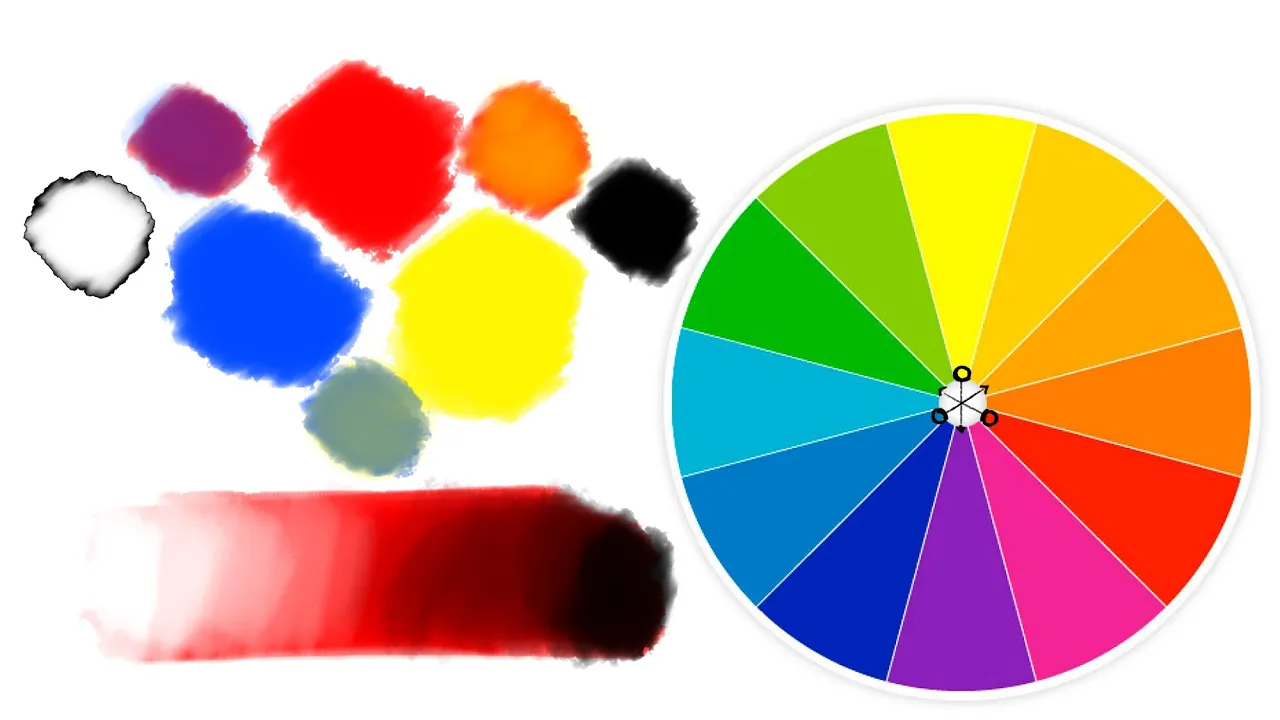
The colors we choose intentionally in our art direction or in our color grade is known as color design or color scheme and these can all be classified with the help of our good friend the color wheel.
Now while the study of how different colors impact our psychology while it can be very in-depth I want to instead focus on the practicality and how we can apply color theory in our films in the color grade.
And there's two ways I'm going to reveal this, one way using the built-in color tools and the other with Cinema Grade.
But first let's review some different color design or color schemes.
If you choose for your film a monochromatic or single hue color scheme, this means your film is tinted primarily with just one color, like this scene from Kill Bill.
An analogous color scheme, uses colors that sit next to each other on the color wheel, Wes Anderson's Moonrise Kingdom is an excellent example of this.
A Complementary color scheme, uses two colors that sit opposite to each other on the color wheel, the most famous instance of this is the famous Teal and Orange look we find in hundreds of film.
And the list goes on, there's split complementary, three way split, four way split.
You name it.
Now that you know some of these I suggest that you look for examples of different color schemes used in different films and see if you can identify what color schemes are being used.
Like I did recently.
I was watching the film Terminal, which is visually very interesting and has some beautiful art direction in it.
It didn't take long for me to realize that it uses all the different color schemes imaginable.
So it is a great case study for us!
For instance in this dinner scene here we see a hexadic color scheme, consisting of 6 different colors.
That's pretty difficult to find and accomplish.
Now there's two ways we can go about adding or affecting the color design in the color grade.
We can of course push colors into the tonal range using the color wheels.
Or we can alter or enhance the art direction using secondary or isolated correction tools and it's the latter method that I think we can have some fun with and explore different color schemes.
In this first example from the Terminal it has Cyan, Red, Yellow and Orange colors.
We can explore different color schemes easily with Cinema Grade, that works in Adobe Premiere, Final Cut Pro X and DaVinci Resolve on the Mac.
To change the color all I need to do is just click over the area I want to change, and drag up or down to change the color.
This is called Direct Grading on the image and let me quickly show you how it works.
To transform this image into an Analogous color scheme of magenta and blue I'll select HSL Vector Tool click over on this red area and drag to change it to magenta.
Then I'll click over the countertop and drag.
I'll tweak it selecting and dragging over a few more colors, and that's it.
As I toggle the correction on and off you can see we've turned this into an Analogous color scheme in the vectorscope.
Now I'll reset this and create a complementary color scheme of red and cyan with just with a few clicks.
And a badddda bing, baddda bang!!!! that looks great!
I'll reset that and now let's try a third scheme.
This time we'll give this image a Sin City vibe, with a monochromatic scheme based on orange.
I'll turn reds into orange and desaturate all the other hues.
Isn't that Awesome!?!
We can experiment with several different color schemes using the same image with Cinema Grade.
Of course this works a little bit different with the built in tools you'll find in Adobe Premiere, DaVinci Resolve and Final Cut Pro X but you can do the same thing.
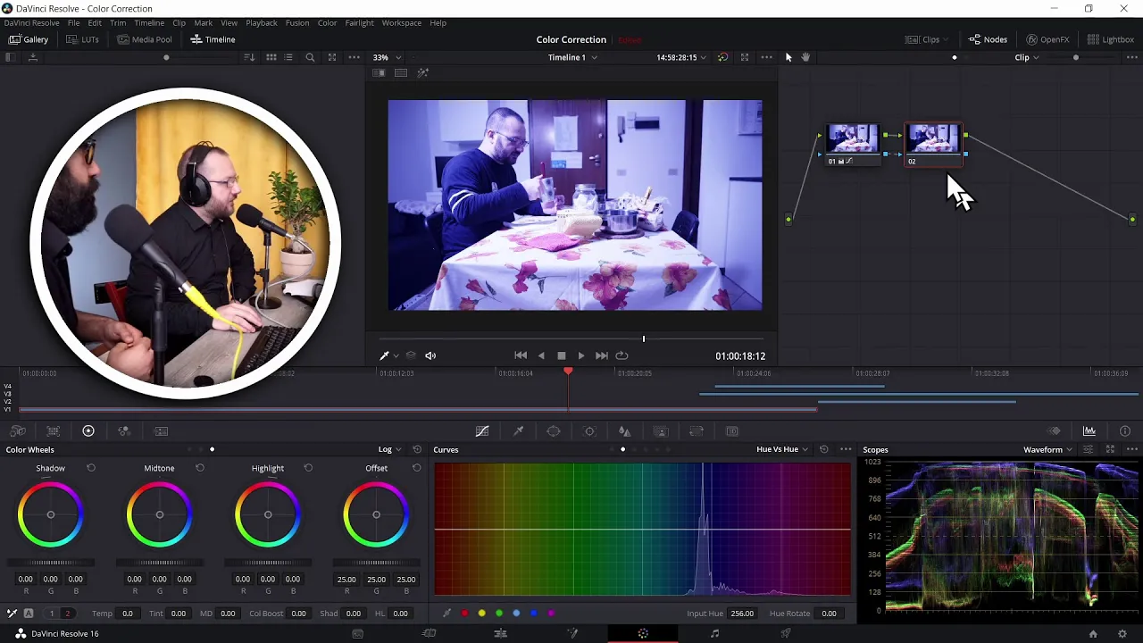
To do isolated corrections quickly we'll use the Hue vs Hue Curve.
Let's see how to do this.
Here in Resolve we have Simon Pegg looking quite surprised.
There is red, orange, cyan and blue on this image.
We can clearly see these colors represented in the Vectorscope.
Going to the Hue vs Hue Curve, Let's say we want to alter the complementary color design to give us more of a red and cyan color contrast.
To do that we'll click over a blue area to create a point for that range and drag the middle point up, moving those hues towards cyan.
We'll do the same for the orange hues moving them towards red.
We'll refine this by widening the hue selections a little bit and add some extra points until all hues fall into an intense red and cyan complementary color design.
Let's see the before and after a couple of times so you can see the color scheme represented in the vectorscope.
You can see in this new design the trace sits opposite each other on red and cyan.
Now in Premiere on this next clip you can see in the vectorscope that we have mainly red, green and blue.
So let's say we want to simplify the color scheme into an analogous color scheme where the colors all sit near red and orange.
We'll isolate the green and blue range with the help of the eyedropper and drag them up.
We'll create a point for red, so it remains unchanged and create a point for magenta and drag it down, moving it towards red.
And now we have an analogous scheme.
Let's watch the before and after a couple of times so we can see the change in the vectorscope.
Finally in our third example and this time inside Final Cut Pro X we have an image with red, orange, yellow and cyan.
Let's explore a Complementary color scheme made up of yellow and Blue.
First, we'll isolate the cyan range with the eyedropper over the cabinet doors.
And then we'll drag the middle point down moving the hue towards blue.
We'll refine our selections by widening the range.
Then we'll do the same for the orange and yellow hues, creating a few more points to refine the selection.
Lastly let's use the Hue vs Sat curve too, to reduce the saturation in the reds and greens.
Here's the before and after a couple of times so you can see the change in the vectorscope.
So that is how you can apply color theory and explore different color designs in your color grading.
As you can see you can do this with the built-in tools but it's a lot easier and intuitive when you can make those changes directly to the image with Cinema Grade.
Now if you're wondering what Cinema Grade is or you're a content creator that needs to do professional color grading but you don't have the time to specialize as a colorist it's a plugin that works inside of Premiere Pro, DaVinci Resolve and Final Cut Pro X on the Mac.
You can do all your color grading there with direct on screen grading, lightroom style controls, false color mode for landing the correct exposure and real time previews of LUTs and presets.
If you want to find out more about the Cinema Grade, you can either click on the card above or the link the description.
Now if you're on Windows or you just need step-by-step guide with the native tools.
I want to invite you to our 1-hour color grading workshop where I reveal my top grading secrets that have had the biggest impact on my career, you can either click the card above or click the link in the description below to save your seat.
I'll also point out that if color theory is something that you're into or you want to find out more about how to apply it in your color grading we cover that in-depth in our Color Grading Academy and we'll have a special offer for it at the end of the workshop.
So be sure to check out Cinema Grade or save your seat to the workshop, click the subscribe button and then the bell for more grading videos!
I hope you enjoyed this video, if it was helpful let me know in the comments below, if there's something you'd like to see or how to create the look of particular film, let me know and have a great day!
Cut!
Up Next
12:26
The Lighthouse Film Analysis: Horror and Cinematic Influences
@WatchMojo
188.6K views•2019-10-16
12:54
Triumph of Orthodoxy Icon: Byzantine Art & History Explained
@BenCallan
2.1K views•2024-08-06

9:49
FastAPI vs Flask vs Django: Choosing the Right Python Web Framework
@TechWithTim
302.5K views•2024-05-26

1:42
Game of Thrones Opening Credits: A Cinematic Analysis
@gameofthrones
46.3M views•2011-04-18
Related Study Plans & Knowledge Roadmaps
Structured learning paths in General & Interdisciplinary Studies
general-studies
Elevator Engineering: History, Physics & Cities
01From Hoists to Safety Brakes: The Dawn of Vertical Lift
02Hydraulic vs. Traction: The Engineering Physics of Elevators
03Modern Speed, Safety, and Algorithms
+ 2 more learning modules
12h5 modules
Explore Roadmap
general-studies
Rubber: Material Science, History & Geopolitics
01Origins of Natural Rubber & Mesoamerican History
02The Chemistry of Natural Rubber & Vulcanization
03The Geopolitics of the Rubber Boom & Colonization
+ 2 more learning modules
12h5 modules
Explore Roadmap
general-studies
Containerization: Evolution, Logistics & Trade
01Ancient Trade & Bulk Cargo: Amphorae to Barrels
02The Industrial Revolution & Cardboard Packaging
03The Containerization Revolution: Malcom McLean
+ 2 more learning modules
12h5 modules
Explore Roadmap
general-studies
Textile Tech: Evolution, Labor & Global Impact
01Pre-Industrial Textiles: Handloom & Cottage Industry
02Mechanization: The Spinning Jenny to the Power Loom
03The Factory System & Global Labor Transformation
+ 2 more learning modules
10h5 modules
Explore Roadmap