This video tutorial demonstrates how to construct Wildstyle graffiti lettering using two types of bars (thinner and thicker), showing how to connect and extend bars, position them before or after letters, and incorporate decorative bars that don't directly connect to the letters, using the name 'SALE' as an example.
Wildstyle Graffiti Construction with Bars: A Step-by-Step Tutorial
Added:Deep Dive
Understanding of basic letter structure and typography anatomy (the fundamental skeleton of standard alphabet letters).
Tipografia: Guia sobre Tipos - Aula 01 - Curso de Design
183.2K
Typography involves understanding glyphs—alphabetic signs designed for mechanical reproduction—and typographic families sharing common characteristics. Letters consist of anatomical elements including serifs (small leg strokes), junctions, spurs, openings, incisions, bars, legs, stems, and more. These elements are deliberately designed through study, explaining font costs. Ligatures connect two or more characters to improve readability, correcting issues like the letter 'i' dot appearing too high when adjacent to certain letters. Ligatures appear primarily in humanist fonts, not geometric ones.
Click to watch →
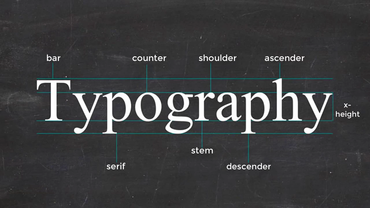
Typography: Anatomy of a Letter
143.6K
Understanding the basic anatomy of letterforms is essential for typography design, including the baseline (invisible line anchoring letters), stem (vertical stroke), ascender (upward stroke extending above the x-height), descender (downward stroke extending below the baseline), x-height (body size of lowercase letters), counters (enclosed or partially enclosed spaces), and the distinction between serif (with feet) and sans-serif (without feet) typefaces.
Click to watch →
![[CLASE] La Anatomía de la Tipografía](https://i.ytimg.com/vi/FcuZErED75A/maxresdefault.jpg)
[CLASE] La Anatomía de la Tipografía
36.7K
Typography anatomy is the study of letter structures, similar to human body anatomy. Each letter consists of identifiable parts that create solid, balanced, and proportional structures. Guide lines (baseline, x-height, capital line) establish the framework for letter design. Key components include stems (fundamental support structures), serifs (decorative strokes), ascenders and descenders (parts extending beyond main lines), counterforms (internal spaces), and distinctive features like ears, shoulders, openings, and tails. Understanding typography anatomy is essential for effective typographic design and proper typeface selection in visual communication projects.
Click to watch →
![[CLASE/LECTURE] TIPOGRAFÍA: Comunicación y Diseño – Anatomía y Clasificación – En Vivo (Live)](https://i.ytimg.com/vi/IQ1F0PGX6l0/maxresdefault.jpg)
[CLASE/LECTURE] TIPOGRAFÍA: Comunicación y Diseño – Anatomía y Clasificación – En Vivo (Live)
717
Typography anatomy is the complete detail to define all parts of a letter, with each letter having an important structure that defines its design as part of an alphabet. Understanding anatomy helps recognize that letters from the same typeface never have exactly equal structure, even uppercase and lowercase differ. Key parts include: arm (brazo) at the top, stem (hasta) in the center, and serifs (serifas) for classification. Learning these parts helps understand how they are visualized, as improper construction or manipulation makes characters incomprehensible and creates communication problems.
Click to watch →
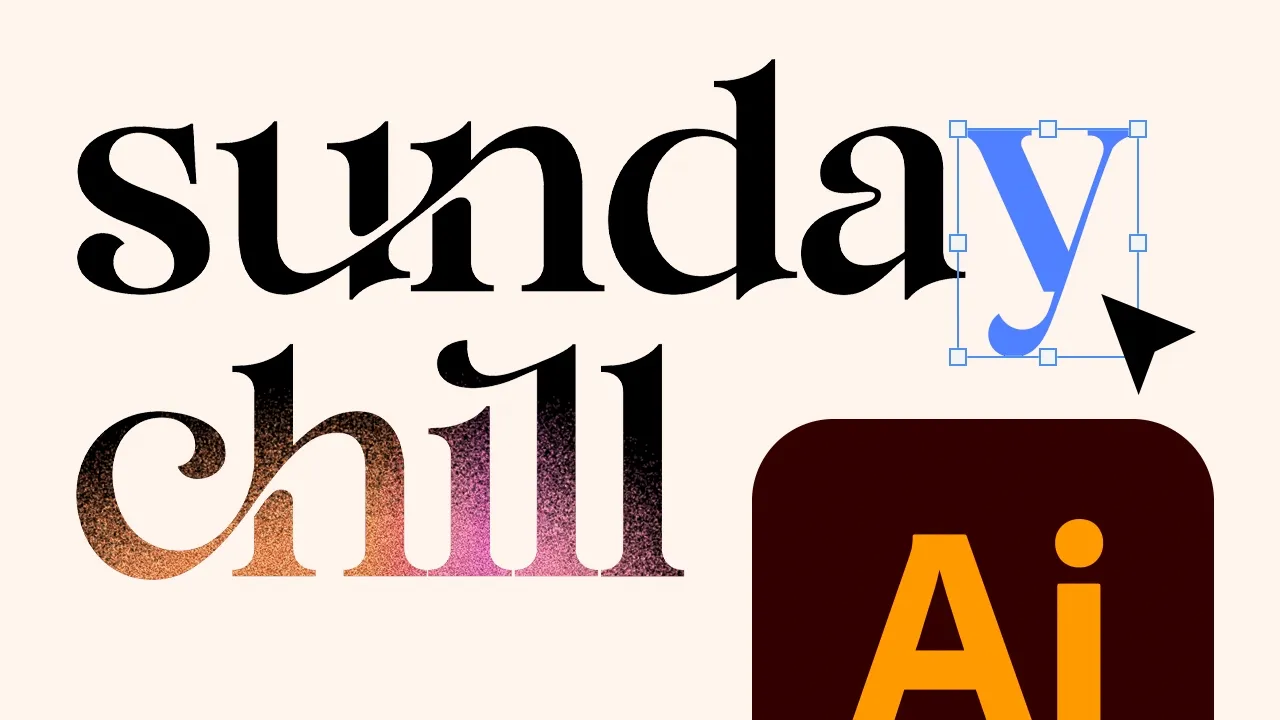
Typographic logo design | Adobe Illustrator tutorial
130.2K
Understanding type anatomy is essential for professional typography. The CAP line defines capital letter height and ascender peaks, while the X-height marks lowercase letter tops. The baseline anchors most letters, and the beard line supports descenders. Additional elements include stems, serifs, counters, ears, links, loops, brackets, terminals, bowls, spurs, ascenders, shoulders, and strokes. Designers should prioritize memorizing CAP line, X-height, baseline, beard line, ascenders, descenders, and serifs as these are most frequently referenced when discussing type.
Click to watch →
Deep Dive
Familiarity with the concept of letter weight, proportion, and spacing (kerning) in hand-drawn lettering.
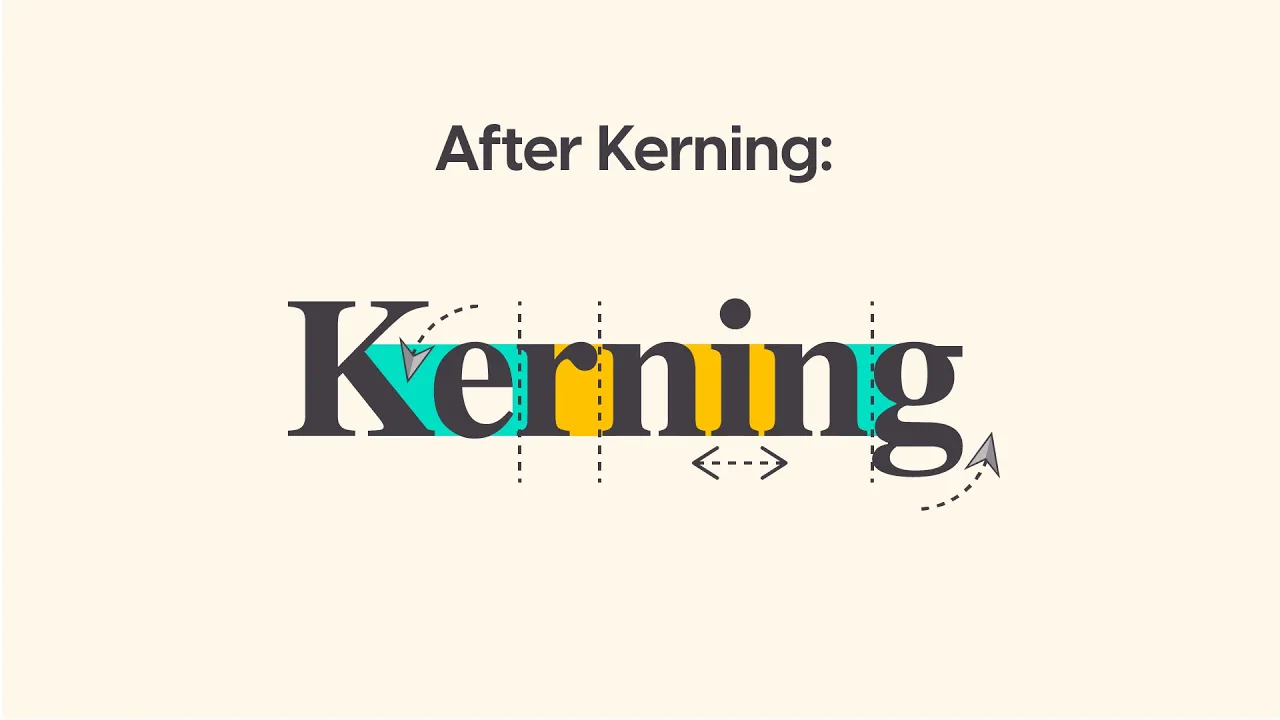
How To Kern Professionally. (Not many know this!) 🤯
316.5K
Kerning is the process of adjusting the space between specific character pairs in typography to create an even optical appearance, not a mathematically calculated one; designers should bring rounded letters slightly closer to straight letters (like 'g' and 'i') and use techniques such as applying blur effects or squinting to identify uneven spacing, practicing regularly to develop the visual intuition needed for professional type design.
Click to watch →
Four Easy T-Shirt Designs that Sell.
57.7K
Kerning is described as an art rather than a science. Rather than precisely measuring space between each letter, designers should focus on visual appeal. The instructor uses the analogy of pitchers holding liquid: each letter form should have roughly equal negative space between it and adjacent letters. Some letter pairs (like B and L) may need to be closer together than others (like L and a), depending on their shapes.
Click to watch →
5 MIND BLOWING Typography Tips For Designers 🤯
41.2K
This comprehensive section covers two essential typography skills. First, understanding kerning (space between individual characters) versus tracking (space between all characters). Type designers must kern letters because they don't appear evenly spaced even when mathematically correct. Use Option/Alt + arrow keys for adjustments, and the Character Panel for precise control. The mirror technique (press O, Option+click, Copy) reveals spacing problems by showing text as shapes rather than readable letters. Second, understanding Metrics vs Optical kerning: Metrics preserves the type designer's exact spacing, while Optical uses Adobe's algorithm for poorly designed fonts. Always use Metrics for body text to maintain legibility, and only use Optical for logo type or single-line headlines where you need to override the designer's kerning.
Click to watch →
Brand Identity Design Presentations and Critique - Young Guns EP 10
245.9K
Kerning refers to the spacing between individual letters in a word. Good kerning creates visual balance and readability. Difficult kerning pairs include diagonal letters next to open spaces (like T), and letters with legs like R and E. Designers should visualize letter spacing as filling space with sand to achieve proper volume. Customizing letterforms slightly can make a mark feel more unique and owned by the brand.
Click to watch →
Kerning - SPACING Letters in Design Space
90.8K
Kerning is the process of adjusting the spacing between individual letters in a word to create visually balanced and aesthetically pleasing text; in design software like Cricut Design Space, this involves ungrouping letters, manually spacing each character to prevent overlapping or excessive gaps, and then welding the letters together to create a single cut path for accurate cutting.
Click to watch →
Deep Dive
Basic knowledge of graffiti terminology, specifically distinguishing between tags, throw-ups, and burners.

GKae and Skert on Gabriel graffiti special
65.4K
Graffiti is a broad term encompassing different types of graffiti art. Tagging is the simplest form, involving just putting out a name or shout out. Graffiti represents a wider range of artistic styles and techniques. Graffiti art exists on different levels: throw ups are more sophisticated than simple tagging, while burners represent the highest level with elaborate murals requiring 10 minutes to whole days to complete. There are important distinctions between taggers (simple name-pouring), writers (artistic skill), and graffiti artists (sophisticated artwork). The debate centers on whether graffiti is art or vandalism, with property owners arguing that writers destroy property without permission, while writers argue they are expressing themselves creatively.
Click to watch →
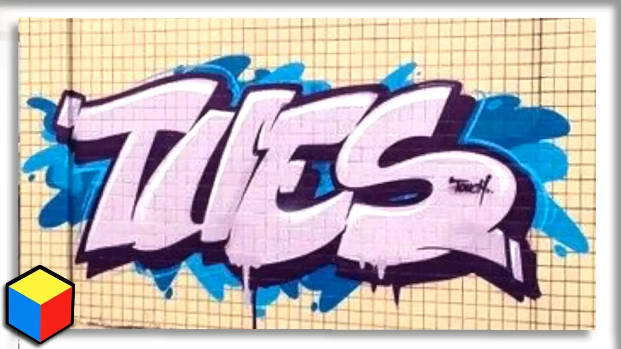
Graffiti - All You Need To know!
41.7K
In graffiti terminology, throw ups, straight letters, and wild styles all fall under the broader category of 'pieces.' These three represent subcategories within the piece hierarchy rather than separate categories. Burner rankings are subjective opinions based on context and surrounding work. Understanding this hierarchical structure helps clarify how graffiti evolves from simple throw ups through increasingly complex straight letters and pieces to the elaborate wild style expressions.
Click to watch →

Beat Street (Graff - Part01)
38.2K
In graffiti culture, a 'tag' is an artist's name or signature, while a 'burner' is a more elaborate and time-consuming piece of artwork; the film explains that 'face 2' was a pioneer who practically invented the concept of burners, transforming graffiti from simple tagging to complex artistic expressions.
Click to watch →
A-Z GRAFFITI SLANG // MUST KNOW WORDS for anyone getting into graffiti!!
604.5K
'Bombing' refers to going out and illegally doing graffiti in quick succession. This term typically applies only to tags, throw-ups, and quick cases rather than more elaborate pieces. The practice involves rapidly tagging multiple surfaces in a short period of time.
Click to watch →
FRENTE AL MURO :: GRAFFITI
60K
The video explains the evolution of graffiti terminology and styles. The 'tag' is described as the writer's signature, which can be from the same author or different authors. Writers began adding outlines (borders) to their tags, then developed 'flow' or 'throw-ups' - typically two-colored pieces that are more legible than basic tags. This progression represents graffiti's evolution from simple territorial marking to more complex artistic expression, with writers appropriating difficult-to-access public spaces for their 'street advertising.'
Click to watch →
Deep Dive
Fundamental drawing skills, including hand control for drawing clean lines and basic geometric shapes using pencils or markers.
Curso completo de dibujo GRATIS (Clase 1) TRAZOS, INTENSIDAD. Soltar la mano, dibujar fácil
59.6K
This lesson teaches the essential fundamentals of drawing, including proper pencil grip (thumb, index finger, and middle finger positioning), three pressure levels (strong, intermediate, and soft), and various stroke techniques such as gradients, curves, spirals, parallel lines, and perpendicular lines to develop hand fluency and control.
Click to watch →

► Draw - Free Online Art Lessons 2 for Kids and Adults- KlineStudios Art
69.2K
This lesson teaches pencil control through drawing basic shapes. Key principles include: (1) Draw lines slowly and keep them light initially, (2) Continue drawing until the line shows up, then stop, (3) Cross lines at corners to establish proper shape geometry, (4) Darken shapes by layering additional lines on top of each other while maintaining light pressure, (5) Circles are easier when using multiple light lines, (6) Initial lines will appear thick and uncontrolled but will become thinner with practice. Practice by drawing multiple shapes and papers to develop control.
Click to watch →

First Live| Basic of art| How to star art| #artlearning #learnart #artdrawing
105
Drawing requires only basic supplies: pencil, eraser, and notebook. Essential practice includes freehand lines, circles, ovals, horizontal and vertical lines. Mastering these basic elements—lines, circles, and ovals—forms the foundation for all drawing. Understanding objects as boxes helps create proper proportions. These fundamentals make complex drawings easier and develop hand coordination.
Click to watch →

Aprender a Dibujar desde Cero #1 | Arrancar con todo en el Dibujo
2.8M
This section covers the foundational exercises for developing hand control and geometric drawing skills. The first two exercises focus on overcoming hesitation and developing freehand line drawing, progressing to directional control. The third exercise emphasizes parallel line drawing in different directions, essential for accurate geometric shapes. The fourth exercise extends to drawing boxes, triangles, and trapezoids. These exercises build the fundamental hand control and observation skills necessary for all subsequent drawing techniques. Practice should be done consistently for about 5-15 minutes daily to develop muscle memory and confidence.
Click to watch →

Learn to Draw | 5 Basic Drawing Exercises | Basic Fundamentals | Draw with Asim
304
Mastering drawing fundamentals requires understanding basic shapes (figures, lines, circles) and proper hand control. Two main pencil grips exist: tight grip (like writing) provides control but causes hand fatigue, while loose grip enables smoother, continuous lines with less pressure. Continuous line drawing develops hand control and line quality. Freehand practice of basic shapes like circles, rectangles, and squares builds foundational skills. Breaking complex figures into smaller geometric parts helps understanding structure. Proper hand positioning and relaxed grip are essential for line control.
Click to watch →
Prerequisite Knowledge
- Concept 01Understanding of basic letter structure and typography anatomy (the fundamental skeleton of standard alphabet letters).
- Concept 02Familiarity with the concept of letter weight, proportion, and spacing (kerning) in hand-drawn lettering.
- Concept 03Basic knowledge of graffiti terminology, specifically distinguishing between tags, throw-ups, and burners.
- Concept 04Fundamental drawing skills, including hand control for drawing clean lines and basic geometric shapes using pencils or markers.
Subsequent Learning
- Step 01Integrating advanced decorative elements such as extensions, arrows, serifs, and bits to increase the complexity of the piece.
- Step 02Applying dimensional effects, including drop shadows, 3D block extrusion, and isometric perspective to the letterforms.
- Step 03Color theory and rendering techniques, including color transitions (fades), fill-in patterns, highlights, and outer glows (force fields).
- Step 04Translating sketchbook concepts to physical media, exploring spray paint techniques, can control, cap selection, and wall scaling.
Hip Hop Love
Musical Break
Sound Interlude
Urban Expression
Echoed Tones
Rhythmic Flow
Closing Vow
Hip Hop Love
2:03Playing Section
- 1
Repeated declarations of enduring love for hip hop culture.
- 2
Musical emphasis on emotional attachment and lifelong commitment.
- 3
Core theme centers on passion for the genre's essence.
Calligraphic Flow and 'Anti-Style' Rejection of Rigid Letter Construction
While bar construction is a popular, highly structured method for building complex wildstyle letters, many graffiti purists argue that this mechanical approach can lead to stiff, lifeless, and overly engineered pieces. An alternative, historically foundational perspective emphasizes natural calligraphic flow, known as "handstyle," where letters emerge organically from the movement of the wrist and arm rather than being assembled like architectural blocks. Additionally, the "Anti-Style" (or "Ignorant Style") movement actively rejects the perfectionism, geometric rules, and technical constraints of traditional wildstyle. Proponents of these alternative approaches argue that focusing heavily on rigid construction formulas stifles individual expression, raw energy, and the spontaneous, rebellious spirit that defines graffiti's origins. By prioritizing intuition, speed, and fluid motion over mechanical calculations, artists can achieve a more authentic and dynamic aesthetic.
Deep Dive
Integrating advanced decorative elements such as extensions, arrows, serifs, and bits to increase the complexity of the piece.

Graffiti Tutorial: Extra Doodads
28.3K
This section explores advanced stylistic elements that transform basic graffiti into dynamic pieces. After establishing 3D shapes, artists add lines using cutback techniques to maintain consistent thickness and create sharp, refined looks. Extensions or bits are arms extending from the main piece, starting where the piece has already started and flowing naturally. The instructor demonstrates adding arrows and bits, emphasizing that these elements should complement the letter's size and surface. The continuous flow principle applies here too - elements should go directly from the letter without breaking off. The instructor stresses that these are fundamental practices, not rigid rules, encouraging artists to develop their unique style.
Click to watch →

Tutorial - Graffiti wildstyle drawing and deconstruction
9.5K
Wildstyle graffiti is characterized by angular, spiky letter designs with decorative elements like serifs (additions to letter ends), extensions (bits flying off letters), and campers (chopped corners), where artists create congruent pieces with consistent flow and dynamic movement; mastering this style requires years of practice and deconstructing successful pieces to understand how elements fuse together.
Click to watch →
How To Do Extensions In Graffiti! (Full Breakdown Guide)
36.5K
Serifs in graffiti are also classified as extensions and fall into two categories. Structure-based serifs create variant structures by having the basic letter structure travel through the serif itself, making it an integral part of the letter's structural variation. Extension-based serifs are simply additional strokes to the letter that don't create variant structures. Both types maintain the three-anatomy structure of origin, travel distance, and destination.
Click to watch →
Making a LazerBlitz Level! ~ Building With Lemons - Geometry Dash
201.4K
Extended decorative elements can be created by combining multiple smaller decorative pieces. By taking existing decorative elements and extending them with additional components, designers can create more elaborate and visually striking decorations. This technique involves wrapping smaller elements with additional pieces to create larger, more complex decorative structures.
Click to watch →
GRAFFITI - EVERYTHING YOU NEED TO KNOW - (EXTENSIONS)!
20.4K
Serifs and compressed extensions follow the same formula as traditional extensions. However, because they are smaller, they almost always automatically flow at the destination and are easy to flow out of the origin. For compressed extensions, even if they don't flow out of the origin, it's extremely easy to have a reason for their travel distance.
Click to watch →
Deep Dive
Applying dimensional effects, including drop shadows, 3D block extrusion, and isometric perspective to the letterforms.

🔴 Best Hand Lettering Tutorial—With Dina Rodriguez
27.2K
This segment teaches drop shadow creation techniques, explaining that manual drawing of shadow lines using shift and option keys provides more control than Photoshop's built-in filter. The instructor demonstrates creating 3D extrusion effects by offsetting the original lettering and using that as a guide for shadow lines. The segment covers maintaining composition by shifting everything to keep the design centered after adding depth effects.
Click to watch →

How to make 3D Title Lettering? | Pixel Art Workflow
57.7K
To make flat lettering appear as solid 3D blocks, duplicate the original layer and shift the duplicate slightly toward the center relative to the original. This creates a drop shadow effect that suggests depth. Then fill in the gaps between the original and shadow with the same color to connect them, making the form appear unified and solid rather than just a flat silhouette with a shadow underneath.
Click to watch →

Inkstitch - Beginner's guide part 3 - Text and system fonts
21.7K
This section demonstrates creating dimensional text effects. Block cutaway effects are created by placing text inside a shape, using path difference to create cutouts, and changing the duplicate to stroke. Drop shadow effects are made by duplicating text, pulling the duplicate down, changing color to shadow-like, and using path difference to cut out the shadow. After creating the effect, trim objects using 'trim add command to selected objects trim thread' to properly merge the shadow and text.
Click to watch →
Art Attack - Series 3 (1992)
263.2K
Create 3D block lettering by drawing a shape, then drawing another slightly offset shape to the right and higher, joining the corners to create depth. The technique works for any shape including circles and letters. For colored block lettering, use different colored pens for different edges to create shadow effects. A two-in-one pen (pencil and pen taped together) can draw both outlines simultaneously.
Click to watch →
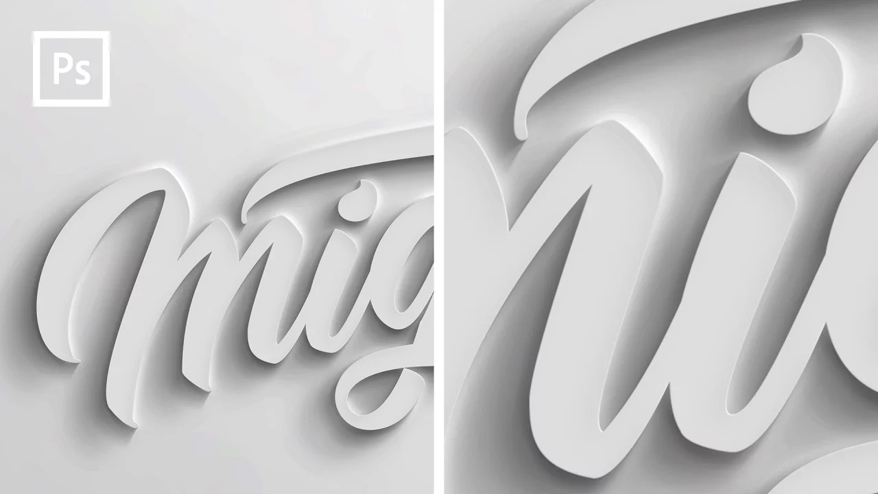
Photoshop Tutorials - How to make 3D text
1.2M
This comprehensive workflow covers creating a realistic 3D extrusion effect in Photoshop without 3D features. Begin by setting up a new document (3000x3000 pixels, RGB mode) and creating a soft gray background with gradient overlay simulating light from upper right. Eliminate banding by converting to Smart Object and applying noise (15-16px) followed by Gaussian blur (30px). Import custom text as Smart Object from Illustrator. Apply layered effects including Color Overlay (light gray), Drop Shadow (Overlay blend mode, 15% opacity), Inner Bevel (75% depth, 45° angle), and Inner Shadow (Linear Burn, 3% opacity). Create double cast shadows by duplicating text layers 20 times with progressive opacity reduction and blur increase. Import pre-made cast_shadow.psd file for automated shadow generation. Group all layers for organization before proceeding to final enhancements.
Click to watch →
Deep Dive
Color theory and rendering techniques, including color transitions (fades), fill-in patterns, highlights, and outer glows (force fields).
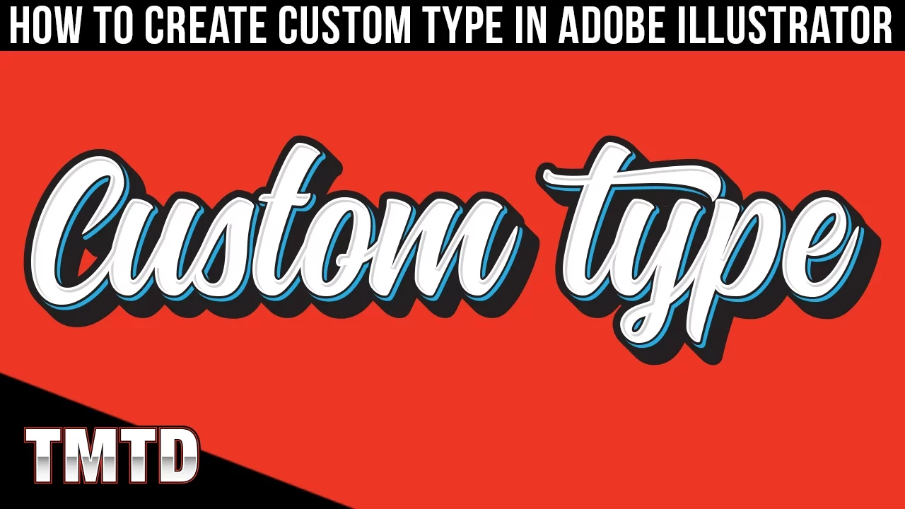
Illustrator Tutorials: How to Create Custom Type in Adobe Illustrator
111.9K
To create highlight or glow effects, select a fill in the Appearance panel, then click effects and choose Path Offset. Enter a negative value (e.g., -2 pixels) to create an inner glow effect. For outer glows, use positive values. Combining multiple fills with different path offsets and colors creates multi-layered highlight effects on text. Experimenting with positive and negative values controls whether the glow appears inside or outside the letterforms.
Click to watch →
10 Quick After Effects Techniques I LOVE
962.5K
To make fading transitions more visually interesting, add a Fill effect to the layer and keyframe its color while animating opacity. Keyframe the fill color at the transparent point (typically black or matching background) and change it to white (or another color) at the fully visible point. This creates a simultaneous color transition during fade-in/fade-out animations, adding visual interest without changing the overall appearance.
Click to watch →

Graffiti TUTORIAL at Lost Place | Full Process with helpful VOICE OVER
297.9K
Effective graffiti fill-in requires strategic color selection and application techniques. For a muddy, vintage style, artists use complementary colors like rusto coat, olive green, and dusty pink. Blue outlines create reflection effects, while dark white and light black provide natural-looking shadows and highlights. Artists should use as little paint as necessary, choosing appropriate spray caps—the calligraphy cap for large fill-ins and standard soft caps for general work. Strategic color layering creates depth. Non-standard color combinations produce unique results compared to conventional bright orange fading with blue outlines. Outlining requires strategic techniques: leaving portions of first lines visible during filling maintains orientation, and painting all outlines first before cutting is more efficient than traditional approaches.
Click to watch →
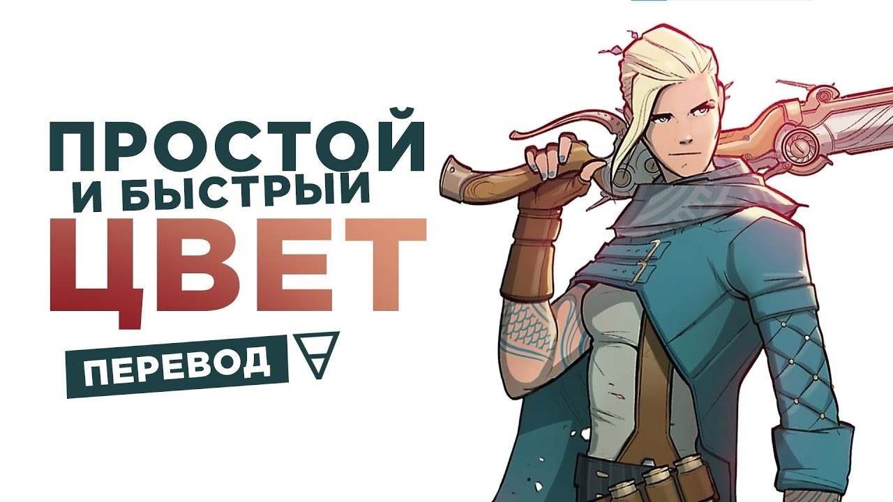
КРАСИМ ЛАЙН БЫСТРО и ПРОСТО
2.8K
This comprehensive section covers three essential rendering techniques that transform flat colors into a complete, professional artwork. First, shadows are added using a Multiply blend mode layer with a desaturated blue color, where the mask allows selective application and the blend mode ensures shadows adapt to any color changes below. Second, highlights use Screen blend mode to add metallic reflections and contour light along edges for cinematic effect. Third, a glow effect is created using warm colors in Screen mode with a soft brush on the mask to reveal subtle illumination along silhouette edges. These techniques work together to give the character volume, depth, and visual impact while maintaining a stylized appearance.
Click to watch →
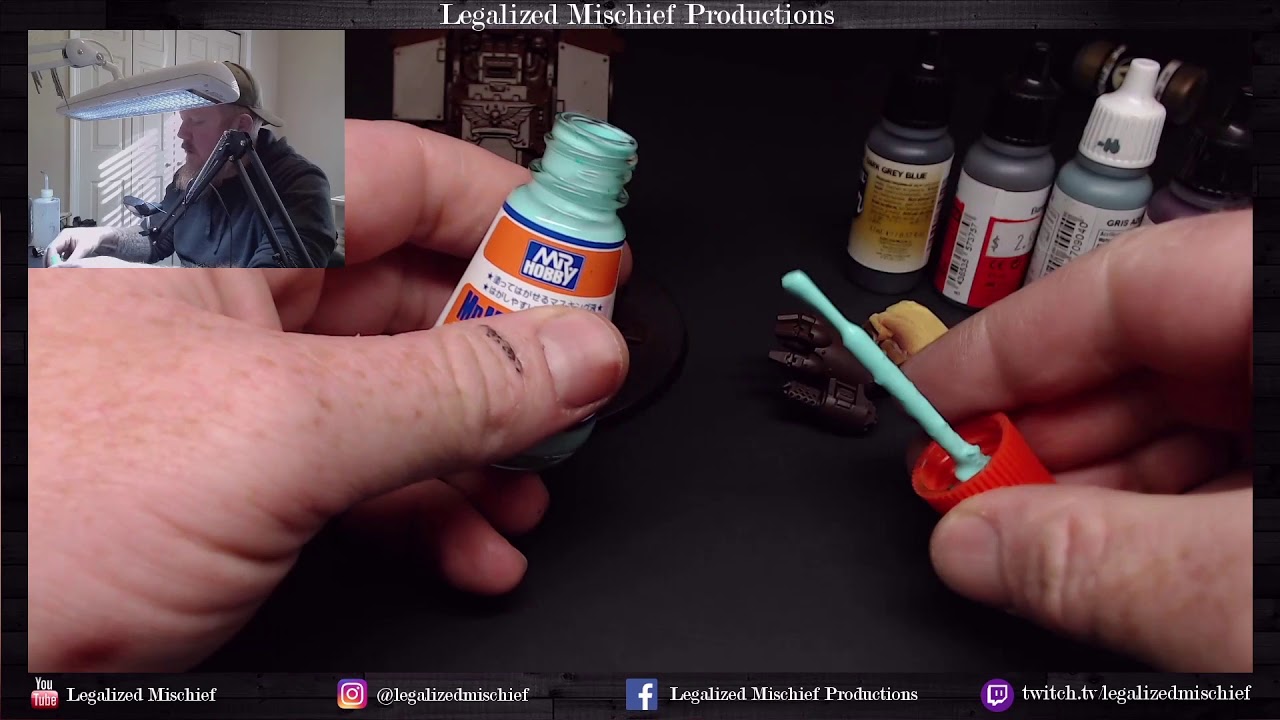
Space Wolf Redemptor Dreadnought Part 2 Storm Cloud Grey Armor
189
The glaze creates smooth transitions between shadow and highlight colors. The technique involves applying the glaze to even out transitions. The result is a smooth transition that looks like magic. Panel lines receive glaze application to enhance the transitions. The technique involves spraying at an angle to concentrate on the line between colors. This creates a much better transition between the shadow and highlight colors.
Click to watch →
Deep Dive
Translating sketchbook concepts to physical media, exploring spray paint techniques, can control, cap selection, and wall scaling.

LEARN HOW TO SPRAY PAINT! For beginners: Graffiti, Mural & Street Art Techniques - An Easy Tutorial
83K
Spray painting requires understanding cap types and basic control principles. Cream Skinny caps (similar to Montana Level One) are ideal for beginners, offering versatile performance for thin lines, thick lines, and quality fades. The fundamental rule is that distance and speed control line thickness—moving closer and faster creates thinner lines, while moving farther and slower produces thicker lines. Proper technique involves moving your hand before pressing the cap to prevent drips, and maintaining consistent body movement rather than relying solely on wrist motion. The three-step process includes sketching with white paint, filling colors from outside to inside, and applying the final outline last. Fading techniques create seamless color transitions by positioning yourself perpendicular to the edge where you want the gradient to flow, then spraying directly onto the boundary.
Click to watch →
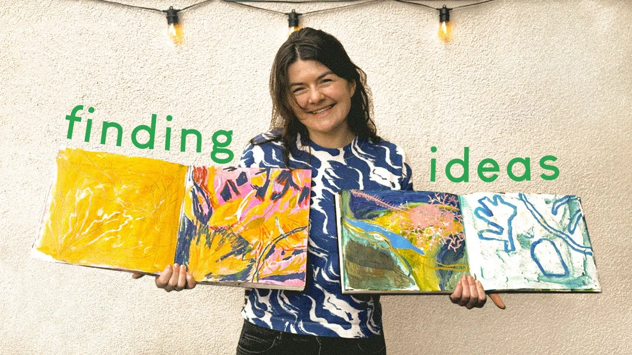
Overcoming perfectionism | Start painting before you feel ready
23.1K
Sketchbooks serve as organizational tools where artists can work with loose leaf paper and organize drawings into groups that make sense together. When selecting drawing media, artists should choose materials that reflect the quality of their subject—for example, using translucent media for clouds and heavier media for solid subjects like trees. The artist's personal style emerges through repeated practice, with elements like line work and scale manipulation becoming hallmarks. Starting simply with basic tools like chunky pens or charcoal helps warm up and develop hand movement.
Click to watch →
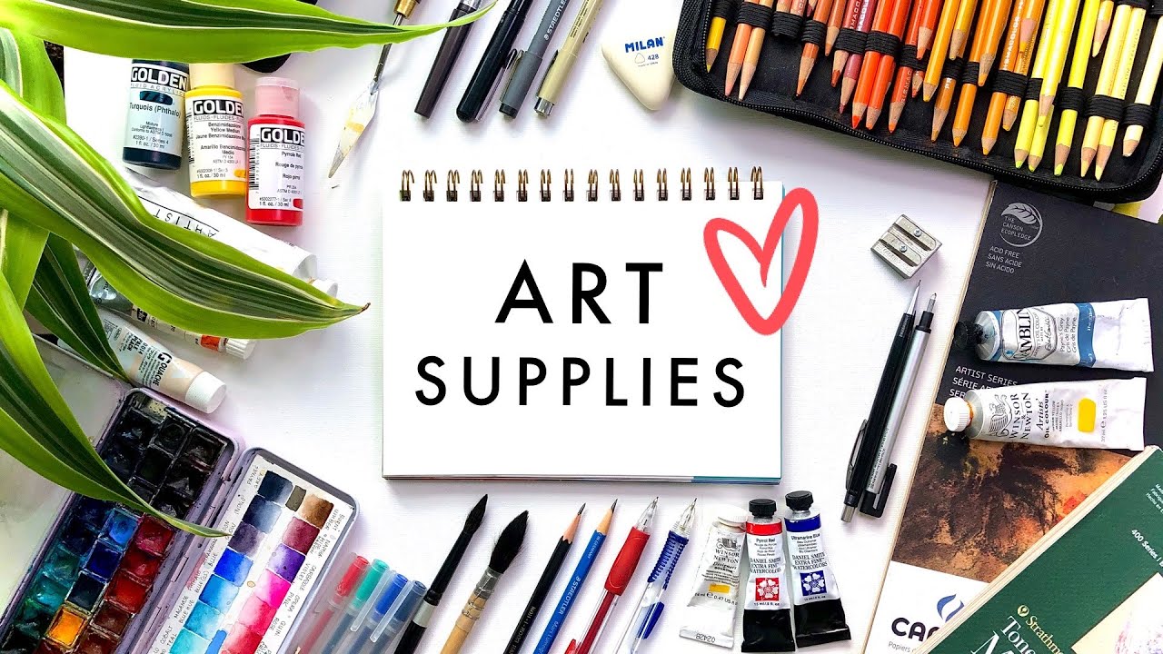
ART SUPPLIES | Tips + Demos | All Mediums!
657.8K
This section addresses paper selection for multi-medium artwork. Quality sketchbooks must accommodate wet media: Stillman & Birn Beta series offers flat-opening pages that hold watercolor beautifully. Leuchtturm 1917 provides compact durability. Moleskine watercolor sketchbooks feature landscape openings for panoramic views and handle all mediums excellently. Jane Davenport sketchbooks with canvas covers allow painting directly on the cover. Mixed media papers include Strathmore tone (184lb) for all paint mediums, Strathmore gray-toned variants, Canson, Arches watercolor pad (140lb cold pressed), and Fabriano Artistico 300lb for heavy applications. White tools like Uniball Sigma gel pens, Generals white pastel pencils, and White Prismacolor pencils create effective highlights on dark surfaces.
Click to watch →
Art Supplies I can't live without: my MUST HAVE Art Supplies!
17.6K
Three essential sketchbooks: Mol Skin Art (thicker paper, handles water better, $20), Strathmore Mixed Media Sketchbook (100% cotton, favorite watercolor sketchbook), and Royal Talons Art Creation Sketchbooks (super cheap, good for experimentation). Royal Talons comes in multiple sizes and colors. Blick Art Materials offers the best prices. The Strathmore is the whitest of all, while Royal Talons isn't really made to hold wet media but can handle it with some rippling.
Click to watch →

Real Time Web Series: Episode 2- Askew MSK
139.4K
Different spray caps serve different purposes in graffiti painting. The Widow Maker cap is versatile enough for filling, outlining, and creating various line widths. Green caps from sugar cans are useful for controlled skinny lines. Blaster caps are valued for splatter effects. The Astro cap (fat cap) allows artists to create lines transitioning from very wide to very skinny within a single stroke, a capability previously impossible with traditional caps. Mastering spray cap techniques requires understanding paint pressure and temperature control. High-pressure paints require techniques like spraying cans upside down to reduce pressure. Keeping paint cool prevents issues like fuzzy lines on hot days. Managing gas pressure in spray cans is crucial, with artists often releasing 20-30% of gas before use for better control.
Click to watch →
Hip Hop Love
Musical Break
Sound Interlude
Urban Expression
Echoed Tones
Rhythmic Flow
Closing Vow
Hip Hop Love
2:03- 1
Repeated declarations of enduring love for hip hop culture.
- 2
Musical emphasis on emotional attachment and lifelong commitment.
- 3
Core theme centers on passion for the genre's essence.
Calligraphic Flow and 'Anti-Style' Rejection of Rigid Letter Construction
While bar construction is a popular, highly structured method for building complex wildstyle letters, many graffiti purists argue that this mechanical approach can lead to stiff, lifeless, and overly engineered pieces. An alternative, historically foundational perspective emphasizes natural calligraphic flow, known as "handstyle," where letters emerge organically from the movement of the wrist and arm rather than being assembled like architectural blocks. Additionally, the "Anti-Style" (or "Ignorant Style") movement actively rejects the perfectionism, geometric rules, and technical constraints of traditional wildstyle. Proponents of these alternative approaches argue that focusing heavily on rigid construction formulas stifles individual expression, raw energy, and the spontaneous, rebellious spirit that defines graffiti's origins. By prioritizing intuition, speed, and fluid motion over mechanical calculations, artists can achieve a more authentic and dynamic aesthetic.
Understanding of basic letter structure and typography anatomy (the fundamental skeleton of standard alphabet letters).
Familiarity with the concept of letter weight, proportion, and spacing (kerning) in hand-drawn lettering.
Basic knowledge of graffiti terminology, specifically distinguishing between tags, throw-ups, and burners.
Fundamental drawing skills, including hand control for drawing clean lines and basic geometric shapes using pencils or markers.
Integrating advanced decorative elements such as extensions, arrows, serifs, and bits to increase the complexity of the piece.
Applying dimensional effects, including drop shadows, 3D block extrusion, and isometric perspective to the letterforms.
Color theory and rendering techniques, including color transitions (fades), fill-in patterns, highlights, and outer glows (force fields).
Translating sketchbook concepts to physical media, exploring spray paint techniques, can control, cap selection, and wall scaling.
54.7K views893likes18:27@MrGraffitiTutorialOriginal Release: 2015-01-27
[Music] [Music] hop I love [Music] you hip hop I love you hop I love you [Music] IP hop I love you I [Music] ah [Music] IOP I love [Music] you hip hop I love you [Music] hip hop I you till I [Music] ah [Music] you IOP you [Music] hop you [Music] H I love you till I die [Music] he a [Music] you [Music] bot [Music] a [Music] B [Music] he [Music] he a [Music] spe want talk see the blockx [Music] a [Music] a [Music] is [Music] he [Music] oh [Music] n [Music] n [Music] nah [Music] n [Music] n [Music] n [Music] [Music] n [Music] [Music] hop I love you [Music] IP hop I love you IOP [Music]
Up Next

10:53
1970s NYC Graffiti: Subway Art's Origins and Impact
@HezakyaNewz
37K views•2019-08-18
12:54
Triumph of Orthodoxy Icon: Byzantine Art & History Explained
@BenCallan
2.1K views•2024-08-06

9:49
FastAPI vs Flask vs Django: Choosing the Right Python Web Framework
@TechWithTim
302.5K views•2024-05-26

1:42
Game of Thrones Opening Credits: A Cinematic Analysis
@gameofthrones
46.3M views•2011-04-18
Related Study Plans & Knowledge Roadmaps
Structured learning paths in General & Interdisciplinary Studies
general-studies
Elevator Engineering: History, Physics & Cities
01From Hoists to Safety Brakes: The Dawn of Vertical Lift
02Hydraulic vs. Traction: The Engineering Physics of Elevators
03Modern Speed, Safety, and Algorithms
+ 2 more learning modules
12h5 modules
Explore Roadmap
general-studies
Rubber: Material Science, History & Geopolitics
01Origins of Natural Rubber & Mesoamerican History
02The Chemistry of Natural Rubber & Vulcanization
03The Geopolitics of the Rubber Boom & Colonization
+ 2 more learning modules
12h5 modules
Explore Roadmap
general-studies
Containerization: Evolution, Logistics & Trade
01Ancient Trade & Bulk Cargo: Amphorae to Barrels
02The Industrial Revolution & Cardboard Packaging
03The Containerization Revolution: Malcom McLean
+ 2 more learning modules
12h5 modules
Explore Roadmap
general-studies
Textile Tech: Evolution, Labor & Global Impact
01Pre-Industrial Textiles: Handloom & Cottage Industry
02Mechanization: The Spinning Jenny to the Power Loom
03The Factory System & Global Labor Transformation
+ 2 more learning modules
10h5 modules
Explore Roadmap