






















![[Paper Review] TimeXer: Empowering Transformers for Time Series Forecasting with Exogenous Variables](https://i.ytimg.com/vi/pv4CVdQGFZA/maxresdefault.jpg)








This tutorial demonstrates how to build a machine learning model for electricity demand forecasting using Python. The process involves importing and exploring a 5-year historical electricity dataset, performing data cleaning including handling missing values through forward fill, backward fill, and interpolation methods, creating engineered features such as lagged values (24-hour and 168-hour lags), rolling mean and standard deviation, and temporal features like quarter, week, and weekend indicators. The model uses XGBoost regressor for prediction, with evaluation metrics including RMSE and MAE. Visualization techniques including line charts, box plots, scatter plots, and heatmaps are employed to analyze patterns and correlations between demand, temperature, and other factors.
Electricity Demand Prediction with XGBoost: Complete ML Project in Python
Added:Hello friends, welcome to data science lovers. In this video, we will build a machine learning project that will predict the electricity demand in a city.
Here we have the historical data set of 5 years and we will use this data set to predict the future demand of electricity.
This is our complete project. Here we have imported our data set and we have used different functions like datetime function and set the date time as a index of our data frame. Then the describe function. Then we have check for missing values and handle the missing values. How to delete a row? How to delete a column.
Then we have used the fill method and bfield method. also the interpolate method.
Then we will learn how we can create a new column changing the data type of any column.
[Music] This is the filtering process.
Then we have make use of holidays module, [Music] the value count function [Music] and most importantly we have used the flagged features here in feature engineering.
the IO function [Music] also we have make use of rolling window to find out the rolling mean and rolling standard deviation.
Here we have draw the chart for the demand over the time. This is our box plot. Our second box plot and we have drawn the scatter plot. This is our confusion matrix and heat map.
[Music] Now we have start building our model. We are defining X and Y [Music] and we have used the XG boost model in this project.
We are initializing the model and training the model. Then we have making the predictions and visualize our predictions and saving our model in our local computer system.
[Music] We will import the pandas library for data exploration, data cleaning and data analysis part. Import pandas spd.
We will also import the numpy library because we will make some array here.
import numpy as np and we will also use the mattplot lip library to draw some charts or bar graphs.
Mplot lip py plot as plt and uh [Music] we will also use the seabone library for the visualization purpose.
import sebon as SNS and here we will also import a random module.
This random module will be used to create some random values.
Okay, we will run this and all the libraries will be imported in this Jupyter notebook.
For your information, the random module provides the functions for generating the random numbers.
Now we will import our data set here.
This is our data set.
In this data set there are multiple columns and if we see the rows there are about 43,000 rows in this data set. So to import the data set as you all know we have to copy its path. I can copy from here also and I can copy from properties also from here.
Copy. And to import the data set we have to use the pdread csv file.
And here we will paste the path of the file. To remove the uni code error we will write a small r here like this. The command has been executed. to have a look at our data set.
This is our data set. In this data set, we have nine different columns and about 43,848 rows.
The first column here is timestamp column. Here we have date, month and year and it is starting from 1st January 2020 and it is still 31st December 2024 means about 4 year data is here. Here the information we have is per our information or so here is at uh 1st January 2020 1:00 a.m. what was the demand at 2 a.m.
what was the demand? So like this. The third column here is day of the week.
These numbers 1 2 3 represents the Monday, Tuesday, Wednesday and all. And the fourth column is month January, February 1 to 12. And this is the year column 2020 till 2024.
And this is the day of year means first day of the year or second day of the year. As here we have 366 means 2024 was a leap year and here we have the temperature record wise you can see then we have humidity and we have the demand.
So based on this data we will build a model that will predict the demand for the next day, next week or next month.
Now let's check some basic informations about this data set and to check the information. We have the info function like this. It will show the basic information. Here it is showing that the range index are from 0 to 43 847. These are the indexes 0 to 43 847. By default the index start from zero.
And here are 43 848 entries or you can say records or rows. The data columns are total nine columns. These are the columns.
And it is showing non- null value counts means how many non-null values are present in each column. In our first column we have 43 848 non-null values which is equal to our actual entries. In second column we have 4 3 842 non-null values which is six less than our actual entries. Means in this column or column we have six null values or missing values. Similarly in our third column we have about 10 null or missing values.
Next it is showing the data type of each column. Our first time stamp column is of object data type. Here we will convert it into date time column and our other columns are of float data type.
Let's convert the data type of our first time stamp column to the datetime format or consider our column timestamp [Music] equal to and here we will use our pandas library pd in this library we will use the to date time function to date time and inside this function we will pass the column name and this is our column name. I will copy this and paste here.
And when we will run this, the command has been executed. If we run the info function again to check the basic information, then you can see that the data type of time stamp column is in datetime format.
Now, so it is simple.
Next, we will set this datetime column as the index of our data frame. Here if you see the index values are starting from zero to 43847 and now we will change our index and our time stamp column will be changed to our index of the data frame. So let's see how here we will use the set index function on our data frame. our data frame dot set index and inside this function we have to write the column name which we want to choose as our index. We want to choose time stamp here like this and we will save the result in our original data frame like this. When we will run this, the command has been executed. And if we have a look at our data frame now, you can see this timestamp column has become our index now. And the total value or the total count of column is changed from 9 to 8. Okay. Here if we notice there are nine columns and time stamp was present here. But now here we have eight columns and time stamp is present as our index of this data frame.
Now we can use the describe function to check the summary statistics of some numerical columns like temperature, humidity and demand.
So to consider a single column we can write like this in single square brackets. But to consider more than one column, we have to write in double square brackets like this. Here we have considered three columns. On these columns, we will use the describe function and it will show the result. Here it is showing the count means how many rows or records are present in this column. In temperature we have 43830 and in demand we have 43835 like this because there are missing values in this data set that we will handle later. The mean temperature is 25°C.
The humidity mean is 59 and similarly the mean of demand is 4le 9 or you can say about 5,000.
The standard deviation of each column.
The minimum value present in each column. The minimum temperature is three. The minimum humidity is 20. And minimum demand is here. And these are the percentiles.
And these are the percentiles. 25% 50% and 75% of the values of these columns.
This is the maximum value present in each column. 50 is the maximum temperature. 95 is the maximum humidity and demand is 10,715 which is maximum here. In short, if we see the describe function produces the summary statistics of all numerical columns, it checks for extreme outliers and large deviation etc. And for categorical data frame, it will show a simple summary of unique values and most frequently occurring values. Now we will check the how many missing values are present in each column using the isal function our data frame and on this data frame we will use the isal function like this and we will check the sum of all missing values. So we will use the sum function also with this. When we will run this it will show the count of all missing values in each column. In our hour column we have six missing values. In day of week we have 10 missing values.
And we have maximum missing values in temperature and humidity column which is 18. We can also show those records that contain any null values or missing values using the is na function or is null function. And the syntax will be our data frame name dot is na. Here I will use any function because we want to show all those records or all those rows which contain even a single missing value. So any and here I will pass X is equal to 1 because we want the output row wise. If when we will run this it will show the result like this in boolean format true and false. To get the desired output, we can pass our data frame name and put the this command in the square brackets like this. When we will run this, it will show the desired output.
These records are those records where we have even a single missing value in our column. This is the missing value. Here in this record we have missing value in year column and similarly other columns also like this one we have missing value in temperature and these all here when we see these four records all the values are missing here means we have to remove these four records from here and as we go down we can check the result like This in this row we have this missing value. Missing value is represented as n means not a number.
Similarly we can show all the records that contain all missing values. Okay.
So the syntax is almost same. Our data frame name dot is any function and this time we will use the all function instead of any function that we use above. Any function we use above and this time we will use the all function small a and x is equal to 1.
When we will run this, it will show the result in boolean format. To get the result in a data frame format, we will pass our data frame and we will include this command in the square brackets like this. It will show all four records where each value is missing in every column. Now we will drop all those records that contain all missing values.
Means we have to remove these four records. And for this we can use the drop p any function our data frame name drop any function.
And here we have to remove the rows where all values are missing. So we will use this function. Here we will use the how parameter. Let's see.
First of all we have to consider our data frame. On this data frame we have to use the drop any function. Inside this function, we have to tell the function what type of rows we want to delete. So in this case, we will have to remove the records where all values are missing. So I will pass parameter how equal to all. How equal to all. When we will run this, it will show the result after removing those records. We will save the result in our actual data frame. data equal to this and this is our data. Now here if we see we have 43,844 records earlier in our original data frame we have 43848 rows.
So we can notice that all four records are removed. Now we can copy this command and run this again. it will show no output because all four records are deleted now. Now if we check the count of missing values in each column again is null dot sum function then it is showing this output after removing the four records.
Now we have to deal with the missing values of these columns and for this we have two different functions. One is backward field, backward fill. The short form is B fill and we have another function which is forward fill and it is denoted by Fill.
So if we talk about backward fill or B fill it means suppose we have a value here 61 in this row and suppose this column has a missing value means this value is missing. So we have to fill this value with the backward field. So when we will use the backward field this 61 value will also be placed here. Here also we will have 61 means the value is moved or you can say is copied in the one row above. Okay. Similarly we have forward field. Suppose this value is missing here.
3012 is not present here and 3172 is present here. Suppose when we use forward fill on this demand column, this 3172 value will be copied at this place also. Means this value will be forwarded in the below row. So this is backward fill and forward fill.
Now in this data frame on some columns we will use the forward field and on other columns we will use the backward field. Suppose I will consider some columns here.
Our column on these columns are day of week, month, year, day of year. I will use the forward field.
So forward fill is denoted by fill. Fill function.
It is simple like this. When we will run this, the values are filled but the changes are not done in the original columns. So we have to consider the original columns once again here like this and equal to here the command has been executed and the changes has been done permanently. And on other columns the temperature and humidity column I can use the backward fill function B fill. It is simple running this. Sorry data frame is not defined. We have data here. The command has been executed.
And we again we have to save this in our horizontal columns like this. And the changes are done permanently in these two columns as well. Now one column is left here which is our demand column. On this column to fill the missing values we will consider a third function which is interpolate.
So first of all we will consider this column demand and on this column I will use interpolate function. In this function we will pass a parameter which is method and our method will be time here. So when we will run this the command has been executed. Now let's see what is this interpolate function.
The pandas library provides the interpolate method for series and data frames to fill the missing values in the time series data. As we have already this data in time series format. So this function or method will work well here.
This method offers various interpolation techniques to suit different data characteristics and requirements. Here we have used the time method. The time method is specifically designed for the time series data interpolating based on the actual time intervals between the observation and it requires a datetime index. Here we already have a datetime index. So this method is the perfect fit to fill the missing values in the demand column and we will make the changes in the column here also.
The command has been executed and all the missing values in each column are filled. Now if we check for missing value is null function dot sum then you can see there is no missing value in any column. And if we check the our shape of our data frame then we can use the shape method like this. It is showing that finally we have 43,844 rows and eight columns. Now we will do some feature engineering. Here we will create a new column quarter which will mention the quarter of the year. The first quarter, second, third or fourth quarter. Okay. And we will insert this quarter column after this day of the year column here. Okay. So how to do this? We have to consider our data frame. As you all know when we create a column, it is always created at the right hand side of the data frame.
But we have to insert the column after this day of the year column. So here we will use the insert function. And here in this insert function we have to pass our first parameter which will be index where we want to enter the column. As the index of the columns also starts from zero. The or is our index number zero. This is index number one, index number two, index number three and index number four. So we have to enter the quarter column at our index number five.
Okay. So I will pass five here. The second parameter our column name. Our column name simple will be quarter. In this quarter column we want the quarter from the year. So we will consider the time stamp index here our data frame name data dot index. From this index value we have to consider the quarter. So like this the command has been executed and when we will see our data frame now a new column has been inserted which is mentioning the quarter of the year. The January is present in first quarter and the December month is present in fourth quarter. Now in this data frame we can see the values in the columns are mentioned in the plot format. We can convert this into integer format.
using the a type function. So these values are in plot format. We can convert these columns into integer format.
We will convert the data type of these columns or day of the week, month, year and day of the year into the integer format. So we will consider these five columns. On these columns we can use type function. Inside this function we have to pass int here because we have to convert into integer. When we will run this sorry we have to pass our data frame name data here. When we will run this the values are converted into integer.
So we will save the changes in our original columns [Music] like this. The command has been executed and let's have a look now here you can see the data type has been converted into integer and this is our data frame now now we will create another column which is week of the year that will represent the week number means this particular date is from which week and this particular date is from which week of the year and the syntax as I told above our data frame name dot insert function first parameter our index number five here second parameter our column name which is week of here and third parameter what we want in this column means the values for this we have to use a special function which is isocaler to extract the week from this timestamp column. So we will consider this time stamp column our data this is our index as you know of the data frame. So we have to consider the index of this data frame and now iso calendar function. Let's see what is this isocaler function. The ISO calendarer function is used to extract the ISO year or week number or week day. Okay. So we have to extract the week number here.
So we can pass here week to extract the week of the year and we can also specify the data type here as as type int means we want the value in the integer format.
When we will run this the command has been executed and this is our data frame. Now here we have the column week of the year. Here it is showing that this is first week of the year. If we expand what we notice here is this date 29th December is from our week number 52. After this date the 30th December 2024 is considered in the first week of our next year which is 2025.
So it is showing one here. We can confirm this thing from the calendar here also. Okay. You can check this from here.
The next thing is we will create a new column to check whether the given date is a weekend or not.
So our data frame name dot insert and this time we will place the column at the index number seven. You can choose any index number of your choice.
Okay. And after this we have to mention the column name. And this time we will name the column as is weekend means the given date falls on any weekend or not. Okay. Next thing we will use this index of time stamp means this date we will use data dot index and from here we will consider the day of week means Monday Tuesday Wednesday or Saturday Sunday. If I show you in this data frame, the Monday is considered as zero, Tuesday 1, Wednesday 2 and Saturday and Sunday are considered as five and six respectively. So we have to check whether it is a five or six. Okay, in this index date column. So for this we will use the is in function. is in and here we will mention the value 5, 6 means we want to consider Saturday and Sunday.
When we will run this, the command has been executed. Now let's have a look at our data frame. We have a new column is weakened. It is showing false and true means in boolean format.
and we can change it into the integer format.
One method to change the data type of this column was that we can insert H type function here like this. It will automatically give the result in the integer format only. But when we will run this now, it will show error because at index number seven, this column has been already created. So now we can't use this function. So now we have to change this data type in our another line of code by considering this column is weekend is weekend and dot hashtype int.
The command has been executed. When we have a look at our data frame now the values are in the form of zero and one.
Zero means there is no weekend and when one is present means it is a weekend. We can check this also using the filtering weak and and equal equal to we want those records where the value is one.
Okay, it is for showing in true and false means boolean and to get the result in a data frame format we can write like this.
So means on 4th January 2020 it was a weekend also on 29th December 2024 it was a weekend.
Next we can check whether on a given date there is a public holiday or not.
For this we have to import the holiday package. Now what is this holiday package? If we see here the holiday package it is available in pandas library. This package offers a comprehensive solution for identifying public holidays across over 80 countries. Okay. So we have to specify our country here while using this package and it allows user to check if a specific date falls on a public holiday for a given country. You have to mention your country and you can also mention your subdivision and it can be easily integrated with pandas data frame to add holiday information to time series data. So let's see how to add a holiday column.
import holidays.
Now using this package holiday first we have to mention the country for which we want to add the public holidays. I want to add the public holidays for India and the short form here is in.
After this we have a parameter which is years means for which year we want to check the public holidays. And here I want to check the public holidays from 2020 till 2024. So simply I will mention this column here our data frame and year column. Okay. When we will run this it will show the result like this. It will show all the holidays present in the given years. Now we will save the information in a new column of our data frame. Suppose the column name is holidays only.
holidays equal to this one. Okay. Now when we have a look at our data frame, it will show the result like this. Where n is present means there is no holiday while other days are holidays.
[Music] In this project, we don't want to use this holiday column. So we will simply remove this column from our data frame.
And the syntax will be data dot drop and our column name holidays.
And we will pass x is equal to 1 because we have to remove the column. The command has been executed. We will save this in our original data frame. And this is our data. Now you can use this older column as per your requirement.
Next we will create some lagged features.
What are these lagged features? Let's first understand these are the past values of a time series data.
Uh I will show some example also what is the use of the lack features here in this project. Here the past demand values are the our strong predictors means these values can be used as input to predict future values. The lag features enable the models to learn from the historical data and improve the forecasting accuracy.
Now let's see how to create the lack features with an example. Suppose we have a data the sales data and uh it is a time series of daily sales from Monday to Sunday and we created a new lag features. In this lag features we will mention the sales of the last day means here we will have a lag of one.
For first value it will see the sale of last day as we don't have the sales of the previous day. So we have to mention here zero. On Tuesday we have to check the sale of last day. Means Monday the sale was 20. So 20 will be mentioned here. Similarly on Wednesday it will be 45 because the sale was 45 here and so on. Here we will have the sale of 50 then 30 then 75 and then 90. So this is our newly created the lagged features with a lag or you can say step of one.
Similarly, we can have a lag of two and it would represent the sales from the two days ago and so on. In this case, we will create two length features. First for the demand from the same or yesterday or you can say last day and second feature for the demand from the same or last week. Our first column will be the data and demand lag 24hour means what was the demand 24 hours ago. In this we will use the demand column data demand. On this demand column we will use a function known as shift. The shift function is used to create the lagged features. Here we want the demand 24 hours ago. So I will pass a step or you can say lag of 24 like this. And we will run this. And if we have a look at our data now, this is our new demand lag features which will show the demand from the previous time point. Here if we expand this data frame.
Okay. In this column here we have a value of 2716 which is shifted from here the last time point of 24 hours ago and we have a value of 2 3 02 here which is shifted from here from the last 24 hours ago. So that's how the lag features are created.
Here we have 24 null values because we don't have the data of the previous day.
Okay. So whenever you will create a lag features, there will be some missing values or the few missing values in the starting.
We will create one more feature here that will show the demands uh for the last 168 hours or you can say 1 week.
Okay. So data my column name will be you can choose any column name. I am choosing here demand lag 168 hours.
It will be equal to the 1 week.
And here we will consider the demand column again.
And this time we will shift the value to 168. Okay.
24 hours into 7 days. So 168 hours for weekly shift. When we will run this, the new column has been created. And if we have a look at our data frame, this is our new column. Demand lag 168 hours.
In this column as well, the first few rows don't have any value because we don't have the data of the last week from this from this time series.
For first week it is showing nothing.
Let's check the values of this column.
Let's say after 168 hours. So I will take a sample using the IO function. So here we will use the IO function and we will consider the only row slicing or record slicing.
So we can write our data frame name dot.
Here we have to pass the index value. I want to check for index from 160 8 till we can put any random number till suppose 200. So it will show the values.
Let's change this to 160. Okay. Here you can see it is showing the result from 7th January 2020.
168 hours will be completed from this date 7th January. Okay. And if we check here the value it is not a number but after completing 168 hours on 8th January 2020 and we will check this we will check this row here we have a value of 2716 then 232 and this is the same value if you notice that we have in the first week of the data.
2716 23 02. So this is just for cross check purpose.
Next we will create two more columns in this data frame. First one is for rolling mean and second column will be for rolling standard deviation.
First understand what is this rolling mean and rolling standard deviation.
These are the parts of a rolling statistics in time series analysis.
Rolling statistics in time series analysis involves the calculation of statistical measures like mean, standard deviation or sum over a moving window of data points. If we talk about rolling mean then it is also known as moving average and it is a time series analysis technique that calculates the average of a subset of data points within a sliding window. I will show this with an example in Excel sheet. And this window moves across the time series creating a sequence of averages that smooth out short-term fluctuations and we will underline trends as in our actual data frame. Suppose this is our data for first 24 hours from here. Okay. And I will highlight this for first 24 hours.
And when I check the rolling mean or you can say mean of first 24 hours the mean temperature we can consider here for this. Here it is showing that the mean average temperature is 10.2. Okay we will note it here 10.2.
Now we will move our window of this 24hour from this second point to the next second point. Okay. And here it is showing also 10.2.
Now we will move again our window from third point to the this third point. Here it is showing that the mean average is 9.7. So this window will keep moving and it will show the result for each subset of our data points.
If we do the same thing the rolling mean for the demand column then consider these first 24 values the mean is coming 3809.
I will write here like something and our window will move to the next 24 values.
We start from here and end till here.
Here the mean is coming 37 98.
37 and what was 37 37 98. Okay. So and it will then move to the third window from here till here. And here this time the mean is coming 3742 [Music] 42. Okay. So this is the concept of rolling mean window.
Let's create a column for the demand rolling mean for last 24 hours. So my column name here I am choosing demand [Music] rolling mean and I am choosing a window of 24 hours.
You can put any column name here of your choice. In this column what we want? We have to consider the demand column. The demand column which is our target column also data demand and on this column we have to use a function which is rolling function.
Inside this function we have to pass the window value means how many values or how many subsets we want to take in a single window.
We want a window of 24 because we have our wise data. So I am taking 24 here.
Okay. And after taking these values, what we want? We want the mean of these values. So we will use the mean function on this. When we will run this, the command has been executed. And if we have a look at our data frame, this is our data frame. And the demand rolling mean is now created.
Let's see first uh 27 records for an example here.
I will expand this and the rolling mean is here 3809.
It is the sum of these values starting from 2716 and till 2896.
And this is our window of 24 hours.
Okay.
And for the next values starting from 23 02 till uh here 2 4 33 the mean value will be 3798 and this is equal to our these values that I explained earlier. Okay.
Similarly we will create a new column that will mention the standard deviation for 24 hours. So my column name demand rolling mean sorry rolling standard deviation this time and 24hour equal to data and I have to consider demand column again dot rolling and the window size will be same 24 and this time we have to use the standard deviation function std Okay.
And run this. The command has been executed. Again, if we have a look at our data frame, the column has been created. Demand rolling standard deviation for 24 hours.
This value uh let me expand this. And here this value 959 is the mean is the standard deviation of for last 24 values. Okay. last or you can say last 24 records of this data frame and it is considering the demand column. So from here starting from 2716 it is considering till this one 2896 and it is showing the value 959.
In the next window, it will take the first value as 23 02 and the last value as 2 433 and the result will be 975.
Okay. So that's how the standard deviation and mean rolling windows will be created.
Next part is we will drop all the rows that have the null values. As you can see here these rows have null values. So we can simply remove these rows to make our model accurate. So our data frame name dot drop na function and it will remove all the rows having any non value and we will save this in our original data frame. And this is our data frame.
Okay.
Now our data set is starting from the date 8th January 2020.
You should know why it is starting from 8th January and the reason is this one that we choose the column demand lag 168 hours. When we created this column, you remember the values till 7th January 2020 there was the null values in this column. So we have dropped all these columns which is containing any null value and starting from 8th January 2020 we don't have any null value in any row.
Now come to the visualization part here.
Okay, we will draw a plot which will show the row demand over the time and we will consider our demand column for this purpose and dot plot. Here we will set the size of our figure using the fix size function and I am setting it as 15x 6.
And we can also give the title to our plot. And let's choose the title electricity demand over time and plt dot show.
So the command is running here and it is the output. It is showing electricity demand over the time from the year 2020 till the year end of 2024. Okay, means December 24.
And here we have the maximum demand. And you can notice here about 10,000 megawatt.
Uh let's give the naming to the x-axis and y axis.
The naming given to x-axis is year and the naming given to y-axis is demand in megawatt. After running this, this is our output. It is year and it is demand in megawatt. Here if you see at the starting month of the 2020 means January, February, March it is cold. So the demand is less and as the time or month goes the demand increases because in summers the demand increases everywhere and similarly it goes down in winter again and it goes up and in winter the demand is low and in summer the demand is high in each year. Now we will visualize the demand by all of the day. For this we will create a box plot here. So first of all using the mattplot li I will set the size of the figure.
Now using the seon library SNS we will draw a box plot and here first parameter we have data. This is our parameter name and this is our actual data frame name.
Okay. So don't confuse with it. And we will have our next parameter x-axis on x-axis. What we want? we want over here.
Next we have on y-axis on y-axis we want demand. Okay. So this is our box plot and we can give the title to this box plot and I am mentioning the title here demand by or of the day.
[Music] Okay. Now we can use the plt dot.show show or we can simply put a semicolon at the end of this command and after running this it is our box plot and it is showing demand by hour of the day starting from zero till 23 and it is the demand on y-axis from 2,00 to 10,000 megawatt in a box plot this upper t represent the maximum value while this lower t represent the minimum value for each hour. Okay. And this strong line represents the median.
And this line represents Q1 or you can say quartile one means 25% values of the all values are below this value. And this upper line this one represent Q3 means the 25 values of all the values falls above this particular Q3 value. And these points you can see here are the outliers. Okay. After seeing this graph we notice that at 700 p.m. which is 19 we have the maximum demand. Okay. From here and it is about 9,000 megawatt. Okay. and minimum demand is present at 3:00 a.m. in the morning which is about uh you can say 1,800 megawatt. So that's how we can read the box plot.
Similarly using the box plot we can visualize the demand by month. So again use the metplot lily library to set the figure. Then we will use the seabone library to draw the box plot. SNS dotbox plot. And we have to give our data.
First of all, our data is stored in variable data. So I'm passing here.
Next, we want the x-axis. On x-axis, we want month this time. And on y-axis, we want demand only.
And we can rename the plot elt.title.
title demand by month.
Okay. At last plt dot show.
So this is the demand by month and it is showing the months from 1st to 12th January to December. And this is the demand on y-axis.
And this one point is our outlier.
And we notice here that in the month of July or the 7th month we have the maximum demand which is reaching above 10,000 while in the month of December here or you can say in month of January we have the least demand and these are the minimum and maximum demand per month and this is the median.
Next, we can draw a scatter plot representing the demand versus temperature using the figure function.
Setting the figure size 10x 6 and we will use the C1 library and scatter plot.
In this plot, our first parameter is data. Here the second parameter is on X-axis. On x-axis we want to show the temperature. On y-axis we want to show the demand.
Here I can use one more parameter which is alpha. Alpha is used to set the transparency of the points. Okay. So and it value is from 0 to 1. Okay. So I can set a medium value suppose 0.5.
Then we can give a title for this plot also.
Here we can give demand versus temperature. At last plt dot show running this it will show the demand versus temperature in the form of a scatter plot. As you can see as the temperature is increasing the demand is also increasing.
And it is obvious because in summer or in high temperature we use more AC, more cooler, more fan. Okay. And these points are the outliers. When the temperature is about 10°C or below 10°, the demand is about 2,000 megawatt only. And when the temperature is 30°C, the demand is also increasing. and it is increasing from 3,000 to about 6,500 and we have the maximum demand here uh at 50° C of about 8,200 megawatt.
Next, we will draw a correlation matrix to show the correlation between different numerical features of this data set. And the correlation matrix is uh used for understanding the linear relationship between the different features of a data frame. So let's see first of all we have to consider our data frame data and this co r function means correlation is used to draw a correlation matrix. When we will run this, it will show the output like this in the form of a data frame you can say.
And we can draw a heat map also for this correlation. And first of all, we will set the figure size for the heat map. So I have set the size of the figure as 12 by 8. And now using the C1 library, we will draw a heat map for this correlation matrix heat map. Our first parameter in the heat map will be our correlation matrix. This one. Okay, I am removing this from here now. And we want to also show these numbers in our heat map. So I can use a parameter not equal to true. When we will run this, this is the heat map for the correlation matrix. We can make it more readable by reducing these decimals points using the parameter FMT. I am setting it to two decimal points. So I can write 2F like this. Okay. And plt dot show.
[Music] Now it will look like this. Here 2F means you can see after the decimal it is showing the value till two points only and not true means it is showing these numeric numbers in this heat map.
Okay. Now I can set the title for this matrix heat map and plt.title.
Here I have set the title as correlation matrix of features. So after running this this is our title. Now try to understand this correlation matrix.
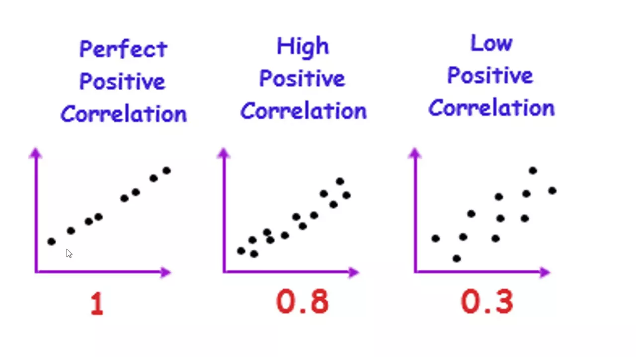
Here we have our main target variable which is demand. We have to check the correlation of this column demand with our other columns. The range of the correlation matrix lies between minus1 to 1 and if there is one means the two features are positively correlated. If the value of one column increases then automatically the value of second column increases and if the correlation matrix the value is minus1 means the two features are inversely correlated. If value of one feature increase then the value of second column will decrease. If we check this demand column, it is showing 0.04 means this this demand column is you can say highly correlated with this hour column. By this correlation of demand and hour column, we can conclude that that the demand is highly depending on the hour of the day. Next, if we consider this demand column with the temperature, it is showing 0.83 83 which is near about 1 means the demand is also correlated positively with the temperature column. As the temperature increases the demand will also increase.
Here also the demand lag 24 hours and these are the correlation and it is also negatively correlated with is weekend column and day of the week column. The diagonal of a correlation matrix always show a value of one. Now this visualization part of this project is also completed. So we can move forward to build our prediction model. As you all know in any model we have two type of variables. One is dependent variable means the target variable and others are the independent variables.
The target variable or dependent variable is denoted by Y. And here Y.
Let's have a look at our data.
At the end of the project, we have to forecast the demand. So this will be our target variable or dependent variable.
So our Y here will be data dot demand.
Okay. Now we have to consider the independent variables and independent variables we can denote with X from this data frame. One variable is target variable. So our all other remaining columns or variables will be considered as our independent variables and we will save this in a X. Okay. Now to consider those remaining columns, we will simply drop the demand column from this data frame. Okay, here our data frame is considered. On this data frame, I have used a drop function.
Inside this drop function, I have mentioned the demand column.
Here we have to pass another parameter x is equal to 1 because we are considering the columns here. Okay, when we will run this, the command has been executed. And if we have a look at our X and Y, suppose this is our target variable. So this is Y values and our independent variables.
These are our independent variables.
Okay, to have a better look, simply write X here. So here, if you notice in X, we don't have the demand column. Here I have written for your reference Y as the target variable or dependent variable and X as the independent variables or features or predictors.
Now we will split the data set into training and testing data with a ratio of 80 by 20 means our 80% of data will be our training data and rest 20% of data will be our testing data. First of all, we will create our X train.
X train equal to and here we will consider this X data frame. This one and we will use the LO function. Inside this LO function, we will consider the records till uh end of 2023 that will be 80% of our total records here. So we will mention the date here 2023 and December 31st when we will run this.
Now have a look at our extra.
This is our X train from 8th January 2020 till 31st December 2023.
Now I will try to explain this X train here. Suppose we have this whole data frame including X and Y. These features or these columns are considered as X and this single column demand is considered as Y. Now we have to split the data into a ratio of 80 by 20. We have the records from 2020 till 2024.
So we have to split these records in a ratio of 80 by 20. So in our X train if you see I have considered from starting till 31st December 2023. So here we will consider from here from starting 2020 until the end of 2023 and all the x variables will be considered here and this this area or these columns will be our x train I will mention here as x train.
Okay, after creating this X train, now we will create the Y train.
And for this we will consider the y here our target variable. And again we will use log function. And inside this log function we will start from our first row and till the again 31st December 2023 which is up to our 8% of data set. And when we have a look at our y train it will look like this. It is from 8th January 2020 till 31st December 2023 the same date. Okay. Now if we go again here here we have this value from 2020 till 2023 80% of y column is considered as our y rate.
Here we can simply write it is our Y train. Okay.
Next we will create our testing data set. Our X test and Y test. First create the X test.
For this we will consider our X data frame. Again we will use the log function. And here this time we will use the data from starting of 2024 till the end of 2024. So here we have to mention our starting date and our starting date will be 2024 and January and 1st January. Okay. when we will run this here by mistake I have typed the testing data set but in actual it is training data set okay 80% is training data so change it here training data okay and this is x text is our testing data and it is 20% of the data set okay 20% of our data set as testing data Now if we go here again this x text is this much area okay from starting of 2024 till the end of 2024 it is 20% of our total x and again I can write here x test okay draw the X text like this. It is considering from 1st January 2024 till 31st December 2024 which is our this data set and it is 20% of our actual data set. Similarly, we will create our Y test.
For Y test, we will consider our Y variable Y do.lo LO function and on this log function we will mention again the date from where we want to consider and we want to consider from 2024 and January 1st and colon after colon we will keep the blank to consider all the records till the end of this data.
Run this and this is our Y test from 1st January 2024 till 31st December 2024.
This is our Y test.
[Music] Okay.
Now we have X train X test Y train and Y test. We can check the shape print and x train dot shape it is total this one and and similarly y train shape it is this one. Okay.
And similarly we can check the shape of test data set X test and Y test.
It is our 80% of data and it is our 20% of data.
Here we have 34,892 records and 14 columns. While in Y train we have only 34,000 records and there is only single column which is Y itself. So it is blank here. Similarly here we have 14 columns and in Y test we have single column the Y itself.
Now we will use the XG boost model here for the forecasting because the reason is simple. SG boost is a powerful algorithm for the time series forecasting as it can handle the nonlinear data easily and it can also handle the seasonality and trends in the time series data effectively. First of all from XG boost library we will import a class known as XGB regressor. XGB It is running here. The command has been executed. In simple terms, you can say from the toolbox which is SG boost. Here we are importing a tool which is SGB regressor. It is a class and it is designed for the problems where we have to predict a continuous numerical value.
Next is from skarn library we will import two fundamental metrics and first one is our mean squared error metric mean [Music] squared error and our second fundamental metric is mean absolute error mean mean absolute error. These two metrics are used to evaluate the performance of our model. We will run this again.
The matrix are imported. Now next is from the skarn library we have a module called model selection and from this module we will import a class the time series split and run this and the class is imported.
Now this time series split class performs appropriate cross validation when we deal with the time series data set.
Next we will initialize and train our XG boost model with some specified sets of hyperparameters.
Start with model XGB and here we will make use of this XGB regressor class.
XGB regressor and here we will pass our hyperparameters.
Our first hyperparameter will be n estimators n estimator.
Here we will set the number as 1,000.
This hyperparameter n estimators defines the number of trays that the model will build. Here the range should be from 100 to 1,000 only because too high range will leads to a problem of overfitting while too low range will leads to a problem of underfitting model. The next parameter we have here is early stopping rounds and we will set it to a value of 50.
This is a regularization technique that helps prevent overfitting of the model.
Our next hyperparameter is learning rate.
and we will set our learning rate at 0.01.
[Music] The learning rate denoted by this symbol is a hyperparameter that determines the step size taken during the optimization process of the model.
In simple terms, the learning rate determines the contribution of each individual tree to the final prediction.
A smaller learning rate might be slower but it will show more accurate updates while a higher learning rate can speed up the training but may lead to the overfitting problem. Our next parameter is random state.
the random state and we can set it as 42 here. Setting a random state ensures that the same sequence of the random numbers is generated each time the model is trained. Our next parameter here is objective and we will set it like regression and squared error.
This parameter specifies the loss function to be minimized during our training. And this item regression squared error here indicates that the model is being trained for a regression problem where the goal is to predict a continuous numerical value which is our demand column or the target variable.
And now we will run this.
The model has been initialized. In short, we can explain this above code like this. The XGB regressor initialization creates a model that will train up to,000 boosting rounds or,000 trees. But it will stop early if the performance on a validation set doesn't improve for the 50 consecutive rounds which are decided by our hyperparameter early stopping rounds. Next, each T contribution is scaled down by a learning rate of 0.01. Means the learning rate is set as 0.01 here to prevent the overfitting of the model.
And at last this model is designed to minimize the squared error for the regression task.
Now let's start training our model.
Here model XGB dot fit function. We will use inside this function. First of all we will pass the X train.
Then we will pass Y train X train and Y train we have defined above. The next parameter is to provide the evaluation sets and eval set equal to and this parameter provides the evaluation sets that XG boost model uses to monitor the model's performance during the training. Here we have two evaluation sets. First one is X train, Y train and the second set is S test and Y test.
[Music] This is our first evaluation set and this is our second evaluation set. And the last parameter we can set as verbose equal to false. Setting the verbose equal to false means we don't want to see the model running here or we don't want to see any message during its running process and we will run this.
Now the model has been running.
[Music] So this is the output and our model is ready now for the prediction tasks.
Let's create a variable that will store the output of our prediction and this variable name.
It can be of your choice. I am naming it as prediction XGP.
Now I will make use of my model that I trained above model_xgp and on this model I will use the predict function to make the prediction and this time we will predict the data from x text. Okay. Now we will evaluate our model with these two evaluation matrix that we import here.
Mean squared error and mean absolute error. So I will create my first variable root mean square error for this XGB model. And here in this I will make use of numpy library to make the square root of our first matrix mean squared error. I will copy from here mean squared error and paste here only like this. Okay. And here in this we will have our y test and our predictions.
This this prediction variable.
Second, I will create another variable mean absolute error for this XGB model. And in this I will make use of my second matrix mean absolute error. I will copy this and paste here.
And inside this we will make use of y test and again this prediction variable we will run this.
The command has been executed.
Now let's print the result of RMSSE and MAE.
Oh like this. Okay. So our RMSSA value is coming about 167.67 while our MAE mean absolute error is coming about 125.
Here the RMSE value is higher than the MAE value which is a common occurrence.
Now the final step is we will visualize our predictions using Mplot library.
First set the size of our figure. Here we will draw two different plots. One for the actual demand and second plot for the our projected demand. So plt do.plot first create a chart for our actual demand. For this on x-axis we will consider our index from the y test.
Okay. And on a y-axis we will consider the values from y test.
And we can also give the label to this chart like actual demand.
And let's give a color suppose blue.
Now if I run this then it will show the output like this.
We can use plt.t show here.
Okay. So this is our actual demand in our testing data set that starts from 1st January 2024 and end at December 2024.
Next we will plot the predicted demands.
So plt do.plot plot on x-axis the values will be same y test index but on y-axis this time we will mention our the predicted values and our predicted values here from this one so I can simply copy this and paste here okay and we can also give the label Let's set the label as XG boost predicted demands or you can say simply predicted values or predicted demand whatever you want to choose. And this time we will give the color to red to differentiate easily.
And when we will run this, you can see the blue color we have the uh the actual demand while in red color we have the predicted demand. And we can change the line style of this predicted demand.
[Music] Suppose we can give it as hash.
Okay. like this.
We can also give the title to this plot.
PLT.title execute electricity demand prediction.
Running this. This is our title. We can also mention our X level and Y level.
Suppose our X level is we are setting as date because date is mentioned here and on Y level we are mentioning the demand.
Running this. Here we have date and here we have demand. We can also set the legend here. PLT dot legend. Okay, legend function. So here we have the actual demand denoted by blue color while the predicted demand is denoted by the red color.
From here we can easily notice that our predicted demand values are approximately equal to the actual demand value. So means this model is working well.
Finally we will save our model and to save the model. We will make use of the joblib library and we will import this import job liib.
Okay.
From this job library, we will use the dump function. Inside this dump function, we will pass our model name.
And our model name here is model_xgb.
We can copy and paste here.
Next, we have to mention our file name.
I am giving file name as electricity uh XGB prediction model. You can name anything.
And here we will use the extension p.
Okay.
When we will run this, the command has been executed and it is showing the output like this.
We can locate this file on our computer system. Here if you see in this folder we have this model electricity demand XGB model dotp extension and it is showing that the type is pkl file.
pkl is the short form for ple file.
Now whenever we want to use this model for prediction, we can simply load this in this Jupyter notebook and use this and this is how we can load this model.
Using the job library, we will use the load function. Inside this function, we will pass the file name, the pickle file name that we saved above. Okay, so that's how we can load this model.
And the model is loaded.
And if we run this, it will show the output like this. Okay. So that's all friends for this video. I hope that you have learned too many things from this project and you will implement this project in real time. Thanks for watching.
[Music]
Up Next

TensorFlow 2.0 Tutorial: Getting Started with Keras for Deep Learning
@KGPTalkie
58.2K views•2019-08-28

Introduction to Secure Multiparty Computation with Yehuda Lindell
@fhe_org
7.7K views•2021-02-04

HTTP Requests Explained: GET, POST, PUT, DELETE
@codecademy
103.1K views•2021-10-07

Enigma Machine Mechanics: WWII Encryption Explained
@JaredOwen
13.2M views•2021-12-11
Related Study Plans & Knowledge Roadmaps
Structured learning paths in Computer Science