




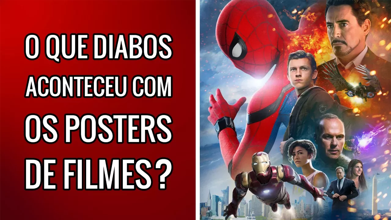
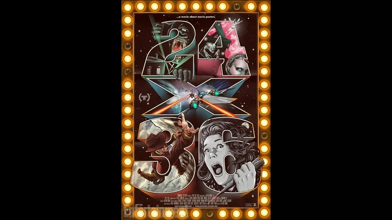












Movie poster design has evolved significantly across different eras and genres, with each period developing distinct visual characteristics: the 1950s featured hand-tinted styles, prominent names, and 50s graphic design aesthetics; the 1970s embraced dramatic black-and-white fashion photography and sexy approaches; disaster films utilized minimalism and grand scale perspectives; cult exploitation posters featured exaggerated blood splatters and non-commercial storytelling; and international styles like Japanese kaiju posters incorporated kanji and collage techniques, while Polish posters maintained hand-drawn typography and silhouette-based storytelling emphasizing expression over pure advertising.
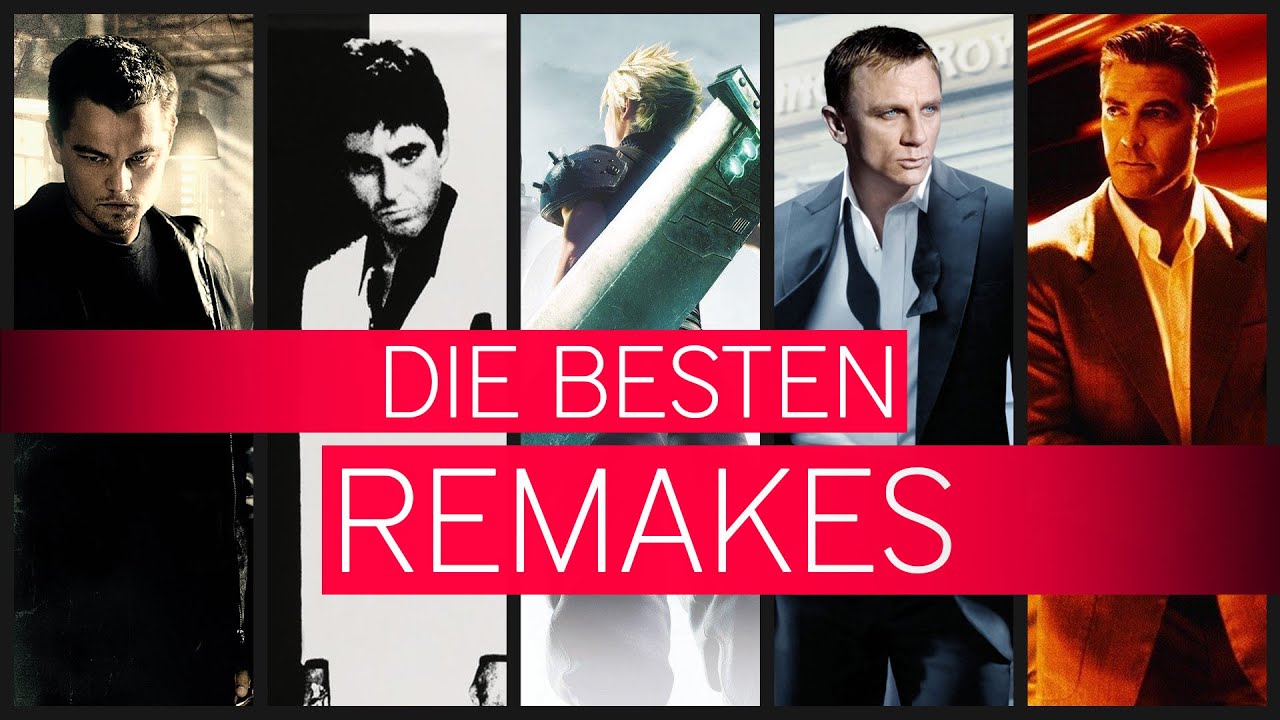
Movie Poster Remakes vs. Originals: Design Decoded
Added:Basic principles of graphic design, including color theory, composition, visual hierarchy, and typography.
An understanding of visual rhetoric and semiotics (how images and visual symbols convey meaning and evoke emotional responses).
The historical evolution of film marketing, particularly the transition from hand-illustrated movie key art to digital photography and compositing.
The concept of cinematic remakes and how film narratives and aesthetic styles are adapted to fit changing cultural contexts over different eras.
Deconstructing genre-specific design tropes to analyze how different genres (such as horror, science fiction, or comedy) communicate their identity visually.
Practical application of digital compositing and layout tools (e.g., Adobe Creative Suite) to design original or reimagined film key art.
Investigating modern digital marketing analytics and A/B testing, including how streaming platforms personalize poster thumbnails based on user data.
Studying the ethical and legal frameworks of design, including intellectual property, copyright, and visual homage versus plagiarism in marketing.
286.7K views8.1Klikes10:59Original Release: 2019-01-28
hello my name is James Berta Soto I'm a movie poster artist I've been designing posters for over 30 years today we're gonna compare original posters to their remakes let's take a look at Ocean's eleven so in this case you have this kind of hand tinted style from the 50s these little running icons the environment is very much from the 50s pulp novel universe the names are very prominently featured and the logo passes very 50s graphic design aesthetic let's take a look at the remake I designed this poster our company chose this direction because we knew that the director wanted us to stay within this 50s aesthetic let's take a look at the vertigo poster this poster was designed by Saul Bass he's the most copied graphic designer and movie poster art and we were inspired by this aesthetic these octagons here kind of a very reminiscent of the spiral in the background the black and white running icon reminiscent of the walking grouping that we have here again that the font itself has a very 50s aesthetic here it's more hand-drawn they kind of tended more modern and contemporary also the use of negative spaces in the same arena [Music] this 1950s aesthetic which comes from the samba school of graphic design utilizes the black and white high contrast imagery the different color flat color shapes used throughout these puzzle pieces that almost form this narrative being created using graphic design let's look at Saul boxes poster for the man with the Golden Arm as you can see the color palettes are very similar you have this hand-drawn type there's a font called a Saul Bass font now that incorporates this fifties jagged movement you also have these panels which are creating a border that's central to the logo and using the language of graphic design to sell a story what you can see here is this dagger that's the main element of the poster these very hard angular shapes and broken-down deconstruction of the dagger is very similar to these puzzle pieces the use of negative space is very much from the solve a school of design let's look at one more solve ass design for anatomy of a murder the typography here is integrated which is kind of a signature of Stahl boss this actually could be in a museum I'm not sure if this could be in a museum but the same graphic design aesthetic is utilized I think because the actors are featured it becomes more of an advertisement and a piece of art you can tell this movie came out more recently because of the font and the typography has a very commercial so usually when the stars aren't big enough to carry the whole film they start introducing a story element or trying to create some artful interpretation of the story in this case the fragmented dagger creates a psychological narrative that's occurring this is the original 1937 release poster the one thing that really captures that era is this curve type this curve angle here creates a stage for these characters to emerge from this golden light and the use of illustration and this hand-drawn quality gives these human emotional characteristics to the story you really have this embrace of the two characters and it sells a love story front and center this 1954 version incorporates the element of collage collage and having your star front and center is very much from that era a Judy Garland was a huge star at the time from a marketing perspective the experience of musicals and singing and dancing as a promise of entertainment seems to dominated the cell compared to the previous one that featured the love story here you're selling this kind of Technicolor world of multiple storylines and multiple elements that take this to a new perspective what you can see here is this typography from the 70s which is reminiscent of that era with the borders and a diagonal type also the photography in this is very glamorous provocative moment which feels like a fashion at a new way of selling your stars front and center here you have another element that's very prevalent in 70s movie poster advertising which is a secondary story cell you also have these water device that connects to the logo which is very much a 70s aesthetic also the gradients of color against this posterized photo effect let's take a look good a couple of fashion photos from the 70s a lighting this very dramatic black and white contrasting photography that's shown here it's a new way of showing celebrities on a poster the sexy approach is something that was a big trend in the 70s here again you have incorporated the black and white fashion aesthetic in the photography the very human connection between the two characters which draws you into the poster the use of negative space which allows your eye to go to the center of the poster the main aspect of this poster is the star cell engaging this human moment Lady Gaga is featured more prominently than Bradley Cooper but their connection is very much the main draw of this poster and there are two parts of an equal partnership let's compare this to walk the line there's the guitar which is an obvious connection is very intimate moment they both promise a musical romance in the star is born the use of gold brings it into the oscar academy stratosphere this is a Japanese poster for Godzilla this is a kaiju movie many movie titles released at this time or about science experiments gone wrong what stands out most for me here is the use of the photography there's no clear perspective being utilized is just a collage of multiple characters there's a fax coming out of the Godzilla's mouths are very minimal and downplayed but it works you also have a very fake looking monster before trays this can be underground pop aesthetic here you can see this suggestion of the creature the scale is portrayed by the smaller scale of the secondary element this is a promise of like a major special-effects experience and the copy line promises that and also the typography has that very Hollywood action aesthetic this is reminiscent of disaster films from the late 90s the scale of the poster is very dramatic in all three cases if you notice the copy line is prominent similar to Godzilla there's a sense of less is more where you're showing less but you're invoking a big epic disaster and this foreboding nature of something big coming you have this grand scale perspective minimalism but I think resonates and these three posters in a similar way that Godzilla does what's interesting about this off the bat is the use of the kanji that brings it into that underground Japanese pop culture the environment these missiles coming down in the sky hitting the character has a promise of action the fire brewing behind the landscape the fact that the the character is walking away is drawing the viewer in the campaign for this release also incorporated fan art which is an example of how a studio release is able to speak to a wide audience but also stay connected to the fan base if we look at all three Godzilla posters side by side you can see how this original release has influenced a lot of the fan art this one is wrought in the Hollywood perspective in the grand scale of action films from Hollywood and this one has a more of a quiet understated quality to it this cult exploitation design is captured very powerfully here the Whitewater reminiscent of the 70s you know have like The Scream which is the horror genre meets the kind of the cult quality of just of the logo the use of block and this kind of exaggerated copy sell is very much from that era let's compare this to some cult releases from that era this exploitation copy sell seems to be a driving force in all of these posters all these three posters have that 70 border aesthetic framing this as a non studio horror release if you look at the typography here it's kind of a throwback quality to it the exaggerated blood splatters come from that exploitation era and also the female character used in an exploitive manner you also have this unusual language of storytelling here that's not commercial at all that goes back to the cold retro quality that you would not find in most traditional advertising in this day and age and that's the artistic qualities that most polish posters have if you look at the Polish poster for eight and a half you have the hand-drawn typography which is very much from the school of Polish poster advertising the use of black and white line art here with the eyes most polish posters even up to today or portrayed in the illustration style and also the idea of one world within the other you have a silhouette and you have this illustration displaying a story here you have the silhouette of the blood and then you have the illustration there's playing the story both of these posters emphasize expression over advertising
Up Next
24:07
Four Essential Elements of a Movie Opening Scene
@ToonOfficialYT
246K views•2025-11-20

23:14
Visual Analysis Essay: How to Analyze Graphic Novels in College Writing
@nataliepleimann5941
1K views•2020-10-14
4:55
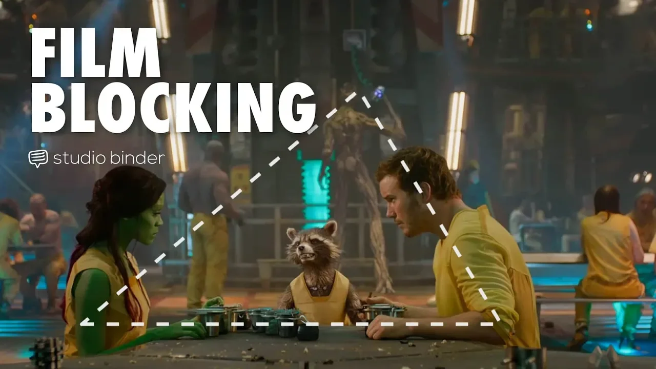
Film Blocking Techniques for Directors: Space, Shapes, Lines
@StudioBinder
1.9M views•2018-07-23

4:00
Evolution of Darth Vader: Anakin Skywalker's Animated Journey Across Star Wars Films
@TellItAnimated
13.4M views•2019-03-30
Related Study Plans & Knowledge Roadmaps
Structured learning paths in Film Analysis
film-analysis
Sensory Cinema: Foley, Haptic Sound & Texture
01Introduction to Film Sound and Foley Artistry
02Micro-Sounds, Textures, and Extreme Amplification
03Haptic Audition and Film Phenomenology
+ 1 more learning modules
12h4 modules
Explore Roadmap
film-analysis
Breaking the Fourth Wall: Mockumentary & Satire
01The Invisible Wall: Basics of Cinematic Illusion
02Looking at the Lens: Direct Address & Character Glances
03The Mockumentary: Satire, Realism, and Complicity
+ 2 more learning modules
12h5 modules
Explore Roadmap
film-analysis
Analyzing the Long Take: Cinema, Space & Ethics
01Foundations of Film Grammar: Montage vs. The Long Take
02Choreography and Mechanics of the Simulated One-Shot
03Phenomenology of Film: Real-Time Spatial Continuity
+ 1 more learning modules
14h4 modules
Explore Roadmap
film-analysis
Anachronistic Music: Period Drama & Subversion
01Foundations of Film Sound and the 'Needle Drop'
02Traditional Authenticity vs. Revisionist History
03The Rise of the Anachronistic Soundtrack
+ 2 more learning modules
12h5 modules
Explore Roadmap