














This tutorial introduces Librosa, a powerful Python library for audio processing and analysis that builds on lower-level libraries like soundfile and numpy. The video demonstrates how to load audio files using librosa.load(), visualize waveforms using matplotlib, and create spectrograms using the Short-Time Fourier Transform (STFT) to analyze how frequency content changes over time. Key concepts include understanding that STFT breaks audio into overlapping windows and applies Fourier transforms to each window, converting complex amplitude values to decibels using a logarithmic scale to better match human hearing perception, and using librosa.display.specshow() to plot spectrograms with appropriate axis scaling.
Librosa Tutorial: Audio Waveforms & Spectrograms in Python
Added:Basic Python programming skills, including familiarity with scientific computing libraries like NumPy for array manipulation and Matplotlib for data visualization.
Fundamental concepts of digital audio, such as sampling rate, bit depth, channels (mono vs. stereo), and how sound waves are digitized.
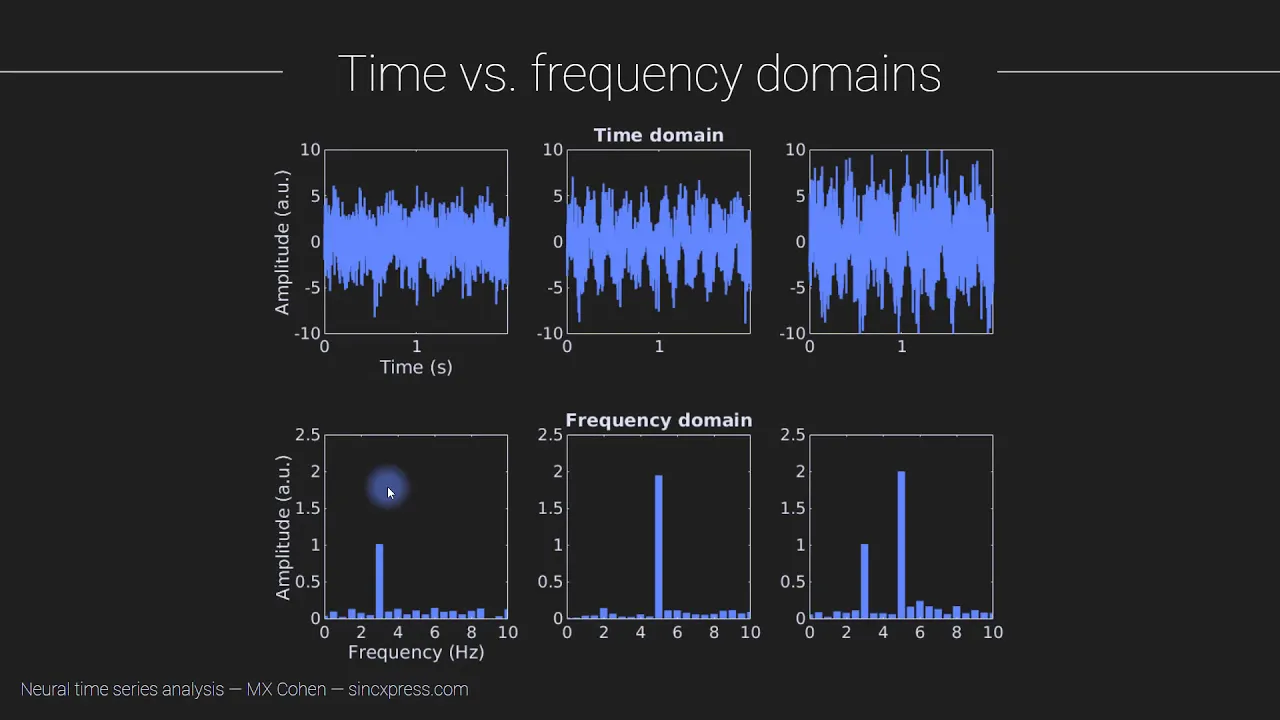
The conceptual difference between time-domain representation (amplitude over time) and frequency-domain representation (energy over frequency).
An introductory understanding of the Fourier Transform (specifically the Short-Time Fourier Transform) as a mathematical tool to convert time-domain signals into the frequency domain.
Extracting advanced acoustic features using Librosa, such as Mel-Frequency Cepstral Coefficients (MFCCs), chroma feature representation, and spectral contrast.
Applying audio preprocessing and data augmentation techniques, including noise reduction, pitch shifting, and time stretching, to prepare audio for machine learning models.
Developing deep learning models (such as 2D Convolutional Neural Networks) that treat spectrograms as images for tasks like speech recognition, music genre classification, or emotion detection.
Exploring advanced Digital Signal Processing (DSP) techniques, such as Harmonic-Percussive Source Separation (HPSS) and onset detection.
2.4K views77likes6:43Original Release: 2025-07-30
Librosa is one of the most powerful and flexible Python libraries for processing and analyzing sound. It builds on lower level libraries like soundfile and numpy and add musically intelligent features specifically tailored for working with music. Let's open a new Python file and see how we can start plotting and visualizing audio data with libroser. We can install libroser in the terminal by running pip install libroser. This gives us the core functionality, but I recommend specifying pip install librosa all. This installs all optional dependencies such as mapplot lib which will be using to visualize audio as well as other libraries that support additional audio formats and features.
At the top of the script, we'll import librosa. To import an audio file, we'll use librosa's load function. This returns a numpy array of audio sample values that make up the waveform and the sample rate per second. Librosa.load expects a path to the file we want to load. I'm using a wave file saved in the current directory. By default, Librosa converts stereo files to mono and resamples them to 22,50 hertz. This helps speed up and simplify downstream processing, but we can easily override both these defaults with keyword arguments if we want. Setting SR to none tells Librosa not to resample the file. And mono equals false tells it to keep the original channels instead of mixing them down to mono. To keep things simple, we'll stick with the default behavior for now. Librosa gives us an easy way to visualize a waveform, helping us quickly understand its shape, dynamics, and timing. To display the waveform, we'll use mattplot.pipplot.
This library helps us create plots and graphs. We'll import it as plt. First, we'll create a blank canvas to draw our plot on with plt.figure and set the figure size to 10x 4 in. Now, all we need to do to draw the waveform is pass our audio data to librosa.dis.wavehow.
We tell it the sample rate by setting the SR argument to map the audio samples correctly onto the time axis. We'll also specify that we want to draw the waveform in the color blue. We'll add a title and labels to our plots axis so it's clear what we're looking at with plt.title, plt.x label, and plt.y label. We can call plt.tight layout to adjust the spacing automatically so our labels and title fit neatly without overlapping or being cut off. Finally, we'll call plt.show to display the plot window. By running this code, we see a visual representation of how the waveform's amplitude changes over time.
We can also use labrosa to see how the frequency content of the sound changes over time by creating a spectrogram.
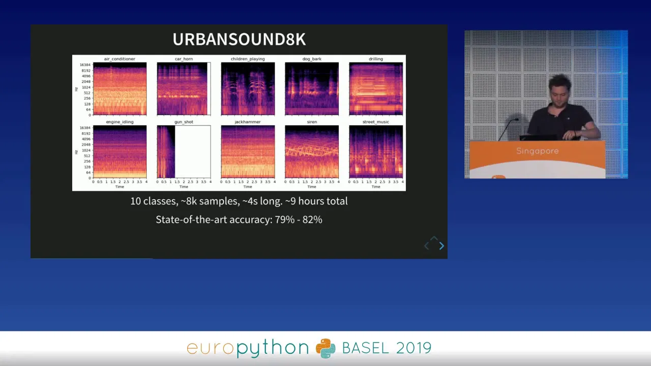
This is a visual map showing time on the x-axis and frequency on the y-axis with intensity or amplitude represented with color. We'll need to also use numpy for this. So we'll import it as np. To break a sound down into its constituent frequencies, we use a forier transform.
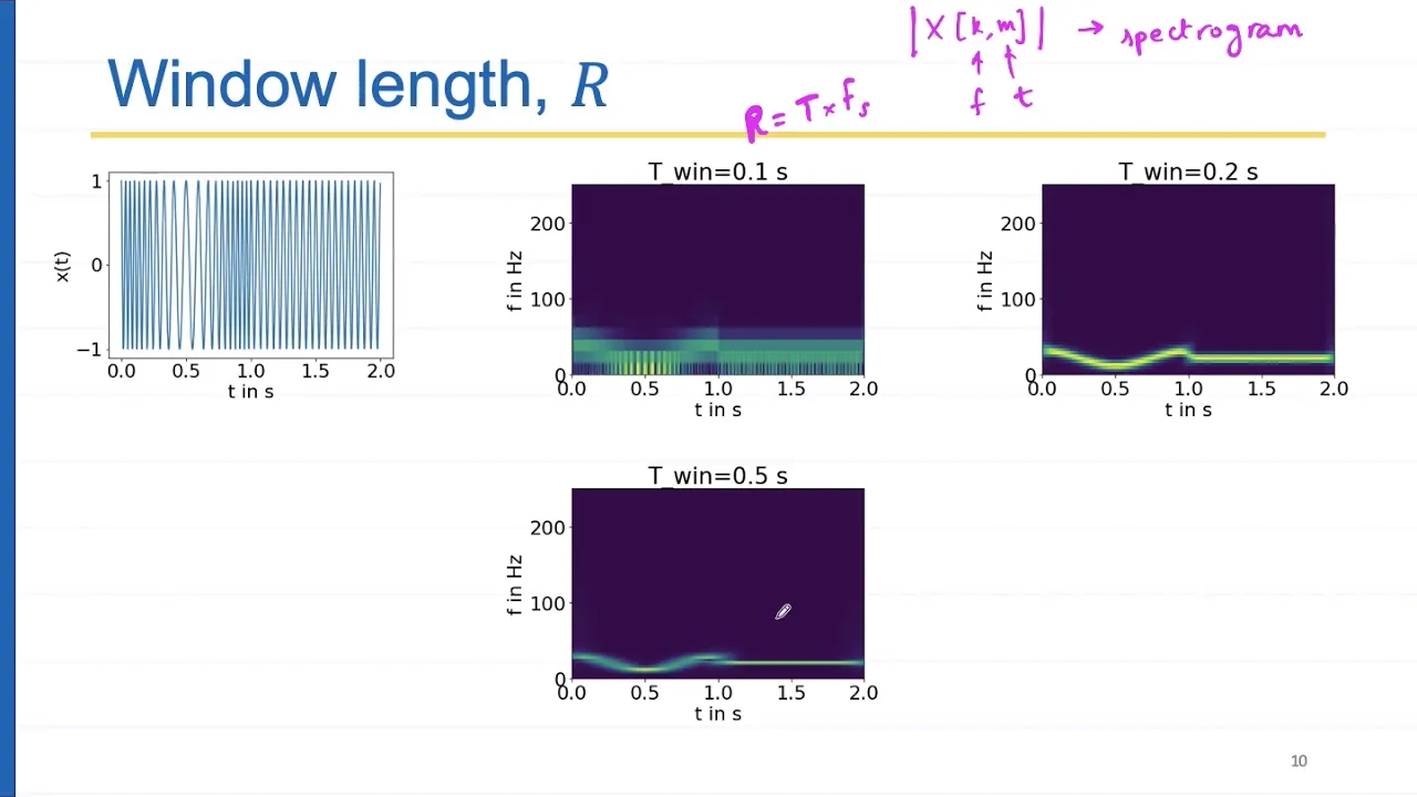
This takes a complex sound and decomposes it into a combination of pure sine waves at different frequencies, amplitudes, and phases. The basic forier transform, however, only shows which frequencies are present and not when those frequencies occur in time. To solve this, we'll use the short time for a transform or STFT. STFT gives us a picture of how frequencies evolve over time by splitting the signal into short overlapping windows, then applying the forier transform to each one. The result is what we plot as a spectrogram.
Librosa provides an STFT function to do this. We'll pass our waveform and it returns a 2D array where each row represents a frequency bin, a slice of the spectrum measured in hertz. And each column represents a window of time. Each cell or element in the array is a complex number that tells us the amplitude of that frequency at that time and the phase of that frequency at that time. Raw amplitudes can vary over a huge range and don't reflect how we actually perceive loudness. Our ears respond to ratios and not to raw numbers and are much more sensitive to quiet sounds than loud ones. To better match human hearing, we'll convert these amplitude values to decibels. Decibels use a logarithmic scale which compresses the range of values and makes the data easier to visualize and interpret.
Librosa provides a convenient function for this. We'll create a variable called spectrogram in Python using np.abs abs on a complex number gives its magnitude or amplitude. In our spectrogram, we're interested in the amplitude of each frequency at each moment in time, but not the phase. So, we can extract the amplitude by applying np.abs to STFT.
Then, librosa.amplitude to db converts these amplitudes to decibels. This gives us a spectrogram where time is on the x- axis, frequency is on the y-axis, and color shows the intensity in decibels. We're now ready to plot the spectrogram. Like before, we'll use plt.figure to create a window with a width of 10 and a height of 4 in.
To display the spectrogram as an image, we'll call librosa.dis.specow, passing in the spectrogram data. We'll tell Librosa the original sample rate so it can label the x-axis correctly with SR equals sample rate. We'll specify that we want the x-axis to represent time and set the y-axis to a logarithmic frequency scale. This better matches how we perceive pitch since lower frequencies are spread out more and higher frequencies are compressed. We can add a color bar next to the plot showing the decibel values corresponding to the colors with plt.c color bar.
We'll set a title with plt.title and use plt.tight layout to make sure it's laid out neatly. We'll display the plot with plt.show.
We can now run the program to see a visual map of how frequencies and their intensities change over time.
With visual tools like waveform plots and spectrograms, Librosa gives us a powerful way to explore and understand the structure of sound. but it also includes many more features for analyzing, transforming, and extracting information from audio. Let me know if you'd like to learn more about Librosa.
Leave your thoughts and suggestions in the comment section below. Please like and subscribe, and thank you for watching.
Up Next

23:25
Extract Audio Spectrograms with Python & Librosa
@ValerioVelardoTheSoundofAI
78.4K views•2020-09-10
12:54
Triumph of Orthodoxy Icon: Byzantine Art & History Explained
@BenCallan
2.1K views•2024-08-06

9:49
FastAPI vs Flask vs Django: Choosing the Right Python Web Framework
@TechWithTim
302.5K views•2024-05-26

1:42
Game of Thrones Opening Credits: A Cinematic Analysis
@gameofthrones
46.3M views•2011-04-18
Related Study Plans & Knowledge Roadmaps
Structured learning paths in General & Interdisciplinary Studies
general-studies
Elevator Engineering: History, Physics & Cities
01From Hoists to Safety Brakes: The Dawn of Vertical Lift
02Hydraulic vs. Traction: The Engineering Physics of Elevators
03Modern Speed, Safety, and Algorithms
+ 2 more learning modules
12h5 modules
Explore Roadmap
general-studies
Rubber: Material Science, History & Geopolitics
01Origins of Natural Rubber & Mesoamerican History
02The Chemistry of Natural Rubber & Vulcanization
03The Geopolitics of the Rubber Boom & Colonization
+ 2 more learning modules
12h5 modules
Explore Roadmap
general-studies
Containerization: Evolution, Logistics & Trade
01Ancient Trade & Bulk Cargo: Amphorae to Barrels
02The Industrial Revolution & Cardboard Packaging
03The Containerization Revolution: Malcom McLean
+ 2 more learning modules
12h5 modules
Explore Roadmap
general-studies
Textile Tech: Evolution, Labor & Global Impact
01Pre-Industrial Textiles: Handloom & Cottage Industry
02Mechanization: The Spinning Jenny to the Power Loom
03The Factory System & Global Labor Transformation
+ 2 more learning modules
10h5 modules
Explore Roadmap