Effective title sequences immediately grab audience attention, generate excitement, and serve the film while standing on their own as artistic works; successful title designers draw inspiration from diverse sources including books, other artists, and life experiences, and should focus on creating rather than waiting for inspiration, as the best designers get their hands dirty and make something rather than spending time searching for external inspiration.
The Art of the Title: A Documentary on Kyle Cooper's Film Design Legacy
Added:Deep Dive
The history of film title design, particularly the pioneering work of Saul Bass and Maurice Binder.

10 Best Opening Title Sequences of All Time
2M
Maurice Binder, considered one of the second most important title designers of all time, pioneered the Bond title sequence style starting with Dr. No. He designed 14 Bond titles from the first through License to Kill, with only one brief gap. His approach combined the unforgettable Gun Barrel sequence with classic 1960s graphic minimalism using colored dots. Binder captured the suave, hip, calm, uber-cool, hyper-masculine metropolitan essence of James Bond using nothing more than a grid of colorful circles, demonstrating how graphic design can convey complex character traits through simple visual elements.
Click to watch →
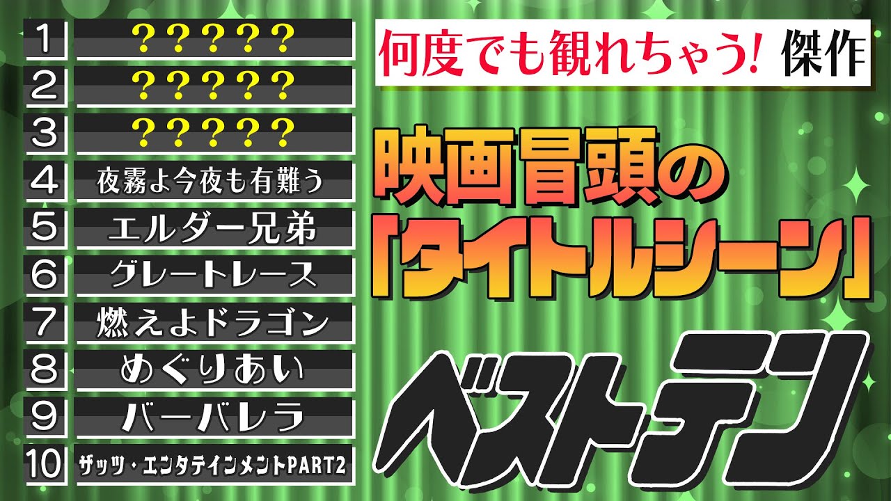
【傑作映画タイトルシーン】厳選タイトルベスト10/タイトル巨匠ソール・バス/タイトルでワクワク『燃えよドラゴン』/曲とロールスピードが秀逸『夜霧よ今夜も有難う』/ヘプバーンのロマンチック名作タイトル
17.6K
The 1950s-60s saw the emergence of professional title designers in American cinema. Saul Bass (1920-1996) pioneered the field, creating iconic sequences for 'The Manchurian Candidate' (1955) and 'West Side Story' (1961). His graphic, text-based approach revolutionized title design. Maurice Binder (1925-2011) became famous for James Bond titles, featuring stylized female figures. Steven Frankel (1931-2011) brought intellectual sophistication to titles like 'The Great Escape' (1962). Richard Greenberg (1942-2018) won the Clio Award for Superman's trailer and founded RGA, creating titles for 'Alien,' 'The Godfather,' and 'The Matrix.'
Click to watch →
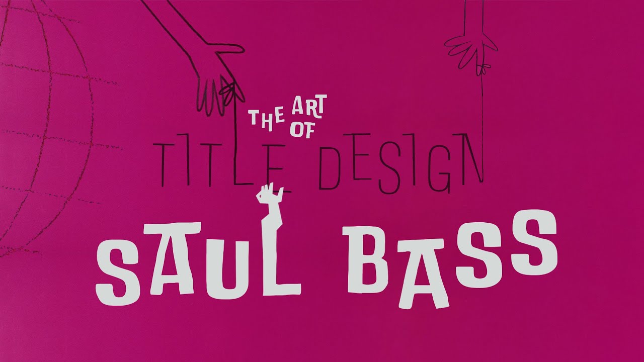
Saul Bass and the art of movie title design
145.2K
Saul Bass revolutionized movie title design in the 1950s and 1960s by transforming film titles from simple credit lists into sophisticated visual storytelling tools; he applied Bauhaus design principles—clean lines, geometric shapes, and limited color palettes—to create iconic title sequences that served as brand extensions for films, such as the famous opening of 'It's a Mad Mad Mad Mad World' which shared visual elements with his print advertisements, thereby establishing a unified cinematic brand identity.
Click to watch →

Stan Evenson - "Saul Bass: The Man, The Mark, The Legacy"
8.8K
In 1952, Saul Bass went out on his own and developed a unique, highly specified graphic design style characterized by boldness, great symbolism, and narrative with emotional content. His work for films like The Man with the Golden Arm, Anatomy of a Murder, Vertigo, and Exodus demonstrated his ability to create visually compelling and emotionally resonant designs. In 1956, Elaine Mura was hired at his office, and they married in 1961. Over many decades, they consulted together on creating film titles for dozens of Hollywood films. Bass's great goal was to create 'a simple visual phrase' that would 'crack the door open slightly to give a hint of what that movie is going to be about,' which would 'really evoke the essence of the story.' This approach introduced a new genre of film title design that set the mood for the film. Bass created iconic title sequences for Mad Mad Mad World, Anatomy of a Murder, West Side Story, and Casino. Beyond film titles, Bass was hired to storyboard scenes and create visual depictions, receiving credit as 'visual and pictorial consultant.' Elaine and Saul Bass became known for their short films, including 'Why Man Creates,' a 29-minute documentary about the nature of creation that won an Academy Award in 1968. Designers like Milton Glazer recognized Bass's profound impact, stating that 'there are very few artists in our time who have created as memorable a series of designs and objects' and that Bass 'truly shaped the vision of our time.' His influence continues to be felt in modern television shows like Mad Men and Falling Skies. Bass passed away in 1996, but his legacy persists through his daughter Jennifer Bass's book 'Saul Bass: A Life in Film and Design' (2011), which spans 423 pages.
Click to watch →

15 Weird Facts About The Long Ships (1964) You Never Knew
3.7K
The opening title sequence of The Long Ships was designed by Maurice Binder, the legendary title designer who created the iconic gun barrel sequence for the James Bond franchise and would go on to design opening credits for 16 Bond films. Binder created a sequence showing silhouetted monks gathering materials and crafting the legendary golden bell, with action playing out against colorful stone backgrounds creating a mosaic-like effect. Meanwhile, Sydney Poitier arrived in Belgrade, Yugoslavia in April 1963 at what should have been one of the highest points of his career. Instead, he spent 14 miserable weeks in what he would later describe as the worst place he had ever been to make a movie, encountering pervasive hostility from locals stemming from tensions with African students on government scholarships.
Click to watch →
Deep Dive
Basic principles of typography, including typeface selection, legibility, visual hierarchy, and layout.

Design || Основы дизайна — базовые принципы, композиция, контраст, колористика, типографика
58.6K
Typography involves selecting and arranging text for optimal communication. Serif fonts feature decorative strokes at letter ends, appearing more traditional and readable in long passages; sans-serif fonts lack these strokes, feeling modern and clean. Minimum readable sizes for web design are 12+ pixels, with larger sizes recommended for mobile interfaces. Line height (1.4-1.6x font size) ensures adequate breathing room between lines. Kerning adjusts letter spacing for visual balance—extreme kerning can make text difficult to read. Internal spacing (between letters) should be smaller than external spacing (between words and lines). Readability must always supersede stylistic choices—decorative fonts sacrifice legibility for style and should never be used for body text. Visual hierarchy organizes information by size, weight, and prominence: headings larger than subheadings, body text smaller than both. Call-to-action buttons require maximum readability as primary user actions. Caps lock on long headings makes scanning difficult. Font selection should match brand personality—serif for traditional trust, sans-serif for modern approachability, script for creativity. Left-aligned text is most readable for multi-line passages, while center alignment works for short headings but causes strain for longer blocks.
Click to watch →
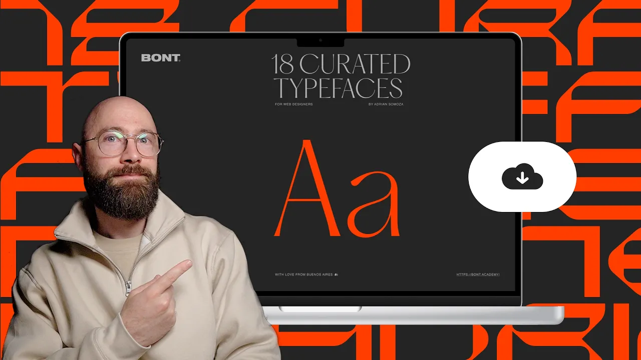
Web Designers only need these 18 typefaces (with examples)
32K
This section addresses display typefaces and core typography principles. Display typefaces (PP Pattern, PP Editorial New, OG, Universe SL, ITC Century Modern, Dato, Price, Allform, Titling Gothic) add visual flair and character to designs when paired with primary typefaces like Helvetica or Futura. Four fundamental principles guide effective typeface selection: (1) Typefaces are neutral tools that create any look when combined with appropriate colors and graphics; (2) Classics endure because they survived decades of improvement; (3) New typefaces don't improve designs—practice matters more; (4) Boring layouts result from poor layout choices, not typefaces. Designers should master a few typefaces thoroughly rather than constantly seeking new ones, as the designer's skill in applying typefaces matters more than the typeface selection itself.
Click to watch →
5 Techniques For BETTER Typography/Text Layouts! (Beginners)
70.9K
Typography is essential to design communication and should never be left until the final stages. Key concepts include: (1) Typeface terminology—typeface is a collection of fonts, while font refers to individual weights/styles within that collection; (2) Visual hierarchy—sans serif fonts typically serve as primary heading fonts due to their boldness, while mono typefaces function as secondary/tertiary fonts for supporting information; (3) Font variations—standard, compressed (narrower characters appearing larger), and stretched (wider characters requiring smaller sizes) all affect visual hierarchy and space management on the canvas.
Click to watch →

Typography Basics | 10 เทคนิคเลือกและจัดฟอนต์
126.1K
Typography is the art of arranging type to make text legible, readable, and visually appealing. Fonts are categorized into three main types: Serif fonts (with decorative strokes, appearing traditional and elegant), Sans-serif fonts (clean and modern without decorative strokes), and Decorative fonts (distinctive styles for visual interest). Effective font pairing involves combining fonts from the same family, pairing sans-serif with serif, or using decorative fonts with basic readable fonts. Key layout principles include avoiding orphaned words at paragraph beginnings, maintaining consistent text alignment throughout, and using grid systems to organize design elements systematically.
Click to watch →

4. Принципы типографики и верстки | Курс UX UI Дизайнер: «Возрождение» | Бесплатный курс веб дизайна
31.8K
Typography is the art of arranging text using typefaces and fonts, while layout is the arrangement of compositional elements on a design page. Key typography rules include: leading (line spacing) should be less than the height of capital letters; interline spacing should be larger than the height of lowercase letters; tracking (letter spacing) should be minimal. The fundamental principle of internal and external spacing states that for any graphic object to have independent meaning, its internal spacing (distance between constituent elements) must be less than its external spacing (distance to surrounding elements). This applies hierarchically: letters consist of strokes, words consist of letters, lines consist of words, paragraphs consist of lines. Letter spacing creates more space around each letter, making text appear more grand. Word spacing must be sufficient to distinguish individual words, and should be larger than letter spacing to maintain visual hierarchy. Line spacing (leading) is the distance between lines of text and should be larger than the spacing between words within a line. When arranging headings and subheadings, the spacing between them (external spacing) should be larger than or equal to the internal spacing within each heading. Grid systems divide pages into invisible rectangles to standardize layout. Modules are the smallest rectangular objects that can be placed on a grid. Modules should not overlap, should have rectangular shapes, and should be coordinated in width and height. The size of modules should match the content they contain.
Click to watch →
Deep Dive
Fundamentals of film editing and cinematography, such as montage theory, pacing, and camera angles.

Introductory Film Studies 03: Editing
24.7K
Editing is the process of stringing together individual shots to create a film, determining how shots are juxtaposed, including transition speed and types. While shot composition and camera angle affect individual shots, editing profoundly influences how viewers interpret a film. Montage, defined as a film sequence that relies on editing to condense or expand action, space, or time, is essential to cinema. Sergei Eisenstein's hieroglyphic theory proposes that individual shots function like characters in writing, where combining two shots creates a new meaning (product) rather than their sum total. This transforms isolated shots into a cohesive narrative, making editing the 'glue' that holds cinema together.
Click to watch →
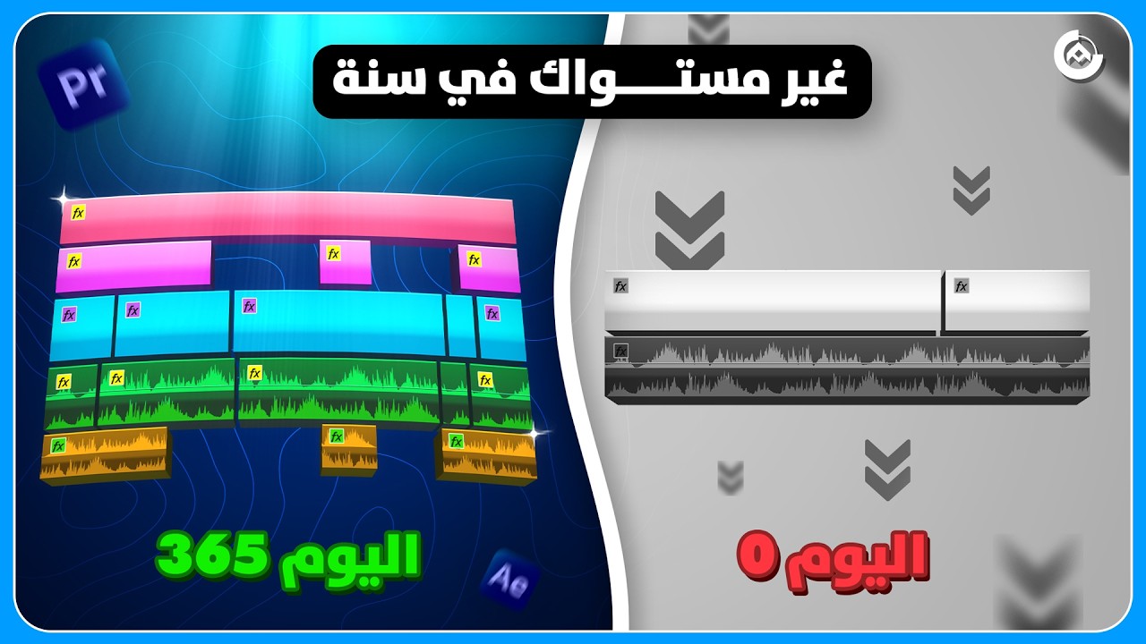
أفضل طريقة لتعلم المونتاج في 2026 ( خطة شاملة في سنة واحدة )
35.6K
This section covers the core principles of Cinema Editing. Step 3 involves deepening understanding of pacing and rhythm, which the instructor describes as the fundamental element determining video success. Proper pacing maintains audience engagement and controls emotional impact. The instructor provides an example showing how speeding up cuts in action scenes intensifies emotional impact. Step 4 involves understanding camera angles and their emotional meanings: high angles convey powerlessness or vulnerability, while low angles convey dominance or strength. Without understanding these meanings, editors may overlook important scenes or fail to recognize the director's intended message. The instructor recommends the 'The Shot List' playlist for learning about camera angles with examples from famous films.
Click to watch →
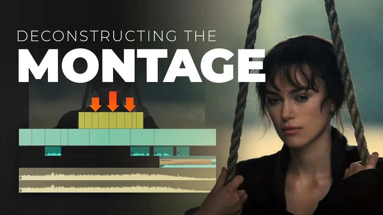
Montage Editing 101 (TUTORIAL)
72.6K
Montages are powerful storytelling tools that compress time and convey emotion through music, consisting of five major types: transformation montages showing character growth, romance montages expressing relationships, loss montages depicting emotional impact, contemplation montages revealing character processing, and straight facts montages efficiently presenting story information; effective montage editing requires balancing length (typically 30 seconds to 2 minutes), using hard cuts over dissolves, starting with gradually increasing music and ending with resolving music returning to natural sounds, minimizing dialogue/voiceover, and employing visual effects only when stylistically appropriate and consistently throughout the film.
Click to watch →
The Editor’s Secret: What Directors Don’t See & AI Can’t Copy
69.9K
Film editing rests on three foundational pillars: Timing, Pacing, and Trajectory Phrasing. Timing encompasses three elements: which frame to select, how long to hold a shot, and where to place it relative to other shots. Pacing involves three dimensions: the rate of cutting between shots, the rate of movement within individual shots, and the overall rate of narrative change. Trajectory Phrasing extends beyond technical placement to capture the intention and energy behind movements. This framework transforms editing from an abstract art into a structured discipline, enabling editors to consciously manipulate audience perception through precise control of visual rhythm and emotional impact.
Click to watch →

Introduction to EDITING THEORY | Continuity Editing, Montage, the Rule of Six, and MORE!
13.2K
Video editing theory encompasses two primary approaches: continuity editing (which maintains viewer immersion through consistent eye line, eye trace, matching action, object continuity, and the 180-degree rule) and montage theory (which derives meaning through strategic shot assembly based on order, duration, repetition, and rhythm). Walter Murch's Rule of Six provides a practical framework for evaluating cuts by assessing emotion (51%), story advancement (23%), rhythm (10%), eye trace (7%), 2D plane (5%), and 3D space (4%). Additionally, filmmakers choose between deductive openings (establishing context first through wide shots) and inductive openings (starting with close-ups to create mystery).
Click to watch →
Deep Dive
The distinction between analog, tactile design methods (physical filming of textures and objects) and early digital compositing.
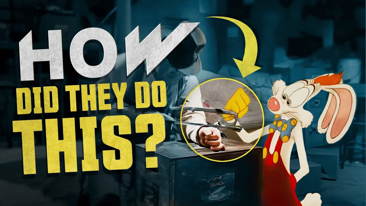
Amazing Effects in Classic Films - How Did They Pull It Off? | Part 8
79.1K
In the 1980s, films like Who Framed Roger Rabbit used fully analog animation techniques before digital compositing existed. Over 82,000 individually hand-drawn and hand-painted cells were created by more than 326 animators over 14 months. Each cell was composited into live-action footage frame-by-frame using optical printers. The technique called 'bumping the lamp' involved tracking constant shifts in light and shadow caused by swinging lamps, adjusting perceived light intensity based on proximity to light sources, and making characters transparent in light. Multiple lighting maps (base color, shadow, highlight, rim) were used to give characters depth and dimensionality.
Click to watch →
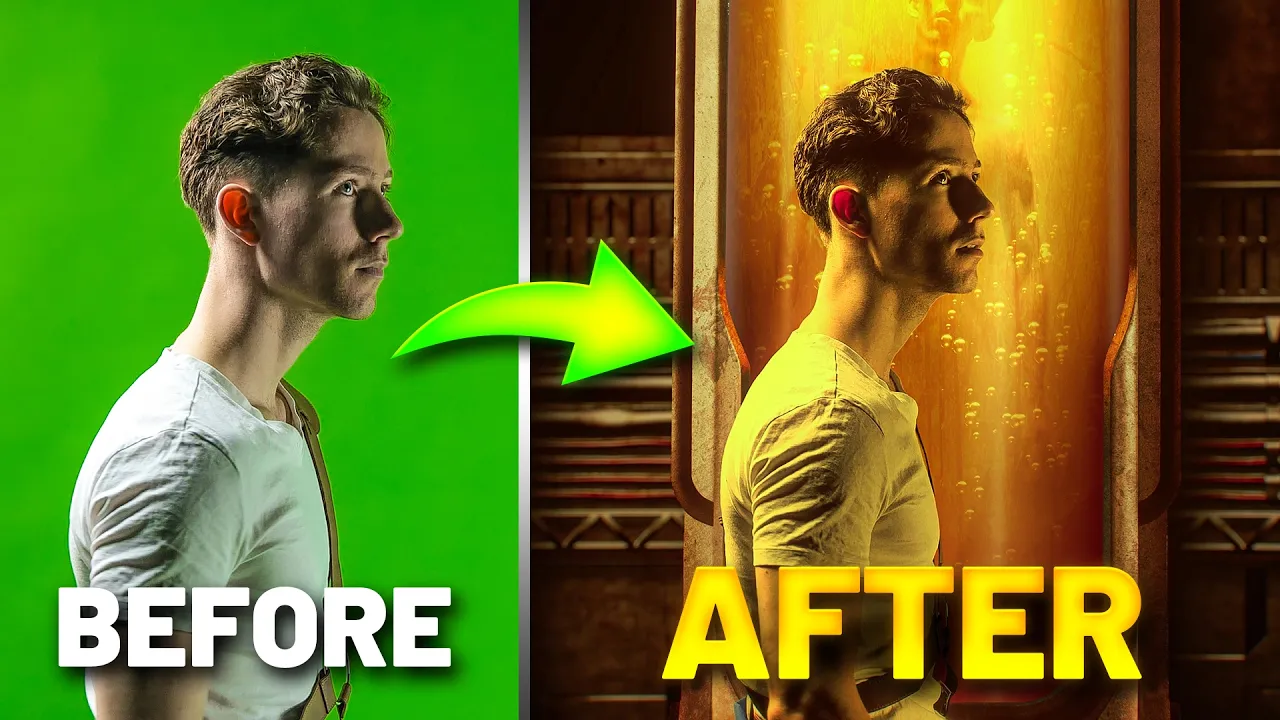
How I Used VFX To Turn My Video Into a Movie!
108K
Successful digital compositing requires physical production techniques. Costume accuracy involves manual alterations like sewing yellow fabric onto jumpsuits. 3D printing provides cost-effective props like the pit boy, which can be painted to appear aged. Green screen compositing requires careful color management to avoid conflicts between subject clothing and screen color. Physical effects like hair dryers create realistic hair movement. These physical approaches enhance digital compositing by providing authentic reference points and textures.
Click to watch →
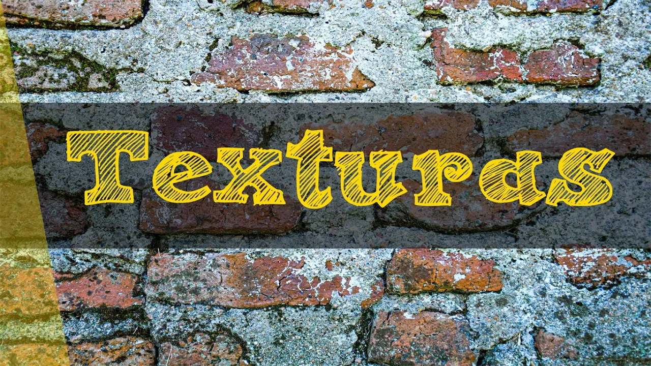
Texturas. Texturas táctiles y Texturas Visuales.
149.5K
Texture is a surface characteristic of objects perceived through touch and sight, classified into tactile textures (felt through touch, producing sensations like roughness, smoothness, or asperity) and visual textures (perceived through sight, including artificial types like brick, plastic, and fabric, as well as natural types like tree bark, grass, and sand).
Click to watch →

A Place For Film - Episode 137 - Visual Effects with Hoyt Yeatman
355
The transition from analog to digital visual effects fundamentally changed the craft. Early digital attempts suffered from poor quality compared to film's approximately 4K resolution, as videotape and NTSC standards fell short. Digital compositing originated from television commercial production at Dream Quest Images, where the team laced up 12 one-inch machines to mix commercials due to registration problems between film and telecine. When someone proposed pin-registered movement on digital medium, the concept of digital compositing emerged. The company then taught Kodak how to do compositing by explaining analog equivalents. However, this transition came with costs: the original physical model-making artistry diminished, requiring more post-production fixes. The digital era prioritized efficiency over craftsmanship, though hybrid approaches combining physical models with digital enhancements proved most effective.
Click to watch →
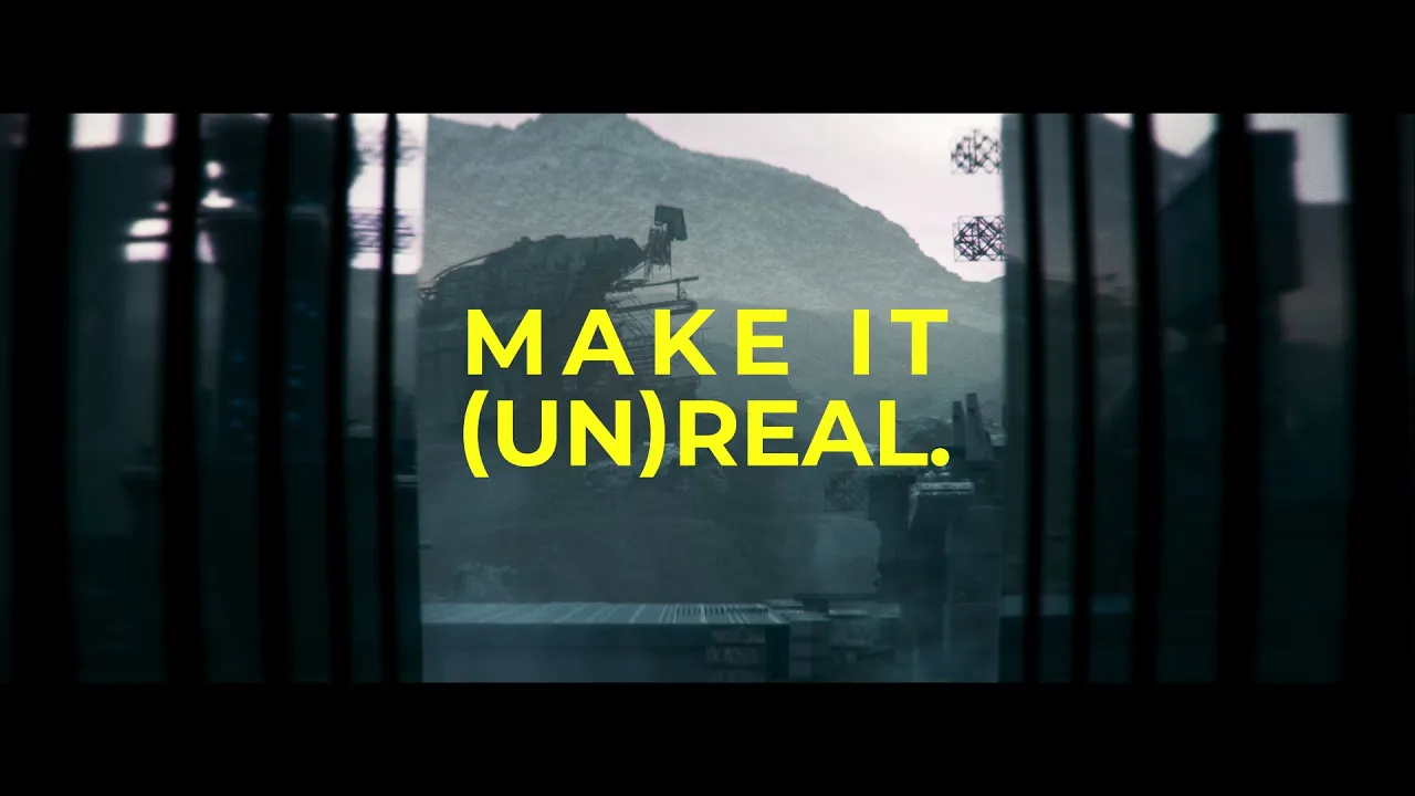
How to Make Your Unreal Engine Renders Look REAL
37.6K
Film is an analog capture method meaning it's captured from a signal generated by a continuously variable physical source, resulting in a continuous image rather than one made up of individual data points (pixels). This provides much more flexibility when preserving information, especially in highlights. In contrast, digital capture is not a continuous representation but rather an approximation made up of individual data points like pixels, with a hard stop finite range of captured data that cannot be recovered if insufficient data was captured.
Click to watch →
Prerequisite Knowledge
- Concept 01The history of film title design, particularly the pioneering work of Saul Bass and Maurice Binder.
- Concept 02Basic principles of typography, including typeface selection, legibility, visual hierarchy, and layout.
- Concept 03Fundamentals of film editing and cinematography, such as montage theory, pacing, and camera angles.
- Concept 04The distinction between analog, tactile design methods (physical filming of textures and objects) and early digital compositing.
Subsequent Learning
- Step 01Hands-on application of motion graphics and title design concepts using software like Adobe After Effects.
- Step 02In-depth analysis of narrative foreshadowing and psychological world-building through opening sequences in modern cinema.
- Step 03Advanced kinetic typography and how text movement interacts with sound design to evoke specific emotional responses.
- Step 04The collaborative production pipeline and pitching process between a title designer, director, and studio.
Origins & Influence
Creative Drive
Origins & Influence
0:00Playing Section
- 1
Kyle Cooper shares his early passion for title sequences and TV shows.
- 2
He credits the Dead Zone titles and mentor Paul Rand for shaping his career.
Minimalist Integration vs. Kinetic Excess: Critiquing the Post-Cooper Title Design Era
While Kyle Cooper's visceral, texture-heavy title sequences (most notably for 'Se7en') are celebrated for revolutionizing modern film openings, some film theorists and designers argue this style popularized a 'style-over-substance' trend. Critics contend that hyper-stylized, kinetic title sequences can act as self-indulgent distractions, functioning more like standalone music videos than cohesive narrative entry points. From a classicist perspective—inspired by the minimalist restraint of designers like Saul Bass—the primary role of a title sequence is to subtly prepare the audience for the story, rather than overwhelming them with sensory stimuli. Opponents of the Cooper-inspired aesthetic argue that the subsequent industry-wide reliance on rapid editing, dark textures, and complex motion graphics has led to visual fatigue and a formulaic approach to film introductions. They advocate instead for 'invisible' or minimalist title designs that prioritize narrative momentum and direct immersion into the film's world.
Deep Dive
Hands-on application of motion graphics and title design concepts using software like Adobe After Effects.

Create Trendy Motion Graphic Titles in After Effects
16.1K
This tutorial demonstrates how to create trendy motion graphic titles in After Effects by using the rounded rectangle tool to design a base box with a black stroke, adding design elements and buttons, animating shape layers using size and position controls, populating text and animating it, and integrating video by setting track matte to a shape layer with a black stroke for stylish designs.
Click to watch →
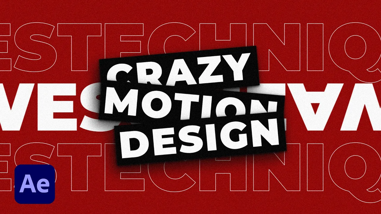
4 Crazy Typography Ideas in After Effects | Motion Graphics Tutorial
81.4K
This section covers professional title design principles: (1) Using title pack extensions for template previewing and easy customization; (2) Adding depth through Drop Shadow effects with layered softness and distance settings; (3) Applying Noise and Grain effects via Adjustment Layers for visual texture and signature style. These techniques help separate main titles from backgrounds, create visual hierarchy, and add professional polish to motion graphics work.
Click to watch →

Motion Graphics & Titling Demo
174
This video demonstrates motion graphics titling techniques using Adobe After Effects, showcasing how text and graphics can be animated and styled for visual communication in video production.
Click to watch →
1/51 | Introduction to Become a Motion Graphics - After Effects
31.9K
Motion graphics design combines traditional graphic design principles, particularly typography, with animation techniques using software like Adobe After Effects, making it ideal for visually-oriented creatives who want to develop skills in creating animated video content; this project-based field enables designers to add motion graphic designer to their professional credentials by learning tools that transform static visual elements into dynamic moving compositions.
Click to watch →

Title Animations : in After Effects
15.8K
This tutorial demonstrates the foundational techniques for creating animated titles in Adobe After Effects, covering essential motion graphics principles such as text animation, layer management, and keyframe-based movement to produce professional title sequences.
Click to watch →
Deep Dive
In-depth analysis of narrative foreshadowing and psychological world-building through opening sequences in modern cinema.
30 Movies With Ridiculously Subtle Foreshadowing That Nobody Noticed
212.9K
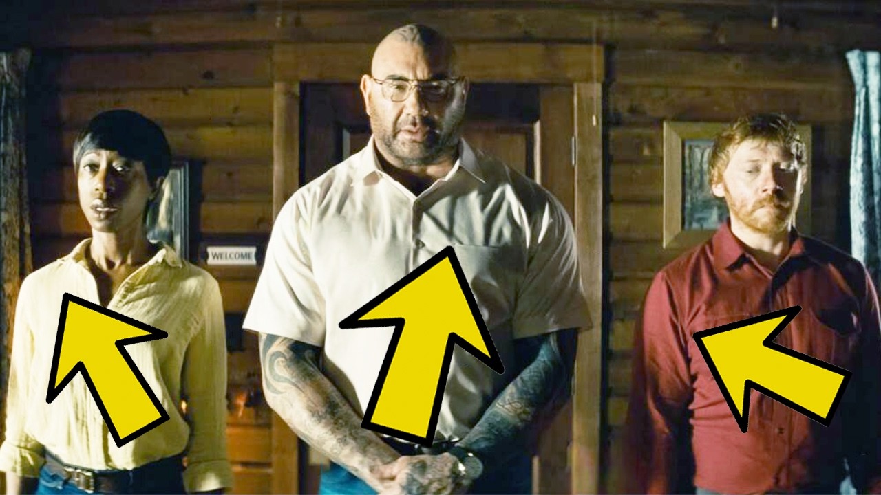
Modern filmmakers employ subtle foreshadowing techniques that reward attentive viewers without giving away plot twists. This segment examines how directors embed clues in dialogue, props, and character behavior. Examples include Caesar's grandfather Charles's dementia foreshadowing power shifts in Planet of the Apes, Nick Fury's precise dialogue hinting he's off-world in Spider-Man, Amy's pen collection revealing her nature in Gong Girl, Norman Bates' taxidermy bird comparison foreshadowing his mother's fate in Psycho, color-coded riders in Knock at the Cabin, a deer painting foreshadowing sacrifice in The Killing of a Sacred Deer, blue sky on Mars suggesting implanted memories in Total Recall, song lyrics about lying foreshadowing deception in Jurassic Park 3, and a wife reading 'Getting Pregnant' foreshadowing infertility in The Departed. These examples demonstrate how filmmakers plant seeds of meaning that bloom into revelation upon reflection.
Click to watch →
¡Top 10 Detalles Ocultos en ESCENAS INICIALES de las Películas!
121.6K
Filmmakers use various techniques to foreshadow plot developments in opening scenes. X-Men 2 uses historical symbolism through portraits of assassinated presidents to hint at Nightcrawler's intentions. A Quiet Place employs environmental storytelling through a seemingly insignificant detail (potato chips) to establish character psychology. The Shining uses freeze frame shots at pivotal moments to establish character importance. The Cabin in the Woods plants subtle visual cues like VHS tapes and underground references to foreshadow the bunker revelation. These techniques demonstrate how directors use visual and narrative elements to prepare audiences for major plot twists without explicit exposition.
Click to watch →

ТОП 10 Скрытых Деталей Во Вступительных Сценах Фильмов
79.4K
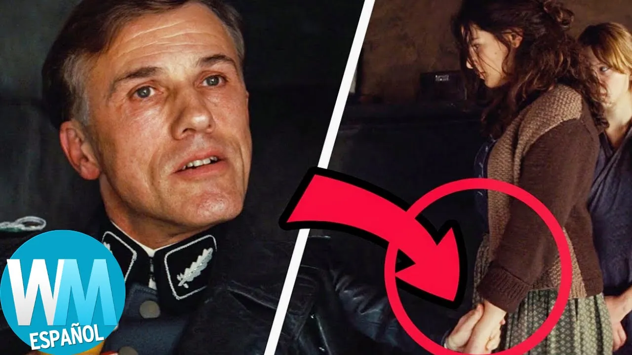
Film opening scenes serve as sophisticated narrative devices that embed foreshadowing elements to reward attentive viewers. This video examines ten films demonstrating various foreshadowing techniques: X-Men 2 uses presidential portraits to signal assassination themes; A Quiet Place establishes sound-based hunting rules through untouched chips; The Devil's Advocate employs stop-motion sequences to reveal character backstory; The Cabin in the Woods hides underground bunker references in background details; Inglourious Basterds uses non-verbal cues to reveal character experience; Reservoir Dogs foreshadows character psychology through minor interactions; The Dark Knight reveals environmental hazards through visual details; Indiana Jones establishes character origins through accidental self-injury; Pulp Fiction uses non-linear storytelling to introduce characters before their main arcs; Back to the Future efficiently establishes multiple plot elements through a single tracking shot. These techniques demonstrate how filmmakers encode narrative information in seemingly incidental elements, creating layered storytelling that rewards careful observation.
Click to watch →
【シュタゲ解説】再放送版はまさかのバッドエンド…10年以上たった今でも語り継がれる神アニメ『シュタインズ・ゲート』に隠された伏線解説【ゆっくり解説】
229.2K
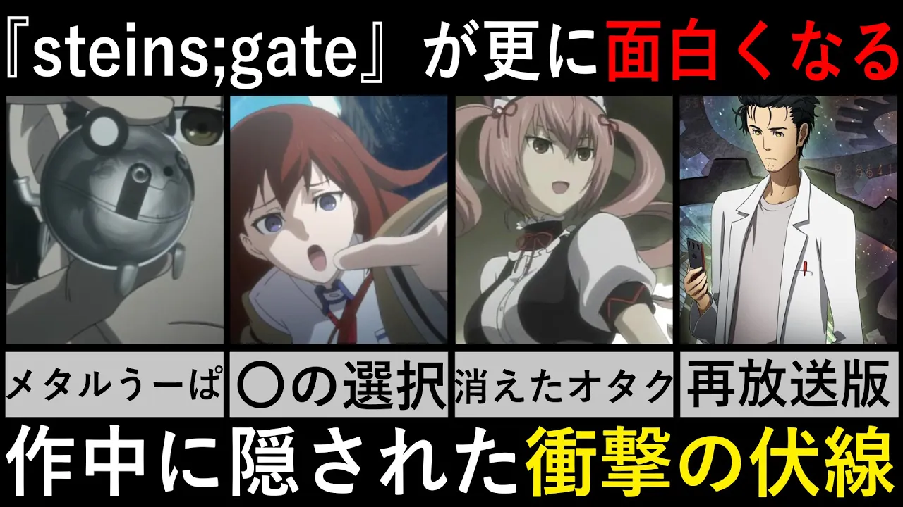
The opening sequence of Steins;Gate contains numerous hidden foreshadowing elements. Multiple characters appear together, representing the existence of countless world lines. Numerical sequences (like 0.571024%) represent world line fluctuation rates connected to major plot events. Gears symbolize the time travel theory and fate's interconnected nature. Kurisu's position on gears emphasizes her role as the key figure holding the time travel paper. A brief shot of a disappearing cicada foreshadows Kurisu's potential death. Celty's maid outfit and her father's revival causing Akihabara's otaku culture to vanish represent cultural consequences of time travel. Okabe's appearance only at the end hints at his crucial role in future history. These elements demonstrate how the opening deliberately plants seeds for the entire narrative.
Click to watch →
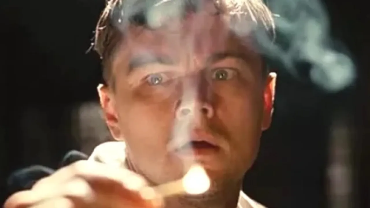
La Gran Pista Que Todo El Mundo Se Perdió Al Principio De Shutter Island
78.3K
In psychological thrillers, filmmakers often embed subtle narrative clues throughout the story that reveal the true nature of events upon rewatching, as demonstrated in Martin Scorsese's Shutter Island where details like Teddy's medication withdrawal causing vomiting, the bathroom resembling a 1950s psychiatric cell, and Chuck's inability to handle a weapon foreshadow the twist that Teddy Daniels is actually the patient Andrew Laeddis.
Click to watch →
Deep Dive
Advanced kinetic typography and how text movement interacts with sound design to evoke specific emotional responses.
![[ 15인 키네틱 타이포그래피 합작 ] 마사라다 - (무)책임집합체 ( ㋰責任集合体 ) / @Kinetic_Team // #타이포그래피](https://i.ytimg.com/vi_webp/ZrPdcl34EI8/maxresdefault.webp)
[ 15인 키네틱 타이포그래피 합작 ] 마사라다 - (무)책임집합체 ( ㋰責任集合体 ) / @Kinetic_Team // #타이포그래피
38.8K
Kinetic typography is an artistic medium that combines animated text with music to create visual storytelling, where the movement and design of letters and words convey emotional and narrative content beyond traditional static text.
Click to watch →
![BLACKPINK(블랙핑크) - How You Like That / Full 키네틱 타이포그래피 [Kinetic Typography]](https://i.ytimg.com/vi_webp/xiWVbeSsCKQ/maxresdefault.webp)
BLACKPINK(블랙핑크) - How You Like That / Full 키네틱 타이포그래피 [Kinetic Typography]
83.9K
Kinetic typography is a video production technique that combines animated text with music to create visually engaging content, as demonstrated in this BLACKPINK music video where text animations are synchronized with the song's lyrics and rhythm.
Click to watch →

Kinetic Typography In After Effects - After Effects Tutorial - No Plugins
1.2M
Kinetic typography is a motion graphics technique where text appears on screen in sync with audio, typically by placing each word on its own layer and timing their appearance according to the audio waveform's peaks; the process involves creating a composition, importing audio, arranging text layers, using null objects for centralized animation control, adding keyframes for layer transitions, and applying effects like motion blur and gradients to enhance visual appeal.
Click to watch →

Bewhy - Dejavu / Full 키네틱 타이포그래피
40.2K
Kinetic typography is an artistic technique that combines typography with animation to create dynamic visual art, where text movements and transformations convey emotional and thematic content, as demonstrated in this video featuring Bewhy's song 'Dejavu' created by Patexum and Lucider.
Click to watch →
![Green Day - Letterbomb lyrics [Kinetic Typography]](https://i.ytimg.com/vi/qjuUMA6W9Zs/maxresdefault.jpg)
Green Day - Letterbomb lyrics [Kinetic Typography]
1.6M
Kinetic typography is a visual design technique that combines animated text with music to create engaging visual content, where the movement and styling of words enhances the emotional impact of the lyrics and creates a unique viewing experience that merges audio and visual storytelling.
Click to watch →
Deep Dive
The collaborative production pipeline and pitching process between a title designer, director, and studio.

A Moment with Walter Lantz: The (Almost) Complete Collection
9.1K
Cartoon directors serve as creative leaders requiring diverse skills—an idea man, gag man, artist, and musician. They create storyboards showing scene sequences, then time productions using detailed timing sheets specifying scene lengths, tempos, and sound effect placements. Directors create model charts for new characters showing front, side, and rear views. They work with musical directors to develop scores matching action and explain entire storyboards to animators. The production pipeline involves multiple specialized roles: animators create progressive drawings showing position changes, cameramen photograph individual drawings using exposure sheets, inkers copy drawings onto clear celluloid cells, and painters add color to the reverse side so characters appear over backgrounds. This collaborative workflow transforms initial ideas into finished animated films through systematic coordination across all departments.
Click to watch →

CG Garage Podcast | Karin Fong — Director, Imaginary Forces
494
Successful title design requires a strong partnership between the director and the title designer. In the case of Seven, Kyle Cooper and David Fincher created a 'perfect marriage' where both parties contributed to the vision. The director provides the emotional and narrative context, while the title designer translates that into visual form. This collaboration involves extensive dialogue about what the sequence should feel like, what influences should be incorporated, and what the audience should experience. The key is that both parties must be aligned on the vision.
Click to watch →

Production designer job description |Production designer in film|Production designer vs art director
2.4K
The production designer collaborates closely with the writer, director, and producer to decide on the film's visual elements. This includes determining how sets should look, what locations to use, costume designs, jewelry styles, hair and makeup styles, and prop designs. The production designer provides expert advice while the director and producer share their creative visions, and together they reach consensus on all visual decisions.
Click to watch →

Amanecine, ruta Macondo con Sofía Guzmán
288
This segment explores the collaborative nature of production design, where designers work within a triad consisting of director, cinematographer, and production designer. The discussion covers how successful production design requires alignment of creative vision among all team members, with each contributing unique expertise. The segment emphasizes that production design involves extensive conversations, sometimes formal and sometimes informal, to establish shared vision. The production designer interprets the director's vision and translates it into visual reality, working closely with cinematographers to ensure lighting, composition, and visual elements align with intended aesthetics.
Click to watch →

Perry Andelin Blake: The World of Production Design (Murder Mystery 2, Hustle, Billy Madison)
1.7K
The director-production designer-cinematographer triad forms the core creative team responsible for visual identity. Production designers collaborate with cinematographers to translate visual concepts into practical shooting plans, creating illustrations and discussing camera angles and lighting requirements. Location scouting involves evaluating real locations against creative requirements, with creative solutions needed when locations don't meet needs.
Click to watch →
Origins & Influence
Creative Drive
Origins & Influence
0:00- 1
Kyle Cooper shares his early passion for title sequences and TV shows.
- 2
He credits the Dead Zone titles and mentor Paul Rand for shaping his career.
Minimalist Integration vs. Kinetic Excess: Critiquing the Post-Cooper Title Design Era
While Kyle Cooper's visceral, texture-heavy title sequences (most notably for 'Se7en') are celebrated for revolutionizing modern film openings, some film theorists and designers argue this style popularized a 'style-over-substance' trend. Critics contend that hyper-stylized, kinetic title sequences can act as self-indulgent distractions, functioning more like standalone music videos than cohesive narrative entry points. From a classicist perspective—inspired by the minimalist restraint of designers like Saul Bass—the primary role of a title sequence is to subtly prepare the audience for the story, rather than overwhelming them with sensory stimuli. Opponents of the Cooper-inspired aesthetic argue that the subsequent industry-wide reliance on rapid editing, dark textures, and complex motion graphics has led to visual fatigue and a formulaic approach to film introductions. They advocate instead for 'invisible' or minimalist title designs that prioritize narrative momentum and direct immersion into the film's world.
The history of film title design, particularly the pioneering work of Saul Bass and Maurice Binder.
Basic principles of typography, including typeface selection, legibility, visual hierarchy, and layout.
Fundamentals of film editing and cinematography, such as montage theory, pacing, and camera angles.
The distinction between analog, tactile design methods (physical filming of textures and objects) and early digital compositing.
Hands-on application of motion graphics and title design concepts using software like Adobe After Effects.
In-depth analysis of narrative foreshadowing and psychological world-building through opening sequences in modern cinema.
Advanced kinetic typography and how text movement interacts with sound design to evoke specific emotional responses.
The collaborative production pipeline and pitching process between a title designer, director, and studio.
324 views10likes3:37@KadenCooperArtOriginal Release: 2024-07-02
[Music] my name is Kyle Cooper I'm a film title designer I was born in swamp Scott Massachusetts I founded imaginary forces but now own prologue films and this is the art of the [Music] title I always really like title sequences I always really like TV title sequences all growing up I was watching TV shows and I was really getting getting into the title sequences what makes a good title sequence is when the lights go down in the theater and you see this thing come out that immediately grabs your attention and it tells you you're in for something excellent it gets you excited for the movie and they're memorable it's it's made to be in the service of the movie but uh the best ones can stand on on their [Music] own I was working at a design company buing Laboratories corporate Communications Department who would bring in work to show you know examples of books or good graphic design and someone brought in a group of main titles and I saw the Dead Zone by our Greenberg Associates in all states and they just kind of blew me away um and that made me want to be a main title designer even though I hadn't yet got me graduate school I was working as an intern trying to you know trying to learn how to be a graphic designer and I saw these titles that inspired me to start my career in title design Paul Rand turned out to be my mentor he's a world class American modernist graphic designer and he was I was lucky enough to have him as a teacher or as a mentor when I was in y graduate school he was a good Mentor and he was a good man he was he became one of the most significant influences is in my life but it was funny he'd say uh I didn't make myself a designer God did when I started doing this I wanted to make horror films I mean or like horror titles I've always been interested in Monsters and science fiction and so I collect these and I just saved them and I saved books I can't bring myself to throw away books books contain ideas and uh that's where I go to look I I had this book collection before the internet but I have some sources that I go to for inspiration I'm very inspired by other artists I'm very inspired by books and just life the the things you notice in life Joseph Cornell is a painter the he paints those giant Point alistic faces but he had a quote that said uh inspiration is for amateurs and what he's saying is instead of spending all this time trying to find inspiration looking in books scanning things in Photoshop going on Pinterest he's saying just get down to it and get your hands in the dirt and just make something [Music]
Up Next

1:42
Game of Thrones Opening Credits: A Cinematic Analysis
@gameofthrones
46.3M views•2011-04-18
12:54
Triumph of Orthodoxy Icon: Byzantine Art & History Explained
@BenCallan
2.1K views•2024-08-06

9:49
FastAPI vs Flask vs Django: Choosing the Right Python Web Framework
@TechWithTim
302.5K views•2024-05-26
24:57
Thomas Midgley: The Inventor Who Poisoned the World with Lead Gas
@veritasium
41.7M views•2022-04-22
Related Study Plans & Knowledge Roadmaps
Structured learning paths in General & Interdisciplinary Studies
general-studies
Elevator Engineering: History, Physics & Cities
01From Hoists to Safety Brakes: The Dawn of Vertical Lift
02Hydraulic vs. Traction: The Engineering Physics of Elevators
03Modern Speed, Safety, and Algorithms
+ 2 more learning modules
12h5 modules
Explore Roadmap
general-studies
Rubber: Material Science, History & Geopolitics
01Origins of Natural Rubber & Mesoamerican History
02The Chemistry of Natural Rubber & Vulcanization
03The Geopolitics of the Rubber Boom & Colonization
+ 2 more learning modules
12h5 modules
Explore Roadmap
general-studies
Containerization: Evolution, Logistics & Trade
01Ancient Trade & Bulk Cargo: Amphorae to Barrels
02The Industrial Revolution & Cardboard Packaging
03The Containerization Revolution: Malcom McLean
+ 2 more learning modules
12h5 modules
Explore Roadmap
general-studies
Textile Tech: Evolution, Labor & Global Impact
01Pre-Industrial Textiles: Handloom & Cottage Industry
02Mechanization: The Spinning Jenny to the Power Loom
03The Factory System & Global Labor Transformation
+ 2 more learning modules
10h5 modules
Explore Roadmap