![[영화를 말하다] 김병규가 〈라오스〉와 〈백서〉를 말하다 | 영화가 시작하고 끝나기까지, 〈라오스〉와 〈백서〉의 ‘애매한’ 시간에 서서](https://i.ytimg.com/vi/5vXYE_cDZfQ/maxresdefault.jpg)













![5 Regras de Composição para Usar em Suas Fotos [PT-BR]](https://i.ytimg.com/vi/A86Zw7l7Y0M/maxresdefault.jpg)
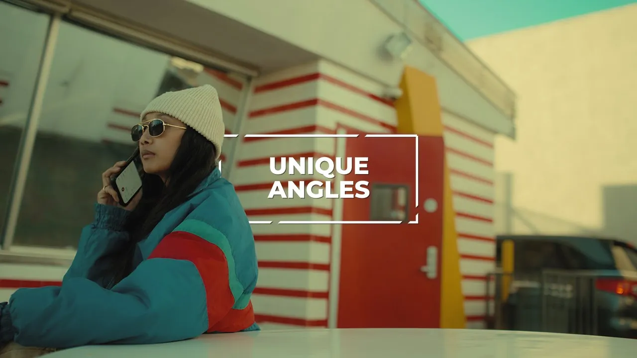






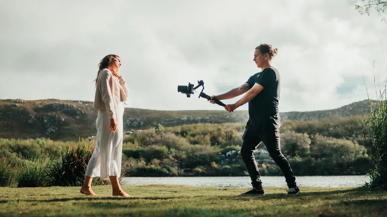
This video explores two major compositional frameworks for film and video—Rule of Thirds and the Golden Ratio—through comparative analysis across different aspect ratios (16:9 and 2.35:1). The presenter conducts side-by-side experiments with real footage to test which method produces more visually appealing compositions. While the Golden Ratio appears to create slightly more aesthetically pleasing results in minimalistic shots with sparse detail (such as horizons and landscapes), the Rule of Thirds proves more versatile for scenes containing focal points like people, objects, or detailed environments. The presenter concludes that while these rules provide useful guidelines, practical considerations and the specific content of each shot ultimately determine the most effective compositional approach.
Composition in Film: Golden Ratio vs Rule of Thirds Explained
Added:framing and composition for film and video. Also look at aspect ratios for cinema and TV. Rule of thirds versus the golden ratio. I've been doing some research into this recently. So I thought I'd make a video on the subject and share my thoughts and discoveries. Firstly, just to clarify my take on this over the last few years. I have been increasingly working in live action, but technically I'm an illustrator. So I'm more accustomed to creating composition straight onto the blank page, which is obviously different from a photographer or a videographer composer's image. But many of the solutions are pretty much the same. So let's look at this as if we were composing a painting. The first thing we need to know is what is the shape of our canvas. Aspect ratio. Likely aspect ratios for film and video were mainly dictated by the technology of both the camera capturing the image and the end screen. The content be viewed on. But of course these days content is viewed on a huge variety of different shaped screens.
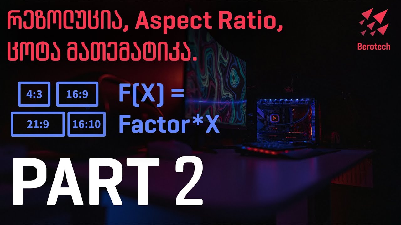
desktop computers, home TVs, tablets, phones, and even if you just look at the aspect ratios within cinema, the list of possibilities is huge. So firstly, we have our good old 16x9 or 1.78:1. This is your HD TV and these days your 4K TVs and screens and monitors. This video we put together in 4K for YouTube, so that's what you're looking at right now. Two of the more popular ratios we often see used for cinema these days would be 2.35 to 1 and 1.85 to1. Many films that you would have seen would be in 2.35 to1. For instance, the original Star Wars or more recently the Star Wars Rogue One, Mad Max Fury Road, Fight Club, Pulp Fiction, Raiders of the Lost Arc, Apocalypse Now, Lord of the Rings, and then also 1.85 to one covers many films also like Godfather, Shaw Shrimp Redemption, Ran, Goodfellows, One Flu of the Cuckoo's Nest, Back to the Future, Vertigo, Fargo, The Big Labowski, Fantastic Mr. box, Finding Nemo. The list is pretty much endless, but you get the idea.
Also, it's worth considering some of the classic aspect ratios, which I still use today in some rare occurrences. Uh 1.37 to1, uh that's your Seven Samuris, It's a Wonderful Life, Citizen Cane, The Third Man, Pinocchio, The Wizard of Oz, etc. Also, these days we do have a few curve balls in the mix. things like La La Land that was at 2.55 to1 which is a very sort of thin and wide aspect ratio. It should be noted that many films are made in several different aspect ratios for different purposes.
For instance, Apollo 13 would have been made in a 2.35 to1 for standard release but then also they would have pressed a 1.66 to1 and a 1.78 to1 IMAX versions for different types of cinema screens.
And you'll even find some films that change their aspect ratio in a single film. For instance, Life of Pie was mainly shot in 1.85 to1, but had some scenes in 2:1 and 2.35:1 as well. Another good example of this is the Grand Budapest Hotel, where different scenes for different periods were shot in different aspect ratios.
For instance, 1.37 to 1 was used for 1930 scenes, 1.85 85:1 was used for the 1985 scenes and 2.35 to one was used for the 1960 scenes. Then you have TV and streaming content. The main contender here is 16 by9 or 1.78 to1 that covers your Sopranos, your Breaking Bad, your Game of Thrones, all that kind of thing.
But there's a few curve balls in there as well. For instance, Stranger Things, which is a recent very uh decent bit of TV by Netflix, that was a two to one.
But for the sake of simplification, let's focus on a couple of dominant aspect ratios. 1.78:1 or better known as 16x9 and 2.35 to 1. Composition. Now, I intend this video to be relatively short, so I'm going to try to cover just a couple of things here. I'm not going to get into every consideration you need to think about while composing a shot.
What is the uh emotional content here?
What is the intent? Are we going for confusion, anger, despair, dynamic, fluid, moving shots? you know, aerials, jibs, and we're not going to cover any of that. We're just going to look at some fairly simple locked off shots that may feature landscape and or a few character or focal points. So, we're looking at this as if we're composing a painting or a single scene and not not necessarily part of a big fragmented story. Rule of thirds. I'm sure anyone that has picked up a camera has probably already heard of the rule of thirds. It is even a very common built-in overlay that many cameras allow you to choose.
Simply put, if you line up any of the important elements either one/ird in from the left or the right or the bottom or the top, this will arguably give you a more satisfying composition than if you just plunk the horizon line bang in the middle of the screen horizontally or if you place the main protagonist or focal point or landmark along the vertical central line. But of course, this is debatable.
Sometimes you will want symmetry or perhaps some crazy Dutch angle with plenty of diagonal lines to inject some dynamic tension or something else entirely will will suit your content and subject better. But more often than not, we will have naturally occurring horizontal and vertical lines within our scene. So this simple rule does help us to compose the shot that has a bit more interest and balance. The golden ratio, I think any art or photography student will also have heard of the golden ratio. It's also called the golden section or the divine proportion.
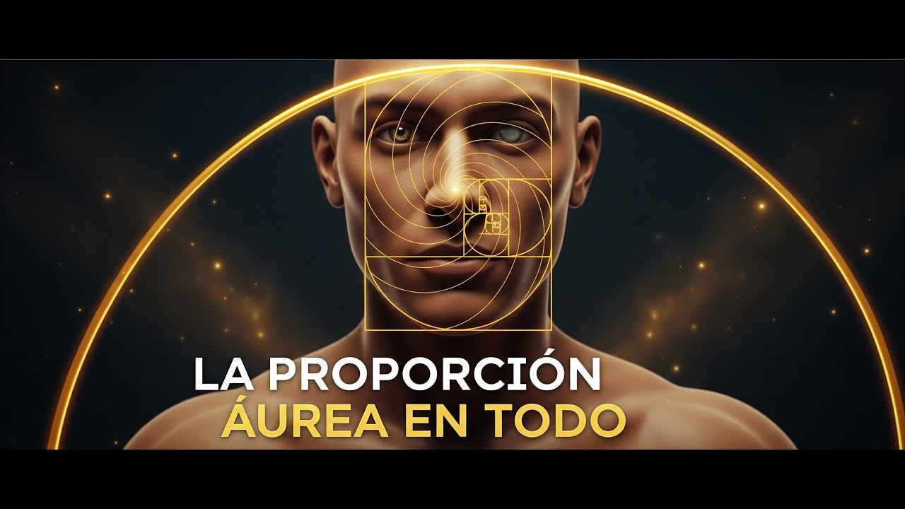
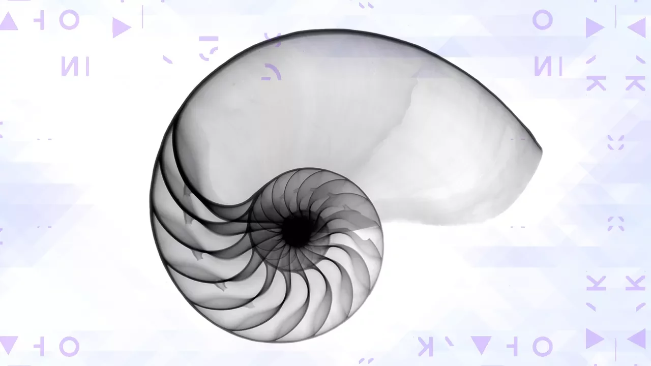
It's a few different names, but it's basically the same thing. And it's essentially closely related to the mathematical proportions that Fibonacci numbers will give you. And it's been used by a great number of painters, photographers, and scientists for many years. It reflects the rhythms and patterns that occur in nature. Example, snail shells, flowers, and plant structures, and even the proportions of our own bodies to some degree. It is in fact very simple. You only have to add one number to the next.
Then repeat adding each number to the last number in the sequence until you get an exponentially growing set of numbers. 1 to 1 = 2, 1 + 2 = 3, 2 + 3 = 5, 3 + 5 is 8, 5 + 8 is 13, 8 + 13 is 21, etc. This also gives you what they call the golden curve, which looks like this. So let's put this into practice in our 16x9 layout and decide for ourselves. Firstly, we find that our 16x9 1.78:1 window is a bit wider than the golden rectangle at 1.618:1. But I'm not going to suggest that we force crop everything into the golden rectangle. So, we're going to cheat a little here and simply stretch the golden ratio pattern to fit our 16x9. You could say that I'm ruining the beautiful mathematical principles completely by doing this, and I'll probably agree with you on that, but it's unlikely we could be expected to rigidly work to this exact aspect. So let's go with it and see what happens.
And the dividing lines we're most interested in here are this one and this one. And if we now mirror this, we get what is called a fi grid. And this is our alternative to the rule of thirds. So now we have our fi grid taken from the golden ratio and we have our rule of thirds. Let's do some compositional experiments and see what works best. Here are some random shots I filmed. I wasn't going for any particular composition with these at the time of filming, but we can move them around and crop to force the composition for comparison's sake. Here we have it forced into the golden ratio. And here we have it forced into the raw thirds. So, which you think is better? Here they are side by side. Let's go through a few of these and see what we find out.
[Music] Now let's do the same thing for our 2.35 to1 aspect ratio.
[Music] Okay, so there we go. What do you guys think? Which was uh which was better for you, the golden ratio or the the rule of thirds? Um I think for me the golden ratio pulls ahead whenever the scene is very very minimal and there's very little actually going on in the shot. if it's just a horizon line and a few clouds or you know very very sparse in terms of uh detail uh then the golden ratio does seem to pull ahead for me and they do sit nicer on the screen uh and they're just a little bit more pleasing and more more sort of um just they just look nicer for whatever reason. But the minute there's any sort of real focus in the scene in terms of detail like boats or cars or people or dogs or whatever, uh then it kind of has to go out the window and you've just got to judge it shot by shot uh and give the character enough head room or leg room or or you know show the path that they're walking on or or something like that. There's there's always something else which pulls ahead of being more important than these so-called rules. Um, but anyway, I thought it was a fun a fun fun sort of test to do and you always hear about these things and until you sort of test it out yourself, you never really know whether it makes a jolt of difference or not. Uh, but I would be interested in hearing your opinion. Let me know. Um, I mean, maybe you sort of made a little note as you're going through about which ones you liked and which ones you didn't. Um, if you got any kind of results or any gut feelings. Yeah, let me know. Let me know what you think and I'd be interested to hear it. Okay, I'll leave that there, guys. Uh, hope that was interesting. Peace out.
Up Next
Art Nouveau Architecture and Decor: A Historical Lecture
@prof.lynneporter8467
46.9K views•2021-04-21

Christian Iconography: History, Theology, and Meaning | Fr. Panayiotis Papageorgiou
@Trisagionfilms
58.8K views•2020-02-21
Ukiyo-e Art: History, Woodblock Printing & Influence
@japanathand
6.3K views•2023-06-08

Earliest Depictions of Jesus in Art: 10 Ancient Images Explained
@UsefulCharts
5.9M views•2022-06-03
Related Study Plans & Knowledge Roadmaps
Structured learning paths in Art History