



![신규 사용자 경험의 핵심, 아하 모먼트를 찾아라! - [ 그로스 해킹, 이렇게 시작하자! ] 시리즈 첫 번째](https://i.ytimg.com/vi_webp/Jqoyte5NfXQ/maxresdefault.webp)




![How to Increase Customer Retention With Your Product [Practical Guide]](https://i.ytimg.com/vi_webp/rA2uxXIavQA/maxresdefault.webp)




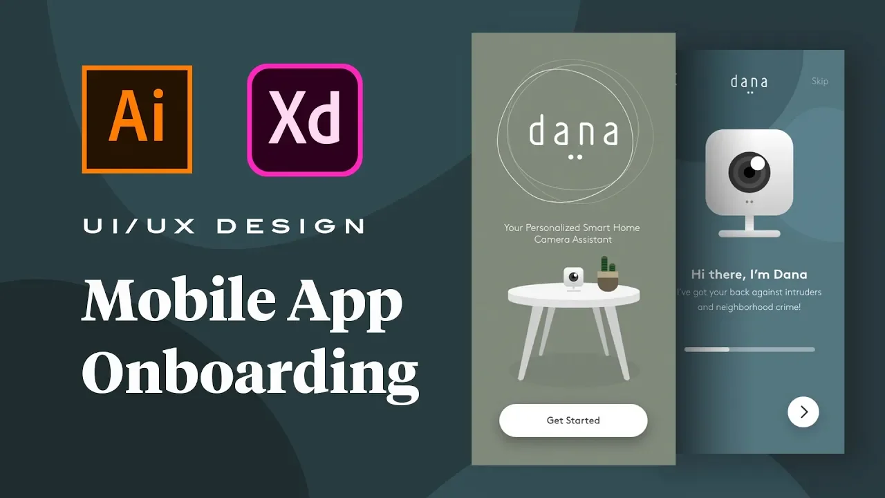








Effective onboarding requires understanding users deeply through three key steps: (1) Know your user types and their specific needs, (2) Work backwards from defining what success looks like for each user type, and (3) Align the onboarding experience with your business model and strategy; successful onboarding avoids common pitfalls like excessive steps, walls of text, and forced monetization by focusing on personalized guidance, progressive disclosure, and emotional engagement to help users achieve their first win quickly.
Onboarding UX Best Practices Derived From 200+ App Analyses
Added:Fundamental UX/UI design principles, including cognitive load theory, Jakob's Law, and usability heuristics.
Key product growth metrics, specifically user retention rates, churn, and the definition of the 'Aha! Moment' (Time-to-Value).
The stages of the standard User Journey, particularly the transition phase from user acquisition to product activation.
Common interactive UI patterns used in mobile and web applications, such as progress indicators, tooltips, and permission modals.
Designing and executing A/B testing methodologies specifically for optimizing user onboarding flows.
Implementing dynamic and personalized onboarding experiences tailored to distinct user personas or acquisition channels.
Advanced product analytics integration using tools like Amplitude, Mixpanel, or Heap to perform detailed funnel drop-off analysis.
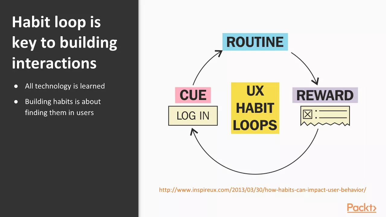
Strategies for long-term user engagement, habit formation (e.g., Hooked model), and feature adoption beyond the initial first-time user experience.
17.1K views521likes17:21Original Release: 2025-02-26
there is a moment when you open a brand new app or log into a service for the first time where you just don't know how it works or if it's going to work for you and somewhere in the back of your mind you're already deciding is this worth my time I have studied over 200 onboarding flows across some of the most successful and not so successful digital products out there and what I found were common patterns mistakes and some really interesting insights that will change the way you think about onboarding ux and UI so the question is what separates a winning onboarding flow from a failed one and how can we design these better well it turns out there's a formula and some key things that make for a really exceptional onboarding experience so be sure to watch the whole video because some of this might not be what you expect I have personally designed many onboarding flows and there is one Golden Rule that you cannot forget and that is you can't onboard someone you do not understand no amount of beautiful illustrations or perfect laid out screens or tool tips will make up for not clearly understanding your users because the key to getting them on board is being able to meet them where they are and having a plan to get them where they're trying to go onboarding isn't just about showing off your product and its features it's about getting the users to the results they care about and for that you need to know who they are and what they care about so when you're planning your onboarding flow these are the three steps that can make all the difference step number one is know that that user Define your user types the most successful products know that not every user is the same you may have power users casual users skeptical users or business use cases you might have users that are completely non-technical and have only ever used things like Facebook or Craigslist you might have users that are motivated by rewards and others that just aren't this is why it's so important to do your user research and understand who your ideal customer is and here's the kicker it's not just about understanding who your product is for but also about knowing who your product is not for trying to be everything to everyone rarely works out so having an idea who this product is just not quite right for is a constraint that you can really use to your advantage when you are creating your onboarding flows Notions web app is a really great example of this when you first sign up it asks you whether you want to use it for a team for personal use or for school so you're self-identifying with the type of use case then it asks you just a few questions about yourself and it does this in a drop down with limited options I think in a lot of cases this is better than just an empty form field because then you can match it better to The Experience on the other end and you have a confined amount of things that you can do when you get to the other side so the first field is what kind of work you do I'm going to go ahead and select product management then I'm going to select a team member and then these these three options here for Wiki project management and Company goals then there is a loading screen here so it lets the user know that something is happening behind the scenes and then you're dropped into the workspace with these walkthrough tool tips so that you have some relevant guidance and you're not left alone to Fumble through this step two is to work backwards you need to Define what success looks like for your users the best apps recognize that different users and user types have different go goals and motivations and levels of experience and that also changes each step of their Journey so here are some questions to think about what steps absolutely need to happen to get them there what is the simplest most intuitive way you can guide them through those steps and how can you get them to their first win quickly so acorns is a great example of this they have quite an extensive onboarding because in a financial use case there are a lot of questions that need to be answered in order to to classify you correctly and these are simple toggles that allow you to choose more than one so that they know how to classify you and then the first thing is to link your bank so this is really important that's one of those non-negotiables where in order for you to see any results you have to link your pank account this is very important that they let the user know that they can trust this that it's encrypted Etc then you can manually enter your bank or choose one of these options and being able to choose this and have an autoconnect feature is again giving them a quick way to a win so that they're not forced to enter everything manually but if for some reason that doesn't work they have the choice to link with their routing and account number instead so next it's letting you know how the automatic linking Works using plaid which is this third party thing and that it's still safe and secure and then you're going to log in to your bank with those credentials and some more Security checks two Factor authentication probably three and then success so now you are going to understand that this is a subscription based app and there are going to be a couple of tiers here so this is how much it costs for the personal the family and then once you've decided on that you can set up your investment account so again there are a lot of questions here and normally I advise against this but again in financial use cases this is usually important and something that needs to be done so it needs your employment status yearly income all of these things what I'm not crazy about is that you cannot come back and finish this later they really make you go through the entire process and I wish that there was some notification that let me know that hey you're going to need to sit down and do this in one session because there isn't a skip or comeback later option when you do manage to get to the end of this intake I do like this screen that summarizes everything that you've input so that you can review it and change the answers if you need to at this point Okay so so now it lets you know that it's analyzing everything and setting up your portfolio and that's it now you're in the takeaway here is that if you don't define success for your users they won't know when they've achieved it now step three is the one that designers most often Overlook and that is aligning the onboarding with the business model and strategy onboarding isn't just about helping users understand the product it also needs to align with how the business plans to make money and that long-term strategy if onboarding is too aggressive in pushing monetization users will bounce before they even understand the value and if it's too passive they might not ever convert we've probably all been catfished before into getting really excited about an app only to be slammed face first into a pay wall before we even get a chance to see what it can do for us that's why it's so critical to balance user experience with business objectives whether that's driving subscriptions increasing ad Revenue bolstering engagement or attract in investors so visco is an app that I have some mixed feelings about visco is short for visual supply company and it's a mobile app that offers photo and video editing tools it's also got a community around it for a diverse audience that usually includes aspiring and professional photographers and content creators now as I go through the sign up process after I've created an account is when I'm hit right with a pay wall now because they have a premium business model they do allow you to see a few different features really really basic features without starting a subscription but you don't know that it's really a fight to even figure out how to get into this app so I'm clicking through as soon as I hit start my free trial I realize it's yearly so I go back to see if they have a monthly I try to continue with monthly but there's no free trial so back to yearly I really don't have any idea what it looks like inside of this app so I hit the x button thinking that I'm just going to be closed out and leave but instead I land inside of the app which is pretty blank there is a feed here I'm going to look at my account there aren't a whole lot of empty States and anything to guide me to figure out what's behind a pay wall what's free what am I looking at what should I be doing this is a good empty State here that says create your first space that you can build a shared Gallery but as soon as you click that you realize it's a pay wall there's no lock icon or anything here to indicate that that is locked before I click it so it's just a ton of clicking around and I feel like I'm wasting a ton of time without knowing what I'm getting for free and what I'm not so I think this could definitely benefit from some better onboarding I can see how perhaps their goals as a business have changed since their early days of attracting funders to now a revenue based model but I think they could be pushing a little too hard here in the direction that turns users off from signing up so this is another example in the same space this is photor which is a photo editing app very similar to photoshop so right from the start there's a lovely onboarding model that comes up that again classifies the user so you can choose any one of these options and again there are limited options it's not just endless and there's not just a field for you to type in your situation so I'm going to choose content creation Enthusiast next it's what do you plan to use it for and again this is going to help customize and personalize the app for you so I'm going to say social media content and maybe uh visuals for post Etc next how often do you edit and create content I could say maybe nearly every day and then I can click done or start free trial so I'm just going to click done and so right away you can see that there are tons of examples it's very full of all kinds of things you can do right at the top it asks you what you'd like to create and there are these three main things here and things you might like to try and that again has been personalized based on the answers to the questions in the onboarding so if I go into photo editor here I immediately have this popup again now this is aligned with the business model because it's really trying to push you to Phar Pro but again you don't need to do it right now you can close it easy here to see that you can do that because of this model so we close that and we can continue using it so I'm going to open an image here once I've uploaded this I see all of these options and effects and different things on the right and these little red dots kind of indicate that I might want to click this and try this so so let's say that I'm going to effects here and I want to click on that it's going to go ahead and start rendering this cartoon graphic there's also ads here that I've noticed ad revenue is part of the business model that's driving this as well as their conversion to uh the pro plans so it seems like on the free plans they're monetizing by having ads and if you upgrade to Pro and you're paying them directly well then you don't have to see those ads so this is pretty funny it rendered me in to a cartoon and I can go to other scenes try out all of this stuff but as I go down I start to see this little Diamond icon on some of them so curiously if I were to click that and I click on this I notice a little Watermark here and if I try to take that off well it triggers another modal here so you can see how this is more cleverly um built in to where I can still see this example I can still try this effect and see if I like it and I know already that when I see that little Diamond icon that this is a pro feature that I'm going to need to unlock but it doesn't stop me from trying it which I really like and it gives me the transparency to know that it's Pro and it also uses another one of my winning formula rules which I'll get into later in the video so the takeaway here is that the best onboarding isn't about locking users in but about showing them why they would never want to leave step four test tweak and optimize in small steps if users drop off at a a certain step it doesn't mean that everything is wrong don't go redesigning all the stuff change one thing at a time and then measure it reduce the number of clicks change the copy add a visual cue the takeaway here is that you don't fix onboarding with panic and guesswork you fix it by testing one small change at a time it has been my experience that the small nudges can lead to the biggest results so after designing onboarding flows for years and looking at these 200 plus examples I noticed some of the same mistakes over and over again before I get into those you might be curious at this point how I was able to study all of these well I used a secret Little Weapon called mobin I didn't have to create an account on 200 plus apps thank goodness I just went to mobin and I searched up onboarding flows and I started analyzing them and you can too it is such an underrated tool for ux and UI designers and I think you should really check them out because you can gain invaluable insights like these just from studying the screen flows and Screen casts that they collect and you can even bring them right into figma to work with them yourselves so use the link in the description below and follow along now that we know what works let's talk about what doesn't a bad onboarding experience can cause up to 80% of people to leave the app before they even try it that's like opening a restaurant and having a 100 people show up and only 10 stay to try the food in the other 90 look at the menu and walk right back out that's not good especially when you pour so much into building a great product and no one even gets to see it and we all know how important first impressions are and how hard it is to win people back and these are easy fixable mistakes that are costing companies millions in Lost users so mistake number one is the too many steps trap if you're asking for their full name job title favorite color grandma's maen name before you even let them see the product they're not going to like that the best apps get users to their first win as fast as possible and later in the video I'll show you what to do instead mistake number two the wall of text problem if your onboarding flow feels like a textbook users will skip it instead try using visual storytelling quick tool tips and real user testimonials to make it feel natural I actually found that onboarding flows like the one here in matter that uses animations and a storyboard style flow are really effective for getting users to get through the onboarding mistake number three is the No Escape room it's normal to feel like you want your users to understand every little bit of your product in order for them to get the full effect but if you force them through a whole 12-step program before letting them do anything that's usually going to backfire so give users the option to skip things if they want to skip them encourage them to explore on their own at the right time and you know sometimes a choose your own journey is just what's right for your type of user and sometimes more handholding is needed the best onboarding flows feel like helpful guidance not like an escape room that they have to struggle to find their way out of so what's the winning formula well there isn't just one thing but there are three key elements that I found always work really really well for onboarding this is the actual experience you want to aim for in terms of the interaction so one is the this is just for me effect the best apps don't treat every user the same like we've talked about so think about the journey and how you can personalize it to your user type or your user's actions if your onboarding flow is one size fits all right now it can probably be improved this brings me to the second key element which is the just in time rule this is about Progressive disclosure and it means that users only get information when and where they actually need it I love using action-based triggers and conditionals for this modals or beacons or other interactions and introduce it to them at certain points and you could use something like intercom to do this for you the third key element is the make it Feelgood Factor this is about emotional engagement apps that use micro rewards progress bars and even subtle animations can create an emotional connection with users that keep them engaged and excited and interested to come back it's not just cute this is pure psychology those tiny hits of dopamine make users feel good about using the app and it's been proven that they were the best onboarding flows don't just educate but they make users feel something now don't forget that I have a course we teach this kind of practical stuff and how to be a modern-day product designer and this is everything from the ux and the UI to the business and product strategy that is missing for a lot of designers so if you're interested in that it's really affordable It's a Wonderful community and I think it's a very unique experience and I'd be honored to have you as a student too so now to get into some of the Practical UI stuff behind onboarding I have a table here that has 14 of the most common types of onboarding design patterns that I've identified their attributes and screens so if you want to go through all of this and see all of these examples then watch this video next
Up Next

13:37
Key Marketing Metrics for Business Growth Tracking
@RickKettner
5.2K views•2020-07-22
46:36
Retention Habits of Top DTC Ecommerce Brands Revealed
@SendItPodcast
44K views•2026-03-03

15:23
Decoy Effect: How Pricing Psychology Influences Consumer Spending
@bobinvestsUS
90K views•2026-01-05

17:30
The Planned Obsolescence of Light Bulbs and Tech
@veritasium
25.3M views•2021-03-26
Related Study Plans & Knowledge Roadmaps
Structured learning paths in Business
business
Pop-Up Retail: Strategy, Design & Execution
01Introduction to Pop-Up Retail & Strategic Goal Setting
02Budgeting, Site Selection, and Legal Essentials
03Experiential Retail Design & Visual Merchandising
+ 2 more learning modules
15h5 modules
Explore Roadmap
business
Reg CF: Startup Funding, Marketing & Launch
01Introduction to Equity Crowdfunding & Reg CF
02Platform Selection & Legal Preparation
03Crafting High-Converting Campaign Assets
+ 2 more learning modules
14h5 modules
Explore Roadmap
business
Productized Services: Scaling Solo Freelance
01Foundations of Productized Services
02Packaging and Scope Definition
03Pricing and Subscription Models
+ 2 more learning modules
15h5 modules
Explore Roadmap
business
Gov Procurement: Find, Bid & Win Contracts
01Introduction to Government Procurement & Business Setup
02Small Business Certifications & Set-Asides
03Finding and Analyzing Contract Opportunities
+ 2 more learning modules
14h5 modules
Explore Roadmap