






![B1.6 Blackbodies plus Wien's and Stefan Boltzmann's law [IB Physics SL/HL]](https://i.ytimg.com/vi_webp/yL4uBhZocRE/maxresdefault.webp)



















Stars are classified by their spectral characteristics, with the O-B-A-F-G-K-M sequence representing temperature from hottest (O stars at ~25,000 K) to coolest (M stars at ~3,500 K), where hydrogen absorption lines are strongest in A-type stars due to optimal thermal excitation conditions; the Hertzsprung-Russell diagram plots luminosity versus temperature, revealing that 90% of stars lie on the main sequence where they spend most of their lives fusing hydrogen, with higher mass stars being hotter, more luminous, and shorter-lived due to faster fusion rates despite having more fuel.
The Nature of Stars: Luminosity, Temperature, and the HR Diagram
Added:Understanding the difference between apparent brightness (how bright a star appears from Earth) and absolute luminosity (the actual total energy output of a star).
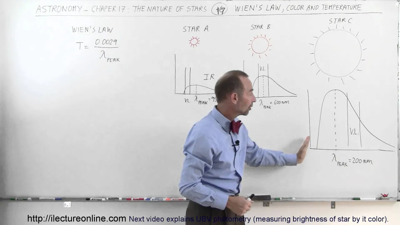
Basic knowledge of blackbody radiation and Wien's Law, specifically how a star's temperature dictates its color and peak emission wavelength.
Fundamental concepts of spectroscopy and atomic structure, which explain how absorption lines in stellar spectra reveal chemical composition and temperature.
An introductory grasp of gravity and nuclear fusion (specifically hydrogen fusing into helium) as the competing forces maintaining hydrostatic equilibrium in stars.
Detailed study of stellar evolutionary tracks on the HR diagram, mapping the specific life cycles of low-mass stars versus high-mass stars.
The physics of stellar remnants, exploring degenerate matter, Chandrasekhar and Tolman-Oppenheimer-Volkoff mass limits, white dwarfs, neutron stars, and black holes.
Using star cluster HR diagrams and the 'main-sequence turnoff point' to determine the relative and absolute ages of stellar populations.
The nucleosynthesis of heavy elements, investigating how stellar fusion and supernova nucleosynthesis enrich the chemistry of the universe.
6.1K views75likes42:38Original Release: 2014-03-26
Today we're going to talk about the nature of stars.
I'll start by reviewing what we've learned about stars so far in this course. One of the most important things that I hope you take away from this class is just how far stars are from us.
If you remember a few lectures ago, we constructed a scale model to help us understand the vastness of space. In this model, we shrunk the Earth down until it was as big as a tennis ball.
In that model, the sun, our star, is the size of an RV parked half a mile away, which already seems quite far from that little tennis ball. The nearest star, however, is 15,000 m away. That's twice the diameter of the Earth. This is such a great distance that it takes light 4.3 years to travel that far.
For comparison, light can go 10 times around the Earth in 1 second.
We also learned the distance is not an easy thing to measure. For example, we can't tell how far away a star is just by measuring its brightness since its brightness will depend on how luminous the star was to begin with. Let me go over this again since I think there was some confusion with terminology before.
Brightness and luminosity are not the same thing. Luminosity is an intrinsic quantity. It's a measure of how much energy a light source puts out in 1 second. It's often expressed in watt.
So the luminosity of a light bulb is 100 W. That doesn't change depending on how far away the bulb is from you. A 100 W bulb is a 100 W bulb whether it's here or in Puerto Rico.
Luminosity is sometimes also called intrinsic brightness, which I grant you is confusing, but it's in order to emphasize that it's a quantity that's defined by the object and doesn't depend on external circumstances.
On the other hand, brightness is a measure of how bright things look to an observer, and that will depend on how far you are from the source. We sometimes also call this apparent brightness. How bright an object appears to be when viewed from some location.
Brightness and luminosity are related by the following equation.
You calculate the brightness of a source by dividing the luminosity by the surface area of a sphere enclosing that source. If you're closer to the source, the sphere will be smaller and so its radius in this equation D is smaller and therefore the brightness is higher.
As you move further away, the area the source is illuminating is growing larger and larger. So the brightness at any point has to go down.
This means that just measuring the brightness of stars by looking up at night doesn't automatically tell you how far away things are or how intrinsically bright they are, how luminous they are.
You need to know one to deduce the other because there are three variables in this equation. You need to know two of these values in order to calculate the third one. So for example, if you know what the brightness of an object is in the sky just by looking at it and measuring how bright it appears to you and you also know how intrinsically luminous it is, then you can deduce how far away it is.
Alternatively, if you know how intrinsically luminous an object is and you know how far away it is from you, then you can deduce how bright it will appear.
You can also do the same thing. If you know how bright something is and you know what distance it is from us, you can calculate the intrinsic luminosity.
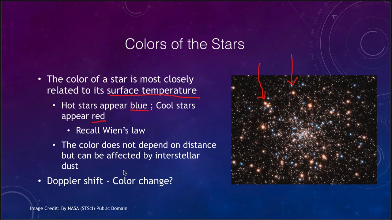
One thing you can deduce just by looking at a star is its temperature. We learned that objects like stars radiate thermal emission and that that emission will peak at a certain wavelength which is determined by how hot the star is. For hotter stars, their emission peaks at shorter wavelengths.
Cooler stars at longer wavelengths.
One thing to remember though is that even though the peak is at a certain wavelength, the star is putting out thermal emission at all wavelengths, just in lower quantities. So, a star that is cool, say at 2,000° Kelvin, its emission will peak in the infrared, but it is still emitting visible light. It's just emitting less of it than infrared light. So, it might still be visible to our eyes. If you're having trouble with these concepts of thermal emission and how it depends on temperature and the wavelength of the object, then do check out this website that has a really nice animation that allows you to change the temperature of a star and see how the thermal emission changes as you change the temperature.
Another important thing that we learned in class is that temperature, luminosity and size are related by the following relationship. The luminosity is proportional to the fourth power of the temperature times the second power or the square of the size or radius.
Now this means that when two objects are the same size, a hotter object will radiate much more energy, will be much more luminous.
Again though, we have three variables.
So we need to know two of them in order to determine the third. It's not enough to know temperature to determine the luminosity of a star. We must also know the radius of a star.
In this case, the two stars are at the same temperature. So I fixed the temperature. One of them is bigger than the other. Therefore, the larger star is more luminous than the smaller star.
In this case, I fixed the size. Now the two stars have the same size. So r is constant.
Their temperatures though are different.
The cooler star, the red star, is cooler than the blue star.
As the temperature changes, their luminosity will also change so that the cooler star will be less luminous than the hotter star at the same size.
If I now fix the luminosity, in order to have two stars with the same luminosity but different temperatures, their radi also have to be different. So if the luminosity is the same but one star is much cooler than the other then that star has to be much larger than the other in order to compensate.
So these two stars have the same luminosity even though one is much hotter than the other.
The final thing we learned in class is that stars don't actually have perfect thermal emission spectra. Their emission does peak in the wavelength that you might expect given their temperature, but some of that light is absorbed on its way out of the star.
If you look in detail at the solar spectrum, you'll see that it's covered in these dark absorption lines.
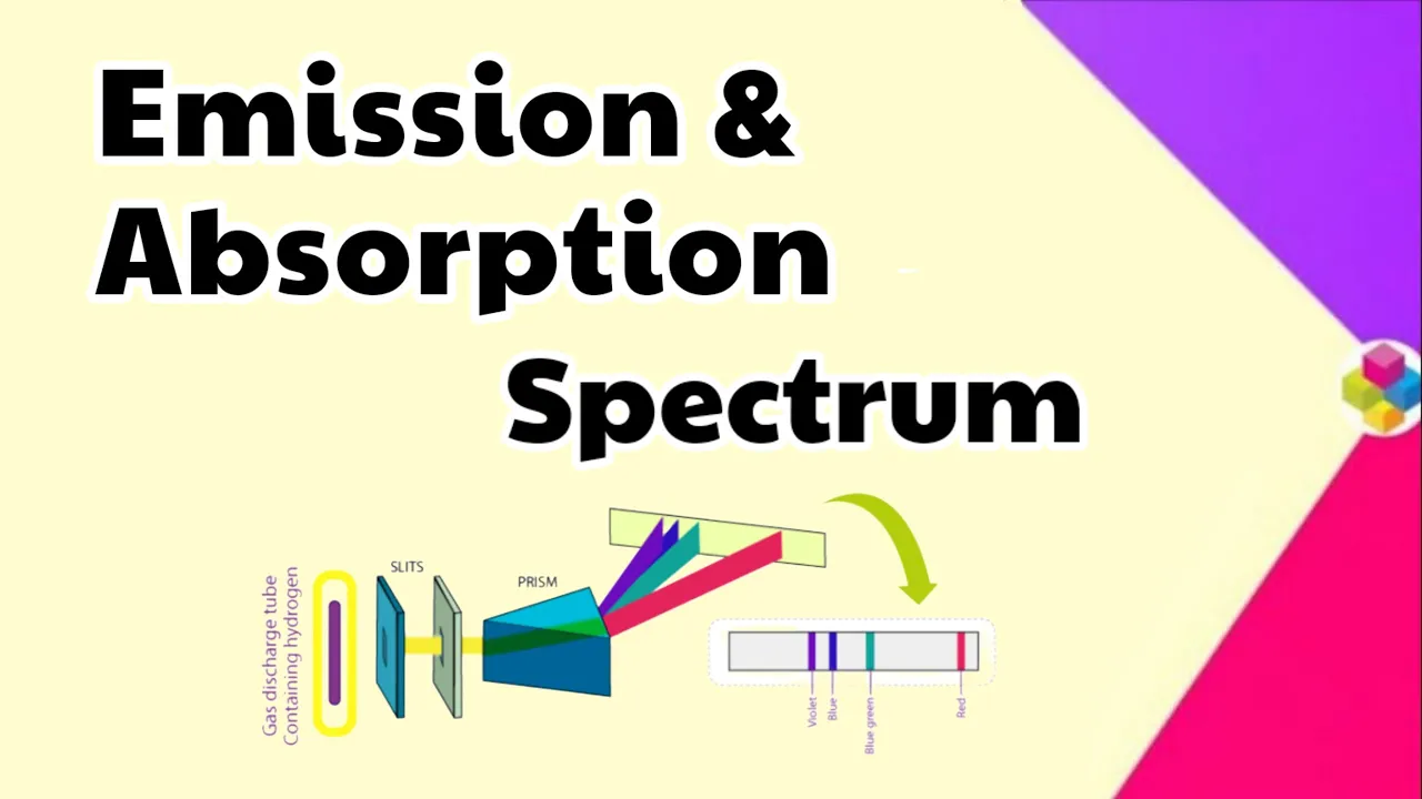
Remember that these absorption lines are created when photons of a specific wavelength are absorbed by atoms in a gas. In the sun, these photons are emitted by the inner layers of the star which are opaque and then are absorbed in the outer less dense regions of the atmosphere which let most wavelengths of light through except for the specific ones which correspond to the energy levels in the atoms that make up the atmosphere.
Since each atom has a specific fingerprint, identifying these energy levels tells you about the composition of the atmospheres of stars.
Another way to look at this is by converting that 1D spectrum where we have the full colors of the rainbow and those black lines um which correspond to colors that have been completely absorbed by the gas. And now we plot it in 2D just like we did in our labs. So that we're plotting intensity as a function of wavelength.
And look again how the uh thermal emission peaks around 500. So there's a a sort of um large scale curve smooth curve that peaks around 500 nm but then superimposed on top of that are these dips in the spectrum that correspond to the absorption lines. Everywhere you see a black line you would see a a dip in intensity.
In this lecture, we're going to learn how looking at these lines in detail allows us to make a different kind of classification of stars, a spectral classification of stars, which is a new way to determine the temperature of stars.
We'll also look at correlations between quantities and see that they can help us gain some physical understanding some of the time.
We'll talk about the HR diagram, one of the most important diagrams in stellar physics, and what it tells us about the nature and evolution of stars. We'll be using the HR diagram throughout the next few lectures in order to understand how stars form, evolve, and die. So, it's important that we spend some time this class understanding what it tells us.
We'll also focus on one particular um area of the HR diagram today and that's called the main sequence. That's where stars will spend over 90% of their lives.
Speaking of stellar lives, the lifetime of a star on the main sequence depends very sensitively on the mass of the star.
You may have noticed that so far in this course all of the protagonists have been men. Galileo, Newton, Kepler, Thompson were all brilliant scientists who furthered our knowledge of the universe.
But science and astronomy in particular were a realm that women were not allowed to enter.
I'm happy to tell you that the situation is very different today where astronomy thrives with the contri contribution of many brilliant female minds. Women are finding exoplanets, probing black holes, discovering pulsars, and leading the search for life in the universe.
We still have a way to go to make science a truly inclusive field. But the great progress we've made in the last decades was made possible in part by a group of women working at Harvard in the late 19th century.
These women were hired by William Pickering to be essentially human computers since actual computers were still some decades away. These women were number crunchers doing grunt work for significantly less pay than a man would receive. In Pickering's lab, the main job was one of stellar classification, sorting through thousands of photographic plates of stellar spectra and identifying spectral lines.
Once the lines had been matched up to their respective elements and the strength of the line had been estimated or how much light was absorbed, the star was classified under some scheme.
The scheme that was currently in favor was one where stars were ordered by the strength of their hydrogen absorption lines in alphabetical order from A the strongest to s the weakest.
One of these computers, Annie Jump Cannon, was renowned for her amazing eye for stellar spectra. Alone, she classified over 400,000 spectra. She also had a great physical intuition and realized that the current classification was not capturing the true sequence of these stars. She rearranged the classification so that the resulting one OB Afghan students have had to learn.
Annie knew that this was the correct way to order the stars, but she didn't know why. It was another woman, Cecilia Payne, who used the new theories of quantum physics to discover that the OBFKGM sequence is in fact a sequence of temperature with O stars being the hottest and M the coolest.
So why is it that the stars with the strongest hydrogen absorption are not the hottest or the coolest, but somewhere in the middle?
You see here that the A stars have the really deep black absorption lines and they're in the middle of the sequence.
Here's the basic idea behind thermal excitation.
Remember the structure of the atom.
Electrons can only exist in certain levels and each of these levels has a specific energy. Here's a hydrogen atom with a nucleus and an electron on the first level.
As you heat a gas, atoms move quicker, collide more often, and more violently.
This excites the electrons and atoms and causes them to move to higher energy levels.
The higher the temperature of the atom, the higher the level electrons will climb to.
At some point, the temperature is so high that the electrons are ejected out of the atom and the atom is no longer an atom since it lost its electron. It's now an ion and we say it's been ionized.
Without electrons, atoms can no longer absorb photons in the same way. So, the absorption lines get weaker.
On the other hand, notice that inner levels are spaced further apart in energy so that they require more energetic photons with a shorter wavelength to change to the outer levels.
As the energy gaps get smaller, you need less energetic photons or longer wavelength photons and so on.
At low temperatures, when the electrons are in their lowest orbits, only highly energetic UV photons are capable of moving electrons to a higher level because the gap between the levels is so large.
Therefore, the absorption lines in the visible part of the spectrum are weaker as well. You need an intermediate temperature that excites the electrons to higher levels so that they are able to absorb less energetic photons in the visible range which will now match the smaller energy difference to the next level up.
This means that for the O stars most of the hydrogen is fully ionized. They are so hot that the the hydrogen is fully ionized and they cannot absorb much light at hydrogen wavelengths. For the coolest M stars, hydrogen is in the lowest level and therefore only absorbs light in the ultraviolet and visible hydrogen lines are not visible.
It is the stars in the middle, the A stars at around 10,000 Kelvin that have the deepest absorption lines because their electrons are at levels that allow them to absorb um photons in the visible range of light.
So, OB AFG KM is a sequence of temperatures where O stars are the brightest and hottest at 25,000 Kelvin and M stars are the coolest and reddest at about 3500 Kelvin.
So, what does this give us?
It gives us a new way to classify stars.
and a more accurate way to quantify temperature than law. In fact, professional astronomers don't stop at OB AF KGM, but they subdivide each class into 10 subclasses numbered from 0 to 9.
So that 0 are the hottest to 09 the coolest within the O's.
It also gives us a pneummonic challenge because obfkm is actually quite hard to remember unless you have some useful way of doing so.
The most common pneummonic that's told to every astronomy 101 and 102 student is oh be a fine girl or guy and kiss me.
But I'm sure that you can come up with better. Some of my favorites from previous students.
Overseas broadcast. A flash. Godzilla kills Mothra.
Old bathwater actually feels good.
Kidding. Mostly.
And over by Australia, farmers give kangaroos money.
So send us yours.
I'm glad to hear. I'll be glad to hear your suggestions and maybe you'll be included in this slide for future classes.
Okay, so how do we put this all together?
Why are some stars hotter than others?
Why is Sirius twice as hot as the sun and Beetlejuice twice as cold? Are all stars that are cooler fainter? Are all stars the same size or are some smaller than others? These are the questions that astronomers were asking themselves in the beginning of the 20th century.
With limited telescopes and no CCDs, astronomers were able to measure temperature, distance, and luminosity for hundreds of thousands of stars and look for correlations between the different quantities.
Now, what is correlation?
Two variables are correlated when they appear to depend on each other. They are uncorrelated when there appears to be no relationship.
If I plot height versus IQ for a sample of adults, would you expect there to be a correlation or no correlation?
This is what that data looks like. Your height is uncorrelated with your IQ. So that short people can be smart, too.
There's no obvious relationship in these data points.
On the other hand, if I now plot weight versus height, what would you expect to see? Would there be a relationship between the two?
This is what that relationship looks like. And you can see that as people become taller, they also weigh more.
Why would that be? Well, as people become taller, their volume increases because their volume increases with height. And of course, their weight must depend on their volume as well. So, the two are correlated. And you could fit a line through that data that would allow you to predict based on someone's height what their weight would be. Of course, there is some width to that um to to that distribution, right? Not everyone who's 5.7 feet is going to be exactly 140 lb. There's some spread in that distribution, but overall, if you weigh someone who's 6'2, they're going to be heavier than someone who's 5'2.
I want to do a quick aside here to talk about some of the dangers of correlation. And a specific example that I like to use is what happens if we plot the global temperature on Earth versus the number of pirates.
What do you think will happen? Are the number of pirates correlated with the global temperature on Earth?
Look, there's an intense correlation so that as the number of pirates decreases, the global temperature on our planet is increasing.
So, we can have a news flash. Decline in number of pirates leads to global warming.
This might seem silly to you, but this kind of thing happens all the time in the press.
What's happening here? Obviously, pirates and the global earth temperature have nothing to do with each other. How are these two things related? What's the hidden variable?
You might have heard someone say at some point that correlation does not equal causation. And that's what they mean.
Just because two variables are correlated with each other does not mean that they're actually directly linked, that one causes the other. Although often times it's very suggestive.
In this case, there's a hidden variable here that will allow you to understand why the number of pirates is related to the global temperature. Can you guess what it is?
So, correlations sometimes mean nothing, but often times they indicate that there's some sort of physical association between the two variables that you're looking at.
Scientists often look for correlations between variables in order to try to understand if there's any physical connection between the two. One of the most famous diagrams in in stellar physics is called the HR diagram named for Herzbrunk and Russell, the two people who independently came up with it. And all it is is a graph of luminosity versus temperature for um a sample of stars.
Sometimes instead of temperature it uh luminosity is also plotted versus spectral class which we've just learned is you know also correlated with temperature. So luminosity versus spectral class is another possibility.
So if we plot this up in a graph like this one where on the x-axis you see we have the temperature going from a lower temperature on the right hand side 2300 kel all the way to 40,000 kel on the left hand side. So temperature is increasing from the left to right which is the opposite of what you commonly see on charts like this. And then on the y ais we have the luminosity from 10us4 to 10 6* the solar luminosity. L this little circle in a dot stands for the luminosity of the sun. So 10 0 which is equal to 1 is 1 solar luminosity. And you'll see that this little red cross here at one solar luminosity and 5800 Kelvin is where the sun would be on this diagram.
Now before I show you where all the other stars are or where a sample of stars would fall onto this chart, I want to take some time to talk about how things work as you go around this diagram.
So in general we know that a hotter object is going to be more luminous. Luminosity is proportional to temperature to the 4th. So a small increase in temperature is going to lead to a large increase in luminosity.
However, luminosity also depends on radius. So, two objects can have the same temperature but different luminosities as long as their size or radius also changes.
The more luminous object must be larger than the less luminous object of the same temperature.
Let's look at the four corners of this diagram.
Over here, we would have cool stars. So, their temperature is around 2,800 Kelvin.
And since I kept the luminosity at around the same value, so I'm still at one solar luminosity. Let me make that exact. So, I'm going to make it at one solar luminosity. And I'm going to make the temperature 2500 Kelvin.
So, this star has the same luminosity as the sun, but it has a much cooler temperature. And what that means is that the radius of this star must be much larger in order to compensate for the decrease in temperature. And you can see the star represented here as being much larger.
Now what happens if I keep the temperature fixed but instead increase the luminosity? So I'm going to keep the xaxis value fixed but I'm going to move this line this point up in luminosity.
What's going to happen to the size of the star as I increase the luminosity and keep the temperature constant? The star is going to get bigger and bigger and bigger. Because again, if you fix the temperature but increase the luminosity, then the radius must also increase.
What happens now? Let's go back to a more reasonable luminosity value. Let's say what happens now if I increase the temperature while keeping the luminosity constant.
If the luminosity con is constant but the temperature increases then the radius is going to have to decrease in order to compensate for that.
So see here how as the star gets colder and bluer the radius gets smaller.
But notice that it's still smaller, still larger than the radius of the sun.
If I now decrease the luminosity, but keep the temperature constant, what's going to happen to the radius?
If the temperature is constant, but the luminosity is decreasing, the size has to be decreasing as well. So, here we go. luminosity decreasing and there goes the size. Now it's smaller than the sun.
Smaller all the way smaller until you can barely see it. It's a tiny tiny point of light that's much hotter than the sun but also much much fainter because it's so small.
So you may have gathered that things that are in the upper right corner of the diagram must have really large radi and things in the lower left corner much must have really small radi. And we can in fact because luminosity, temperature and radius are um related to each other and defined by each other we can plot on this graph things called iso radius lines which are lines where the radius of the star remains constant. So if I plot the um sun again at uh let's see 5800 Kelvin and one solar luminosity you'll see that it falls onto the line of one solar radius. So in order for a for a star to remain of the same size when the temperature increases if I increase the temperature and the star and force the star to remain at the same size I have to increase the luminosity as well. So over here the star would have roughly the same size but a different temperature and luminosity and so on along this line.
So you can see that the stars retain more or less the same size. I mean it's I can't precisely click on it but the temperature and luminosity change to compensate for each other. So that the cooler the cooler objects are less luminous and the hotter objects are more luminous.
If I increase this object at this temperature to um 10 solar radi.
So I increase its size by a factor of 10. Then it's luminosity also increases by a factor of 100 because it goes as r 2.
Okay. Okay. So now that we understand how the HR diagram works and I encourage you to um come and play with this simulator um if you want to um do it yourself the website here is um astro.unl.edu um and you can copy that from your video.
What's going to happen now once I plot let's say every star within the the nearest um 100 light years? If I were able to go out and measure the distances and therefore the luminosities of every star that's within a certain um radius of the Earth and I measure their temperatures as well and I plotted them up on this diagram. What is that going to look like? Are there going to be stars everywhere along this space? Are there going to be stars that are very very large and cool and luminous? Are there going to be stars that are very very luminous and very hot and even and really um large? Are there going to be stars what kind of star will have a 0.001 001 solar radius and yet have a temperature that's close to 30,000 Kelvin. Do those stars exist in the universe? Perhaps not every possibility, not every combination of luminosity, temperature, and radius is possible or common. Which ones are more common than others?
So let's look at that now.
Here's that website again if you want to go and play around with it.
And what I described before is exactly what the mission of the Hippco satellite was in the '90s. It was a satellite that was orbiting above Earth and was able to measure parallaxes, so remember distances to 41,000 stars all within 100 parex of the sun.
And it measured parallaxes, therefore it measured distances. From the distance and the apparent brightness, you can obtain the luminosity of the star. And from its color, you see on the x-axis here, it's a plot of color, but you also have the um spectral classifications on the uh upper part of the plot to help you figure out where those go. So, it goes from M stars, M0 stars, the coolest, all the way to B 0. And the O's are not included in this diagram for reasons which will become clear uh in next class. So if we plot all of these stars here, they are.
So that's what I call a correlation between color and luminosity. There's only a few combinations that seem to exist in the universe. So we say that once you define the color of a star, you have a pretty good idea of what the luminosity is going to be, especially along this line here. where most stars seem to be located.
So you can see that stars cluster in different areas of the diagram. Every stage of a stars life is captured in this diagram and we'll be using it for the next few weeks to understand how stars are born, how they spend most of their life, and how they finally die.
But in this lecture, we're going to concentrate on this part of the diagram, the most densely populated part. If we take a survey of stars on the sky, 90% of stars will be somewhere along the sequence, which for that reason is called the main sequence. We understand the main sequence to be a phase that all stars go through. And the fact that most stars appear to be on it means that it's a very long phase of their life. If you took a survey of a 100,000 people on Earth at all different ages from 0 to 100, you would find that most respondents work at some kind of job.
That's because the phase in your life in which we usually work, say from 18 to 65, is the longest phase. We spend some time in infancy where we go to school and sometime after retirement. But in general, most of our life is spent in the workforce.
In the same way, stars spend about 90% of their lives on the main sequence.
And in fact, here is our sun at a specific combination of luminosity and color and temperature.
Remember that once luminosity and temperature is defined, we can also define its radius.
Now the thing to remember is that each star in the main sequence sits at a certain spot a certain combination of luminosity and temperature and therefore radius and it doesn't move for the entire main sequence lifetime.
The main sequence is not an evolutionary sequence for the stars. They don't move along the sequence as they age. They arrive at the main sequence stage of their lives and stay at that point with that luminosity and that temperature until they finally move off of the main sequence and something else drastic happens to change their temperature and luminosity.
Now, why is the time spent of the main sequence so long? And why is it so stable? Why does the luminosity and temperature not change over a main sequence lifetime? For the sun, that lifetime is 10 billion years.
The reason behind that is that what we believe is happening to stars when they're on their main sequence is that they're undergoing hydrogen fusion in their core.
And as Kate discussed in the last lecture, through hydrogen fusion, stars can achieve hydrostatic equilibrium.
Let's talk about how this works in a little more detail. In every star, you have a struggle between two forces that have gravity crushing everything inward and that of pressure pushing everything outward. that pressure is generated by nuclear fusion in the cores of stars.
Now this process is actually a feedback process and I'll describe why that is here. The rate of nuclear fusion inside a star is proportional to the density of particles and their temperature. That's easy to understand because the more dense particles are, the more often there will be collisions and the hotter they are, the faster they'll be moving.
So, the likelihood of fusion will be higher once they collide.
So, let's see what if gravity is winning. gravity becomes a little bit stronger then that means that the star will contract because the the force going in is higher than the force going out. If the star contracts though its density and temperature go up once the density and temperature go up we now know that the rate of fusion has to go up as well because the rate of fusion is proportional to density and temperature.
But if the fusion rate goes up, that means that pressure outward is going to get higher and win over gravity.
If the pressure outward is winning against the gravity inward, that means that the star is now going to expand and grow in size. If the star expands though, what's going to happen to its density and temperature? they're going to go back down because as the star expands, there's just more space for the particles and they're going to move slower. So, the density and temperature go down.
But if the density and temperature go down, the rate of fusion, as you know, now has to go down as well because it's dependent on density and temperature.
Now, the fusion rate going down means that the pressure outward has to decrease as well. So now the pressure outward is smaller which means that the gravity is stronger and winning again and that means that the star will contract.
Well, if the star contracts then the density and temperature have to go up and so on and so forth and you're stuck in this feedback loop.
This feedback loop between the pressure outward from the rate of from nuclear fusion and the gravity inward is what allows the sun to be so stable stable enough to last for 10 billion years fusing hydrogen into helium. Those 10 billion years are very important.
They've allowed life on Earth to evolve over the last 4 1/2 billion. We've already used up half of the lifetime of the sun. If the sun couldn't radiate quite so steadily or for such a long period of time, life on Earth may never have evolved. And intelligent life in particular, which took so very long, might never have arisen, and looked up at the skies and wondered why it is that the stars shine and why it is that they shine so stably.
Another important consequence of the fact that the rate of nuclear fusion is proportional to the density and the temperature is that higher mass stars have higher densities and temperatures at their core. And therefore, the rate of fusion in those cores is higher, which means that their energy output must be higher if they're able to fuse more hydrogen atoms per second. If their energy output is higher then they then they must be more luminous.
So higher mass stars have higher luminosities. And we find that the main sequence is in fact a sequence of mass where stars in the lower right are cool and small and low mass and faint and long lived because again the rate of fusion at their cores is much slower than it might be in a more massive star.
In the upper left hand of the sequence, you have very highmass stars, the O stars and B stars and A stars, which are hot and they are bright and they are short-lived because they burn through their fuel really fast. As Kate mentioned before, it's a little bit counterintuitive because you might expect that something that has more mass will have more fuel and therefore last longer. But really the dominant process here is just how fast the rate of fusion goes when things are more concentrated and densities and temperatures are higher. So that these highmass stars burn through their burn through their fuel, live fast and die young.
As we've seen, the main sequence is a long stable stage of stellar evolution where stars are burning hydrogen and forming helium. But at some point, all stars run out of fuel, some faster than others. If there's no more hydrogen in their cores and the temperatures and densities aren't high enough to fuse helium, what happens to that star? It's not going to be able to stay in the main sequence anymore because it's no longer in hydrostatic equilibrium. We'll find out what happens to them in the next lecture.
Up Next

11:10
White Dwarfs & Planetary Nebulae | Stellar Evolution Explained
@crashcourse
1.2M views•2015-08-27
61:17
First Billion Years of the Universe with the Square Kilometre Array
@iaaudc
121 views•2022-05-26

6:25
Kepler's Laws of Planetary Motion Explained (Educational Astronomy Video)
@Peekaboo_Kidz
404.9K views•2023-02-17

6:10
Gamma-Ray Bursts: Cosmic Snipers Explained | Astronomy
@kurzgesagt
15M views•2016-07-31
Related Study Plans & Knowledge Roadmaps
Structured learning paths in Astronomy
astronomy
Reionization: Pop III Stars, IGM & 21cm Line
01Foundations of Cosmology & the Early Universe
02Population III Stars & Cosmic Dawn
03Physical Mechanisms of Reionization
+ 2 more learning modules
17h5 modules
Explore Roadmap
astronomy
Planetary Rings: Dynamics, Roche & Resonances
01Foundations of Gravity and Orbital Mechanics
02Tidal Forces and the Roche Limit
03Structure, Composition, and Collisions
+ 2 more learning modules
10h5 modules
Explore Roadmap
astronomy
Asteroseismology: Stellar Waves, Ages & Cores
01Foundations of Stellar Astrophysics & Wave Mechanics
02Stellar Oscillation Modes: P-modes and G-modes
03Mathematical Framework of Asteroseismology
+ 2 more learning modules
35h5 modules
Explore Roadmap
astronomy
Adaptive Optics: Physics, Engineering & Control
01Foundations of Wave Optics and Wavefronts
02Atmospheric Turbulence & Optical Distortion
03Wavefront Sensing Technologies
+ 3 more learning modules
35h6 modules
Explore Roadmap