











![[ 15인 키네틱 타이포그래피 합작 ] 마사라다 - (무)책임집합체 ( ㋰責任集合体 ) / @Kinetic_Team // #타이포그래피](https://i.ytimg.com/vi_webp/ZrPdcl34EI8/maxresdefault.webp)

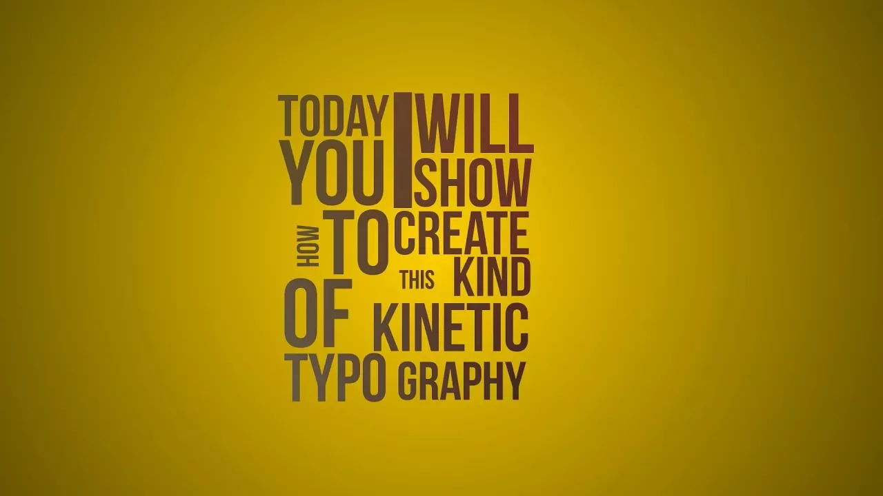


Title sequence design is a time-based art form that exists at the intersection of filmmaking, graphic design, and typography, where creativity emerges from making novel connections between disparate elements, media, and modes of thought; designers draw inspiration from films to create entirely new combinations, as demonstrated by examples ranging from Saul Bass's kinetic type in North by Northwest (1959) to modern CGI techniques, showing how the same design concept can be executed across different eras and technologies.
Intersections: Fast Times in Title Design | Typographics 2022 Talk
Added:Basic Typography Principles: Understanding type anatomy, classification (serif, sans-serif, display), kerning, and visual hierarchy.
Introduction to Motion Graphics: The core principles of animation, timing, and spatial composition in time-based media.
Foundational Film History: Awareness of different eras in cinema and how technological shifts historically influenced film intros and credits.
Practical Title Design Workflows: Learning industry-standard tools like Adobe After Effects and Cinema 4D to animate typographic elements.
Visual Metaphor and Semiotics: How to use title sequences to establish narrative themes, psychological tone, and foreshadowing for film and television.
Advanced Kinetic Typography: Designing complex, expressive type that reacts dynamically to sound, motion, and narrative pacing.
In-Depth Case Studies: Analyzing the portfolios and creative philosophies of legendary designers like Saul Bass, Pablo Ferro, and Kyle Cooper.
375 views13likes22:37Original Release: 2022-07-12
[Music] [Applause] [Music] so [Music] [Music] [Applause] hi everybody um my name is lola landicich and it's an honor to be speaking to everyone here today everyone tuning in by live stream i want to take a moment also to thank the typographics crew for inviting me out thank you barbara sasha kara and everyone who's here and has helped us today so who am i what do i do primarily i work as an art director and graphic designer myself mostly in branding editorial lettering projects i've been a graphic designer for 15 years but i've never really been able to specialize that was difficult in the early days of the web and digital design when you were expected to be graphic or web branding or editorial but now being fluent in several design disciplines is increasingly the norm much of my work focuses on design but i'm also obsessed with film and i write this is the intersection at which i always find myself working film plus design plus text one of my major projects is art of the title a website that i run i've been working on it for the last 11 years which feels like a really long time in internet time show of hands who's familiar with the site yay awesome for those of you that aren't it's a website dedicated to the art of title sequence design and film tv and beyond it exists at the nexus of design film and text just like me just like title sequences the site by now has thousands of examples of title sequence design from the beginning of film up until today it's become an internationally well-known resource it's an archive and it's a tool for students and fans of film television and design over the years the site has ballooned into one of one great honker of a website i'm pleased to say that people like david fincher ava duvernay guillermo del toro lee among others are fans of the site which is so cool this is a screenshot of the site from a little while ago the article on the game of thrones title sequence is a perfect example of how the site works um this title sequence as i'm sure many of you aware was designed by studio elastic in 2011. the sequence took almost 30 people more than a year to put together the sequence is different each episode the locations the way the map moves various elements are changed so it's important to share the story of how that was made to highlight the beautiful craft involved in this kind of work to champion the skilled designers creating these pieces that's a lot of what i do it also allows fans to feel closer to this work and allows people to enter these new worlds so working designers and craft people who don't normally get recognition can find their names on here and by explaining these processes the tools and software used people can more easily enter motion design typography etc the french mathematician henry poincare defined creativity as the capacity to join scattered elements in new and useful combinations this is how i've always thought of my work as a designer and as an all sorts creator making connections is a creative process we are at our best when we make interesting combinations when we see connections that feel novel and fascinating to us personally when we see where ideas intersect where media can intersect where modes of thought can intersect this is where we create something new and that's the title of this talk intersections fast times and title design i have 20 minutes less now title sequences are a time-based art form we'll look at some historically important ones and some of my personal favorites but let's see how many we can do [Music] [Music] that's all you get honey i shrunk the kids is the first movie i remember seeing in theaters it made a huge impression on me it begins with this topsy-turvy chase which sees the titular kids terrorized by typography and then by household objects it feels at once innovative but also familiar it looks like cartoons that we know and love by the time that this came out in 1989 but it also departs from them in really exciting ways it signaled a minor turning point in the history of animation so it was created by cgi pioneer bill croyer and his team at crore films three years earlier in 86 croyer had the idea of combining his two passions hand-drawn animation and computer graphics you can see in some of these selections you can see how the camera flies through typography you can see how the viewpoint changes in the mailbox you can see the shape of the snake head how that sort of revolves around there wasn't a lot of that in cartoons up until this point basically they built 3d models on a computer rendered them as line drawings that could be printed onto punched animation paper and then combined those with hand-drawn sketches so this was their revolutionary combo technique and it meant that they prospered as a firm and they did a lot more title sequences that year kroyer also went on to do um that amazing beautiful movie fern gully [Music] so we can't talk about intersections and film title design without talking about saul bass's opening to north by northwest 1959 this sequence is often credited as being the first sequence to use kinetic type type and motion it's also one of the first examples of what we call situational type where the text is integrated into the environment by matching its perspective a technique famously revisited by picture mill for david fincher's 2002 film panic room so when you look at this you can see how it's a direct descendant of bass's work for north by northwest the perspective of the text the lines the buildings both films are also kind of about accidental connections and the consequences of those encounters the title design here was created by picture mill with effects by computer cafe when we spoke to david fincher about this title sequence he said that the idea for it was kind of a running joke him and angus wall the editor would say what is that credits type is it supposed to be a projection that the audience is having over the scene or is it actually there in the scene so they decided to put it there in the scene now we'll jump to the 60s [Music] i wish i could show you all of this one of my favorite uses of type comes from egenio lardani the designer his title sequence for casanova 70.
lardani is primarily known for his spaghetti western title sequences so the good the bad and the ugly a fistful of dollars films like that here lardani takes an extremely playful approach the letters become characters themselves with voices and mannerisms they whistle they fight they get intimate they take the shapes of tanks bells doors it's really beautiful and if you have some time like check it out you can obviously look at all these sequences on our website [Music] [Music] animator sally crookshanks opening to 1986 black comedy ruthless people here crookshank lets loose a flamboyance of vivid and vicious characters all grappling hands and anthropomorphized objects out to inflict injury upon the credits similar to lardani crookshank gives her credits personalities she gives them facial features limbs when you look at the credit for judge reinhold there um he's drowning in a swimming pool so it's a perfect introduction to a film full of gleeful acrimony and 80s era memphis design here's what i like to call the art of the title sequins [Music] foreign [Music] yes [Music] so beautiful um glittering sequins and gems gather to form these credits followed by lettering hand-painted at pacific title and art studio and then combined with vibrant kaleidoscopic backgrounds the sequence is unabashedly ostentatious and delightfully unusual it remains to this day a vivid and joyful piece of title design and the intent for this opening was to set up some elegance and to set the tone for the main character the exuberant auntie meme [Music] now i bet you're wondering why is she showing anti-mame and total recall the reason is that they're connected they're created by the same title designer um anti-maim came out in 1958 total recall came out in 1990 so behind both of these sequences is wayne fitzgerald he had a 40-year career he created hundreds of title sequences and it's remarkable because every one of his title sequences looks entirely different he was not one of those designers who has a very clear fingerprint who puts a lot of his own aesthetic and style into a piece when we talked about fitzgerald about creating the main titles he said i was shown the movie and it was decided that it really needed something colorful up in the beginning because mame was a colorful character so it was a matter of how to do it the point was to get it from the cigarette holder to the kaleidoscope and set up some elegance and i just love what he did with total recall here it's a total horse of a different color the titles are enormous red as the dust on mars burning one out after the other a sense of blood sex dread and intrigue um so i really love that because these two examples more than 30 years apart are an example of how a designer can draw inspiration from disparate elements can take cues from the film to create entirely new combinations [Music] so this one for 24 hour party people um the great michael winterbottom film starring steve coogan was created by central station design they're a manchester-based team they've created a lot of interesting work all throughout the 2000s and the 90s it's hand wrought it's a real introduction to a vibe the mad chester party scene it reflected a lot of the sort of type deconstruction aesthetic that we saw going on during late 90s early 2000s it was a rejection of what people could see was a digital revolution and a nod back to nostalgia the insistence of texture think about films of this era like seven it's got a lot of these exact same techniques scratching directly on film painting on the optical film causing destruction to the artifact of film for the sake of it feeling hand wrought [Music] [Music] true [Music] i didn't warn you on purpose so that's enter the void from 2009 that's a very short clip of a much longer more intense title sequences it's one of the most famous title sequences of the 2000s if you're into that kind of thing designed by tom cann it's a visual onslaught of typography and once you see it it always sticks out i believe you don't tend to forget it and it sticks with you long after you finish the film itself if you manage to do that what i love about this sequence aside from how beautiful it is just on a technical typographic standpoint is that it uses a multimedia approach so for certain segments so i don't know if you managed to catch the actual title in that clip but for the title itself they used a process called electrophotography and they hired a guy named thorsten fleisch to do this and he was originally gasper noe was originally planning to do a sequence in the film using this technique but they found that it worked really well for the typography so what they did was um let's see here he cut out the letters on cardboard wrapped them in aluminum and shot around 30 000 volts through it so it's a very out of the box kind of combination and that's why i always urge designers to have weird skills because they often come in handy just electrocute your type this is one of the simplest title sequences i've seen in a long time and one of the more effective ones it just i loved it as soon as i saw it at the bottom of a cliff in the half light of evening waves crash against rock revealing the opening production credits and the title only visible thanks to the splash or the tide so this eerie opening both foreshadows the film's climactic battle in which the water and liquids play a vital role and they nod at a central tenet of horror storytelling which is what is monstrous can only be vanquished once it's been revealed and the other thing that i really appreciate about this is that there's a long lineage of the invisible man being adapted onto screen based media i just wanted to show some comparisons here 1933 the text comes from out of focus into focus there's a smoky windy vibe hollow man the year 2000 very digital focuses more on the science of how to make this invisibility possible but still a kind of coming together of elements and then the most recent is this one designed by greenhouse graphics um using obviously cgi effects to make the typography visible there's lots more other examples from these adaptations but these are the three i find most fascinating altered states one of my favorite 80s movies 1980 this title sequence was designed by richard greenberg who was recently passed away but he was in a design firm called our greenberg associates which is actually now the worldwide agency rga but they actually began their careers as title designers one of the early projects was altered states so here text is used as a kind of window a lens through which the footage gets to be seen this is a technique that happens a lot in science fiction richard greenberg used it a lot in his title sequences he he deconstructed typography a lot in his title type title sequences so richard greenberg also designed the dead zone you can see that typography as lens happening again and i also bring up stranger things because you can see the direct lineage of how this all comes full circle stranger things was directly inspired by both altered states the dead zone a lot of these 80s title sequences and owes a great debt to richard greenberg i thought i would leave us kind of on a lighter note one of my favorites from the last few years and also probably inspired somewhat by stranger things is the end credits to this film princess ceda i was directed by mariali rivas from chile and it's a 2018 film the titles are by studio called smog they were created using string cardboard rotoscoping and stock imagery i'm always a sucker for a combination of analog and digital processes so talking to pablo gonzalez the creative director of smog he says we ended up filming the title designs we would have like a cardboard with pins and we would recreate the design and untangle them in front of the camera then we would rotoscope that it was so painfully long that process but it was really worth it the result was very interesting it's funny that it was so handmade and so if you look at each one they've got these very little quirky idiosyncrasies the string kind of pulls it along it doesn't look like anything that you could make digitally and it really stuck out to me because it was so unique [Music] do thank you so much [Music] [Applause] [Music] uh [Music] you
Up Next
21:20
Top 10 Pre-Title Sequences in Film History: A Critical Analysis
@JamesNintendoNerd
183.9K views•2023-01-28
12:54
Triumph of Orthodoxy Icon: Byzantine Art & History Explained
@BenCallan
2.1K views•2024-08-06
9:49
FastAPI vs Flask vs Django: Choosing the Right Python Web Framework
@TechWithTim
302.5K views•2024-05-26

1:42
Game of Thrones Opening Credits: A Cinematic Analysis
@gameofthrones
46.3M views•2011-04-18
Related Study Plans & Knowledge Roadmaps
Structured learning paths in General & Interdisciplinary Studies
general-studies
Elevator Engineering: History, Physics & Cities
01From Hoists to Safety Brakes: The Dawn of Vertical Lift
02Hydraulic vs. Traction: The Engineering Physics of Elevators
03Modern Speed, Safety, and Algorithms
+ 2 more learning modules
12h5 modules
Explore Roadmap
general-studies
Rubber: Material Science, History & Geopolitics
01Origins of Natural Rubber & Mesoamerican History
02The Chemistry of Natural Rubber & Vulcanization
03The Geopolitics of the Rubber Boom & Colonization
+ 2 more learning modules
12h5 modules
Explore Roadmap
general-studies
Containerization: Evolution, Logistics & Trade
01Ancient Trade & Bulk Cargo: Amphorae to Barrels
02The Industrial Revolution & Cardboard Packaging
03The Containerization Revolution: Malcom McLean
+ 2 more learning modules
12h5 modules
Explore Roadmap
general-studies
Textile Tech: Evolution, Labor & Global Impact
01Pre-Industrial Textiles: Handloom & Cottage Industry
02Mechanization: The Spinning Jenny to the Power Loom
03The Factory System & Global Labor Transformation
+ 2 more learning modules
10h5 modules
Explore Roadmap