















Location typography in film and television serves as a powerful visual storytelling device that enhances narrative by creatively integrating text with imagery to establish setting, convey character personality, and emphasize thematic elements such as movement and transition; effective location typography goes beyond mere factual information to become an integral part of the visual narrative, using scale, design, and phrasing to create visual hierarchies and emotional resonance that transforms the viewer's relationship with the on-screen content.
Location Typography in Film: A Visual Storytelling Analysis
Added:Fundamentals of Typography: Understanding typeface classification (serif, sans-serif, slab), typographic hierarchy, and the psychological impact of font choices.
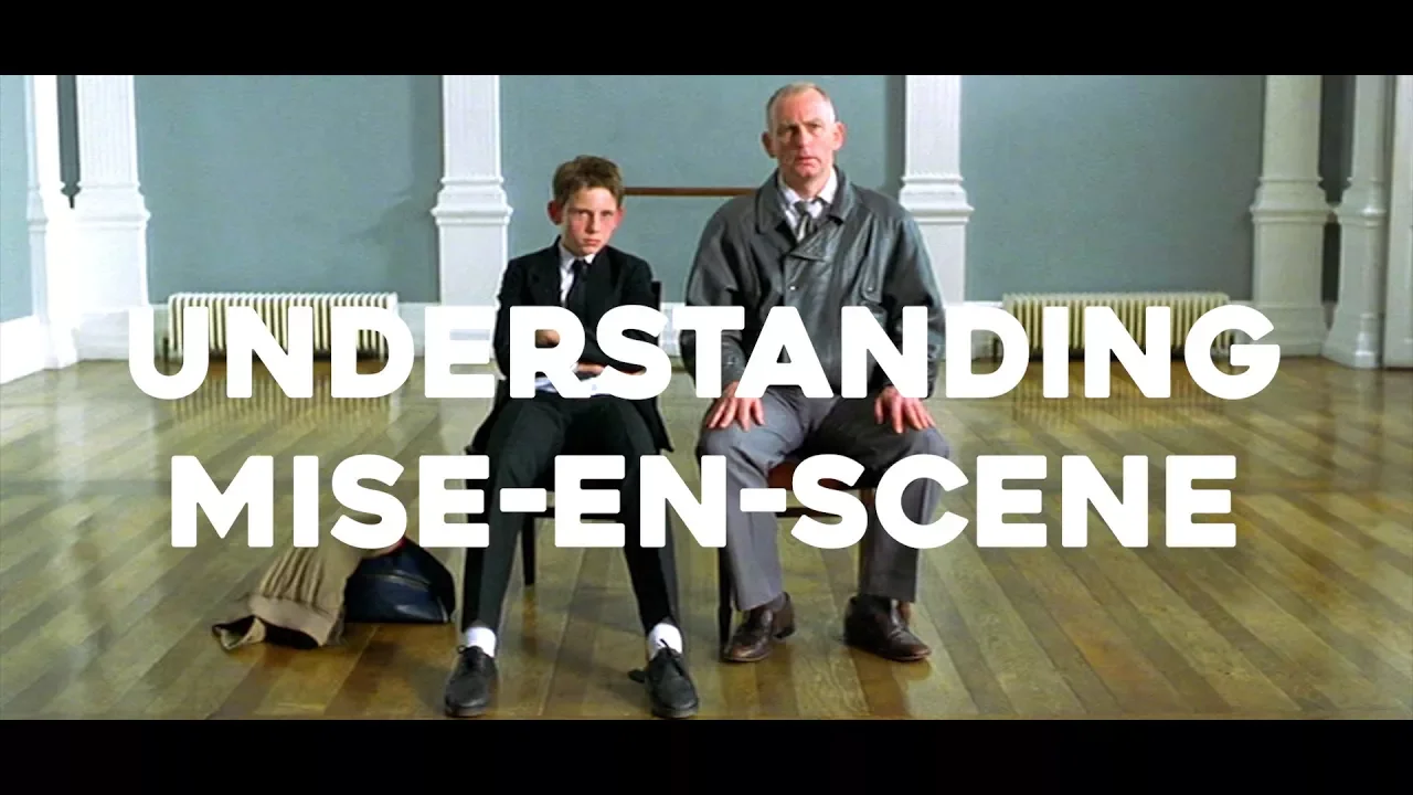
Introduction to Mise-en-scène and Visual Composition: How filmmakers arrange visual elements within a frame to convey subtext, mood, and narrative themes.
The History and Function of Title Design: Understanding how opening credits and title cards have historically been used to establish tone, setting, and genre in cinema.
Kinetic Typography and Motion Graphics: Exploring how to integrate text dynamically into three-dimensional film spaces using industry-standard visual effects software.
Diegetic vs. Non-Diegetic Typography: Analyzing the difference between overlay narrative titles and in-universe environmental text like signs, billboards, and branding.
Comparative Case Studies in Title Design: Investigating the portfolios of influential title designers and agencies, such as Saul Bass, Kyle Cooper, and Imaginary Forces, across different cinematic eras.
Cultural Semiotics in Graphic Design: Studying how historical and regional typographic styles carry deep sociopolitical meaning when utilized in contemporary visual media.
21.8K views837likes5:53Original Release: 2017-11-23
how we interpret meaning from text depends very much on its physical representation the size shape font ratio color and general aesthetic design this video will explore how to make an impact with location typography film titles are often used as visual storytelling devices taking on the personality of a film and preparing the audience for the kind of experience they are about to have this can be described in relation to both screenplay and art direction as part of the movies visual narrative typography can also be used to convey additional information within the film one familiar example of this is location titles these are usually placed in the middle at the bottom or in the corner of the image and help situate the viewer in a specific place particularly if the narrative moves across a number of different locations or time periods some films use this opportunity to be creative bringing the design of the typography in line with the aesthetics of the image for example in Quantum of Solace we see this in the various culturally specific font styles in atomic blonde the use of bright but grungy spray-painted titles reflects its retro neon aesthetic one trend in design is overly large or exaggerated typography which has been used in a number of recent films and television shows to foreground the setting as an important aspect of the story lately untethered hurt this is a dream scenario in a way we go each location card references the film title itself as the characters travel away to various cities across America here typography is used to emphasize the movement from one place to another as a transitional device it represents the characters desire to escape from their circumstances and find for themselves a place to call home this transitional focus is also the case in up in the air a film that situates the viewer from above and which is intrinsically tied to notions of transients and vagrancy in Captain America Civil War the story shifts from one country or period of time to another in a fairly conventional fashion but with far bolder aesthetics than previous films in the Marvel series which have tended to follow traditional title styles very recently mind hunter has also used the boldness of lodge typography almost to excess in order to emphasize the importance of place in the unraveling of each case it also draws attention to the sense of motion and repetition as the two FBI agents venture from state to state where typography appears to function more than a mere narrative device is in the television show preacher once again it follows this particular trend of large and somewhat over indulgent white typography in order to indicate a particular time or place where it differs is in the capacity of the titles themselves to enhance and add to the narrative and to bring their own personality to descriptions of the image this is figured in the sheer size of the typeface which is positioned in the center of the frame in order to draw a particular attention to the words themselves Ellen Lupton describes this manipulation of scale as creating hierarchies and contrasts which help create visual contrast movement and depth this relationship between the viewer and a visual object such as typography can be determined by the distance between them the closer the visual object the more intimate the relationship here the titles become integrated into the frame of the image and begin to take on the personality of the characters and eccentric aesthetic style not just in the visual representation but also the phrasing and expression rather than just providing factual information about the on-screen events it's almost as if the titles are from the perspective of an omniscient narrator they aren't there to just instruct or educate but instead to tell a story the importance of textual design is also reflected in the opening credits sequence where the imagery related to each character is masked by the typography of The Associated actors named in a more integrative approach than the traditional text on image design in many ways this focus on typographic aesthetics isn't surprising as preacher is an appropriation of a comic book series a medium in which visual and textual design are equally prioritized the integration of text and image therefore becomes a prominent part of the storytelling process in both the comics and television show and allows us to see the importance of space-time and character as integral in the world building of the series titles and typography are often overlooked in their contribution to visual storytelling location titles are commonly used in film yet are rarely memorable and this is why creative unconventional or bold typography can make such an impact in these instances we can appreciate how the design and phrasing of words can be critical to the expression of cinematic space and time [Music]
Up Next

8:05
The Cinematography of Fear: Se7en's Most Terrifying Scene
@Nerdstalgic
236.2K views•2022-07-25

23:14
Visual Analysis Essay: How to Analyze Graphic Novels in College Writing
@nataliepleimann5941
1K views•2020-10-14
4:55
Film Blocking Techniques for Directors: Space, Shapes, Lines
@StudioBinder
1.9M views•2018-07-23

4:00
Evolution of Darth Vader: Anakin Skywalker's Animated Journey Across Star Wars Films
@TellItAnimated
13.4M views•2019-03-30
Related Study Plans & Knowledge Roadmaps
Structured learning paths in Film Analysis
film-analysis
Sensory Cinema: Foley, Haptic Sound & Texture
01Introduction to Film Sound and Foley Artistry
02Micro-Sounds, Textures, and Extreme Amplification
03Haptic Audition and Film Phenomenology
+ 1 more learning modules
12h4 modules
Explore Roadmap
film-analysis
Breaking the Fourth Wall: Mockumentary & Satire
01The Invisible Wall: Basics of Cinematic Illusion
02Looking at the Lens: Direct Address & Character Glances
03The Mockumentary: Satire, Realism, and Complicity
+ 2 more learning modules
12h5 modules
Explore Roadmap
film-analysis
Analyzing the Long Take: Cinema, Space & Ethics
01Foundations of Film Grammar: Montage vs. The Long Take
02Choreography and Mechanics of the Simulated One-Shot
03Phenomenology of Film: Real-Time Spatial Continuity
+ 1 more learning modules
14h4 modules
Explore Roadmap
film-analysis
Anachronistic Music: Period Drama & Subversion
01Foundations of Film Sound and the 'Needle Drop'
02Traditional Authenticity vs. Revisionist History
03The Rise of the Anachronistic Soundtrack
+ 2 more learning modules
12h5 modules
Explore Roadmap