


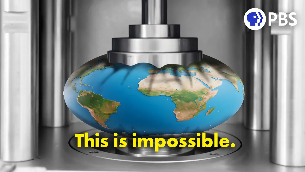

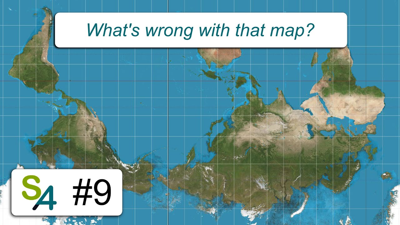
![QGIS: Essentials Part 1 [002]: Bakit nagsisinungaling ang lahat ng mapa (Map Projections)](https://i.ytimg.com/vi/db16XVLyaWM/sddefault.jpg)


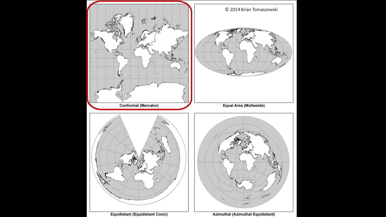




![Types of Map Projections [AP Human Geography]](https://i.ytimg.com/vi_webp/IBYzeT2O97g/maxresdefault.webp)

![[ShadowingBook] Why every world map is wrong | TED-Ed](https://i.ytimg.com/vi/zGaHKDg1Ixo/maxresdefault.jpg)
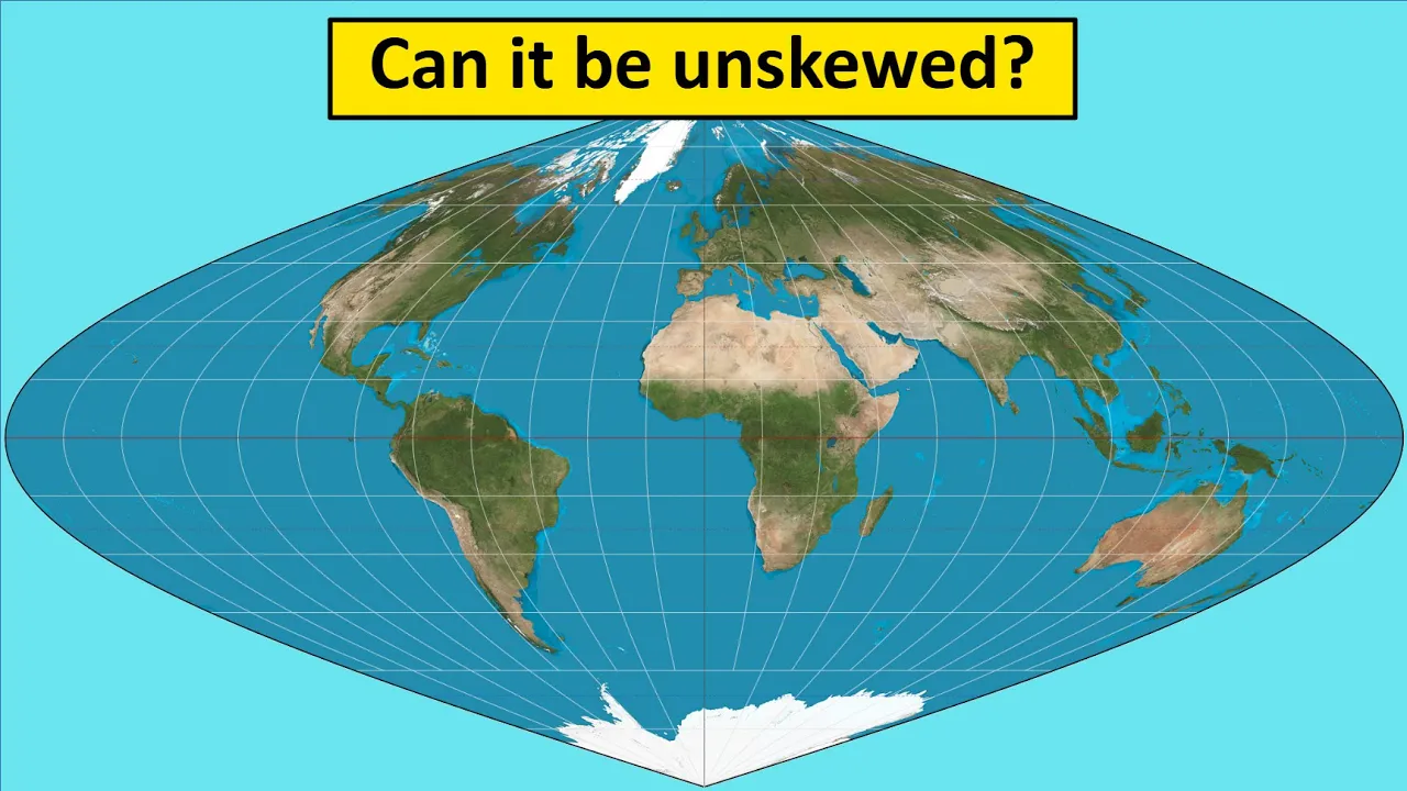
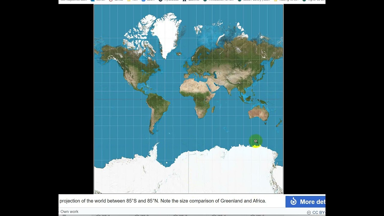
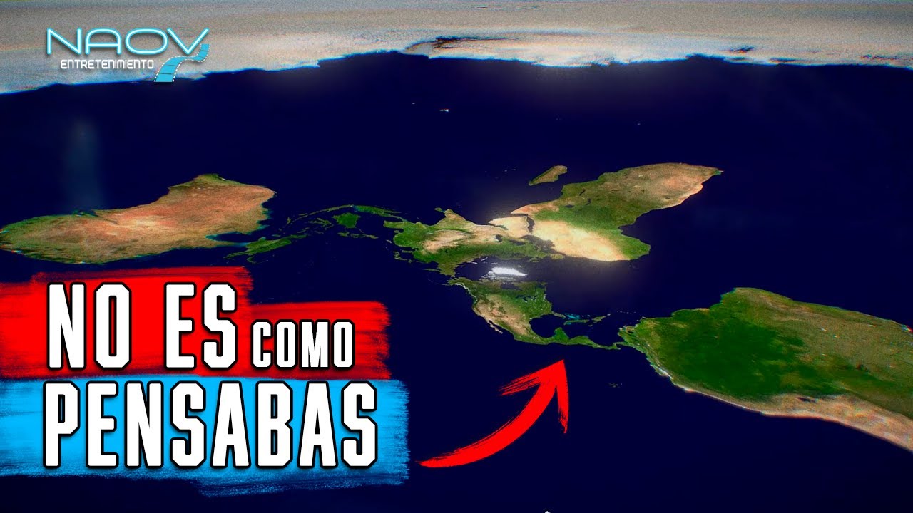

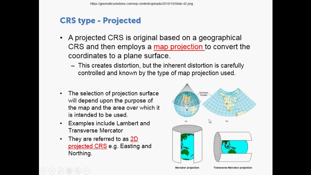
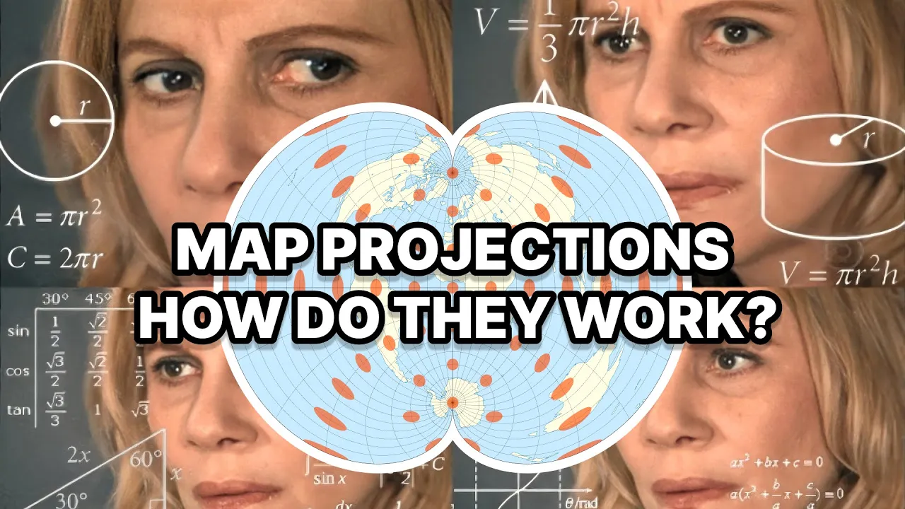



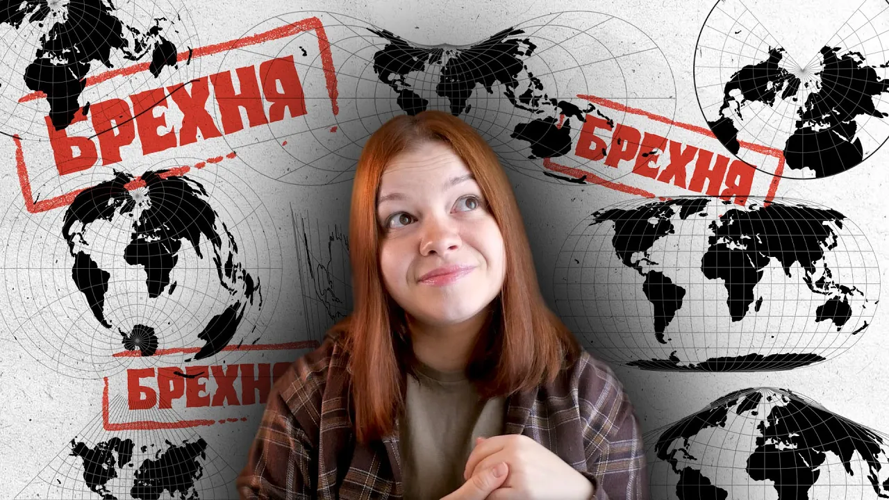

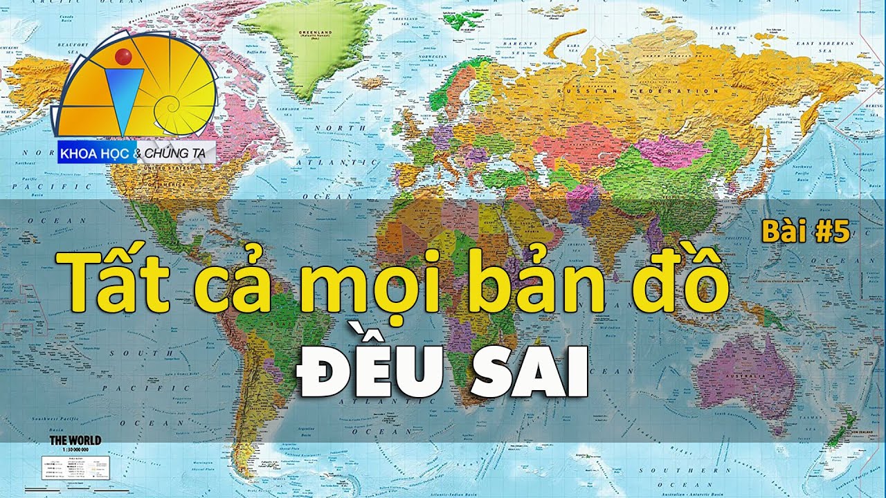

The Mercator projection, commonly used in world maps, distorts the actual sizes of landmasses by shrinking Africa and other equatorial regions while expanding northern and southern regions, making African countries appear much smaller than they actually are; this distortion has historically reinforced European imperialist attitudes and created misconceptions about African geography, whereas the Gall-Peters projection provides a more accurate representation of landmass sizes.
Why Maps Distort Africa: The Truth About the Mercator Projection
Added:The mathematical impossibility of flattening a 3D sphere (oblate spheroid) onto a 2D plane without distortion.
The fundamental concept of map projections and the trade-offs between preserving area, shape, distance, and direction.
Basic geographic literacy, including the general location and scale of major continents (e.g., Africa, Europe, North America) and landmasses like Greenland.
The basic coordinate system of latitude and longitude, including the significance of the Equator and the poles.
Alternative map projections such as the Robinson, Winkel Tripel, and Dymaxion projections, and how they balance different types of distortion.
The Web Mercator projection, including why it is used by modern digital mapping services (like Google Maps) and how it affects web navigation.
The field of critical cartography, which examines how maps have historically been used as instruments of colonialism, nationalism, and geopolitical propaganda.
Tissot's Indicatrix, a mathematical method used to quantify and visually demonstrate the local distortion of map projections.
110.8K views2.4Klikes10:08Original Release: 2022-01-14
did you know the country ghana is as big as the uk did you know the country nigeria is bigger in size than germany did you know this now the sad thing is this is not even conspiracy theory or heresy this is common knowledge but how come this knowledge has escaped africans most africans don't know anything about this and until few weeks ago i always taught an african country there is a small african country fun fact there are no small african countries surprised right yeah i was equally as surprised did you know that there are hundreds of maps out there different map projections out there and all of them are inaccurate it is general knowledge i'll leave links in the description below but one particular map shows the actual sizes of every country and this is it this is so surprising and the standard one we use doesn't show the actual sizes especially africa it shrinks africa and it's surprising how this common knowledge has now been hidden in a way that when someone hears it you would think it is conspiracy theory or something but how come this common knowledge has found this way to evade africans has it been purposely hidden from us and if you want more knowledge about this stick to this video to the end because today i'm really going to delve deep into this particular issue also if you like contents like this be sure to leave a thumbs up on this video also be sure to subscribe to this video for more content like this hello lovely people welcome to my youtube channel i'm andy and this is andy's insights and on this channel we do educational content mainly african commentary and anything relating to africa so now we all know that the world is a sphere that is round little did we know it is impossible physically impossible mathematically impossible to represent a sphere on a flat surface without mathematical errors without inaccuracies so many mathematicians and cartographers cartographers are people that make maps many mathematicians and cartographers decided to use projections because they couldn't represent the earth on a flat surface they use projections to project the surface of the earth which is a sphere onto a flat surface and the problem with this is no matter how they projected it it was always inaccurate so the cartographers and mathematicians decided that depending on the use of the map a different map would be used in each situation when the inaccuracy does not apply to the map so i'm going to talk about the different types of maps and how all the maps are inaccurate now the map that was supposed to be used in africa or that africans were supposed to know about is called the gal peters map and this map shows the exact landmass of each country now the problem with this map the reason many people did not use this map is because this map is not accurate when it comes to directions when you want to find a 90 degree 10 on this map and on the edge surface it was different even though the area was the same the shapes of the lamps were different this map was proposed by james gao and arnold peters in 1855 and in 1970 it was released for the public to see and surprisingly a map designed in 1855 and brought to the public knowledge in 1970 was not made known to africa because nowhere in our educational system where we made to know about the true size of africa you can google it it is not conspiracy theory you can google it the gal peter's projection of the map and you see for yourself that this was common knowledge i'll leave a link in the description below now the map we use today is called the mercator projection and this map shrinks all the land alongside the equator and expands the lands that moves further away from the equator so lands that are on the north and south side of the world are expanded exponentially so when you look on these maps the western world the countries along that side they are on the northern side are all made bigger than what they actually are and this has made the western world portray themselves as bigger than us that was not the intent of the map but that is the reality now people think the countries on the north side the outside countries are bigger than the african countries and it's a total lie cater projection has fostered european imperialist attitudes for centuries and created an ethnic bias against a third world now the accuracy of this makita map was the reason why it was the preferred choice on this marketer map the reason the countries along the equator was shrinked is because it gave the opportunity for accurate directions and accurate readings of the map 90 degree on that map is 90 degree on the floor because mathematically shrinking countries in the middle gave a chance for it to be calculated accurately but this leaves the inaccuracy of size and this left room for wild inaccuracies because the countries in africa were all shrinked on the map so what you see on the map are not the real sizes of african countries now if you are not getting it take for instance greenland now greenland on the map looks bigger than africa right now if we drag greenland the real size of greenland and bring it onto africa africa is 14 times bigger than greenland but on this map africa is made to look smaller than greenland this is just unacceptable for african countries not to know this because we had to know that we were strained in order to calculate something accurately not because our land was actually smaller and this has made it possible for a country to refer to a country in africa as you this small country in africa which is absolutely not true now this map projection was invented by gerardus marcata in 1569 so it's preceded the gal peters map but scientifically any time there's a new discovery the old one is re-evaluated and the new one is made known because this one showed accuracy in the land mass now even surprisingly it was said gerardus marketer himself when referring to the masses of the land decided to use another map when discussing the true area of the land but how come african countries when learning about the true size of the land we use the marqueta projection which showed africa to be smaller who actually picked out which projection we should learn in our syllabus because most of us grew up thinking our countries were very small now taking our countries in comparison to other countries they are way bigger way bigger now with this came controversy because critics actually claimed that most western countries decided to continue using this map because it showed them as a bigger country and with bigger in our minds bigger is better so we're seeing this irregardless of how small it is we actually saw ourselves as smaller than what we actually are and that is a flaw in our educational system because when we're learning our social studies and geographies we always wanted to just see the land mass the sizes of the actual land and it was not accurate so just imagine a kid in africa trying to invent something just looking at the visual mass of the lambs is already wrong to begin with there are other projections the wrinkle triple projection actually is all inaccurate it's very inaccurate when it comes to both the directions and the landmass but this is even what is shown to have the least inaccuracy when it comes to the size of the actual land and also when it comes to the directions and even that was not used now to compare the actual size of each country there's a website called thetruesize.com and in this website you can actually take your country and compare it to the actual size of another country if your country was to be positioned there during the time of the projection as you can see and you can tell that the african countries are way bigger and the sad thing is this boston school in the us in massachusetts is the first private school to actually take the gaupitas map and use it as the primary map and countries in africa schools in africa have no idea about this knowledge they say is power and if that knowledge is taken from you you would feel inferior because the power has been taken out of your hands and that's the issue in this case so if you like contents like this be sure to subscribe to my channel right down there subscribe and also like this video now stick to my channel for other content just like this thank you and until next time [Music] you
Up Next

20:20
Cartographic Propaganda: Maps, Power, and Persuasion
@nofanfare7426
325 views•2024-07-01

33:02
The Great Schism of 1054: Causes and Consequences
@SacredCathedrals
113.5K views•2026-02-19
91:57
The Geopolitics of the Ukraine War and the Rise of Global Autocracy
@JordanHarbingerShow
468K views•2025-04-19
17:05
Understanding the Cold War: Superpower Conflicts and the Road to Détente
@OverSimplified
46.1M views•2019-01-24
Related Study Plans & Knowledge Roadmaps
Structured learning paths in History
history
Byzantine Iconoclasm: Theology, Art & Politics
01Foundations of Byzantium and Early Christian Images
02The First Iconoclasm: Leo III and the Crisis of Images
03Empress Irene, Nicaea II, and the Second Iconoclasm
+ 2 more learning modules
9h5 modules
Explore Roadmap
history
Iranian Revolution (Causes, Events & Legacy)
01The Pahlavi Dynasty and the Roots of Discontent
02The Spark of Rebellion and the Rise of Khomeini
031979: The Fall of the Shah and the Climax of the Revolution
+ 2 more learning modules
8h5 modules
Explore Roadmap
history
Mali Empire: Mansa Musa, Trade & Timbuktu
01Foundations of the Mali Empire
02The Trans-Saharan Gold and Salt Trade
03The Reign and Pilgrimage of Mansa Musa
+ 1 more learning modules
6h4 modules
Explore Roadmap
history
1947 Partition: Politics, Borders & Legacies
01Foundations of British India and the Divide
02The Political Negotiations and the Mountbatten Plan
03Drawing the Boundary: The Radcliffe Line
+ 2 more learning modules
8h5 modules
Explore Roadmap