

















![Filtry pasywne | #46 [Podstawy]](https://i.ytimg.com/vi/tAeXu7M5oxg/maxresdefault.jpg)


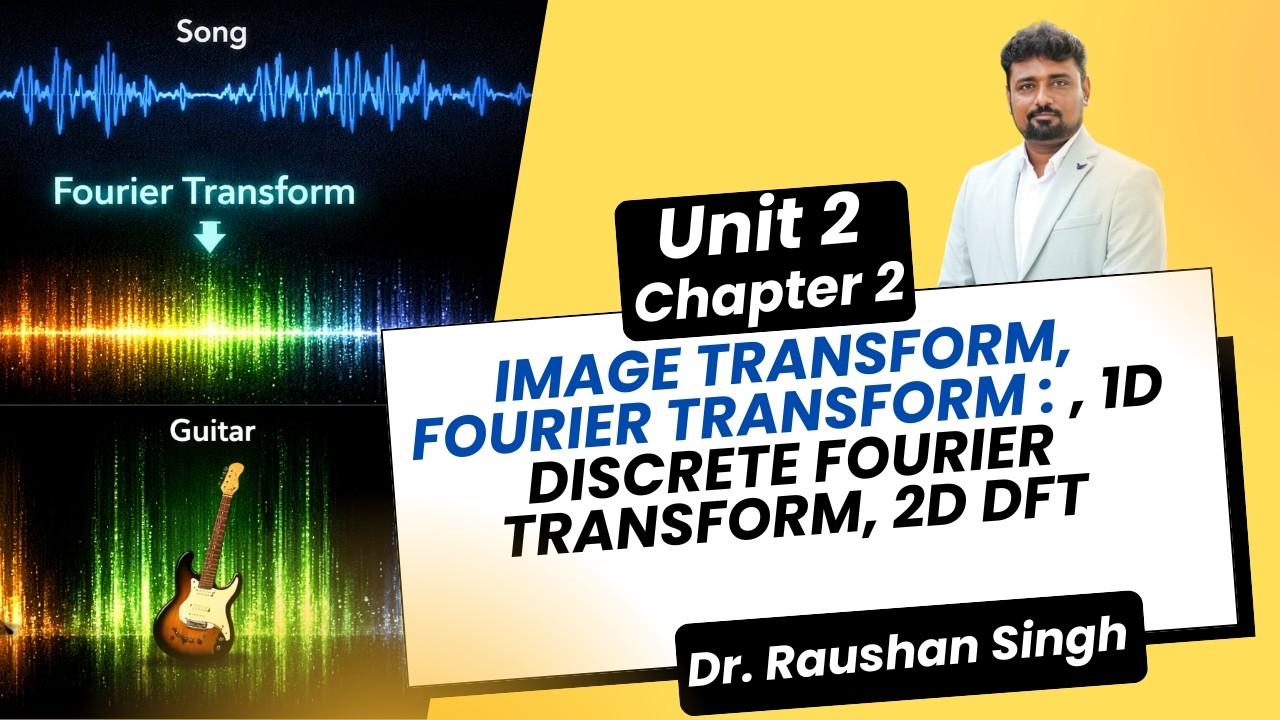


The Fourier Transform converts time-domain data into frequency-domain information by projecting measurements onto rotating circles (clock faces) at different frequencies, then summing the resulting vectors to reveal the underlying periodic components of the signal; the Fast Fourier Transform (FFT) is an efficient algorithm that reduces computational complexity from O(n²) to O(n log n), making real-time frequency analysis practical for applications like audio processing, image analysis, and signal filtering.
Fourier Transform & FFT: An Intuitive Introduction
Added:Understanding of basic trigonometry and the unit circle (sine, cosine, and wave frequency).
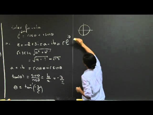
Familiarity with complex numbers and Euler's formula, which represents rotation in the complex plane.
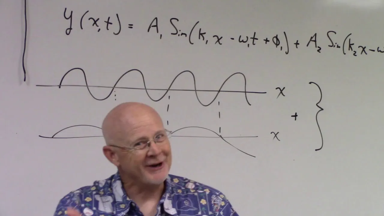
The concept of wave superposition (how multiple sine waves can combine to form complex signals).
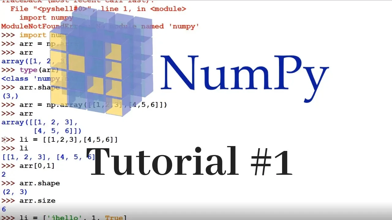
Basic proficiency in Python programming, particularly handling arrays with libraries like NumPy.
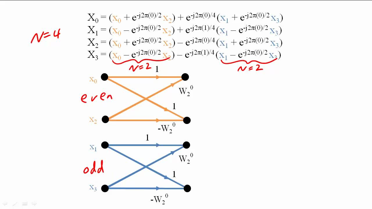
Deep dive into the Cooley-Tukey FFT algorithm to understand how the computational complexity is reduced from O(N^2) to O(N log N).
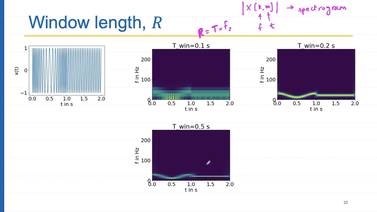
Study of the Short-Time Fourier Transform (STFT) and spectrograms for analyzing time-varying signals like speech or music.
Practical applications in Digital Signal Processing (DSP), such as high-pass, low-pass, and band-pass filtering.
Exploration of the 2D Fourier Transform and its applications in digital image processing, such as filtering and compression.
324K views5.2Klikes37:05Original Release: 2014-09-08
so my name is William today we're going to be talking about the 4ier transform the fft and how to use it uh my original goal for this talk was I was going to take this Whirlwind tour through a bunch of digital filtering techniques and then as I was put in that together I realized that it was probably a better plan to Instead try and give you a thorough and deep int intuition for what the fora Transformers doing and why in the world you would and how you would use it so this is a bit of an experiment for me this is this is the lecture that I wish I had when I was an undergraduate in electrical engineering so please let me know the things that don't make sense and things that I can prove so ultimately this talk is the story of a moving point and this point is moving in one Dimensions the horizontal Dimension and it's moving left to right time is increasing infinitely but the function that returns to position of this point on the horizontal axis um causes it to oscillate the superod function and in fact this is the coine function the position of the point on the xais and cartisian coordinates so the the horizontal axis is the cosine of the time but this particular point was not content to exist in one dimension only no it wanted to move in two Dimensions but these two dimensions are independent so just like the previous slide this point which is moving in two Dimensions is oscillating back and forth on the horizontal Dimension but is also oscillating up and down on the vertical Dimension so the vertical position is described by the S function and the horizontal position is described by the cosine function as you can see in red I'm drawing out the sign function over time the horizontal position I'm sorry vertical position and the cosine function is drawing out the horizontal position in green so the takeaway from that is that the S and cosine give you a circle circular motion and the sign and the cosines describe here the vertical and horizontal dimensions and since mathematicians like to complicate things we have special names for those axes the horizontal axis is usually called the real axis and the vertical one is called imaginary it's not imaginary but it's called that sometimes so if you see that term don't be afraid so when we talk about points moving around the circle it's important to um also consider the notion of of rotation and time and speed of rotation so when we talk about speed of something we talk about the distance it travels over a period of time so in this case a point that moves all the way around the circle is moving around one circumference now if you think back to your geometry uh you remember that one circumference is equal to 2 * pi * the rad radius and there's a nice little animation in the bottom left by fabulous animator Lucas VB you should check him out uh illustrating that idea that a radius * 2 * pi is the circumference of the circle so when we also talk about distance that's the distance the point has moved around the circle we want to talk about time and the time um for uh reasons of convenience let's just consider the distance it moves in 1 second so up here what we're talking about circumference in 1 second is the same thing as 2 * pi * the radius in 1 second now we had seconds in the denominator the lower half and because that happens often one over seconds we give that a special name and that name is Hertz and it's a unit of frequency of oscillating motion so really if you want to Intuit this you should think of a clock clock has hands that are rotating around the face of this circle and those hands rotate at different speeds they're traveling the same distance but they're doing it in a different period of time the uh our hand for instance is moving 2 * pi * the radius but it takes 360 seconds to do it which 1 over 300 or 3600 and the top right is 2 pi 2 * 704 and then the minute hand travels at same distance the radius or the circumference of the circle 2 * pi * the radius of that Circle it do does it in 60 seconds and the second hand again is moving around the face of this clock is traveling around the circle but it does so in 1 second and Illustrated here in the bottom right is again points rotating around the circle at different speeds or different frequencies the top left circle is the uh lowest frequency and it increases down to the bottom right okay so keep this thought in your mind notion of points rotating around circles the Notions of clock hands moving around and now let's talk about our data so we have a Time series of measured data this is anything that you measure this is your heart rate over time this is the height of Tides over a year uh this is the energy on an antenna um on your cell phone this is anything that you measure at fixed intervals in time and you take those measurements and you save it digitally so now you have an array of measurements so the point here is that data is discreet you have discreet individual measurements measured at fixed intervals and since you know that interval you know how fast you made your measurements every second every day every hundredth of seconds that time is what we're calling T Subs because again it's one/ seconds we can also call that in hertz so it's just one over that time period okay so here's where it gets interesting this data here is in one Dimensions it's a measurement over time but we look at the data and we say there's something interesting about it when we measure data Maybe we take the mean or the variance or you look at the distribution you look at a histogram or if you have an image you look at the red and green and blue channels these are different ways that you can look at your data to Intuit um what's underlying but when you have data that's periodic or you think it might be periodic one of the ways to look at that data is to look at the frequency content what is the underlying periodic nature of your data and to do that we're going to transform this one-dimensional data into two dimensions and we do that by projecting the data onto these circles these moving clocks so what you're looking at in the top is that same measure data the same wave form of measurements and if you can see the little red dot is traveling along that's indicating One Moment In Time and at that one moment in time I am changing the length of the clock hand as it were on these lower plots so the point is rotating around the circle and each of these three bottom plots at the same rate but for each measurement I'm changing how long the clock arm is so to speak okay so you can see that when the measurement is very high the clock arm is long when the measurement is near zero the clock arm is at very center of the graph and in fact when the measurement is negative the clock hand switches directions but the important thing to look at here is that we've taken our measured data and we have what we call projecting that information now into two Dimensions the two dimensions are these clock faces and you can think back to the first slid we looked at we have these circles which we can also look at in independent vertical and horizontal Dimensions okay so this is looking at time Instant by time instance what if we took all of our measure data at once and Drew it all in two Dimensions so essentially what if we took our signal and we coiled it around that Circle our one-dimensional data now becomes two-dimensional we now have translated time into a spatial Dimension so again as time passes the clock hand ticks along the face of the circle and our measurements are used to modulate the length of the clock hand so what you're looking at here is again all of the measurements drawn on that face of that Circle at one point we're essentially wrapping around the circle and as we increase the frequency in other words as we increase the rate at which the clock hand ticks around the face of the circle it becomes faster and faster and it spreads the data around that clock face essentially it's coiling it up tighter and you can see create some interesting patterns there so now we have a bunch of measurements in two Dimensions we've taken all the measured data we've coiled around this clock face for a specific frequency so every point in our measurement now lives in these two Dimensions we call this a vector it's a line and we can add these vectors together so in other words we're going to take all of our measured points project them into two dimensions and then we're going to sum all the vectors together so quick aside in summing vectors we sum their components independently so if we have a vector a and a vector B their horizontal components will cancel each other out and their vertical components will sum together so in other words vectors that are closer together sum to be larger vectors sort of intuitively okay and then the other point that we should make about vectors is that we could describe them as having a horizontal and a vertical component or we could describe them by their length and the angle at which they make with this the zero the horizontal axis point okay tracking with me so far okay so this is the same picture here where we're taking our measured data we're wrapping it around the circle and uh each frame of this animation we're wrapping it around a circle of an increasing frequency a faster rate of rotation as it were and what we're doing for each frame in this animation we're taking all these points that live in two dimensions and we're summing them together we're taking the average essentially so you could think of it like finding the center of mass of this shape so all the vectors summ together give us one vector and that one vector we can look at the length uh well so so the one vector this the average Vector of this shape is shown up in the top right and then if we just look at the length of the vector that's what we're plotting in the bottom right okay and you can see that something magical happens right about 1.1 the shape all aligns such that most of the points are close together in one area of the graph which means that when you sum all those vectors together it becomes very large so we call that a 4A transform effectively we're looking at the length of the vector we're projecting all of our data onto some frequency component and we're looking at the periodic nature of our data because we're as time is progressing we're positioning the data such that at a specific frequency it all lines up on top of each other okay so what if we looked at a different signal this is some data that I created I added some noise to it we look at it and we think there's probably something periodic under there um it might be hard to figure that out if I was just to sort of count between the Peaks so instead we're going to do the same process that we've already done we're going to take our measured data we're going to wrap it around a circle uh that's traveling a a clock face that's traveling at different rates and you can see that uh coming up when the frequency reaches about 2.2 Hertz all of the points line up uh wait for it you see right about now the vector is going to get very large because all of the data lines up on one side the center of mass the average of all vectors becomes very large in that One Direction meaning that the the underlying frequency of how fast that clock is tracking caused all of our data to line up together and exposes this underlying periodic value of that data and as it is as it were I I generated this data by taking a sine wave of 2.2 Herz and manipulating a little bit and you can see that at 4.4 Hertz we get a similar sort of peak slightly less power so even multiple of that frequency because half the data in that instance lined up together so really that that's the foundation that's all that's happening when you take this discret 4an Transformer the fft and all this abstractions of of integrals and complex numbers um overly complicates matters unless you really need to worry about it so as an aside Leonard Oiler I think he's come up three times today in the sessions I've been he got around he was uh I don't know chilling one day and playing with some math and he made a discovery and that Discovery is useful but complicates your lives because he figured out that if you took a sign of some value and you added it to J which is theare root of1 and you multiply that time cosine of the value that amazingly equal e raised to the power of J * the value it's pretty astounding that that works out but effectively all that means is he came up with a shorthand way of expressing this sign and cosine this circle information into e ra to the power and because of this it's Shand notation it's used almost everywhere when you're discussing these 4A transforms so when you see EJ something just think in your mind take a deep breath oh it's a circle and we'll see that come up a little bit so everything that we've talked about up to this point we can express mathematically as a sum remember we're summing all our points and we're taking our points and we're mapping it onto these circles so up at the top it's an equation big X is our output what we're looking for it's the frequency information of our signal f subk is the specific frequency we're interested in we probably want to look at a whole range of them and we're taking our data which is X shown in red and we're multiplying it by exp or etimes J time something which is the circles so we're multiplying our data times Circles of varying frequencies and we're summing them together and then we're shoving it into an array X big X and again if you were to um get rid of the exponential value and break it out so it's more intuitive you can say well oh oh right the real the horizontal values of this output that's the summation of our data times the cosine and then the vertical what we call imaginary that's the summation of our data times the sign function and these equations just describe what we looked at pictorially taking our data mapping it to a circle summing all the points and then looking at the length of the vector so in a block diagram what we're doing is we again measure the data we pick a frequency one we arrange our points around a clock traveling at 1 Hertz we average all the points now we have a vector an average vector and we look at the length of that average vector and we save that measurement you can also look at the angle of that vector for 95% of what you would ever want to do you really don't care about the angle but it's there we call that the phase and then you repeat this process for every frequency that you care about analyzing so a few notes a few gotes um if you'll notice in that mathematical equation the sample rate how fast we took our measurements never explicitly appears it turns out it doesn't matter whether or not you're measuring your heart rate every second or the tied every day when you put it into your computer you're putting it into an array of fixed measurements at fixed intervals all that you would end up using the sample time for is at the end of the day when you're doing your analysis when you're showing it to your boss or you're trying to figure out what's going on you normalize the values to figure out actually what the frequency and whatever units you care about whether it's days or seconds or hours another important note is there's no point in measuring frequencies that are greater than 1/2 your sampling frequency now that's a little crazy um if you spend some time looking at the the geometric graphs we were showing you can probably convince yourself that that's true um but just know that and finally again I'm reiterating this point all that we're doing is for each frequency we're summing all the measured points projected onto this circle and down in the bottom is that's how you will normally see this discret 4A transform written out so summation data time circles so if you were to write this out as a computer program um I call this pseudo code I think it's actually valid python so how we would write this out if we were going to create a a a computer program to compute the 4A transform and measure data we would iterate through all our frequencies for frequency and frequencies frequencies is a array of 1 through 100 Herz for instance then we would iterate through every one of our measurements that's for measurements in our measurements and um then fractional distance is just tracking where we map those points to Around the Clock face because we're spreading them evenly Around the Clock face and the average Point again is the summation so for each measurement we're summing them all together where we're summing our measurement times e to the 2 pi frequency fractional distance which is mapping the point to the circle so we have an accumulator and we append the average value into our 4A transform array great so this works you can do it you can uh copy the code in whatever language you want and try it out you'll notice though that this is not a terribly efficient algorithm you have a nested for loop it's actually ins squared efficiency so you're iterating over every frequency and every measurement and generally those two are going to be on the same um order of magnitude so for most of History this was not a terribly easy thing to do until these two guys showed up uh Tuki and kie and they came up with the fast 4A transform algorithm I believe this was in the 60s um I don't know the actual date of the paper I think I have a link in the slides and they took that algorithm that we showed on the previous slide and they reduced it to in login computational complexity which is tractable and as a result of doing that of publishing that paper theyve changed everything thing about our modern world all of our Digital Electronics our music players our podcasts our cell phones depend on taking lots and lots and lots of these 4A Transformers and doing it very rapidly and if it wasn't for their paper that would never have happened so those two guys pretty fly okay practically speaking any language you have you will be able to find an fft a fast forf transform um package I one of the more popular ones is written in C is called fftw fastest 4A Transformer in the west and most languages will just wrap over that and it is very fast and if you were going to use that all you need to know is that you have a function and you pass to the function a your data and the number of bins you want to calculate now that word bins you will see commonly um used and that just means like with a histogram you have to choose spacing of measurements to make because the frequency components are are um not discreet you have to choose at which interval do I want to measure 1 Herz 2 Herz 3 Herz or 10 Herz 20 Herz 30 Herz and the number of bins chooses that granularity okay so you pass in the data and the number of Bin to this algorithm and it spits out an array of the 4A transform where K the length of the array uh goes from zero up to the number of bends you chose and like I mentioned in a previous slide you only care about the first half of that um yeah so you take the first half of that data and that's that's your output your frequency information output now that output is two- dimensional and we represent those two Dimensions as complex numbers real and imaginary components horizontal and vertical components and remember what we really care about at the end of the day from almost everything you want to do is the length of the vector and you do that by taking the absolute value so you shove in your data shove in the number of bins spits out a complex array you take the first half take the absolute value and you're golden okay but like I said the output doesn't actually correspond to uh physical numbers you have to plot it such that it's understandable so the common question you get a lot is well okay I got an output array and I got the absolute value and I see Powers but what are those actual frequencies so the output frequencies are just uh zero up to the sampling rate and Herz you're looking at the first half of that so every bin is corresponding to0 up to fs/ 2 okay so you're going to write it out in Python it would be this frequency AIS array another practical consideration is how many bins do you choose uh so here's an animation of again the signal at top I'm passing it through this fft algorithm and I'm plotting it and I'm changing the number of bins so that's what plotted at the top of the the animation I'm going from 10 b or 30 bins all the way up to I think 256 so you can see some interesting patterns emerge um you'll also notice past a certain point we didn't really gain much you also notice below a certain point you don't get much information back so practically you want to play with that number modate the number of bends to see if visually or whatever algorithm you're building on top uh can actually use that information but in general the number of bends you choose is around the same order uh as the length of the data you have and you can also change the number of bends based off the speed of the computer you have if you're Computing this on Arduino probably want a limited number of bends if you're Computing this on your laptop go town so that's the the the Practical use Point number one practical use Point number two is windowing functions um I worked at a defense contractor with a lot of experienced engineers and I got this question a lot they would come by and they say hey I'm taking an fft and I'm supposed to take a windowing function what does that mean and all that's happening is that for reasons that probably don't matter practically to you is that you have your measured data and the window function just um modulates or reduces the power at the beginning and the end it's a function that you multiply times the data and that's shown in green so if we have 600 measurements I multiply that green function times our measurements so that the data at the beginning and the data at the end is sort of reduced and ignored and when you do that you get much prettier outputs so shown up top is again our measured data multiplied by this green window function and at the bottom is the 4A transform output and you can see that as I impose this windowing function I get better resolution between the low points in My Graph that's the noise and the high points which are the actual frequencies that make up my data so the takeaway here is use a window function there are a multitude of them you you can probably just choose one of them and it will work equally well if you're uh really want to try things out try different ones and see how it looks but use a window function that was point two point three if you have a lot of data or you have data that's constantly running say you're recording a microphone and you want to look at the frequency output um you're going to have to set up some process to pull in data compute the fft and plot it and then pull in some more data and generally what it's done is you take a chunk of data use that to compute the fft then take the next chunk of data and overlap some of it such that the latter half of the data in the first window becomes the first part of the data in the second window and so forth so you have overlapping Windows of data that you use to compute your outputs and generally that overlapping window is about 50% so half half of the old data becomes the new data Okay so wrapping things up here I have a canonical example of the 4A transform where we look at some audio information so I'm going to play this clip this is me plucking some guitar strings so I recorded this on the laptop and I pulled it into python so I a string of measurements and then I took those measurements and I Chun them into windows and computer the fft and I'm plotting those on this next graph and this is what we call spectrogram the spectrogram is showing frequency on the xaxis time on the horizontal axis and the colors represent the power the amount of energy at various frequencies and you can see that at the beginning of the audio clip there was silence tracking up from the top left down silence so uh the output is sort of uniform and eventually it may be 15 seconds in I pluck the first guitar string and you see a strong component at um 15 Hertz um now notice this the output I plotted here is in bins this is the direct output of the algorithm um I can look at the sampling rate of my sound card which is probably 44 khz and I can use that to change how the uh bins are plotted so you can see I hit the first string about 15 seconds in I hit it again at 20 or 30 seconds and you can see the power level increases across the board I hit it again at 43 seconds 60 seconds and then it about 70 seconds in I plucked the next string up so I went from a e to a whatever the next string is g a play the mandolin not the guitar and you can see that the frequency the the fundamental the lowest one increased was a higher note um you also notice that the original sound energy is sort of bleeding through because the string is still resonating so we see that component and you'll notice that the purple purple illustrating the highest power sort of Fades in intensity as I get to the bottom because that string is vibration is diminishing um and you also notice that not only we do we have a single tone shown here on the far left we have multiple tones and that's what gives the guitar it its guitar sound is the intensity of all these tonals and uh you'll see that the higher frequency tones tend to diminish faster than the lower frequency tones so final notes um if you look at the output of a 4A transform most of the time the Y AIS will be plotted logarithmically um it's usually an easier way to view Powers so each tick instead of being 1 two 3 four five will be 10 100 a, 10,000 so as a consequence of that when you're looking at 4A transform plots outputs of frequency and you see small variations in power if it's plotted logarithmically those are actually very large variations in power so the previous plot was again logarithmically scaled um so there were quite large variations in what the sound card was picking up okay point two is pretty interesting and I'm sorry that we don't have time to go into it more but the inverse 4A transform works just like the 4A transform so not only can you take time series data and transform it into a frequency domain you can take frequency domain information and transform it into time series data so you could take measured data take the fft fiddle with the frequencies and then take the inverse fft and now you have data that that's been filtered some way should play around with that take your fft delete the middle part and then take the inverse fft which works just the same way um most languages you have an fft function and an IF fft function and just see what the output looks like and a final Point here is usually you'll get better performance if you take your signal and remove the average the average just scales the whole plot up and down um if you remove the average the scaling works out much nicer so in summary again measure data mapping it onto a basis function and the basis function is a circle a point rotating around a different frequencies we take the two-dimensional average of all those points mapped onto that function we find the magnitude of the vector how long that Vector is and we say that and the fft algorithm is an efficient algorithm we use to compute all those values and it gives you a vector of signal averages at various frequencies so I wrote down some some cool ideas of oh what what would we want to do with all this if we had time to play around with the experience uh experiments so the first one is if you watch the fifth episode of the first season of mcgyver he's he's breaking into the bad guy's house bad guy has a safe and the safe safe is activated not by punch code no it's activated by tones so my guy listens to the tones and he pours out wine glasses and he he emulates the tones and unlocks the safe it's a great scene I wish I had a clip of it because I busted out laughing the first time I saw it uh Amazon Prime has it go watch it anyways I was you should make a safe like that terrible idea but it' be a fun project um maybe you would want to take the Peaks the highest values of your fft and train a machine learning model to recognize your voice or your C meow um the app Shazam or soundtown uses this method to figure out what song you're listening to it records the audio takes the fft and looks at the Peaks and then matches it to a library because the frequency compon the frequency information the songs match up uh you can take the fft of an image you take the horizontal fft and then the vertical or the other way around um then that's you look frequency content of a two-dimensional image that way you can measure if your house really has 60 HZ power or if your power company is messing up you could measure the voltage take the fft of the voltage you could take the fft of stock prices Apple price over time and see if there's periodic components obviously the trading floor is closed on Saturday and Sunday so you would probably see a very strong 7-Day frequency component there um maybe you want to measure your energy or your sleep patterns that's what I've been doing over the past year to look at how my sleep affects my energy and to see if there patterns in there uh and then for a fun app you should check out the acoustic picture transmitter on iOS I have it on my phone uh you will take a picture compute the it'll take the picture compute the audio the time series audio that corresponds to the picture so on your phone I can transmit a picture and you look at the the spectrogram and you see the image in the SP spectrogram it's pretty wacky so um closing things out thank you for your time um here are some helpful resources that if you're still scratching your head these will give you different pictures of what I'm talking about um really just iterate on this it takes a lot of time to let it sink in of what's actually happening but when it does it it'll click and these are three Great Links here uh you can ask me questions afterwards or on Twitter at gallamine um the slides and the code I use to generate this presentation I will be putting on my website and thank you for your time [Applause]
Up Next

6:00
The Mathematical Impossibility of Accurate World Maps
@Vox
23.3M views•2016-12-02

4:43
Elliptic Curve Cryptography Explained: ECC, ECDSA, ECDH
@PracticalNetworking
28.5K views•2024-10-21
10:44
Fourier Series Introduction: The Big Idea Explained
@DrTrefor
387K views•2021-05-03

27:18
The Prisoner's Dilemma and the Evolution of Cooperation
@veritasium
22.5M views•2023-12-23
Related Study Plans & Knowledge Roadmaps
Structured learning paths in Mathematics
mathematics
Tensor Calculus: Vectors to Riemann Curvature
01Mathematical Foundations: Linear Algebra & Calculus
02Covectors, Dual Spaces, and Tensor Basics
03The Metric Tensor and Index Gymnastics
+ 2 more learning modules
40h5 modules
Explore Roadmap
mathematics
Gödel's Incompleteness: Logic, Proofs & Limits
01Introduction to Formal Systems & Hilbert's Dream
02Set Theory, Cardinality, and Cantor's Diagonal Argument
03Arithmetization and Gödel Numbering
+ 2 more learning modules
14h5 modules
Explore Roadmap
mathematics
Galois Theory: Fields, Groups & Solvability
01Foundations of Abstract Algebra: Groups & Fields
02Polynomials & Field Extensions
03Splitting Fields & Symmetries
+ 2 more learning modules
24h5 modules
Explore Roadmap
mathematics
Non-Euclidean Geometry: Models & Geodesics
01Euclid's Fifth Postulate and the Birth of New Geometries
02Hyperbolic Space and the Poincaré Disk Model
03Geodesics: Defining Straight Lines in Curved Spaces
+ 2 more learning modules
15h5 modules
Explore Roadmap