













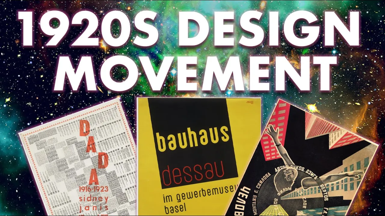





The Bauhaus school, founded by Walter Gropius in Weimar in 1919, pioneered a revolutionary approach to design education that combined art, craft, and technology, fundamentally transforming graphic design through its emphasis on geometric abstraction, functional typography, and the integration of design into everyday life. The school's evolution from its early expressionist phase, led by Johannes Itten and his spiritualist philosophy, to its later constructivist period under László Moholy-Nagy, who championed the 'New Typography' and experimental visual communication, established foundational principles that continue to influence contemporary design education and practice worldwide. Key innovations included the Basic Course (Vorkurs) for incoming students, the integration of graphic design as both a subject and survival tool for the struggling art school, and the development of design thinking that prioritized functionality, accessibility, and visual clarity over ornamental decoration.
Bauhaus Typography at 100: A Curator's Tour with Ellen Lupton
Added:hello everyone welcome in we'll get started in a few minutes we know we have a very international audience joining us today so feel free to share your location in the chat say hello welcome laura sarah i've heard of her welcome from oakland someone from iceland montreal australia fantastic slovenia hello from baltimore and desal that's interesting this is fantastic yeah mexico bowl one of the exciting things about this event is that we're combining audiences between cooper hewitt and letter from archive so uh it's really cool to see folks coming from both of those communities we'll get started in about three minutes david kobianca welcome good to see some familiar names here and we already have a question but that's just mike saying hello from stanley bispo uh one of the things i always like to remind people is if you'd like to um chat with everyone and change the uh little menu bar in your chat to share with everyone otherwise you're sharing just with your with the host and panelists and um yeah we'll get started here in just a moment welcome from new jersey and welcome from poland louise welcome from ojai well i'll quickly introduce myself and and get us started here in a moment my name is stephen coles i'm the associate curator and editorial director at litter form archive uh and we're really excited to have this partnership with cooper hewitt and to have a conversation a presentation from ellen lupton who we all admire so much has been a really integral part of this show wrote a great introduction to the catalog of our exhibition and so we're really excited about this uh event and to share some time with her before we welcome ellen to the virtual stage i'd like to talk about a couple of things that are coming up at letter forma archive we have uh our next salon series with islam ali who is one of our favorite makers in the collection does incredible things with artist books and laser cutting and arabic type and he'll be joining us to talk about arabic letter forms and contemporary book art we also have a workshop coming up with hope ming this is a back by popular demand workshop called modern monograms and you'll spend four wednesdays uh finding and exploiting the relationships between letters hope is a great teacher and a great designer so that should be a good one and then we have a themed tour if you've ever been in the online archive and if you haven't i encourage you to check it out but you'll have a chance to spend some time with rebecca anaya to look at the influence of the arts and crafts and art nouveau movements on typography and she'll guide you through these these movements and [Music] and give a lecture and kind of a tour through the collection and then we have a really interesting online workshop coming up with rudiger schlemmer who wrote this incredible book uh typographic knitting um and this is going to be a multi-day workshop where you'll spend your time uh learning knitting skills and um combining that with typography you can make a poster scarf pullover blanket and if you've ever seen his book he'll really enjoy this one because he's trying to put some of that stuff that he shows in the book into practice and then finally uh we have uh well if you'd like to learn more about the events that we have coming up at the archive go check out that url and we have manager here uh sharing links in the chat as well if you want to direct click to the site to learn more we also have uh volunteer opportunities it's been a while since we had volunteers coming to the archive and we're excited to uh call all type lovers to volunteer as attendants at our gallery um the same gallery that you'll be hearing some about from ellen today so we'll we'll need some help in supporting uh the gallery and shop operations and ensure that all of our guests have a fulfilling experience so this will be in real life at the archive shop and gallery and uh you will be given a standard level membership during the course of volunteering with us so check that out uh in the link that was just posted in the chat so i'm really excited to welcome ellen lopton to this event she is a writer curator educator designer she is the baddie cook and william o'stein mets design chair at micah in baltimore she serves as senior curator at cooper hewitt and smithsonian design museum in new york city and also she's just someone that i look up to as a writer and curator those are two things that i'm still always learning and some of the best things i've learned have come from her books and her work if you haven't had an opportunity to check out the biohouse book that we published the catalog for that goes along with bauhaus at 100 please do her introduction is really an important part of that book and really sets the stage for what we tried to do with that show so so excited to welcome ellen to the stage and really excited about this uh this kind of collaborative event with cooper hewitt thanks for joining us thanks steven i learned so much from you too it's amazing i'm delighted to be here um greetings from cooper hewitt um i'm ellen lupton i'm curator of contemporary design at cooper hewitt smithsonian design museum and we are really delighted to be doing this program with you at the letter form archive in the service of accessibility i'm going to describe myself i'm a white woman with dark blonde hair i'm wearing a dark t-shirt and a modern pearl necklace designed by betty cook and behind me are two of my favorite places in the world the letter form archive and cooper hewitt museum and both galleries are overflowing with bauhaus and that makes me super happy i'm a bauhaus fan girl and i'm so delighted to be able to nerd out about all things bauhaus tonight with you on behalf of cooper hewitt this program is presented by the parsons school of design cooper hewitt m.a program in the history of design and curatorial studies our lecture series graphic design history is part of our spring graduate seminar which i'm teaching every week with a wonderful group of grad students and some of our events are public including tonight's talk so welcome grad students it's so great to have you here in the audience our lecture series was created by the curators at cooper hewitt to celebrate the work of our community of scholars and curators so in 2019 cooper hewitt opened our exhibition herbert beyer bauhaus master which features pieces from our collection and from the amazing collection of meryl c berman alas the pandemic forced us to close our exhibition short we didn't get to share it as much as we had hoped to at the letter form archive you have a few more weeks to come and see the amazing exhibition bauhaus typography at 100 and if you can't see it in person please check out the amazing book that stephen just mentioned so full of new things and new photography of our favorite stuff up close and personal and cooper hewitt also published a book about herbert beyer featuring a lot of pieces from our collection and merrill berman's collection there are so many ways to enjoy the bauhaus and tonight is going to be one of them it was a life-altering experience for me to be able to walk through this exhibition live and in person with rob saunders who curated the show and as director of the letter form archive and he spent hours with me um going through the extraordinary pieces that he assembled for this show and so we're going to go on a quick little run through there is early bauhaus there's high bauhaus there's some pre bow house and there's bauhaus influencers and one of my favorite pieces in the exhibition is this weird little book cover by a german designer named walter dexl and he's representing the human body here the parts of the body with just lines and circles and that's a theme we can kind of follow tonight is some of this anatomy of the bauhaus body and sort of explore a rather strange and reduced sense of what the human form can be um it kind of works you know now walter dexl himself had rather mixed opinions of the bauhaus and he was working at the same time and creating quite similar work to what people were doing at the bauhaus and it was rather annoying to him and he thought the bauhaus was quite overrated and dependent on a never failing flow of publicity and that my friends is exactly the point the bauhaus people knew from very early on that they needed graphic design and lots of it in order to get the word out and keep people interested in this little art school that was always struggling to stay open and graphic design was there as a subject matter and a medium but also simply as a tool for survival the exhibition also has a section called beyond the bell house that shows us what people did after they left like the radical pedagogy of max bill or the influence of the bauhaus on corporate modernism and corporate identity standards but it doesn't end on a corporate note one of my favorite pieces in the exhibition is this extraordinary poster by vanessa zuniga tenitsaray who's a designer from colombia and she studies the graphic language of pre-columbian pottery and analyzes it to uncover and present the modular language of representation found in those pieces and so beautiful and imaginative abstractions of human forms and animal forms and abstract decorative forms and then that study of these indigenous design languages informs her own invention of her own language for her time and place so let's dive in to the bauhaus and start at the beginning once upon a time in weimar germany a little art school opened and the first director of the bauhaus was the architect walter gropius and by the time he left in 1928 just really a short time later it was the most famous art school in the world and in his opening statements about creating the school he spoke of the devastation in his country and across europe wrought by world war one he said the ruined world visible and invisible will be resuscitated from our brains and from our hands and it is with that kind of grand statement of utopian possibility that he started a school of art and design in weimar and the school has left us many things many legacies and one is this idea of a basic course a preliminary experience for incoming students that plunges everybody into a direct engagement with materials and form with the goal of erasing all the bad habits and all the received ideas that young artists might have brought with them to the school and this idea remains in use in schools around the world and here we see gropius's very famous diagram translated into english of the bauhaus curriculum with that basic course at the edge i was really interested recently to find this more casual drawing by paul clay who taught in the basic course at the bauhaus that takes that same content and renders it in a kind of different hand and there at the top of the circle two little flags have been planted and one of them seems to say something like propaganda and the other says burlog or publishing and so there at the edges in the outskirts in the suburbs of the bauhaus mind was graphic design and publicity making its little stake right and offering perhaps a lifeline to the school the first leader of the basic course was johannes etten he was a painter a swiss painter he wore long robes and he studied an esoteric philosophy called mazdazon and he had many followers who actually came with him to the bauhaus who already embraced his teachings which were very much based in expressionism and spirituality and principles of vegetarianism and celibacy and the work that his students did there in this classroom was very wild and physical and raw it may not be what many people associate with the bauhaus when they think of sort of clean and perfect geometries a beautiful project that it initiated and worked on is this portfolio of prince called utopia documents of reality and the cover is designed by margeet terry adler who was a student of ettin and it's full of these extraordinary lithographic um type studies or lettering studies by etten that are directly based on the teaching that he was doing in his basic course where he would have students contemplate an image of an old master painting or a medieval painting and attempt to chart their inner emotional response to the work and he got very angry if people didn't look really into it and really appropriately distressed by the emotional content sort of reverse trigger warning in the early bauhaus and in this beautiful drawing here we see he's created this esoteric geometric diagram on top of the typography and that also flips over and lays on top of the image and it's it's another theme that we'll see in bauhaus graphic design these kind of networks of lines that make visible invisible energies life forces ideas thoughts we could call them thought lines or theory lines and it's something that we'll see many of the artists and designers at the school create regardless of their particular ideological outlook one of enton's outstanding students was a young woman named friedel dicker who followed ettin to the bauhaus and worked with him in his classroom and created works like this extraordinary watercolor in which she's exploring letter forms not unlike those we saw in enton's portfolio and dicker also studied with kandinsky and clay who were teaching in the basic course as well and she was the first student to be invited to help teach that course so she very early on took a leadership role and a pedagogical role at the school in addition to being a student and here we see some postcards designed by kandinsky and clay for the first bauhaus exhibition in 1923 where they're translating their drawings into kind of graphic advertisements for the energy and ideas of the bauhaus and we can see some of those energy lines at work in their graphics as well dicker collaborated with it on the utopia portfolio which included not only those lithographic hand-drawn letters by etten but this extraordinary series of letterpress prints where dicker worked with a printer to translate bitten's texts into letterpress a process that she spent several weeks on it was very rigorous ongoing work she wrote letters about it to her friend about the process of creating this typography for etten and we can come in and see the extraordinary typography the use of much more decorative typefaces than you might associate with the bauhaus and attempting to translate some of that energy and ox from itan's hand handmade letters into something distinctly typographic and it is quite wonderful that a page proof exists from one of these prints where we can see dicker and or ettin writing sketches and notes to the printer and the printer would then go and make those corrections which are reflected as you see in the final print so it's really fun when we get to get little scraps of the working process of our favorite designers these these traces of the real these traces of the thought process after the bauhaus dicker worked as a designer artist and teacher between 1943 and 1944 she taught art to children in the theresa stott concentration camp ghetto dicker herself was murdered in auschwitz poland in 1944 several of her students survived and became founders of the new discipline of art therapy and child psychology so if we think about the legacy of bauhaus teaching and bauhaus pedagogy this is one beautiful vein of this idea of art as experience and art as access to inner knowledge that carries forward today and has survived in this most extraordinary manner the worst experiences of human history dicker was able to save over 4 000 of the drawings created by these children and they are preserved today in the jewish museum in prague czech republic and you can see here the influence of clay and kandinsky and etton and dicker herself carried forth into these extraordinary works it's kind of heavy so i just want to take a moment for us all to think about that especially in this time of war that we're currently experiencing spirit bauhaus that's the thing i think we all just experienced some of it together the spirit of the place carrying forward and those early years at the bauhaus were very much embedded in an expressionist point of view they were very interested in the other worldly lothar schreier was an avant-garde theater director his work celebrated sound and movement and gesture over the traditional focus on literature in the theater his 1921 play crucifixion is documented in this woodcut book which is in the exhibition and in the collection at the letter form archive and which i had only ever seen little black and white images of it in various bauhaus publications and it's so extraordinary to be able to encounter it up close and to see the real thing and how big and rich and material it is schreier was director of the stage workshop at the bauhaus in weimar from 1921 to 1923 those early years those spirit years and here's our our theme of weird anatomies at the bauhaus these are some representations of the players on the stage and how they might have been dressed in a very abstracted way this one is called mutter or mother and the mother here is a bunch of rectangles with circles for her eyes her face her mouth her breasts her womb quite an abstracted image of the maternal and inside the book perhaps its most um extraordinary element or influential element is this visual score that schweier created that was an attempt to translate the sounds words movements and tones of the theatrical performance into a kind of score based on the linear layers of a musical score and it's quite obscure um he knew that most people would not be able to really recreate any kind of performance for it and he saw it as something much more esoteric that would reach those with the special talent to understand what it was about schreier was forced to leave the bauhaus in 1923 as gropius craved a new direction for the school and he was replaced by oscar schlemmer as director of the theater workshop who ushered in a new period of bauhaus experimentation with bodies and space um and and here we see a diagram of a if a player on a stage enveloped by a network of these thought lines or theory lines um piercing the body turning the stage into a kind of space thickened by geometry so we're into constructivist bauhaus a different time a different place bitten was also forced to resign in 1923 gropius was fed up with the eccentricity it was not a good luck for the people of weimar a quite conservative town and and gropius was committed to moving the school in the new direction more towards technology and industry um and he hired someone to replace etten a young artist named lazlo maholinage who was hungarian he was only 28 years old when he started working at the bath house and he often was mistaken for a student because he was so youthful and the other faculty clay and kandinsky and muka other people who were teaching at the time were really a different generation from maholinage so mahlinage arrives as this young blood full of en energy an immigrant who didn't speak german clearly and full of a passion to really live out and create the vision um imagined by walter gropius and so they quickly became very close collaborators and maholi naj was really um licensed to like to do it to make it happen to make this new bauhaus happened in this portrait he is by his wife lucia maholi he's shown wearing a engineer's coverall over his suit and tie his shirt and tie so he's really representing a very new image of the artist who is not um not wearing long flowing robes like etten but is dressed as a kind of worker of the future an intellectual worker of the future he had already an established career before coming to the bauhaus as he traveled across eastern germany to berlin in 1920 he earned money for his train tickets by doing lettering and sign painting so there was this survival instinct with graphic design on his way to berlin he contracted the spanish flu and nearly died survived that pandemic and he belonged to the hungarian avant-garde group ma which means today and continued throughout the magazines publication to be the berlin correspondent for the journal lucia maholinage his wife was a photographer and writer and before meeting laszlo in 1920 she was working in the publishing industry and quite a bit of knowledge of how books and magazines are published and she was also a photographer and began studying commercial photography while at the bauhaus and if you were ever curious what their apartment looked like well here you are in the actual dining room of lucia and laszlo fitted out with bauhaus furniture and bauhaus artwork lucia maholi's photographs of people and objects and bauhaus buildings became part of the visual bedrock of the bauhaus myth both during the time the school was opened and after the school closed in this these pages from the bauhaus journal she is credited for her photography but that would end later and walter gropius took her negatives with him when he emigrated to the united states and really used these glass negatives that she had created um to help build the and spread the myth of the bauhaus in the u.s and kind of cut her out of that process something that she fought hard against for for decades to come maholinage and herbert beyer designed this catalog for the big 1923 exhibition in weimar which is sort of a last stand event to prove the value of the school and this beautiful book which is available in a gorgeous facsimile that came out in 2019 really gets you inside the mind of the school at that moment the cover is designed by herbert beyer the interior pages are designed by maholinage who worked with gropius to make the book happen to to edit the book as well as lay it out so when we talk about designing a book it isn't just someone being handed some files but but really the whole conception of how it could happen the book is square which reflected the philosophy of geometry that was being espoused by kandinsky at that moment and that was part of this kind of creation of a visible scientific image for the school the yellow triangle the red square the blue circle a kind of elementary sentence of a visual geometry um a square book is hard to design we can see maholinage kind of struggling there with it with these very long lines but here he is launching the new typography and this is considered the first essay to use that phrase and it would go on to have a huge influence on typography in the 1920s and i see hans has his hand raised i'm not sure if stephen could maybe help him um so there's the new typography getting started gropius and maholinage also decided to um publish an entire series of books the bauhaus book series which are beautiful little slim volumes they were not meant to be big or imposing or expensive they were written by leading artists and designers of the day they were the voice of the avant-garde written by people both at the bauhaus and across europe and maholi naj designed these books often with the assistance of lucia maholi together they wrote bauhaus book number eight painting photography film although lucia is not credited for the book and the cover features an abstract photogram which is a technique that lucia and maholi developed together in her dark room at the bauhaus here's another beautiful printer's proof this is from painting photography film um and we can see here where maholinage has told the printer that he wants these black bars to run off the edges of the page to bleed to be more dynamic and he's adding an arrow to create more sense of motion to the page and that's how it got printed so again i just i just love seeing that process taking place and imagining this this young artist figuring it out and kind of learning on the job how to create the new typography something he had written about but didn't quite get what it would be and then really making it happen in essays like this in painting photography film he's creating a score for a movie so the idea of how to use typography and gridlines and photographs and repetitions and symbols to create a visual translation of the action and unfolding of a film and we can see the influence of maholinage here in this beautiful book which is featured in the exhibition at the letter forum archive the author takao tagaki visited europe in the 20s and is very directly creating an homage here to maholinage in this gorgeous book cover molly naj also looked at the idea of graphic notation in bauhaus book four the theater of the bauhaus which he co-authored with oscar schlemmer and farcus molnar the cover here is by schlemmer and inside the book is this incredible piece of information design that folds out of the book and is a score for performing on stage and maholi naj was deeply interested in theater and performance and created many designs related to theatrical space and how it could envelop the audience and engage the audience and use new new technologies of light and projection and stage design so here we are at the top of this long graphic and we can see maholinage's diagram of the stage which includes moving panels it includes a screen for projecting films and light on a lower visible stage for musical instruments and sound making of all kind and underneath are these vertical bands showing the simultaneous creation of of form and light and music and movement and we can travel through the piece and see this uh beautiful diagrammatic um design uh that for example the color bars are showing different intensities of light and simultaneity of light so it is quite an interesting and elaborate system and of course we saw it earlier a similar interest in the more expressionistic woodcut work of lothar schreier um so sometimes you know art historians and theater people say well these things are interesting experiments but did they really work you know aren't they just too obscure for someone really to make sense of and there's some truth to that but really if we think about time-based media from a distance perspective from today there are incredible parallels in the software we use in the interfaces for animation or video editing which use these timelines and layers to um to help the creator work out camera movements and transitions and timing and sound all in simultaneous form so i think the bauhaus is always there inventing something and perhaps it's real use changes over time but there it is that extraordinary work one of mahogany naj's students was marianna braunt a german artist who came to the bauhaus she abandoned a career as an expressionist painter it said that she burned all her paintings to start over and immerse herself in this new experience at the school and she entered maholi naja's metal workshop and she was the only woman in that workshop and quickly became one of the most influential product designers of the bauhaus creating many of the school's most memorable and iconic objects she ultimately became acting director when mahali naj left in 1928 and this self-portrait we see her holding a camera up to a mirror to take an image of herself and these are some of the incredible products that she made in the metal workshop um her teapot from 1924 is one of her first products and was created in weimar and it shows the her fascination with these perfect geometries which we've seen throughout the course of the school whether it was expressionist wombs and screaming faces of the mother or a more rational geometry in the pedagogy of kandinsky so here we see this this teapot turned into half of a globe and an ebony circle as the handle and across as the base later her work would become more functional less of a less founded in in craft and and sculpture and more in the function within the home so her hanging glass lamps were designed so that it would be easy for someone to adjust the height of the lamp as it hangs over say the dining room table or a work area and these lamps are still in production they really work for people the teapots not in production but is one of the world's most coveted objects for sure so beautiful mariana bronte also created photo montages and and most of these were done in a short period where she took a leave from the bauhaus and and did some traveling and photo montages for many bauhaus designers and artists and many artists of the era were kind of an outlet for personal expression and they were cheap because you could make photo montages by just cutting out magazines that you happen to have around so we can imagine marianna braun with her favorite magazines creating images of what it was like to live at that time so the image on the left shows a kind of liberated bauhaus body you know a body in space wearing you know minimal clothing to to exercise and have freedom of movement but then on the right is another kind of reality where we have a woman kneeling um and and these lines of thought or these theory lines uh connecting her hands to a sort of bourgeois man in a in a hat and a suit um who's really controlling society and controlling her destiny um so we get to two very different interpretations of of of life in the 1920s for her this is sort of a fun one this is a design she did for a journal cover in 1927 that was intended for reproduction i don't think it was ever reproduced but that was its intention and here we see this kind of joyous engineering figure this guy in a jumpsuit uh manipulating the the lever of a giant machine and that machine seems to be cranking out typography as all machines should and i think she's done a really nice job at creating this this sense of joy and emotion and if you were ever curious about mariana braun's work from home set up well here you have it there she is catching some sunlight on her bauhaus balcony reading the latest issue of bauhaus magazine and then there's practical bauhaus so i want to tell you about one of my favorite bauhaus people who was herbert beyer and herbert beyer came to the bauhaus as a student in 1921 he was very young he was 21 years old he didn't have a lot of background in art he'd done some some studies but he was pretty green to it and he had this copy of kandinsky's book concerning this ritual in art and there's a similar copy in the exhibition letter form archive and i like to imagine in my fantasy that that's herbert's copy of the kandinsky book and he was so taken with this little book that he was compelled to go and enroll in the bauhaus he couldn't afford a train ticket so he walked 258 kilometers from darmstadt to vymore according to google maps that's a 54-hour hike i hope he had some cookies and in those early years at weimar there was no graphic design workshop there was no formal training in graphic design but gropius recognized that buyer was interested in graphic design and encouraged him to do this work and he knew it would be good for the school too that the school needed some publicity so this postcard for the 1923 exhibition shows uses those kind of theory lines the thought lines in a very practical way basically this little postcard is a geometry lesson in how to draw a circle a square and a triangle um so it's very functional and very direct um everything in this postcard is drawn by hand the bauhaus did not have any type setting equipment at the weimar the print shop there was really intended for artistic printing and not for commercial printing and it's fun to come in close to this original maquette from merrill berman's collection where we can see buyer working it out in gouache and creating this design for a postcard in 1925 the bauhaus moved to decile a city near berlin in a brand new campus designed by walter grophius with architectural lettering by herbert beyer and buyer returned to the school now as a young master no longer a student and he set up a modern letterpress print shop at the bauhaus for printing publications and documents and ads and postcards and students worked with him he was a very practical guy he was not much interested in doing theoretical lectures and he preferred to simply be working there in the shop with students rather than devising elaborate exercises and experiences for them and this is a portrait by his wife irene beyer from 1926 where he's marking up some proofs um among the many things printed there in that letterpress workshop were letterheads uh herbert buyer was interested in contemporary theories at the time and what business correspondence should look like and so he used the letterhead as a testing ground for new ideas and design so he's distributed the text across the field of the letterhead creating a kind of typographic grid and creating spaces for a typist to add their content to the letterhead and across the bottom of the letterhead is a manifesto about why capital letters should be banished from writing um he felt that capital letters were unnecessary they were not functional because we don't hear them in speech they were a waste of metal they made fonts too big and too difficult to produce and they were kind of hierarchical lowercase letters and and printing entirely in lowercase was a more egalitarian kind of typography this was not an uncommon belief in the 20s various progressive designers were interested in this abolishing of capital letters but herbert buyer hung on to it for way longer than most people did for many decades he continued to espouse that this is what societies should do now it is very very exciting to bauhaus fangirls and fan people all around the world but the letter form archive has acquired herbert beyer's original actual drawing for his universal alphabet of 1926. how cool is that amazing so of course the alphabet is only lowercase because right and it is an alphabet designed on modular principles using parts of circles and straight lines so abandoning the organic complexity of traditional fonts for this very purified geometry and it's so fun to come in close and see the little guidelines that he used to create the letter forms the anchor points for the compass the mistakes the retouching the perfecting of those circles [Music] sorry about that um the overlapping arcs right i'd love to see a font that actually preserved all that element of making in in herbert byers letter forms so cool herbert buyer eventually emigrated to the united states and this remarkable photo montage is in the collection of cooper hewitt museum we have over 500 works by buyer mostly from his career in the u.s and so we're so proud to have this material and to be able to study it and share it here we see a giant ham through the sky escorted by warplanes and buyer has added those theory lines or thought lines to the trajectory of the plane to kind of dramatize the space and the action going on here why is the ham flying through the air well it turns out that this montage was created for an ad for gas stoves and the the gas industry in the us was fighting the electric stove industry and they used this kind of wartime depiction of the ham to suggest that that cooking with gas was more patriotic this is 1942.
and there's buyer standing in one of his exhibition designs with his theory lines turned into physical objects he's been able to make it real to put those lines into space he was part of a wave of european emigres who promoted modernist design in the u.s and throughout his long career in the u.s he never stopped talking about the bauhaus the bauhaus was his point of origin a calling card a magical word um that brought all kinds of intrigue and respect uh to the work that he was doing in his remaining career and this is one of my favorite herbert beyer pieces uh created in 1939 in the u.s and it shows a uterus beautifully rendered in pinks and red and black and gray surrounded by the menstrual cycle and the phases of the moon and emanating from the center or those thought lines or theory lines bringing us you know to the core of human generation um extraordinary uh piece and the brochure is actually about five inches tall it's a very tiny little piece that he made this extraordinary image for and it was used to promote a hormone-based pharmaceutical product to doctors so there's the bauhaus the bauhaus at the center of everything this extraordinary diagram of the bauhaus in decile it depicts the school in relation to how far it is from other cities in germany and france and and beyond so this notion of the bauhaus being in the middle and projecting outward selling itself promoting itself sending out its products its postcards its books and making itself heard through often graphic design and the curriculum with its center in architecture but its periphery in basic design creating this system of pedagogy that was adopted all around the world and is still with us bauhaus bodies look at this extraordinary drawing by kandinsky from his book point and line to plane a bauhaus book showing this ecstatic circular concentric body kind of exploding into space bauhaus business it was always a business the school was always trying to stay afloat it never had enough money this gorgeous logo by maholi naj was designed to advertise and brand that bauhaus book series which was part of the school's financial plan and that idea of business it carries on um this beautiful logo by paul rand who loved the bauhaus and took those ideas in his own direction or tom guys mars identity for uh mobile oil company also on view in the exhibition at the letter forum archive and then finally this incredible icon found by vanessa zuniga to nitzere and the pre-columbian pottery of indigenous people in colombia and finding the bauhaus everywhere taking it back finding that geometry wasn't invented in the 20s it's bigger than all of us it's forever it's infinite every generation discovers and destroys the bauhaus for itself the bauhaus always had enemies there are always people that wanted to shut it down ultimately the nazis did in 1933.
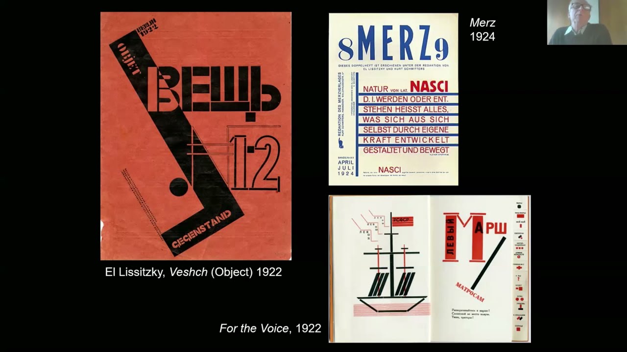
when laszlo maholinage left in 1928 he said ah i want to get out of here it's just gotten too commercial it's too focused on utilitarian stuff um and leaving with him the same year were marcel broyer and walter gropius and zante shivinsky and they all went to berlin to be commercial designers right not enough of art school let's make some stuff out there in the world um the bauhaus we keep finding it we keep finding new things there um i keep loving it i keep um i keep seeing new ways to understand it and and new people who were forgotten or erased or overlooked um who were making things and making it happen so um so thank you i enjoyed talking with you all about the bauhaus and perhaps we can have a conversation thank you so much ellen that was fantastic you are such an excellent storyteller and i've already i mean i thought i well never thought i knew at all about the bat house but there were a ton of things in there that were new to me so thank you so so much for that really beautifully organized too thank you um we have a lot of questions and probably won't get to them all but i'll start picking out a few and i'll just do one now that just because it was uh you were just talking about theory lines craig eliason asked what was the source for that term uh i've seen similar forms referred to as lines of force in the context of futurist art a label with a very different connotation for a very similar visual element yeah i don't have an official word for it um i came up with theory lines my friend jenny tobias and i have been bouncing like what do you call this thing that recurs through so much bauhaus design and yet is used sometimes in a very mystical way sometimes in a decorative way sometimes in a functional way it's actually how something was made but what they do is they visualize the invisible right so lines of force is is good too and um you know in american streamlining speed whiskers right we're used to show objects moving and and we're much maligned by the good modernists because toasters don't actually move why do they need speed whiskers so this this idea of trying to add a sense of movement but also i think of spirit or intellect to things like that these thin pencil lines they um they create relationships they connect this to that and so you see them in you know the paintings of maholinage as well as his graphic design in kandinsky yes and futurism and and lots of the artwork of of the period and i don't think there's any single point of origin it's like a thing a technique um that gets used and [Music] it's on all different meanings i like coining our own terms whenever whenever we can whenever we need to to help explain things and so i think that's an excellent one um just answer a common question that's coming up often in the chat that we will send the transcript of the chat to everyone after the event as well as a recording so don't worry you won't you won't miss out on that if you had to come and go uh a question from an anonymous attendee what are some common misconceptions people have about the powerhouse well i mean that the main one is that the bauhaus is rational and i know in my own writing i've said oh the rational period i don't think the bauhaus was very rational you know the bauhaus was grandiose it was theoretical it was um utopian and so there's that expressionist period the very spiritual period which gets a bit buried and overshadowed and and was deliberately buried by gropius who became the um the spokesman for the bauhaus and its afterlife right the main spokesman so that area that that period gets kind of brushed under the carpet and hidden away and yet it it's so much part of the school and if you read the writings of of maholinage and and others who are associated with the so-called rational battle house it's some pretty wild stuff you know about remaking man and this kind of reinventing the biology of human existence through design it's not just rational it's it's more than that and i think sometimes people uh confuse the rational typography or what they see as rational typography with it with all of the uh the ways that they were actually thinking but that's not necessarily the case yeah uh here's a question from hans koch uh what were the inspirational and personal connections between bauhaus designers and the russian constructivists thank you for the wonderfully and uh informative lecture well elizinski traveled and lived in germany during the early 1920s and so he knew many of the bauhaus people and they and they knew him so there is a direct link there um malevich who was ukrainian um was hugely influential to the obviously the founding of constructivism but also to abstract art in western europe and one of the bauhaus books was a book by malevich so there's a lot of influence there but i think it's really important that there is also an avant-garde in poland and an avant-garde in hungary and other eastern europe european countries and that part of the decolonization of the bauhaus and the decolonization of modernism is really about looking at parts of europe that kind of get squished between germany and russia but there's sort of a hegemony of that constructivism is russian and you know new typography is german but there are so many people working in other parts of europe and creating constructivist design and socialist inspired design and you know i've been looking a lot just this week at maholi naja's career before the bauhaus so i had just had in my mind that you know maholi naj was so young and he had this opportunity to teach at the bauhaus and that created him but he actually had quite an interesting and extensive practice before he got to the bauhaus which frankly is why he got the job and that some of those ideas like creating scores for a film um that entire project he had already designed in in berlin in hungarian um in 1922 and you know those ideas are are there before the bauhaus that's amazing how young was he that that was that was well he was 28 when he came to the bauhaus oh right okay so he's not as young as herbert who is really green herbert buyer arrives really is just a kid you know he's 21 and um you know did not have his own voice as an artist but naj man he came there with a voice and with knowledge you know gropius didn't know what to do about constructivism maholi naj brought that to the school a quick question from kevin woodland that asked if malay naj coined the term the new typography in that document you showed was that before anyone else uh chick hold of course is famous for using it but well chick hold chick hole did not coin the term chick hold visited the bauhaus exhibition and bought that book in 1923.
um maholi naj was a very close friend in berlin with kurt schwitters who we all know as a dada you know artist but was also a graphic designer and and very interested in typography and functional typography and malinage really got his typography bug from shredders and was super interested in what schwitters was was doing uh caroline caroline or caroline hatch asks um it's interesting how much propaganda goes into the argument for the necessity of the school we are at a time period now when so many pure art schools are suffering or closing or shifting focus to more marketable art programs like graphic design or design mpas what do you think current art schools could take from the maps well you know that communicating what you do matters that you know that a school isn't just what happens between faculty and students but the schools create knowledge and that that knowledge can be shared and can can emanate and um can can go further um i mean graphic design at the bauhaus was not the most highly valued discipline right far from it it wasn't even in the curriculum at weimar architecture was the most highly valued discipline but graphic design was there out of necessity and i think part of the impulse to create that working print shop and decile was knowing that they needed to print their own stuff you know so you know i love that about graphic design that it's necessary that we need it to communicate that we need it to explain who we are and fine artists need it just as much as graphic designers do we all need to communicate what we do beautiful thank you becky owen uh asks if you could share your thoughts on the bauhaus's overlap uh or distinctions from the arts and crafts movement or more specifically uh for book design the german private press movement bremer karna et cetera is it fair to say the spirit of the bat house the school looks forward into modern day while arts and crafts looks backwards and i appreciate any insight you have on these two movements well there are whole books written on that it's a huge topic and the bauhaus definitely came out of those reform movements um the reform of industry and so forth that art arts and crafts represents um so the german burke bond for example is you know direct in a direct line with the bauhaus i don't want to speak in a scholarly way about it because there's just so much that's been written on that but they are connected not not disconnected they're much more connected than they are separate susan mantis asks were they designing all non-serif typefaces we actually post an article on our blog yeah the letter forms design you know most of the experiments in alphabets at the bauhaus were were just alphabets they weren't actually made into typefaces but there was one typeface that that buyer designed that was a serif um any other answer to that question you're the expert on that stephen i think your forensics on bauhaus typography are legendary you know right down to the fonts used by etten and friedel dicker in their utopia book you know that's pretty cool i know you have a good library um yeah but that makes it yeah yeah that's just uh it's often a misconception that they were designing typefaces there they were really experimenting with letter forms uh but the the typefaces that were used were the ones that were already in existence and they just did amazing things with them for the most part but they also use their lettering in things and you could consider those typefaces in a way kevin woodland asks hi ellen did the designers of the swiss typography movement favor all lower case settings for the same reasons that uh as buyer or is it for different reasons with the fire really speaking for all the bauhaus in that in that essay well first of all buyer did not invent this movement um you know he was one of of many who espoused getting rid of capital letters and there's actually a management theory guy named i think portsmon who really originated the notion of it but yes the swiss designers also embraced the idea of lowercase letters as being more egalitarian and also more organic which is very important to max bill that typography be organic and so those shapes were very desirable and so yes the the um the egalitarian quality of lowercase letters i think was much better exploited by the swiss designers later than than they did at the bauhaus uh niels thorson asked can you touch on the balance of the bauhaus idea of reducing things to their simplest form versus use of element in graphic design well i think i think the idea of of reducing form is just one of the fundamental design principles explored at the bow house and i think it's important to acknowledge that people for all millennia have reduced form to geometry right this is not owned by the bauhaus it was articulated by the bauhaus um but it is an incredible design principle and one that has to be learned right i think we have a impulse to make things more complex and so that finding of the essence and removing what's extraneous is a is a learning you know whether you're a writer and learning to make a better sentence or a designer creating a layout it's it's a learning and that kind of goes along with this monica ready ass how can we take these some of these bauhaus principles to modern ux design hi monica well i mean it's the same idea of laying a field i mean that letterhead that buyer did where the type is like points in a field you know like creating spaces for activity to happen that's an interface idea maholi naja's score for a theatrical performance is an interface idea um [Music] and so i i just think that so much of what we see in these kind of mythical legendary works continue to inform what we do today and continue to have value as long as we don't see them as some kind of law that can't be broken right i think there's a history of the bauhaus being seen as oppressive and creating a set of roles that are imposed on on people and and that's to be avoided yeah i think that one of the things i learned most in in just experiencing this i wasn't part of the curation process but just experiencing the exhibition and looking at the buyer exhibition is just how it was about experimentation more than rules that it was uh there was all sorts of different things going on and uh not tying it down to every one philosophy yvonne this might be too long to answer for today but asks explain the process of how hand-drawn letters are transformed into something that can be used for printing that might be someone that you would there are multiple yeah there were multiple ways they could have done it through an engraving making a plate that they would print from or later it could have been photographically reproduced but i i'm not sure if they have that kind of technology yet at the biohouse sure well making it a photographic plate of type was very common a logo or a headline or something uh what art and design school today most embodies the philosophy and practice of the bauhaus can you comment on the institutional offspring of that house like om which is a very important design school in germany um that's a big one i don't know i mean i i feel like art schools have become very corporate um but the bauhaus wanted to be corporate you know the bauhaus was trying to be a sustainable business do we see that kind of experimentation i feel like a lot of art schools including where i teach were focused on marketable skills and students want that and need that and are paying a lot of money and you know want to work in the in the field often it doesn't feel like there's space to reinvent the world you know to create something radically new uh i don't know how much time you have with this rep to getting up at 15 after the hour we have 21 more questions so we won't get to them all no how about we just do how many two more scans good okay um so omar asks if there are any aesthetic hangovers from the bauhaus movement movement that you notice regularly in design today oh dear um i don't think so i actually feel that people have in their mind that like bauhaus typography was is better than it was and when you look through like the bauhaus books and bauhaus posters and stuff there's something kind of homespun about it you know i think max bill's generation [Music] really made it into something perfect right the swiss design methodology is just so um sleek and extendable and truly a system and at the bauhaus the stuff is kind of raw it's kind of messed up you know and i really love that about it the imperfection and the seeking that you see in it i think a lot of typography that we look at now and say oh that's so bad how it's really not people aren't looking closely yeah absolutely that's another part of the thing i've learned from this exhibition is just how much um expressionism there is about house work and it wasn't necessarily again about you know following uh some sort of straight-line set of rules uh there's so many here i'm trying to pick like the best one we can close on um random be random yeah okay well this is um you know kind of uh on topic for the moment but uh hands asks as a follow-up to the russian constructivists are there any interactions between bauhaus and rivochenko or stephanova um ronchenko never went to the bauhaus he um visited europe once uh he went to paris in 1925 for the art deco exhibition and installed his workers room there um stapanova never went to europe of course their work was known why because it was published in avant-garde magazines [Music] including you know ma the hungarian magazine there were just so many places that you could see this work and so although they didn't have an opportunity to directly interact with um designers in germany or the netherlands um certainly their work was known as was tatlin the great ukrainian architect his tower was never built but it was seen everywhere because this plate this photograph of it was reproduced over and over again in our public magazines yeah it's like without graphic design you have no avocad that is the cat lane's tower existed you know there's a beautiful model of it but most people only ever saw the picture that is a great way to to close this where would it be without graphic design nowhere ellen thank you so much for your generosity and your amazing scholarship and just making this stuff so accessible to so many people it's it's really uh i'll learn a lot from that and and i have personally too so thank you so much for this awesome event it's been such a joy such a joy thank you thank you everyone and remember you will get a copy of the recording uh link sent to you and you'll be able to share that around as well as the chat uh thanks to cooper hewitt thanks to uh manager for helping host this and sarah who couldn't be with us and the rest of liver from our archives thank you again ellen thank you it was great fun thanks to to rob and lucy parker and everybody who made such a beautiful book and exhibition it's been an honor to be part of it yeah go check out the book everyone you will enjoy it and if you can come see us in person and see the show we will love to uh to to have you alright take care turn her out take care thanks so much
Up Next
Barcelona Pavilion Architecture: Mies van der Rohe Walkthrough
@FourthWallArchitecture
292.2K views•2019-04-04

Christian Iconography: History, Theology, and Meaning | Fr. Panayiotis Papageorgiou
@Trisagionfilms
58.8K views•2020-02-21
Ukiyo-e Art: History, Woodblock Printing & Influence
@japanathand
6.3K views•2023-06-08

Earliest Depictions of Jesus in Art: 10 Ancient Images Explained
@UsefulCharts
5.9M views•2022-06-03
Related Study Plans & Knowledge Roadmaps
Structured learning paths in Art History