



![Vector basics | Selection & Direct selection tool & more Ep4/19 [Adobe Illustrator for Beginners]](https://i.ytimg.com/vi/GFY0_EMVYDw/maxresdefault.jpg)









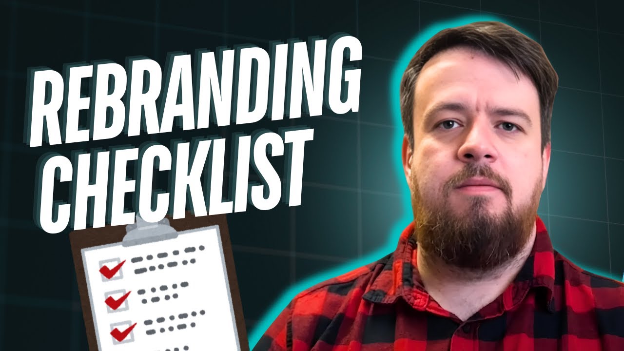
A brand style guide is a comprehensive document that documents all brand elements including logo variations, typography, color systems, photography styles, and application examples, serving as an essential tool for ensuring consistent brand implementation by clients and facilitating repeat business through clear hand-off packages.
How to Design a Brand Style Guide: A Step-by-Step Tutorial
Added:Fundamental principles of visual design, including color theory, typography, grid systems, and visual hierarchy.
The core concepts of brand identity versus brand strategy, and how a brand's mission and values translate into visual assets.
Basic proficiency in vector design software (such as Adobe Illustrator, Figma, or Canva) to create and manipulate design assets.
An understanding of different image formats (vector vs. raster) and color profiles (CMYK for print vs. RGB for digital environments).
Brand Governance and Asset Management: How to implement, distribute, and enforce the style guide across large organizations.
Dynamic Brand Identity Systems: Designing responsive logos and identity systems that adapt to motion graphics, UI/UX, and various digital environments.
Advanced Brand Collateral Design: Learning how to apply visual guidelines consistently to packaging, merchandising, and physical spaces.
Conducting Brand Audits and Rebranding: Knowing how to evaluate the effectiveness of an existing identity and manage the transition of a brand refresh.
37.7K views1.2Klikes12:08Original Release: 2022-04-13
hi creatives and welcome back to agency academy today i am going to talk about brand guides and why a brand guide is one of the best ways for you to get repeat work and make sure that your life as a designer is just way easier and a brand guide is a document that i put together at the end of every branding project and it's basically a way for your client to be able to have an overview of everything that you've created and the point of it is to make sure that it just feels really easy for them to implement the brand in the way that you intended it to be because i know that you have had so many thoughts about exactly the way that they should execute it on social media on their website and if you don't hand over those exact instructions it can be tricky for the person who's taking over to do it in the way that it was intended i think having a little bit of extra time and effort put into your brand guides is a really good way for you to build that really lovely hand-off package for your client and i've had a lot of people that actually come back to do more work because they feel like oh actually you know my brand so well it feels much easier to come back because we have this document together and because we have this relationship so i think it can be a good investment but speaking of that i think that we need to make sure we create some sort of template for brand guides because that way we make sure that we don't actually have to put that much time once we've created the brand into creating the brand guide once it's all done so today i wanted to talk you through my brand guideline templates and just show what sections i include why and you can use it as the basis for your own i also created a indesign template for you that you can use so if you want to grab that one you can go to the description and download it as well so the project that i want to share the brand guide for today is for a company called remote collective they're a social enterprise that we worked with a couple years back and they basically take different fabrics and materials that people don't have anymore so like if they've like donated it to charity or maybe they just didn't really find the use for it and they make amazing fashion items like handbags and clothes from this material and so the biggest challenges for this brand was to make sure it was a community-built brand so they have lots of creators and volunteers and they needed this brand to be easy to use in basically whatever whatever format so if it was embroidered if it was stamped on something if it was on their website so it was a really fun project but it meant that there were a lot of different applications so i'll show you the different applications and how we thought about this when we put together the brand guide so first of all the cover of the the design for the brand guide the cover should really reflect the brand so in this case it's a very minimalist one but in some cases we've gone all out so maybe i'll put some examples on the actual cover here and once we start getting into it i just like to have some sort of like impact image or something that is giving them a sense of the brand so in this case we have a label because it represents what their brand is going to be used for a lot but it also has the pattern the logo the type so i thought that was a good way to sort of give an introduction to the brand then i like to give a little bit of an overview of what is going to be included and so this is something you can do also in the branded style um and i like to do this so that let's say a web developer or a marketing person could come in and see exactly what section they need to have a look at if especially if the brand is bigger and then we go on to the logo and i think it's nice to start with the logo because this is what people often talk about in some cases i've put let's say the mission statement and maybe even a little bit about the target audience or the personas in this we typically create a very extensive research document so that's a separate item and but you could put a little bit about maybe the tone of voice or about the mission of the company if that's something that you feel is useful in this document in this case i have the logo and i have the kind of lock up with the icon and the name and then because in this one we have also the collective which is added we've done that as a separate item so in this first one you just have the logo which is something that is kind of an overarching thing because sometimes they'll be switching up collective for other things like remote community or remote fashion week something like that so we wanted this to be something that is easy for them to switch out and just to show kind of the vibe of the logo with the extra text and next up we have this really fun application and this is something that you might not have for every brand but in this case the logo was created with these really simple shapes just to create a vessel for them to either sew it or paint it or fill it with a fabric or something like that so it was a really creative way and to just be able to have this in different styles and different patterns so i just showcased some examples and i think it's always good for for all the sections to include a little bit like of an explanation so that the person who is reading also gets the why of why they've made each design choice and next up we show another application of the logo which is the stamp and so we have either the letter r with the little text around it or we have the sort of reverse or inverted with the stamp color being on outside and these are different ways that they can do it when they have applications like seals or stamps on packaging and stuff like that next up i like to show the typography and in some cases that just means the fonts that we're using and the typefaces in certain cases we might have hand lettering or other applications but in this case because the logo needed to be so flexible we kept the type really simple so i just list what the different ones are for and what they are so that they're easy for the client to use in this case we also had a little bit about alignment so the general alignment is to the left but for those really small applications they can align the text to the center like a small label so that's just a way to keep it super consistent next up we have brand colors which also seems like something that is pretty obvious for a brand guide and i like to have kind of the purpose of each so in this case the key brown color is this yellow which we call sunshine and we put the hex code in this case they're not using print that much they are printing but they're mostly stamping so we haven't included like the pantone or the cmyk but in certain conditions we do that as well then we have the backup colors which are more for patterns and then we have the neutrals which are for things like maybe the footer of a website or background color things like that i just really like naming colors because i feel like it gives a little bit more personality to the brand and if you let's say have different shades of blue instead of just saying that the light blue or the medium blue you can say oh it's the ocean color and i think it just brings a little bit more i don't know it's a little bit nicer to me next up we have photography and this can be super different in some cases it's really extensive and we have lots of different sections like in this case we have fashion photography here which is showcasing the the photography of a product but also the photography with the person and the product so giving some examples and then we have workshop photography which because they're a community brand and because they are very volunteer-led we wanted to give a little bit of this vibrancy feeling and some examples of what that could look like in some cases we have a custom photography and in some cases we use stock photography it really depends on the project and what it is that you're after next up in this case we have patterns and so in this case we developed these patterns from the shapes of the logo and so we wanted to show here that you can combine a few of the shapes together with let's say the logo and the stamp but you can also have them as a whole pattern block for example and so we have a little instruction for example for when someone's creating a new pattern to use their neutral colors as the background adding shapes of maybe three additional colors and so that you're not trying to make it too difficult for them but you're giving enough instruction that the brand integrity is kept next up we like to showcase a little bit of examples here and so this is where i typically put mockups if it's a store it might be putting signage or what inside of the shop might look like if it's a food delivery or a food ban maybe it's a food truck or packaging or something like that so i think it's nice to have examples so that they can visualize the brand so in this case we have some bags some tags some stickers some packaging and this is just to showcase how it all comes together at the end we always just put a little bit of contact details and basically that's it for this one i thought i would quickly share one more with you so i just want to show you this one quickly just to give you an idea of how they can differ because i really think that putting the spin of the brand on the actual um brand guide is also really important and so in this case it's a very different brand it's a marketing company for more sustainable brands a lot of vegan brands and so here we're also leading with a mock-up to give the feeling of the brand and then we have sort of the colors and the type all customized to the brand itself and we're showcasing the typography and showcasing the photography of the style itself so we're going through the same sections of like the logo and different applications the colors the type and in this case you know we also have the different color combinations for the type because that can also be something that you want to combine so sometimes you might have to customize a couple different pages just to fit this specific brand but overall you know you have these different sections that are going to be fit and specifically created for the brand so in this case we have these shapes that we're using so we're looking at how the shapes are being combined with photography and how the shapes are used by themselves i hope you found that helpful i think creating brand guys is such a fun part of the project because you've already come up with all the ideas and all you have to do now is put together this beautiful document and hand it to your clients so i hope this was inspirational and if you want to use the template then please feel free to go down to the description and let me know what you're working on i'm super curious uh if you have any ideas for videos let me know and if you like the video make sure to hit the like button and maybe subscribe to the channel it makes me super happy to see that so many people have come here recently and i'm really curious what it is that you want more of thank you so much for watching and good luck with your projects [Music] you
Up Next
62:34
Understanding Royalty Statements: Questions to Ask Your Publisher
@AuthorsGuild
4.9K views•2017-11-30
12:54
Triumph of Orthodoxy Icon: Byzantine Art & History Explained
@BenCallan
2.1K views•2024-08-06
9:49
FastAPI vs Flask vs Django: Choosing the Right Python Web Framework
@TechWithTim
302.5K views•2024-05-26

1:42
Game of Thrones Opening Credits: A Cinematic Analysis
@gameofthrones
46.3M views•2011-04-18
Related Study Plans & Knowledge Roadmaps
Structured learning paths in General & Interdisciplinary Studies
general-studies
Elevator Engineering: History, Physics & Cities
01From Hoists to Safety Brakes: The Dawn of Vertical Lift
02Hydraulic vs. Traction: The Engineering Physics of Elevators
03Modern Speed, Safety, and Algorithms
+ 2 more learning modules
12h5 modules
Explore Roadmap
general-studies
Rubber: Material Science, History & Geopolitics
01Origins of Natural Rubber & Mesoamerican History
02The Chemistry of Natural Rubber & Vulcanization
03The Geopolitics of the Rubber Boom & Colonization
+ 2 more learning modules
12h5 modules
Explore Roadmap
general-studies
Containerization: Evolution, Logistics & Trade
01Ancient Trade & Bulk Cargo: Amphorae to Barrels
02The Industrial Revolution & Cardboard Packaging
03The Containerization Revolution: Malcom McLean
+ 2 more learning modules
12h5 modules
Explore Roadmap
general-studies
Textile Tech: Evolution, Labor & Global Impact
01Pre-Industrial Textiles: Handloom & Cottage Industry
02Mechanization: The Spinning Jenny to the Power Loom
03The Factory System & Global Labor Transformation
+ 2 more learning modules
10h5 modules
Explore Roadmap