

![‘Alignment’ Design principle of Graphic Design Ep11/45 [Beginners guide to Graphic Design]](https://i.ytimg.com/vi_webp/2kokQi9vb6E/maxresdefault.webp)










![[39] 🔥 Figma SLOTS: полный обзор, как пользоваться слотами в компонентах в Фигме. Бесплатный курс](https://i.ytimg.com/vi_webp/uZMno46BMRM/maxresdefault.webp)





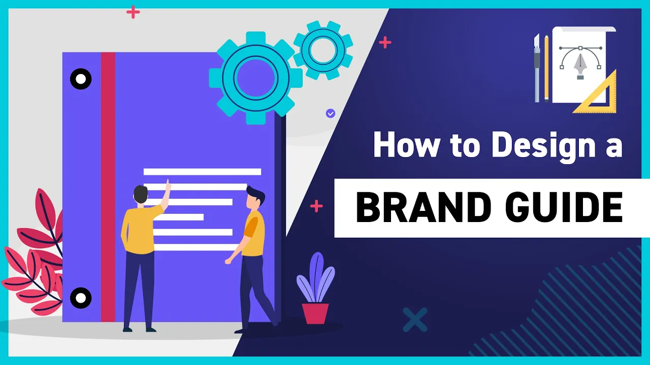

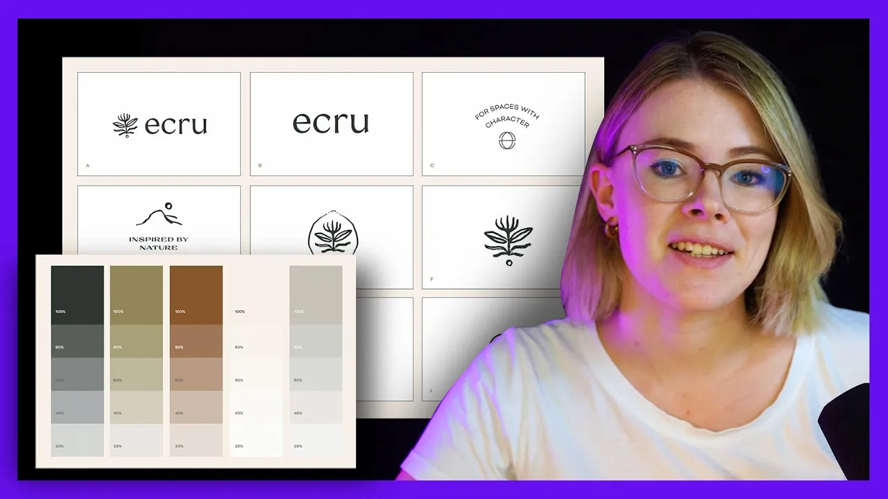

A brand style guide is a rulebook that ensures visual consistency across all brand communications by specifying how to use logos, colors, typography, and imagery, preventing brand identity from being compromised when different designers or team members create materials.
How Brand Style Guides Work: A Guide for Designers
Added:Basic principles of graphic design (hierarchy, contrast, balance, and alignment).
Fundamentals of typography, including typeface classifications (serif, sans-serif) and basic typesetting.
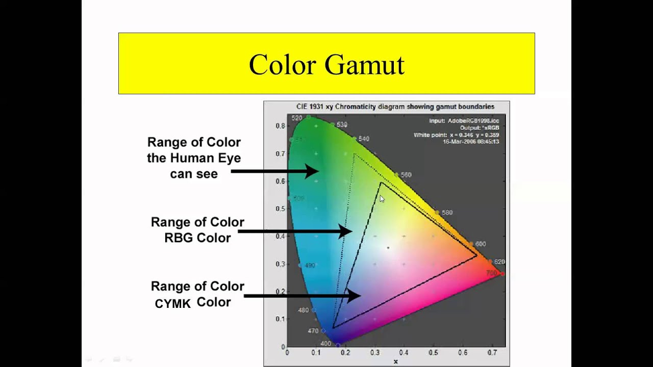
Core color theory concepts, such as color psychology, color harmony, and color spaces (RGB, CMYK, and Pantone).
The distinction between brand identity (the visual elements) and brand strategy (mission, values, and target audience).
Developing and compiling a complete, professional brand style guide/brand book for a client.
Transitioning from static brand guides to dynamic digital design systems (e.g., component libraries in Figma).
Implementing brand governance: How to enforce guidelines across large organizations and manage digital assets.
Adapting brand style guides for multi-channel applications, including responsive web design, print collateral, and motion graphics.
5.8K views32likes14:03Original Release: 2022-01-22
and so i'm going to show you an example example with an already existing company that we all know which is a netflix all right so i studied netflix and their designs are pretty much consistent all right i pretty much constantly hi guys my name is ek lee welcome to my channel from graphics design to motion graphics from branding to logo designs all i do is to simplify your design learning process you can trust me on that i provide awesome tutorials that will help you learn fast all you have to do is to subscribe to this channel like my videos and share welcome once again to this channel enjoy and um today i'll be bringing to you a very very interesting um concept like you know what we do basically in this channel is to talk on concepts amazing concepts and sometimes we do practicals on concepts that will help you become a professional designer it doesn't matter if you are a ui designer or a graphics designer or you are maybe a web designer or a brand identity designer as far as you are in the design space you would likely benefit from what we do in this channel so today we're going to be talking on star guides and before i continue i want you to i want to be you to um subscribe to this channel all right um you can like the videos if you feel we have been of help to you or if you are just starting out still um you can check out our other videos and you you'll find you find something you find a lot all right a lot to learn and i also beat you to share this video with your designers friends shades star guides so what are star guide basically what are style guides basically so what it is um definition here says a brand style guide is a rule book that explains how an organization presents itself to the world through its logo font and color selection photography and much more okay it is simply a rule book all right it's a rule book um a brand guide is usually maybe an ad copy or it might it might be in soft copy all right what you call maybe pdf or any other fam file format all right so another explanation says um though you're going to get it very soon he said it's a reference tool that helps maintain consistency in what a brand looks feels and sound like all right it's just that what the most important word there is consistency to ensure consistency all right to ensure consistency let me give you a typical example for instance you create a brand identity for for those of us that are into brand identity maybe you create a brand identity for for for a client maybe you you did the logo you chose the colors all right so all these things they have to create a feel for the brand all right it helps to to mold the brand's personality all right so what you don't want to do is to is to mess it up later on all right it's to mess it up because you might end up designing something for your brand um and maybe you are not the designer you're not the in-house designer you're not design designer that is to continue designing for them so you don't want anyone to mess things up all right so what you want to do is to create a style guide to ensure that whosoever has to take on responsibility from from henceforth is going to follow through that guide so that it the brand's personality can still be maintained throughout its existence all right there are exceptions except maybe a rebrand is being done all right but if a rebrand is not done the brand ought to maintain our constituency and what can help you achieve this is simply a stagger and so i'm going to show you an example example with an already existing company that we all know which is a netflix all right so i studied nexus and their designs are pretty much consistent all right i put most constant that's all you can have in netflix maybe netflix maybe um a branch office maybe in california and you have one here and maybe you might have netflix all over the web all right maybe in adverts and and um just everywhere everywhere and you still see that consistency you can see okay this is netflix all right you can see that this is netflix they still maintain their personality even online anywhere offline all right so this is what a star guide helps you to do so one of the basics thing that okay people already know that okay the color is to be maintained they already know the colors to be maintained but there are other things that needs to be maintained other than the colors all right some person's already okay this logo is to be maintained they are not to change logos all right they are not to change logos and sync after we've done this today then tomorrow they change it but there are other things that needs to be maintained other side the colors and the logo all right and that's what i'm going to talk about today for netflix this is what we call their style guide all right this is not too comprehensive all right depends on the brand you're working for you don't need something that is very comprehensive but this is the foundation so what you want to talk about first in your style guide like i said it can be in a book format or it can be maybe a book format which is ad copy or it can be soft copy all right so what i want to first of all talk about is the logo the the logo types you have all right the logo forms you have so netflix they have only two they have the end symbol which is the primary logo all right the primary signature all right so and they also have um the word mac which is the netflix all right so that's it that's it you also have what the netflix symbol all right so the next you want to do to tell them how to use it how do they apply the logo so the first thing is to tell them okay this is the amount of clear space that you should use why is clear space important declare space prevents the logo from being clustered all right sometimes you might just make a logo and a year a year yeah time you just get to see the logo business and you're like oh did i design this logo why is looking awful on this on this um graphics most times people don't get to maintain the necessary class space so you are the creator of the logo you should tell them okay this is the number of this is the amount of space you should leave in the four corners of the logo while applying it to any design all right so that is important so logo in context logo in context simply means how the logo should be applied maybe to a background all right netflix have only theory scenarios that the logos are is is allowed to be applied on all right they have three scenarios one is it is a color background and the color background has to be solid all right it's solid background without gradient without any form of texture all right just only color then the next one is a texture background um then the next one is a content background a content background might be um like netflix streaming movie streaming um platform so you might want to put it on there on a movie like you've seen in their movies you might just find netflix at the side right so this is what they are trying to to tell you so anything and this is prohibited that's what they're telling these are the only scenarios you can apply the word mark and the and this the end symbol all right so the next thing we have is logo readability like like i always upload the most important thing in design is clarity all right because people definitely want to interact with your design and if they can't see what is there if they can't read what is there then there's no point in the design so what they are telling you is okay this is how this um mark can be applied on different shades of of of black different shades of gray all right they they they they went ahead to give us the percentage we have zero percent black when there's no black at all it can work um ten percent black it can work 20 black it can work 30 black it can work but 40 black it can't work all right that's what we have over here even 50 black it can work 60 black it can't work 70 black it can't work but as from 80 percent black to 100 black it can work fine this is to ensure that the logo what is readable all right so we have special use of the word mac all right so in every logo it is advisable even as a designer to have a black and white fashion all right it's very very important so here they are telling um they're telling us that you can't use the n symbol all right you can use the n symbol in a black and white format because if you remember the n symbol has a gradient so when making it white if you make it just white and black it will be flattened and the meaning will be lost all right so you can only use the word mark which is the netflix all right and you can only use it when the background is black you make the text white when the background is white you make the text black so that's just these are just rules that are guiding the use of it all right okay we also have things to avoid so you want to decline these are the things to avoid these are the things designer might be tempted to do with the logo but it is pre-beated all right so you say don't change the gradient on the end symbol right do not change the gradient for any day you can see here the the the gradient the black portion of it is is is them quite very very very very visible in the original this is not like this all right so you do not what stretch the logo designers i think then they are coming up or maybe they are just getting this people are just getting um to start our design most times they stretch the logos a lot so this is prohibited it it disfigures the logo you should not do that it disregards the logo so another thing that you might be tempted to do is to add the shadow to the netflix logo yeah it is prohibited you can see the cancer science it is prohibited and on that thing do not add the logo to it to a very very busy background and that one do not change the color there are many ones there are many don't do's here and now you might be tempted to do this with square on the loop because it's looking and it's looking all squared all right you might won't be tempted to put a square around it so they said it is pre-beated all right it is what prohibited so that's it and do not use the symbol on the red background it is prohibited it is prohibited all right it is a taboo to use it all right so these are just simply rules then we have also the word mac all right the word mark the way you shouldn't use it there are many ways you shouldn't use it right you should not rotate it like what they said here do not rotate the symbol for any reason do not rotate it all right and also do not it's almost the same thing almost the same thing you know use it on busy backgrounds almost the same thing all right to not change the colors so these are just simply guides and the last thing you want to do is to create scenarios or examples of where you applied it the right way all right you can use a mockup to represent it to just show scenarios of how you applied it sometimes you want to use a video to show how the logo should be applied all right all this should be done all right all this should be done in order to what maintain consistency so that brand you created today in the next five years just to see it and get this okay yes wow this is nice this is nice it's not only for you it's first if it's for the consumers imagine you are buying a a privilege today and tomorrow they have changed you won't you won't trust it they have changed their their packaging next mode they change not advisable so i think that is all we have today i just had to do a quick one on this so if you have any question you can dm me on any of my social media accounts creatively by ekd um creativity okay if you have any question that i did not get to cover on this video you can try question at me on any of my social media and all right creative ekd um whether it be um instagram or facebook you can just throw a question a question at me all right or you can just put your question right here on the comment section i hope you've learned something today i hope you've learned something i'll beat you too again subscribe to this channel like our videos share with your friends share with your with everybody share with everybody because one way or the other they're going to benefit from this video so we have all the amazing videos in this channel on branding all right so we are just trying to break down the concepts and i want you to anticipate the next video i'm going to make now i'm the next might not be the next probably but it is coming soon a video where i will be showing you practically how i i create my my logos all right from idea formation to execution it's going to be a very practical video so i want you to anticipate it if this video comes to you very late it means it must have been in the channel already alright so i want you to check for it i'm going to be signing out now i'm going to be signing out so see you next time bye hi guys my name is ekd welcome to my channel from graphics design to motion graphics from branding to logo designs all i do is to simplify your design learning process you can trust me on that i provide awesome tutorials that will help you learn fast all you have to do is to subscribe to this channel like my videos and share welcome once again to this channel enjoy
Up Next
29:19
Brand Equity Explained: Brand Promise and Key Models
@DsimsOrgInRS
44.4K views•2015-07-31
46:36
Retention Habits of Top DTC Ecommerce Brands Revealed
@SendItPodcast
44K views•2026-03-03

15:23
Decoy Effect: How Pricing Psychology Influences Consumer Spending
@bobinvestsUS
90K views•2026-01-05

17:30
The Planned Obsolescence of Light Bulbs and Tech
@veritasium
25.3M views•2021-03-26
Related Study Plans & Knowledge Roadmaps
Structured learning paths in Business
business
Pop-Up Retail: Strategy, Design & Execution
01Introduction to Pop-Up Retail & Strategic Goal Setting
02Budgeting, Site Selection, and Legal Essentials
03Experiential Retail Design & Visual Merchandising
+ 2 more learning modules
15h5 modules
Explore Roadmap
business
Reg CF: Startup Funding, Marketing & Launch
01Introduction to Equity Crowdfunding & Reg CF
02Platform Selection & Legal Preparation
03Crafting High-Converting Campaign Assets
+ 2 more learning modules
14h5 modules
Explore Roadmap
business
Productized Services: Scaling Solo Freelance
01Foundations of Productized Services
02Packaging and Scope Definition
03Pricing and Subscription Models
+ 2 more learning modules
15h5 modules
Explore Roadmap
business
Gov Procurement: Find, Bid & Win Contracts
01Introduction to Government Procurement & Business Setup
02Small Business Certifications & Set-Asides
03Finding and Analyzing Contract Opportunities
+ 2 more learning modules
14h5 modules
Explore Roadmap