







![El Telescopio Espacial TESS🛰 [Un UNIVERSO de EXOPLANETAS en nuestra GALAXIA💫]](https://i.ytimg.com/vi/p0eTQ-R113w/sddefault.jpg)






In this Planet Hunters Coffee Chat episode, Nora Eisner demonstrates how to enhance light curve data visualization using Lightkurve in Python by customizing plot markers (changing from lines to points using marker='o'), adjusting colors, and applying transparency (alpha values between 0-1) to improve data clarity and distinguish multiple datasets when plotting.
Lightkurve Data Visualization Tutorial: Customize Plots in Python
Added:Basic Python programming, including familiarity with importing libraries and utilizing package documentation.
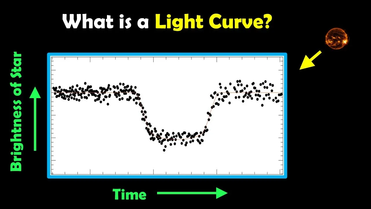
Fundamentals of astronomical photometry, specifically what a light curve represents (brightness variation of a star over time).
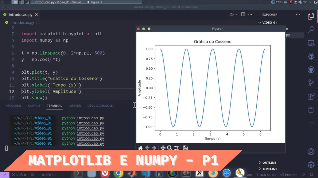
Introduction to the Matplotlib library, as Lightkurve's plotting functions are built on top of it.
An understanding of space telescope missions like TESS (Transiting Exoplanet Survey Satellite) and how they gather transit data.
Applying advanced data processing techniques in Lightkurve, such as flattening light curves and removing outliers.
Phase-folding light curves to analyze periodic events like exoplanet transits or binary star eclipses.
Using Periodograms (such as Box Least Squares or Lomb-Scargle) in Lightkurve to detect exoplanet candidates.
Visualizing Target Pixel Files (TPFs) to inspect the raw CCD pixel data of a target star.
2K views65likes8:06Original Release: 2021-08-03
'Welcome to another episode of Planet Hunters Coffee Chat. I'm your host, Kassie Perlongo, joining me today is fellow co-host and astronomer, Nora Eisner. Hey, Nora!' 'Hi!'
'So if you're just now joining us, we're going to drop some links here - somewhere here, or over here - to have a look at our introduction. Look to see about what we started out doing and why we're doing these videos. But for the purposes of today... in our last video, actually, we talked about downloading TESS data, introducing, excuse me, downloading and importing light curve data in Python. And today we're going to talk about how to enhance that data. So, Nora, we're going to go back to Jupyter Notebook. We may have some troubleshooting aspects again, like in our last episode. But I'm really excited to see what we can do to change and manipulate this data so that it makes it a little bit more robust and clear.'
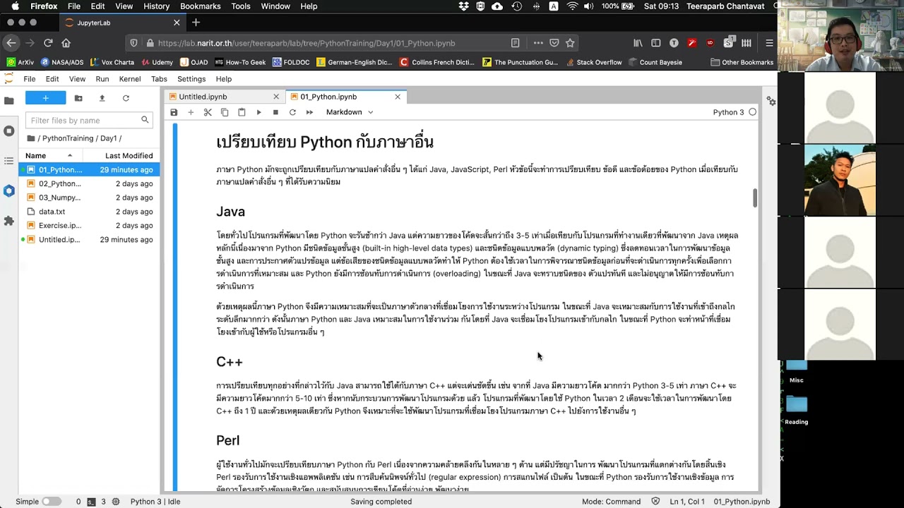
'Yeah, let's make some data look pretty...'Yeah.' 'Let me share my screen... fantastic. Yeah so, hopefully, you've seen the last video where we talked about how we can use Lightkurve to import data and to just plot it. And we'll just we'll start off at that same point. So let me just... this is another empty notebook so we'll just run this again.
This is for the same... same TIC ID that we use - or same target that we used - last time.
So, again, we're just defining the target. We're then searching for what's available, we're using sector 23 of this... of this target. And then we're downloading that data and, after we've downloaded it, we can plot it. And we had... this is what we had last time. And something that, actually, I didn't mention last time, is that it's very simple then to just use this notebook to look at a different target. And to use exactly the same code and just to change this one simple thing. So, you have to change the TIC ID. And we can just go ahead and do that now. So, we can change this to 55525572 - the only TIC ID that I know, without having to...' 'It's Nora's favorite TIC ID.'
'It is! I have a favorite. Maybe... maybe you have a favorite, too, and you can tell us about your favorite TIC ID in the chat.' 'Future episodes, yeah.'
'So, we'll just run this. Just to show that we can just do this very easily for a... for a different target, as well... And we'll let that run and there you go. So, this is for a different... different target. For my favorite star. So in this episode, we're going to look at how we can, kind of, enhance this and make this look prettier. So I, you might mention - or you might remember - two episodes ago, that I mentioned that I prefer these to not be lines but to be simple points. So, let's just look into doing that now. And we do that with this lc.plot() command. So, we'll just... I've made some notes of what we can look into. So, in this command, so lc.plot()... Within this () parentheses, we can add some commands to tell it how to plot things. So as a starter, I'm going to get rid of of those lines - I don't like those - so, we'll say the "linewidth = 0" to get rid of that. That will unfortunately get rid of the entire plot, so we have to also say the marker that we want instead. We can want that to be... this needs to be "=" a dot, for example. So let's have a go and see what that looks like.'
'And there you go. Now it looks like a beautiful painting and there's a bunch of scattered lines.
Okay.' 'I think it's much easier to see... the transit in this data but, like I said already, this is just a personal preference. You can make this look however you want it to look.
So there's a number of things you can do, you can make this marker, kind of, almost anything you want. We can make this into stars, we can make it into boxes - ooh, the stars are very tiny and you can't really see them very well - we can make it, maybe, into triangles. So the way to look these up is to go to... not this one... is to go to the marker. So, this is matplotlib, this is the, kind of, the library that we're using. And there's a whole list of of different things that you can use and that's just how these points will appear. And we'll provide this link to this... kind of, look up in...' 'So it's very much... it's very much personal preference but it can, I mean, you can do little stars and stuff too with that?' 'Yeah, you can. You can do whatever you want!'
'That's cute.' 'It's good fun.' 'I mean, honestly. Who thought that this would be fun, plotting data points?' 'We want them to look pretty. We have to look at these a lot, so we want them to look like the way that we want them to look. All right. So, another thing we can do is we can change the color. Kassie, what's your favorite color?' 'Green.' 'Green? Okay... we type green in there and... and there it is.' 'Beautiful.' 'So, again, just like we had for the markers, we also have a page which tells us the colors. So you have different... different names. You can even have different shades of green, if you like.' 'Wow.' 'Yeah, so you just... you type those in and you can just change these variables in here. So the last thing that's quite useful to change is "alpha". So that's a value that ranges between 0 and 1, and it's just how see-through those markers are. So at the moment, by default they're always 1, which means that they're not transparent at all. But we can, for example, make those, I don't know... 0.3.
And that just shows... what this really, kind of, brings out is when there's lots and lots of different points on top of one another. So you can see these slightly darker regions which are just where more points are overlaid on one another. And that just kind of brings those out a little bit more. So these are all just, kind of, small things we can do to help visualize the data and make it look prettier. Yeah.' 'Okay. So just to reiterate what you were just saying, so this is nice to to make it look prettier and everything, too. But is there, like, a tangible reason why you would want to use this? Do you use it in presentations is it good from an academic standpoint... does it help with your outreach or anything, so that you can really point that out to people? Because it looks pretty and we like pretty things but is there, like, real reasons in the real world as to why you would use it and do these things?' 'Yeah. So, if you're just plotting, kind of, one data set it's not that important. Maybe the only thing that I think is quite important is the points versus the lines. I just... I just think the transits pop out a lot more with the points. But in terms of the colors and the marker shapes, that's really important if you're plotting multiple data sets. So in one of the future episodes, we'll be looking at plotting both "binned" data and "unbinned" data and we'll plot them on the same graph. So there, it's really important to have different colors or different markers just to differentiate between, kind of, these different things. Also, if we're looking at multiple sectors of data, you might want to plot each sector in a different color. Yeah, so it's all just enhancing the visualization. And yeah, it's very important if you're giving a talk or presentations and just... making it as, kind of, visually as appealing as possible.' 'Great, okay. So it's not just to look pretty, there is a reason for these particular things. Of course, I like it and, you know, it's green, so it's obviously the best thing that's ever been done in the entire world. But, you know, I like knowing that there are real-world applications behind this too, that you guys use this to really help visualize and, you know, to get people excited and stuff like that. When you're showing... you know, it's hard... when you see the code - the code is cool - but when you actually visualize something, it just brings it to life, doesn't it?' 'Yeah.' 'It really does.
Cool. Well thank you very much for showing us how to do that, I'm going to have a lot of fun doing different colors. Especially since you showed me there are different shades of green. And we hope that you have a lot of fun going through this. Again, we're going to point... click the link to take a look at how to do this and notebook - we're going to have this all set up for you - and join us in our next episode. So thank you very much, Nora.' 'Thank you! Bye.' 'Bye.'
Up Next

9:25
Invisible Cut Techniques for Seamless Long Take Filmmaking
@SteveRamsdenYoutube
165.5K views•2022-08-20

12:54
Triumph of Orthodoxy Icon: Byzantine Art & History Explained
@BenCallan
2.1K views•2024-08-06
9:49
FastAPI vs Flask vs Django: Choosing the Right Python Web Framework
@TechWithTim
302.5K views•2024-05-26

1:42
Game of Thrones Opening Credits: A Cinematic Analysis
@gameofthrones
46.3M views•2011-04-18
Related Study Plans & Knowledge Roadmaps
Structured learning paths in General & Interdisciplinary Studies
general-studies
Elevator Engineering: History, Physics & Cities
01From Hoists to Safety Brakes: The Dawn of Vertical Lift
02Hydraulic vs. Traction: The Engineering Physics of Elevators
03Modern Speed, Safety, and Algorithms
+ 2 more learning modules
12h5 modules
Explore Roadmap
general-studies
Rubber: Material Science, History & Geopolitics
01Origins of Natural Rubber & Mesoamerican History
02The Chemistry of Natural Rubber & Vulcanization
03The Geopolitics of the Rubber Boom & Colonization
+ 2 more learning modules
12h5 modules
Explore Roadmap
general-studies
Containerization: Evolution, Logistics & Trade
01Ancient Trade & Bulk Cargo: Amphorae to Barrels
02The Industrial Revolution & Cardboard Packaging
03The Containerization Revolution: Malcom McLean
+ 2 more learning modules
12h5 modules
Explore Roadmap
general-studies
Textile Tech: Evolution, Labor & Global Impact
01Pre-Industrial Textiles: Handloom & Cottage Industry
02Mechanization: The Spinning Jenny to the Power Loom
03The Factory System & Global Labor Transformation
+ 2 more learning modules
10h5 modules
Explore Roadmap