























Traditional choropleth election maps are misleading because they color administrative units based on land area rather than population, causing sparsely populated regions to visually dominate and distort the true distribution of votes; this bias can be corrected by filtering out unpopulated areas using nighttime satellite imagery as a proxy for population density, which reveals that urban areas are the actual battlegrounds in elections rather than rural regions.
How To Fix Election Maps With Street Lamps | TED Talk
Added:Understanding Choropleth Maps: Familiarity with standard thematic maps where geographic areas are shaded in proportion to a statistical variable (such as political votes) and the visual biases they can create.
The 'Land vs. People' Mapping Dilemma: Awareness of how geographical area size does not correlate directly with population density, which often misrepresents election outcomes.
Basic GIS and Satellite Remote Sensing: A foundational understanding of how satellites capture data from Earth, specifically nighttime light (luminosity) data used to measure human activity.
Data Visualization Principles: Knowledge of cognitive biases in data interpretation, specifically how the human brain mistakenly equates visual area/color dominance with statistical weight.
Advanced Cartograms and Dasymetric Mapping: Exploring alternative cartographic techniques, such as population-weighted cartograms or dot-density maps, that accurately scale geographic regions based on population.
Luminosity as an Economic and Social Proxy: Studying how nighttime light data is utilized in global economics and social sciences to estimate GDP, poverty levels, and urbanization in data-scarce regions.
Spatial Analysis in Political Science: Delving into geographic information systems (GIS) applications for analyzing voting patterns, redistricting, and identifying gerrymandering.
Ethics in Information Design: Investigating the ethical responsibilities of designers and journalists to prevent misinformation when presenting political and demographic data to the public.
163 views3likes13:36Original Release: 2024-09-30
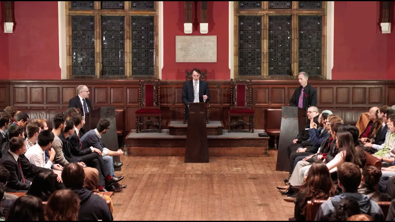
this is a map of the 2020 election in the US uh it is an election that if you did not know very much about it you would think that the candidate receiving the red votes won uh the candidate in this election that got the red votes was Donald Trump the candidate getting the blue votes was Joe Biden this is what's called a corle map uh the way it works is you take a country you chop it up into administrative units these can be States or counties or precincts and then you assign color to each one of those administrative units on the basis of how much of the vote each candidate got pretty simple right if Donald Trump got 100% of the vote pixels in here would be 100% red for that County if Joe Biden got 100% of the vote the county would be 100% blue now this is by far the most common way of communic ating election results and 2024 is an election year not just in the US but also in the UK so we're about to see a hell of a lot of these there's just one problem with this type of election map which is that it's not only incorrect it's actively misleading again if you didn't know who won this election you would probably surmise that Donald Trump won in fact this was a key piece of evidence that Donald Trump and his supporters used to claim that the election was stolen from them they said look at this map look at how red it is how is it possible that we didn't win in the next 10 or so minutes I'm going to delve into the problem with this type of election map and show you how we can arrive at a solution using Street lamps and an aging us weather satellite so I've zoomed into the state of Oregon in the Pacific Northwest if you look up in that corner in the northwest there's a blue splotch that blue splotch is Portland it's the largest city in the state it's home to around 600,000 people it voted mostly for in this case Hillary Clinton this is data from the 2016 election now down here I've outlined in Black Harney County Oregon at 26,000 squ kilm this county is roughly the size of Belgium now I'm going to pause and I promise this is related as it's a Friday night um how many of you are going to Coco later how many of you know what Coco is Coco is a club oh we got a hand we got one at least one person go to Coco later Coco is a club in Camden um it's like 10 minutes away from here it has a maximum capacity of, 1500 people uh the amount of votes that were cast in Harney County Oregon were, 1600 in the 2016 election and yet the amount of space that Harney County takes up on this map is several times the size of the entire city of Portland right the 1600 people that voted here 1,400 of them voted for Donald Trump right so this count is going to be really red that red is Multiplied across an area the size of Belgium but with a population the size of Coco on a Friday night you sort of see why this might be a problem if the only tool that this map has to communicate the election result to us is the color that it displays now if we try to think of a solution to this problem you might think well counties are pretty big right Harney county is pretty large what if we chop up the counties into precincts what if we use smaller administrative units smaller units should be more precise right the interesting part about this problem is that it actually gets worse the smaller the administrative units you use it gets worse the more precise the data that use is and that's because the densely populated counties tend to be smaller and the sparsely populated counties tend to be a lot bigger right why would you subdivide Harney County you're you know there why would you cut it into two counties of 700 people just keep it as one of 1400 right but as we move from counties to precincts as we get smaller administrative units you can actually see Portland shrinking um the the extent of the visual bias in these Maps cannot be corrected by using smaller administrative units by using more precise data this is a fundamental problem with this sort of map which is that it colors pixels based on land area not on the number of votes but of course land doesn't vote people do if we look at a histogram of the pixel colors in this map in in Oregon we can see that the uh distribution of pixel colors is heavily skewed to the to the red side right so we can see over here on the left very few pixels that are purely blue and we can see on the right lots of pixels that are purely red in fact we can actually see Harney County itself in this one bar now again these maps have as their only tool to communicate information to us the color of the pixels if they did their job perfectly the average pixel color in a state should be the exact average of the vote in that state so in other words Donald Trump in 2016 got 44% of the vote in Oregon the average pixel color in Oregon should therefore be 44% red right well the average pixel color in Oregon for that map is 76% red so it's almost doubling the extent of his lead and that's through that mechanism of having having large sparsely populated counties take up more space on the map than smaller densely populated counties so how do we go about fixing this if we can't use smaller administrative units I was thinking about this problem as I was flying back into the US during the last election and I was looking at a site that many of you have also probably seen I was flying at night so I saw the city of Boston um which which is where I was flying into my parents don't live in Boston they live in a small town just North of Boston and as I was flying into Boston I saw something sort of like this obviously not this because this is from the International Space Station and I was not flying that High um but I saw a bunch of Lights speckled throughout a vast sort of dark landscape and I saw the city of Boston as a large shimmering City and I saw the town that my parents live in as a small dot in a big black forest and then I thought about what the election map would look like if we were to Overlay it on the site that I was looking at that dark Forest that my parents live in would be a sea of blue because we're in Massachusetts but you get the point um the entirety of the forest would receive the color of the votes from that tiny dot of light that is the town that my parents are from so I got the idea to merge the election data with nighttime lights data since the distribution of light pollution across the world pretty closely mirrors population density we can actually use it as a proxy for population density why not to filter out the areas that are unpopulated if the fundamental problem with these election Maps is that they overstate the vote shares of underpopulated areas what if we just got rid of those areas on the basis that they're dark at night so this is a nighttime lights image of Dallas Texas it's taken by an old us weather satellite called V that stands for a visible infrared Imaging radiometer Suite rolls off the tongue um an old us weather satellite that takes pictures of the Earth at night quite pretty pictures at that and when we look at Dallas Texas we can see obviously the city itself and then as we move outwards we see Darkness right these are Fields um maybe some desert and in those fields and desert we see little pockets of light human settlements when we look at precinct level voting data for the corresponding area we can see the outline of Dallas Texas here again in blue but it is sort of a drift in a sea of red right but as we know from that previous image most of that area is empty so what I thought to do was just clip out the dark areas and keep the color of the areas that are bright at night to mirror the distribution of the population so if we cycle through these images you should get a sense for what's going on here right we move from a nighttime lights image uh to the precinct level vote share data to a filtered vote share map um and what this does is it retains the spatial information of where the voter are located right but it gets rid of the areas that are unpopulated and this significantly reduces the visual bias in these Maps now if we Zoom back out to Oregon and we apply this process we can see up here that Portland stays bright right the the city of Portland we can actually see its precise outline now and if we look at Harney County we can see just a few settlements dotted in this Mass area the size of Belgium we've taken the problem of coloring this empty space red and introducing visual bias and we've reduced it drastically we can do the same thing for um now actually if we plot out the histogram of pixel color again it looks a lot better right that 44% vote share is this black line the dotted line now shows the average pixel color the average vote share is 44% now the average pixel color after filtering is 47% so we went from being off by 30% to now only being off by 3% not perfect but it's a hell of a lot better this is that same process applied to the state of Nevada it's a key Battleground state it also happens to be largely desert and when you filter Nevada on the basis of nighttime Luminosity you can see the two Battlegrounds in Nevada which are Reno and Las Vegas now when we zoom out and we apply this to the entirety of the US something really interesting happens right this bit right here in the middle the Heartland that was the basis of the claims that Donald Trump and his supporters were making that the election was stolen from them vanishes when we filter based on population density based on light pollution but not only does that Heartland vanish a new Battleground appears a phenomenon of cities characterized by blue centers and red rings appears now it's important to remember that when Donald Trump won the prevailing narrative for the reason for his victory was that rural workingclass white voters uh staged effectively a political Rebellion against the Elites in our country um and that it was rural voters that brought Donald Trump to Victory and that the story of the 2016 election was a conflict between Urban Elites and Rural voters but when we filter the data based on nighttime lights and we look specifically at cities most of the Cities look the same they have a blue core and a red ring and this much more accurately reflects the actual Battlegrounds that took place in the 2016 and the 2020 elections Donald Trump was carried to victory in 2016 not by rural white workingclass voters as we saw in that previous map there simply Aren't Enough of them to uh lead to a comprehensive election Victory he won on the backs of more affluent Suburban voters and in fact one of the key reasons for Joe Biden's victory in 2020 was a switch by Suburban white women to Joe Biden from Donald Trump so we are able to understand political Dynamics in the US much better once we adjust for population density in this way without losing the spatial information of where those votes were cast and if we zoom out and apply this to the entirety of the US not only does it look very pretty but it highlights that story and as we head into a year of two elections not just in the US but in the UK and as we are about to be bombarded with very very bad cor election apps I hope you remember this exercise and that land doesn't vote and that people do thank you
Up Next

10:31
Japanese Militarism: The Meiji Oligarchy & Taisho Democracy | Extra History Pt. 1
@extrahistory
1M views•2021-12-11

24:30
BRICS Pay and de-dollarization: A New Financial Order Emerges? | 55 chars
@DannyHaiphongYT
164.6K views•2024-10-22
20:55
The Politics of Food: Who Shapes What We Eat? | Phillip Baker
@TEDx
71.5K views•2016-11-22
10:19
Explaining the Saudi-Iranian Proxy Conflict in the Middle East
@Vox
18.2M views•2017-07-17
Related Study Plans & Knowledge Roadmaps
Structured learning paths in Political Science
political-science
Economic Statecraft: Sanctions & Chokepoints
01Foundations of Geoeconomics and Economic Statecraft
02The Mechanics of Weaponized Interdependence
03International Sanctions: Types, Implementation, and Efficacy
+ 2 more learning modules
12h5 modules
Explore Roadmap
political-science
Central Bank Independence: Politics & Policy
01Foundations of Central Banking and Monetary Policy
02The Time Inconsistency Problem & Inflation Bias
03The Delegation Model and Designing Independence
+ 2 more learning modules
12h5 modules
Explore Roadmap
political-science
Consociationalism: Power-Sharing & Stability
01Democratic Dilemmas in Divided Societies
02Introduction to Consociational Democracy
03The Four Pillars of Consociational Design
+ 2 more learning modules
12h5 modules
Explore Roadmap
political-science
Rebel Governance: Legitimacy, Economy & State
01Foundations of Rebel Governance and Statehood
02Establishing Political Legitimacy and the Rebel Social Contract
03Wartime Economies and Rebel Resource Management
+ 2 more learning modules
14h5 modules
Explore Roadmap