







![Maps -L1 [𝐈𝐧𝐭𝐫𝐨𝐝𝐮𝐜𝐭𝐢𝐨𝐧, 𝐈𝐭𝐬 𝐭𝐲𝐩𝐞𝐬 𝐚𝐧𝐝 𝐜𝐨𝐦𝐩𝐨𝐧𝐞𝐧𝐭𝐬 & 𝐌𝐞𝐧𝐭𝐢 𝐪𝐮𝐢𝐳] 𝐂𝐥𝐚𝐬𝐬 𝟔 𝐆𝐞𝐨𝐠𝐫𝐚𝐩𝐡𝐲 𝐂𝐡 𝟒 | Sundar Sir](https://i.ytimg.com/vi/QdUEStlBp2o/maxresdefault.jpg)







![Types of Map Projections [AP Human Geography]](https://i.ytimg.com/vi_webp/IBYzeT2O97g/maxresdefault.webp)
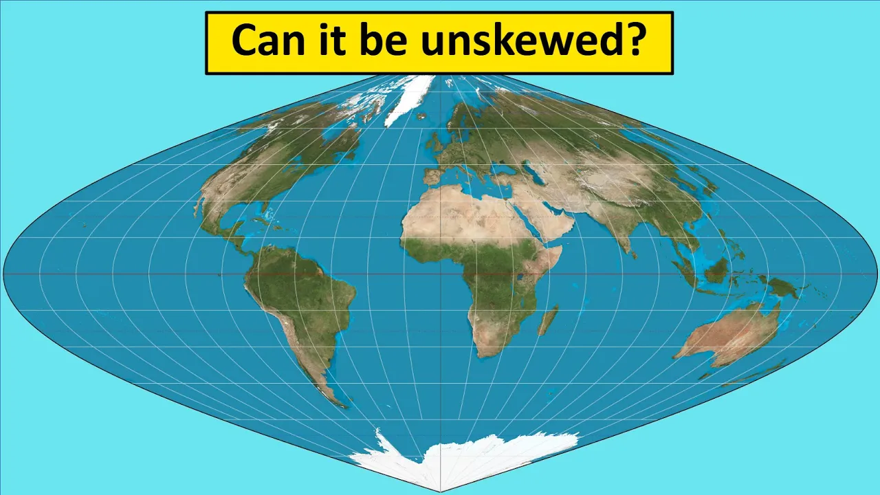


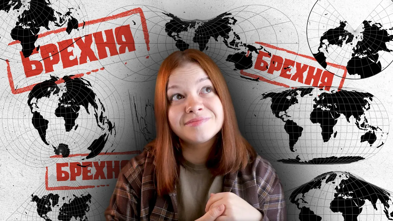
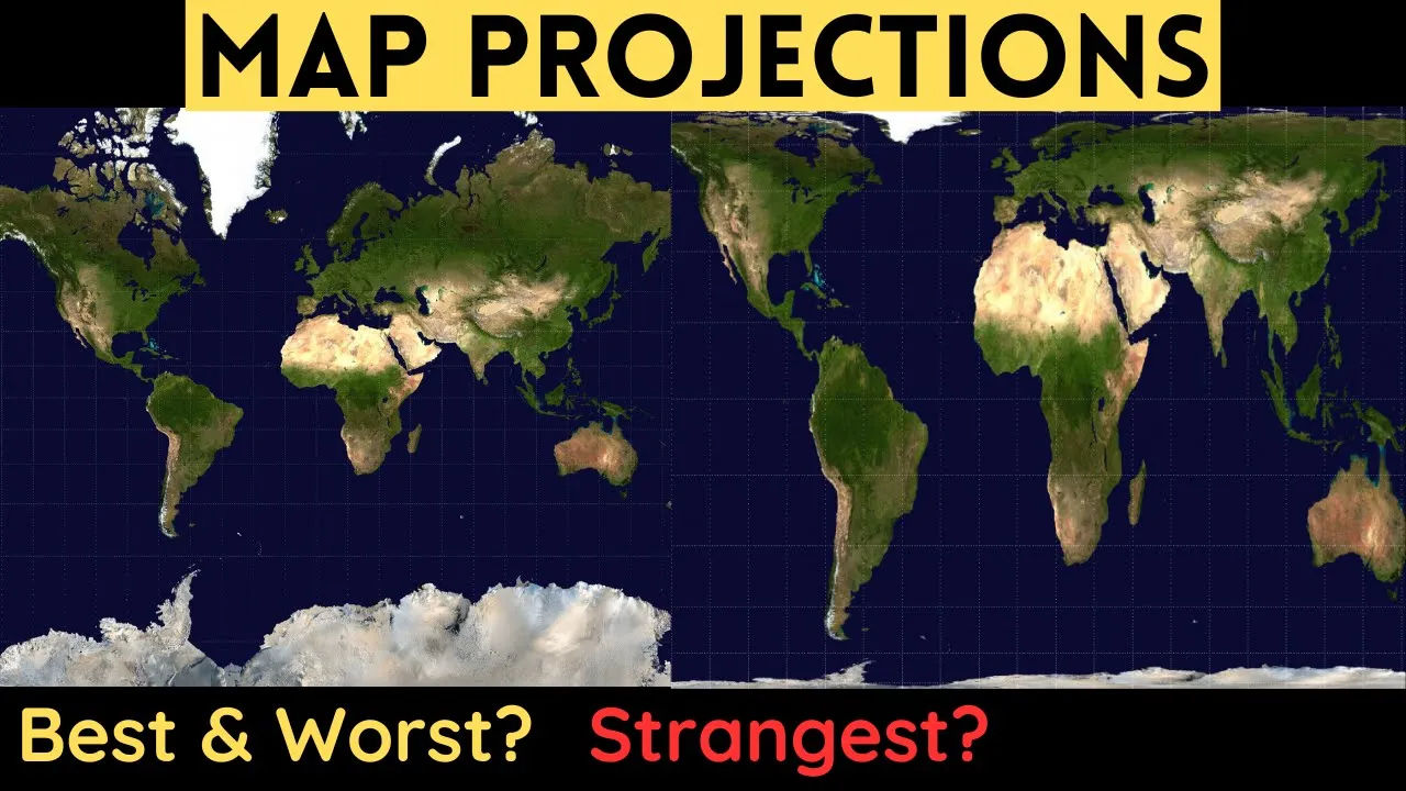
Every flat map of a round Earth necessarily introduces distortions because it is mathematically impossible to preserve both area and shape simultaneously; the Mercator projection prioritizes navigational accuracy by making straight-line routes correspond to constant compass directions, but this causes polar regions like Greenland to appear disproportionately large compared to equatorial regions like Africa, while the Peters projection attempts to correct this size distortion by sacrificing shape accuracy.
Map Projections Explained: Why Every World Map Is Distorted
Added:Understanding the Earth's true shape as an oblate spheroid (geoid) rather than a perfect sphere.
The coordinate system of latitude and longitude (meridians and parallels) used for global positioning.
Basic geometric principles of dimensionality, specifically the challenge of flattening a three-dimensional curved surface onto a two-dimensional plane.
The fundamental components of a map, such as scale, orientation, and the difference between conformal and equivalent properties.
Tissot's Indicatrix and the mathematical methods used to quantitatively measure and visualize distortion in map projections.
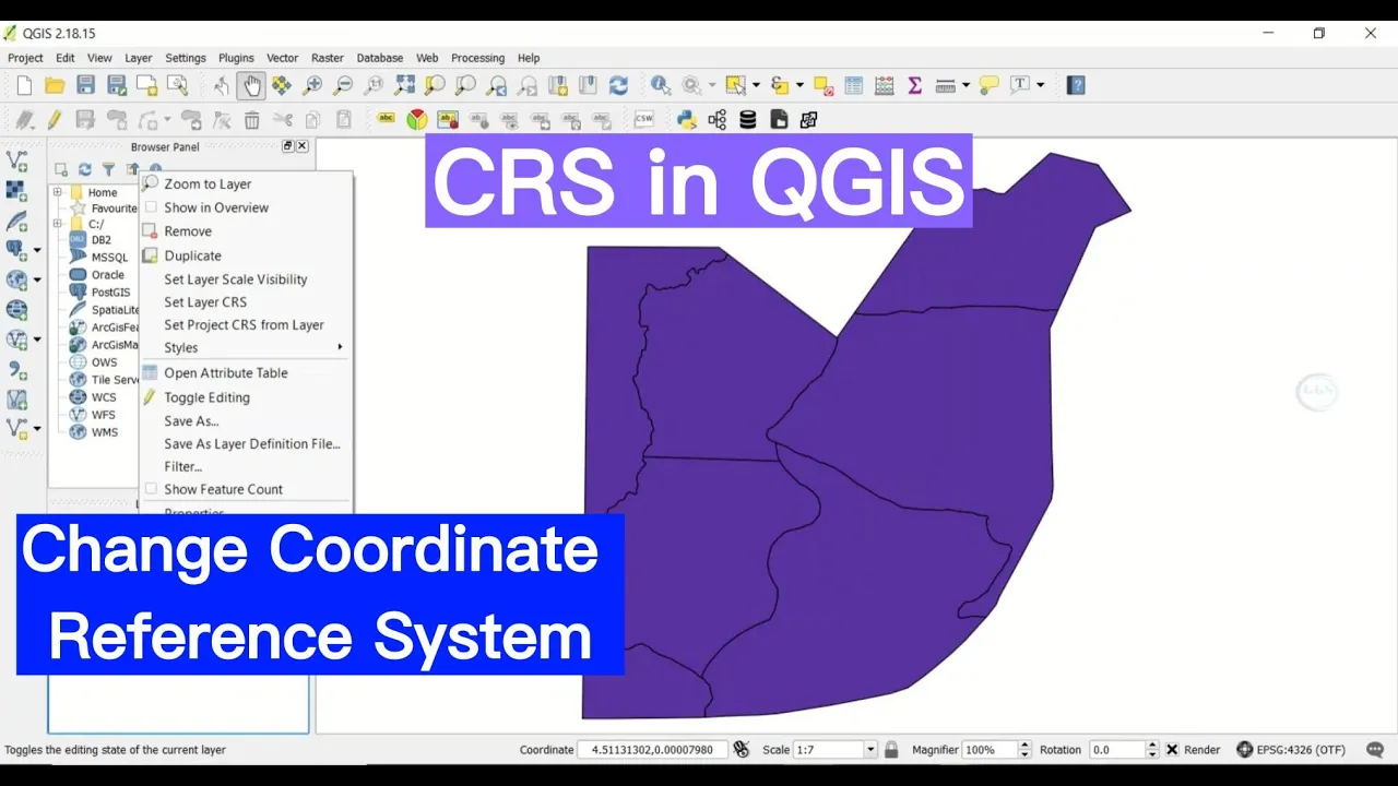
Coordinate Reference Systems (CRS) in modern GIS (Geographic Information Systems) software, including how to choose and reproject spatial datasets.
The political and sociological implications of cartography, exploring how map projections can reinforce colonial biases or shape geopolitical perceptions of size and power.
Advanced compromises in cartography, such as the Winkel Tripel, Robinson, and Dymaxion projections, and their specific applications in education and navigation.
4.6M views153.7Klikes6:16Original Release: 2019-06-20
Today, we'll be asking, is the world definitely round?
Yes.
- Welcome to Map Men - We're the men And here's the map.
♫ Map Men, Map Men ♫ Map Map Map Men Men.
Here at Map Men, we love a good globe.
Because it's a map, but also a toy.
But globes aren't very convenient because they're bulky and difficult to carry around.
Unless your friends attach one to your head for your stag do and make you wear it all around Bristol.
So, if you want the world in a book or a poster or a shower curtain, that globe is going to have to be flattened. But it's a notoriously challenging task.
The best way to demonstrate the difficulty of displaying the curved earth on a flat map is to take an easy-peel orange, and you'll find that even with a rolling pin, you just can't make the damn thing flat. Stupid orange! Stop being round! Start being flat!
But you can make juice.
The only exception is the map produced by the Flat Earth Society because apparently, this is a real bird's-eye view of the world.
Antarctica conveniently encircles the earth "to stop the water falling off"(!)
So because flat-earthers don't believe in the globe, they're not actually distorting it.
But they are distorting the minds of vulnerable loners scouring the internet for answers in an increasingly incomprehensible world.
Meanwhile, us gullible round-earth believers have a dilemma: You can't flatten a round thing without ruining it.
You either have to stretch bits, squash bits, or slice bits.
But a clever solution came along in 1569 from a Belgian man... Flemish - Belgium wasn't a thing.
...Flemish man called Gerard Mercator.
This is my Mercator costume?
Yeah, Mercator was a globe maker... who loved cricket and stag dos.
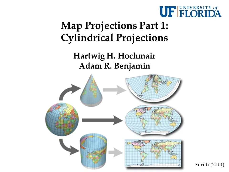
His ingenious solution was to imagine the earth like a balloon covered in ink.
and then imagine the balloon in a big cardboard tube and then imagine inflating the balloon inside the tube and then unfolding the big cardboard tube and looking at the results.
This was impressive for a man who'd never travelled more than 200 kilometres from where he was born and especially impressive as they hadn't even invented balloons or big cardboard tubes or Belgium.
Mercator's projection became so successful, it stood the test of very very long time and earned its status as the official definitive flat map of the world.
Maps using the Mercator projection have been used extensively in schools, TV weather maps, bad tattoos, it's even used by Apple Maps.
So it's great. The end.
♫ ♫ ♫ Whoa! Hold your onions, sonny Jim me lad me boy.
The Mercator projection is not without its problems.
When you inflate a balloon in a tube, the top of the balloon has to stretch to touch the sides.
As a result, countries near the poles look bigger.
This has the naughty effect of making Greenland look about the same size as all of Africa, when in real life, it's about the size of Greenland.
As well as being inaccurate, more worryingly it's a bit racist.
It's well known that the Mercator projection was designed to make the colonial powers of northern Europe look bigger, and make Africa look smaller.
Well, that's wrongly well known.
The Mercator projection had nothing to do with racism and everything to do with navigation.
Before Mercator, all maps had a problem.
If you were a sailor and tried following a straight line on the map the curvature of the earth meant you'd gradually drift off course.
Help!
But with the Mercator projection, a straight line on the map was the same as a straight line on the sea... as long as your compass wasn't broken.
OK, I hereby concede that the Mercator projection is not racist on purpose.
But it was still a problem that needed solving.
So, in the 1970s, a German man called Arno Peters tried... *tried* to make a better map.
Why is this my Arno Peters costume?
- Revenge. - Oh!
The Peters projection sacrifices accuracy of shape in favour of accuracy of scale.
The polar regions are squished and the bits near the Equator are stretched fixing the Greenland problem, and making Russia look far less intimidating.
- It's a great map! - It's a terrible map!
Why?
First of all, Arno is a stupid name.
Secondly, he wasn't a map maker, he was a publicist... (spits)...who copied the work of James Gall.
Work which was so abundantly terrible it should never have been copied in the first place.
Look at the shape of Africa. It's awful!
- Can I say something controversial? - Go on... So what?
(gasp!)
Ask yourself, what is the point of a map on a classroom wall?
Is it to teach children how to navigate the ocean in a boat?
No, it's so they can understand the world around them.
And understanding something like Africa is huge is pretty important.
I think it's important that Africa doesn't look like a sad piece of melted cheese.
- Well, ultimately there is no right answer... - Except mine.
...because every flat map of a round world is necessarily wrong.
But loads of map makers have tried to come up with their own solutions over the years.
And here are a few of our favourite attempts... - Eurgh.
Ooh, that's clever.
Ha ha ha. No.
Ooh, pointy!
Hmm... not bad... but quite bad.
Nope! Nope! Nope nope nope!
Aargh! Aaargh!!
So it looks like the only way round the pesky projection problem is to join the Flat Earth Society.
Jay, will you do the honours?
Gladly.
Come on! Be flat, you stupid round thing!
Be flat! Flatten!!
Why aren't you flat, you stupid big round... (they laugh) ♫ I hate my job, I hate my life, I want to get out of here.
♫ I wish that I could learn the skills to start a new career.
♫ You can, you know, I'll tell you how, you go to Skillshare dot... ♫...com where you can learn a lesson or two - Such as what? - Well... ♫ Editing skills, graphic design, how to create fantastic apps, ♫ Music production, leadership skills, digital illustrated maps.
♫ But how can I afford it all? Those classes sound so dear.
No they're not, it's just ten dollars a month to sign up for a year.
Wow!
♫ Skiiiillshare ♫ More than 28,000 courses ♫ Skiiiillshare ♫ One of my favourite web resources ♫ By the way, they've got a very special offer for you ♫ You simply go to skl.sh/mapmen2 ♫ And you'll get Skillshare free for two months, and guess what else will happen ♫ The more of you sign up, the bigger the fee they pay to Map Men.
♫ Skiiiillshare ♫ Click on the link that's down this way ♫ Skiiiillshare ♫ I'm going to quit my job today.
♫ I'm off to start a brand new life and Skillshare is my chance ♫ Not so fast, you've got to give your notice in four months in advance.
N'oh.
Up Next
15:51
Map Projections Explained: Types, Distortions & Uses
@Examrace
47K views•2014-08-12
12:54
Triumph of Orthodoxy Icon: Byzantine Art & History Explained
@BenCallan
2.1K views•2024-08-06
9:49
FastAPI vs Flask vs Django: Choosing the Right Python Web Framework
@TechWithTim
302.5K views•2024-05-26

1:42
Game of Thrones Opening Credits: A Cinematic Analysis
@gameofthrones
46.3M views•2011-04-18
Related Study Plans & Knowledge Roadmaps
Structured learning paths in General & Interdisciplinary Studies
general-studies
Elevator Engineering: History, Physics & Cities
01From Hoists to Safety Brakes: The Dawn of Vertical Lift
02Hydraulic vs. Traction: The Engineering Physics of Elevators
03Modern Speed, Safety, and Algorithms
+ 2 more learning modules
12h5 modules
Explore Roadmap
general-studies
Rubber: Material Science, History & Geopolitics
01Origins of Natural Rubber & Mesoamerican History
02The Chemistry of Natural Rubber & Vulcanization
03The Geopolitics of the Rubber Boom & Colonization
+ 2 more learning modules
12h5 modules
Explore Roadmap
general-studies
Containerization: Evolution, Logistics & Trade
01Ancient Trade & Bulk Cargo: Amphorae to Barrels
02The Industrial Revolution & Cardboard Packaging
03The Containerization Revolution: Malcom McLean
+ 2 more learning modules
12h5 modules
Explore Roadmap
general-studies
Textile Tech: Evolution, Labor & Global Impact
01Pre-Industrial Textiles: Handloom & Cottage Industry
02Mechanization: The Spinning Jenny to the Power Loom
03The Factory System & Global Labor Transformation
+ 2 more learning modules
10h5 modules
Explore Roadmap