








![C05 آموزش کامل شیمی یازدهم فصل اول - دنیای رنگی بافلزات دستهd [کالبد شکافی شیمی یازدهم]](https://i.ytimg.com/vi_webp/6kS0CDHm6Eg/maxresdefault.webp)










![Solo era necesario un poco de empatía y comprensión pero… [Doblaje Latino]](https://i.ytimg.com/vi/NxASZ7J15ec/maxresdefault.jpg)



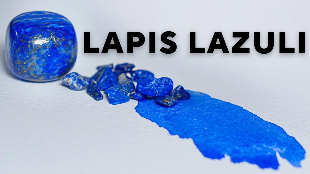
The world's most expensive colors, such as ultramarine blue from lapis lazuli ($460 for 225ml) and Tyrian purple from Murex snail glands ($3,000 per gram), command premium prices due to their labor-intensive extraction processes, limited natural sources, and superior qualities like lightfastness and vibrancy compared to synthetic alternatives. These luxury pigments are favored by professional artists who value their archival quality and ability to add significant value to artwork, even when synthetic options are available at dramatically lower costs.
The Chemistry of Luxury Colors: From $460 Paint to Corte
Added:The fundamental difference between pigments (insoluble particles suspended in a medium) and dyes (soluble compounds that chemically bond to a substrate).
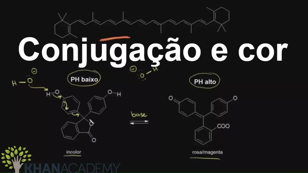
The chemical basis of color, specifically how conjugated molecular structures (chromophores) absorb and reflect specific wavelengths of visible light.
Basic inorganic chemistry, particularly how transition metal complexes and crystalline silicate lattices (such as those in lapis lazuli) generate intense coloration.
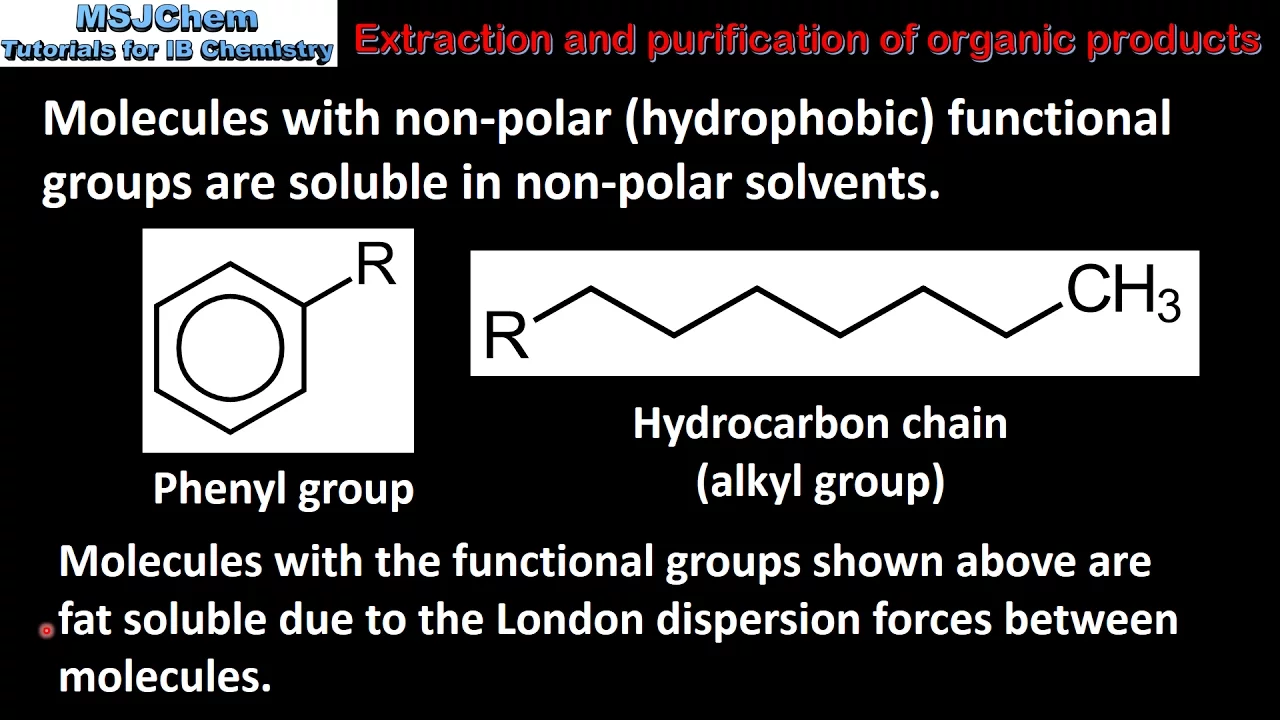
The concepts of extraction and purification in organic chemistry, demonstrating how biological compounds are isolated from natural sources.
The synthetic pathways of modern organic chemistry used to create highly stable pigment alternatives, such as phthalocyanines and quinacridones.
The analytical chemistry methods used in art authentication and conservation, including Raman spectroscopy, X-ray fluorescence (XRF), and chromatography.
The chemical degradation and aging mechanisms of historical pigments when exposed to light, oxygen, and various binding mediums (like oil or egg tempera).
The toxicology of historical pigments (such as those containing lead, arsenic, or mercury) and the shift toward sustainable, non-toxic green chemistry in the modern paint industry.
2.7M views22.7Klikes1:37:42Original Release: 2025-09-20
This royal purple dye made from crushed snails can cost $2,700 a gram.
And the premium pigments in these colored pencils help explain why they cost 14 times your average Crayola box.
The world's most expensive colors aren't used for everyday arts and crafts. So, why would someone pay $23 for a single pastel stick? And who's dropping thousands to access Panon's color library?
Business Insider dived into the factories, mines, and workshops where these colors are made. Starting with ultramarine made from a rare blue stone.
This is the most expensive blue paint in the world.
It comes from these lapis lazuli rocks extracted from mines in Afghanistan.
But you can't just crush up lapis lazuli and turn it into paint like you would with many other natural pigments.
It takes a laborious process to create the color called ultramarine blue.
We found it priced as high as $460 for a 225 ml tube of oil paint that was on sale. This identically sized tube of synthetic ultramarine costs only $19.
Lapis lazuli pigment has been expensive since ancient times, but modern-day artists have the option of a much cheaper alternative. So why do some still favor the natural stuff despite the high price?
The first step in turning lapis lazuli stone into paint is to crush it.
Next, keep crushing it.
>> Sometime I sneeze and it's blue. I mean, it's uh uh my hair uh they would be all blue.
Pigment maker Muhammad Eran's goal is a fine powder, but not too fine, or else he will have a difficult time extracting the bright blue lazerite from the other minerals in the stone. If the lazerite isn't pure enough, you end up with a muddy grayish color rather than the true blue ultramarine is known for.
That's because the lapis lazuli rock contains a mixture of minerals that left in the mix can dilute the color of the finished product. Can you see the blue blue parts? So it's all leazerite. It's leazerite, pyite, silicate. So the our job is to remove all those impurities and just extract leerite.
But isolating pigment isn't easy. When Business Insider visited Muhammad's workshop in Canada, he showed us the Cini method, named after the Italian painter who most famously described it.
It's one of the oldest and most labor intensive ways to turn lapis lazuli into fragelico, the purest ultramarine blue pigment. It takes longer and produces less pigment than other methods, so it's usually reserved for specialty orders.
>> We extract lazerite by senini method when we are supplying to different museums and for the restoration projects.
>> What separates the Cini method from other methods is that the powder gets turned into a dough.
Muhammad heats the lapis lazuli powder with beeswax, pine resin, mastic gum, and linseed oil.
>> See like this one mastic. So when I'm doing this, I I have sometime start eating them, you know. It's so good.
[Music] Traditionally, the mixture is stored for a week and needed every day. Instead, Muhammad rolls his dough into little balls and lets them dry for two or three days.
>> I used to make long sticks and then extracted with hand, but I don't use hands now. I have another machine.
>> Mohammed's method is mostly hands-free, opting for a ball mill that tumbles the dough balls with steel balls and hot water.
they will push each other and you know it will create a um it will help to take out these lazarite. It will make them soften and so the lazerite is going to come quickly and easily.
>> After about 2 hours the lazerite will be pulled into the water leaving the other minerals stuck in the dough.
If I remove this water, you can see this. This is all fried angelica. First, it need washing five, six more times. After the final wash, Muhammad will run the drained pigment through a dehydrator.
And in about 2 hours, it's ready to use.
So now you can see this a beautiful color. And I'm really happy with the results.
>> It's not much.
>> See with with the with the 400 g of using lapis tuli, we only got this much.
And this is around um 20 to 30 g. This size of the jar of uh Frang Angelico Senini, it sells around $190.
Muhammad's company Demyro produces 4,000 to 5,000 lbs of lapis lazuli pigment every year, mostly using a secret method that he took 6 years to develop.
While the Cini method can take up to four days to produce one kilo of pigment, Muhammad's method yields up to 20 kilos in a single day.
>> That's for the bulk orders like Michael Harding. He he we supply to him. So his orders are usually like 200 to 400 kilo.
So that we cannot extract by the Senini method.
>> Muhammad has spent nearly his whole life thinking about Lapis Lazuli. He grew up in Pakistan on the border of Afghanistan, the region where most of the world's lapis lazuli comes from.
>> I think I was seven or eight years old and uh someone brought lapis rough to show to my grandfather and at that time when I saw lapis I got so fascinated with its pyite and the color and I thought like oh what is this?
But getting lapis lazuli from Afghanistan these days is more than a matter of expense.
In June 2025, we sent a videographer to see how lapis lazuli is mined at Sari Sanangi, the largest source of the stone in the world.
[Music] From the capital city of Kabell, it's about a 10-hour drive to Faizabad.
Then it's another 5 hours or so to the remote mine across treacherous mountain roads.
After the daunting journey, what we found was not what we were expecting.
[Music] We'd coordinated with the Ministry of Culture and Information, which either didn't know or didn't give us any indication the mine wouldn't be operational.
We don't know exactly why the mines have closed, but they've been under Taliban control since it took over in 2021 following the US's withdrawal from the country.
Lapis lazuli from Afghanistan has come under criticism for potentially funding the militant fundamentalist movement, but it's still the world's highest quality source of the stuff.
The mines here are saturated with lazerite, making the stones bluer and more intense than lapis lazuli found elsewhere.
Afghanistan is also the location of the first known use of lapis lazuli as a pigment. These sixth or seventh century wall paintings near the Buddhas of Bameyan, a UNESCO World Heritage site, used generous amounts of ultramarine.
Since then, it's been used by artists all over the world, like in this 16th century copy of the book of kings from Persia or in Vermeier's Girl with a Pearl Earring from the 17th century.
During the Renaissance, lapis lazuli was the highest quality and most expensive shade of blue painters could buy. Its luxury status combined with the Christian symbolism of blue representing divinity meant they used it almost exclusively in religious contexts like the robes of the Virgin Mary and Michelangelo reserved it for the heavens in the last judgment.
These days artists can now use a cheaper synthetic option. Today it sometimes costs 24 times less than the natural stuff. And while the two varieties are mostly identical, artists will still reach for the pricier natural one for certain occasions.
>> Lapises has a crystalline structure, so it reflects light and the synthetic one, it absorbs more light. So that's when you'd see the difference of uh synthetic after painting, it's like the lapis is going to be more brilliant, more vivid than the um synthetic one. Some artists like the textural quality a natural pigment provides. There's also simply the bottom line to consider.
>> It adds value to their artwork. So when they're using synthetic, if some someone is selling a painting for let's suppose $1,000, but when they use lapisuli pigment, they can sell the same painting for $5,000.
>> To turn the pigment into paint, Muhammad mixes it with oil.
I use walnut oil um for when I'm checking because it's not so yellow. So it's really give me the real uh it's um shades and color and I can check its quality. For the last 10 years the demand has gone so up even individual artist and plus the companies uh and especially the last three four years uh because of the AI uh I see the big demand uh for the real artwork now. So our target is to make it available for everyone so they can so we can share the beauty of this uh beautiful rock and pigment to with everyone. These days, there's a synthetic version of every color under the sun. But as with lapis lazuli, the natural version still persists. This rich purple made from snails is one of them.
Making authentic Tyrion purple dye starts here with extracting a Murex snail gland.
It takes nearly 45 kg of these snails to produce a single gram of pure Tyrion purple extract.
It's a painstaking and pungent process.
And the result, this single gram of dye that can fetch nearly $3,000.
By comparison, 5 g of a synthetic version sells for under $4.
Tyrion purple can be used to dye clothes or create paints.
In the ancient world, it was so rare that only royalty could afford to wear clothes dyed with it. Even today, at such an astronomical price, Tyrion purple pigment is mostly a collector's item. So, what makes real Tyrion purple so hard to make? And why is it so expensive?
This is Muhammad Gasin Noira.
He's been making Tyrion purple dye in his home in Tunisia for 15 years.
Today, Gussen is one of a handful of producers in the world, bringing this ancient dye back to life.
Gusen learned how to make this dye through an excruciating process of trial and error. Because there's no instruction manual, he reconstructed the techniques he uses from first century texts.
>> Oh my god, I must say that I I I have gone through a lot of failures. The historical texts about the process of making turning purple are very rare and are quite vague. So you have to start everything from scratch and learn everything on your own.
To make the extract, cussing must navigate a complex process. And it's this extensive labor that accounts for much of the final price.
The part of the Murex snail that contains the pigment is called the hyperbrancial gland. The good thing is that the the gland is located right under the shell which helps a little bit in the extraction.
>> It's the only part of the snail used to make Tyrion purple. And each gland contains only a few drops of pigment.
But before he can extract the gland, Kussen has to wash, scrub, and sort the snails by size. But you don't really want all of this mud and scent to interfere with the dye when you crush the shell and expose the gland. So this is the first step and it's a very important step. You really have to clean your snails very very well.
Hen can now extract the gland from the clean snails.
If he hammers each shell too lightly, it'll take too long. But if he hits it too hard, he'll crush the gland.
It took us in 2 years to learn how to do this efficiently. And of course, the snail is not wasted. Then it will be cooked for dinner. Everything is basically recycled.
>> To make the extract, Hassen first merates the fresh glands in cold water and lets them ferment in an airtight container.
Once the glands release their colorant, cussen gently washes and filters the mixture to separate the dye from the flesh.
This is the first of six separate rounds of purification necessary to make a pure tyrion purple extract.
Now can dry the pigment mixture. He applies it to a sheet of glass and lets it dry under the sun. He uses glass because it won't absorb any of the valuable pigment.
So these glands have been drying for 3 days. They are half dry now. Uh they're still malleable as you can say.
This is the pure colorant or more or less pure.
>> Once the pure colorant mixture is dried, he scrapes it off the glass with a razor making sure to get every last bit. And the whole process from the liquid colorant up until the dried pure powder, the whole mass will have lost at least 98% of its weight.
>> The dry pigment is now purified five more times in a grinding and siving process to remove any detritus. The nearly 100 lb of Murex snails are finally transformed into 1 g of pure Tyrion purple extract.
And acquiring enough snails is another challenge, an expensive one.
Russen can spend hundreds of dollars sourcing the snails he needs for his dye. That's because finding these snails requires experienced fishes.
One of the fishes works with is Salem Bened. He harvests Murex snails from Sulleon Beach. Like Hen See and his team have perfected their technique over time.
It can take Salem 4 hours to find the right snails or he can die for a whole day to no avail.
The bloodmouth snail is particularly difficult to catch and requires Seem to dive 15 m deep, which makes it more expensive.
And if the weather is consistently bad, the price goes up even more. Sometimes conditions force See and his team to go a whole month without fishing, but it's out of their control.
It's dangerous for the snails, too, which are highly sensitive to climate change. Since the early 1970s, the population of Murex snails has steeply declined due to temperature changes in the water and overh harvesting.
>> We have to be very cautious not to be engaged in overh harvesting to make sure that the small specimens are put back into the sea to preserve the the specy.
So this is why it takes a lot of time >> and careful management of the snail population is vital asen and his divers attempt to revive Tunisia's thousands yearear-old dye making tradition.
Gussen doesn't use all the fresh snails to make extract. He reserves some to dye fabric directly.
This time he mixes the snail glands with water and a reducing agent and lets them ferment. The mixture goes from a colorless liquid to green before it turns purple.
Finding the right pH balance in this step is crucial. If it's too acidic, the wool may burn. And if it's too basic, it may cause the wool to felt.
>> So now we're just monitoring the pH.
It's about eight, which is perfect. This is also the moment when the soluble dye is the most light sensitive.
Must cover the dive vat immediately to avoid too much exposure to light.
Too much light can turn the dye from purple to blue, destroying a week's worth of work. When the material has soaked for the appropriate amount of time, Kussen lifts the vat lid, exposing the mixture to lightened air.
This allows the mixture to oxidize. And this is how the color will gradually start to develop.
>> But one round of vat dying won't always do the trick. Like with this silk scarf, >> it took me like 8 months to produce and it required like uh 800 lb of fresh snails. And this is still not completed.
>> And it's not always guaranteed that the color will come out the same shade.
>> Historically speaking, there isn't a single hue or shade of Tyrion purple.
fits a range of shades that ranges from the color of cluttered blood to the color of red purple.
>> This range is the result of mixing three different subspecies of murex snails.
Hexoplelex trunculus which produces a violet blue color. Bollinous brandaris which secretes the color of clotted blood and the blood mouth or strmontor hemasta which releases a rich red purple color.
Tyrion purple dye dates back to the Bronze Age and is named after the Phoenician city of Tier. Some historians believe it was produced as early as the 21st century BC.
Ancient civilizations from Phoenicia to the Carthaginian and Roman empires prospered by producing and trading this dye. One of the production sites was Menings on the island of Gerba which is now an archaeological site.
A text from the 4th century states that a single pound of Tyrion purple dye costs £3 of gold. But production of this dye came to a screeching halt in the 15th century after the fall of the Baantine Empire.
[Music] Ali says he's grateful that Gusen is reviving this culturally valuable dye so Tunisians can reconnect with their ancestry.
Gusen learned about the dye at the age of 14 and was enthralled by its history in Carthage. Over a decade later, he found a Murk snail on the shore oozing purple.
>> My old passion for red purple came rushing from its deep slumber, and I really had this revelation. And this is how my adventure for reviving this legendary dye started.
>> Now he hopes to ramp up his production, offering more shades of pigment.
Well, of course, my dream is to enlarge this project and to like to create a an old-fashioned dye factory and to produce more, but as I said, the main concern should always be to preserve the specy because if there is no murex, there's no dye.
>> While Muhammad's workshop is dedicated to one color, this 300-year-old pastel maker creates nearly 2,000. Take a look inside the workshop where just two people make some of the world's most exclusive colors by hand.
In their liquid form, pastels look just like paint.
[Music] But Margaret's goal is to drain the moisture, turning this bright blue blob into some of the most renowned pastel sticks on the market. Laameson Du Pastel, founded by Enri Rocher, has been making them the same way for 300 years.
These drawers store hundreds upon hundreds of colors with only slight variations between shades, some only a trained eye can see. But a premium pastel business is hard to sustain.
Pastels aren't as popular as other fine art mediums like oil paint. So for years, the business struggled to find and keep its customer base.
Today, its two co-owners work tirelessly to keep this centuries old tradition alive without sacrificing the quality the mason is known for. So how is this niche art business still standing?
Isabelle Rocher, a relative of Enri Rocher, and Margaret Zer are the company's only two employees. They make new pastel sticks a lot like the old ones. Starting with pigment and a binder based on a secret formula that took Roshcher and his son decades to develop.
>> People like Whistler, Rodon, Duga, Sisley, who all had issues with the medium. They were having problems with the powder sticking to the paper. They were having mold on their works. So, Enri Roshi brought all of his scientific skills to try and remedy and bring them the product that they were looking for.
So, the base of this new color is um ceruan blue, which is a very classic pigment.
This new color, Caribbean Blue, will join more than 1,900 others the Mesa offers. It's the biggest selection in the company's history, maybe even the biggest selection of pastels ever. So, adding new colors to the mix takes a discerning eye and skilled hands.
That's where Margaret comes in. She's the creative force behind the business.
If the sun's out and we don't feel like working, we don't work. or if the sun's out and it inspires us to make a beautiful color, we do that.
>> After the initial color is set, Isabelle and Margaret divide it into nine gradations from dark to light so artists can find the exact shade they need.
>> So, I'm I'm essentially aiming to go between those two. So, we have 1 2 3 4.
This will be number five, 6 7 8 9.
Margaret, I started with one and a half spoons of the dark. I think I'm going to be making masses already.
>> Throughout its centuries long history, the mason was renowned for its unmatched range of colors. This is especially important for pastel artists who can't just mix two pastels together to make a new color before putting it to paper.
Can't blend pastel on a palette like a painter might. But if you really want to make a line of a color, you need to have a stick of that color.
>> That blending needs to happen at the very beginning of a pastel's life instead.
>> I'm actually not far from where I want to be, which is really magical. I'm going to mix it. I really mix it in before I compare.
So, I'm actually right now a bit a bit darker than I want to be. So, I'm going to add a bit of white.
If the paste is too stiff, you can't integrate the white and the color very easily. But by bringing it to a sort of cake batter consistency, they merge quite well.
When they're satisfied with the color, Isabelle scoops the mixture onto a terracotta roof tile to dry.
We use the tiles because that's how my it was done in the past, but the advantage of the tiles is they're porous. The tiles absorb a bunch of the moisture, creating less work for Margaret when she will put the mixture through their antique press.
[Music] After the paste has adequately dried, Margaret wraps it in a cloth and uses an antique press to gradually squeeze the moisture from the paste.
This is a tool that was there when Isabelle took over the masel. I would imagine it's been used for for quite a long time. Yeah. Essentially, the a lot of what we're surrounded with are are tools and drawers that date back 150 years. And it's as well it gives us this sense of of am in French. Uh I'm not sure how you say that in English, a spirit, a soul.
>> Margaret joined Isabelle at the Mason in 2010 after a visit to the shop. She sent a cold email inquiring about a summer job and ended up finding her calling.
>> I would would have been happy just cleaning the shop. So, I didn't expect an invitation come to the house and make the pastels with her.
>> The way I see it is I I allowed the business to survive. Um, and today I'm giving Margaret a sort of structure within which she can really make the craft live.
And by the end of this, we'll probably end up with something more consistent with modeling clay cookie dough.
This is one of those points in the process though where, you know, you might want to just sort of muscle it, but you actually have to be quite attentive.
There's certain colors that lose water quite quickly that you can easily overpress, and it's always more complicated adding water back.
That's better.
Ease up.
Okay, I'm coming over with the paste.
Hand rolling each pastel allows them to add more pigment to the mix than if they used a machine.
We tolerate certain consistencies that machines can't tolerate. We end up with colors that are either more vibrant or deeper or or more concentrated.
To me, it's always been the phase of the making that I prefer.
It's sort of the moment when you're actually forming them. So, you're starting to see it happening and becoming a a pastel.
When you don't know how to roll them, you can end up with pancakes.
The first pastels I made I made just didn't look like anything. They they were all weird shapes and they were flat. They had holes in them.
[Music] The cutting with the large braid. I believe that was also um the invention of anchor.
[Music] to the traditional process because I think in the past they used to cut the sticks um once they were dry which took forever. So it's cutting the ends at one in one fell swoop.
When Isabelle took over the company for her aging aunts in 2000, she held on to many of the tools and techniques that Rocher developed in his day.
And then we let them um air dry usually for about 3 weeks. Kind of all the season depends on the colors.
But there was also plenty about the languishing business that needed to change.
When she took over, the Mason had next to no inventory and hardly any customers to sell it to. My great aunts were in their 80s when I took over, which means that for the last 20 years, they hadn't made much. They were very secretive. So, they hadn't tried to generate new customers. So, essentially, their customer base, as the artists had grown older and died, they hadn't been replaced.
>> So, she spent her first 2 years regenerating supply. I managed to reconstitute about 250 or 300 colors before focusing on demand.
The ma serves what's known as a niche market. Imagine the market as a pie.
While a mass market company like Crayola tries to carve the biggest slice by appealing to as many people as possible, businesses serving niche markets cut smaller specialty slices that appeal to a specific type of customer.
A huge reason for Roshcher's success was how he collaborated with artists to create the colors they needed, and Isabelle was determined to do the same.
The the most difficult thing for me was that I had no art background at all. I had no artistic background either. I didn't draw. I didn't paint. So when I was talking to the artists, I felt I was talking a different language.
>> One of these artists is Claude Bahad.
>> I've known her since the day I took over. I think that the first color I made was a blue and an indigo blue uh that she'd been waiting for for 2 years.
Did she tell you that she was creating colors for me?
>> Yeah.
>> Yes, they did. That makes me very proud.
For sure. That means that they like what I can do with their colors. For sure.
They serve me, I serve them. It's an exchange as in life.
Clode picked up pastels later in her career after spending most of it working with oil paints.
I bought the pastel rocher very slowly in the beginning and I discovered that I sold much more with pastel rocher because the work became much better because the quality of pig nuts was wonderful.
Historically pastels have taken a backseat to more popular mediums like oil paints. you have waves of it being used extensively and then it goes back into being a secondary medium that people only use you know to to do basic drawings and etc. We are aware that you know it comes and goes and and at at the moment we feel that a few artists are really picking up the technique and doing really serious things with with it not just preparatory drawings.
I walked into this thinking there are just maybe a handful or maybe 10 artists in France that really need the pastels.
If I can multiply that by the number of countries around the world, I should be able to make a living out of it.
Isabelle inherited an archive of century old pigment, some of which is still usable.
[Music] Sometimes Margaret can even reach into the company's past to make new pastel colors.
>> That's beauty.
It's a really beautiful walker, actually.
Actually, I'm I'm I'm processing this in real time that I really like this pigment.
>> This is a genuine discovery.
Well, I kind of want to see what what kind of a pastel this makes. I imagine because it's a an ochre, it will make an agreeable texture. I want to compare this to ogres that we already have in the range to see if I'd actually kind of mind if I can get a piece of paper and >> Sure.
While much of the process remains the same as when Rocher ran things, what Isabelle and Margaret really hold on to is how he thought about the business.
What really makes, you know, our pastels what they are is his formulas and how they marry to the craftsmanship of the artisan that he met.
[Music] I know that Margaret has in her head several other ranges that she wants to bring in. Um, and on paper she already knows that one day we will go above 2,000.
But essentially, as long as we keep having people coming to the shop asking for colors they don't have, we're going to be bringing in new things.
You might associate colored pencils with elementary school, but the professional versions can cost 14 times more than the ones you used as a kid. Business Insider visited a professional-grade colored pencil factory to see what goes into these pricey tools.
[Music] Every colored pencil starts off like this bright powdery pigment.
But it's the secret recipe for transforming these pigments into colorful cores that sets professional pencils apart from student grade ones.
Every ingredient from pigments to waxes and oils and even the wood is carefully chosen to make these pencils perform better on paper.
And artists are often willing to shell out hundreds of dollars for this level of performance.
A set of 120 FiberCastell Polychromos pencils costs $350, 14 times as much as a similar box of Crayola colored pencils.
And some brands price their sets at over $550.
But professionals say that compared to cheaper alternatives like Crayola, the difference in quality is glaring.
>> Looks quite chalky and waxy in comparison to this, which has taken so many more layers.
>> Making highquality colored pencils involves more science than art.
So, how did chemists and engineers perfect them? And why are they so expensive?
At Fibel Castell's factory in Stein, Germany, workers churn out a whopping 2.3 billion pencils a year. Making them takes a surprising amount of precision.
Starting with these, the pigments.
Just like people, the particles of each pigment have their own distinct personality and behavior.
Some are rough and edgy and scratch across the paper while others are smooth and silky.
But size also matters down to the micrometer.
Fibercastell says ideally 90% of the pigment particles should have a diameter of less than 40 microme.
It says this is perfect for creating a core with a consistent texture and vibrant color that applies smoothly.
Balancing the pigment's behavior requires adjusting the other ingredients. Unlike cheaper alternatives, professional colored pencils have a lot more pigment than filler. So, it's important that the balance of ingredients is just right.
The ingredients are top secret, but Gard Lugert, a chemist at FiberCastell, told Business Insider, "It's a specific combination of oils, waxes, and fillers that binds the pigments."
The result is this mixture, dough-like clumps of color. But each color has a bespoke formula because not all pigments are created equal.
After the mysterious blend of waxes, oils, and fillers is mixed with the pigment, it's pushed through this high pressure machine.
The result, identical pencil length cylindrical cores.
Workers bake the cores in batches to harden them. Then they dip the dry cores in a melted mixture of waxes and fatty acid derivatives.
Fiber Castell's colored pencil cores are 3.8 mm in diameter, making them less likely to break compared to Crayola's 3.3 mm cores.
The company randomly tests cores from each batch to make sure they won't break under pressure.
Quality testers apply pressure to the cores at a 60° angle.
They shouldn't break until the force is at least 3.3 kg.
The core's performance is also scrutinized with smear tests like this one.
Pencil cores made by different brands each have their own characteristics.
The wax base of Gon Dash's Luminance pencils is soft so the color melts into the paper that makes them great for creating gradients.
Fibercastell's colored pencils, on the other hand, have a harder core, so they're best for fine lines and realistic details.
Even the wood encasing the cores of professionalgrade pencils is carefully considered.
A pencil's wood determines how long the pencil will last and how well it will sharpen.
At the factory, the seedout is cut into planks which are stored for months until they're dry. Grooves are milled into the wood and the cores are slotted into the planks. Another identical plank is glued on top and they're pressed together before the next machine cuts them into perfect pencils.
But the pencils shouldn't just perform well, they must also look and feel expensive.
Workers mix dyes to the exact color of the cores to create a water-based varnish for the outside of the pencils.
Another machine coats each pencil with this varnish.
The pencils are then stamped with the company's branding and the end caps are dipped again, rounding out the top of the pencil.
Every step of the way, the pencils are checked for visual defects like chips and varnish irregularities, and the faulty ones are removed.
My collection of pencils now is probably worth I would say about600 700.
That's Bethany Ver and she knows a thing or two about colored pencils. She has about 400 high-end ones which she uses to make realistic animal portraits that can sell for up to $6,500.
And each brand and each um type of pencil works and they complement each other so well. So I tend to use the car luminance um because they're wax based.
So it creates a really lovely smooth buttery seal to the surface and then over the top I can go in with polychromos. You can sharpen them to a fine point. They're super great for detail.
Bethany has big expectations for these pricey brands when it comes to blendability.
Blendability in the world of colored pencils means that the artist can layer colors over one another directly on the paper, creating gradients without sharp lines. The colors should transition smoothly.
While some colored pencil artists might use blending tools and solvents, Bethany prefers to create a blending effect through layering.
So layering and creating like the subtle changes, especially with a equestrian portrait, we think about the contours of a of a horse's face. There's no harsh lines. So the only way we can do that is by creating a lot of pigment on the paper. We do that through layering.
>> She says she can't accomplish the same look with cheaper colored pencils.
>> These are Crayola colored pencils, which I think we used to have at school. And obviously I think you can pick these up from most supermarkets or sort of local stationary stores.
>> She's demonstrating the difference with swatches.
First up, Crayola.
>> The one thing I'm really really aware of is they're very kind of chalky. I'm quickly realizing whilst doing this is that I'm having to use a lot of pressure and a lot of layers to really make this a little bit well more blendable.
>> Too many layers can create what's called a wax bloom, which Bethany doesn't want.
Eventually, when you press quite hard, you're not really going to be able to layer that much more pencil over the top. And already it's becoming it feels a little bit slippery under hand cuz I'm adding quite a lot of layers.
Slippery, waxy layers limit how much gradation Bethany can achieve.
With expensive pencils, she doesn't have that problem.
And then even despite the fact that I'm doing this, I can still go over with more layers. And if I was to take a little bit black, whereas on here we can, you can see how scratchy that is.
If I use the same light pressure, it just blends so beautifully into whatever we've put down underneath.
Bethy's work on animal portraits often requires her to blend several shades of the same hue, like varying browns in horsehair or dog fur. Compared to cheaper brands, manufacturers of professionalgrade colored pencils offer a much wider variety of shades.
when we've got such color like such vast color choices, it does make it easier to really flip between colors and you get a lot of sort of subtle like different hues. Whereas a lot of the cheaper pencils, you only get your very bog standard colors. You might get a couple of different shades of a red, but they're all very vibrant. You don't get the neutral colors that you do with these these pencils.
But for artists and their clients, all this effort from pencil producers is pointless if their work doesn't stand the test of time.
I need to, especially when we're looking at selling our work and selling it to the public, um, and actually charging for the work. We need to be ensuring that that work is going to last for years to come and it's not going to discolor. It's not going to fade. Um, it's going to stay as vibrant as the day when we drew it or the day that we completed that portrait. You see, it's super colorful and I really really aimed like I wanted to show you this piece because of all the blending that went into it, but you can still see about five years on how vibrant the colors are. Um, so obviously using the professional gray pencils that even if this was in direct sunlight all the time, it wouldn't it wouldn't fade at all.
>> It's like your your portrait.
>> The longevity of a color is known as its lightfastness.
Barber Castell uses a star rating where three stars means the color will be preserved with little or no fading for 100 years in museumlike conditions.
Almost all of the colored pencils the company offers in its professional lines of three stars. Each color receives a rating through a specialized lightfastness test.
Fore test.
for Castell says perfecting texture, durability, and lightfastness for its Polychromos line costs five times more than producing its student grade pencils.
All this R&D translates to a higher price tag, but according to Farber Castell, the extra effort is worth it.
Bethany appreciates this attention to detail because it allows her to create the realistic portraits she's built a business on. That's why she'll never go back to cheaper alternatives.
Like if you were to just do what I did and bought a couple of pencils at the start, then obviously I think that can keep the cost down. However, as my collection has grown and as I've got more confident with the medium, obviously that's naturally led for me to expand the collection, which is now, as I said, worth a fair few hundred. Um, and to me and the work I create now, I couldn't be without the entirety of my collection.
Panone doesn't sell pigments, but it still offers some of the most expensive colors on the market. So, what are you actually buying? And is it worth it?
Take a look at this cereal box. No, a closer look. Even closer.
Thousands of tiny dots create the illusion of solid color.
But it's just an illusion. For pure color, like this yellow, get ready to pay. This is a panone color. The company's products cost hundreds to thousands of dollars. But Panone doesn't sell ink. It sells these standardized color guides for designers and printers.
>> So, this one was around $1,000, but the entire set is about $8,000. I think >> it's actually over $9,000.
And Panone recommends replacing its products every 18 months. I find that suggestion convenient for them.
>> For 60 years, one company has dominated color standards. Now, some frustrated designers seek a better alternative.
>> Panone becomes a necessary evil because it's such a mainstream language.
>> So, why are panone colors so expensive?
And how does a company make a fortune on color without selling a drop of ink?
Most printing is like that cereal box.
You might have heard it called CMK or halftoning. It's a process that's been around since the 19th century. But CMYK can only produce a limited number of colors. Panone gives designers a shared palette way beyond that range. And these colors are solid. See no dots.
They look brighter, cleaner, and more consistent.
You might know Panone from its color of the year, but you actually see it every time you go to the grocery store. Its colors are everywhere. To understand why panone became the industry standard, we have to go back to the 1950s.
Before computers and Adobe, design was a physical process. You'd have these little tweezers and you'd have to kind of move things around in your composition. You would use a lot of chemicals. There was a lot of rubber cement, Xacto knives. Getting things to be really precise was really hard.
>> And getting colors to look the same around the world was challenging.
>> Color matching really wasn't something that people could do when working with different printers. One of the famous examples is of Kodak. Some printers would print the yellow a little darker, some would print it a little brighter.
When the customers saw those side by side on the shelf, they'd often go for the brighter box, thinking that that film was fresher. Solving this problem was a huge business opportunity, and one man was ready to capitalize on that.
Larry Herbert started working at Pantone in 1956.
Back then, it was a printing company, so Larry knew how frustrating it was to communicate color. If you say green, it's like great. What kind of green?
Brat green. Oh my god, it's Shrek.
Well, if you wanted to have a specific color, you often had to bring an example of that color in with you to the printers. And then the printers might have their own formula guides or recipe books that they could match colors to, but they didn't share those with other printers. Larry realized that a shared standard would streamline communication and prevent mistakes. But he wasn't the first to come up with this concept.
There were other color references like the Manel color system developed in 1905 or this 1922 book for textiles.
Even before that, scientists worked to standardize color names. Although this author might not have appreciated Panon's color of the year, Mocha Moose.
>> More than just a color, Mocha Moose is a treat.
>> He denounces fanciful and nonsensical names.
But there wasn't a system used across industries.
>> To duplicate exactly the subtle shadings and tone combinations conceived by the artist require the services of an expert chief colorist.
>> Larry was determined to change that.
His key innovation was the panone matching system. Panone chooses a bundle of colors and assigns a numerical code to each one. Every color has a specific formula like a recipe written by Panton.
The company distributes its system through guide books like these. So instead of saying royal blue, you'd say Panone 300. Then you'd specify if you're printing on coated or uncodated paper.
Printers anywhere in the world instantly know what you want and they have a repeatable way to recreate that color.
as long as they also own a guide book.
Numbers matched two colors. It's sort of that simple. Panone released its first guides in 1963 with about 500 colors.
219, that's eight parts rub red and eight parts white. And the system was a hit, selling over 200,000 copies in about 5 years. By 1971, it was used in 42 countries at hundreds of printers.
Two years later, it was up to 58 countries.
It was such a needed product. As branding and corporate identity was getting larger, as people were starting to pay more attention to how brands were presenting themselves, color consistency just became incredibly important. And Panone fit the bill perfectly.
In less than a decade, panone became the industry standard.
>> Superman or Batman, even states, they have PMS colors associated with their flags.
The company expanded into textiles and plastics. And in the 1980s, Panton was quick to license its colors to software companies.
>> We have over 10,000 colors at this point.
In 2001, Panton referred to itself as the world's only universally accepted color communication language.
And one reason Panon stayed dominant is that its system is proprietary. Property Panone registration mark. Before you get to the colors, you're greeted with a trademark and copyright notice. But Panton's near monopoly has caused some designers to feel like they have no choice but to pay.
>> Panone don't own anything. The only thing they actually own is the code that they associate with that color. So they don't own the color. They just own the language that we use to describe the color.
>> And it's gone to court to protect that language. In 1968, Panton sued a competitor called Paraton, saying that it copied Panton's intellectual property, and Panton won. The judge determined that Panton system had sufficient originality and uniqueness to qualify it for copyright ability.
There's no corporate headquarters for CMYK. There's no corporate headquarters for RGB, but there is a corporate headquarters for Pantone.
>> Does Panton have a serious competitor?
[Music] That's a good question.
Um, everyone can be a a competitor, but at the same time, there's only one Panone with such a dedicated team.
>> For printers, Panton is a fact of life.
>> The whole 38 years I've been here, we've been using Panone. If we went away from Panone, a lot of our higherend clients, I don't think they would want to do business with us anymore.
Kevin uses panone guides to verify that printed colors match client orders.
>> If they have a book and they pick the color, then we have our book and we know exactly what they want. They're one of our most valuable tools that we have in the printing industry.
>> Allied Printing mixes each panone color inhouse using a set of base inks.
If you mix to the formula, you're getting the panone color. Where if you're just shooting in the dark, you could be mixing ink all day long.
>> Anthony is Allied Printing's resident ink mixer.
>> Just go to page 65. Find your color.
This is 7-Eleven right here.
So, we want a six pounder. Usually, I do my six pounders in a onegon. This fits up to like 8 lbs.
This is my recipe right here. So I have transparent white which is clear.
We have yellow.
We have warm red.
This one calls for 4.6 lb.
And then we have black.
All right. So that's the last ingredient. Ready to throw it on the mixer.
But Allied Printing doesn't buy ink from Panton. It works with a licensed manufacturer.
And to access color formulas, Anthony uses third-party software that's again licensed by Panon.
The only thing Allied Printing buys from Panon are the guide books.
After mixing, Anthony tests every batch to ensure it's consistent.
I'll put down my sample first and then this is my batch.
Draw it down.
There's your color.
It looks good. The formula looks good.
And that's it. That's a typical ink order fulfilled.
>> Because panone colors are premixed from 11 base inks, they look brighter and cleaner compared to CMYK, which uses just four colors.
Panone has a huge gamut of colors that you'll never be able to achieve with CMYK.
You can try to imitate panone colors through fourcolor process, but in my opinion, you never do. They get dingy and dirty.
CMYK is useful for something like this photo with hundreds of slightly different colors and shades.
Panone excels when you need one solid color to look exactly the same every time it's printed. Like with a logo or a brand color.
>> We could run a part of a project here in Connecticut and someone else could run part of a project in California. And if you're running panone, they're going to match.
>> But depending on what you're printing, panone is often more expensive. Besides the effort of mixing colors, Kevin says the ink itself costs about 15 to 25% more than CMK.
>> Some of our customers don't care about price. A lot of big corporations, if that's their corporate color, they want their corporate color to be perfect.
>> But some designers are frustrated by Panone's level of control.
Panone becomes a necessary evil because it's such a mainstream language.
>> These frustrations took center stage in October 2022.
>> I woke up one day, opened my laptop, and there were a load of black squares where there were colors because Panone wanted additional money for me to access the color palette.
>> Panone colors used to be accessible in Adobe software like Photoshop. But to access them now, designers need to pay a subscription fee to Panon.
This added cost has festered as a point of friction between Panton and its customers. If I'd been asked 3 years ago if I had any issues with Panone, I would have really, really struggled to answer that question. But now we were at being asked to pay $15 on top of that Adobe fee. And it's not as intuitive of a system. Panon says the old colors were outdated and its new plugin offers more features, but not everyone is happy about the change. The Adobe plugin has a onestar rating.
What we used to have used to be really easy. It's a tool and I want it to be easy.
Of course, having its own plugin also gives Panton a space to advertise new products.
That's just reality in the world, right?
There's a lot of subscriptions out there. If you're a serious designer, that cost will be nothing.
>> They can put the prices up whenever they want and the whole world has to agree.
They can charge whatever they want for the color books because there's no competition. And that's not right. We need healthy competition.
>> But how do Panon's customers feel about there being only one panone?
>> You don't really have a choice, especially if you want to be on par with industry. You're at a competitive disadvantage if you're not aware of this.
>> Rotome is an industrial designer, so having a three-dimensional color reference is invaluable.
But when he and his wife Candace started their own studio, the price of panone was shocking.
>> When I tell people I spent $1,000 on a color set of grays, they look at me like I'm crazy.
>> Roto really likes gray. I I like white and I like black and so gray is just like right in between. There's quite a bit of variation. This one skews more blue, more purple, whereas this one skews a little bit more neutral. There's just so many variances in gray or even white.
>> One replacement chip is $20 and the complete set costs over $9,000.
Unfortunately, Rotose has started to yellow.
This is the original color. You can see how bright that is. It hurts a little bit.
>> Panton recommends replacing its guides every 12 to 18 months. Although Kevin is the only person Business Insider spoke to who actually does this.
>> These are the ones, the older ones. So, a lot of these are from this is 2016 and from new to old. See how much yellowower the old one is.
But for many designers, paying hundreds or thousands of dollars every 18 months is unrealistic. It's maybe not super necessary, but there is definitely an expiration date on those things. We probably update them every couple years.
>> This is a good example of when when it's time to buy some new Panone books.
The panone system, it's definitely does really well in in corporate America with with the larger business structures.
Your freelancers and your small studios, it's not optimal for us. The barrier to entry is high.
If you want access to Panton's tools, you have to spend at least a few hundred.
A set of these binders costs $561.
It lets you rip out swatches. Useful for collaboration, but also destructive.
Replacement pages are $13 each.
>> You can tell this whole row is missing.
So then this becomes essentially useless cuz you can't compare colors.
>> Ra is a graphic designer. She works with brands like Hershey and Keebler.
I feel like I'm building a grocery store over here. Her favorite panone color is taxi cab yellow.
>> I think it might be 132. 132 is not right. It is what I would define as a baby poop color. I take it back. Not 132, but 130. Look at that. Look at that beauty.
Reach uses panone guides to translate her digital designs to print. Making sure that what they're seeing on their screens matches the color that they experience in real life.
So, this is my baby. This is my panone bridge guide. We have our panton colors and then over here we have our um CMYK values. It's pretty beat up cuz I use it a lot.
>> Thankfully, that's one of the more affordable guides, just $265.
>> We have like 30 of them or something.
So, that's like that adds up.
>> But for a lot of designers, access to Panone's shared language is worth the cost.
Panone shapes our world. Anything that is being printed, especially for larger brands, is likely using a panone >> like Target Red, Tiffany blue, and of course, Minion yellow.
>> I think for the functionality within our industry, it makes sense for there to be one big player.
>> It's such a dance because there are so many partners involved in producing things like this. You're sort of creating the design intent, handing that off to another partner that's going to then make sure that they use the same design intent.
>> That partner is often a printer.
>> If there were three different types of guides and designers got a hold of them, they would make printers life miserable.
Every printer in in the world would have to go to three different standards.
>> Designers, they can definitely work without Panda. There's millions of them that do, but they're missing out.
>> Eddie works at Pentagram, a premier design agency with locations around the world.
>> My favorite panone color is black. It is. It is a color. Um, but you always have to have a hint of color somehow.
This particular yellow I would say is like a corn yellow. It wouldn't be a sort of sunflower yellow. It's not warm enough.
At Pentagram, an abundance of panone guides are always within arms reach.
This bundle costs over $1,000.
Having a panto system is an investment.
It definitely is, but you should pay for that. When you're dealing with panone, what you see is really what you get. You cannot print this at home or go to King Co's and and believe that you're actually going to get that color. It's never going to happen.
>> Color experts at Panton work hard to ensure that every guide is consistent.
That's essential to the company's reputation and its bottom line. Panone says it earns about half of its revenue from the guides.
>> The first guide that I purchased was around 2005 2006. I had started my own studio. So before I would borrow it from friends or try my very best to go to the printer and then I would pick there just like any other tool you upgrade your software on subscription. Why wouldn't you do the same thing with panone?
I don't see panone as a tool actually. I see it as a language and part of a process, but because they have such a vast monopoly, it becomes a language that we're all forced to speak. And sadly, it's a language that we need to pay to access.
Most of the designers Business Insider spoke to said, "Despite their frustrations, it's worth the cost."
Panone delivers on its promise of consistent color. reproduce thousands maybe even millions of times that color would look different each and every time especially on a global scale. That's why systems like panone are around to keep that consistency to keep that quality control and that's the reason why you spend that money.
Despite how much design has changed in the last 60 years, the system Larry Herbert developed back then still works.
X-Rite, a large color science company, bought Panton in 2007 for $180 million.
Not a bad return for Larry and his family. And remember the Munell system, one of the earliest color standards.
X-ray owns that, too.
After 62 years, it's hard to imagine a new system replacing panone. But Stuart thinks there's a better way.
>> An open-source model makes complete and utter sense for a color standard. If enough people used it, it would easily eclipse panone overnight. the idea of something replacing panone, something that is cheaper potentially could, but I doubt that it's going to be happening, you know, anytime soon.
Panone touches nearly every project Rach.
But she says she's not thinking about panone, she's thinking about color.
>> Color is a part of our world. It's critical to what I do, but it also inspires emotion and connection and happiness. I think Panone helps us identify and produce those colors. I don't think they own the colors.
Seeing your work in in the wild, it's a great sense of pride. It just feels great to know that all the effort that you put in has come to life the way that you intended and is now something for people to connect with. And again, amazing bragging rights. You can tell your family, "Go to the store, pick up this pack. I made this." Takes what we do and makes it tangible.
Panton's color library is vast but theoretical. To get your hands on some actual pigment, you can seek out someone like this Japanese artist who makes natural dye. This is what it takes to make indigo using an 800year-old process.
These threads are being dyed with natural indigo. While this used to be the only way you could dye clothes this color, it's becoming a rarer and rarer sight. The invention of synthetic indigo meant the natural stuff was nearly bleached from existence. Within a couple of decades, global production of the plant-based dye had dropped 90%.
The multi-billion dollar fashion industry of today relies on cheap synthetic indigo made with toxic chemicals which can pollute waterways and threaten animal and human health.
Now some people are looking to increase production of natural indigo as a more sustainable option and a way to keep the art form alive. But natural indigo has its own environmental costs. So, which version will permanently dye the fashion industry? And can the art of natural indigo dying stand the test of time?
For centuries, natural indigo was a lucrative industry in Japan's Tokushima Prefecture.
Originally reserved for the upper class, the dye eventually became so widespread it was dubbed Japan Blue.
But once synthetic alternatives came on the scene in 1897, it only took a couple decades to wipe natural indigo almost completely off the map.
Kentto Watonab is one of a handful of producers still growing and dying with the plant today.
[Music] Watonabe's indigo dye is called sukumo, a product unique to this area of Japan.
Unlike most fabric dyes, indigo is not soluble in water. So, producers must first process the leaves into something that can dissolve before they can use it to dye clothes. Natural materials like cotton, linen or wood absorb dye best.
But Kenta has been known to get creative.
He says dying should be done slowly and in layers.
Most of the world separates the indigo pigment from the plant, forming a powder or compressed puck. But sukumo uses whole leaves.
Fermentation is necessary to change the water insoluble indigo molecule into its water- soluble form luccoindigo.
In this form, the dye can penetrate fabric. But once it's exposed to oxygen, it reverts back to indigo, making the color permanent.
Late in the year, when the temperature cools down, Kent and his team spread out bags of dried indigo on a dirt floor and pile them up.
They sprinkle the pile with water, a necessary ingredient to fuel fermentation.
[Music] Fermentation is necessary in most methods of natural indigo production and usually takes 3 to 4 days.
This pile of wet leaves will ferment for 120.
>> Once a week, the team shakes things up.
>> If the bacteria are alive and well, the pile should be wet, hot, and smelly.
After 4 months, Kenta bags the leaves and lets them rest for 6 months as they undergo another round of fermentation.
The amount of fermentation time is a balancing act.
[Music] Composting them this way results in a dive vat like this one that can be used much longer than ones made with quick fermentation methods as long as it's properly cared for.
A vat of sukumodai is a living thing.
The bacteria inside aid fermentation and consume oxygen in the dye solution, keeping the yellow lucco indigo from turning blue before the time is right.
Part of Shina's job is teaching customers how to raise a vat.
Gina constantly has to check that the vat has everything it needs.
Every morning he samples each vat and logs its progress.
[Music] The first step to raising an indigo diveat is creating the perfect home for fermentation.
[Music] Wood ash is mixed with water. When the ash settles, it leaves behind highly alkaline liquid.
They also need food, wheat brand. In this case, sea shell ash acts as a supplement, providing minerals and more alkalinity to the solution.
Kenta and his employees work overtime to keep Watanab's running in a shrunken industry.
Tokushima Prefecture, where Kamita is located, grows 70% of Japan's natural indigo, but that's only about 42 acres of indigo fields in total. At the industry's peak in the early 1900s, Tokushima was home to 37,000 acres. The decline was all thanks to synthetic indigo. Natural and synthetic indigo molecules are identical, and it's the only molecule that produces the specific blue hue genes are known for.
Synthetic indigo replaced natural indigo for a simple reason. It's cheap.
Synthetic indigo costs around $3 per pound. Natural indigo runs about $54 per pound. Part of that price gap has to do with supply.
Manufacturing the world's denim consumes about 55,000 tons of synthetic indigo annually.
Compare that to natural indigo. Only a few hundred tons are produced each year.
Watonab sells its largest dye kit for over $1,000.
It comes with almost 8 lb of zukimo, plus all the ingredients for a healthy dye and a 20gallon plastic vat.
On top of costing more, natural dye is often less potent.
But the synthetic version has its downsides, too. Preparing synthetic indigo for dying requires a slew of toxic chemicals like analin, formaldahhide, and hydrogen cyanide.
These chemicals pose a health risk to textile workers and pollute the water used in the dying process.
According to a 2023 study, each year about 1.84 billion tons of waste water from the textile industry are disposed of without proper treatment.
Watonabes pours its waste water back into its fields to fertilize the next crop.
And Kenta says his solution is safe to stick your hands into.
But scaling up natural indigo production could prove difficult.
As much as 10 million acres of land would be needed to produce enough natural indigo to serve the fashion industry, according to some estimates.
To put that number into perspective, that's about the same amount of land dedicated to growing cotton in the US.
Some experts are skeptical growing that much indigo is even possible.
Watanabes works with 2 and 1/2 acres.
In March, Kenta sews the seeds from last year's harvest. He transplants the seedlings to the fields by May. Between May and July, workers maintain the crop, weeding by hand, machine, and goat.
Kenta founded Watanabes in 2018.
Before that, he studied for three years with a local indigo master.
[Music] Fore.
There are only a handful of sukumo masters in Tokushima today.
[Music] For Kenta, innovation is a necessary part of keeping the tradition of sukumo alive.
He hopes to eventually increase his farm to 7 and 12 acres.
[Music] Sorting and drying the leaves is one area where Kenta is trying to improve efficiency.
When working by hand, workers must separate the stems from the leaves since the leaves are the only part of the plant that contains the dye compound.
[Music] Trying out new machines like this is part of Kenta's effort to reduce the amount of labor needed in the hopes of scaling production.
[Music] [Music] After a year of careful production, the sukumo is ready to be used.
Because it's made from natural ingredients, this dye will have impurities and inconsistencies that synthetic dyes don't.
Most see that as a feature.
Colors also vary from that to that.
Foreign [Music] speech. Foreign speech.
Since each vat is a living ecosystem, Shina says it's necessary to avoid overworking the dye.
Oh, listen.
[Laughter] Vats are productive for about eight months.
Kenta's goal for the future of his workshop isn't to replace synthetic indigo in the fashion industry. but to teach as many people as possible about the art of sukumo.
Hosting workshops at places like the Grand Front Osaka Mall exposes the art to people who may not learn about sukumo otherwise.
It's still uncertain whether scaling up natural indigo production could solve the fashion industry's issues with denim, but Kenta believes sukumo is worth saving regardless.
You don't know.
Unlike natural indigo, making oil paint is usually a matter of hours rather than months. But it can be pricey just the same. Here's what goes into a high quality tube.
[Music] Oil paint is simple. At its most basic, it's just a mixture of oil and pigment.
But depending on the color and quality, a liter of this paint could cost you between $285 and $1,000.
So, what is it that makes this paint so special, and why is it so expensive?
Oil paint has been used for hundreds of years. It's made from a drying oil like flax seed and pigment, sometimes with fillers and thickeners added. When mixed and crushed, these ingredients bind and thicken to form a permanent paint.
[Music] While the rise of oil paint is associated with the Renaissance, paintings using poppy seed oil have been dated as far back as 7th century Afghanistan.
But there's one key reason this paint hasn't ever been cheap. Pigments cost a lot of money.
So, in a good oil paint, you're going to be looking for high pigment loading and a good quality pigment in that high pigment loading. So, it doesn't matter if you have loads of pigment if it's a bad quality pigment. You're looking for lightfastness so it doesn't fade. And tests on lightfastness that have been going on for generations in fact for some pigments. So, you're not going to create a masterpiece and then 50 years down the line it's completely washed out.
The highest quality oil paint can be up to 75% pigment. And throughout history, the most sought after pigments have been worth far more than their weight in gold. And that's because they take a lot of work to discover and to make. The favorite imperial color in Roman times, Tyrion purple, was a bright pigment made from the glands of sea snails. And it could take 12,000 snails to make just 2 g of the color. Indian yellow was originally made from the urine of cows fed only on mango leaves. And in the 16th to 19th centuries, mummy brown was actually made with the groundup remains of Egyptian mummies. And while the color was perfect for some flesh tones, we quickly ran out of mummies to use.
Pigments do dramatically change the cost. And in professional levels, you'll have series. So you'll have probably series 1, well up to series 7. The higher the number, the more expensive it is. And that's due to the pigments, how difficult they are to obtain, where they come from. Um, and also how in demand they are as a product in the real world.
Possibly the most valuable though was ultramarine, literally meaning beyond the sea, as it had to be mined in Afghanistan.
It was made from lapis lazuli, which in its purest pigment form can still cost up to $30,000 per kilo.
The gemstone was used to make the pigment until a synthetic version was created in 1826.
And the vibrant blue was valued so highly in the Renaissance that it was generally reserved for painting the robes of the Virgin Mary.
Synthetic versions of many of these pigments have now been created. And while this means many are cheaper, some can still be difficult to produce.
Cobalt blue, for example, has to be made by heating its components to 1,200°.
And once you have these pigments, they're tricky to work with. Windsor and Newton has been making oil paints for almost 200 years. And its factory in France produces over 5 million L of paint each year.
In fact, produce paint is like cooking.
So we have mixing. So we are mixing components like pigments and other additives like oil. We have an milling.
So it depends. We're using different type of machines. So we're using granite, ceramic or steel. Then we are testing. Okay. So testing the viscosity, the green and of course the color.
The whole process is so select. So for every single pigment, you need to handle it in a particular way. So it will need a particular amount of oil with it. And that ratio changes for every pigment.
and you're going to need to grind it to a particular finness. And actually, even with the same pigment, the milling and the grinding will affect the color you have. So, if you over grind, you might end up with something duller. Or with another color, if you grind it very fine, you might end up with a purple rather than a blue.
>> The research and testing for these colors can take months or even years to get right. Small samples of each color are made in a lab to measure consistency and lightfastness.
Above all else, the quality of oil paint needs to be reliable. As professional artists need to guarantee that what they're working on now will last for hundreds of years. And despite comparatively new paints like acrylic, oil still remains an artist favorite.
>> We've still got works that are still beautiful and relevant from the 15th century. And it's also it's durable and it has this ability to layer where you can scrape back, you can keep working, you can work on a piece for years and keep on redoing it. And it gives every piece this history. And you know, the materials themselves are expensive.
They're reliable.
They're gorgeous. I mean, they come out of the painting at you.
[Music]
Up Next
42:50
Making Ultramarine Blue Paint from Lapis Lazuli Rocks
@JakeDontDraw
138.6K views•2025-08-24
12:54
Triumph of Orthodoxy Icon: Byzantine Art & History Explained
@BenCallan
2.1K views•2024-08-06

8:04
Traditional Parchment Making: Last US Workshop | Artisan Crafts & History
@BusinessInsider
7.9M views•2021-03-07

1:42
Game of Thrones Opening Credits: A Cinematic Analysis
@gameofthrones
46.3M views•2011-04-18
Related Study Plans & Knowledge Roadmaps
Structured learning paths in General & Interdisciplinary Studies
general-studies
Elevator Engineering: History, Physics & Cities
01From Hoists to Safety Brakes: The Dawn of Vertical Lift
02Hydraulic vs. Traction: The Engineering Physics of Elevators
03Modern Speed, Safety, and Algorithms
+ 2 more learning modules
12h5 modules
Explore Roadmap
general-studies
Rubber: Material Science, History & Geopolitics
01Origins of Natural Rubber & Mesoamerican History
02The Chemistry of Natural Rubber & Vulcanization
03The Geopolitics of the Rubber Boom & Colonization
+ 2 more learning modules
12h5 modules
Explore Roadmap
general-studies
Containerization: Evolution, Logistics & Trade
01Ancient Trade & Bulk Cargo: Amphorae to Barrels
02The Industrial Revolution & Cardboard Packaging
03The Containerization Revolution: Malcom McLean
+ 2 more learning modules
12h5 modules
Explore Roadmap
general-studies
Textile Tech: Evolution, Labor & Global Impact
01Pre-Industrial Textiles: Handloom & Cottage Industry
02Mechanization: The Spinning Jenny to the Power Loom
03The Factory System & Global Labor Transformation
+ 2 more learning modules
10h5 modules
Explore Roadmap