











![Learning linear representation of persistence diagrams [...] | AI & Topology | Frédéric Chazal](https://i.ytimg.com/vi_webp/WqhZWj7GoQI/maxresdefault.webp)
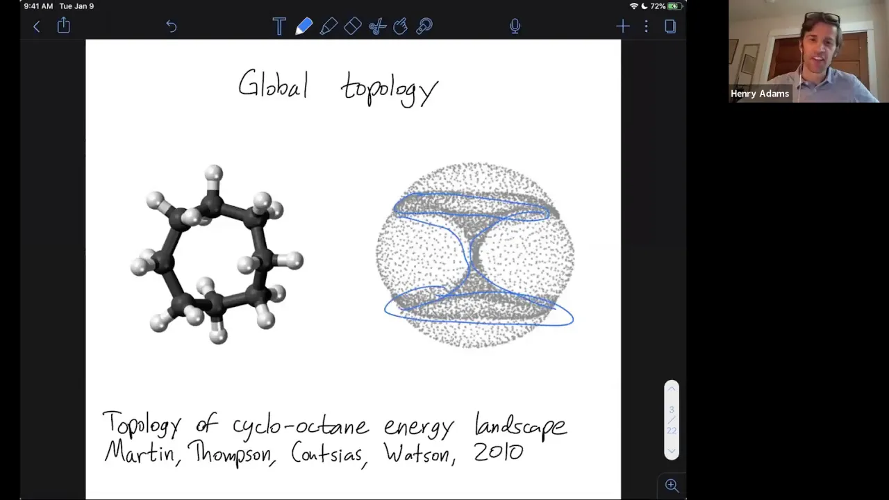

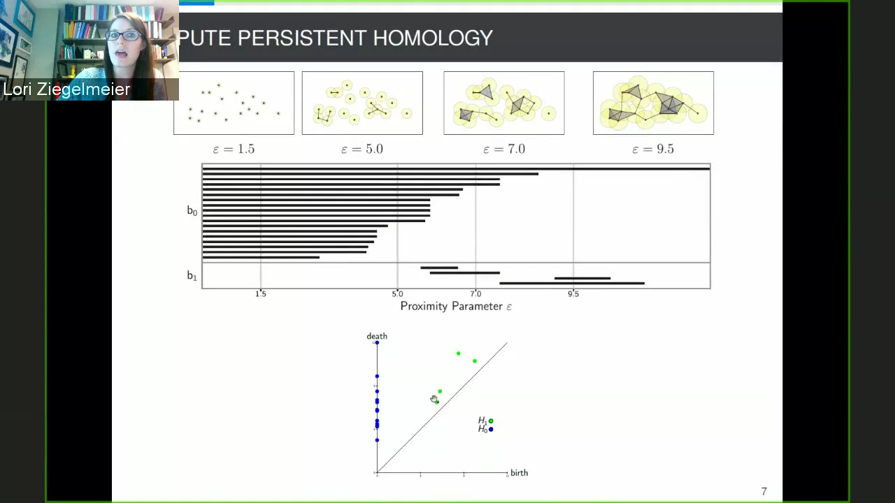









Persistent homology is a technique in topological data analysis that measures how topological features (like connected components and holes) change as we vary a scale parameter, typically by growing balls around data points and tracking when features are born and die; this is visualized in a persistence diagram where the distance from the diagonal indicates how long a feature persists, allowing researchers to distinguish significant geometric structures from noise, as demonstrated in applications like analyzing brain arterial trees to detect age-related differences.
Persistent Homology: Topology in Data Analysis Explained
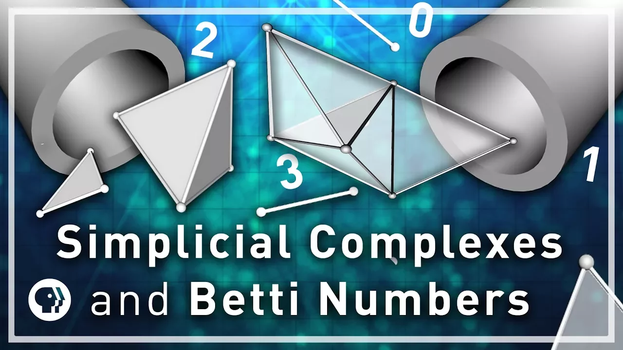
Added:Basic concepts of algebraic topology, specifically simplicial complexes, homology groups, and Betti numbers.
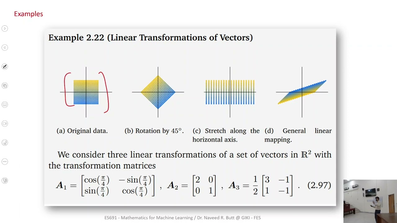
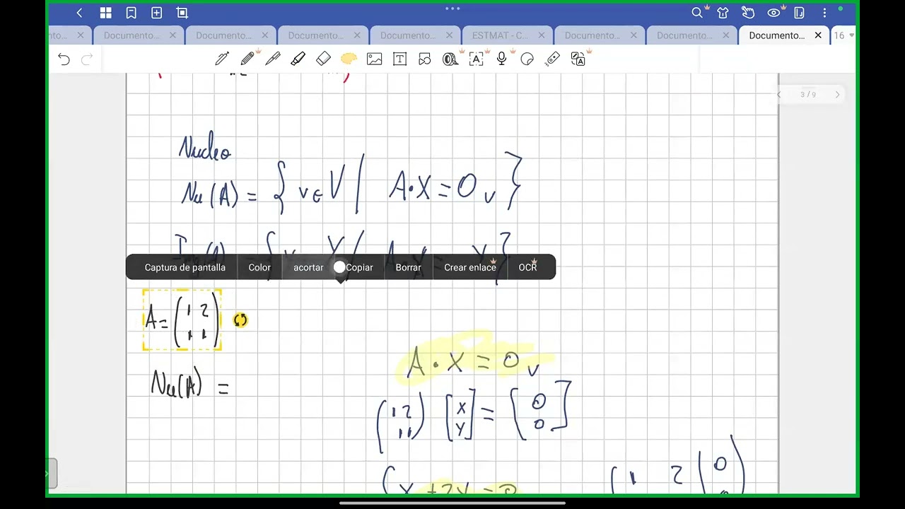
Fundamental linear algebra, including vector spaces, boundary matrices, kernel and image spaces, and matrix reduction.
The concept of metric spaces, distance metrics, and how geometric data points are represented in high-dimensional spaces.
Introductory data analysis concepts, particularly clustering, dimensionality reduction, and the representation of point cloud data.
Vectorization methods for persistent homology, such as Persistence Barcodes, Persistence Diagrams, Landscapes, and Images.
Integrating topological features into machine learning pipelines, allowing TDA features to be used in neural networks or random forests.
Advanced theoretical extensions of TDA, including multidimensional persistence and zigzag persistence.
Practical application of TDA in specialized fields, such as structural biology (protein folding), materials science, and time-series analysis using software libraries like Ripser or Gudhi.
3.9K views100likes16:56Original Release: 2021-11-16
Okay, welcome everyone to this continuation of what is algebraic topology, the last video on this playlist which is topology in data analysis. So I would like to explain a very very nice application of topology in real life. So homology is so great. I hope I convinced you if you were following me throughout the videos.
Thank you very much by the way for watching. But if you were following me obviously I'm a fanboy of forology and it's so great. I would like to explain a really really beautiful um uh incarnation of topology in real life.
Whatever real life means we will see that. So I stole this idea from a very nice nice blog linked in the description by someone actually who works in the ind in industry and uses this this really in practice which really beautiful very readable and um I stole it as I said. So everything here is based on basically this blog post which you really should check out. Anyway, so the title is what is persistent homology. So what is this type of homology and as you can see there's a word homology involved. Yeah.
So there will be homology.
So let's have a look at the main idea.
So kind of I would I will run a mathematical demonstration in a second.
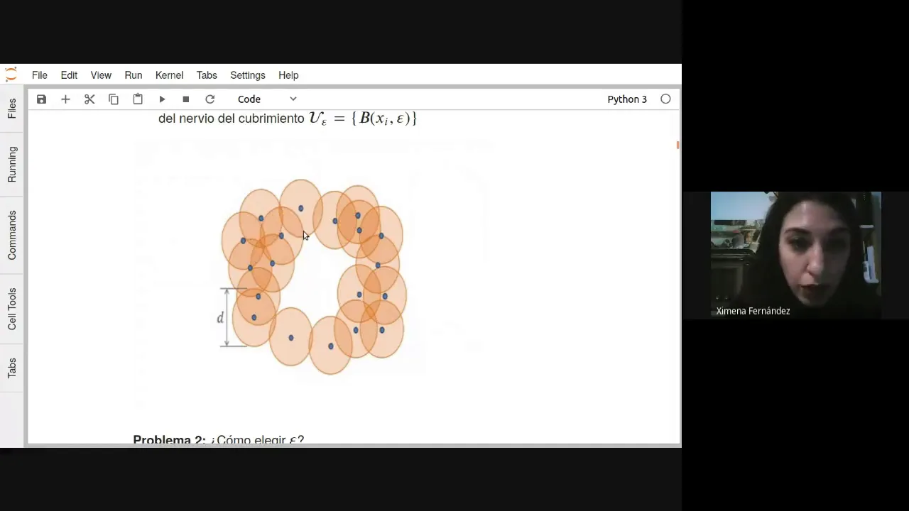
uh but what I kind of would have in mind is that there's a set of points somewhere and you kind of grow discs around those points and while growing discs you construct a certain simplial complex and you compute homology of the simplial complex and we'll see that in the mathematical code in a second and kind of the idea here the idea underlying this whole topological data analysis or at least this flavor of topological data analysis would be this idea that you have something that you vary somehow continuously and somehow how do you observe at what scale do you observe change in a certain type of data right we're really talking about kind of real world data here um I kind of there's many different flavors obviously in uh this video I would like to restrict to this to kind of data being kind of discrete points in Rn you will see that in many illustrations but first let's have a look at this mathematical illustration So here's Mathematica and there are three sliders here. So I have a discrete parameter. I have a distance parameter which is kind of this growing balls. You will see that in animations later uh a little bit more in detail.
And as as those grow balls grow you will connect points if they end up in the same bowl. We'll see that. So here you can number the various the number of points. Um I won't do that. And you have a random seat. It's kind of the kind of the starting of this whole um that there should be some random number involved and just a starting seat of the whole process. So kind of you should think of this as having some random points spread somewhere and this program will compute the homologies. It's a little bit silly.
It won't compute really the H2 because everything is plain in this case. So H2 will be a little bit boring but you can imagine that this is happening in in R3 or in even higher dimensional spaces. So you would be able to compute higher dimensional um groups as well if you in practice. So um and this is how it works. So let's get the parameter down to zero. As soon as the parameter is down at zero each point is a universe on itself because kind of I will grow balls of of certain size around those points.
You will see that in animations later as I said and as soon as the points the balls coincide or collite you actually draw um you connect them into a simplic complex and of course if there are no balls and every point is just the universe for itself and in this case apparently there are 24 of these points.
So each one is just well a universe of itself as I said. So h0 is 24 and kind of the idea is then now you would like to see kind of the structure of this set of points. So this this kind of some data you have collected and you increase successively the radius and as the radius gets a little bit bigger some of them get connected and as you can see this will drop down um the homology because this is now one connected component for example this is a connected component and you keep on increasing here more things get connected uh those things drop down uh as you can see more things get connected and you might end up with a circle at one point. Oh, there's a circle as you can see. And now you there was a circle was born. So you get another generator here. You increase and increase and increase. And you see how it varies.
There's another circle or this is a beautiful example. Now you have two circles at around this parameter. And of course if you just put it all the way back then it's just a filled complex and it's boring again. So what I would like to do or what people do here is they kind of you kind of think of this parameter increasing increasing and you will see changes in homology and you kind of record those changes in homology and this should tell you something about the the kind of the geometry behind uh the cloud of points the cloud of datas data that you have collected okay that's kind of the main idea here I will have more animations later just in the later animations there will be the I will show the balls or the animations show the balls but they won't connect um the complex anymore. So like like the Mathematica demonstration did just keep that in mind you will do that and but anyway um you will understand what's going on as soon as you see it. So the zeros persist in homology. So here's already the picture. We will see that in an animation in a second are kind of you have those points somewhere you grow those balls and you record in a nice diagram which is called persistence diagram which I will explain uh in a second are kind of every time something is born and how long it survives until it's killed. Uh so uh so there will be a burst. This is this line and there will be a death. This is this line. And um you kind of want to record in this diagram when something is born like you connect something in the complex like the circle was born before and at one point it would die because everything is just connected everything will just cluster and you just um kind of want to measure how long it will survive. So the interesting uh point here is the difference between the point so this point we'll see that in an animation in a second. So it's distance from the x= y axis. So kind of these diagrams I will have more examples later. I kind of designed such that at x= y everything is born. So let's say I would I would be born something would have been born by by having a parameter uh one. So the this radius of the circle is one and then I would put a point here basically and I would keep going until the point is destroyed and then I would put a point here. We'll see that in a second.
Um particular for the one dimensional it's much nicer to see and because here kind of everything is born in step zero, right? So you can't destroy connected components and you can't create new connected components. You can only only destroy them. So everything is kind of concentrated on this line here. Um, but before I continue waffling, let me just show you the animation. So, here's the animation and you have start with some points. You grow the circles. As you can see, the radius increases and some points the circles will collide. Um, and this is where you kind of mark the generators and the homology will die.
And this is where you will mark it on this diagram. And yeah, now the last component would die. So, in this case, I would connect everything now into a big complex, right? So you have a lot of points. Each of one of them is a single generator and mology. You grow the circles around your points. They will collide at one point. You will connect them. Uh compute the corresponding homology. There will be fewer generators. You mark that on this diagram and you just keep on going. Like pretty simple idea. Just grow balls and see whenever they collide and connect things according to the balls. And so this should measure kind of how connected components change uh as you go along in in the data as you increase your um your radius around the points.
Kind of the same for the first homology for the first it will measure how internal circles appear and change. I will show you the animation instead of waffling and then everything kind of will be clear anyway. So here's the animation. It's kind of the same idea.
You have a set of points, you have a grown radius and basically can't quite see it, but there are some small circles involved which die very very soon. And then there's a bigger outside circle which takes a while before it dies. So now it's dead and you will record its its death here on this line and it's created roughly in this step. So it will be roughly about around here when it when it's going to die. So the circle is still there. The circle is still there. Maybe it's roughly more like here and now it's that. So you record it. So this kind of should tell you or will tell you the diagram itself how circles change in your data, right? This should tell you something about the overall shape of your data. Really the same idea. You have this uh cloud of points and and you do it at the same time. Of course, you would record zero and one at the same time. Um and you would draw them in this diagram. I show you more nice diagrams in a second.
So like here uh very early on in this picture a lot of kind of small circles are born. Something like here is a small circle that will be born relatively soon. It will get will die relatively soon. Here's a little one. Here's a little one and so on. And then the big circle kind of the bigger thing. It will take a while until it dies. I should have used a different color. Give me another try. So the bigger circle here will die a little bit later and that's why but it will be created very early on as well and will die very late. So it has a kind of a huge distance uh from the x= y. So this is x= y y= x whatever axis kind of the distance of a point between the x= y distance is kind of how how long it will survive in a wall. And again the same idea you kind of want to measure how internal uh circles in your data changes as as soon as you increase the number of volts.
Um and here's a formal definition. I don't want to go into the formal definition too much. But of course there's a formal definition which you can read if you want or go to the Wikipedia page. Let me just explain this persistence diagrams a little bit more carefully because I got a little bit confused when I first saw them. So this is really how it works. So let's say you have um so usually they're distinguished by colors. So you would use different colors for the different homologies to make it kind of easier to see. As I said, you would put everything maybe in one diagram. Maybe you want to only put one of them or two of them or whatever.
So in this example, I have let's say H2 homology which is red and I have an H1 homology which is blue. And this is how it works. So um let's say you have some point A that is born very early on. So roughly um about 0.5 and it won't survive very long, right? It it just it's just born and basically is already dead. So where would you put it on this diagram? You would go to 0.5 and put it very very mildly a little bit above the x= y axis. So roughly about whatever it is 0.51.
And you will do the same with all the others. So here B is roughly born at 0.75. So you put it at 0.75 roughly here. And it survives a bit longer. So it's a little bit further away from um from the x= y axis. Same for C. C is somewhere around here. So it's born somewhere around here. It survives quite a bit. um and D is born very late and it survives a really long time. So um it it will be just very high above the x= y axis right. So I will just put uh it's somewhere here and just move it along uh the corresponding distance how long it survives and it kind of in this diagram the further something is to the top the longer it survives in nomology. So this diagram kind of tells you kind of the internal structure of uh your set of data. And to give you a real world example um here something you people really did in real world. So this looks very very clustered. So if you study something that is huge of course um then you have so many points and it looks already like a cloud. But you can kind of see kind of a little bit of those differences. So this is just the 1D homology whatever it's a 1D homology of of those guys here which is got a very surprising real world application. So the idea here is that you have those brain arterial trees. So kind of the blood flow in your brain and you would kind of like to see whether there are some differences between age groups. So what they did is they had a certain age cutoff and they had this above age cut off and the below age cut off. So the kind of the old people and the young people they separated them in two different groups and they looked at the persistent or the top at the shape structure of the brain. Basically kind of a fun idea and they made those diagrams exactly in the correct way. So they kind of rendered those those things into point clouds and then used this persistent homology to kind of measure kind of how connected it is in some sense and certainly for those trees. So for those blood trees, blood flow trees if you want kind of the circle should be the most important one. So they kind of focused on the one-dimensional case anyway. And this is how it looks like and this is what you could expect. So I just took this kind of out of random because it was I discussed in the blog that I mentioned. There are several other examples which kind of looks the same. And as you can see there's a slight difference. It's it's a mild difference between the two pictures. So between the below age group and the above age group. So here you have a lot of kind of death very early on. So most things kind of concentrate in this area here roughly. So maybe in this area. a lot of death very very early on. So not many huge circles if you want and this looks a little bit different. So it's a little bit thicker as you can see. Maybe it's more like this. So circles survive a little bit longer in persistent. So there's a difference in the brain that you can measure using persistent which I find very very exciting, surprising, beautiful, amazing papers link in the description. Of course, you should be careful now to make any interpretations here. So those differences are reason relatively subtle. Like almost everything you ever measure in the human brain, it will be relatively subtle.
There will be differences whatever depending on whatever and it will be really really subtle. So here's one that's rel related to age. But you can see the difference like circles survive a little bit longer. circles in those brain flow uh blood flow in the brain will survive a little bit longer if you're younger and they will die a little bit earlier if you're older. Um as I I said again because it's important no implication or there's no interpretation known I think what this can will cause or whatever you can just measure the difference and you measure the difference using topology using homology which is awesome as hell it's awesome as isn't it a real life example this might be helpful in the end to understand whatever some brain diseases in old ages because maybe you can measure differences um using persistent homology and amazing strategy. Beautiful.
Um anyway, so this was my um series on what is algebraic topology. Thank you for following me. I hope you like this last example of this amazing applications of homology of a variant of homology obviously persistent homology uh in in real life, whatever you call real life, let's say in the sciences.
And yeah, I really hope you enjoyed the series itself.
Up Next
15:03
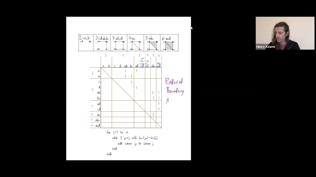
Persistent Homology Algorithm Explained with an Example
@aatrn1
3.5K views•2021-11-18

4:43
Elliptic Curve Cryptography Explained: ECC, ECDSA, ECDH
@PracticalNetworking
28.5K views•2024-10-21
20:20
Normal and Separable Field Extensions Explained | Abstract Algebra
@VisualMath
957 views•2021-07-13
6:00
The Mathematical Impossibility of Accurate World Maps
@Vox
23.3M views•2016-12-02
Related Study Plans & Knowledge Roadmaps
Structured learning paths in Mathematics
mathematics
Tensor Calculus: Vectors to Riemann Curvature
01Mathematical Foundations: Linear Algebra & Calculus
02Covectors, Dual Spaces, and Tensor Basics
03The Metric Tensor and Index Gymnastics
+ 2 more learning modules
40h5 modules
Explore Roadmap
mathematics
Gödel's Incompleteness: Logic, Proofs & Limits
01Introduction to Formal Systems & Hilbert's Dream
02Set Theory, Cardinality, and Cantor's Diagonal Argument
03Arithmetization and Gödel Numbering
+ 2 more learning modules
14h5 modules
Explore Roadmap
mathematics
Galois Theory: Fields, Groups & Solvability
01Foundations of Abstract Algebra: Groups & Fields
02Polynomials & Field Extensions
03Splitting Fields & Symmetries
+ 2 more learning modules
24h5 modules
Explore Roadmap
mathematics
Non-Euclidean Geometry: Models & Geodesics
01Euclid's Fifth Postulate and the Birth of New Geometries
02Hyperbolic Space and the Poincaré Disk Model
03Geodesics: Defining Straight Lines in Curved Spaces
+ 2 more learning modules
15h5 modules
Explore Roadmap