





![Postwar ECONOMIC Prosperity, Causes & Effects [APUSH Review]](https://i.ytimg.com/vi/KZA_004n2To/maxresdefault.jpg)


![Create Andy Warhol Style Pop Art - Lady Ga Ga [Photoshop CS5]](https://i.ytimg.com/vi/G7NZa8W0Nu4/maxresdefault.jpg)








![[村上隆:EP.2] 日本潮流霸主 笑面花花 第二個Andy Warhol 普普藝術 大眾化題材 藝術與商業之間的微妙關係 ︳#CarmenChanArtChannel](https://i.ytimg.com/vi/KnhddPwqpjY/maxresdefault.jpg)




Pop Art is not about celebrating consumer products but about critically analyzing the hidden psychological messages in commercial imagery; artists like Andy Warhol used techniques such as context shifting (placing commercial images in galleries), repetition analysis, and scale manipulation to reveal how advertising shapes our thoughts and desires, teaching us to decode the visual language of consumer culture.
Understanding Pop Art: Critical Analysis of Consumer Imagery in Modern Visual Culture
Added:The historical shift from Abstract Expressionism to Pop Art in the mid-20th century.
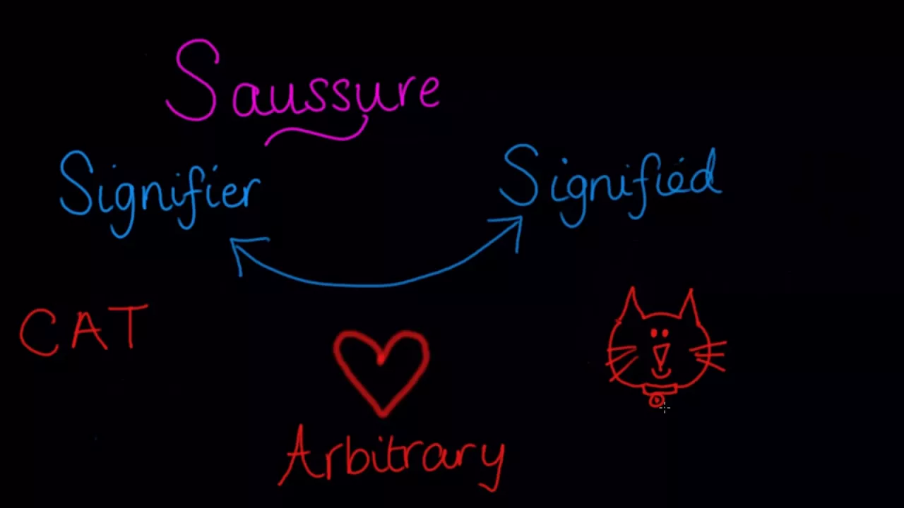
Basic concepts of semiotics, specifically how visual signs and symbols construct meaning in advertising and media.
The socio-economic context of the post-WWII boom, including the rise of mass production, suburbanization, and consumerism.
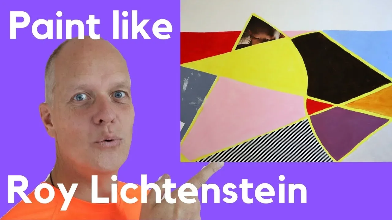
Familiarity with foundational Pop Art figures such as Andy Warhol, Roy Lichtenstein, and Richard Hamilton, and their signature techniques.
Advanced postmodern cultural theories, specifically Jean Baudrillard's concepts of simulacra, simulation, and hyperreality.
Critical analysis of contemporary digital visual culture, including influencer branding, algorithmic consumerism, and internet meme aesthetics.
The study of Neo-Pop (e.g., Jeff Koons, Takashi Murakami) and how contemporary artists navigate the fine line between art and high-end merchandising.
Practical application of 'subvertising' and culture-jamming methodologies to critique modern corporate marketing and media campaigns.
670 views60likes14:08Original Release: 2025-10-07
Andy Warhol walked into a grocery store, bought 32 cans of Campbell soup, and painted them exactly as they appeared on the shelf. No artistic interpretation, no emotional expression, just commercial products copied onto canvas. Art critics called him a fraud, a joke, a talentless hack who was mocking everything art stood for. Today, those soup cans are worth over $100 million and are considered some of the most important artworks of the 20th century. But here's what most people miss.
Pop art isn't about loving commercial products or thinking advertisements are beautiful. It's about learning to see the hidden messages in everyday images that corporations spend billions of dollars getting you to ignore. I'm Oleg G from Art Explained Simply and Quickly.
And today I'm giving you the essential tools to understand pop art. Not just recognize famous paintings, but decode the visual language of consumer culture that's been shaping your thoughts and desires your entire life. Pop art emerged in the 1950s and60s when artists realized something crucial. The most powerful images in modern life weren't hanging in museums. They were on billboards, in magazines, on television, and in grocery stores. These artists developed techniques for taking commercial imagery seriously, analyzing it critically, and revealing the psychological and cultural mechanisms hidden within seemingly innocent advertisements and product designs.
Understanding pop art begins with recognizing its core principle. There's no fundamental difference between high art and low culture. A painting in a museum and an advertisement in a magazine are both images designed to affect how you think and feel. Pop artists insisted that if we're going to understand modern life, we need to analyze commercial imagery with the same seriousness we give to traditional art.
So, how do you actually recognize pop art when you see it? Start with these visual characteristics. Bold flat colors that look like commercial printing rather than painterly technique. Clear outlines and simplified forms borrowed from advertising and graphic design.
Familiar imagery taken from consumer products, celebrities, comic books or mass media. Repetition of the same image multiple times referencing mass production and mechanical reproduction.
Before we go deeper into interpretation techniques, I'm curious. When you look at advertisements or product packaging in your daily life, do you ever think about who designed them and what they're trying to make you feel? Or do commercial images just feel like neutral background information. Share your thoughts in the comments below. The first tool for understanding pop art is what I call the context shift method.
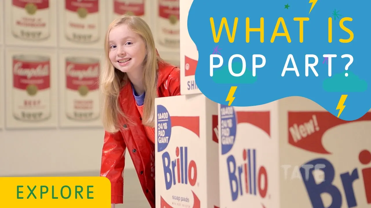
Pop artists take images from one context, usually commercial or mass media, and place them in another context, typically art galleries or museums. This shift forces you to actually look at images you normally ignore. When you see a brillow box in a supermarket, you don't think about its design. When Andy Warhol creates identical wooden boxes printed to look like brill boxes and displays them in a gallery, you're forced to consider what makes this different from the supermarket version. If there's no visual difference, what makes one art and the other just packaging?
This questioning is exactly what pop art wants you to do. The movement teaches critical thinking about how context shapes meaning and value. The same image can function completely differently depending on where and how it's presented. This insight applies far beyond art galleries. Think about how the same photograph looks different on Instagram versus a billboard versus a museum wall. If you're finding this video helpful, please hit like to help the YouTube algorithm push my videos to other art lovers. Want to support further? Check out my affordable membership options with exclusive perks or simply use it to say thanks. And your support helps me create content like this every week. The repetition analysis method helps you understand one of pop art's most common strategies. When you see the same image repeated many times, like Warhol's multiple Marilyn Monroes or soup cans, ask yourself, what does repetition do to meaning? In commercial culture, repetition is used for brand recognition and psychological conditioning. Advertisers know that seeing an image repeatedly makes it feel familiar, trustworthy, normal. Pop artists use this same technique, but exaggerate it to the point where you become conscious of the process. Try this exercise. Look at any repeated pop art image and notice how your perception changes as you look from one to the next. Do the repeated images feel more or less meaningful? Does the repetition make the subject feel important or empty? There's no single correct answer.
Pop art uses repetition to ask questions about value, meaning, and authenticity in mass culture. The source investigation method is crucial for understanding pop arts relationship to its original imagery. When you encounter a pop artwork, try to identify where the original image came from. Was it an advertisement, a news photograph, a comic book panel, a product label?
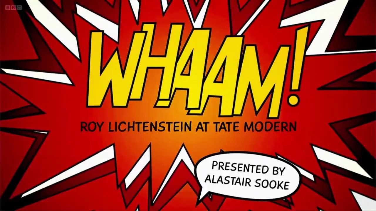
Understanding the source reveals what the artist is commenting on. Roy Likenstein's comic book paintings aren't just about making comics look important.
They're exploring how popular culture uses simplified visual languages to communicate complex emotions and narratives.
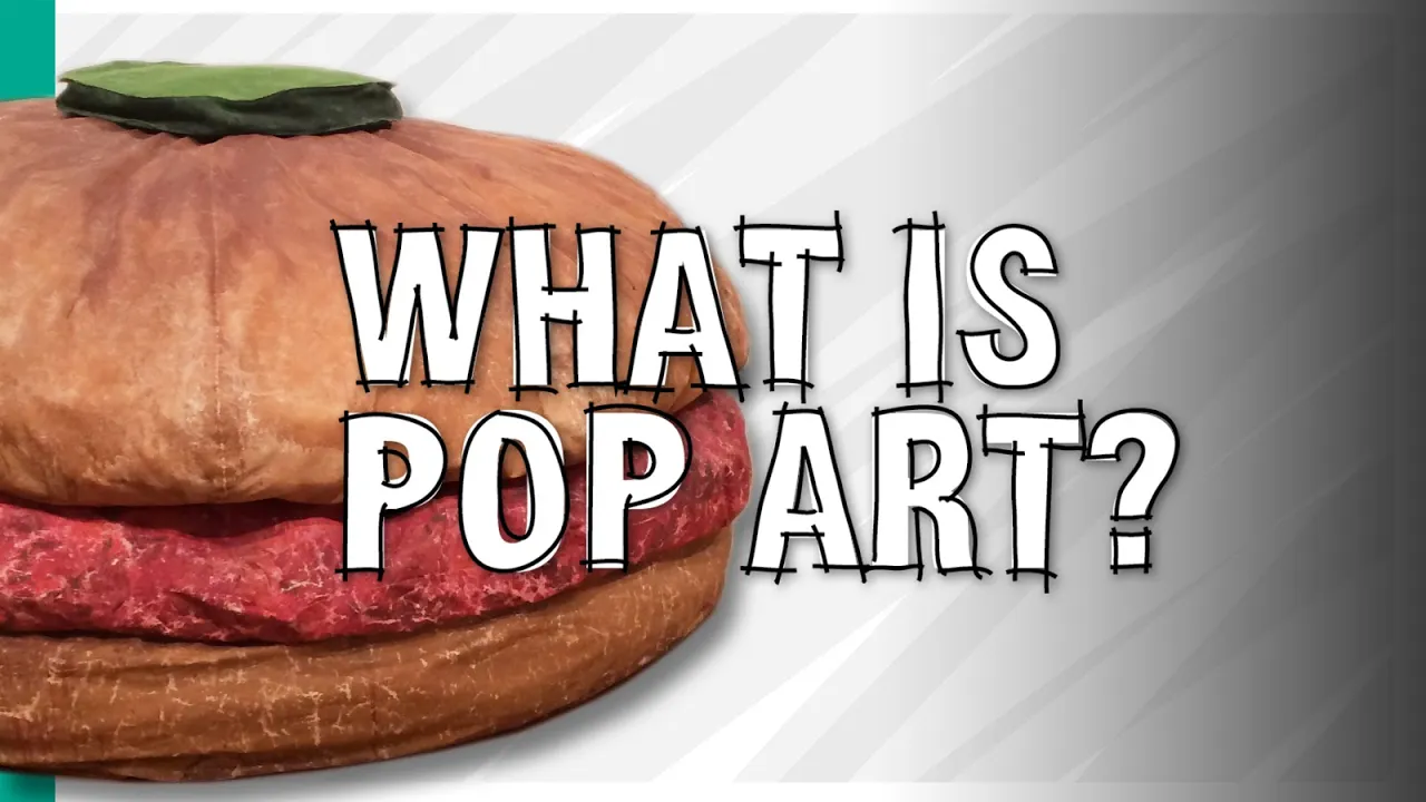
The scale consideration method reveals another pop art strategy. Many pop artworks radically change the scale of their source imagery. A small comic book panel becomes a 6-ft painting. A soup canin label gets enlarged to monumental size. A hamburger becomes a giant soft sculpture. Ask yourself, what does this scale change accomplish?
Making something larger forces you to pay attention to details you'd normally miss. It can make the familiar seem strange, the insignificant seem important, or the ordinary seem absurd.
Let's talk about the flatness observation method. Notice how pop art typically avoids creating illusions of three-dimensional depth. The images look flat, graphic, posterlike. This flatness isn't lack of skill. It's a deliberate choice that references commercial printing techniques and challenges traditional paintings emphasis on creating spatial illusion. The flatness also keeps you focused on the image as an image rather than a window into another world. The color function method helps you understand how pop art uses color differently than traditional painting. In academic art, colors are carefully mixed and modulated to create realistic effects. In pop art, colors are often pure, unmixed, and applied in flat areas that reference commercial printing processes.
These colors aren't trying to look natural. They're trying to look printed, mechanical, mass-roduced. This technique connects the artwork to the commercial world it's depicting and commenting on.
Now, I'd love to hear your perspective on a practical question. When you see pop art techniques used in contemporary advertising, social media, or design, do you think it's homage to the original movement or proof that capitalism has absorbed pop arts critique? Share your thoughts in the comments. The irony detection method is essential for understanding pop arts often ambiguous relationship to its subject matter. Is the artist celebrating consumer culture or criticizing it? The answer is usually both or neither. The ambiguity is intentional. Pop art refuses to give you easy answers about whether commercial culture is good or bad. Instead, it presents commercial imagery in ways that make you think about it rather than just consume it passively. Practice this when looking at any pop artwork. Ask yourself whether it makes the subject seem more appealing or more absurd. Often you'll find it does both simultaneously, creating productive confusion about your own relationship to consumer culture.
The medium awareness method involves paying attention to how pop artists use their materials and techniques. When Warhol uses silkcreen printing, a commercial technique, rather than traditional oil painting, he's making a statement about art's relationship to mass production. When Likenstein hand paints bend-aid dots that mimic cheap printing processes, he's creating something that looks mass-produced but is actually laboriously handcrafted.
These contradictions are intentional and meaningful.
The celebrity consideration method applies specifically to pop art's fascination with famous people. When artists repeatedly image celebrities like Marilyn Monroe, Elvis Presley, or Elizabeth Taylor, they're exploring how mass media creates public personas that are simultaneously everywhere and nowhere.
We feel like we know these people because we see their images constantly, but we don't actually know them at all.
We know their mass produced images.
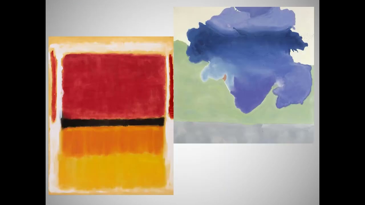
Understanding pop art's relationship to earlier art movements helps clarify what makes it distinctive. Unlike abstract expressionism, which emphasized personal emotion and unique artistic vision, pop art embraced impersonal techniques and commercial imagery. Unlike surrealism, which explored the unconscious mind through dreamlike combinations, pop art stayed firmly grounded in conscious everyday visual culture. Pop art essentially said, "The strange and meaningful isn't hidden in dreams or elite culture. It's right in front of us in supermarkets and on television." The contemporary application method helps you use pop art insights to understand current visual culture. Look at Instagram influencers, Tik Tok trends, or viral memes through pop art lenses.
Notice how social media creates the same tensions between authentic self-expression and commercial performance that pop art explored. The selfie is basically a pop art self-portrait using mass media techniques to create a public persona.
The democratization analysis method examines pop art's claim to make art accessible to everyone. Traditional art required specialized knowledge to appreciate. Pop art used familiar imagery that anyone could recognize. But as critically, did pop art actually democratize art, or did it just make elite art worlds seem more accessible while maintaining the same power structures?
The advertising literacy method might be pop art's most practical legacy. By teaching us to look critically at commercial imagery, pop art provides tools for understanding how advertisements work on us psychologically.
Next time you see an advertisement, try analyzing it like pop art. What emotions is it trying to trigger? What lifestyle is it associating with this product? How is it using color, composition, and cultural references to affect you? The appropriation ethics method involves thinking about the politics of pop art's use of existing imagery. When artists take images from commercial culture and present them as art, who benefits? The original creators of the advertisements?
The artists who appropriate them? the corporations whose brands become even more famous. These questions remain unresolved and controversial.
Contemporary street artists, graphic designers, and digital artists all use pop art strategies, often without realizing they're working in this tradition. Understanding pop art gives you a framework for analyzing how visual culture functions across multiple contexts, from fine art galleries to social media feeds.
If you're ready to see commercial imagery with new critical awareness and understand the visual languages that shape modern culture, hit that subscribe button right now and join our community of art explorers every week on Art Explained simply and quickly. We provide practical tools for understanding art movements, analyzing visual culture, and developing your own critical perspectives. What commercial imagery in your daily life do you think deserves more critical attention? How do you think pop arts strategies for analyzing consumer culture apply to social media, influencer marketing, or contemporary advertising?
What visual messages are you surrounded by that you've been trained to ignore?
Your thoughts on these questions help develop the critical visual literacy that pop art pioneered.
If this video gave you practical tools for understanding pop art and analyzing the commercial imagery that saturates modern life, give it a thumbs up. It helps more people discover these essential skills for navigating contemporary visual culture. See you in the next exploration.
[Music]
Up Next
4:32
Pop Art Movement: History and Cultural Impact | Educational Guide
@ARTiculations
52K views•2016-03-19

114:18
Christian Iconography: History, Theology, and Meaning | Fr. Panayiotis Papageorgiou
@Trisagionfilms
58.8K views•2020-02-21
7:48
Ukiyo-e Art: History, Woodblock Printing & Influence
@japanathand
6.3K views•2023-06-08

16:34
Earliest Depictions of Jesus in Art: 10 Ancient Images Explained
@UsefulCharts
5.9M views•2022-06-03
Related Study Plans & Knowledge Roadmaps
Structured learning paths in Art History
art-history
Gothic Cathedrals: Engineering, Light & Society
01The Birth of the Gothic: Romanesque to Suger's Vision
02The Structural Triad: Pointed Arches, Ribbed Vaults, and Flying Buttresses
03Theology of Light: Lux Nova and Sacred Geometry
+ 2 more learning modules
14h5 modules
Explore Roadmap
art-history
Pre-Raphaelites: Realism, Symbolism & Critique
01The Victorian Art Establishment and Academic Formula
02The Founding of the PRB and Radical Realism
03Medieval Revivalism and Literary Symbolism
+ 1 more learning modules
8h4 modules
Explore Roadmap
art-history
Street Art: From Subways to Art Market
01Subcultural Origins in Philadelphia and New York (1970s)
02The Subway Era and Style Wars (Late 1970s - 1980s)
03The East Village Scene and Early Gallery Crossover
+ 2 more learning modules
10h5 modules
Explore Roadmap
art-history
Classic Maya Art: Iconography, Glyphs & Ritual
01Foundations of Classic Maya Visual Culture
02Deciphering Maya Hieroglyphs & Text-Image Integration
03Sacred Geography and Cosmological Architecture
+ 2 more learning modules
14h5 modules
Explore Roadmap