





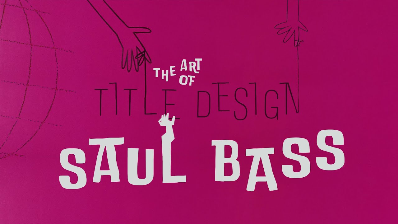
![[2016] LIBRARY Cartoon – '타이틀 시퀀스'의 개척자 솔 바스](https://i.ytimg.com/vi/FdtOkDNknlI/maxresdefault.jpg)


![[Tutorial] Como hacer una intro 3D basica Con efectos [C4D] [AE]](https://i.ytimg.com/vi_webp/W2XWPQsrEeg/maxresdefault.webp)




![Adem's Top 1000 Logos [Part 1] (250/1000)](https://i.ytimg.com/vi/VgRLb3lxpSM/maxresdefault.jpg)
![WBBZ (MeTV) promos and bumpers [September-October 2012]](https://i.ytimg.com/vi_webp/9mtFo0jemTI/maxresdefault.webp)


![Green Day - Letterbomb lyrics [Kinetic Typography]](https://i.ytimg.com/vi/qjuUMA6W9Zs/maxresdefault.jpg)

![Title Sequences & Creative Design // Alan Williams, Imaginary Forces [FirstMark's Design Driven]](https://i.ytimg.com/vi_webp/VXePgYgylaA/maxresdefault.webp)



Film title design serves as a crucial storytelling tool that creates anticipation and draws audiences into a film's world; effective title sequences achieve this by being conceptually true to the story, integrating design with filmmaking rather than merely mirroring directorial style, and often becoming culturally iconic elements that extend beyond their initial purpose to define the entire production's identity.
Film and TV Title Design: Artistry and Craft | PBS
Added:Basic principles of graphic design, including typography, color theory, and composition.
Fundamentals of visual storytelling and how media uses semiotics and symbolism to convey narrative meaning.
An understanding of basic film grammar, such as framing, pacing, and editing techniques.
The historical context of title sequences, particularly the pioneering work of designers like Saul Bass.
The technical execution of motion graphics using industry-standard software like Adobe After Effects and Cinema 4D.
Analyzing how title sequences function as branding and marketing tools for television networks and streaming platforms.
The integration of sound design and music synchronization with kinetic typography and visual pacing.
In-depth case studies of modern creative agencies specializing in title design, such as Imaginary Forces or Elastic.
230K views2.3Klikes6:33Original Release: 2012-04-18
[Music] I think tile design's like a curtain.
Like when you're in the theater, when the curtain gets up, there is a there's a moment of anticipation. I think it draws you from your everyday into this fantastic world. It's a movie inside of a movie. And it's always been something that's fascinated me. I mean, that's such an important time. The movie starts and it's a very precious little moment there that really can't be wasted.
I think a good title sequence is just a show of respect to the audience. So, we're really going to actually try as hard as we possibly can to invite you in and to entertain you. A key component of our design is just the concept work. We hope you know something is very aesthetically striking, aesthetically memorable, but hopefully the reason why it resonates with you is because it's so true to the story it's telling. The project that really launched our company was the title sequence to David Fincher's Seven. What Fincher needed was a formal expression of what he was going for, not so much to to mirror his style, uh, but rather to reinforce his style, but in a completely different language.
You hope that a television series lasts years and years, and that whatever sequence you're coming up with would have a lifespan that encompasses the bigger ideas within the story. Mad Men's a perfect example, right? What happened is that show became part of the culture and the title sequence became part of the culture and that final image of Don Draper with his arm draped over the back of his chair became the iconic image for the show. We're not out to duplicate what the director is doing in the film.
Sometimes it's wonderful to have that contrast, that play. The sort of highest compliment is that the title really is of the movie and and that the movie can't exist without the title sequence.
and vice versa. I mean, that's always really what we're going for, building the anticipation for the audience at the beginning of the film before they see it. I think it's so much fun in Zombieland. The challenge was really about bridging design and film making. It was directed by Ruben Flecher and he was taking an approach that we understood in terms of bringing type into the film in a real integrated way.
We were responsible for the whole intro.
So the whole beginning required a lot of design thinking. Eventually everything clicked that this was going to be these beautiful slow motion shots of zombies all around the country killing people and then integrating the type in the same way. So having them move in that beautiful poetic style. So you have this grace to it and at the same time it's horrific. I think from the beginning Ruben also wanted to have the rules be typographically featured within the film. So the solution for that was to have the type interact and be a part of the scene and so in a sense become a character. What we really discovered is that we didn't want to overpower the image. The images were so fantastic. So we didn't want to have the font do so much of that work to say like hey I'm funny. I'm a funny font. It didn't need that. It didn't need to be sort of slapped in your face. I remember seeing it in a theater and people laughing at the way that the type behave. That was just a really gratifying moment to see that type entertain in that way. I've always loved title designs.
I've always loved title making. It's a really cool thing to entertain. It's like how do you make something stick with someone? How do you put it in a context so that they'll feel something?
With Blue Valentine in particular, um it hits people. It was very honest. It's it takes you places that are really hard to go. One of the things I wanted to get across in the title sequence was that there was love that it it did exist and that even though it was harsh and it was a hard thing to watch them lose their love, it still existed and it and it didn't devalue that. They had always planned to have fireworks at the end.
The DP shot the fireworks. You know, Derek just kept on saying, "I want more out of focus, more out of focus, more out of focus." And so finally they just took the lens off the camera and so the real beautiful u bouques. I mean it's just the camera and it's it looks magnificent to me. I edited that by itself. I found the music and and I did something that was a rhythmic ode to the film but it was purely rhythmic. We had one of our test screenings and uh right after it the writer came up to me and she said you got to do something with the end that's nostalgic. We had these fantastic stills that uh Dobby Russo, our set photographer uh on Blue Valentine took. And it was funny because as I was watching it at that moment, I was seeing them inside the fireworks.
Right after that, I went back in the studio and and put something together.
Those aren't necessarily stills that were taken while the shooting was happening. There's a connection. He had time with them and they collaborated with him. He really got the actors to give to him. I think that's one of the reasons why the photos are so uh resonant and and powerful. Putting images inside of darkness and lightness and revealing them is a experimental technique and especially to put something like that in a mainstream cinema was really exciting for me. Those moments of almost ecstatic moments of film making are really magical. That moment of mystery at the beginning of the film, it's your only opportunity to really get the audience in into the story. images in motion. They're by necessity a story because they're happening over time. For me, the first explosion is like I'm going to tell you a story. It's not going to be in words, but it's still clear that there's a story happening. When everything all falls into place and becomes sort of part of your experience of the show, that's when design becomes film making, right? Storytelling.
watched all of Saul Bass's stuff. I used to make mixed videos of like all his title sequences. He was the pope, you know. Come on. He's he's showing filmmakers to not be literal and he's okay to challenge your audience a little bit. He's the best. I mean, it's not just title design. Any major logo that I grew up with was probably designed by Salt Bass. He elevated the form. He just got people to pay attention to title sequences beyond simply the information that they were conveying. It is mindboggling how much that guy contributed to the visual world, the graphic world that we live in.
Up Next

3:11
Afrofuturism: Bridging Sci-Fi and Social Justice
@Vox
270.5K views•2016-03-04

114:18
Christian Iconography: History, Theology, and Meaning | Fr. Panayiotis Papageorgiou
@Trisagionfilms
58.8K views•2020-02-21
7:48
Ukiyo-e Art: History, Woodblock Printing & Influence
@japanathand
6.3K views•2023-06-08

16:34
Earliest Depictions of Jesus in Art: 10 Ancient Images Explained
@UsefulCharts
5.9M views•2022-06-03
Related Study Plans & Knowledge Roadmaps
Structured learning paths in Art History
art-history
Gothic Cathedrals: Engineering, Light & Society
01The Birth of the Gothic: Romanesque to Suger's Vision
02The Structural Triad: Pointed Arches, Ribbed Vaults, and Flying Buttresses
03Theology of Light: Lux Nova and Sacred Geometry
+ 2 more learning modules
14h5 modules
Explore Roadmap
art-history
Pre-Raphaelites: Realism, Symbolism & Critique
01The Victorian Art Establishment and Academic Formula
02The Founding of the PRB and Radical Realism
03Medieval Revivalism and Literary Symbolism
+ 1 more learning modules
8h4 modules
Explore Roadmap
art-history
Street Art: From Subways to Art Market
01Subcultural Origins in Philadelphia and New York (1970s)
02The Subway Era and Style Wars (Late 1970s - 1980s)
03The East Village Scene and Early Gallery Crossover
+ 2 more learning modules
10h5 modules
Explore Roadmap
art-history
Classic Maya Art: Iconography, Glyphs & Ritual
01Foundations of Classic Maya Visual Culture
02Deciphering Maya Hieroglyphs & Text-Image Integration
03Sacred Geography and Cosmological Architecture
+ 2 more learning modules
14h5 modules
Explore Roadmap