








![Les clés du regard [8 ]- Georges de La Tour (nouvelle version)](https://i.ytimg.com/vi/Kf93vq4y5cU/maxresdefault.jpg)




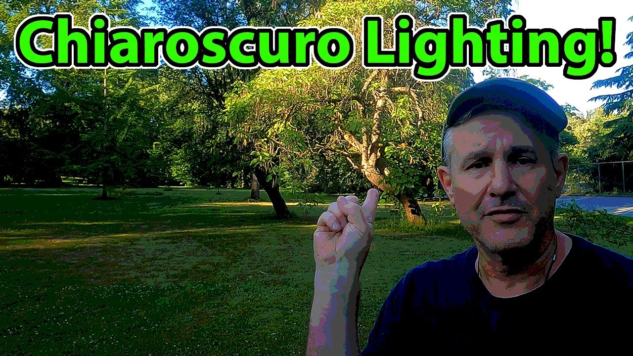
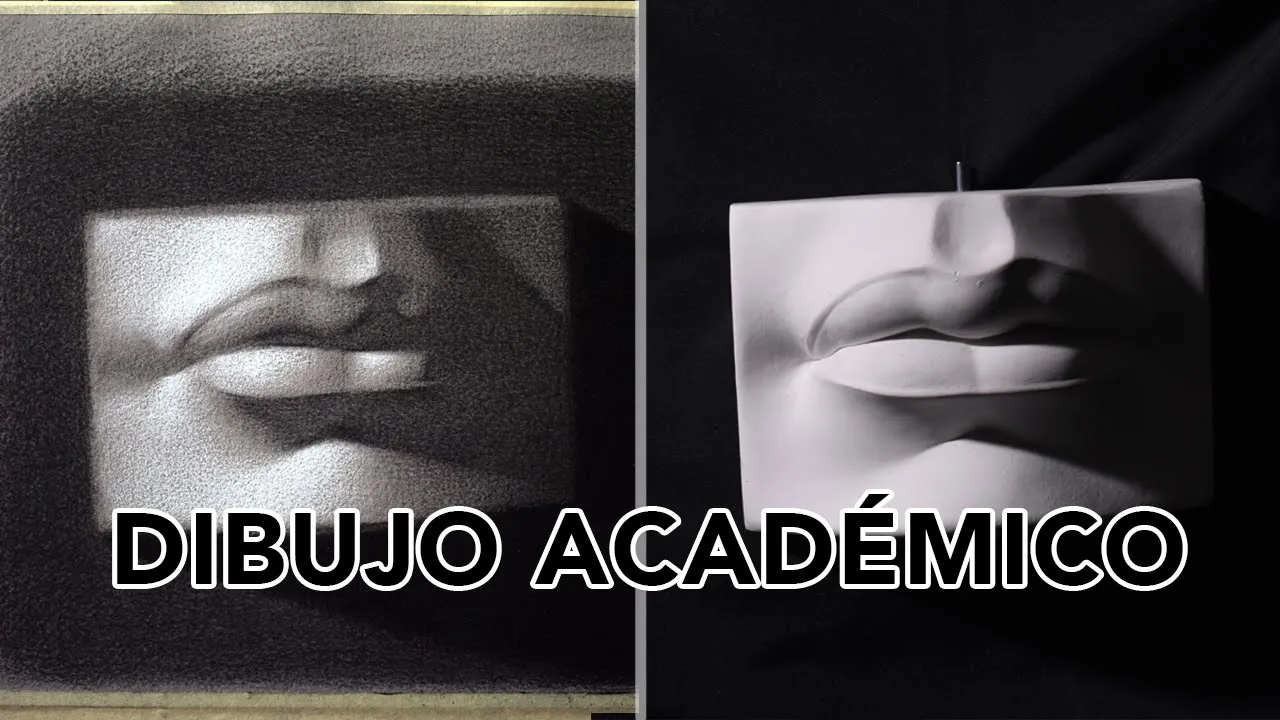



Tenebrism is an artistic technique characterized by extreme or violent contrast between light and dark areas in paintings, derived from the Italian word 'tenebroso' meaning gloomy; unlike chiaroscuro which uses subtle gradations of light and dark to create three-dimensionality (as pioneered by Leonardo da Vinci), tenebrism creates dramatic effects by isolating specific elements in a spotlight against a completely dark background, making it a dominant visual element rather than a subtle modeling technique.
Tenebrism vs Chiaroscuro: Explained with Baroque Art
Added:Fundamental understanding of the Baroque art movement, including its historical context, religious drivers (like the Counter-Reformation), and general emphasis on emotion and drama.
Basic art theory concepts of 'value' (lightness and darkness) and how artists use tonal contrast to create the illusion of three-dimensional form on a flat surface.
A general familiarity with High Renaissance art techniques, particularly how early masters initiated the study of light and anatomy to set the stage for Baroque developments.
Familiarity with Michelangelo Merisi da Caravaggio, including his reputation as a revolutionary and controversial painter who rejected idealized classical beauty.
An in-depth study of the 'Caravaggisti' (followers of Caravaggio), such as Artemisia Gentileschi and Gerrit van Honthorst, and how they propagated tenebrism across Europe.
Analysis of Rembrandt van Rijn's unique adaptation of chiaroscuro to create psychological depth and internal warmth in Dutch Golden Age portraiture.
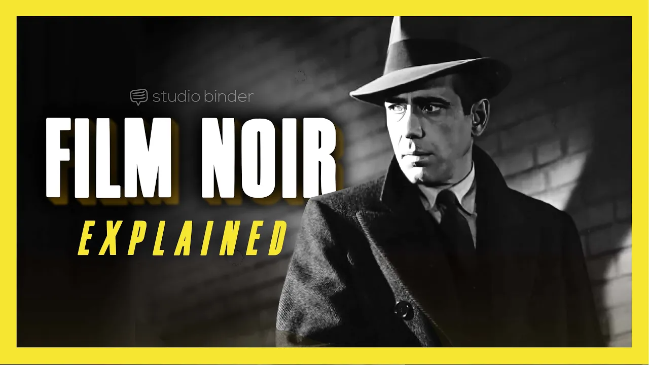
The legacy of tenebrism and chiaroscuro in modern visual media, particularly the use of low-key lighting in Film Noir, German Expressionist cinema, and contemporary photography.
Practical studio application, learning to physically render extreme light contrasts using traditional media like charcoal and oil paint, or digital painting techniques.
34.7K views1.6Klikes8:39Original Release: 2021-08-27
Tenebrism is one of those art terms that is particularly associated with paintings from the Baroque period. But what is exactly? Is it the same as chiaroscuro? And who were the key artists using this technique? In this video, I will clarify what tenebrism is and will show you plenty of example of paintings reflecting this style.
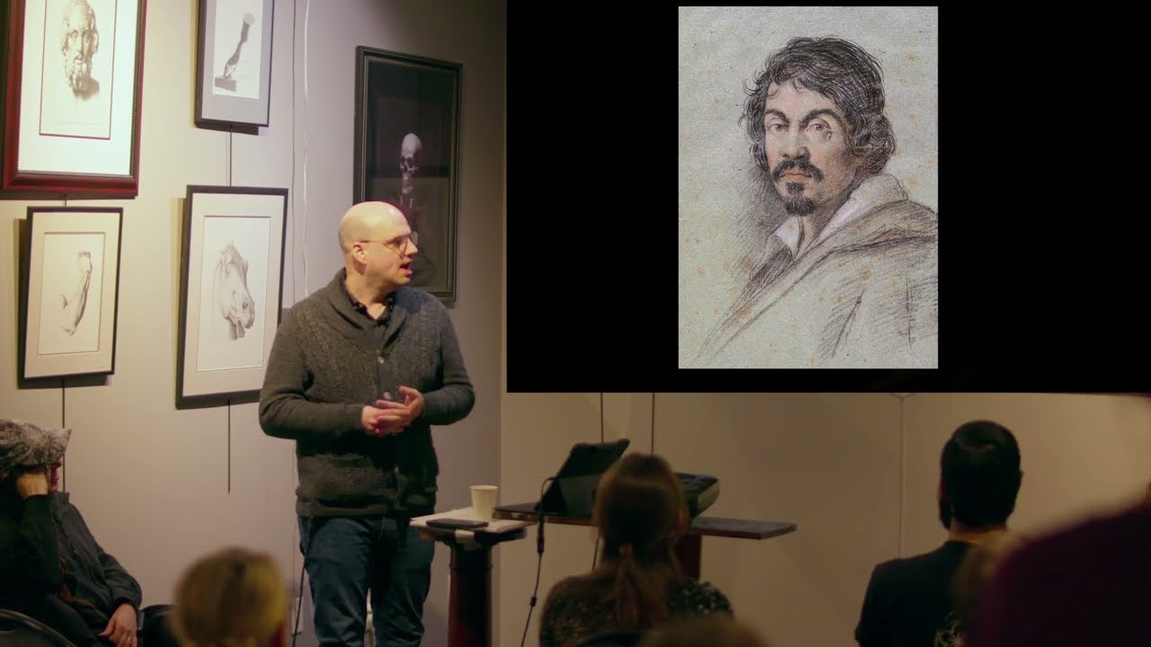
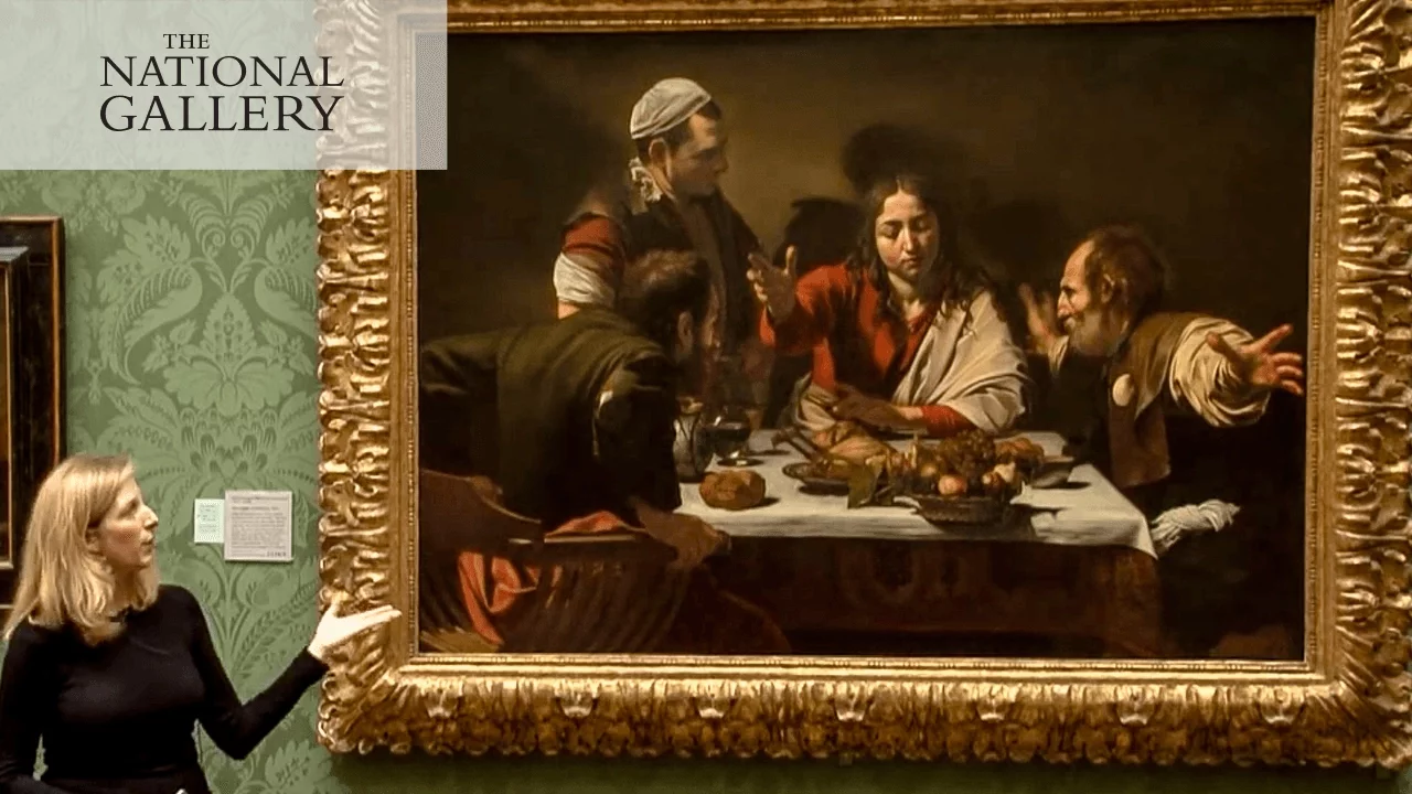
The artist that is most frequently associated with tenebrism is Caravaggio. This is The Supper at Emmaus painted by Caravaggio in 1601 and currently on display in the National Gallery in London. It shows how the resurrected Jesus reveals his identity to two of his disciples and an innkeeper. A simple description of the use of tenebrism here is the contrast between the figures in the light and the dark background. Now, some people may refer to this effect as chiaroscuro, which is the use of strong contrasts between light and dark.
The terms chiaroscuro and tenebrism are sometimes used interchangeably, and sometimes incorrectly, and later on in this video, I will give a more detailed explanation of their differences.
But first I want to show you another version of The Supper at Emmaus which Caravaggio painted five years later. In this painting, the contrast between light and dark is even stronger, and Caravaggio left the background completely dark by using black paint. It is a better example to illustrate what tenebrism is than the earlier version of The Supper at Emmaus, as tenebrism is characterized by an extreme or violent contrast between light and dark.
To understand tenebrism a bit better, let s start with the basics. The word tenebrism comes from the Italian word tenebroso, which can be translated as gloomy. The goal of the tenebrism technique is to put particular elements of the composition in a spotlight, as if you are in a dark interior room and use a spotlight to highlight particular elements. The effect is that the paintings get a more dramatic feel.
Now, let s return to the difference between chiaroscuro and tenebrism. Whereas tenebrism is derived from the Italian word for gloomy, chiaroscuro is a combination of the Italian words chiaro, which means clear, and oscuro, which means dark. It is a technique that was developed during the Renaissance, and that uses the contrasts between light and dark.
So, whereas theoretically you could use the word chiaroscuro for all paintings that use tenebrism, this is not true the other way around.
Leonardo da Vinci was one of the inventors of the chiaroscuro technique, and we can use one of his drawings to illustrate that not all chiaroscuro can be called tenebrism. This study of arms and hands used darker lines in particular areas, and the darker lines vary in their thickness. It may not look that revolutionary to us now, but Da Vinci used these contrasts between light and dark to create a more vivid perception of the three-dimensionality of the objects in his drawings and paintings. Another clear example to illustrate that chiaroscuro is different than tenebrism is The Milkmaid, painted by Johannes Vermeer around 1660. Is it a relatively bright painting, but yet the refined and subtle differences between light and dark in the shadows in this work are referred to as chiaroscuro.
Now, let s explore some works that are great examples of tenebrism. Let s look again at some works by Caravaggio. He painted three versions of David with the Head of Goliath.
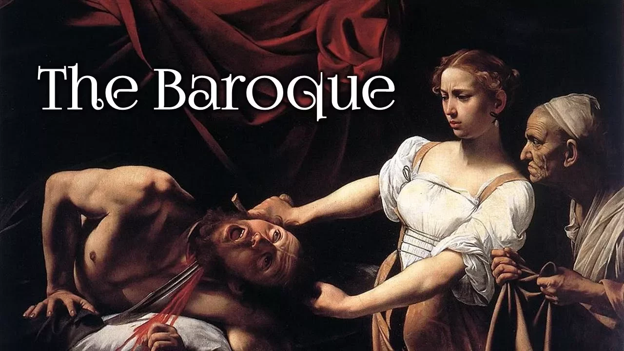
Caravaggio left the background completely dark, creating a violent contrast between the scene in the foreground and the background. Unlike Da Vinci a century before in his work, he did not use this to create a better representation of three-dimensionality. Instead, he wanted to create the maximum amount of drama, something that perfectly fits with the theme of these paintings. And instead of multiple contrasts between light and dark within a single work, something that is typically referred to as chiaroscuro, in these works by Caravaggio, there is basically one main contrast between a part of the painting that is completely in the dark, and another part that is in the light. And so, as there is certainly a contrast between light and dark, we could technically use the word chiaroscuro, or strong chiaroscuro, to refer to this painting. However, it is much more accurate and clearer if we reserve the word tenebrism to refer to this single, violent contrast between light and dark. The difference here is really how dominant the contrasting effect is. If it is a dominant element of the painting, tenebrism would be the right term.
Now before making it a little bit more complicated again, let me show you some wonderful examples of tenebrism. A Man Singing by Candlelight by Adam de Coster is one of the more extreme examples of tenebrism where even the features of the man are hard to distinguish. And this portrait of Saint Jerome by the Spanish artist Jose de Ribera is also a great example of the completely dark background. And the Dutch floral artist Rachel Ruysch shows in this still life that the technique can also be used for a completely different genre. And so does Francisco de Zurbar n in this still life. And while the background in Murillo s painting of Two Women at a Window is a little bit less dark, the stark contrast between fore- and background is also a typical case of tenebrism. And it can even be used in portraiture, as can be seen in this self portrait from 1679 by the Dutch artist Godfried Schalcken. Let s return to the works of Caravaggio, which I earlier classified as tenebrism. Well, that is not the full story. While the contrast between the dark background and the foreground is a typical use of tenebrism, there are also contrasts between light and dark in the scene in the foreground. We can look, for example, at the folds in David s garments, in which Caravaggio used the contrasts between light and dark to create shadows and three-dimensionality. These effects would be called chiaroscuro.
So, while many paintings contain some form of chiaroscuro, sometimes quite subtle and other times quite pronounced, only relatively few paintings really contain the dramatic effect that we call tenebrism. I want to end by showing some works by the French artist Georges de la Tour. He has painted many interior scenes that are solely lit up by a single candlelight, making them a beautiful example of tenebrism. But as explained earlier, even in his paintings we can also recognize elements that we could classify as chiaroscuro.
The Magdalen with the Smoking Flame is a good example. We see the large dark areas mostly at the bottom of the painting, but the somewhat more subtle differences between light and dark, which we should call chiaroscuro, can be seen in the top half of the painting, for example in the books on the table. Well, I hope that this video has helped to clarify a bit what tenebrism is, and what the difference is with chiaroscuro. As these terms overlap a bit, and their usage is often imprecise in practice, it may still be a bit confusing when coming across these terms, but I do hope that this video has given you a solid foundation on recognizing tenebrism in paintings.
Finally, if you enjoyed this video, please hit the thumbs-up button, consider leaving a comment down below with some feedback, questions, or something else you want to share with us, and subscribe to the channel for more videos about art history. And, as always, I would like to thank you for watching this video.
Up Next
30:51
Caravaggio's Life & Artistic Evolution: A National Gallery Guide
@nationalgallery
2.5M views•2016-03-03

114:18
Christian Iconography: History, Theology, and Meaning | Fr. Panayiotis Papageorgiou
@Trisagionfilms
58.8K views•2020-02-21
7:48
Ukiyo-e Art: History, Woodblock Printing & Influence
@japanathand
6.3K views•2023-06-08

16:34
Earliest Depictions of Jesus in Art: 10 Ancient Images Explained
@UsefulCharts
5.9M views•2022-06-03
Related Study Plans & Knowledge Roadmaps
Structured learning paths in Art History
art-history
Gothic Cathedrals: Engineering, Light & Society
01The Birth of the Gothic: Romanesque to Suger's Vision
02The Structural Triad: Pointed Arches, Ribbed Vaults, and Flying Buttresses
03Theology of Light: Lux Nova and Sacred Geometry
+ 2 more learning modules
14h5 modules
Explore Roadmap
art-history
Pre-Raphaelites: Realism, Symbolism & Critique
01The Victorian Art Establishment and Academic Formula
02The Founding of the PRB and Radical Realism
03Medieval Revivalism and Literary Symbolism
+ 1 more learning modules
8h4 modules
Explore Roadmap
art-history
Street Art: From Subways to Art Market
01Subcultural Origins in Philadelphia and New York (1970s)
02The Subway Era and Style Wars (Late 1970s - 1980s)
03The East Village Scene and Early Gallery Crossover
+ 2 more learning modules
10h5 modules
Explore Roadmap
art-history
Classic Maya Art: Iconography, Glyphs & Ritual
01Foundations of Classic Maya Visual Culture
02Deciphering Maya Hieroglyphs & Text-Image Integration
03Sacred Geography and Cosmological Architecture
+ 2 more learning modules
14h5 modules
Explore Roadmap