

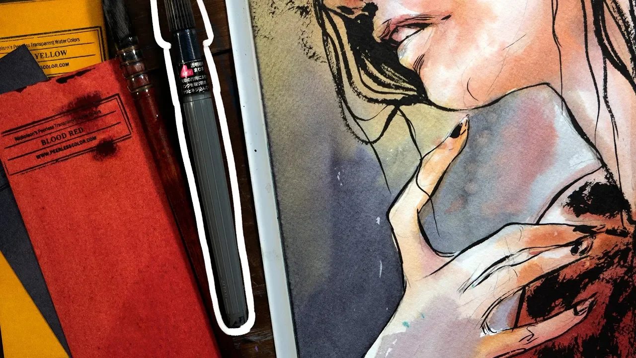
![[CONSEILS]-Comment ASSOCIER les couleurs ![DESSIN]](https://i.ytimg.com/vi_webp/YplFjfowTSo/maxresdefault.webp)












![Como Fazer 🌸Arte Post DIA DAS MULHERES 🌺 [Arte Avançada no Canva]](https://i.ytimg.com/vi/Iu2FS3k_iUk/maxresdefault.jpg)
![Quick Procreate Ink and Color Tutorial [SPEEDPAINT]](https://i.ytimg.com/vi/Cy5Yww2gAgk/maxresdefault.jpg)

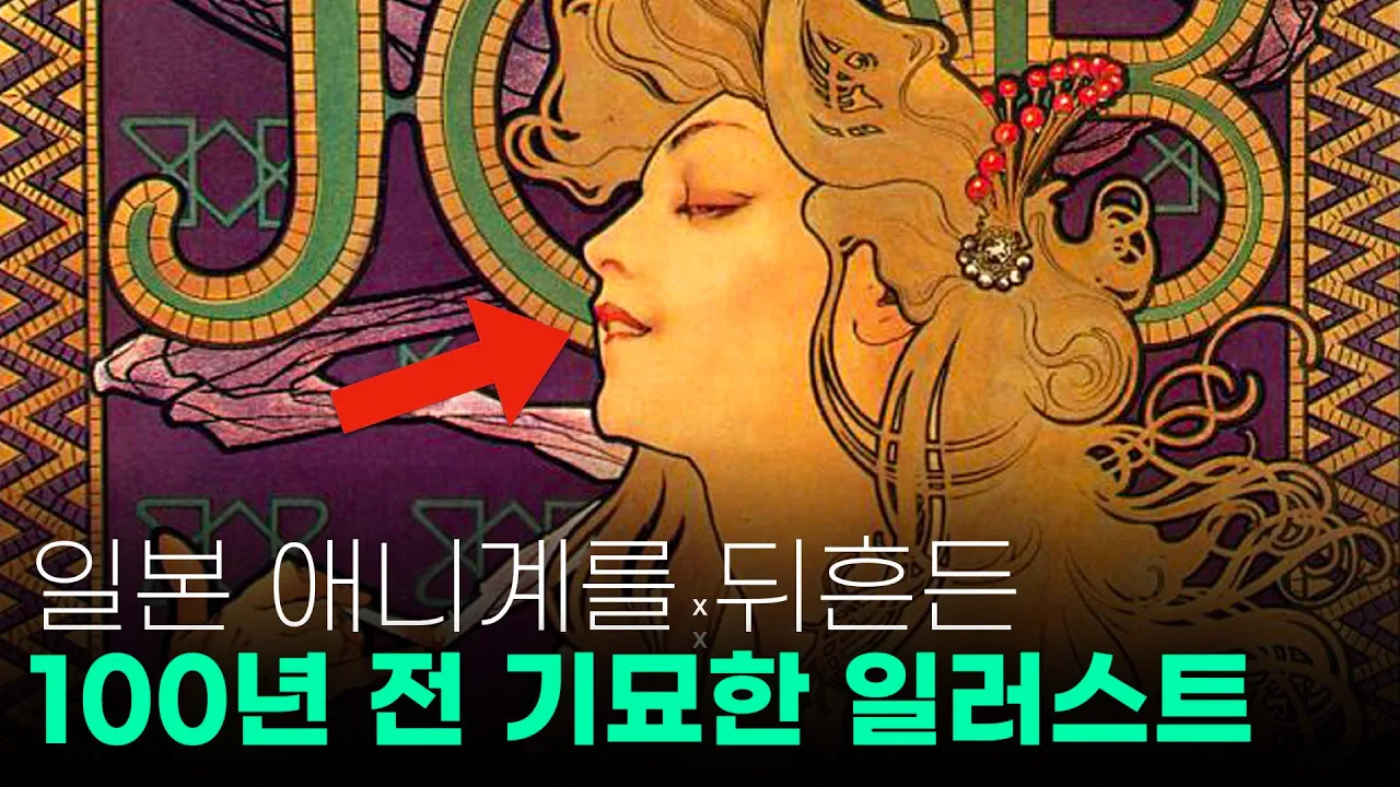
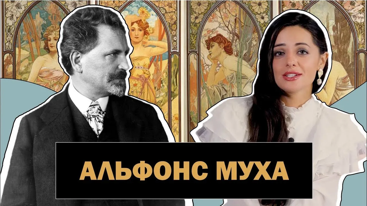
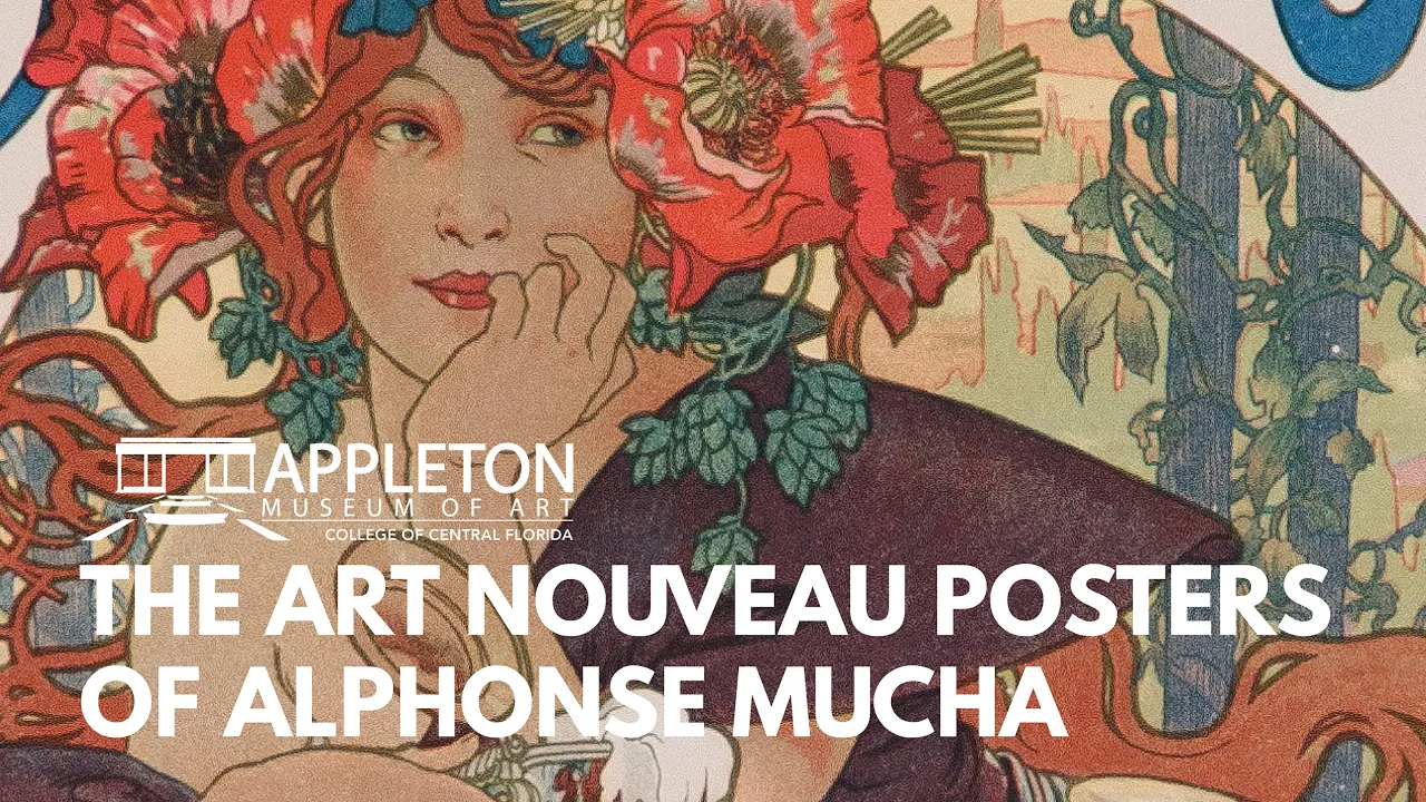
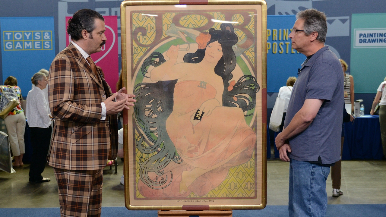

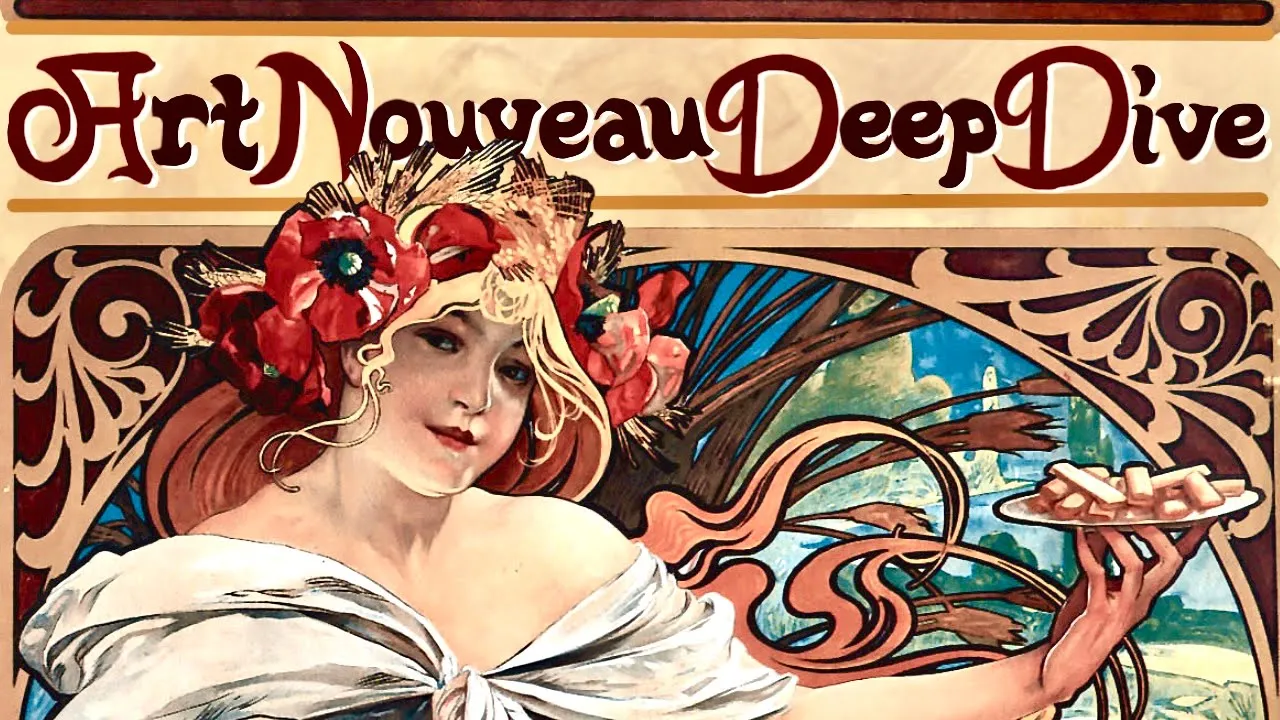
To paint in the Art Nouveau style like Alphonse Mucha, artists should: (1) prepare a smooth surface using multiple gesso layers with sanding between coats; (2) separate and outline hair sections individually; (3) draw figures and faces with precision while exaggerating fabric and hair; (4) use thicker, darker lines around the main figure and thinner descriptive lines for other elements; (5) apply one solid color with only one or two slight variations for shadows; (6) significantly dull all colors to achieve the muted palette characteristic of Mucha's work.
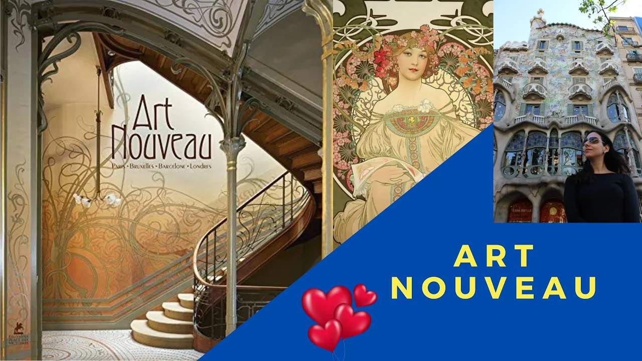
How to Paint in Mucha's Art Nouveau Style: 6 Pro Tips
Added:Fundamental drawing skills, including human anatomy and precise figure illustration.
Basic color theory, specifically the use of harmonious, muted, and pastel color palettes.
An understanding of line weight and control using mediums such as ink, gouache, or digital lining tools.
A basic introduction to the Art Nouveau movement, its historical context, and its focus on organic, flowing forms.
Advanced composition techniques integrating typography and intricate decorative borders with figurative art.
Translating traditional Art Nouveau painting and inking techniques into modern digital illustration software.
Exploring the influence of Japanese Ukiyo-e woodblock prints on Mucha's style and the broader Art Nouveau aesthetic.
Applying Mucha's aesthetic principles to commercial design projects, such as packaging, branding, and modern advertising poster art.
105.9K views5.9Klikes14:01Original Release: 2018-07-31
hey everyone I'm brick bowling I'm nervous and I'm a mom and I am here to bring more beauty into your life today we are going over how you can take your own picture or painting and make it in Mooka or Art Nouveau style it's just why I'm sure being a professional artist myself I spent a lot of time doing master copies where I'm copying other artists to learn from their work and so this is just right up my alley and learning so today I'm just gonna take that and show you how you can do your own painting in the style of lucca the first thing we need to learn about Lucca is his actual process and so most of mu cos most famous works are actually lithographs so lithographs is a printing process and not a painting process so the THOG rafi is a printing process that just leaves a smooth surface tip number one in painting like lucca is to actually prepare your surface you have a really smooth surface so whether you're doing an oil paint or you're doing a watercolor you want to have a very smooth surface and because I decided to do mine as an oil painting i jess owed smooth board many times to get an even layer which you can sand between gesso layers to make it even more smooth with with the gesso that I was using it smoothes itself out just a little bit so I ended up not sanding it the gesso I use but the daniel smith gesso which and so daniel smith if you see this video please bring back your Jessel I am trying to like spread out my gesso as long as I can because I love it so much compared to any other gel and of course I'm not talking about any random guy named Damian Smith I'm talking about the company daniel smith bring back the gesso tip number two the hair and even sometimes to close you can see it's split into separate sections the hair that Luca puts on his figures heads is split into separate sections and then outlined individually since my model had dark hair and it was all together I didn't do much too separated at all other than I put in some hair that was away from the larger body of hair tip number three is draw the figure and the face with precision and then exaggerate the fabric and the hair okay so I had to tell the truth there I didn't really do this in my painting but I listen to some podcasts on mukha when I was working on this painting and they talked about how mukha of would occasionally bring models in and capture their face and figure perfectly then he would go back in and make up the drapery and the flowers and the hair the way that he wanted to I just found that absolutely fascinating that he didn't step completely away from having a model for every picture but he added in what he wanted to make it look the way that he wanted so I'm definitely going to be trying to add some of that those techniques into my regular practice because I think sometimes you have this idea of how you want it to look like and if you don't get a picture of it exactly you're like oh well it's close enough well you know what you can just make it up if you really want to do tip number four for a painting like Lucca is that you want to draw or paint thicker lines around the figure and thinner lines the more descriptive lines so this is the big one this is like the one thing that makes Lucas work stand out and so distinct from everyone else's is that Hugh poopa a thicker and darker line outline around his figures and occasionally you'll see other parts of the drawing that are a bit but woman's holding a flower you know the flower is in that thicker outline and since his work is very flat he's not putting in a lot of Shaving to make it look pretty it's very flat and the thick outline makes the viewer understand what the most important part of the painting is immediately they look at the picture and immediately they're focused on the big gear and they're not focused on all the many other things design elements that are I felt like this was one of the most important parts in my painting to make it look like it was an lucas style play with the oil paint it was a lot harder than it would have been with the leopard wrap so with the lithograph your your print you're essentially printing separate colors and so the outline you know would just be printed on there but with oil paint your print you're essentially putting the colors on right next to each other and so know sometimes you go over a little bit and you have to come back and you have to clean up so I'll tell you let me tell you what I did - so what I found is that I had to do this thick lines first as well as some of the main thin descriptive lines so like in the skirt so I'm making sure that those lines were in there and then I would fill in the large sections of color and then after after I put in the shading of that color I would go in clean up the lines and then add some more of the descriptive lines on top of the other color which man I had a Sigma aggression with my dark color a lot so in the background I didn't really clean up the lines around the grass because I wanted to have a little bit of a different texture and if you look closely at some of mu cos prints the background lines they're thin lines in the background sometimes they're lighter and value but a lot of times they're not as this and they're not and so I kind of I kind of let that happen to where it's like you kind of find a loose align outlines in the grass tip number five for PG like Luca it's that he would do mainly one solid color and then only do one or two slight variations in that color to provide the shadows for each other many of Lucas lithographs have very little variation in color even in the skin tones or the clothing so to mimic that I painted one color and then did a darker or even a little brighter color for the shadows okay I have another tip so we'll call this this sneaky tip between tip five and six okay which is I I told my colors with raw umber and so I had to dull every single of my colors and even when I had been pretty dull like I I would even match them to some of the colors in my book they even still on my pinky babe being so bright they really do seem really bright and and part of that too is that his paintings would all be really similar in the same colors and the same color family dull your colors a lot you'd be surprised how dull his colors are tip number six have fun decorating so once you get your picture in and I ended up having a canvas and I put my picture in and I have lots of extra space on the top and bottom I'm like up I'll just put decorations and put swirlies in there put flowers in there that Art Nouveau curved or had too big which maybe I'll do a video on just how do you get that curve just right cuz I have some idea I driving in the car the other day um so if you're unsure about how to get some of these decorations like these fancy curbs or these flowers to look like they're in the right style um go ahead and find some examples and then take like one or two examples and mix them up and just drive just practice and try I mean I'm sure it's like the more that you do it the easier and all of a sudden becomes an effort so I truly do well I know but I do hope that it helps you and your desire to be able to let's just seven tips help you paint more like in addition to this painting and these tips I want to share with you what colorings I ended up using four years ago I kind of figured out this palette for myself and it's worked really well for a lot of what I do and sometimes I'll kind of switch out colors there's been a couple of colors I've switched out and I'm still looking for certain like a good red first my daniel Smith buff titanium gesso titanium white cadmium red transparent red oxide brought amber cadmium yellow yellow ochre and indigo if you like this video to hell the rest of the world that you liked it by giving it and if you aren't going to try this and try to paint like Luca leave me a comment below I want to see it you know leave me a link and of your picture in social media or whatever I'll try to come and find you I'm not very good at the tweeting fee but I am good on Instagram so it's put put the link there I would love to see your guys's work if you want more art and more beauty in your life subscribe and I'm thinking that maybe I will do a mukha tutorial that's like a follow along Bob Roth style where I provide the picture and you just coffee and I walk you through this step and it's going to be awesome so if you want to see that definitely subscribe and join me in that painting party and let me know what other things that you would like to see I'm gonna be myself be someone we're gonna make mistake I just wanna feel it's just what I do when I'm so
Up Next

2:59
Victor Horta's Art Nouveau Town Houses: A UNESCO Architectural Legacy
@UNESCO
60K views•2013-11-05
12:54
Triumph of Orthodoxy Icon: Byzantine Art & History Explained
@BenCallan
2.1K views•2024-08-06

9:49
FastAPI vs Flask vs Django: Choosing the Right Python Web Framework
@TechWithTim
302.5K views•2024-05-26

1:42
Game of Thrones Opening Credits: A Cinematic Analysis
@gameofthrones
46.3M views•2011-04-18
Related Study Plans & Knowledge Roadmaps
Structured learning paths in General & Interdisciplinary Studies
general-studies
Elevator Engineering: History, Physics & Cities
01From Hoists to Safety Brakes: The Dawn of Vertical Lift
02Hydraulic vs. Traction: The Engineering Physics of Elevators
03Modern Speed, Safety, and Algorithms
+ 2 more learning modules
12h5 modules
Explore Roadmap
general-studies
Rubber: Material Science, History & Geopolitics
01Origins of Natural Rubber & Mesoamerican History
02The Chemistry of Natural Rubber & Vulcanization
03The Geopolitics of the Rubber Boom & Colonization
+ 2 more learning modules
12h5 modules
Explore Roadmap
general-studies
Containerization: Evolution, Logistics & Trade
01Ancient Trade & Bulk Cargo: Amphorae to Barrels
02The Industrial Revolution & Cardboard Packaging
03The Containerization Revolution: Malcom McLean
+ 2 more learning modules
12h5 modules
Explore Roadmap
general-studies
Textile Tech: Evolution, Labor & Global Impact
01Pre-Industrial Textiles: Handloom & Cottage Industry
02Mechanization: The Spinning Jenny to the Power Loom
03The Factory System & Global Labor Transformation
+ 2 more learning modules
10h5 modules
Explore Roadmap