Analyzing Film Title Design: Motifs & Meaning
Learning Goal: Deconstruct the graphic design, kinetic typography, and symbolic motifs of film title sequences to analyze how they establish thematic, historical, and psychological frameworks before the narrative begins.
- Prerequisites: None (An open mind for film analysis and a basic interest in graphic design are recommended).
- Estimated Total Study Time: 14 hours
Module 1: Foundations and History of Film Title Design
This module covers the historical evolution of title design, tracing its journey from utilitarian copyright notices and text cards to the mid-century artistic revolutions. You will explore how pioneers like Saul Bass transformed the opening moments of cinema into a powerful visual canvas, setting the stage for contemporary motion design.
Recommended Videos
Why this video: Lola Landekic, the Editor-in-Chief of Art of the Title, delivers a stellar, high-level lecture on the intersections of typography, film, and graphic history. This serves as the perfect historical anchor, outlining how the discipline developed into a time-based art form.

Why this video: This short, targeted breakdown introduces Saul Bass's signature aesthetic style—including hand-drawn fonts with 50s-style jagged motion, paper cutouts, and iconic geometric motifs. It illustrates why his graphic style became the most influential blueprint in film branding.
Why this video: This explainer contrasts historical "pre-title" sequences with traditional opening credits. It analyzes how the structural placement of the title card has shifted over time, moving from an immediate opening display to a delayed, dramatic exclamation mark.
Note on Historical Gaps: While Lola Landekic's lecture and the Vanity Fair profile provide a solid overview of Saul Bass, deep historical analyses of Maurice Binder (the designer behind the iconic James Bond gun-barrel sequences) are sparse in this specific video pool. To complement this module, we recommend independently searching for: "Maurice Binder early optical printer title sequences" or "The history of Bond title design."
Knowledge Checkpoint
- Understand how title sequences evolved from silent film cards to standalone cinematic art.
- Identify key hallmarks of Saul Bass’s visual style (e.g., hand-cut paper aesthetics, jagged kinetic motion, high-contrast geometry).
- Define the structural difference between a pre-title sequence (cold open) and a traditional opening title sequence.
Module 2: Deconstruction and Analytical Frameworks
Before diving into complex graphic case studies, you must build an analytical toolkit. This module introduces a structured film-studies framework to dissect any opening. You will learn to isolate elements of energy, stakes, contrast, and visual storytelling, translating a sequence's creative choices into narrative expectations.
Recommended Videos

Why this video: This short introductory video focuses specifically on the narrative architecture of title sequences, explaining how title designers use motion graphics to build "airlocks" that ease the viewer out of the real world and into the fictional universe of the movie.
Why this video: Establishing character, tone, and visual motif without dialogue is critical to film studies. This video breaks down how filmmakers convey complex themes in the first 5 minutes of a film, laying the analytical foundation for decoding visual symbols.
Why this video: To analyze titles, you must recognize what fails. This video introduces a clear structural framework for a movie's opening acts: Energy, Personality, Emotional Stakes, and Contrast. You will learn to apply these four parameters to title sequences.
Note on Analytical Gaps: Most video essays focus on analyzing the live-action dramaturgy of "opening scenes" rather than the standalone graphic frames of the credit roll. As you watch these, make a conscious effort to apply these narrative frameworks specifically to the graphic layouts and font choices that overlay the imagery.
Knowledge Checkpoint
- Explain the "airlock" concept and how title sequences psychologically transition audiences from the real world into a film's headspace.
- Evaluate an opening sequence using the four-pillar framework: Energy, Personality, Emotional Stakes, and Contrast.
- Deconstruct how a character's visual positioning in the opening frame establishes power dynamics before dialogue begins.
Module 3: Typography, Graphic Design, and Motion in Cinema
Typography and graphic design in film are far more than aesthetic decorations—they serve as immediate narrative tools. In this consolidated module, you will analyze how specific typeface selections, font layouts, color psychology, and kinetic typography establish a film's genre, historical period, and emotional tone before a single scene plays.
Recommended Videos
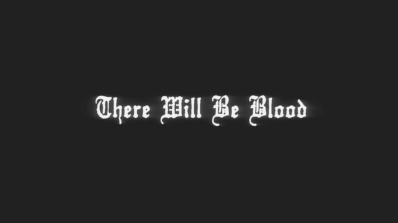
Why this video: This video serves as a deep dive into movie typography. It explores how filmmakers act as "casting directors" for typefaces, using design details like serifs, weights, and letter-spacing to build subtext and signal historical authenticity.
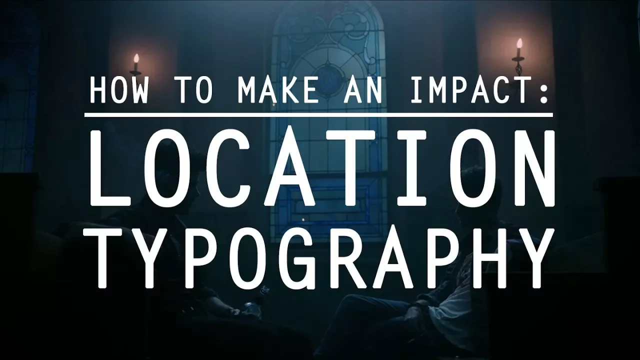
Why this video: Focusing on the physical positioning of text, this video explores "location typography." It shows how embedding text within the cinematic environment establishes spatial awareness, geographic context, and psychological distance.
Why this video: Produced by the Academy, this video features professional title designers discussing how they coordinate typography and graphic layouts to mirror a film's psychological progression and underlying conflict.
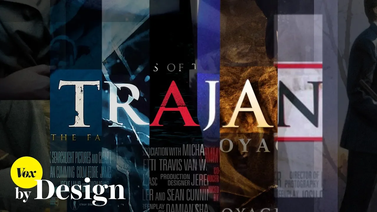
Why this video: A concise study of how graphic elements dictate genre expectations. It highlights how a single typeface style can become visual shorthand for specific cinematic genres, priming the viewer's brain for what's to come.
Knowledge Checkpoint
- Describe how typographic choices (such as serif vs. sans-serif, kerning, and weight) serve as "casting decisions" that reflect a character or plot's nature.
- Explain how "location typography" physically anchors the text to the scene's geometry and sets up geographical rules.
- Analyze how a single typeface can establish genre-specific expectations (e.g., sci-fi, horror, or indie drama) before a single frame of live action is projected.
Module 4: Psychological Framing and Symbolic Motifs
This module transitions from graphic theory to psychological projection. You will explore how title sequences manipulate texture, macro-photography, and visual metaphor to prime the audience's psychological state. Through the work of David Fincher and title designer Kyle Cooper, you will study how tactile, disturbing visual motifs establish thematic frameworks early on.
Recommended Videos

Why this video: This short documentary analyzes the legacy of Kyle Cooper, the title designer who revolutionized the industry in the 1990s. It explores his philosophy of creating standalone artistic narratives that serve the larger feature film.

Why this video: This breakdown focuses on Kyle Cooper's game-changing title sequence for David Fincher's Se7en. It analyzes how tactile textures, erratic hand-scratching on film, unstable shutter speeds, and gritty macro-photography put viewers inside the skin of a killer.
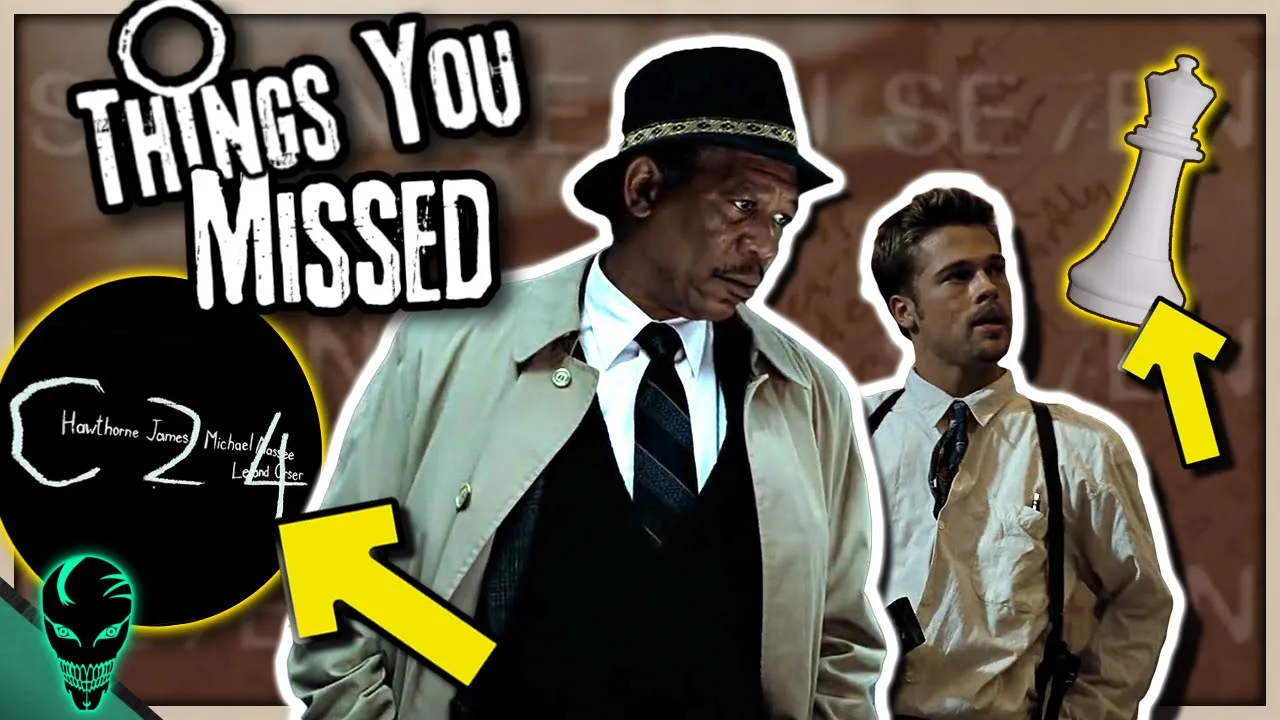
Why this video: An exhaustive breakdown of the hidden visual motifs, subliminal flashes, and typographic tricks scattered throughout the Se7en opening sequence. This video provides a masterclass in reading dense visual symbolism.
Why this video: This breakdown examines David Fincher’s Fight Club opening sequence. It illustrates how the title sequence uses a virtual camera pullback from the protagonist's neural pathways, framing the entire movie as a psychological construct right from the start.
Knowledge Checkpoint
- Define Kyle Cooper's contributions to the "tactile/grunge" aesthetic of title sequences in the 1990s.
- Explain how Se7en uses inconsistent shutter speeds, scratched celluloid, and macro close-ups to build immediate psychological discomfort.
- Identify how Fight Club's CG title sequence serves as a psychological framing device for the narrator's split personality.
Module 5: Case Studies: From Classic to Contemporary Masterpieces
This final module focuses on deep comparative case studies. You will analyze contemporary design pipelines, tracing how teams like Imaginary Forces translate narrative themes into complex, multi-layered opening sequences. You will study TV title sequences to understand how they set the stage for complex world-building.
Recommended Videos

Why this video: This WIRED feature traces the evolution of television title sequences from simplistic cast roll-calls to highly complex narrative art. It sets up the historical context for the transition from analog optical elements to modern digital visual pipelines.

Why this video: The actual title sequence of Game of Thrones, created by the elite design studio Imaginary Forces. Watch this sequence closely to analyze how the mechanical, changing world map acts as an interactive legend that primes viewers for the geography of each episode.
Why this video: An inside look at Imaginary Forces' digital design workflow for Amazon’s Jack Ryan. The creative directors discuss how they research character lore to design symbolic blueprints, moving from initial concept boards to finished CGI frames.
Note on Technical Gaps: While these videos provide a fantastic look at the creative process, the precise technical comparison between optical printer-based sequences (analog) and modern digital rendering pipelines (C4D/After Effects) is relatively brief. To round out your technical knowledge, we recommend looking up: "How optical printers made titles" and "Imaginary Forces title sequence design process."
Knowledge Checkpoint
- Contrast classic TV title sequences (such as simple actor roll-calls) with modern TV sequence "airlocks" that establish mood and world-building.
- Explain how the Game of Thrones animated map serves as an active narrative guide for viewers.
- Outline the design workflow used by modern agencies like Imaginary Forces (moving from research to storyboarding to final CG compositing).
Course Map
This flowchart maps the revised, highly optimized pathway through this curriculum.
Key People Index
- Saul Bass (1920–1996): The legendary graphic designer who transformed title sequences from simple text cards into a standalone graphic art form (collaborating with directors like Alfred Hitchcock, Otto Preminger, and Martin Scorsese).
- Lola Landekic: Editor-in-Chief of Art of the Title, an authority on motion design history, taxonomy, and the cultural preservation of title sequences.
- Kyle Cooper: Co-founder of Imaginary Forces and Prologue Films. He is widely credited with bringing title design back into the cultural spotlight in the 1990s with his analog-focused, highly psychological title sequence for Se7en.
- David Fincher: A director famous for his meticulous visual detail and his use of title sequences (Se7en, Fight Club, The Girl with the Dragon Tattoo) to establish a film's psychological setting early on.
Final Self-Assessment
Test your mastery of title sequence analysis by verifying that you can complete each of the following tasks:
- Trace the history of title sequences from silent-era text cards to the mid-century innovations of Saul Bass.
- Identify and define Saul Bass's signature design principles (e.g., cut-out paper aesthetics, high-contrast flat graphics, hand-drawn typography).
- Explain how a Cold Open (Pre-Title Sequence) alters the pacing of a movie compared to a traditional opening credit sequence.
- Evaluate any title sequence using the four-pillar framework: Energy, Personality, Emotional Stakes, and Contrast.
- Analyze how kerning, serifs, font weight, and typeface selection can evoke historical periods, genres, or thematic subtext.
- Explain the concept and technical approach of Location Typography in film.
- Describe the narrative function of the tv title "airlock."
- Detail how Kyle Cooper used macro-photography and tangible surfaces in Se7en to visually mimic a fractured psyche.
- Analyze how the virtual camera in Fight Club's opening sequence frames the entire film as a psychological construct.
- Explain how the mechanical map in the Game of Thrones opening sequence acts as an interactive legend that primes viewers for the show's complex geography.
- Describe the creative workflow of modern design agencies like Imaginary Forces, from initial concept sketches and mood boards to final digital rendering pipelines.