Deconstructing Maps: Projections & Geopolitics
Learning Goal: Analyze how cartographic choices and map projections influence geopolitical perceptions, historical narratives, and modern data visualization.
Every map is a combination of mathematical compromise, artistic design, and political perspective. This curriculum explores how the transition from a three-dimensional planet to two-dimensional surfaces introduces systematic distortion. By analyzing these distortions, you will learn to decode the hidden historical, imperial, and modern geopolitical motivations built directly into the grids of the world maps we consult daily.
- Prerequisites: Basic knowledge of global geography and foundational historical concepts of colonialism.
- Estimated Time to Complete: 12 Hours
Module 1: The Geometry of Flattening: Why All Maps Lie
This module addresses the fundamental geometric problem of cartography: the mathematical impossibility of translating a 3D sphere onto a 2D plane without distorting area, shape, distance, or direction. You will learn the core geometry of flattening and see how all flat maps are, by physical necessity, compromised models of reality.
Recommended Videos
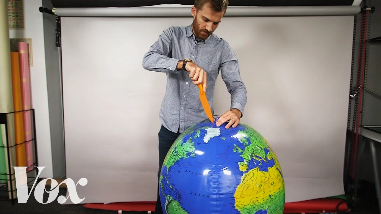
Why this video is valuable: This foundational video visually demonstrates the physical and mathematical reality of cartographic distortion. Using concrete, hands-on demonstrations (such as trying to flatten a real orange peel), it introduces the geometric concept that any flat world map must compromise on either shape, area, distance, or direction. It offers an excellent conceptual gateway to why no perfect flat map can exist.
Why this video is valuable: Jay Foreman delivers a fast-paced, highly engaging breakdown of why flat maps are structurally inaccurate representations of Earth. He explains how different cartographers throughout history have had to choose which geometric parameters to preserve and which to sacrifice, paving the way for understanding the political choices behind these mathematical trade-offs.
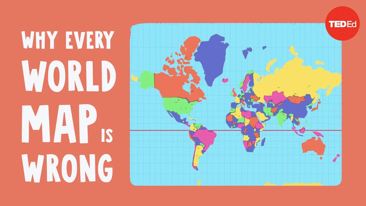
Why this video is valuable: This animation systematically breaks down how various projection techniques transform geographic coordinates. It details the math behind planar, conical, and cylindrical models, explaining how each system shifts distortions to different parts of the globe, allowing students to visualize the underlying geometry of spatial projections.
Knowledge Checkpoint
- Explain the geometric reasons why a sphere cannot be flattened onto a 2D plane without tearing or stretching.
- Identify the four primary spatial properties that undergo distortion on a map: shape, area, distance, and direction.
- Differentiate between the three main families of projections: cylindrical, conic, and planar (azimuthal).
Module 2: The Classic Projections: Trade-offs & Mechanics
This module dives deeper into specific projection types, comparing conformal maps (which preserve local shapes and angles) with equivalent maps (which preserve relative land areas). You will analyze classic historical projections—including the Mercator and Gall-Peters—as well as modern compromise projections like the Winkel Tripel.
Recommended Videos
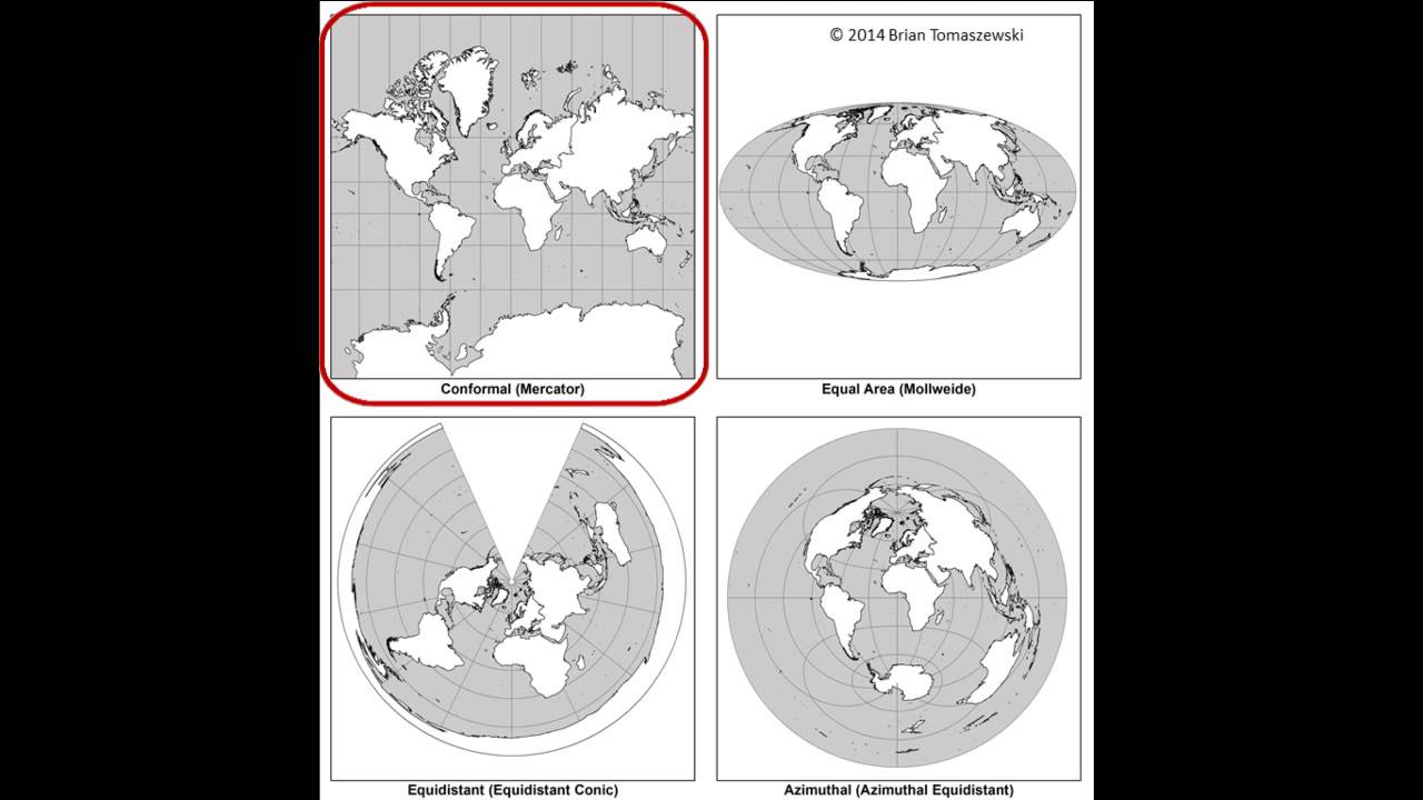
Why this video is valuable: This academic lecture provides a rigorous introduction to map projection categories and coordinate reference systems. It clarifies how projections are mathematically constructed and explains how conformal, equivalent, and compromise projections systematically distribute scale error across a map surface.
Why this video is valuable: An in-depth, textbook-style explanation of projections. It contrasts tangent and secant surfaces and details how standard parallels operate to preserve map properties. It is highly useful for mastering the technical classification of projections (conical, cylindrical, and azimuthal).

Why this video is valuable: This tutorial reviews the practical applications of classic projections. It explains why the Mercator projection preserves angles and directions (making it ideal for maritime navigation) and how other options choose to preserve area at the cost of severe shape distortion.
Curriculum Note on Modern Compromise Projections: While the video pool briefly covers the Winkel Tripel projection (e.g., in SciShow and The Parallel Truth), long-form analytical videos on compromise projections are limited. Students are strongly encouraged to independently search for: "Winkel Tripel and compromise projections mathematical derivation" to see how modern cartographers balance area and shape distortions simultaneously without strictly preserving either.
Knowledge Checkpoint
- Define "conformal" and "equivalent (equal-area)" projections and explain why a map cannot be both.
- Contrast the Mercator projection (conformal) with the Gall-Peters projection (equivalent) in terms of shape and area distortion.
- Explain how compromise projections (like the Winkel Tripel or Robinson) work to minimize overall visual distortion across the entire map.
Module 3: Cartographic Imperialism and Geopolitical Perceptions
This module explores how historical choices in map design, particularly the global dominance of the Mercator projection, have helped shape eurocentric hierarchies, colonial narratives, and skewed perceptions of the relative sizes of nations.
Recommended Videos
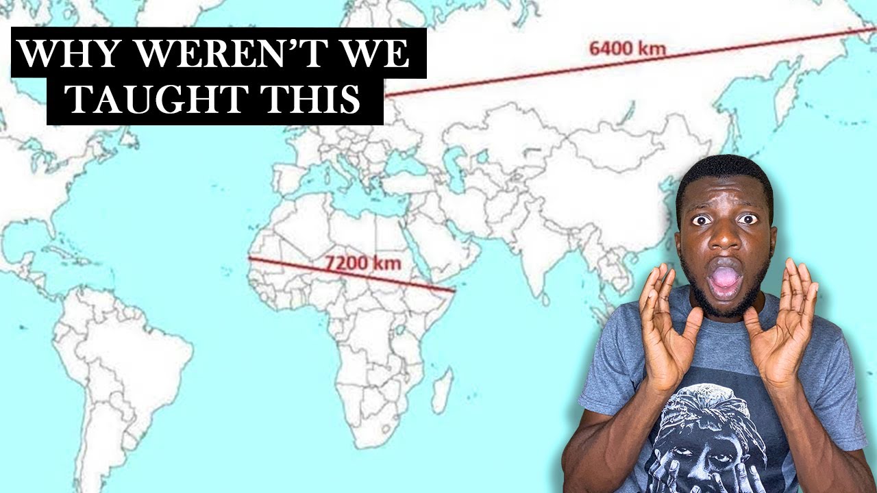
Why this video is valuable: This video focuses on the extreme distortion of Africa's size on traditional school maps. It explains the mechanics of how high-latitude areas are artificially expanded, causing northern landmasses to dwarf equatorial regions. It demonstrates the real spatial scale of Africa compared to Western nations.
Why this video is valuable: This piece bridges cartography and modern political discourse. It unpacks the call from African leaders and scholars to dismantle colonial-era maps that systematically minimize the continent's geographic and political prominence, detailing the psychological and educational impacts of these cartographic legacies.
Why this video is valuable: Although brief, this video delivers a sharp summary of how mapmaking was used as "history's first operating system" to establish imperial ownership, construct borders, and control trade routes across the British Empire.
Knowledge Checkpoint
- Describe the "Greenland-Africa Problem" on Mercator maps and calculate the actual ratio of their sizes compared to how they appear on a conformal cylindrical projection.
- Detail how colonial powers used cartography as a tool of administration, land division, and imperial legitimacy.
- Evaluate the ideological critiques leveled by Arno Peters against traditional eurocentric world maps.
Module 4: Maps as Weapons: Propaganda and Cartographic Statecraft
In this module, you will analyze how state actors, past and present, deliberately manipulate map elements—such as disputed borders, territory labels, map centering, and selective color-coding—to project political power, manufacture public consent, and claim contested sovereignty.
Recommended Videos

Why this video is valuable: This deep-dive lecture directly tackles how maps are manipulated to influence public opinion, drive nationalistic agendas, and bolster territorial claims. It serves as an excellent practical guide to reading between the lines of state-produced cartography.

Why this video is valuable: An illuminating case study of how cartography functions in educational materials. It investigates how geography textbooks can omit certain borders or selectively name regions to support a specific state narrative and shape young citizens' geopolitical outlook.

Why this video is valuable: This segment explains "cartographic aggression"—the practice of unilaterally drawing straight lines on maps through unverified or disputed areas (such as the Siachen Glacier) to establish legal and historical precedents for territorial claims.
Curriculum Note on Cartographic Propaganda: Because video materials covering official state map regulations (e.g., China’s cartographic standards or disputed border laws) are sparse in the video pool, students should conduct independent research using these search terms: "How to lie with maps cartographic propaganda Monmonier lecture" and "disputed borders on modern state-approved atlases".
Knowledge Checkpoint
- Define "cartographic aggression" and explain how drawing or omitting borders on official state maps impacts international law.
- Explain how map centering (e.g., Pacific-centric vs. Atlantic-centric) changes the perceived geopolitical relationships between countries.
- Identify three common techniques used in cartographic propaganda to distort public perception of an adversary's territory or power.
Module 5: Digital Cartography, GIS, and Modern Visual Distortions
This module moves into the modern era, examining the hidden biases of digital web-mapping platforms (such as the Web Mercator projection used by Google Maps) and critically evaluating how popular data visualization designs, like choropleth maps, can distort electoral, demographic, and climate data.
Recommended Videos

Why this video is valuable: An essential critique of choropleth maps, which color arbitrary political regions based on aggregate data. Dr. Ballinger explains why standard political maps are misleading—since "land doesn't vote, people do"—and demonstrates how alternative spatial proxies can create more accurate demographic visualizations.

Why this video is valuable: This video analyzes Google Maps' transition from a flat, Web Mercator projection to a dynamic 3D globe view at smaller zoom levels. It highlights how web mapping platforms have handled high-latitude distortions over the last two decades, and explains the engineering and visual compromises that led to the dominance of Web Mercator in modern web applications.
Why this video is valuable: Arvidsson explains the cognitive bias where viewers equate geographic area with thematic importance in data maps. This video shows how unnormalized data in choropleth maps can lead to false conclusions, illustrating the necessity of critical visual literacy in GIS.
Curriculum Note on Advanced GIS Biases: To fill gaps regarding the step-by-step math of cartograms or gerrymandering spatial analysis, students should independently search for: "Electoral cartograms vs choropleth maps data visualization tutorial" and "Gerrymandering spatial data bias and GIS analysis".
Knowledge Checkpoint
- Explain why web-mapping services (Google Maps, OpenStreetMap) historically adopted the Web Mercator projection, and detail the distortion trade-offs of that choice.
- Critique a standard red/blue US electoral map, explaining how geographic area distorts our perception of raw voter population.
- Define a "cartogram" and describe how it corrects for the area-bias inherent in choropleth mapping.
Course Map
Key People Index
- Gerardus Mercator (1512–1594): Flemish geographer and cartographer who created the Mercator projection in 1569. His map preserved angles and rhumb lines, making it the definitive navigational tool for sailors, though it severely distorts relative landmass sizes away from the equator.
- Arno Peters (1916–2002): German historian who promoted the Gall-Peters projection to challenge the eurocentric bias of the Mercator map, advocating for equal-area representations of the Global South.
- Oswald Winkel (1873–1953): German cartographer who developed the Winkel Tripel projection in 1921. It was designed to minimize the three main types of distortion (area, direction, and distance), and was adopted as the standard world map projection by the National Geographic Society in 1998.
- Dr. Ollie Ballinger: Geographer and lecturer at UCL whose research critiques traditional choropleth mapping, using alternative spatial data proxies (like lighting datasets) to make human populations and elections more accurately visible.
Final Self-Assessment
This comprehensive self-assessment evaluates your mastery of the curriculum's core concepts.
- Explain the geometric proof of why a sphere's surface cannot be flattened onto a 2D plane without metric distortion.
- Identify and define conformal, equivalent (equal-area), and compromise map projections.
- Explain why the Mercator projection became the dominant maritime navigation tool and describe its mathematical preservation of angles.
- Detail the visual and geopolitical distortions that arise when using the Mercator projection as a standard political classroom map.
- Describe how European empires used cartography to claim and divide colonial territories.
- Identify three distinct techniques used by governments to conduct cartographic propaganda on national maps.
- Explain the concept of "cartographic aggression" using a historical or modern border conflict as an example.
- Contrast how Google Maps displays the world at high zoom levels (Web Mercator) versus low zoom levels (3D Globe), detailing the visual differences.
- Explain why standard choropleth election maps can be highly misleading, and explain how a cartogram resolves this area-bias.
- Formulate a set of design criteria for selecting an appropriate map projection to visualize global climate change data.